 sarahmonster
commented
5 years ago
sarahmonster
commented
5 years ago In exploring solutions, @melchoyce and I narrowed down to two paths.
These particular prototypes focus on creating a new menu from scratch. Not every state or setting has a mockup — the focus right now is to go broad, not deep, in this exploration. We'll test these two approaches and then narrow down in iterations, based on your feedback as well as user feedback.
Concept: Going all-in on child blocks

This approach takes advantage of some smart patterns introduced by the Jetpack contact form block and WooCommerce products blocks. Each page type is its own child block. We focused on two things: using as many established Gutenberg patterns as possible for consistency, and retaining existing navigation menu features so the block can be a direct port for backwards-compatibility purposes.
Questions:
- We’ve introduced a “hide menu” setting, which is to tackle the issue of some themes providing default menus, some setting fallbacks, etc., which means there’s no consistent way to get rid of a menu. In the future when we have full site editing, this could come in handy for themes or sites that don’t allow you to delete global blocks. For now, it’s a bit superfluous and we might remove it.
- The navigation menu should include a “Login” and “Logout” item, as well as an RSS feed link menu item — should these be their own menu types, or listed in “Pages?” Maybe they should be in a “Meta” page type?
- We’ve included menu descriptions inline, but we're wondering if, since not a lot of themes currently support them, if they should live in the sidebar?
- Should we deprecate any menu features, like XFN, from the block?
- Should any other menu options live in “Advanced Settings?”
- Anything missing?
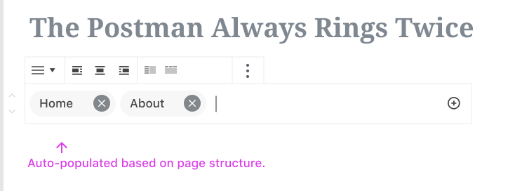
Concept: Menus are just links
Desktop prototype: https://www.figma.com/proto/2boguPnkQ8r2aCeovzBHwY/Menus-are-just-links?node-id=83%3A15896&viewport=402%2C418%2C0.5&scaling=min-zoom

Mobile prototype: https://www.figma.com/proto/2boguPnkQ8r2aCeovzBHwY/Menus-are-just-links?node-id=83%3A15896&viewport=402%2C418%2C0.5&scaling=min-zoom
Inspired by Material Design’s chips, this option aims to present the menu as closely as possible to the way it looks on your live site.
This uses the some interface as adding links elsewhere (when creating an inline link, or when adding a button) so there’s consistency any time users add a link. (Note that this only works if users think of navigation in the same way they think of inline links, which may not be the case.) This is a good opportunity to refine and unify how this interface works (#6392) as well as evaluating other search interfaces. We can unify these experiences across the entirety of the product whilst also making a teensy accessibility win.
It tries to make as many smart default guesses as possible for the user: it allows for converting menus if you already have some saved, but if you don’t, it defaults to a small menu based on existing pages. Finding items to add to the menu is primarily based around a smart search that searches across all types of content on your site, as well as including pages for archives and recognising and adjusting for social media links. Pasting a link will work as expected, so the interaction will be immediately accessible in as few inputs as possible.
Questions:
- Does the chip approach work here to add clarity and usability, or does it feel too divorced from existing Gutenberg patterns? Is there a better way to clearly communicate a link in a navigation menu while it's being edited? (See alternate style ideas.)
- This approach avoids putting settings in the sidebar as much as possible but doesn't include many fine-grained controls (beyond a horizontal/vertical option and alignment for the menu, and a few options for individual menu items). Are there other settings that should be included here?
- How can we improve on the existing "add link" interface to make it more accessible, usable, and flexible? (For instance, the ability to upload a file directly here would go over like gangbusters; see also #8322.)
- This isn't included in the prototype yet, but we'll want to include some options for adding new content here as well: maybe just a "Create new page" option below search results? Are there other types of content we should allow for dynamically creating from this menu?
- Sub-menus haven't been fully explored here yet either, and they open lots of questions. Should we allow for unlimited layers of sub-menus, or restrict the number of children? Should sub-menus be expanded by default, or should there be a way of expanding and collapsing them? Can you select a sub-menu individually? Would the toolbar be specific to the parent menu, or to the sub-menu? Is there such a thing as sub-menu settings, or are those settings owned by the parent menu and applied across all sub-menus?
- What happens when a user has a lot of items in their menu? How can we make it as easy as possible to navigate through those items across a range of devices?
What do you think?
At this point, we'd especially appreciate overall feedback about:
- Technically feasability: Can we do all this? Are there ideas here that are too wishful thinking?
- Accessibility: Are there things we could improve here? Does anything in particular raise a red flag? What can we do to ensure these approaches are as accessible as possible?
- Experience: Do these feel like natural approaches? Are there any parts of the flow that feel awkward?
- Settings & functionalities: What functionalities and settings are critical to meet the needs of the majority of users? Are there settings we can drop, or that we should be sure to include?
Leaving comments directly in Figma would be great, and you can also comment here. We'll work on refining these prototypes and running some lightweight usability testing to get a sense of how natural the interactions are.
 deckerweb
 melchoyce
 getdave
 Luciaisacomputer
 alexislloyd
 scruffian
 jwold
jwold jorgefilipecosta


 youknowriad


 kaktux
 idea--list
 javierlorente
 klihelp
 draganescu
 mtias
mtias mapk
mapk WayneAnderson
 scottsawyer
 collimarco
Since creating a block for navigation menus is one of the priorities for 2019, @melchoyce and I have been spending some time working on some ideas for a navigation menu block.
Lots of great work toward exploring a navigation block has already happened in #1466. In the interests of refocussing the conversation, I'm opening a new issue for this as we attempt to reach a solution.
First, let's establish a framework for understanding and evaluating the proposed solutions.
1. What’s the problem we’re trying to solve?
Building navigation menus for a website is a fragmented process that’s difficult to understand and visualise. It relies on a pre-existing understanding of the model WordPress uses to organise menus and doesn’t map to users’ understanding of how navigation menus should work. There are multiple different ways to create a menu (Customizer, Appearance > Menus, widgets) that all offer slightly different experiences, increasing confusion. Creating a link to certain parts of your site often requires manual work.
2. What existing research do we have?
Menus came up a few times in our sitebuilding research. Relevant takeaways: some people model the structure of their menus on the structure of their sitemap (or vice-versa).
Competitive analysis: http://simp.ly/publish/fTQTQB
Mel reviewed existing explorations to compile the discussion and ideas that have emerged around navigation blocks over the years.
Functionalities to consider:
3. What are our guiding principles?
After discussion with developers, accessibilities, and other designers, we've decided that in order to support the problem:
4. How do we choose a successful solution?
Using prototypes, we’ll test and time the creation of a simple menu and a complex menu. We’ll also ask users to rate their experience from a scale of 1-5.
This quantitative data (experience rating and time to creation) will be used alongside the qualitative data (user feedback, your feedback!) to determine which solution is the most effective and should be pursued. @melchoyce will be responsible for this selection. We'll then iterate on the solution until we hit on what we think is the best approach.