Yeah, but we can still make the labeling friendlier.
Closed mtias closed 6 years ago
Yeah, but we can still make the labeling friendlier.
Definitely, but "Show on all" wouldn't apply. I don't have any bright ideas, though :)
Well, we could always ask some copywriters :)
Quick suggestion: "Reusable block"
So, here are some mockups that assume that you can only convert a single block into a reusable block. That means if you want to create reusable layout parts, you'll have to wait for nesting.
Step 1, converting to a reusable block:

Step 2, prompt to create a reusable block:

Step 3, a reusable block:

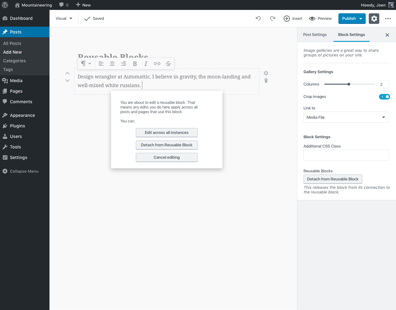
Step 4, editing a reusable block:

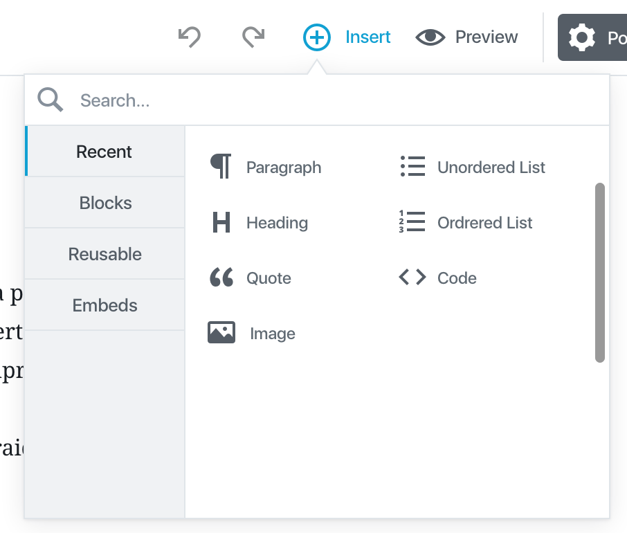
Step 5, inserting a reusable block:

Thoughts?
Great job. This is a great start to moving into reusable blocks and adds a ton of benefit right off the bat.
A few thoughts:
It's hard to judge discoverability and distinguishability as well we're us and bias. I would say this is a great case for a/b testing. I would suggest get the feature in then we can take from there. I'm super excited about this.
Solid feedback, thanks.
Editing reusable blocks - On step 4 we have a prompt that displays when I try to edit the reusable block. Should we have that prompt every time? That may be ok, but it also could cause friction.
We could do it so the alert only pops up once, when you start typing or doing an actual change, and not just selecting the block. But seems like this is also an area we might want to polish in implementation.
Differentiating reusable blocks - On step 3, it’s hard to tell what is a reusable block vs a regular block. The dashed lines help, and seeing “detach from reusable block” in the document settings helps, just not sure if these are enough. Should we try a different outline color, or an icon next to the reusable blocks, or highlighted text in the document settings area?
I tried a color, and I was considering a gray background, to imply it's "grayed". But in case of the color, it feels like that's a territory owned by the collaborative editing PR now (#1877) — though that could just be me falling short.
One thing we could do is add a label when the block is selected, same as the design for collaborative. A label that just says "Reusable Block: [Blockname]", or something.
Discoverability of my reusable blocks - I could see having a hard time finding out where I can find these reusable blocks. What if we did something like adding an indication to the “+ Insert” button whenever a reusable block is created? I'm thinking of the Slack notification bubbles next to the channels for instance.
Good points. Seems like this is something that could be optimized as a second phase of this. Maybe the creation modal is two-step, with a "You can now find your new block in the inserter" message in step 2, or something.
All solid ideas. If you would like to mess with the mockup (or if I have to step out in case of baby), I've updated the sketch file that includes these mockups here: https://github.com/WordPress/gutenberg/blob/master/docs/design.md#more-resources
Great flow, thanks for exploring these @joen!
Piggybacking on @jwold's feedback with some ideas:
Editing reusable blocks - On step 4 we have a prompt that displays when I try to edit the reusable block. Should we have that prompt every time? That may be ok, but it also could cause friction.
Maybe the prompt should only show up the first time you edit a reusable block on whatever post or page you're working on. Once you save, leave, and come back to edit later, you could see the prompt again.
Differentiating reusable blocks - On step 3, it’s hard to tell what is a reusable block vs a regular block. The dashed lines help, and seeing “detach from reusable block” in the document settings helps, just not sure if these are enough. Should we try a different outline color, or an icon next to the reusable blocks, or highlighted text in the document settings area?
+1
Discoverability of my reusable blocks - I could see having a hard time finding out where I can find these reusable blocks. What if we did something like adding an indication to the “+ Insert” button whenever a reusable block is created? I'm thinking of the Slack notification bubbles next to the channels for instance.
To be honest, I'd still like to see us explore tabs on the left side of the block inserter on desktop. I foresee folks wanting to add tabs in the future (maybe even us, once we start doing more with customization), and moving the tabs to the left would better accommodate this growth. Plus, I believe it would help fix some of the accessibility problems @afercia has pointed out in other issues.
If we moved tabs to the left, we could try something like:

Solid feedback as usual. Just zooming in on the "tabs on the left" thing — that's an interesting idea. I have a feeling @afercia might love it ;)
Editing reusable block prompt:
Maybe the prompt should only show up the first time you edit a reusable block on whatever post or page you're working on. Once you save, leave, and come back to edit later, you could see the prompt again.
+1
I tried a color, and I was considering a gray background, to imply it's "grayed". But in case of the color, it feels like that's a territory owned by the collaborative editing PR now (#1877) — though that could just be me falling short.
One thing we could do is add a label when the block is selected, same as the design for collaborative. A label that just says "Reusable Block: [Blockname]", or something.
+1
I'd still like to see us explore tabs on the left side of the block inserter on desktop.
That does allow for a lot more expandability. Good idea. Would be nice to know our longest word in German (for example) to see how much width to give it.
That does allow for a lot more expandability. Good idea. Would be nice to know our longest word in German (for example) to see how much width to give it.
I wonder if we could let the tabs be as wide as they need to be to fit one word (and go onto multiple lines if there are multiple words), or maybe hyphenate if a word is too long?
I wonder if we could let the tabs be as wide as they need to be to fit one word (and go onto multiple lines if there are multiple words), or maybe hyphenate if a word is too long?
Good point. Doesn't have to be a limit on how much it expands, or cuts off words for another line.
I'm going to work on building out the flow that @jasmussen describes here—it's a really good starting place that we can iterate on.
One question, though: how are reusable blocks deleted?
I'm thinking we add an X icon next to the reusable block in the Inserter Menu, which removes it and detaches it from every post where it was used.
One question, though: how are reusable blocks deleted?
I'm thinking we add an X icon next to the reusable block in the Inserter Menu, which removes it and detaches it from every post where it was used.
Excellent question to be asking.
I think for now, it's probably fine to have an X button next to the block in the inserter menu, so long as it has a confirm on click. We'd want to have the action to be functional, regardless of any future enhancements.
Long term we should think of a better interface for this. It could perhaps be accessible from the ellipsis menu... or maybe it lived elsewhere. Maybe it's a submenu item of the wp nav menu, like categories? Perhaps the inserter has a blue link to "Manage reusable blocks" that loads a new section? This is something to think about as we explore this.
Howdy!
In WP.com, we have a feature called "Simple Payments" which allows you to create and insert a (PayPal) payment button into a post very easily. We have a custom UI built for creating and managing those buttons and use Custom Post Types on the backend to keep track of them.
Gutenberg reusable/global blocks look like the perfect solution for the payment button:
However, we've discovered that it currently doesn't satisfy all of our needs. First, it would be great if we could use our own CPT definition to store the payment buttons and tell Gutenberg to use that for this specific global block. Would that be possible?
Secondly, the global blocks inserter UI is lacking more details about a payment button. From the mockups, it looks like a global block is identified only by a title. It would be nice, though, if we could add some more info like price and/or the button preview. @mtias had this idea that we could have a special function in a block which would return a preview/something for a global block which would get rendered to the right (or on hover/focus?) of the global block in the inserter UI.
What do you think? Something worth adding?
Should this be considered satisfied by #3378, #2659?
One appealing aspect of blocks is that they lend themselves to become reusable pieces. This will be key for theme customization (think menus, headers, footers, etc) down the road, but it could already be useful in the context of posts, and it may be wise to get the foundation in place.
Examples
WordPress at the moment treats galleries like this—you insert the shortcode and it is evaluated at render time. But it would be nice if any block could be turned into such a reusable entity in a way that is clear to the user and not a surprise.
Proposal
Shared blocks can get a different outline color:
And when updating them the user can be presented with a confirm dialog asking if they want to update across all posts or convert the current instance back to a static block.
Saving flow can be tricky, because we could issue saves through the API separately from saving a post, since the post only has a reference to the content of the block. This is more of a UX question, though, that will affect blocks like "navigation menu" down the road.
cc @aduth @nb @westonruter @jasmussen @melchoyce @iseulde @youknowriad @nylen and anyone interested.