WordPress / gutenberg

The Block Editor project for WordPress and beyond. Plugin is available from the official repository.
https://wordpress.org/gutenberg/
Other
10.3k stars 4.11k forks source link

Advancing the Block Interface #18667

Closed mtias closed 3 years ago

mtias commented 4 years ago

We are about to cross the one year mark since the release of Gutenberg in WordPress 5.0. In this lapse of time there has been an explosion of blocks being created šŸŽŠand millions more users interacting with the block editor, leading to multiple iterations, improvements, challenges, and lessons learned.

What patterns have emerged as more intuitive? Where does the current interface fall short? Whatā€™s common and what is strange when comparing different blocks among the hundreds that already exist?

Something else that was not expected at the beginning was seeing other projects outside the confines of WordPress interested in using the block editor. This poses interesting design questions. How would a Drupal version of Gutenberg look? Is there an essence there that can help us refine its foundations?

The biggest design tension the editor faces is between making blocks and their interactions clear while not distracting people when they are creating, writing, and thinking. This is a tension that means, some times, bringing a block into clear focus and, other times, letting it recede into the background. (See #16280.)

This is particularly challenging when taking into account people have different needs, preferences, and dispositions that can completely inverse what ā€œclearā€ or ā€œoverwhelmingā€ means to each person. Density of information can be helpful to some while hindering the experience of others.

In the block editor context this translates to different tradeoffs, as the more that gets added the more complexity the interface needs to orchestrate. Making writing easy can come at the expense of making other important actions more convoluted. This, however, is the fundamental usability challenge we need to wrestle with!

Over time, the interface has evolved to handle increasingly complex needs, such as nested block structures, movement, selection, breadcrumbs, navigator, outlines, and more. These have all grown organically to meet new challenges. But in trying to address them in isolation, new problems arise: elements that were not designed to be prominent suddenly become more focused.

One thing that has proven useful is exploring ā€œmodesā€ in more depth ā€” of which top toolbar, focus, and navigation are good examples. Thereā€™s been immense progress around iterating and improving upon these issues with each release. (Latest is this proposal for selection modes.) However, there are other problems that reflect structural constraints and require looking deeper at the anatomy of the block in order to improve. Sometimes this requires significant investment and thinking, as was the case with the newly introduced ā€œnavigation modeā€, which can then unlock new pathways. (See #17088.)

This unlocking is crucial to create an interface that can serve all users while recognizing their intrinsic differences. One of the most fundamental aspects to address there is clarity.

The Block as a Canvas

block-canvas

A principle that has remained true is that the block canvas is the primary interface and brings about the expectation of direct manipulation. Blocks can define multiple states, variations, and can mutate. The canvas of the block should guide users around interacting with the content. For this, the interface needs to welcome exploration and needs to be able to teach its affordances intuitively.

One of the biggest virtues of the block is that it allows to have contextual tools when you need them, avoiding having to show unrelated tools when you donā€™t need them.

It also provides uniformity within diversity, as learning the ingredients of the interface happens once but scales to hundreds of blocks.

Looking at the current anatomy of the block a few aspects arise:

image

The natural visual hierarchy shows the main interactions or functions:

(With one hidden part in the block inspector (sidebar settings), but letā€™s pause that one for now.)

It is apparent that the block functions already carry interface weight and spread across a few different surfaces. When considering screen readers and keyboard navigation this also means a lot of areas that the user needs to traverse to interact with a block effectively.

image

With so much UI itā€™s worth attempting to reduce the surface, bringing it to the minimum possible to strike the right balance and clarity. There are also too many shades, making outlines and elements feel crowded and making it harder to increase contrast without increasing the feeling of overwhelmingness. This can be notorious in nested contexts, like in #14935 and the cascading issues it generates. More complex blocks surface a lot of these problems more clearly: see #17544.

A Toolbarā€™s Tale

The Toolbar is the second most important aspect of a block. Itā€™s a fundamental extension of the direct manipulation principle. Third-party blocks have naturally wanted to do more with the toolbar, adding new controls or expanding on previous ones. Libraries like CoBlocks, Kioken, Editorā€™s Kit, and a long etcetera have been pushing those boundaries. (Color tools (#16662), background tools (#16479), etc.)

This has resulted in the following challenges:

image

Reflecting upon this situation, a few principles emerged:

Letā€™s Explore!

Looking at all these considerations we can start piecing together paths of exploration for a more refined block interface that emphasizes clarity and function while reducing how many elements are floating.

image

image

Absorbing the movers into the toolbar can become a contextual action, simulated in the following GIF.

paragraph-movers

The movers have a more clear relationship to the block type they are affecting, which can also help refine the drag-and-drop behaviour.

paragraph-movers-alt

Drop-downs can be recognized as extending from the same elements as the toolbar itself, reducing the amount of unnecessary icons, and improving contrast and clarity.

image

When looking more broadly to the block we can also apply some of the same principles to reduce materials (outlines with different weights) and benefit from the reduction the toolbar allows. Combining this with the work done on the ā€œnavigation modeā€, the outlines can become a more effective system to communicate states and interactions.

image

An important aspect is that outlines for block selection can remain consistent, including those employed during navigation mode, ideally helping with issues like #17184:

block-outline-navigation

Combining the movers with the toolbar also helps tremendously in some of the scenarios where the current model fails ā€” like the use of horizontal movers in Buttons or the Navigation block:

image

Itā€™s also interesting to see how these principles can help extend the toolbar to the placeholder element, so that the initial setup of the block connects better with later interactions, retaining an element of familiarity:

image

image


This is just to kickstart the conversation, I think thereā€™s a lot of potential in thinking about all these problems more holistically from a design, usability, and accessibility perspective. Huge kudos to @pablohoneyhoney and @jasmussen for playing with these ideas a bit.

Thereā€™s a lot more ground to cover and explore. What do you think? Does it spark any other ideas? If you have been working with blocks and experiencing the rough edges, does it solve some of them?

richtabor commented 4 years ago

This is great @mtias, really forward-thinking. šŸ‘ šŸ‘

Here are a couple notes I had while reading through the issue:

  1. I'm curious what this means for the "Top Toolbar". What parts of the interactions do you imagine becoming ingrained there?

  2. The last screenshot references a color UX pattern. Baking in an easily implemented foundational colors experience would be so fantastic for blocks! Having background/text color controls in a standardized locale would lead to a much needed pattern for applying colors.

  3. I'm not sure if it's been explored yet, but it may be interesting to explore having the toolbar remain static on the parent block while nested blocks are being edited - with controls adapting based on the selected child block.

  4. What does the little black triangle at the bottom right of the block icon? If it means that there's a dropdown with additional controls in it? If so, the alignment/text alignment controls should also have it.

Screen Shot 2019-11-25 at 9 09 34 PM
jasmussen commented 4 years ago

I think MatĆ­as is on a flight today, so I'm doing my best to answer in his place. I'm sure he'll chime in if I'm off base!

I'm curious what this means for the "Top Toolbar". What parts of the interactions do you imagine becoming ingrained there?

This is something we'll need to explore and address in implementation. The focus has been primarily on the default experience, which has the most literal visual context to each block being edited, but the top toolbar option should remain an option for those who prefer. Whether this means always showing the mover control, or making sure there's space for it to appear without moving the toolbar, there are options here.

The last screenshot references a color UX pattern. Baking in an easily implemented foundational colors experience would be so fantastic for blocks! Having background/text color controls in a standardized locale would lead to a much needed pattern for applying colors.

šŸ™Œ

I'm not sure if it's been explored yet, but it may be interesting to explore having the toolbar remain static on the parent block while nested blocks are being edited - with controls adapting based on the selected child block.

I believe #18440 (addressing #17267) might be along the lines of what you are suggesting here. I happen to agree with you this is necessary for at least some container blocks!

What does the little black triangle at the bottom right of the block icon? If it means that there's a dropdown with additional controls in it? If so, the alignment/text alignment controls should also have it.

Dropdowns are likely to be increasingly necessary in the toolbar, not just to scale (the alignments menu which could theoretically grow to include custom flexbox alignments), but in order to better address plugin, responsive, and nested contexts.

In this exploration, dropdowns do not have additional visual indicators, which is consistent with popovers like the Block Library, Block Traversal and Ellipsis menus. It remains to be seen in implementation how intuitive this is for all sorts of users, but the idea is to reduce and simplify a very complex control. The triangle for the block item instead becomes an anchor point for the block, indicating the toolbar segment from which all others expand.

ZebulanStanphill commented 4 years ago

Regarding the move controls, how would these changes affect accessibility? What would be the tab order for the toolbar controls? Is it bad for accessibility to have the move controls only be shown when hovering the block icon?

jasmussen commented 4 years ago

Good questions, Zeb! Finding the right balance with the mover control is of great importance. On the one hand they offer a clear interaction for easily swapping two blocks around in a manner that is mobile friendly and not as fiddly as drag and drop, which is important for people with reduced motor skills.

At the same time, it's a big control that is useful only some of the time. Same as the sibling inserter ā€” the plus that sits between two blocks ā€” the idea outlined in this ticket suggests that the control could be hidden until needed.

Tab-order-wise, the controls could potentially be in a better place than before, as there will now be a single block toolbar control to tab into. Just like the sibling inserter is surfaced on both hover and focus, so would the mover controls, and they would come before the rest of the controls in the toolbar.

As I also noted to Rich, the mover control is one of those aspects that will need to be refined as we explore it in code. The intent is to find the right balance between utility and accessibility, there are a few ways we can go with it.

mapk commented 4 years ago

I'm really excited to see these evolutions!

I recall another challenge we face is having UI appear and disappear with various hover and selections. While this exploration still allows this, I believe grouping the UI into one cohesive toolbar as shown here will help resolve the problem. šŸ‘

The stronger contrast is beautiful. šŸ˜

Thereā€™s a lot more ground to cover and explore.

We definitely need to put this to the test. It would be fun to explore in the context of:

Basically exploring how this new toolbar works in relation to what was addressed here (some of this is already being done):

Over time, the interface has evolved to handle increasingly complex needs, such as nested block structures, movement, selection, breadcrumbs, navigator, outlines, and more.

This will help keep us focused on the whole.

mtias commented 4 years ago

I'm curious what this means for the "Top Toolbar". What parts of the interactions do you imagine becoming ingrained there?

It's a good question. The top-toolbar is mostly in a decent place, since it doesn't suffer from many of the problems the in-canvas toolbar has. I'd expect it'll inherit some of the main improvements (clarity around drop-downs, contextual tools, differentiation of ellipsis menus ā€” which the header has two ā€”, focus states, etc).

There are some challenges to the header area that I think we need to look at more holistically, especially with full-site editing which is likely going to bring more controls within a limited space. I could see, for example, top-toolbar not adding the controls to the header but immediately below it if we can work out the double-stacking not looking horrendous :)

Having background/text color controls in a standardized locale would lead to a much needed pattern for applying colors.

Agreed! I think we are getting to a point where the UI work can help us drive issue like #7553 and #9534.

What does the little black triangle at the bottom right of the block icon?

What @jasmussen said. Also it's meant to emphasize the dropdown and add a level of hierarchy to the block type, which has been absorbing more interactions (transforms, styles, selection, possibly more).

image

ZebulanStanphill commented 4 years ago

I could see, for example, top-toolbar not adding the controls to the header but immediately below it if we can work out the double-stacking not looking horrendous :)

I think long-term, something like this is inevitable. Semantically, it seems weird to combine the general toolbar with the block toolbar, and having the two on separate lines would allow controls on both to be given optional inline labels (see #10524) without getting really cramped.

karmatosed commented 4 years ago

I am excited about this iteration and appreciate it started by distilling back to the block. I want to dive a bit into this with some thoughts that come to mind. The first of those is how critical noting it's been a year is. It's crucial the interface evolves, responds and adapts to what is today's space and what will be in future. There's a lot we've all learnt along the way that can be fuel for this iteration. I think it's also worth pointing out this itself should be an iteration, with more to come.

A big problem currently is as the interface gets more complicated with nested blocks and content, the current situation doesn't scale. That feels at the root of going back to the block and re-examining. I think the suggestion of for example moving the block movers solves such a big piece of this. The toolbar suggestions as a unit to me feel instinctively like a significant step forward. It is also worth noting some benefits come in usability just from having the bigger hit space; there's an opening of the interface even that soothes cognitive load.

I am very keen on bringing in a grid and feel this as spreads across the experience is going to reduce visual confusion and space for comprehension of the experience as a whole.

As I look at the examples, wayfinding seems more natural; this is a significant improvement and one of friction today. Being able to see what you are doing and when is even more crucial as the move to site editing ramps up. While it's not being visualised in complex content in those examples, I can see how this would at least be a lot more easy to focus on than what we have currently.

It would be great to as part of this iteration explore not only the visual language but the interaction one. What story can we tell, what can we enhance with the animations, dragging and bounces? There's never been time for crafting of this into a story arc, pacing. Similarly, taking the time to make an audit of what interactions we have seems right. By setting up an interaction language the experience will improve dramatically along with all the other improvements proposed. In the examples shown, I am optimistic about this being part of the work.

melchoyce commented 4 years ago

Is there a prototype we can play around with, even something static from Figma, to get a better feel for the whole system?

pablohoneyhoney commented 4 years ago

We'll collect and organize some of these explorations in a file for everyone.

ItsJonQ commented 4 years ago

@mtias , @jasmussen , @pablohoneyhoney Absolutely stunning work! It's so incredibly exciting šŸ˜

Since we're focusing heavily on the experience, I think it would be incredibly important to ensure the interactions feel really good. The GIFs in the post help demonstrate some of these interactions.

As @melchoyce touched upon, I think having an interactive prototype would be really helpful. Something that you can click, poke, drag, and play with.

I created a very simple one here: https://codesandbox.io/s/github/ItsJonQ/g2-prototypes/tree/master/

Non-code view, here: https://tz3ir.csb.app/#/

(Pardon the icons, haha. I put this one together really quickly)

We can use this CodeSandbox to prototype, experiment, and refine interactions. Not just with the new Toolbar, but for all of the new concepts introduced in the post :).

Edit: Updated CodeSandbox links

ZebulanStanphill commented 4 years ago

What does "active" and "inactive" mean in this GIF? image

pablohoneyhoney commented 4 years ago

Sorry if it's unclear @ZebulanStanphill , inactive means resting (while typing, for example but not interacting with the toolbar), active means hover, focused, or pressed on the toolbar. To be tested and stressed further, it was sketched in isolation to think about different approaches to movers.

ZebulanStanphill commented 4 years ago

Alright then. I'm not sure I agree with hiding the inline formatting controls until you hover/focus the toolbar. What was the reasoning behind that aspect of the mockup?

Also, how would navigating to the block inspector fit in with this new block toolbar design? There's been discussion of turning the inspector into a modal opened by a toolbar button.

pablohoneyhoney commented 4 years ago

Hiding controls was an hyperbolic exploration to talk and demonstrate contextuality, surfacing the most relevant UI for the given action a user is performing. Having a more intelligent UI that shows the most pertinent controls while affording access to them at any given point. Paragraph (through Rich Text) will always have exposed formatting controls.

Re: the second point, this is to be explored in the context of the whole environment, but this approach should afford accessing the inspector. Maybe @jasmussen has some thoughts on this as he explored a bit on https://github.com/WordPress/gutenberg/issues/13663#issuecomment-521917305

jasmussen commented 4 years ago

Re: the second point, this is to be explored in the context of the whole environment, but this approach should afford accessing the inspector. Maybe @jasmussen has some thoughts on this as he explored a bit on #13663 (comment)

Yep. I think the interaction of the contextual block settings sidebar, and how to best handle focus between that and the block, is worthy of its own discussion being continued in #13663, and the design here doesn't necessarily need to steer that any way or other.

However I have continued to think about it. It's about striking the right balance between surfacing helpful advanced block settings for power users, and providing a baseline intuitive tabbing interface. One idea that needs more thought is to default to block settings opening in a modal dialog, but allowing a user to pin the sidebar to the right, like one might pin the toolbar to the top.

chrisvanpatten commented 4 years ago

I think there are a lot of really compelling ideas in this ticket! I don't have a ton of things to comment on (as I like a lot of what's being said!) but one thing I want to observe is the continued prevalence of "hover" actions.

I recently switched to an iPad as my primary computing device, and it's an environment where hover events simply aren't possible. Safari in iOS 13 does its best to interpret touches as hovers and map it appropriately, but it works inconsistently and is clunky at best. And even though iPadOS technically supports mice, it doesn't allow tracking hover events as the mouse pointer is treated as an analogue for touch input.

I know there are also accessibility implications to hover events, although I'm not really comfortable speaking to those. But more generally as iPads and touch devices become more common (and specifically become more common primary devices) it would be great to start from a place where hover is treated as a progressive enhancement.

ZebulanStanphill commented 4 years ago

@chrisvanpatten I agree; I want to see a mockup of how the proposed new toolbar would work for mobile. Perhaps tapping the block icon would cause both the mover and the transform/styles menu to appear?

Another thing I'm curious about is how the mockup toolbar works in tight situations where the block toolbar is right up against the left side of the screen. If the hover controls always slide out to the left, how are you supposed to use them if they go off-screen? Will the block toolbar always be positioned a minimum distance away from the left edge to ensure there is room for the mover to appear?

gziolo commented 4 years ago

A small note from the angle of the user. I share the sentiment that we should take into account touch devices as the current experience on the iPad isn't great even if you use it with the smart keyboard to boost your productivity. In general, we reached the point where the number of visits from mobile devices is bigger than those for desktop computers so we should ensure it feels great in all cases.

mtias commented 4 years ago

Definitely. "Hover / Focus" in the presentation is generally interchangeable with a similar tap-step on touch devices, which would need to be properly defined.

The biggest blocker we had on mobile for a more usable toolbar has recently been addressed in #18686. With the proposed toolbar iterations I imagine we'd be able to present a few tap-steps like:

image

Expanding to:

image

And perhaps even surface a "move to" so that you could tap, scroll to where you want to move the block, and tap again to drop a block:

image

ZebulanStanphill commented 4 years ago

Nice mobile mockups.

Something else I'm wondering: why should the movers be on the left of the block icon? If the block icon is the "anchor" point of the toolbar, I'd think that it should be the first thing you tab into, and therefore the movers should appear after it.

ItsJonQ commented 4 years ago

:wave: Hallooo!! I have a prototype update in regards to the "G2" Advancing Block UI that was presented during the design meeting.

I recorded a walkthrough of my prototypes here: https://www.loom.com/share/f27357393abc49bca2d070cdbc9a7633


Linky to code and things! CodeSandbox: https://codesandbox.io/s/github/ItsJonQ/g2-prototypes/tree/master/

Prototype Preview: https://tz3ir.csb.app/#/

Github Repo: https://github.com/ItsJonQ/g2-prototypes/tree/master/

diegohaz commented 4 years ago

Awesome, @ItsJonQ! Thanks for the amazing work!

The first thing I noticed playing with that is that people with motor disabilities or anyone who has difficulties using a mouse may struggle with the collapse effect.

Pointer hovering the toolbar, which gets expanded and collapsed right away because the pointer subtly moved away

I'd say that this would affect anyone at certain level.

Debouncing the collapse effect may help with that.

ItsJonQ commented 4 years ago

@diegohaz Thanks for the feedback!

I've been noticing some interaction challenges myself. And I think my motor skills are okay. So I can imagine the challenges others may have.

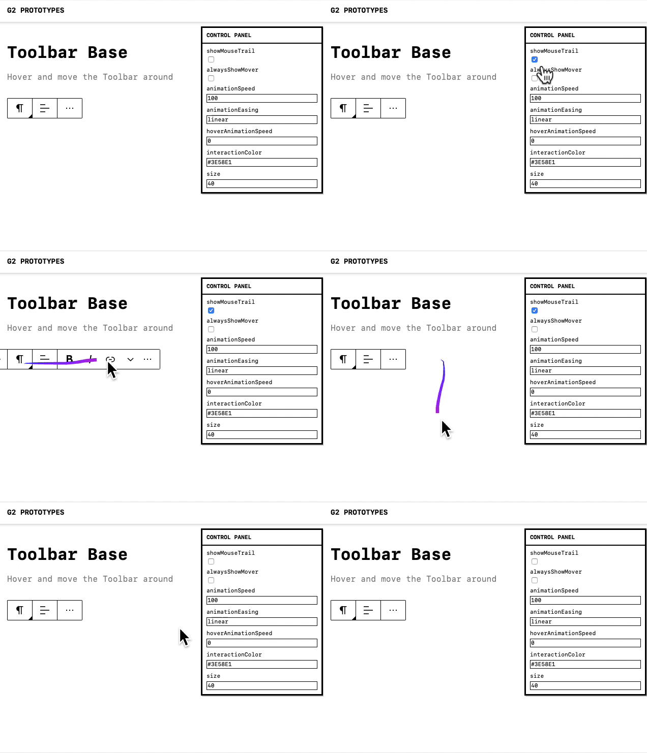
Based on your feedback, as well as feedback from others, I've added an option to see your mouse trail.

I think this will help visually demonstrate how easy/difficult an interaction is:

Screen Capture on 2019-12-06 at 12-01-56

I think this tool can help us refine some interaction/UX ideas :)

Debouncing the collapse effect may help with that.

I'll give that a try!

ItsJonQ commented 4 years ago

šŸ‘‹ Halloo!

x-posted from https://github.com/WordPress/gutenberg/pull/18685#issuecomment-562676154

After playing around a bit...

I have an alternative interaction pattern idea that tried to lighten the UI re: movers.

Screen Capture on 2019-12-06 at 12-20-18

(I don't know if this was tried previously).

The idea came from playing around with Notion (they don't use arrows in their mover though).

These are my initial thoughts + observations


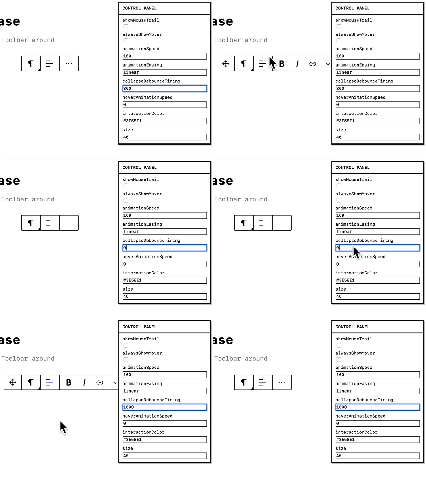
@diegohaz I've added debouncing :D https://tz3ir.csb.app/#/toolbar-base

Screen Capture on 2019-12-06 at 13-20-13

ZebulanStanphill commented 4 years ago

Quoting this comment by @afercia:

Many users (e.g. keyboard users, screen reader users) navigate the content in a linearized way. When they land within a block, they find several controls that belong to the block UI before they can finally land on the block content. The inserter, the movers, the block toolbar: they all come before the block main content in the source order. This makes these users experience far from ideal.

Ideally, users should find the block main content as first thing. After that, the controls for additional actions: move, formatting, add. This would also replicate what is the most logical workflow, where everyone would expect to

  • first add content
  • and then format the content, move the content, find additional options and as last thing find the inserter to add a new block As always for accessibility, the logical order and grouping of UI controls is paramount. Worth noting the accessibility team asked a few times to have an option to move also the block toolbar after the block.

For this reason, I think it would be best if the mover controls were merged into the block toolbar, since combining that with an option to show the toolbar below the block would provide a better keyboard experience than what we have now.

I'm not a fan of having the mover slide out upon hovering the block icon. That feels too hidden to me. I think a better solution would be to put a drag handle to the right of the block icon which is always visible. Hovering or tapping the drag handle would cause it to expand and show the arrow controls. Tabbing into it would also cause it to expand, with focus jumping to the arrow controls (because the drag handle is useless to keyboard users).

diegohaz commented 4 years ago

Another thing to keep in mind is how the move control ā€” if it's a single draggable button ā€” will be accessed by keyboard users.

One option is to activate it by pressing Enter or Space and then use arrow keys to move the block around. When it changes, screen reader users should be notified about the new block position (maybe using aria-live regions).

The user could press Escape to exit this mode and then use arrow keys to move between the toolbar items again.

Maybe that's a better UX even for sighted users? The current behavior has a very poor UX in my opinion. When you use the draggable handle, it's difficult to find the right spot to drop it. And subsequent clicks on the arrow buttons are slow due to the position change (you can press Enter multiple times while focusing the arrow button though, but that doesn't feel intuitive enough).

Dec-11-2019 08-55-22

Related #6289

pablohoneyhoney commented 4 years ago

In light of the comments and ideas above, here some further explorations on movers. I'm hopefully capturing the collective sentiment and the individual nuances, we can all keep exploring in the open figma file: https://www.figma.com/file/fnyj380i05vGzuuH60frLQ/G2-Design?node-id=85%3A6975

And we can also translate these in interactive models @ItsJonQ to see them in action. There are different details and trade offs in the different options.

Option 1: Contextual, where the movers appear when relevant.

Screen Shot 2019-12-11 at 11 57 36 AM

Option 2: Visible by default, while the block type loses its nature as an anchor point.

Screen Shot 2019-12-11 at 11 57 42 AM

Option 3: Movers live on the right side of the toolbar.

Screen Shot 2019-12-11 at 11 45 15 AM

Option 4: Relying on a drag behavior, while it becomes a difficult motor skill for users of all types, even on desktops.

Screen Shot 2019-12-11 at 11 45 26 AM
ItsJonQ commented 4 years ago

@pablohoneyhoney šŸ˜ Wonderful!! I'll try to mock these up when I can. They will be fun to poke at

ZebulanStanphill commented 4 years ago

Thoughts on the block mover

I think whatever design we go with must keep the individual buttons for moving a block up/down (or left/right). Relying on a drag handle is bad for accessibility, and the arrow buttons are often faster and easier to use anyway. Drag-and-drop should be a secondary enhancement.

I also would strongly advise against making the arrow buttons too small. They should be easy to tap with a touchscreen at all (not just mobile) viewport widths.

https://github.com/WordPress/gutenberg/pull/18685#issuecomment-564025483 currently implements the movers as two separate arrow buttons that double as drag handles, thus reducing the size of the mover while increasing the size of the drag handle. GIF

The mover could still be made to only appear when hovering the toolbar or after clicking something (perhaps a button that expands into the full mover when clicked), but there needs to be 2 normal-sized arrow buttons somewhere in the design.

Concerning where in the toolbar the movers should go, it may be helpful to consider it in terms of keyboard navigation. When tabbing into the block toolbar, what tab order of controls makes the most sense? Whatever the answer is, it should be used as the basis for the visual order.

Thoughts on the block toolbar structure in general

Currently, the block toolbar seems to have an order based on putting block-level controls on the left and inline controls on the right. The block transformer/switcher affects the whole block (and in some cases changes the block type), the block alignment dropdown affects the entire block, and then the inline formatting tools only affect portions of the block.

However, there is an exception to this rule: the "More options" menu. This menu contains only options that affect the entire block, yet it is placed on the right side of the toolbar.

Now consider this: the block switcher/transformer is placed under a button with the block icon. At first glance, it looks like this button should open the menu for the general settings of the block. To an extent, this is true, with the transforms/styles placed there. However, the rest of the general options are thrown in the ellipsis menu.

I've noticed that this mockup almost turns the block icon button into another dropdown menu: mockup

The styles are put into a sub-menu, and technically the transforms could be put into one as well. (And perhaps they should, given the large number of transforms for some blocks like the Paragraph block.) Alternatively, both could be turned into buttons that open a modal to give more breathing room for the available options (including more space for previews).

Why not take this a step further and combine the block icon menu with the ellipsis menu?

Alternatively, what if the block icon button took over the role that the ellipsis menu currently serves, and the block styles and/or transforms were moved into a separate button on the toolbar?

ItsJonQ commented 4 years ago

@pablohoneyhoney Update! Added some updated Mover prototypes! https://tz3ir.csb.app/#/toolbar-movers

mtias commented 4 years ago

Why not take this a step further and combine the block icon menu with the ellipsis menu?

This is an interesting idea worth exploring. The biggest issue is that we should not bury transforms as it's a very important interaction for basic formatting.

ZebulanStanphill commented 4 years ago

However we choose to expose the transforms, the design needs to account for a lot of transforms being available. Here's what the available transforms for the Paragraph block looks like on my website right now: image

The simple list shown in the mockup in my previous comment may not scale well with this many options.

jwold commented 4 years ago

From my initial read Iā€™m excited. The changes that are being proposed feel like a breath of fresh air to the interface. The words that come to mind are simple and calm.

Making things more contextual to the block also makes sense. I wasnā€™t sure about bringing the movers into the toolbar initially, but seeing how they can be converted to horizontal in context would be more useful. Also, I see there's been discussion about whether they stay visible at all times or not. That's something I'm not sure about myself.

Mapk: The stronger contrast is beautiful. šŸ˜

Agreed! Felt so relaxing to look at that new contrast.

Karmatosed: What story can we tell, what can we enhance with the animations, dragging and bounces?

Would love to see where we can explore motion!

jasmussen commented 4 years ago

In #19344 Riad and I are slowly beginning work on trying this UI out in practice. The branch is still very much in progress and too early to fully evaluate. However it's a good way to test the waters on some of the ideas.

For example the emphasis on focus outlines on the block footprint rather than outset block borders regardless of focus seems to work well:

focus

This outline shares DNA with block selection, both visually and insofar as when a block has this blue outline, you can press Delete to intuitively remove the block(s):

select

It also helps unify how normal and floated blocks look and behave, making floats feel more intuitive:

floats

This last GIF also surfaces an interesting aspect of the Image block, in that the caption field is part of the block, and is therefore highlighted when the block is selected (and can be deleted with the Delete key):

Screenshot 2020-01-10 at 16 01 02

As soon as you tab into the caption field, or backwards into the toolbar, focus is moved there. As is evident above, the caption field is a little tightly packed near the focus outline, which is technically an accurate preview of the block footprint. But is there a generic way to handle this more gracefully?

youknowriad commented 4 years ago

But is there a generic way to handle this more gracefully?

In my opinion and small experience :), trying to be too smart is often not the greatest approach. Since this is the accurate representation of the focused element, I wonder if it's better to just leave it as is even if design-wise, it's not perfect.

ZebulanStanphill commented 4 years ago

I really like how much more consistent everything feels with these changes. The float outlines finally making sense is especially nice. Personally, I don't mind the tight outline around the Image block caption, since it is an accurate representation of the actual block size.

pablohoneyhoney commented 4 years ago

Design is never perfect :) but we can also keep exploring to avoid such as:

Screen Shot 2020-01-10 at 9 49 45 AM

Conceptually, the interface seems to not respect users' content.

ZebulanStanphill commented 4 years ago

@pablohoneyhoney It looks like the outline needs to be moved to touch but not overlap the edge of the block footprint.

youknowriad commented 4 years ago

@ZebulanStanphill I believe it was moved to overlap because of the placeholders to avoid the "double border" issues (placeholders have black borders).

jasmussen commented 4 years ago

Thanks for the feedback, I think I largely agree with all of it, but mostly it's given me some ideas to explore and I'll return!

jasmussen commented 4 years ago

Moving to a box shadow for the placeholder (plus transparent outline for Windows High Contrast mode), and a fully outset rather than 1px overlapping border for focus/select improved things quite a bit:

Screenshot 2020-01-13 at 10 08 08

It's still tight, but it's definitely better than before.

Also made progress on button focus styles today.

jasmussen commented 4 years ago

For folks subscribing to this thread or landing here, there's a branch in #19344 which is nearing a point of stability. It would be great to get further thoughts and feedback on that branch, but otherwise if you're able to check out and try the branch, it's a great way to see some of the ideas outlined in this thread in action.

jasmussen commented 4 years ago

Hello again! In #19348 I have worked on expanding some of the UI outlined in this ticket outside the editing canvas, including giving the top toolbar some love, as was discussed here:

Please feel free to head on over and try the branch out, your review thoughts would be very much appreciated.

richtabor commented 4 years ago

Looking good @jasmussen. I'm curious though - is there a reason to have two different focus border radii values within the toolbar/navigator controls?

jasmussen commented 4 years ago

There's supposed to be only a single unified radius, in this case 2px, absolutely. There are currently a couple of very specific cases where the border radius effectively becomes a pixel larger, due to the item in question already having a border and the outset focus style growing the outermost radius by 1px as a result. I think there may be one or two cases where that can be tweaked, but the goal is definitely a single radius.

ZebulanStanphill commented 4 years ago

There's something I'm wondering about regarding this mockup: image

How would this work on mobile?

oldrup commented 4 years ago

Using Gutenberg for all my post, I most say, I find it faster to recognize the icons in the menu, than the text, and I don't find the removal of the icons an improvement. Increasing acceptance and usage of Gutenberg, is also about making it friendly to new users. Stripping out friendly icons deemed "unnecessary" does not help with that.. (Purely my opinion - got no user tests to back that statement)

images

paaljoachim commented 4 years ago

I just want to comment on the icons comment from @oldrup We can recognize something visually as an image or through text. Having icons beside the text really helps create an even better recognition of what we are looking at. Using an icon we will gradually build up a recognition and when we see the icon in another location we will automatically understand what it represents.

ellatrix commented 4 years ago

Is there anything left here? :)