 ZebulanStanphill
commented
4 years ago
ZebulanStanphill
commented
4 years ago Just noting that the tab order should definitely match the visual order (left to right, top to bottom) whenever possible, to ensure good accessibility. If you think the document settings should be the first thing you tab into, then perhaps that's a sign that you're putting it into the wrong spot, visually, and you need to move it to the start of the toolbar, rather than the middle.
Using the document title as the label for the button is a bad idea. To follow accessibility guidelines, the button should be labeled based on what it does. It opens post/page settings, so it should be clearly labeled as such. I'd suggest "[Post] settings", where "[Post]" is the current post type, e.g. "Page settings", "Template settings", or "Product settings".
If there's a lot of controls to show, we could use a popover modal similar to the "Options" modal, rather than the currently proposed dropdown menu design. We could also potentially keep the current sidebar look, but make it act more like a modal to improve accessibility (meaning it closes automatically when your focus leaves it).
I do like that this separates the document settings from the block inspector (the latter of which probably shouldn't be accessed from the top toolbar in the first place, but rather the block toolbar... and it should also act like a modal).
It's also worth remembering that this all has to work on mobile, so keep that in mind when designing interfaces that have side-tabs.
 ghost
ghost shaunandrews
 dubielzyk
 afercia
 paaljoachim
 noahtallen


 jameskoster
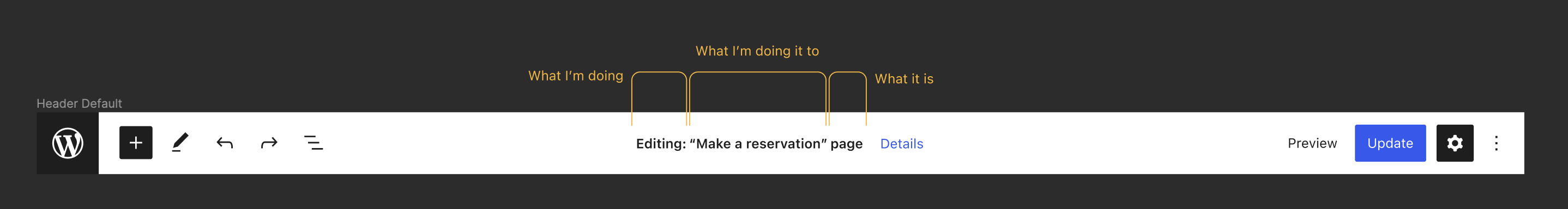
 mtias
mtias diegohaz

 Addison-Stavlo
 MichaelArestad
 vindl
vindl
Since the very beginning, we have attached the permalink function to the title of the post. This had the intention of making it a bit more prominent — particularly for pages — compared to just having it in the sidebar panel.
It was also stated at the beginning that in the future the title would become a block, and thus the permalink function would need to move away. We have also discussed many times the idea of bringing features that used to exist in the document panel closer to more relevant places in the post (featured image being an obvious one).
There's also the cases where the design of a post / page template doesn't include the title for whatever reason. We don't have a clear way of showing that the title is not just visual but also important semantic data (even if a title should not be shown, we don't want users to end up with "(No title)" in their post list.
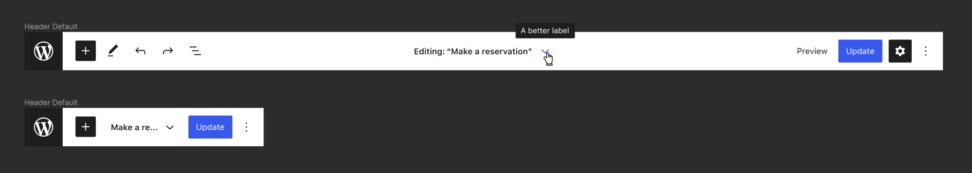
In this issue I'd like to suggest absorbing the title and permalink flow in the editor header:
This would open a dropdown containing some of the most relevant elements from the "status" panel: permalink, date, visibility, author, delete. It would also give a visible and consistent place for the document title.
In the context of full-site editing we have a "template" dropdown in the top left area showing what the current template you are editing is (single, page, archive, etc). I'd propose exploring a way to combine this so that the relationship is more clear:
And extend it to all the different types of content and templates you might have:
Of course, we need a better way to handle the top-toolbar option, but I'd argue that's already becoming the case with the header growing in functionality and it being able to contain any number of plugin extensions.
Thoughts? Ideas?