@Garance91540 Looks good 👍, but I can't access the google drive link.
Closed Garance91540 closed 2 months ago
@Garance91540 Looks good 👍, but I can't access the google drive link.
Looking good!
It would be useful to see them in context as well as in the grid system to understand balances.
Shapes, could you explain its function? Seems a bit busy, and has a bit of tension between triangle and square.
@Garance91540 Looks good 👍, but I can't access the google drive link.
@Soean I added a zip file with the icons in the description
@pablohoneyhoney here are the icons with more context:
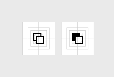
in grid system:

in context of the Product screen of the Woo app. (The shapes icon will be used for product variations such as color or material):

I'll work on a new iteration for the shapes icon!
Hi @pablohoneyhoney ,
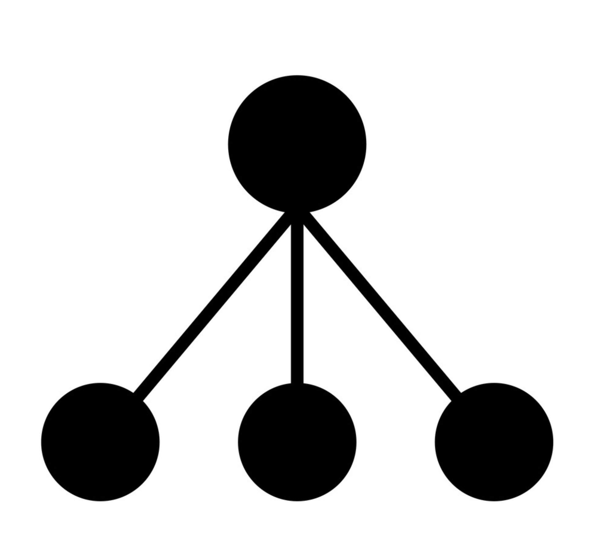
Here are some new options for the "shapes" icon. Curious to hear your thoughts!

I wonder if something more universal could work for the variations use case... something like 'copy' or 'swatches'? 🤔

I wonder if something more universal could work for the variations use case... something like 'copy' or 'swatches'?
@jameskoster I can't unsee "copy" when I see those :)
What about something like this?

The vertical space between the triangle and the shapes below doesn't seem consistent with the horizontal space between the squircle and the circle. Otherwise that looks pretty good to me!
The vertical space between the triangle and the shapes below doesn't seem consistent with the horizontal space between the squircle and the circle.

updated ^
In that case it seems like we have this whole set of new icons finalized! 🎉🎉🎉
@pablohoneyhoney , did you still have feedback on these icons or are we good to go?
There’s something obscure about the different shapes together. My eye tries the decipher a few things at the same time and I don’t necessarily associate the 3 shapes with variations (color, materials). If it’s simply to convey variants, have you tried to only use four circles that transmit choices? @Garance91540
I think that could work, as long as the circles are different some how.
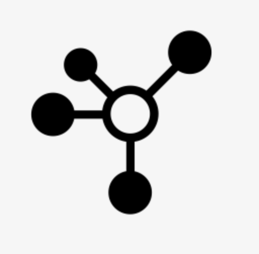
But if all the objects have to be alike then we'd need to work out a way to illustrate the relationship between them. That being the concept of a common source with different variants. Maybe something like a "node" icon:


If we think an icon composed of similar elements will work better, then I think we could use the existing "product-categories" icon I'm seeing in the G2 design Figma file instead of creating this new "shapes" icon:

I think that works
Hi
Removing the good first issue label because it is not clear what needs to be done here.
Closing this out as, four years on, it's not clear what, if anything, is actionable still.
I've been working with @jameskoster and @jasmussen to create new G2 icons. (I'm currently working on the Woo app and noticed there were no current G2 icons equivalent for some existing icons).
svg files here G2-icons.zip
First time contributing to this project so don't hesitate if you need other formats.
cc @pablohoneyhoney