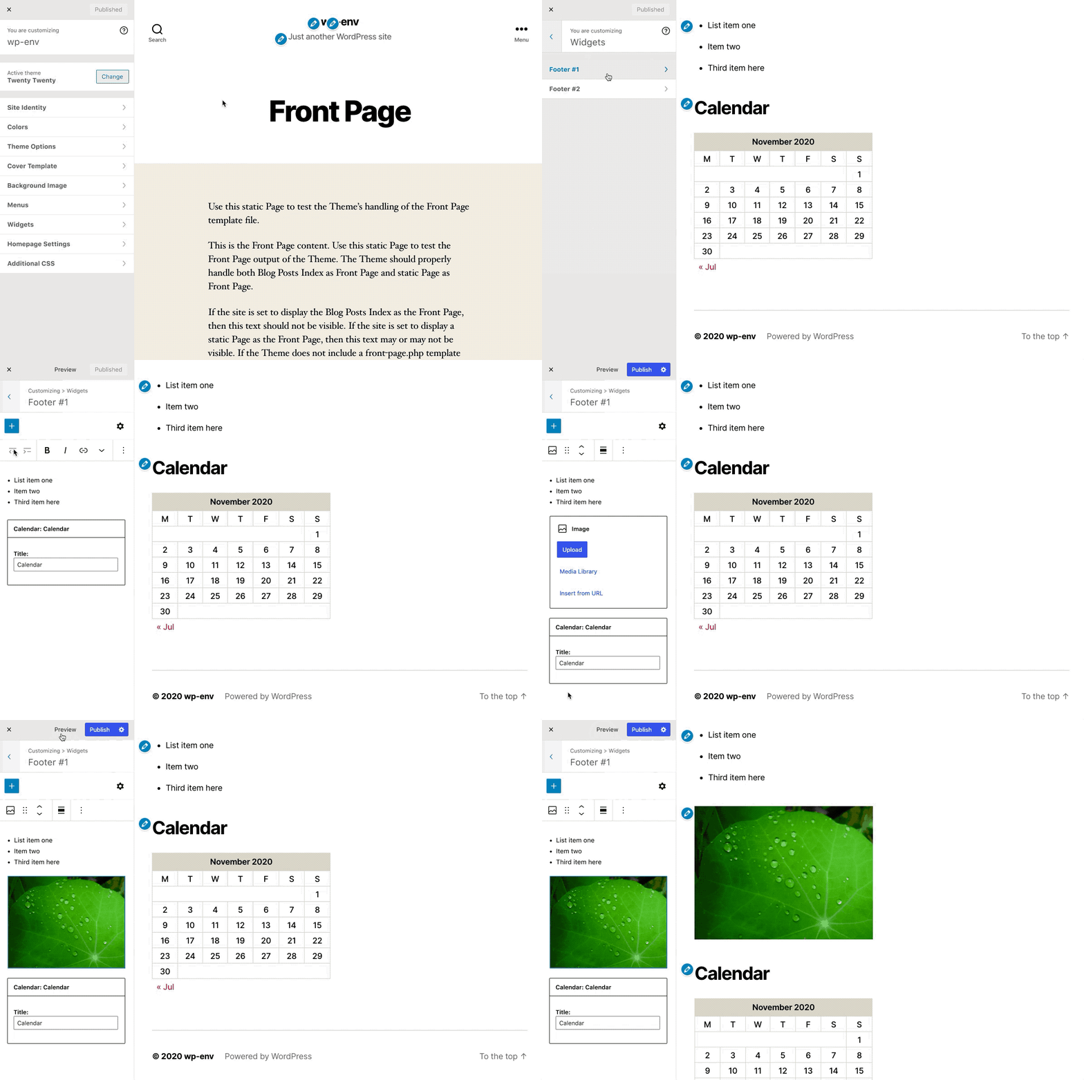
Closed draganescu closed 3 years ago
The great thing about the Customizer is the sidebar presents the backend widget management while also providing a frontend preview of the live edits. Keeping this frontend preview while managing widgets AND blocks is important. @celloexpressions writes it well in his issue.
@draganescu, to your point here:
a path where a block editor would expand to "full screen", like the theme selection works.
Would this be another interface separate from both the Customizer and the Widget Screen? The current problem with the block editor is that it doesn't show me how the widget areas are displayed on the frontend (ie. Footer).
Congrats! You've asked three very big questions that have been on my mind a lot this week π
In #26012 @celloexpressions details a complex approach which endorses the Customize API as a common ground between blocks and widgets, enabling live previews, draft changes, scheduling and so on, for any widget area update.
Further discussion on #25818 has @noisysocks suggesting an alternative experience:
Maybe we could make the Customizer a little more modal. Have the left hand side slide out to reveal a full block editor. Then clicking Preview slides it back where it was
I think there's a lot of common ground between what @celloexpressions and I wrote in #26012 and #25818, and I don't think what he proposed in #26012 regarding technical architecture is complex.
I think part of the problem is that us Gutenberg folk are not very familiar with how the Customizer works. For that I'd recommend reading https://developer.wordpress.org/themes/customize-api/ which I personally found very enlightening.
How to make the block editor talk to the Customizer?
Here's very roughly what I imagine...
There's a React component in the @wordpress
namespace called e.g. BlockWidgetsEditor
, which:
BlockEditor
that allows the user to edit the provided widget areas.<BlockWidgetsEditor
widgetAreas={ ... }
onChange={ ( widgetAreas, changes ) => {} }
/>
Then, there's a React component in the @wordpress
namespace called e.g. BlockWidgetsScreen
, which:
BlockWidgetsEditor
and hooks it up to the REST API.BlockWidgetsScreen
can then be mounted into the standalone widgets.php
WP Admin screen in the normal way.
render(
<WidgetsScreen />,
document.getElementById( 'widgets-screen' )
);
Lastly, there's a class in the @wordpress
namespace called e.g. BlockWidgetsSection
, which:
wp.customize.Section
.BlockWidgetsEditor
and hooks it up to Customize settings using the Customize JavaScript API.render(
<WidgetsEditor
widgetAreas={ buildWidgetAreasFromFormData( wp.customize.get() ) }
onChange={ ( widgetAreas, changes ) => {
for ( const widgetArea of changes.widgetAreas ) {
wp.customize( `sidebars_widgets[${ widgetArea.slug }]` ).set( widgetArea.widgets );
}
for ( const widget of changes.widgets ) {
wp.customize( `widget_[${ widget.slug }]` ).set( widget.instance );
}
} }
/>,
this.container
);
What is the best experience for managing widgets now that we have blocks alongside them?
Throwing out two ideas...
We could make the Customizer's widgets block editor modal and have it so that, when you click Widgets, the RHS is complete replaced with a block editor.
This would be really similar to how the theme switcher in the Customizer already works.
You could imagine that maybe the block editor fills the RHS and the LHS can be used for the inserter.
This means we lose real time previewing, though, which is a big selling point of the Customizer and very useful in this context because the block editor in this context doesn't have theme styling.
I noticed that the widget areas in our block-based widgets.php
screen are only 700px wide.
What if, when you click Widgets, the LHS extends from 300px to 700px so that it can fit the block editor in it?
On smaller viewports, only the block editor would appear. This is already how the Customizer works. On mobile viewports, the RHS goes away and instead you see a Preview button in the top left.
We would have to figure out where to place the block inserter and block options.
Should we unify the Customizer and the widgets screen?
I'm undecided as to whether or not to unify these two screens.
At the very least, I strongly think that we need to add previewing to widgets.php
as suggested by @celloexpressions in #26012. What we have right now is a very poor flow which I'd describe as Press Update and be surprised!
It should be possible to add previewing to this screen by making use of the existing changeset infrastructure in WordPress. Potentially, changesets could be added to the REST API. See https://core.trac.wordpress.org/ticket/38900.
If we add previewing to widgets.php
and make the block editor in the Customizer larger and potentially more modal, then there is really no significant difference between the two screens.
We could remove widgets.php
and have Appearance β Widgets deep-link to Appearance β Customize β Widgets. This would significantly reduce implementation complexity and reduce our long term maintenance burden.
Working on @noisysocks' concept 1 above, I put together this prototype in Figma.
Thanks for getting a prototyping going @mapk!
My initial thoughts:
Nice work!
This approach definitely keeps things consistent with the post editor which hopefully means less learning for users who are used to that.
I like that this approach lets us do things like allow users to drag and drop blocks from the inserter to the editor.
I think we need a Preview button which instantly shows the user's changes without saving them.
The Update button in the top right of the screen should probably say Publish (or Save Draft or Schedule) as, in my mind, it's the same button that currently exists in the top right of the Customizer's sidebar. (Weird idea: If it's the same button, could it animate over to the right?)
What does the cog button in the top right of the screen do? Does it open the block settings, as in the post editor, or does it open the publish options drawer, as it does in the Customizer?
Obviously this approach means there is no real time preview on the right. How important is real time preview for users? How do we determine that?
I keep coming back to the idea that the customizer mixes very functional simple UI on the left with accurate an accurate view of content on the right. The block editor on the other hand tries to represent these two concepts in one, but is naturally a little more complex in its interface, and also less representative of content (particularly so in the case of widgets since themes can't style the editor). So naturally, what we end up with is not going to be quite as easy for users, and we have an editor that is designed around the idea of looking like the content, but doesn't.
So I think we have to be careful about taking over the right-side of the screen by default as it takes away one of the most powerful things about the customizerβa very fast loop in terms of tinkering and viewing content.
We could potentially try to use what the customizer does on mobile as inspiration, where it's easy to flip between customize/preview:
I have a slightly out-there suggestion, which is to show the List View in the customizer panel instead of the block library. I feel like this is closer to what the customizer does at the moment and gives users some basic organisational control over blocks.
It'd then be interesting if we could change this slide out panel to the block library:
And then on the right default to the preview, but make it possible to quickly switch over to the full editor quickly for editing. Alternatively the user could edit blocks individually in a modal that can be launched from list view.
@noisysocks great writeup π I agree that a "bridge layer" between the customizer API and the widgets editor would likely be the best solution here.
As for the preview, my thoughts are that the premise of blocks is that they look the same/similar in the editor and on the site. The premise of customizer is that the UI (sidebar) is separate from the preview (live site). One way or another, some consistency will be broken. Maybe it's not as much about finding a good way as it is about finding the "least bad" way of proceeding? To break it down, the blocks editor could be placed in:
I wonder how embedding the blocks right in the preview would feel like to the user. I put together a rough mockup to exercise this idea:
Though it poses its own challenges though. For example, as @noisysocks mentioned in another PR, the editor wouldn't be properly rendered in the site markup at the moment. I imagine it wouldn't be that hard to work around this limitation by separating the CSS/scripts scope of the editor by wrapping it in an iframe or shadow DOM. Another challenge is that the publish feature in the sidebar now feels disconnected. Also, the footer is horizontal which means these widgets would have to be wrapped in columns block to be displayed like that. Plus it's unclear what would happen after adding another widget to that footer. It's a tough problem π€
Thanks everyone for digging into these ideas further. I'd like to circle back to my original thoughts:
It seems like the existing customize widgets UI (and API) can be largely reused, expanding the add-widget-item panel to the complete list of blocks that can be added to widget areas. Alternatively, the entire experience could be relocated into the live preview (inline editing).
The presence of the live preview of the frontend is a great opportunity. Can widget-blocks be edited directly on the frontend? Should we extend the existing visible edit shortcuts to offer a visual relationship between widget/block areas and the frontend of the site? Maybe widgets are edited over the preview, similar to the theme-install overlay?
@adamziel brings up an interesting idea where "inline editing" is an abstracted editor located within the preview. The customize selective refresh API already offers the infrastructure that would be required to toggle a widget area between an editor and the preview within the preview iframe. Themes have been able to add support for this since 2016. And the visible edit shortcuts provided an incentive for themes to support this functionality.
However, going with more of a full-screen editor-to-preview toggle maintains the clear separation between editing and the frontend that avoids issues like displaying widgets in columns within the editor. This inherently means the editor can look different from the preview. If we go with a sidebar approach, note that the current widgets and menus panels in the customizer partially obscure the preview when adding items. We could either expand this to a full preview takeover (like the mobile approach) or try to fit the UI within a partial-width space.
A full-screen panel (@mapk's mockup) with a prominent preview/edit toggle similar to mobile would be an easier initial implementation. It also functions similarly to the standalone widgets screen. This is where I see the screens merging, with the [autofocus]
capability transitioning existing widgets screen links. Then we have less to maintain, less technical debt, and more opportunity to iterate on this new experience.
Another point that I made in #26012 is that we could expand this approach to post editing. One the block editor is integrated with the customize API, we can expose edit icons for other elements of the site within the preview, and open a similar (potentially modal) experience. The big benefit of post editing within the customizer is the improved access to previewing post content, and the ability to edit post content within the larger site customization process. This has been a long-term goal for the customizer.
Would such scenario make editing template-specific widget areas more challenging though? As in the user would first need to find the right page?
This is already the case in the Customizer. Some controls are hidden until you are on a specific page or template. In my view it's a feature, not a bug. It would be really strange to change a setting and not see any effect.
I have a slightly out-there suggestion, which is to show the List View in the customizer panel instead of the block library. I feel like this is closer to what the customizer does at the moment and gives users some basic organisational control over blocks.
This is a neat idea. I'd love to see a mockup. Having the List View remain in the sidebar in both modes could mean that there's less of a "disconnect" between the two modes, which is nice. You could even allow simple edits (re-arranging blocks, removing blocks) straight from the List View, though I'm not sure how useful that is.
I wonder how embedding the blocks right in the preview would feel like to the user. I put together a rough mockup to exercise this idea:
Cool mockup! π It definitely presents a lot of challenges, like you say. How would the editor know that the blocks are laid out horizontally instead of vertically? What does it even mean for blocks like Paragraph and Separator to get laid out horizontally? What would happen in themes that widget areas into more "dynamic" places e.g. hamburger menus?
A full-screen panel (@mapk's mockup) with a prominent preview/edit toggle similar to mobile would be an easier initial implementation. It also functions similarly to the standalone widgets screen. This is where I see the screens merging, with the [autofocus] capability transitioning existing widgets screen links. Then we have less to maintain, less technical debt, and more opportunity to iterate on this new experience.
Agreed. If we go for a full-screen modal approach then this feels like the perfect time to "remove" widgets.php
because the screens would be near-identical and developers will have to update their plugins to work with the new screen one way or another.
As I'm thinking through iterations of this full screen editor take over, I wanted to share the original design concept but with a tweak that includes a "Preview" button for refreshing the Customizer preview after editing in the panel.
This original direction tends to align more with @adamziel's point here:
The premise of customizer is that the UI (sidebar) is separate from the preview (live site).
I've always preferred this direction because it keeps the editing in the panel and the the preview in the preview section. π
Prototype
I wonder how embedding the blocks right in the preview would feel like to the user.
Editing the blocks in the Preview could lead to some confusion IMO. Some things are editable in the panel (ie. identity, theme colors, etc) while other things are editable in the preview (ie. widgets and blocks). There's also the Settings inspector we'd need to account for leading me to think we'd need to include the Gutenberg topbar or something similar.
The "full screen" block editing ideas above seem like a better approach compared to respecting the relationship between the side-panel and the preview, where side controls preview. This approach works great if what you have in the side-panel are a bunch of settings, form controls and data management UIs.
We want to have blocks editable in the Customizer. Blocks are free form. When an image is inserted we see the image, not the URL of the file. When text is edited, it is rich text, not a text area with check boxes. Because of this the relationship between the settings and the preview of the settings is broken.
There are many things that result from this breakage:
I would go more towards the ideas that involve taking over enough screen estate on desktop environments so that it feels like a desktop experience. Also this allows for testing ideas on say a fixed inserter or a fixed list view. There is some habit formed that block editing should be previewed from the post editor, so switching between a modal block editor and the Customizer's preview looks like something we can afford to ask the user.
The "full screen" block editing ideas above seem like a better approach compared to respecting the relationship between the side-panel and the preview, where side controls preview. This approach works great if what you have in the side-panel are a bunch of settings, form controls and data management UIs.
I'd like to challenge this. π I think the side panel controlling the preview is exactly what's going on in the recent prototype above. Keeping that separation was the goal there.
We want to have blocks editable in the Customizer. Blocks are free form. When an image is inserted we see the image, not the URL of the file. When text is edited, it is rich text, not a text area with check boxes. Because of this the relationship between the settings and the preview of the settings is broken.
Blocks are becoming ubiquitous. Because they provide a preview of the block itself should be a benefit, not a deterrent. Besides the preview in the panel isn't a preview of how they look in relation to the site. That's where the Customizer preview comes in handy. Whether or not you edit blocks in a side panel or in a full screen interface doesn't change the fact that we still want to see them in context to their actual widget areas in the site itself.
No way to drag and drop (or move in any way), widgets between areas, which keeps the need to switch screens
This is how it works right now anyways. I can't drag and drop widgets into different widget areas in the Customizer.
Two previews of the same content
Not really. As mentioned above, the preview in the side panel is merely a preview of the block, not a preview of how that blocks looks in context of the site.
A portrait mobile WYSIWYG view port with a landscape tablet preview. This is particularly jarring when using blocks that stack on mobile (columns, gallery etc.)
Isn't this exactly how it works on the widget page in wp-admin? Or even on the mobile web? If users want an improved experience that shows actual widget areas displayed as they would on the frontend, that's where FSE comes in.
A portrait mobile WYSIWYG view port which is not optimized for use on desktop: for instance the horizontal scroll to reach all block tools is both unexpected and hard to do with a mouse.
This could be challenging, but no more so than editing in a full screen editor only to have to click back into the Customizer for a preview. There are definite pros and cons. It's important to note that any sort of preview experience that keeps all editing ability in the sidebar will work this way. It's about as close as we're going to get until FSE is implemented and themes adopt it.
The inserter and the inspector are modal but in a way that breaks with now the side panel works.
I think we're bordering on territory that is going to require some breaking to make this happen.
I wanted to share the original design concept but with a tweak that includes a "Preview" button for refreshing the Customizer preview after editing in the panel.
Not sure I understand this: why require the user to click Preview for changes appear in the RHS? In the rest of the Customizer, changes appear (near) instantaneously. We can do that here as well.
If users want an improved experience that shows actual widget areas displayed as they would on the frontend, that's where FSE comes in.
Just noting that it's not always up to the user because e.g. they may find a theme that really suits their needs but it doesn't support FSE.
Not sure I understand this: why require the user to click Preview for changes appear in the RHS? In the rest of the Customizer, changes appear (near) instantaneously. We can do that here as well.
I would love for this to happen! π However, I was under the impression that we could not technically make it work.
A portrait mobile WYSIWYG view port which is not optimized for use on desktop: for instance the horizontal scroll to reach all block tools is both unexpected and hard to do with a mouse.
Aligning with @noisysocks' concepts above, I iterated on an expanding panel in the Customizer.
I would love for this to happen! π However, I was under the impression that we could not technically make it work.
It should be no problem! It would work similar to how Widgets currently work in the Customizer where part of the RHS fades out and then is refreshed.
If the widget area has only static blocks in it, we may be able to avoid the fade-out altogether.
Aligning with @noisysocks' concepts above, I iterated on an expanding panel in the Customizer.
I think I'm a fan of an expanding panel! It maintains what the Customizer is good at: real time preview of what the site will actually look like, but also allows the user to quickly get more space for e.g. editing gallery blocks, column blocks, navigation blocks, etc.
We'd need an alternative to drag-and-drop that works for keyboard users, e.g. a Expand/Collapse toggle button.
We'd need to be careful that there's still enough room for the publish drawer to slide out when you click on the cog button.
I think the content in the left hand side sidebar should reflow when the sidebar's size changes. This means there will be more space for editing gallery blocks, column blocks, navigation blocks, etc. You can see how this reflowing would look by opening the post block editor and resizing your browser.
Should the content in the right hand side reflow? Doing this would mean that, if you make the left hand sidebar really big, the preview will show how the site appears on mobile devices. I'm unsure if that's what a user would expect or not.
We'd need an alternative to drag-and-drop that works for keyboard users, e.g. a Expand/Collapse toggle button.
Yeah, I think it'd be worth providing options like the default and 50/50 split. Possibly even a 100/0 that has a full-editor.
What I think is needed though is a good idea of how this will work on various screen sizes. What if I resize my browser to less than the width of the expanded sidebar? Either the side panel's sizing is percentage based or I guess we'd switch to that 100/0 view.
I'd also be interested in whether the resized sidebar carries over to other widget views, most of them don't really need it, but the switch back might be an unusual transition.
The magic of the customize API and experience is that previews are live, so yes -- there is no preview button unless the editor goes full screen (at minimum, on small devices). There are three types of previews (the transport
property for customize setting
s):
refresh
- default, which fully refreshes the front-end preview. This works for all themes out of the box but is relatively slow.selective_refresh
- themes opt-into this to get the edit shortcuts (pencil icons) and the ability for only selective parts of the page to refresh. This could be a single widget or an entire widget area. When this is enabled for widgets with add_theme_support
, some actions like reordering widgets will work instantly without any refreshing.postMessage
- logic is fully implemented in JavaScript to enable truly live previewing, and the best user experience.This link covers these options in more detail, and also outlines the contextual visibility of widget areas in the sidebar (active_callback
). I wrote most of this documentation and am happy to answer any questions: https://developer.wordpress.org/themes/customize-api/tools-for-improved-user-experience/
Historically, we have avoided allowing arbitrary user resizing of the customize controls pane. Ideally we would find a width that is ideal for the widgets UI and automatically adjust accordingly when entering and exiting the widgets panel. A wider sidebar only makes sense if we specifically design its contents for this width. The customize sidebar does currently grow dynamically on very large screens. Background: https://core.trac.wordpress.org/ticket/32296
The reorder
button is the current input-agnostic approach to "drag and drop", can we keep something like this? It's definitely worth considering that a wider sidebar triggers responsive layouts. This is the driver for how the add-widgets pane currently works (obscuring the preview). The customizer generally tries to show a desktop-like preview on larger screens, with the device preview buttons at the bottom allowing for dynamic previewing of responsive layouts.
What I think is needed though is a good idea of how this will work on various screen sizes. What if I resize my browser to less than the width of the expanded sidebar? Either the side panel's sizing is percentage based or I guess we'd switch to that 100/0 view.
I'm not sure what the exact breakpoint should be but I imagine we'd maintain the Customizer's current behaviour which is that it switches to "mobile mode" where the sidebar expands to 100% and a Preview button is added to the sidebar's toolbar.
I'd also be interested in whether the resized sidebar carries over to other widget views, most of them don't really need it, but the switch back might be an unusual transition.
If you add this to your DevTools you can see how it looks by clicking into and out of different sections. It's not too bad.
.section-open #customize-controls {
width: 800px;
max-width: 800px;
}
.wp-full-overlay.section-open {
margin-left: 800px;
}
The magic of the customize API and experience is that previews are live, so yes -- there is no preview button unless the editor goes full screen (at minimum, on small devices). There are three types of previews (the transport property for customize settings):
Agreed. Thanks for going into detail. I did look into how this part of the Customizer works last week and, yes, we can definitely have live preview for the block editor. A small caveat is that if there are any dynamic blocks (blocks that have a PHP render_callback
defined), we'll need to use selective_refresh
instead of postMessage
which I think is no problem.
Historically, we have avoided allowing arbitrary user resizing of the customize controls pane. Ideally we would find a width that is ideal for the widgets UI and automatically adjust accordingly when entering and exiting the widgets panel. A wider sidebar only makes sense if we specifically design its contents for this width. The customize sidebar does currently grow dynamically on very large screens. Background: https://core.trac.wordpress.org/ticket/32296
Thanks for that linkβthat's good context to bear in mind.
It's tricky to pick one width that works for the block editor. ~300px works just fine for blocks like Heading, Paragraph, Search, etc. But then there are more layout-oriented blocks like Gallery, Columns, Navigation, etc. that really require ~700px to be properly representative of how they'll look.
On most viewports, though, a ~700px sidebar means there is very little space remaining for the preview area.
Thus, we have our dilemma:
Which do we optimise for? Personally, I think both are equally important which is why I am fond of a resizable sidebar as above or a button that quickly toggles between a ~300px sidebar and a ~700px sidebar.
The reorder button is the current input-agnostic approach to "drag and drop", can we keep something like this? It's definitely worth considering that a wider sidebar triggers responsive layouts.
Sorry, I should have wrote "drag to resize" instead of "drag and drop". I was referring to the interaction shown by the GIF in https://github.com/WordPress/gutenberg/issues/26900#issuecomment-728539175.
The block editor already has up and down arrows which can be used instead of drag and drop to re-order blocks. They're in the block toolbar. We should definitely keep this.
Here is a crazy idea that is probably impossible (or immensely complex):
Description:
get_sidebar
works so we know what is the root of the react tree for each editor, maybe, no idea.The good:
The bad:
Here is a crazy idea that is probably impossible (or immensely complex):
This is exactly what our long-term thinking has been for the customizer. Post and widget (block) editing can happen directly in the preview. It is feasibly possible with existing themes by leveraging the selective refresh API. And the pencil icons were the usability first step for this.
My primary question would be how difficult it is to implement from the Gutenberg side. If it's doable, then I'd definitely prefer this approach.
Agreed. This is exactly what I was hoping. See tweeted mocks from 3 years ago:
Editing Post Content Blocks | Editing Sidebar Blocks |
---|---|
It breaks the conventions of the Customizer, this may bleed into other parts. It opens the "door" for even more editing in the "preview" as an user expectation.
Editing inline in the Customizer preview has been a capability which has not yet been fully leveraged. Here's an example plugin that implements it for the site title and tagline: Customize Inline Editing. (Unfortunately the videos are not available anymore.)
It rearranges some of the muscle memory users have from the other block editors, only to fit the layout of the Customizer.
I see accessibility being a concern, toggling between different windows (the controls panel and the preview).
Thanks for the exploration, @draganescu!
One problem I see with editing widgets/blocks inside the preview of the Customizer is that the Customizer doesn't limit one's view to just the widget areas. So let's say I click through the Customizer to get to the Widgets area in the left panel. Now I'd like to add a new widget or block... can I add it anywhere in the right side? Can I add it between two paragraphs in the post content area instead of the footer?
I don't think the goal should be to make the Customizer a full site editor. That is already being worked on. Having two full site editors in different locations begins to go down the pathway of too many competing interfaces within WP which we're trying desperately to unify.
The side panel is used for both the inspector and the inserter.
I agree and submit that we should take advantage of the mobile-web interface to inform how we do this. It's already working this way, but I'm sure we can improve it.
- How does the UI guide the user to only edit widget areas seeing as that's where I've clicked into in the side panel?
- How does the user identify which area in the preview is editable and which is not?
This can be handled with visual borders and/or overlays. At a minimum, autoscrolling to the widget area in the preview when it's opened in the sidebar (needs to be coordinated with the accessibility strategy).
I don't think the goal should be to make the Customizer a full site editor. That is already being worked on. Having two full site editors in different locations begins to go down the pathway of too many competing interfaces within WP which we're trying desperately to unify.
This has been the long-term goal of the customizer for years. Expanding the ability to edit various parts of the site within a unified interface with live preview. And eventually expanding into post editing. The driving consideration for implementation is that it needs to generally work with existing themes; themes could then opt-into ways to improve the experience. This emphasis on backwards compatibility has driven the approach to all customizer features since it was first introduced.
Once the block editor is incorporated with widgets, then the infrastructure is in place to extend customizer editing to post content (see also the customize posts plugin and Weston's mockup above). This covers most of the potentially editable areas for most use cases in terms of what we can support with existing themes. Template editing is a different feature and conversation.
The Gutenberg full site editing project is founded on the premise that everything should be constructed with blocks to enable comprehensive full site editing. It also puts emphasis on template editing as a critical part of that approach. These are interesting explorations. They ultimately need to be reconciled with the WordPress Philosophy and backwards compatibility in a more meaningful way. And we'll need to consolidate the full site editing and customizer interfaces into one experience. Adding a block based "full site editor" alongside the customizer is not realistic for core. I'm planning to put together a more detailed study of these issues and potential solutions in the next few weeks.
In the meantime, it would be great to see block & widget editing inline in the customize preview in alignment with the mockups from 2017.
Here is a crazy idea that is probably impossible (or immensely complex):
I did some more digging here and it isn't impossible. Tricky though π
To avoid CSS bleed issues we would probably have to take an approach similar to #25775 where the editor content is in the preview iframe
and all editor UI controls are rendered outside of the iframe
using React portals.
To avoid styling issues due to different markup we would have to take steps to make sure that the editor has essentially the same markup as the preview. A lot of progress has already been made on this front: #23034, #19701, etc. Potentially we could only support blocks that have supports.lightBlockWrapper
set to true
.
I'm not certain how well this approach would work in practice when it comes to different types of layouts. For instance, what happens if a theme author puts a flex-direction: horizontal
on their widget area and then we render a block editor inside that widget area? Or what would happen in themes that have more "dynamic" widget areas e.g. hamburger menus?
Having two full site editors in different locations begins to go down the pathway of too many competing interfaces within WP which we're trying desperately to unify.
Just to clarify: If the active theme is a block-based theme then Appearance β Customize, Appearance β Widgets and Appearance β Menus are all hidden from WP Admin. In this sense they're not competing interfaces.
I did some more digging here and it isn't impossible. Tricky though π
There's also the before_widget
and after_widget
markup, or would we just ignore that?
I think that's going to be tricky to handle. Potentially it could be a wrapping element where the opening tag is in before_widget
and the closing tag is in after_widget
. Probably not impossible to render them, but unexpected wrapping elements would probably mess with some editor features.
Yes good catch. Agree it's tricky.
@mapk given the inclination to embed the editor in the Customizer's side bar as the best option to preserve the current user expectations, and the difficulty in embedding blocks in the preview, I wonder how can we improve this flow:
Working on slideout flows of certain UI areas in Gutenberg.
Prototype
I will close this in favor of #27343 as the questions posed initially have all been answered, complete with alternatives.
Introduction
Since the beginning of the new Widgets editor project, one of the requirements was that by allowing blocks to be used in widget areas in the normal widget screen (which we call the Widgets editor) these blocks should be also editable in the Customizer.
The Customizer has successfully allowed widget editing so far, it covers all the functionalities of managing both the widget areas (sorting widgets, adding and removing widgets) and the widgets themselves. However, the new Widgets editor adds blocks to the mix and problems arise in the Customizer:
This discussion aims to clarify that.
Current status
Right now, as of Gutenberg 9.3.0, the blocks added in the Widgets editor appear in the Customizer, but:
edit
link that move the user away from the Customizer and back to the Widgets editor, which is a jarring experience.This has been a graceful failure experience, but for the reasons above, it's clearly not good.
Ongoing discussions
25818 signalled the problem with the original attempt (see #23977). The initial take on implementing block editing in the Customizer was to embed a block editor in the sidebar, which would edit an entire widget area. There were a few problems:
In #26012 @celloexpressions details a complex approach which endorses the Customize API as a common ground between blocks and widgets, enabling live previews, draft changes, scheduling and so on, for any widget area update.
Further discussion on #25818 has @noisysocks suggesting an alternative experience:
Open issues
Given the above, let's thread a clarifying discussion in this issue and try to solve these outstanding problems:
How to make the block editor talk to the Customizer?
This is important as to determine the level of complexity of this whole idea and understand if it is a "project" on its own. It may be that this also affects how the new Navigation editor - which would allow blocks in navigation menus - works in the Customizer as well.
What is the best experience for managing widgets now that we have blocks alongside them?
The original idea of embedding a block editor in a constrained sidebar suffers from a lot of problems. We may come up with ideas to fix those. Or we can discover together new ways of editing blocks while taking advantage of the live preview that the Customizer offers. @noisysocks and @celloexpressions seem to agree on a path where a block editor would expand to "full screen", like the theme selection works. Other ideas welcome.
Should we unify the Customizer and the widgets screen?
If the editing of widgets and blocks will provide the best experience in the Customizer what is the role of keeping the duplication of functionality in an extra screen (editor) that would offer no extra benefit, and which would also require duplication or lack of a preview of changes?
Our goals
Before diving in, let's reiterate our overarching goals that are the base of this discussion:
Let's talk!