Closed critterverse closed 1 year ago
Definitely something we need to get to! (I think this should also be available for the Group block.) I'd consider this to be part of the layout / alignments panel to which we recently added this:
In my experience, fixed
is a bit... troublesome, especially in a responsive world π
Maybe we could use sticky
instead?
I temporarily created a custom block style for a sticky header in a theme, but I had to make it available for all template parts and not just the header π¬ https://github.com/WordPress/gutenberg/issues/31171
Just assigning myself to this one as I'd like to have a go at coming up with a solution for it. Nothing to see yet, but I'll be hacking away over in #38039 (I thought I'd try sticky
support to begin with).
Update: while I've made a start on exploring this issue in #38039, I'm switching over to focusing on helping move forward the styles engine (https://github.com/WordPress/gutenberg/issues/38167) in the shorter-term. My aim is to get back to this fixed/sticky position support once the styles engine has progressed a little further. (If anyone else wants to pick up this issue and explore it, don't let that stop you, though!)
@critterverse another thing I'd like to see us address is how we present these things in the list view. For example, at the root level of the document, fixed / absolute positioned elements could be grouped as its own tree. This would allow easier management of non-flowing elements. Not sure how we should represent absolutely positioned elements within another container down the tree.
Just came across this and chiming in to say how this would be really neat to have.
Some aspects worth considering for this functionality would be:
Definitely +1 on this. All of the other major CMS platforms have this and it would really help us designer / developers to stay competitive :)
As we are talking about sticky/fixed options....
I am these days redoing lots of older tutorials. One of them is for the old Genesis theme Altitude Pro one page child theme. Instead of the usual old Altitude Pro theme that uses widget sections. I decided to add internal links to the Navigation and Cover blocks with background images further down on the same page. What is missing here is that the Navigation lacks a sticky/fixed option as it does not follow along after having clicked an internal link.
For one page themes it would be helpful to have a way to add a sticky/fixed option to the Nav block. Having it stay visible as one jumps up and down the page going through the various sections. Which could be a section 1 = intro, section 2 = about us, section 3 = services etc.
Going from this:
Clicking Section 2 (internal link). As the page jumps to section 2. Navigation stays at the top of the page.
Adding back in the Navigation. Could be through a sticky/fixed option in the Nav block settings.
Having a way to add the sticky/fixed option to the navigation on the page would be a huge help in navigating a one page theme. As one might only want to show the navigation and not the rest of the Header content as one clicks through the various internal HTML anchor links.
Ps.
Using Twenty Twenty Two FSE theme I have yet to be able to make only the Navigation block stick. I even tested on the Row and Group block. Only the Header block was able to become sticky using CSS and position: sticky !important;
another thing I'd like to see us address is how we present these things in the list view. For example, at the root level of the document, fixed / absolute positioned elements could be grouped as its own tree. This would allow easier management of non-flowing elements.
I was thinking about this too. Potentially some sort of layering system may be an idea. Not necessarily that users can add endless amounts of layers, but something simple might be worth starting with where fixed/sticky elements are presented on a different layer and those layers can be toggled visible/invisible so that they don't interfere with other blocks. This idea sounds a bit similar to isolated/focus mode though, so perhaps it's an iteration on that. I think it might be nice to make it feel like an integral part of editing a template, whereas at the moment focus mode feels like launching a new editor.
Just an update that I've started digging into exploring another solution for this, that expands on an exploration from earlier in the year, but plays with hooking into the layout block support so that we server-render the sticky position support. It's very early, but the draft PR is here: https://github.com/WordPress/gutenberg/pull/44723 (screengrabs on the PR) β there's quite a few issues to tease apart (I've left a bunch of to-dos and some notes further down on the PR), but appears to be promising so far.
One thing that's come to mind, is that in terms of prioritisation, I think it would likely make sense to switch the LayoutPanel over to the ToolsPanel prior to trying to land the sticky position support (this issue: https://github.com/WordPress/gutenberg/issues/44560), as the controls are quite prominent in the group block for something that'll be used fairly infrequently.
I'll be focused on other things next week, but plan to pick up the WIP PR again from the week after.
Here's a design of the List View that shows sticky items in a separate section. I'm assuming that it won't be possible to nest sticky items.
The proposal above removes the sticky group from the main tree, but we could leave a reference in the original position. Clicking the reference could select the sticky group on top.
And another more general question: have we settled on placing the position controls inside Layout or is it a temporary solution? To me, Layout should be responsible for the internal display, and fixed or sticky are more of external properties.
To me, Layout should be responsible for the internal display, and fixed or sticky are more of external properties.
Good question!
There was the comment from back in May of last year about putting it in the Layout panel https://github.com/WordPress/gutenberg/issues/30121#issuecomment-804822087, but I'm not sure if there have been more recent design explorations?
From my perspective, although existing Layout controls affect inner elements, I quite liked the idea of position being part of the layout panel, in the sense that these are controls that relate to the layout of the block / tools related to page layout. It also seems to fit a bit better there than the other existing panels like Dimensions.
Another thing to consider is that we have an open issue (https://github.com/WordPress/gutenberg/issues/44560) to switch the Layout panel over to using the ToolsPanel so that we can conditionally show / hide tools for each block. I imagine since position controls will be used sparingly, we would probably want them to be hidden by default on the Group block, so that it doesn't clog up the sidebar, and users can reach for it just when they need it? So, if we were to move it to another section in the sidebar, we'd need to ensure it doesn't become too cluttered for common group block tasks (like grouping together adjacent blocks, setting background colours, etc) that are probably more common interactions that controlling position.
Nice one @javierarce!
have we settled on placing the position controls inside Layout or is it a temporary solution? To me, Layout should be responsible for the internal display, and fixed or sticky are more of external properties.
I don't disagree, but I'm leaning towards Layout being the best place for it at the moment, in absence of any obvious alternatives (ideally we avoid additional panels).
The layout panel itself could use a great deal of love, but one starting point could be to move it to becoming a ToolsPanel, that would allow hiding some of the rather advanced controls it holds by default. In such a context, a "Position" option could be a nice addition:
What do you think?
Will position
also need to entertain relative
and absolute
values in the future? If so the segmented control may struggle to accommodate it all. I don't think that needs to hold up anything here though.
Relative can probably be default, right? It doesn't have to translate 1:1 to CSS. As far as absolute, I think it could be a bridge to cross when we get there: the free-form layout use cases that come to mind seem like they might require some separate design thoughts altogether.
It really depends on whether we want to support the full expression of CSS. There may be situations where you want child blocks to be positioned absolutely relative to the viewport, in which case position: static
would be required on the parent.
Relative can probably be default, right? It doesn't have to translate 1:1 to CSS
It's not a strong feeling, but I'd lean towards making static
the default and providing relative
as an option, only because it does match CSS and that may be helpful to those who are familiar with the syntax.
I agree that it's probably fair to cross the bridge later like you say, but still good to keep in mind.
Update: I've added some notes on next steps for the WIP PR here (https://github.com/WordPress/gutenberg/pull/44723#issuecomment-1301667212) along with a couple of comments on the current blockers β still a fair bit more to be done before it'll be ready for testing. I'll be AFK off and on for the next couple of weeks, but will pick up the PR again once I'm back.
A few thoughts / things that might be good to get some design input on:
I'll just add the Needs Design label β I think the controls for selecting position, and the desired mobile behaviour probably need a little more exploration prior to working much further on the WIP PR. In the meantime, I'll be happy to pick up the Layout -> ToolsPanel task once I'm back if no-one beats me to it π
In addition to the Default / Sticky / Fixed controls, we'll still need a way for users to at least select Top / Bottom positioning so that we can support sticky footers as well as headers. The original designs in the issue description had an Area section, but perhaps there's another way to go about it?
I'm not in love with the following mockup, but for now it can maybe serve as a general idea of how it might work:
Outside of compression to a single row, the dropdown would theoretically scale to relative and static positions, if we chose to include those at some point. What do you think?
What is the desired behaviour across desktop and mobile? E.g. should the user be able to flag the setting for one of desktop or mobile, or both? I'm mostly thinking of big headers that would be too big for mobile, or sites that want a sticky header on mobile, but not on desktop. Would something like the Overlay Menu of the Navigation block work β only instead of Off / Mobile / Always, have something like Desktop / Mobile / Both?
It is likely that we will need to tackle something along the lines of #19909 to enable this and similar cases, but for the near future I'd keep it simple and just have the behavior be the same across all breakpoints.
It seems important not to conflate position: sticky
and position: fixed
.
Do we need the "Placement" control? It appears that making something sticky relative to the bottom of the viewport is a bit hacky. It also doesn't solve the fixed-footer use case.
I like to start with as little as possible, and only add controls when we know for sure they are needed. I'd love to start with just the segmented control if we can.
+1.
Position
Feels like a good place to start and a very neat enhancement on its own.
I've updated this issue with the latest mockups and ideas from the comments. It was already assigned a dev, so hopefully this just adds clarity!
Thanks for updating the designs! Just to double-check, so in the initial implementation we are only allowing sticky to the top position, and not footer positions (the issue title still flags footer)? The way I've implemented how we store the data for it in the WIP PR, we can support more positions (e.g. footer), but I agree with the idea here that we'd expose only the minimal control to begin with. It also very much helps us explore building this feature incrementally. Though I do really like the additional placement control in this comment: https://github.com/WordPress/gutenberg/issues/30121#issuecomment-1301896850, perhaps for a follow-up?
so in the initial implementation we are only allowing sticky to the top position, and not footer positions
Yes, purely to keep the implementation as simple as possible, and I would consider it mainly a UI thing. I'm sure we'll follow up, it might also allow us to refine the placement control a bit; even if it might work, it's a little complex.
Update: there's been lots of great discussion on this feature lately, so I thought I'd try to recap where things currently sit, as the discussion is spread across a number of PRs:
trunk
so will likely require feedback / adjustment to find the right balanceI created mockups in https://github.com/WordPress/gutenberg/discussions/46032#discussioncomment-4261662 that try to take a near-term/long-term look at it.l What do you think? Thank you for the update π
I'm wrapping up for the year now, so just a quick update on the current WIP work exploring a solution for this (with discussion still ongoing over in: https://github.com/WordPress/gutenberg/discussions/46032)
fixed
. However, this introduced some subtle issues that were difficult to detangle, so I have since opened up a new PR that explores an alternate (and slightly simpler) approach of forcing a re-render whenever the block canvas is scrolled. It might not be the most performant approach, but it's the closest fix I've come up with so far: https://github.com/WordPress/gutenberg/pull/46565If anyone is keen to jump in to any of this work while I'm away, feel free to hack away at any of the open PRs, take them for a spin, or offer feedback on the discussions. In particular, any feedback on the usability of the current WIP (https://github.com/WordPress/gutenberg/pull/46142), and accessing the position UI from within the sidebar will be helpful, along with any insights or suggestions for how to resolve issues with the block selection toolbar (https://github.com/WordPress/gutenberg/pull/46565). No worries if no-one has a chance to look at it, though, I'll pick all this up again when I'm back! π
Update: we've merged in the initial PR to implement this feature in #46142. To recap where the feature currently stands:
There's a fair bit more to do to improve on the feature and build out some of the remaining features, tasks and use cases. As flagged in reviews in #46142, there is a discoverability issue in setting up a site with a fixed header, given that it's a bit fiddly to do with 'sticky' alone.
For any ideas, suggestions, improvements, or thoughts on direction for the feature, let's add to the tasks over in #47043 β feel free to edit / add to that list as anyone sees fit!
Thanks again for all the collaboration on honing in on an MVP for the feature within the plugin π€
Just including a screengrab of the current state of this feature, for quick reference. The screengrab below demos wrapping a header template part in a group block, setting that group block to full width, then setting that group block to "sticky":
There has been a little talk already about adding background image support for Template Parts. This would likely include an option to set the background image in a fixed position, similar to the option currently available for the Cover block. However, I think it would be useful to extract this option from being specifically tied to background settings, and make it a more general option.
Based on conversation in this thread, here's a mockup:
When a group has been set to sticky, the list view is segmented into sticky and scrollable categories:
As needs emerge, we can explore adding additional options, including placement.
Issue updated Nov 3.
Initial proposal
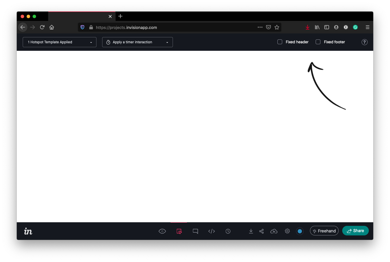
There has been [a little talk](https://github.com/WordPress/gutenberg/issues/29238) already about adding background image support for Template Parts. This would likely include an option to set the background image in a fixed position, similar to the option currently available for the Cover block. However, I think it would be useful to extract this option from being specifically tied to background settings, and make it a more general option thatβs available to Header and Footer Template Parts whether or not they have a background applied. I can see this option working well in the βAdvancedβ settings for the Template Part in the Block Inspector, alongside potential new icon options for setting a Template area as shown in PR #30005: ![TemplateParts-fixed](https://user-images.githubusercontent.com/77359364/112078776-651fdc80-8b55-11eb-9385-5a5e4f518b6e.jpg) For a working example, [Invision](https://www.invisionapp.com/) prototypes have a similar option allowing you to lock elements to the top or bottom of the browser window: ![invision](https://user-images.githubusercontent.com/77359364/112078452-d6ab5b00-8b54-11eb-8927-a8f21610904c.jpg)