 JDGrimes
commented
7 years ago
JDGrimes
commented
7 years ago I noticed that the image block can apparently already be dragged. After discovering that I was expecting all of the block types to be draggable as well.
Closed diegoliv closed 6 years ago
JDGrimes
commented
7 years ago I noticed that the image block can apparently already be dragged. After discovering that I was expecting all of the block types to be draggable as well.
 diegoliv
commented
7 years ago
diegoliv
commented
7 years ago Yep, and if you select all the text inside a text block, you can drag it and drop it on other places. I tried it, but most of the time, it ended dropping the content inside another block.
Probably the best way to solve this is to have some sort of handler (maybe at the left of the block) which the user would use to drag the hole block.
 jasmussen
commented
7 years ago
jasmussen
commented
7 years ago Drag and drop would be a nice progressive enhancement on top of arrows and shortcut keys!
I'm noodling on a different look for block and inline level formatting controls, based on feedback about the popup toolbars. But in the current UI (which, let's keep for the prototype to get proper feedback on it), we could do something like this:

That is, extend the block level toolbar ever so slightly with a label for what you're looking at, providing a draggable area.
jasmussen
commented
7 years ago Here's another mockup:

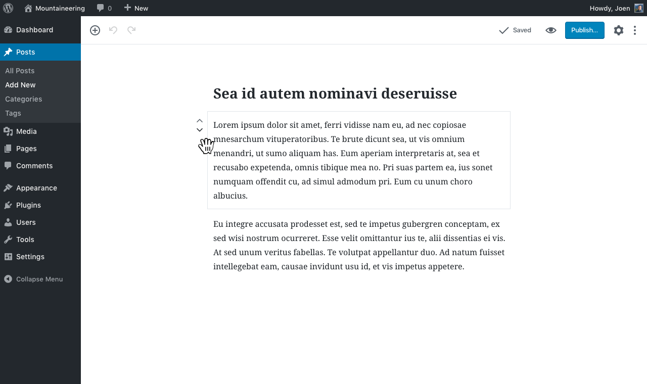
Hover a block to reveal switcher, up/down arrows, and along the top of the edge, a tiny grid of dots indicating a draggable area.
 JohnPixle
commented
7 years ago
JohnPixle
commented
7 years ago Hi people. I was playing around with image mockups at inVision, and created a short flow that shows drag control on hover.
It also explores the idea of showing another set of actions on hover on the right side. Actions like duplicate a block, delete, split in columns etc. I am not sure if all these actions are a stretch at this point but here is a 10sec video: https://cl.ly/jAEr
I'll be happy to explore this further.
 melchoyce
commented
7 years ago
melchoyce
commented
7 years ago Quick riff on @jasmussen's mockup:

 jasmussen
commented
7 years ago
jasmussen
commented
7 years ago ❤️ thanks for that riff Mel!
Mark just voiced a well-formulated concern about the blocks feeling "too heavy". If we, after having used the prototypes for a good long while, feel the same way, perhaps we should consider integrating the type switcher in the block level controls as @JohnPixle did in the mockup above, to limit the floating side UI to just arrows and drag handles. That feels especially true with bigger drag handles.
melchoyce
commented
7 years ago They do feel quite heavy, yeah.
JohnPixle
commented
7 years ago Continuing from Slack I would like to point out the comment from @melchoyce and share a screenshot comparing Medium and Gutenberg contextual toolbars.

I believe this is related to the overall block weight issue. Not only visually, but heavy in a sense of
Showing both the contextual styling toolbar and the block controls + border at the same time is a bit too much if we indeed want to follow the “just write” flow mentioned earlier at the blog.
Quite unsure on how to overcome this, only testing will show. Will explore this further design-wise and let you know what I come up with.
John
JohnPixle
commented
7 years ago Following up to this, I have been brainstorming with myself about the most efficient options/UI elements shown to the user at each of the 4 states:
Can we contextually isolate the options for each of the interaction levels above, so that we only show a minimal but useful amount of tools and options to the user?
Each of the decisions taken for every of the above states will define the weight of the block. If a block gets too heavy, and the page is composed of many blocks, we have a heavy page. The weight metaphor here might not only refer to visual information, or in regards to performance. It might depend on the editing levels that is provided for each interaction stage with the block.
There is a text block. What might someone want to do to a text block apart from editing the content? Can we provide the options the user needs at this very first level of interaction? Should this UI accommodate only for the hover state, or it should remain when the block is in focus as well? Should these apply to all blocks globally? Should we find a consistent hover vocabulary for all blocks?
Possible actions on hover would be:
If the above assumptions are correct (they are assumptions for now), then we evaluate how and where to show these elements/buttons.
(important: in the hover case, we should not forget that the borders of the block would(or would not) appear. I am referring to the block element’s box that currently appear on the prototype.
This prototype: https://iseulde.github.io/editor-blocks/ does not give any hover options on hover. This is interesting and helps with the problem of an indeed busy editor screen with som many hovers. This approach though has the cost of not-direct manipulation of the block.
Now, what happens when you click on a block. What is the UI? Is it progressive and adds up to the already existing hover UI?
Apart from the case of writing, one would click block either to edit the content as a cohesive entity (text alignment or image floats in the case of image block) OR manipulate individual elements by highlighting them and using the contextual toolbar (Bold, Italics, etc). SO for the case of a text block, one possible UI set for the clicked blocked state could be:
I am all in for the optimal writing flow approach. When the user starts to type I would hide everything except for the circled + icon which adds a new block.
Highlighting text brings up the contextual toolbar. Would like to explore flows and ideas that do not show both control types (block and contextual). Or at least display them in a consistent, non-obtrusive way.
To summarize, I believe it's a matter of first evaluating the options/needs of the user at each of the 4 interaction states (hover/click/write). We could user-test several scenarios and adapt accordingly.
Sorry for the long post, I would love to hear your input on any of these.
jasmussen
commented
7 years ago SOLID brainstorm work. I think the different categories of actions you've come up with make a lot of sense.
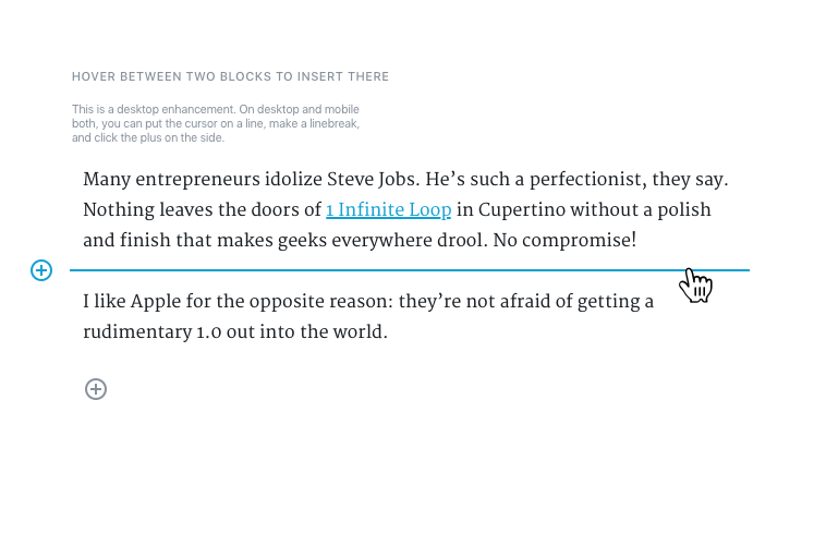
As a quick preface — we should be mindful about hover, and always keep mobile in mind. We should use it as sparingly as possible. But when you are on a big desktop screen, we should also consider not limiting ourselves out of the dogmatic view that any hover enhancement is off the table. For example, hovering between two blocks to insert a new one is a nice desktop enhancement to make, so long as you do the same on mobile (put cursor where you want a block, click (+) ).
Some quick ones:
[deleting a block] (perhaps with a click-and-backspace pattern as has been suggested, or a trash bin?)
Backspace seems obvious here for now, then we can revisit a trash bin if it becomes necessary after testing.
Perhaps duplicate a block
Same — the browser Cut/Copy/Paste tools should probably suffice, and if they don't we can revisit.
Incidentally the whole writing flow can be really helpful as we explore what we show on hover and on click. When you are on desktop, I think it's important to show the rearrangement controls so you don't have to click in first. Formatting can then appear on click. The switcher is an unknown — does this need to exist on hover, or is it okay to show this only on click? The answer will probably present itself as we move forward.
Here are two recent mockups on hover and click:
See also this clickable slideshow-prototype I put together for a writing flow:
https://projects.invisionapp.com/share/NMAHISEE5#/screens/219366717
JohnPixle
commented
7 years ago Thanks for putting these together. The inVision prototype is great, love the simplicity of adding a citation to the quote right away. Great points all the way.
jasmussen
commented
7 years ago Added an animatic for a draggable area in https://github.com/WordPress/gutenberg/issues/90#issuecomment-281043094.
jasmussen
commented
7 years ago Quick mockup for what a block looks like when being dragged:

See also the animatic in the previous comment 👆
 karmatosed
commented
7 years ago
karmatosed
commented
7 years ago Can we contextually isolate the options for each of the interaction levels above, so that we only show a minimal but useful amount of tools and options to the user?
This comment by @JohnPixle really resonates with me. I keep thinking lately about how magic the editor should be. This to me is where we can bring some of that 'wow it just knew' in. I'm chasing to think of this as 'Predictive Editing', something it seems like the current direction is heading. If done right, I think users will love this.
jasmussen
commented
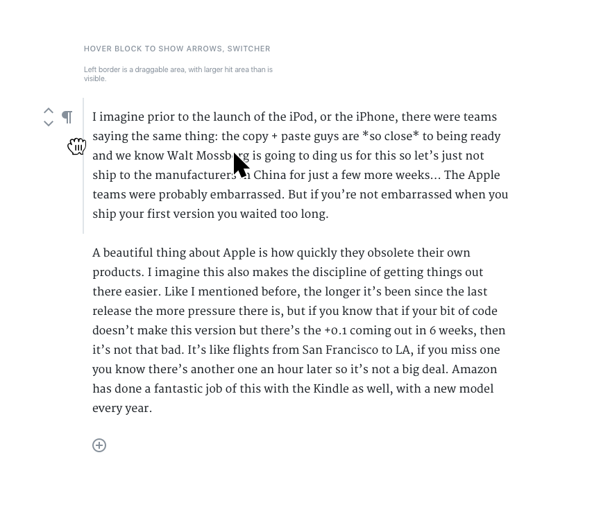
7 years ago Another mockup that puts the draggable area along the left side of the block, on hover:

JohnPixle
commented
7 years ago This to me is where we can bring some of that 'wow it just knew' in. I'm chasing to think of this as 'Predictive Editing', something it seems like the current direction is heading.
I think @karmatosed made a great point here adding the predictive character that the editor might potentially need to have. If this is done right, and we achieve a mutual predictive model among the editor and the user, we then have a fine-tuned, truly un-interrupted writing flow. The editor predicts user's next move, and the user predicts (ideally with no effort) the behaviour of the editor (what shall i do in order to achieve [task])
I hope I am not off topic here, but regarding this, I believe that the blocks metaphor might be able to help with enhancing predictability through a metaphor. One knows from real life how a block might behave. Can we extract how a user's model might behave in the editor context? Not sure if it is worth looking into the idea of enhancing this concept or not, and how one would achieve it while maintaining a fairly clean UI.
jasmussen
commented
7 years ago Great ideas here @karmatosed and @JohnPixle. It truly ties into the whole "everything in its right place" thing I've had on my brain for months now. There's a great song for it too!
Probably worth grounding it in the near term, and make it feel predictive. Whenever there's a button or feature, worth asking: what's the right place for this? Embracing the block metaphor itself is a step in this direction; we can show the cite attribute only when you are working with quote blocks. That's the right place.
karmatosed
commented
7 years ago we then have a fine-tuned, truly un-interrupted writing flow. The editor predicts user's next move, and the user predicts (ideally with no effort) the behaviour of the editor (what shall i do in order to achieve [task])
Yes! It just flows :)
@jasmussen that song is now the soundtrack of the editor :)
Whenever there's a button or feature, worth asking: what's the right place for this? Embracing the block metaphor itself is a step in this direction; we can show the cite attribute only when you are working with quote blocks. That's the right place.
So much yes :)
 metricjs
commented
7 years ago
metricjs
commented
7 years ago I think another consideration here is should users be able to drag multiple blocks at once? I know if I had 5 paragraphs to move around, I certainly wouldn't want to have to move them all separately. This ties in with #62 (Multiple Block Selection). Looking at the ideas on both tickets, I think the last mockup by @jasmussen would combine best with the demos in 62, because the long draggable area could stretch the whole height of the box surrounding the multiple blocks. This would both help make it clear which blocks are being moved and if the height of the multiple selected blocks is taller than the user's window, it ensures they can always see and access the drag handle. If the drag handle was just a button, it may need to move around so it's always visible.
 ellatrix
commented
7 years ago
ellatrix
commented
7 years ago Blocks can now be dragged with the left and right border in https://wordpress.github.io/gutenberg/tinymce-single/ Not sure if it's discoverable enough though. Still need to enable multi block dragging.
ellatrix
commented
7 years ago Another thing we could do is allowing people to use the arrows both for clicking and dragging.
 StaggerLeee
commented
7 years ago
StaggerLeee
commented
7 years ago Sorting icons influence to much whole design. This padding left. If it just could be solved some other way, with 100% width of blocks. Maybe to balance it with just 2 icons on right with same padding. Icon to delete block, and icon to empty block. Would not be so good for smaller devices, I know.
 nylen
commented
7 years ago
nylen
commented
7 years ago I am not sure we need this at all, honestly. I think the current experience (arrow icons) is better than drag and drop, mainly because blocks stay in the same place on the screen after you rearrange them.
"Click a block arrow 5 times (at the exact same place on the screen) to move it down 5 blocks" is precise, easy, accessible, and mobile-friendly; drag-and-drop is not really any of these things.
jasmussen
commented
7 years ago I agree, @nylen, largely.
Drag and drop is a nice desktop affordance, which we should build if we have the time, or if this jumps out at someone willing to invest a little time in it. Because we have a design for it that works, and it ties very well into the mockups for #219 that are likely to be relevant for the customization focus later in the year.
But what we have works great without it, and so I'm revising the priority.
 maddisondesigns
commented
7 years ago
maddisondesigns
commented
7 years ago Drag 'n Drop is definitely needed. Rearranging blocks using only those arrows icons is extremely cumbersome, and also very slow.
nylen
commented
7 years ago Rearranging blocks using only those arrows icons is extremely cumbersome, and also very slow.
@maddisondesigns what are your concerns with the current approach? IMO, it helps greatly that a block stays in the same place on the screen when an arrow is clicked to move it up or down. This allows, for example, rapidly moving a block down 5 places with a series of clicks in the same place on the screen.
Though this didn't always work correctly in my testing. We'd like to know about bugs or shortcomings with the current approach.
maddisondesigns
commented
7 years ago @nylen My main concern is that it's slower and not as natural as dragging 'n dropping. As you said yourself, having to do 5 clicks to move a block down, for what should be one action. What happens if/when ticket #219 gets implemented? Are you planning on having four arrows (Up, Down, Left, Right)? Would you only allow dragging left & right, but not up & down? That would make for a very confusing user experience. With the proliferation of mobile devices and touch screens, dragging 'n dropping is a more natural experience for people. Look at every single page builder out there. Every single one of them allows you to drag 'n drop blocks around the page, so it's not like people aren't used to this kind of interface. I'm not saying to get rid of the arrows. By all means, keep them there, but also allow people to drag 'n drop content around the page.
nylen
commented
7 years ago Dragging and dropping a block is not really a one-step operation. It is more like 3:
Step 2 is incredibly difficult to get right, and requires a lot of complicated behaviors like duplicating an item (or at least its general shape and size), scroll handling, and determining the intended new location, especially at the beginning and end of the content. We have all used bad drag-and-drop experiences, and I would argue they are worse than not having it at all.
That said, for two-dimensional movement with columns, I agree that arrows alone are probably not a good solution. Though mobile support for that is going to be very tricky no matter how it works.
jasmussen
commented
7 years ago We are thinking of drag and drop as a progressive enhancement for desktops. One that would be great to have, but we should build it after we have explicit button actions in place for doing the same, including splitting into columns in the future.
This decision is based on a desire to ensure accessibility as well as mobile devices can play the same game.
So that is to say: drag and drop is cool 👍 — but it should come after explicit button actions.
 mathetos
commented
7 years ago
mathetos
commented
7 years ago I just tested the beta plugin and thought that drag and drop would be desireable. But when I actually tested it (you can see here my surprise here: https://youtu.be/jXRPTyZnBwA?t=3m ) the arrows were very easy to use. You'll hear in the screencast that often "dropping" an item where you want can be buggy. So I was overall surprised how easy it was to re-arrange the blocks with only the arrows and no drag and drop. As @nylen mentioned, drag and drop is actually more moves than just using the arrows in this case.
So, one voice of concern for drag and drop being not only more UI, but also perhaps not as easy as it is currently.
 buzztone
commented
7 years ago
buzztone
commented
7 years ago Step 2 is incredibly difficult to get right, and requires a lot of complicated behaviors like duplicating an item (or at least its general shape and size), scroll handling, and determining the intended new location, especially at the beginning and end of the content.
We're using Drag and Drop for React http://react-dnd.github.io/react-dnd on the Visual Editor for CF7 we are currently developing.
We've found it's pretty solid for simple dragging & dropping in a vertical direction on desktop, which could be a relatively simple but useful enhancement to the current arrows for now.
 carlhancock
commented
7 years ago
carlhancock
commented
7 years ago The up/down arrows are obviously needed for accessibility, but drag-n-drop of content blocks is a must have feature. I've seen comments about how the arrows will work fine for mobile, but if anything drag-n-drop is even more ideal for mobile because mobile devices are all touch screens so drag-n-drop is far more natural for moving elements around than clicking up/down arrows repeatedly.
I come at this from 8 years working on a highly successful drag-n-drop form builder. There is absolutely no way we could have got away with having a visual form builder that required a cumbersome clicking of up/down arrows to reposition existing fields. It would be simply too cumbersome. Not having drag-n-drop of content blocks kind of defeats the whole point of having a pretty nextgen visual editor.
 jwold
commented
7 years ago
jwold
commented
7 years ago I come at this from 8 years working on a highly successful drag-n-drop form builder.
Having used Gravity Forms for years on a bunch of projects, I can attest that the drag and drop feature made such a task a LOT easier.
StaggerLeee
commented
7 years ago How did you manage to make sorting via arrows not move block even a single pixel. Allways in the center and steady. Amazing work you do. I got sold on Gutenberg from first time I saw it.
 rmccue
commented
7 years ago
rmccue
commented
7 years ago Step 2 is incredibly difficult to get right, and requires a lot of complicated behaviors like duplicating an item (or at least its general shape and size), scroll handling, and determining the intended new location, especially at the beginning and end of the content.
FWIW, I have some solid code from an internal block-based editor we built at @humanmade which handles drag-and-drop (also as an enhancement to an arrow-based system). If there's interest, I can look at making this open source.
We ended up with a pretty decent system that works by suspending the browser's layout engine:
On mousedown, we measure the current height of the container and set it explicitly on the container. We also measure each item's current offset from the top of the container, and absolutely position it at the exact same spot, and also store the height of each block. This is a slightly-expensive operation, but it happens when the user initially clicks the block, so it doesn't cause drag-lag.
When the cursor moves, we use translations to have the block move on a single axis in a highly performant way. Other blocks are additionally moved out of the way by translating using the stored height to create a gap (which acts as the drop target). These translations can also be animated. (We used Velocity.js for the animation, but native animation works just as well.) Because the browser's layout engine is "suspended", there are no painful reflows, which are usually what cause drag-lag.
When the block is dropped, we already know exactly where it needs to be. We first reorder the DOM to move the block to the correct position, then un-suspend the layout.
(The toughest challenge was moving blocks with Plupload elements inside them, as it really doesn't like being removed from the DOM. Our eventual solution used only a single DOM insertBefore call when dropping, which avoided the typical issues with traditional DnD libraries.)
With that said, that's the technical implementation; the UX is the tough part. This solution does allow a lot of flexibility in terms of what you can implement though.
 hedgefield
commented
7 years ago
hedgefield
commented
7 years ago Please yes, drag and drop would make quickly rearranging content much more intuitive, like Trello/Meistertask/Waffle do.
jasmussen
commented
6 years ago Here are some fresh mockups for how drag and drop could look today.
1: hover near the edge of a block to reveal a grab hand
2: grab the block, lift it off the page

3: dropzone indicators appear where you can release the block

The above mockups are optimized for making the page minimally jumpy. As such there's a gray "inset" where the block you're currently dragging around used to sit. There's also a blue dropzone indicator, same as the one you see when you drag an image from the desktop into the editor.
StaggerLeee
commented
6 years ago Maybe better to have some drag & drop indicator icon ?
jwold
commented
6 years ago As such there's a gray "inset" where the block you're currently dragging around used to sit. There's also a blue dropzone indicator, same as the one you see when you drag an image from the desktop into the editor.
Love this! Would like to see how it "feels" in practice, but the idea of this is great.
carlhancock
commented
6 years ago @jasmussen Good start! I'm assuming the "grab handle" would be the entire grey border on all 4 sides? Any thoughts on how this would work on touchscreen devices going this route as the block UI isn't visible until you select a block to give it focus.
Ideally, on a touchscreen device you could drag-n-drop blocks in Gutenberg the way you can drag-n-drop cards in Trello. Which may require different JS behavior for those devices because you'd likely want the entire block to be the grab handle for drag-n-drop purposes and then tapping to select an individual block to initiate the block edit UI.
jasmussen
commented
6 years ago I'm assuming the "grab handle" would be the entire grey border on all 4 sides?
Yes. If you have no blocks selected and hover the block, I'm not entirely sure whether it's just that draggable separator line left and right of the block, but if the block is selected and showing full block boundaries, yes absolutely all 4 sides. And also, we want to make this grabbable area as thick as we can, so it's not just a 1px draggable border.
Any thoughts on how this would work on touchscreen devices going this route as the block UI isn't visible until you select a block to give it focus.
Generally I'd defer to the programmer implementing this, on what the best approach is. In my experience, drag and drop especially on phones is very fiddly and usually only good for small blocks like rearranging items in a list block (for which we'd wait for a nested blocks feature to take full advantage of). As soon as you have to drag a block far enough that it also has to scroll the screen, it gets iffy.
That said, I have the following mockup (based on a concept by @iamthomasbishop) which shows the mover, trash and cog on block click and below the content (kinda like how the caption pops out when you select an image). In this case, you could imagine a draggable area popping out too, perhaps a little dot grid left of the movers:

 mtias
commented
6 years ago
mtias
commented
6 years ago Done in #4115.
The arrow will work fine for mobile, but for desktop, probably most users will want to sort blocks with a drag & drop approach.