Open mrwweb opened 2 years ago
I agree that it's primarily focused on theme customization, but the token-driven settings for users (spacing, weights, sizes) is an important UI change that would be required to fully implement the design token proposal. For example, I envision a block "Gap" setting that is a drop down of presets rather than a pixel size input.
Indeed, the UI would follow suit. I've been hoping to make the slider UI component support presets so you can slide through guided steps. I'm not worried about adding this layer of interface once things are in place, the current UI that optimizes for discrete values can always sit behind a toggle (like custom font size does today) or be entirely disabled by a theme.
Because of that, I'm not sure if this was right: "Custom theme styles driven purely by the use of classes will be opaque to the user and the system as a whole. This is not a problem in itself when characterized as the things a user won't have UI access to modify anyways." They would be very clear to the user because they'd be reflected in block settings.
No, I'm referring to a theme leveraging standard classes to do non standard modifications — like rendering a background image as the decoration for large space gap, and so on. Control over that image (or whatever CSS effect you might think of) is what would be opaque to the user. This is not a problem in itself (there will always be a need for things there is no UI for) and just needs to be conceptualized properly, which is what I tried to condense in that sentence.
I don't think that adding classes to block HTML would somehow make things that markup or expectations for it any different. All it would do is make themers' lives a lot easier.
The big difference is markup is an html standard, while specific classes we might choose are an ad hoc implementation. That puts an extra burden in their longevity. WordPress already needs to respect the .alignleft
and .aligncenter
(without any prefix or namespace) because they have been part of the content markup for a long time. What we introduce needs to be thoughtful and ideally easy to deprecate if a project requires it (that is, they should be dynamically generated by the server and not statically serialized).
That's what I'm really trying to do here. I am personally doing my best to adopt theme.json… and it will never be a full replacement for CSS.
Fully agreed! Ideally it also simplifies the aspects that are most tedious to write purely in CSS (while accounting for all the ways users can combine things).
One assumption I'm making is that if plugins all have to re-invent the wheel with gaining access to these tokens—as opposed to providing standard CSS classes and custom properties that everyone can share—then there will end up being more collective CSS, even if core's CSS is pared down to only reflect what's on the page.
One important consideration here is that a theme interacting with theme.json properties won't have to do anything to determine when those properties are relevant to be printed or enqueued for a given site request, and it could even be merged with other plugins interacting with the properties since they are structurally understood. If they hook CSS to classes on their own they won't know if the classes are actually used so any extra CSS added through them could be unnecessarily printed.
They're rarely even thinking about how it looks on mobile. However, that lack of foresight shouldn't be a reason to not help users create portable content.
Definitely, and I'm not mentioning this to dissuade from trying but to do it in a way that leads users more often to better outcomes. A large part of that is how the UI conveys things.
I agree with @glendaviesnz identification of #38719 as a discrete task. I'd also include there printing block type classes for elements that might be missing them.
The nomenclature of tokens and presets is not entirely clear, and it seems it should be broken down per structural topic (typography, colors, layout/dimensions, border, etc) because they are all in different states (some support presets, some don't, etc). We should probably open a new discussion ticket for this alone where the concrete proposals (of which there are many) can be discussed granularly. Discussions can be a good format since we can branch with comments on anything more specific and compare methods better. @glendaviesnz can we turn your existing issues into a discussion thread? I think we can focus better there.
Cascading layers is definitely something we should orient ourself towards, even if not ready to be used as is, it should help identify how to structure the styles engine better along the lines of this breakdown:
The big difference is markup is an html standard, while specific classes we might choose are an ad hoc implementation. That puts an extra burden in their longevity. WordPress already needs to respect the
.alignleft
and.aligncenter
(without any prefix or namespace) because they have been part of the content markup for a long time. What we introduce needs to be thoughtful and ideally easy to deprecate if a project requires it (that is, they should be dynamically generated by the server and not statically serialized).
Does it necessarily have to be this way for CSS classes? The fact that a block’s CSS needs to simultaneously support every set of markup and classes that block has ever used makes adding and modifying styles extremely complicated. Larger changes to markup like the gallery block revamp obviously would still need the full “open-in-editor-and-save-post” block migration, but simpler changes like switching out old classes for new ones could be accomplished with a simple find and replace on the wp_posts table. Supporting this kind of “class migration” would make the sort of changes we’re discussing here and in #38719 much easier, as we wouldn’t be as constrained by existing decisions made around styling and markup.
(This is a bit outside of my wheelhouse, so correct me if this idea has been previously discussed and dismissed)
@glendaviesnz can we turn your existing issues into a discussion thread? I think we can focus better there.
@mtias I am happy to do that. I initially avoided doing so due to this comment, but there is probably enough interest in this topic from enough people for it not to get lost in the discussions at this point.
Currently the following separate issues have been forked from, or were already closely related to, this wider issue:
Let me know which ones you think could benefit from being a discussion, or feel free to convert them yourself.
@glendaviesnz @mtias Whatever you two think keeps this conversation moving forward sounds good!
Hey peeps 👋 there's a lot very thoughtful discussion here around CSS classes and naming in general, so I thought it might be a good place to seek some feedback on my experiment in #42763, where I'm moving the content width logic into its own layout type, to make it possible for blocks to apply content width to their children by default.
The main thing I'm seeking feedback on is the name for this new layout type: I provisionally called it "column" but don't really like that as it can be confused with the Column block. I'm currently leaning towards "center", because what that layout type does is create a center-aligned column of content. It would be great to have some more thoughts on this!
For reference, the layout type name is exposed as a block classname (is-layout-[name]
) and can be used in block.json
when defining a specific layout type for a block.
Thank you for your great work! If it is called "center", what would the other options for the layouts be? And what would they look like?
I still favour a clean separation between a width and an alignment property to be able to do something like the below image shows:
If it is called "center", what would the other options for the layouts be? And what would they look like?
Good question @sascha-bleech . Currently, apart from 'default', we also have 'flex', which has horizontal and vertical variations, and a bunch of alignment options too. In the future we may have other layouts such as 'grid', and perhaps something that allows for absolute or fixed positions.
What we're trying to do with 'center' is split out the content width logic that currently is part of 'default' into its own layout, so that it's possible for blocks to have content width enabled out of the box.
I still favour a clean separation between a width and an alignment property to be able to do something like the below image shows:
That's an interesting idea! The current work won't impact the possibility of implementing something like that in the future, though the name 'center' might not be the best if we were to enable right or left alignment for the content.
It's hard to find a good single word description for this 😅
constrain
would be another possibility, though it may not be immediately obvious what it means.
Yeah, "constrain" or (preferably) "constrained" sounds like a much more descriptive title to me... at least after you realize what it means, anyway. There's certainly a lot less room for confusion in the long-run than a name like "column".
Good question @sascha-bleech . Currently, apart from 'default', we also have 'flex', which has horizontal and vertical variations, and a bunch of alignment options too. In the future we may have other layouts such as 'grid', and perhaps something that allows for absolute or fixed positions.
The other options/variations all sound very CSS like: flex, grid, fixed, absolute... What about calling it "block" to keep with the CSS nomenclature? Or maybe "theme" as it seems to be the default layout which is defined in the theme?
"Constrain" sounds too negative/constrained to me ;-)
Thanks for the feedback everyone! I decided to go with "constrained" as it best describes the specific layout type.
The other options/variations all sound very CSS like: flex, grid, fixed, absolute...
That wasn't on purpose; it would be preferable not to name them after their implementation details 😅
@tellthemachines I'm late to the party, but hopefully not too late!
The main thing I'm seeking feedback on is the name for this new layout type:
I wonder whether the answer is simpler than that and more or less answered:
I'm moving the content width logic into its own layout type, to make it possible for blocks to apply content width to their children by default.
As many people have pushed hard for on #33374, I think there's a general feeling that the centered and constrained alignment should be the default alignment both for top-level blocks and container blocks like Group, Cover, and even Column blocks. So for a name, I would propose "default", and because of that I wouldn't expose that as a UI option if it can just be the default state of all block containers.
Giving this a name (and a class that can be applied to block containers) is an awesome idea and so I'm glad you're doing that work!
@mrwweb
I would propose "default", and because of that I wouldn't expose that as a UI option if it can just be the default state of all block containers.
I proposed the same here: https://github.com/WordPress/gutenberg/pull/42763#issuecomment-1209546994. There was a bit more conversation beyond that you might find informative. It seems default
unfortunately isn't in the cards, but it does seem that we're getting the theme.json
layout settings applied to container blocks by default, so at least that will resolve our issues with adopting theme.json
.
I wonder if the CSS layers specification could be useful here:
/* Create the layers, in the desired order */ @layer base, theme; @layer base { /* Append to 'base' layer */ h1.title { font-size: 5rem; } } @layer theme { /* Append to 'theme' layer */ h1 { font-size: 3rem; } }
It isn't supported everywhere unfortunately, and some time might pass until it is.
Cascading layers seem to be widely supported by now: https://caniuse.com/css-cascade-layers
Encapsulating all WordPress/Gutenberg-generated CSS into layers would make custom theme development so much easier as we would not need to match the specificities all the time.
Because layered CSS cannot overrule non-layered CSS developers can't benefit from cascade layers until the core uses them as well.
@krokodok Cascade layers feels like a good new issue to open and would likely help with some of the goals mentioned in this thread. I'd encourage you to open that and bonus points for summarizing the conversation that's already happened on other issues and one discussion.
With the spacing scale (#35306) now out in the wild, I wanted to show how it can make themes and plugins more interoperable today. I hope that plugins take advantage of techniques like this and folks will be inspired to further action on standardizing colors, font-sizes, etc.
Background: I have a set of files I use to make The Events Calendar (TEC) plugin inherit styles from my themes. Because TEC uses custom properties, I can override their values to match my theme better.
Instead of using the plugin default, I can remap the TEC spacing values to use the theme.json
spacing scale. So with very few edge-cases, almost any theme should be able to have TEC use their spacing scale with this code:
body {
/* Remap The Events Calendar spacing properties to theme.json presets */
/* custom property fallbacks are the values used in TEC */
/* Note: spacing scale is slightly collapsed to accommodate the number of default spacing presets */
--tec-spacer-0: var(--wp--preset--spacing--10, calc(var(--wp--preset--spacing--20) / 2), 4px);
--tec-spacer-1: var(--wp--preset--spacing--20, 8px);
--tec-spacer-2: var(--wp--preset--spacing--30, 12px);
--tec-spacer-3: var(--wp--preset--spacing--40, 16px);
--tec-spacer-4: var(--wp--preset--spacing--40, 20px);
--tec-spacer-5: var(--wp--preset--spacing--50, 24px);
--tec-spacer-6: var(--wp--preset--spacing--50, 28px);
--tec-spacer-7: var(--wp--preset--spacing--60, 32px);
--tec-spacer-8: var(--wp--preset--spacing--60, 40px);
--tec-spacer-9: var(--wp--preset--spacing--70, 48px);
--tec-spacer-10: var(--wp--preset--spacing--70, 56px);
--tec-spacer-11: calc((var(--wp--preset--spacing--70, 56px) + var(--wp--preset--spacing--80, 80px)) / 2);
--tec-spacer-12: var(--wp--preset--spacing--80, 80px);
--tec-spacer-13: var(--wp--preset--spacing--90, calc(var(--wp--preset--spacing--80, 80px) * 1.2));
--tec-spacer-14: var(--wp--preset--spacing--100, calc(var(--wp--preset--spacing--80, 80px) * 2));
}
There are some specifics to the above code where I've had to do some things to map a smaller theme.json
scale to a wider range that TEC expects with some collapsing and averaging, but I'm overall quite pleased with the results in my testing so far.
What's exciting to me is that there's no reason The Events Calendar couldn't just do this themselves and have their plugin styles automatically match the default spacing of a theme. Plugins can start doing this today as long as they provide fallbacks. Default WordPress comes with 20 - 80 defined on the spacing scale. Form plugins, events plugins, slideshow plugins, etc, could all really benefit from using this. --wp--style--block-gap
is another great candidate that plugins could use immediately with a fallback (for instance a gallery plugin).
TEC similarly uses an "accent" color which would be a prime candidate for grabbing directly from a palette of standardized color slugs. Interestingly, TEC would also benefit from the ability to easily reference additional values like settings.elements.h3.fontSize
.
Conclusion: I hope this shows off the value of standardizing "design tokens" via theme.json
. We should celebrate the spacing scale! Let's find ways to make this work even better with colors and font sizes!
What problem does this address?
I have written a blog post describing the issues this proposal addresses in detail.
The overall goals are to:
The need for a clear direction and solution along these lines has come into focus recently:
The background and reasoning behind each decision along with examples are provided, so please read the full proposal if you want to leave a detailed comment.
This proposal brings together multiple different threads of conversations because I think it's important that each change is considered in the context of the others. When they come together, they illustrate a cohesive vision for a vibrant WordPress ecosystem benefiting all users and developers.
What is your proposed solution?
This is a four-part solution that builds on existing practices already in WordPress while committing to full block/setting coverage and backwards compatibility:
wp-block-media-text
,wp-block-media-text__content
,wp-block-media-text__media
,wp-block-media-text__image
) and use single-class selectors in core CSS when styling them so they are easy to overrideis-vertically-aligned-center
,has-background
,is-style-{name}
,alignwide
)theme.json
design tokens. For example, have all themes definebackground
,foreground
,primary
,secondary
, andaccent
colors andgap-1
,gap-2
,gap-3
,gap-4
, andgap-5
for gap values. Use these values as the standard options in block settings for the primary means of customization. I've written a proposed set of standard tokens to get this conversation going.wp-color-background
,wp-gap-4
,is-vertically-aligned-center
This proposal is illustrated with code snippets in the blog post and there's a functioning demo showing a partial implementation.
I believe if these four things were done consistently and with a commitment to backwards compatibility, all of the following become easier or newly possible:
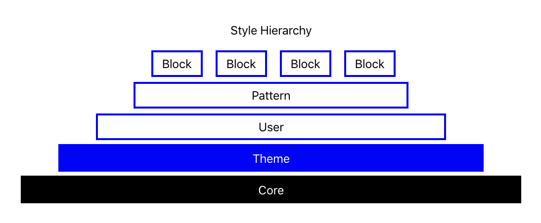
theme.json
48px
gap is easier for users and would look good in any theme without modification)Proposed Standard Design Token Names in
theme.json
Themes and plugins could define additional tokens beyond these, but all of the following would be expected of new themes. WordPress would likely provide a fallback in cases where themes defined only some or none of the tokens.
foreground
,background
,primary
,secondary
,accent
font-size-1
,font-size-2
,font-size-3
,font-size-4
(default),font-size-5
,font-size-6
,font-size-7
font-weight-1
,font-weight-2
,font-weight-3
(default),font-weight-4
,font-weight-5
copy
,headings
,monospace
border-1
,border-2
(default),border-3
gap-1
,gap-2
,gap-3
(default),gap-4
,gap-5
margin-1
,margin-2
,margin-3
(default),margin-4
,margin-5
padding-1
,padding-2
,padding-3
(default),padding-4
,padding-5
two-columns
,three-columns
,desktop-menu
contentSize
(exists),wideSize
(exists),maxSize
Things not included in the proposal
This proposal doesn't need to interfere with or be at the expense of:
7px
border vs a small border)Related Issues
This is closely related to a number of existing issues, and tries to present a cohesive vision for a solution. Here's an incomplete list of current relevant issues:
38167 / #37495
38694
35470
33180
29568
35306
35141
38719
Credits / Attributions
None of the ideas in this proposal are new (a strength of the proposal). I think they are most compelling when packaged together. This builds on tons of existing thinking and work by other community members. Therefore, I think it's important to credit a many people here as I can.