 azaozz
commented
6 years ago
azaozz
commented
6 years ago Pinging @noisysocks and @iseulde for the editor changes. I can add the core changes.
For the editor the changes (as I see them) would be:
- Add a
data-wp-attachment-id="1234"attribute to all<img>tags. - Always insert the "large" size image.
- Add
srcsetattribute with the medium, large and xlarge sizes (we'll add the xlarge image size to the default sizes shortly). - Add
sizesattribute suitable for the image width in the editor. - On saving, perhaps remove both the
srcsetandsizesas they would probably be different when displaying. Alternatively we can override them in the display filter. - When setting any pixel values for image dimensions, base them off the editor width. It won't make sense to have images wider than what is visible in the editor.
TODO: consider what would be the best way to pass percentage width to the front-end.
 noisysocks
 davisshaver
 mor10
mor10 ms-studio
 joemcgill
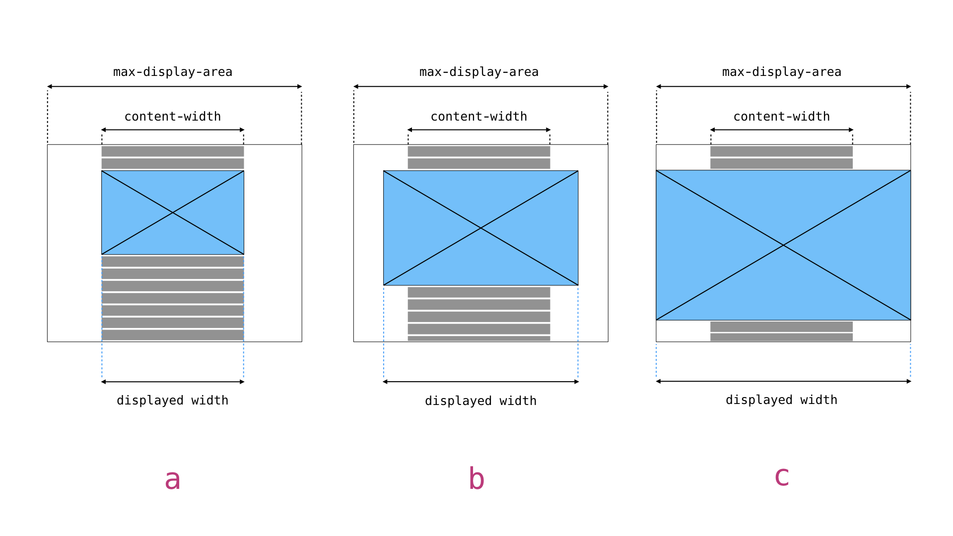
 alialaa
 andreiglingeanu
 derweili
 chrisvanpatten
 mtias
mtias getsource
This is a "mini-proposal" on how to handle images in the editor and the front-end (follow-up from #4914).
Currently:
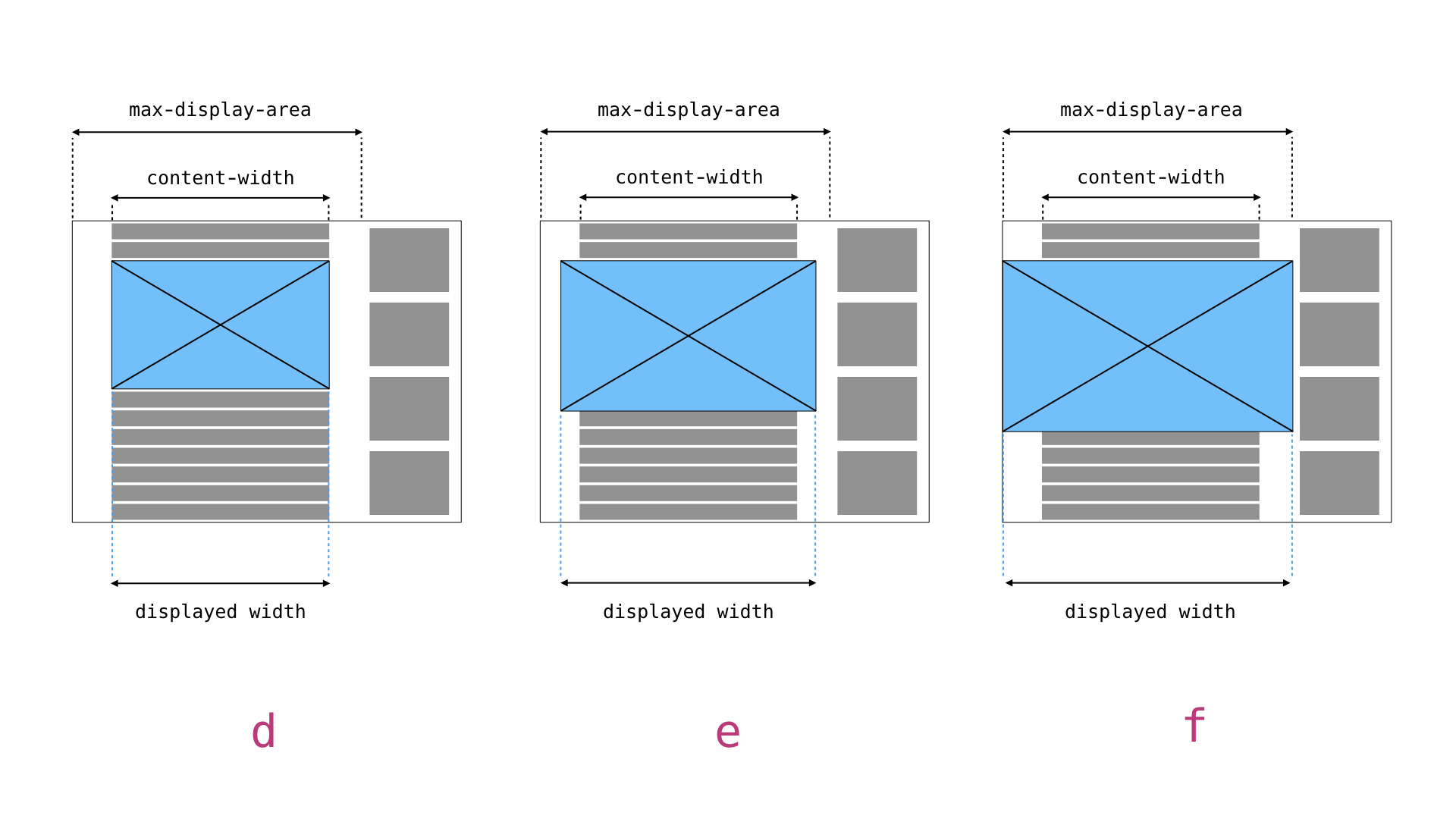
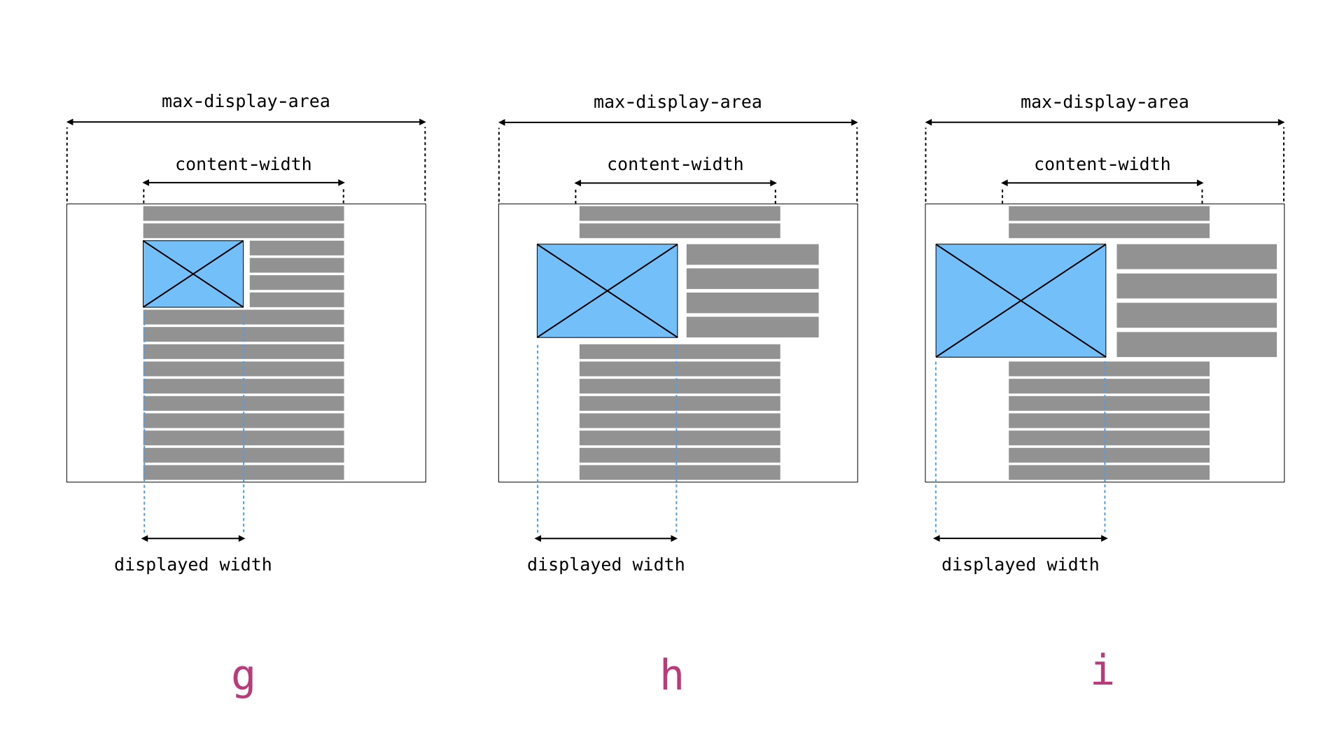
srcsetattribute, but thesizesattribute is pretty useless as it only refers to the full size image file:sizes="(max-width: 6000px) 100vw, 6000px".To fix this in the editor:
srcsetattribute that will also list 2x large size (so images are retina ready). This is a new size and will have to be added to the default WP sizes, see below.srcsetandsizes attributes a bit differently. Ideally that should have the attachment ID, something likedata-wp-attachment-id="1234". Then perhaps we will be able to drop the "old" way of passing the ID,class="wp-image-1234".To fix this for the front-end:
<img>tags and addingsrcset, etc. that will produce usablesizesattribute. It will depend on the new data-* attribute and take into account theme's width when calculating sizes. If we are going to recalculate hard-coded width attributes (see above), this can be done here and the values used in both attributes. Alternatively we can set the width in percentage (HTML 4.0 style) in the editor, then replace them with pixels at this point.Implementing all of the above will ensure all images are always "retina ready" both in the editor and on the site. It will also improve handling on the front-end and optimize image loading there.
This will also affect other enhancements, mostly #4914. Also, as described in #6131 the themes will be able to add more precise
sizesattributes for the different images.