nus-pe-bot
commented
3 weeks ago
nus-pe-bot
commented
3 weeks ago Team's Response
No details provided by team.
Items for the Tester to Verify
:question: Issue response
Team chose [response.NotInScope]
- [x] I disagree
Reason for disagreement: I would like to contest this decision.
From the course website, it is stated that the user guide should be formatted in a manner which is as user-friendly as possible:

In my honest opinion, the logical ordering of sections in the UG help to improve user-friendliness.
To elaborate on my initial bug report:
-
I find that it is not logical to insert the autosave section in between the generate and records sections. To me, I felt that this actually disrupted the flow of the UG, and it felt incredibly odd for the guide to suddenly describe this autosave feature out of nowhere. I would suggest that this section be placed towards the end of the guide instead (after all of the main features of the application have been explained), as this feature seems to be relevant to all of the subsequent features described (like DIY, retry etc.). Having it at the end also serves as a bit of re-assurance and information for the user, as this lets them know, that all of the work they've done previously is automatically saved to their local storage.
-
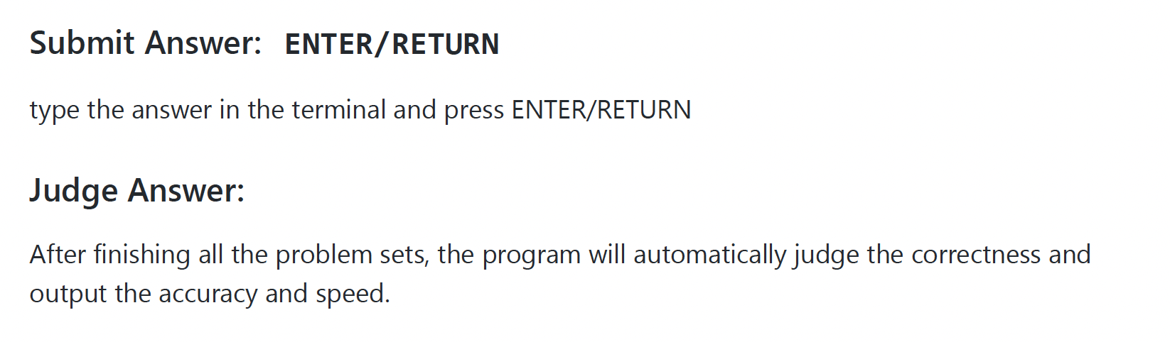
Likewise, Submit Answer and Judge Answer feel quite out of place too. Firstly, Submit Answer seems rather self-explanatory, and I wonder why this is included as an individual section in the first place. Next, these sections seem rather trivial, and do not seem like actual features of the application either. I would suggest that the content of these sections are merged into the descriptions of the generate and retry sections instead, as these are the only two features of the UG which allow for the user to actually try out their problem sets (and thus, would need to press enter to submit answers, and would also need to know how the application judges their answers).
Sections are ordered in an illogical manner, and feel out of place.
Autosave section is inserted between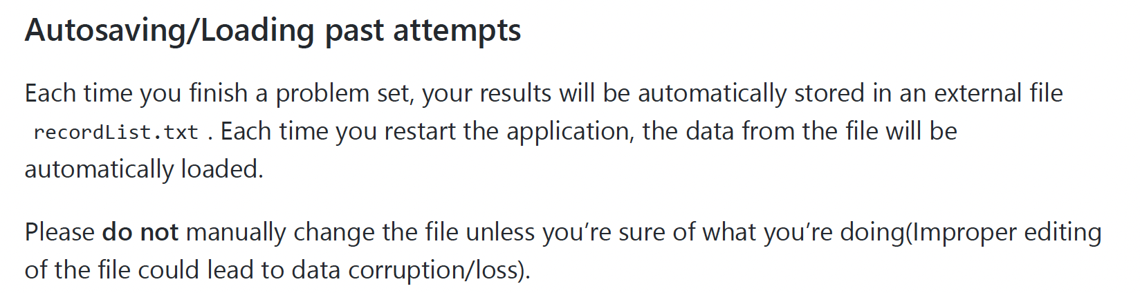
generateandrecordssection.These two sections feel out of place as well (given their position in the UG).