Team's Response
No details provided by team.
The 'Original' Bug
[The team marked this bug as a duplicate of the following bug]
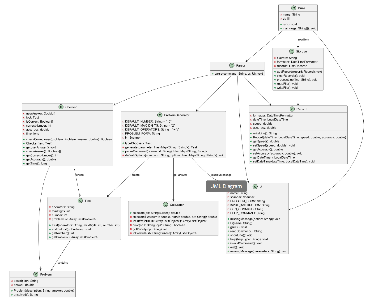
Class diagram is too large and complicated
Note from the teaching team: This bug was reported during the Part II (Evaluating Documents) stage of the PE. You may reject this bug if it is not related to the quality of documentation.

You can consider omitting the specific details and functions names, but show how the classes actually interact with one another, using mainly arrows and labels.
[original: nus-cs2113-AY2324S2/pe-interim#2448] [original labels: severity.Low type.DocumentationBug]
Their Response to the 'Original' Bug
[This is the team's response to the above 'original' bug]
nice suggestion, surely diagram for each class will make the architecture more clear and readable
Items for the Tester to Verify
:question: Issue duplicate status
Team chose to mark this issue as a duplicate of another issue (as explained in the Team's response above)
- [ ] I disagree
Reason for disagreement: [replace this with your explanation]
Too many arrows.
Class associations are not represented correctly. The correct way: