YuLab-SMU / ProjectYulab

:next_track_button: Small coding tasks that enable you to participate in our development
33 stars 3 forks source link

reproduce a funkyheatmap using aplot #6

Open GuangchuangYu opened 1 year ago

GuangchuangYu commented 1 year ago

using ggplot2 to plot columns and using aplot to create a composite plot.

Please reproduce the funkheatmap demonstrated in the README.

lishensuo commented 1 year ago

Dear Professor Guang,

I appreciate the opportunity to contribute to the discussion. After carefully considering the problem and learning the two R package (here is my simple notes for aplot and funkheatmap). I have come up with a possible solution to try to produce that demonstrated figure of funkheatmap.

The figure below is the result and following is my R codes
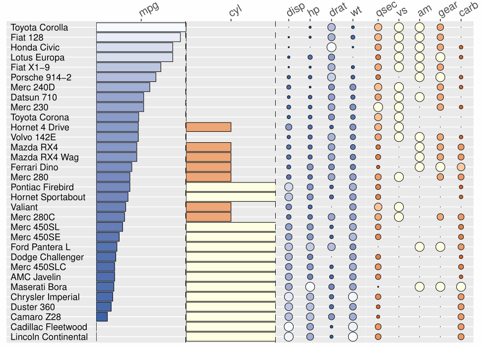
 image-20230614163459314

library(aplot)
library(tidyverse)
data("mtcars")

## step1 - firstly  perform 0~1 normalization
normalize_0_1 <- function(data) {
  normalized_data <- apply(data, 2, function(x) {
    (x - min(x, na.rm = TRUE)) / (max(x, na.rm = TRUE) - min(x, na.rm = TRUE))
  })
  return(normalized_data)
}

data_sc <- normalize_0_1(mtcars) %>%
  as.data.frame() %>% 
  rownames_to_column("id") %>%
  arrange(desc(mpg))

## step2 - then draw 5 subplots sequentially from right to left
# fig1:Dotplot
p1 <- data_sc[,c(1,4:7)] %>% 
  reshape2::melt("id") %>% 
  dplyr::mutate(id=factor(id, levels = rev(data_sc$id))) %>% 
  ggplot(aes(x = variable, y = id)) +
  geom_point(aes(size=value, fill=value), stroke = 0.3, shape=21) +
  scale_size_continuous(range = c(0, 5)) +
  scale_fill_gradient(low = "#08519C", high = "#F7FBFF") +
  scale_x_discrete(position = "top") + 
  theme(legend.position = "none") +
  theme(axis.text.x =  element_text(angle = 30, hjust = 0, size=13)) +
  theme(axis.ticks.y = element_blank(),
        axis.text.y = element_blank(),
        axis.line.y = element_blank(),
        axis.title = element_blank(),
        axis.ticks.length.y = unit(0,"pt"),
        plot.margin = margin()) +
  theme(panel.grid.major.x = element_blank(),
        panel.grid.minor.x = element_blank())

# fig2:Dotplot
p2 <- data_sc[,c(1,8:12)] %>% 
  reshape2::melt("id") %>% 
  dplyr::mutate(id=factor(id, levels = rev(data_sc$id))) %>% 
  ggplot(aes(x = variable, y = id)) +
  geom_point(aes(size=value, fill=value), stroke = 0.3, shape=21) +
  scale_size_continuous(range = c(0, 5)) +
  scale_fill_gradient(low = "#CC4C02", high = "#FFFFE5") +
  scale_x_discrete(position = "top") + 
  theme(legend.position = "none") +
  theme(axis.text.x =  element_text(angle = 30, hjust = 0, size=13)) +
  theme(axis.ticks.y = element_blank(),
        axis.text.y = element_blank(),
        axis.line.y = element_blank(),
        axis.title = element_blank(),
        axis.ticks.length.y = unit(0,"pt"),
        plot.margin = margin()) +
  theme(panel.grid.major.x = element_blank(),
        panel.grid.minor.x = element_blank())

# fig3:bar plot
p3 <- data_sc[,c(1,3)] %>% 
  dplyr::mutate(id=factor(id, levels = rev(data_sc$id))) %>% 
  ggplot(aes(x = id, y = cyl)) + 
  geom_col(aes(fill=cyl), color="black", linewidth=0.3) + 
  geom_hline(yintercept = 1, linetype="dashed", linewidth=0.8) +
  scale_fill_gradient(low = "#CC4C02", high = "#FFFFE5") +
  scale_y_continuous(position = "right", expand=c(0,0),
                     breaks = c(0.5),
                     labels = c("cyl")) + 
  coord_flip() + 
  theme(legend.position = "none") +
  theme(axis.text.x =  element_text(angle = 30, hjust = 0, size=13)) +
  theme(axis.ticks.y = element_blank(),
        axis.text.y = element_blank(),
        axis.line.y = element_blank(),
        axis.title = element_blank(),
        axis.ticks.length.y = unit(0,"pt"),
        plot.margin = margin(0,2,0,0)) +
  theme(panel.grid.major.x = element_blank(),
        panel.grid.minor.x = element_blank())

# fig4:bar plot
p4 <- data_sc[,c(1,2)] %>% 
  dplyr::mutate(id=factor(id, levels = rev(data_sc$id))) %>% 
  ggplot(aes(x = id, y = mpg)) + 
  geom_col(aes(fill=mpg), color="black", linewidth=0.3) + 
  geom_hline(yintercept = 1, linetype="dashed", linewidth=0.8) +
  scale_fill_gradient(low = "#08519C", high = "#F7FBFF") +
  scale_y_continuous(position = "right", expand=c(0,0),
                     breaks = c(0.5),
                     labels = c("mpg")) + 
  coord_flip() + 
  theme(legend.position = "none") +
  theme(axis.text.x =  element_text(angle = 30, hjust = 0, size=13)) +
  theme(axis.ticks.y = element_blank(),
        axis.text.y = element_blank(),
        axis.line.y = element_blank(),
        axis.title = element_blank(),
        axis.ticks.length.y = unit(0,"pt"),
        plot.margin = margin(0,0,0,0)) +
  theme(panel.grid.major.x = element_blank(),
        panel.grid.minor.x = element_blank())

# fig5:text plot
p5 <- data_sc[,1,drop=F] %>% 
  dplyr::mutate(value=1) %>% 
  ggplot(aes(x = id, y = value)) +
  geom_text(aes(label = id),
            hjust = 0) +
  coord_flip() +
  ylim(c(1, 2)) +
  theme(axis.ticks = element_blank(),
        axis.text = element_blank(),
        axis.line = element_blank(),
        axis.title = element_blank(),
        axis.ticks.length.y = unit(0,"pt"),
        plot.margin = margin(0,0,0,0)) +
  theme(panel.grid.major.x = element_blank(),
        panel.grid.minor.x = element_blank())

## step3 - finally merge the above subplots
p <- p4 %>% 
  insert_right(p3) %>% 
  insert_right(p1) %>% 
  insert_right(p2, width=1.2) %>% 
  insert_left(p5) 

ggsave(p, filename="figure.pdf", width = 8, height = 6)
lishensuo commented 1 year ago

Sorry for the wrong title for you

GuangchuangYu commented 1 year ago
library(aplot)
library(tidyverse)
data("mtcars")

d <- yulab.utils::scale_range(mtcars) |>
  rownames_to_column("id") |>
  arrange(desc(mpg))

palette1 <- scale_fill_gradient(low = "#08519C", high = "#F7FBFF") 
palette2 <- scale_fill_gradient(low = "#CC4C02", high = "#FFFFE5")

g1 <- funky_text(d)
g2 <- funky_bar(d, 2) + palette1
g3 <- funky_bar(d, 3) + palette2
g4 <- funky_point(d, 4:7) + palette1
g5 <- funky_point(d, 8:12) + palette2

funky_heatmap(g1, g2, g3, g4, g5)

image

funky_heatmap(g1, g2, g3, group1=g4, group2=g5, 
  options = theme(legend.position='none', 
      plot.margin = margin(r=2),
      strip.text.x = element_text(size=15, face='bold'))
)

image

GuangchuangYu commented 1 year ago

Now incorporated in the aplot package.

Another request is to extend funky_heatmap() to be compatible with funkyheatmap::funky_heatmap().

This is important to work with existing code and take the advantage of aplot.

For example, we can access each of the subplots and modify it using ggplot2 syntax.

p <- funky_heatmap(g1, g2, g3, group1=g4, group2=g5, 
  options = theme(legend.position='none', 
      plot.margin = margin(r=2))
)

p[[5]] = p[[5]] + theme_minimal() + scale_y_discrete(position='right') + xlab(NULL) + ylab(NULL)

p

image

lishensuo commented 1 year ago

Dear Professor Yu,

I would like to offer two minor suggestions for further improvement inspired from the funckyheatmap package.

Firtstly, regarding the funky_point() function, it might be helpful to provide more point shapes provided by R base and other mapping setting (such as only color and fixed size). The following is expected visualization and its R codes. image-20230620203731528

library(aplot)
library(tidyverse)
library(ggfun)
data("mtcars")

d <- yulab.utils::scale_range(mtcars) |>
  rownames_to_column("id") |>
  arrange(desc(mpg))

funky_point2 <- function(data, cols, shape = "circle", fix_size = NA, fix_fill = NA) {
  d2 <- aplot:::funky_data(data, cols)
  shape_value <- switch(shape,
                  circle = 21,
                  square = 22,
                  diamond = 23,
                  up_tri = 24,
                  down_tri = 25,  
                  "Invalid parameter")
  g = ggplot(d2, aes(.data$name, .data$id)) + aplot:::funky_theme()

  if (is.na(fix_size) & is.na(fix_fill)){
    p <- g + geom_point(aes(size=.data$value, fill=.data$value), 
                        stroke=0.3,  shape=shape_value)
  } else if (is.na(fix_size) & !is.na(fix_fill)) {
    p <- g + geom_point(aes(size=.data$value, fill=.data$value), 
                        stroke=0.3,fill = fix_fill, shape=shape_value)
  } else if (!is.na(fix_size) & is.na(fix_fill)) {
    p <- g + geom_point(aes(size=.data$value, fill=.data$value), 
                        stroke=0.3,size = fix_size, shape=shape_value)
  } else {
    p <- g + geom_point(aes(size=.data$value, fill=.data$value), 
                        stroke=0.3, size = fix_size, fill = fix_fill, shape=shape_value)
  }
  return(p)
}

g0 = funky_text(d, 1) + theme_blinds()
g1 = funky_point2(d, 8, shape = "circle") + theme_blinds()
g2 = funky_point2(d, 9, shape = "square", fix_fill = "#7fc97f") + theme_blinds()
g3 = funky_point2(d, 10, shape = "diamond", fix_size = 5) + theme_blinds()
g4 = funky_point2(d, 11, shape = "up_tri") + theme_blinds()
g5 = funky_point2(d, 12, shape = "down_tri") + theme_blinds()
p = funky_heatmap(g0, g1, g2, g3, g4, g5,
              options = theme(legend.position='none'))

Secondly, I originally want to add a pie function as funckyheatmap package do. However I failed to implement it due to limited knowledge. On the other hand, I tried to extend the funky_bar() function which could also reflect groupping ratio. The following is corresponding visualization and its R codes. image-20230620204931000

library(aplot)
library(ggfun)
library(tidyverse)
data("mtcars")

d <- yulab.utils::scale_range(mtcars) |>
  rownames_to_column("id") |>
  arrange(desc(mpg))

set.seed(1)
d$level_A = sample(1:10, nrow(d), replace = T)
set.seed(2)
d$level_B = sample(1:10, nrow(d), replace = T)
set.seed(3)
d$level_C = sample(1:10, nrow(d), replace = T)

funky_bar2 <- function(data, cols, levels_label=NULL) {
  if (length(cols) == 1) {
    d2 <- aplot:::funky_data(data, cols)
    label <- names(data)[cols]

    p <- ggplot(d2, aes(.data$value, .data$id)) + 
      geom_col(aes(fill=.data$value), color='black', linewidth=0.3) + 
      aplot:::funky_theme() +
      geom_vline(xintercept = 1, linetype="dashed", linewidth=0.8) + 
      scale_x_continuous(breaks = 0.5, labels=label, expand=c(0,0)) 

  } else if (length(cols) > 1) {
    d2 = d[,c("id", colnames(d)[cols])] %>% 
      tidyr::pivot_longer(cols = !id) %>%
      dplyr::mutate(name = factor(name, levels = rev(colnames(d)[cols])))
    label = ifelse(is.null(levels_label), "Percentage", levels_label)

    p <- ggplot(d2, aes(.data$value, .data$id)) + 
      geom_col(aes(fill=.data$name), position = "fill",color='black', linewidth=0.3) + 
      aplot:::funky_theme() +
      geom_vline(xintercept = 1, linetype="dashed", linewidth=0.8) + 
      scale_x_continuous(breaks = 0.5, labels=label, expand=c(0,0)) +
      scale_fill_discrete(limits = colnames(d)[cols])
  }
  return(p)
}

g0 = funky_text(data, 1) + theme_blinds()
g1 = funky_bar2(data, 2) + theme_blinds()
g2 = funky_bar2(data, 13:15) + theme_blinds()

p = aplot::funky_heatmap(g0, g1, g2)

Thank you once again for your (and your team) excellect work and for considering my suggestions. I look forward to seeing the continued development of the package and would be delighted to contribute in any way possible.

GuangchuangYu commented 1 year ago

@xiangpin

  1. pls extend funky_point() to internally call ggstar to support more shapes.
  2. extend funky_bar() to support groupping.

@lishensuo for the pie chart, you can explore the possibility of using the scatterpie package.

lishensuo commented 1 year ago

Professor Yu, I have made an attempt based on your suggestion. I think the main problem is that funky_plot is for discrete samples with their attributes. And the scatter pie plot based on ggforce is for continuous variables (funckyheatmap package did a very complex process). Therefore, I tried to make a pseudo-axis for samples to implement it. The following is the output and its codes which could be seen as the extension of grouping funky_bar().

image-20230625161033268

library(tidyverse)
library(scatterpie)
library(aplot)
library(ggfun)
library(tidyverse)
data("mtcars")

d <- yulab.utils::scale_range(mtcars[1:10,]) |>
  rownames_to_column("id") |>
  arrange(desc(mpg))
set.seed(1)
d$level_A = sample(1:10, nrow(d), replace = T)
set.seed(2)
d$level_B = sample(1:10, nrow(d), replace = T)
set.seed(3)
d$level_C = sample(1:10, nrow(d), replace = T)

g0 = funky_text(d, 1) + theme_blinds()
g1 = funky_bar2(d, 2) + theme_blinds()
g2 = funky_bar2(d, 13:15) + theme_blinds()
g3 = funky_bar2(d, 13:15, pie = T) + theme_blinds()
# aplot::funky_heatmap(g0, g1, g2)
aplot::funky_heatmap(g0, g1, g3)

funky_bar2 <- function(data, cols, pie=FALSE) {
  d2 <- aplot:::funky_data(data, cols)
  if (length(cols) == 1) {
    label = names(data)[cols]
    mapping <- aes(fill = .data$value)
    position <- 'stack'
  } else {
    label = "name"
    mapping <- aes(fill = .data$name)
    name.levels <- names(data)[cols]
    d2 <- d2 |> dplyr::mutate(name = factor(.data$name, levels = name.levels))
    position <- 'fill'
  }

  if(pie == FALSE){
    p <- ggplot(d2, aes(.data$value, .data$id)) + 
      #geom_col(aes(fill=.data$value), color='black', linewidth=0.3) + 
      geom_col(mapping=mapping, position=position, color='black', linewidth=0.3) +
      aplot:::funky_theme() +
      #geom_vline(xintercept = 0, linetype="dashed", linewidth=0.8) +
      geom_vline(xintercept = 1, linetype="dashed", linewidth=0.8) 
    #scale_fill_gradient(low = "#CC4C02", high = "#FFFFE5") +
  } else {
    d2$pie_x = 0.5
    d2$pie_y = rep(rev(seq(nrow(data))),each=length(cols))
    d2$pie_r = 0.5
    p = ggplot() + 
      geom_scatterpie(aes(x=pie_x, y=pie_y,r=pie_r),
                      data=d2, cols="name", 
                      long_format=TRUE) + 
      coord_fixed() + 
      aplot:::funky_theme() + 
      scale_y_continuous(breaks = rev(unique(d2$pie_y)), 
                         labels = rev(as.character(unique(d2$id))),
                         expand=c(0.01,0))
  }

  if (label == "") {
    p <- p + scale_x_continuous(expand=c(0,0)) 
  } else {
    p <- p + scale_x_continuous(breaks = 0.5, labels=label, expand=c(0,0)) 
  }
  # p <- p + funky_fill_label(data, cols)
  return(p)
}

I think there are also some limitaions (e.g. circles must be close to each other) and haven't come up with a better way yet.

GuangchuangYu commented 1 year ago

@xiangpin pls review and incorporate it to aplot if possible.