Team's Response
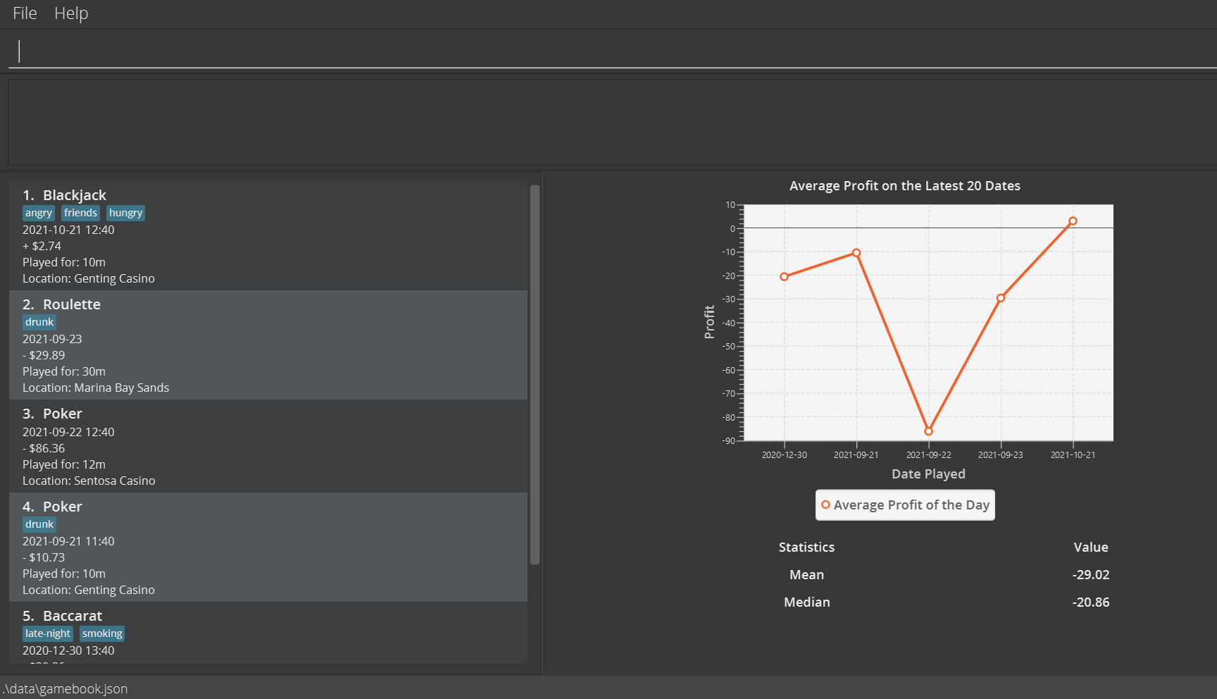
Hello! We felt that it was redundant to go into too much details as we have many screenshots in the UG that show the presence of the graph and statistics panel. In fact the very first section (Quick Start) already contains such a screenshot! The below image was taken from the Quick Start section.

Items for the Tester to Verify
:question: Issue response
Team chose [response.Rejected]
- [x] I disagree
Reason for disagreement: I think the user guide should cover every feature to tell the users exactly what they do. As a tester myself, I missed the fact that the graph was supposed for be the 20 most recent days, and I believe that was not mentioned anywhere. Whether the mean and median are calculated from the last 20 days only as well is not mentioned either, and could cause confusion for users. Given how front and centre this feature is, I believe this issue stands. Perhaps Low severity is ok since the feature seems self-explanatory on the surface but it could very well trip users up.
:question: Issue severity
Team chose [severity.Low]
Originally [severity.Medium]
- [ ] I disagree
Reason for disagreement: [replace this with your explanation]
The graph feature of the app is not mentioned at all in the user guide for the product, and could confuse users who have to guess at what functionality it can provide. Given that the beginning of the user guide highlights instant analysis of gambling records as a key feature, and seems to be the unique selling point of this software,
it seems remiss to me that such an important feature of the app is not properly explained, since this is what most users will be referring to when adding new games into their list. Terms used such as mean and median are not explained to non-technically inclined users at all.