Team's Response
No details provided by team.
Items for the Tester to Verify
:question: Issue response
Team chose [response.Rejected]
- [x] I disagree
Reason for disagreement: As no details of the rejection are provided by the team, I can only assume they disagree with this bug in its entirety.
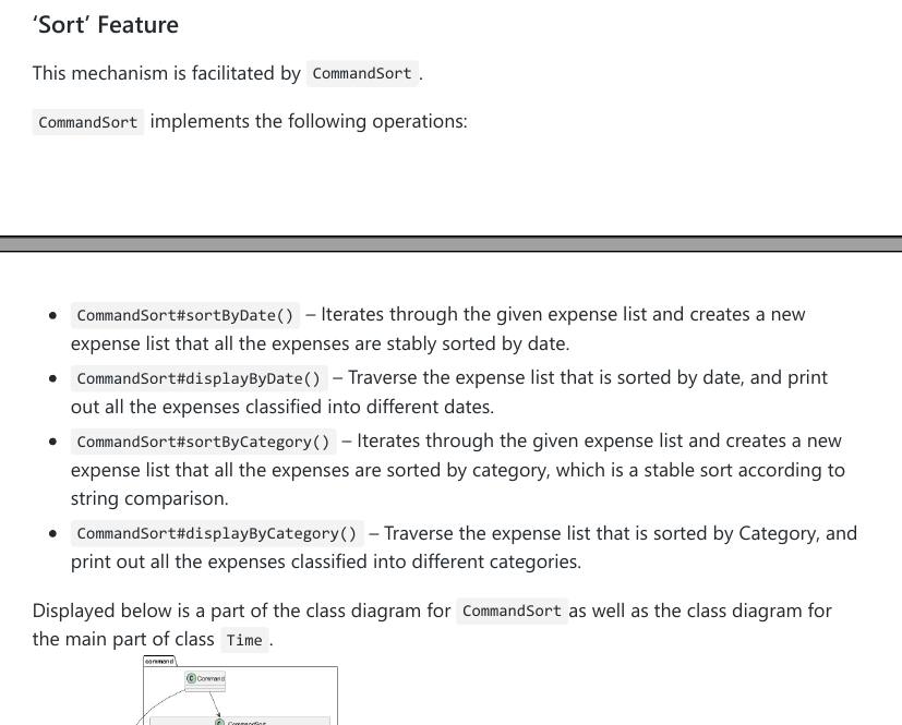
I still believe this is a valid issue with your diagram. That said, looking back at it again, it could be due to the inclusion of all the variables in all the classes that made it cluttered too.
In the guide, the diagram is used to reference how commandsort works, as such a lot of the details are not needed, such as the specific variables in Expense and Time classes. In my opinion, the details in the other classes are not required, because the main goal of the diagram is to show how the command class interact with other classes when the sorting methods are called. This can be a way for the team to reduce the clutter.


Alternatively, the team can split the diagram up, such as showing how commandsort is related to the classes in data package in one diagram, and the rest of the classes in another diagram, if they wish to show all the details in the classes.
class diagram too cluttered in DG.
It might be good to split it up into two diagrams for ease of viewing. I had to zoom in a lot to see the details in the classes.