 nus-pe-bot
commented
1 year ago
nus-pe-bot
commented
1 year ago Team's Response
No details provided by team.
The 'Original' Bug
[The team marked this bug as a duplicate of the following bug]
List in command summary incomplete
Note from the teaching team: This bug was reported during the Part II (Evaluating Documents) stage of the PE. You may reject this bug if it is not related to the quality of documentation.
Missing
list -w
[original: nus-cs2113-AY2223S2/pe-interim#2187] [original labels: severity.Medium type.DocumentationBug]
Their Response to the 'Original' Bug
[This is the team's response to the above 'original' bug]
Thank you for this report. Our team had overlooked the command summary while updating the UG for V1.0. However, this should be a
severity.VeryLowsince it is a cosmetic error.Items for the Tester to Verify
:question: Issue duplicate status
Team chose to mark this issue as a duplicate of another issue (as explained in the Team's response above)
- [ ] I disagree
Reason for disagreement: [replace this with your explanation]
## :question: Issue severity Team chose [`severity.VeryLow`] Originally [`severity.Medium`] - [x] I disagree **Reason for disagreement:** I feel that the team could have better documented the command summary better, as it is impossible to tell which flags/options are compulsory or optional based on this table. A command summary should be clear and intuitive, but to understand this well, a user would have to refer back to the detailed explanations for each command to find out which flags are required, which slightly defeats the purpose. I believe this is more than a cosmetic issue that was overlooked by the team, hence I believe it should at least be classified as `Low`.
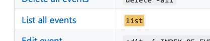
The command summary as shown below
is supposed to be a section where users take a quick look to then use these commands. However, from a quick glance, and from reading the documentation of the
addcommand for example, I know that a lot of these switches are actually mandatory. There is no indication of that anywhere, hence if I just used this command summary for reference, I am bound to face a lot of difficulties. Consider a widely implemented CLI syntax, or provide more clarity.