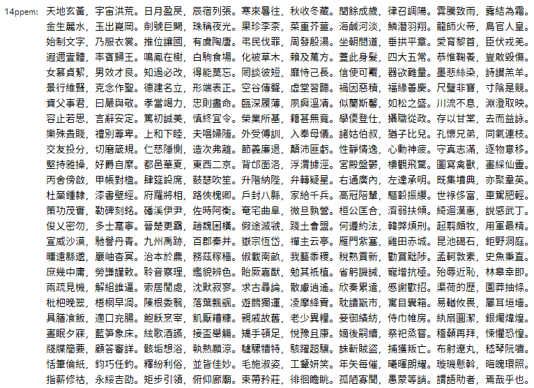
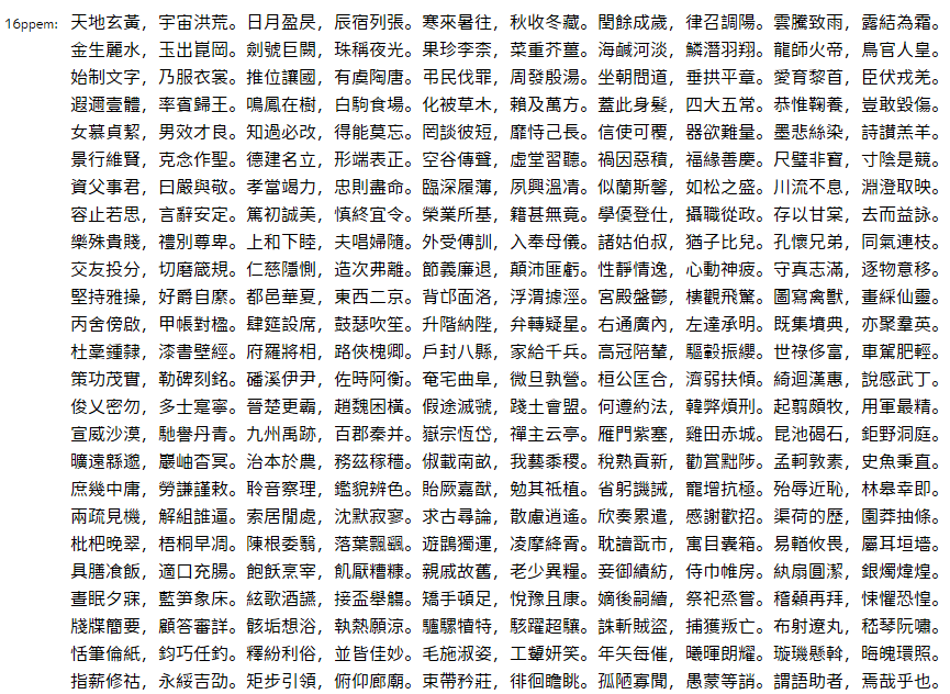
知乎刚看见,真来了~
Closed be5invis closed 10 years ago
知乎刚看见,真来了~
Given that Source Han Sans is CFF, and not TTF, how does gridfitting relate to this particular project?
Many applications (especially embedded) cannot handle CFF OTFs, therefore a gridfitted TTF might be a great help.
One of the projects in which Adobe and Google collaborated prior to the release of Noto Sans CJK and Source Han Sans was to provide significant CFF enhancements to FreeType, which is arguably the most broadly-deployed font renderer on the planet. This is one of the reasons why both font families were deployed as CFF not TTF. A better (and longer-term) solution would be for such such environments, including embedded ones, to simply upgrade to the latest FreeType, and take advantage of its CFF enhancements, and to bundle the appropriate Noto Sans CJK or Source Hans Sans font resources.
FYI @lemzwerg
Nice to see Adobe's consistent attitude of eliminating TTF. :D
The attitude is not one of eliminating TTF, but rather to promote CFF which has been a second-class citizen for a decade or more. It is an especially good time to promote CFF now that FreeType has been enhanced to provide superb rendering for CFF-based fonts.
Automatically gridfitting CJK fonts in a sensible way for low resolutions is a very hard problem. While there exists John Hobby's approach in his famous paper, this
Since CFF hinting is far easier than TTF hinting, I think that Adobe's approach is fully valid. Note that MSYH is really, really badly hinted. I wonder how this font could ever pass quality control...
MSYH is some sort of special: its outline is created by Founder, but the gridfitting it included is made by Monotype. Compared with Microsoft Jhenghei will show the difference. — Reply to this email directly or view it on GitHub.
@lemzwerg Where can I read this paper?
Here's the link: http://ect.bell-labs.com/who/hobby/89_2-17.pdf
@lemzwerg I want to know whether John's method is suitable for extremeley-low resolution, for example, 10 ppem or 12 ppem. I saw the rasteriazation in the article looks nice, but it is about 30ppem.
IMHO, CJK scripts below 24ppem (approx.) should be represented by manually created bitmaps or graymaps. Reason is that you have to change the topology of many glyphs to partially compensate the lack of space for the many strokes. This needs creativity, something a computer algorithm can't provide. For example, a glyph like 麗 can't be represented at such small sizes easily, if at all.
I honestly think that CJK fonts at 10 or 12ppem are impossible to realize in general.
Maybe there will be some algorithms to "elimate" redundent strokes and produce, at least acceptable, gridfit. We can find "similar" strokes, for example, horizontal strokes in the "目" part of "直", and then elimate it into "日" even "口".
We dont HAVE to change the topology, just make the unwanted stroke zero-width.
`Redundant strokes'? You are joking, aren't you? Characters like 品晶畾瞐 all have different meanings! What you suggest again needs creativity, namely to decide on the context what could be simplified while still retaining legibility. However, if there is no context, e.g. having a single character, no simplification can be ever possible.
Compare this to a mathematical formula: Do you think that the operators -=≡≣ contain `redundant strokes'?
@lemzwerg I think that @be5invis is referring to glyphs with a much larger number of strokes for which stroke-reduction does not affect one's ability to distinguish them. I agree that for simpler glyphs, stroke-reduction is a strongly negative thing.
But who is going to decide that? That way madness lies, I reckon.
@kenlunde Stroke elimation will be applied only when there is no more space to place these strokes. for 12ppem, there IS enough space for 品晶畾, and stroke elimation will only apply to 瞐.
Anyways, ttfautohint is not able to do this, and I'm not sure that I will ever go this route.
There are thousands of characters that can't be correctly displayed at 12ppem – do you know any commercial font that can render more complicated CJK characters in a satisfying way at that resolution?
Maybe some bitmap font? just kidding…
I do not think creating high-quality gridfitting automatically is impossible, but it is not easy.
@lemzwerg Saffron does some stroke elimination. See http://www.ronaldperry.org/SaffronWebPage/
@behdad Where did you find this? It's amazing.
@lemzwerg This image explains what I thought: Elimate similar strokes while keeping the "outline" of characters to make glyphs readable in extremely-low resolution

ps. I found that Saffron has been include in Flash Player, therefore Adobe HAS the techology which is used to elimate strokes...... And I think this stroke elimation can be transplanted into TT instructions to provide high-quality gridfitting.
Yes, Saffron is impressive. It certainly has its benefits, provided you have a stroked font. However, the situation is different for TTFs. Instead of implementing such a feature with bytecode instructions, you can save far more space by using bitmaps for such small sizes! Stroke elimination had to be done separately per ppem size, which means shifting a lot of points using delta instructions or the like. Given that a 10x10 bitmap needs 20bytes, you certainly need four to five times more bytes for a manipulation with bytecode to get the result shown in the previous comment.
To summarize: Saffron is a rendering environment, but not a good technical solution for TTFs or CFFs.
@lemzwerg TT Instructions has more flexibility, and vertex movements can be compressed into instructions. And the standard SFNT bitmaps can only contain black-and-white result, while TT instrs can be used from BW to subpixel-based rasterizers.
Saffron has provided the algorithm for MAZ and character simplification, and I think that transplanting them into TT instructions will not be extremely complcated, though compressing is.
The SFNT bitmap format does support graymaps! However, I don't know whether Apple or MS do support graymaps (FreeType does).
What do you mean with 'Saffron has provided the algorithm ...'? Where can I get it, without paying for a license or the patents?
BTW, I think that neither MAZ nor compressing would be difficult to implement; it's quite similar to what ttfautohint does. However, compressing would be very space consuming since all affected ppem values need separate bytecode to suppress and shift strokes.
@lemzwerg

After a 10-hour coding I made my first prototype of automatic stroke elimation. Gray outline: original outline Blue outline: hinted outline Red points: "Touched" points Green points: "Untouched" points
As you can see strokes are placed right on the grid while some strokes are elimated. There is only 500 lines of JavaScript code. I think the whole autohinter (including TT instruction generation) would be less than 2000 lines.
@lemzwerg IDK. The image is rendered directly using "touched" coordinates. I'd like to read more information about TT instruction programming and translate my result into instructions.
There's 3 major autohinting steps
https://gist.github.com/be5invis/3b7cb80680af4c7488b1 @lemzwerg the generator.
 @lemzwerg This is what could be achieved using this autohinting algorithm.
NOTE: THIS IS NOT TT RASTERIZATION, IT'S SIMULATED USING HTML5 CANVAS.
 @lemzwerg I've tweaked this thing for several days, including stem weight allocation optimization and better stem alignments.
Congrats! Now the interesting part comes, namely how to generate proper hints :-) Note that ttfautohint doesn't support B/W hinting in general; your method might improve that. However, I still think that the costs are too high, this is, you need to much bytecode instructions to support all small ppem values properly.
 @lemzwerg Added a procedure to generate Fontlab-like hints, here is what I have achieved.
Note the "hints" may vary under different ppems, to provide character simplification.
@be5invis can we see this online? :)
@davelab6 It's not online-ready yet, though source is accessable from https://gist.github.com/be5invis/3b7cb80680af4c7488b1 .
I am late to this thread, but have just a couple comments.
Saffron's MAZ is neither CFF nor TT. Saffron uses its own font format. Although it is used in Flash, the code is licensed by Adobe from a third party. I doubt it would be suitable for Open Source.
As others have noted, the CFF rasterizer in FreeType does not attempt stroke reduction; that is indeed a hard problem. Instead, the rasterizer uses declarations in the font to identify prominent horizontal strokes and begins by grid-fitting them. In a second pass it attempts to grid-fit other horizontal strokes where there is enough room to do so without closing counters between strokes. If there is not enough room to align a stroke, then it is left unhinted, in its original position. Our testers (who read Japanese) claim they can read the resulting text down to 12 ppem (sometimes even 10 ppem), but they rely on context to do so.
@davearnold I see. However the algorithm used by Freetype does not work well under B/W environments, it may create black rectangles ("Stroke collision"), therefore stroke simplification is necessary.
@be5invis Correct. The CFF rasterizer was designed specifically for anti-aliased rendering. Monochrome (1-bit) rendering at small sizes requires different techniques.
@davearnold However millions of people still using B/W rasterizer under y-direction. At least stroke simplification will help them.


@davearnold @kenlunde Well... I added an optimization pass using generic algorithm, and here is what I've achieved. The project is here.
I'd like to replace my current feature recognizer into a median-tree-based feature recognizer, to procide a more precise stem recognization
Hi Belleve,
This rendering looks looks pretty good to me, though I do not read Japanese. However, I thought you were working on non-antialiased rendering?
Have you compared this with FreeType CFF rendering?
Thanks.
-Dave
@davearnold His examples are written in Simplified Chinese. Feel free to say "I do not read Kanjis".
True. Obviously, I don't read either language!
It has been THREE years...


“Technology is what turns Impossible into Possible.”

Would these hinting instructions be implemented in Microsoft CJK fonts?
(Although this is not related at all the Source Han Sans, I'm quite sure Source Han Sans played a good role in stirring competition.)
@hfhchan I cannot tell you the real products but, YES, we are using IDH in MS fonts.
https://github.com/be5invis/source-han-sans-ttf/releases ← Hinted version of SHS
https://github.com/be5invis/source-han-sans-ttf/releases ← Hinted version of SHS
Do you have comparisons of the CFF version with Adobe hinter, and TTF version with yours?
@behdad CFF definitely cannot do stroke reduction for very small size (~12ppem), because its mechanism simply cannot let you to assign a point's coordinates. And in TTF we can.
Gridfitted TTFs are extremely useful for low-density display devices and web use, however there is still NO CJK font which is well fitted. Gridfits of MSYH often make characters ragged, due to lack of blue zone alignments.
Manually adding gridfits is unacceptable due to the quantity of characters, therefore is it possible to create an automatic gridfit generation algorithm which generates gridfits for thousands of characters? Adding it into
ttfautohintmight be a great help because people may reuse Source Han Sans in their own composite font and re-generate gridfits.