 ShikiSuen
commented
10 years ago
ShikiSuen
commented
10 years ago Could anybody tell me whether Korean Hanja Glyphs follows Kangxi Dictionary–style glyphs or not?
Closed kenlunde closed 7 years ago
ShikiSuen
commented
10 years ago Could anybody tell me whether Korean Hanja Glyphs follows Kangxi Dictionary–style glyphs or not?
 DerkZech
commented
10 years ago
DerkZech
commented
10 years ago @ShikiSuen The standardized glyphs in South Korea are not identical to the gylphs used in Kangxi Dictionary, but they can be considered the "closest" relatives when compared to the standards in China, Japan, and Taiwan.
A. Comparison of modern glyph standards:

Note: some of the variations above are not solely due to differences in "glyph standard" (字形標準), instead they can be considered different variant characters (異體字).
B. Kangxi Dictionary form vs. South Korean standard

As you can see, the character forms in Kangxi Dictionary (KD) are often inconsistent, such as 像 and 象 and the four short horizontal strokes in the 雨-top. On the other hand, the South Korean hanja standard has eliminated much of these inconsistencies along with the taboo characters (避諱字) in KD. Another minor but significant change in the Korean standard is the consistent and more apparent effect of "broken strokes" (斷筆) for "bent" strokes (折筆). A print-specific broken stroke refers to a stroke that is written as one stroke but appears as two strokes in print. For example, if you compare 巛, 幺, and 鼠 in SK standard and KD forms, you'll notice that the KD forms 斷筆 are either less obvious (reduced) or just non-existent. The differences between the two 瓜 above, however, are not due to a print-specific 斷筆, because the two strokes of 瓜 in the Korean and Japanese standards are not only printed but also written. A more appropriate comparison of a printed 斷筆 in 瓜 would look something like this instead:

(left: w/o 斷筆; right: w/ 斷筆)
In summary, while the Korean standard of hanja is closest to the character forms in Kangxi Dictionary, the two are still non-identical. The Kangxi Dictionary forms, moreover, are rather inconsistent and less predictable due to the taboo characters. In fact, in terms of scale and purpose, the KD forms per se can hardly be compared to the national standard in practice today. In this sense, the KD forms cannot really be considered a "standard."
By the way, I don't think this conversation is relevant to the intended subject here, so you might want to discuss this elsewhere.
 kenlunde
commented
10 years ago
kenlunde
commented
10 years ago The lack of use in Korea, at least over the past 100 years, no doubt explains the more conservative nature of their standard shapes. Greater usage of a script tends to result in greater innovations, which translate into changes.
 tamcy
commented
10 years ago
tamcy
commented
10 years ago Just want to add that in the above screenshot, "并/研" on the "H" row are the reference styles released by the Office of the Government Chief Information Officer (OGCIO). Their form are the same as J/C/T if Education Bureau's "List of Graphemes of Commonly-used Chinese Characters" is considered. I believe this is one of the challenges if a HK variant of the font is to be developed.
 orangeparanoid
commented
10 years ago
orangeparanoid
commented
10 years ago I agree that a Hong Kong font should be different.
I can find the only open-to-the-public authoritative source for Hong Kong Chinese characters here: (The Chinese words are images. So, they won't be affected by the font installed on my computer.)
(You can copy and paste a Chinese character in the 輸入單字 box to get the result.)
適合小學生學習的中文科常用字,共3000個。本字表內的所有單字採用由華康科技(香港)有限公司贊助的「華康香港標準宋體」,符合香港教育學院《常用字字形表》所列的標準字形,使用者可參考本字表內單字的寫法作為教學用途。
According to this site run by Hong Kong Baptist University, this list uses a commercial font from 華康科技(香港). The font follows 常用字字形表 (Common Word List). The site says, for teaching purposes, the way of handwriting can be followed for reference.
This site is "A Study of the Chinese Characters Recommended for the Subject of Chinese Language in Primary Schools" sponsored by the 優質教育基金 (Quality Education Fund).
About Quality Education Fund: In October 1997, the Chief Executive announced in his Policy Address the establishment of the Quality Education Fund (QEF) to finance projects for the promotion of quality education in Hong Kong. http://www.qef.org.hk/english/aboutus/objective_scope.html
That means, in my opinion, this site provides a "somewhat standard" supported by the HKSAR Government since the Government supports this site financially. (although the HKSAR Government did not announce a standard and force people to follow it.)
This site provides 小學中文科常用字表 (Common Word List for Primary School Chinese).
寺: The second horizontal stroke is longer than the first horizontal stroke on the top. This is the Hong Kong way of writing. 待侍特等 are affected.
Other different Hong Kong VS Taiwan characters include: 黃統充溫令戶直
I agree that 常用字字形表 (Common Word List) is the only viable option in terms of "Hong Kong standard" as there are no other Hong Kong standards currently implemented or suggested by the government.
Teachers have a headache when they see the current Taiwan font commonly used on Windows. The Taiwan font is just different from how teachers in Hong Kong teach the kids to write the Chinese characters.
The Chinese teachers suffer from the pervasive Taiwan font. The teachers who use Chinese to teach Social Studies and Mathematics are also affected.
Can we agree on using this "somewhat standard" indirectly financially supported by the HKSAR Government?
kenlunde
commented
10 years ago I just modified the fifth paragraph in the initial post for this Issue to clarify the plan for supporting HK.
Also, all of the discussions in this and other Issues have been very helpful.
 extc
commented
10 years ago
extc
commented
10 years ago The 小學中文科常用字研究 (http://lcprichi.hkbu.edu.hk/) was intended to modify 《小學常用字表》 2600 字 as stated in the "研究方法" section of the website. It is published in 2003, it suggested which word should be included (that is the scope) in the Primary School Chinese language learning; while the HK standard we are talking about is 《常用字字形表》, which was the writing form or writing style stardard. The English name of this book is "List of Graphemes of Commonly-used Chinese Characters".
The 小學學習字詞表 published in 2007 was a result of updating the 小學常用字表 in 1990 as stated in the '前言' of the book: 建基於大型語言調查,參考各地最新研究成果,循科學方法更新學習詞匯,以適應社會語言發展情況和小學生的學習需要。本字詞表包含的字詞,比 1990 年《小學常用字表》增加 605 字、刪減 34 字,比 1996 年《小學教學參考詞語表 (試用)》增加 3,911 詞語、刪減 909 詞語。
The book included 常用字字形表 as appendix. 常用字字形表 is re-arranged in 2012 with 'Cantonese and Putonghua Pronounciation and Simple English Explanations'. You can get the description under the Education Bureau, HK website: http://www.edb.gov.hk/tc/curriculum-development/kla/chi-edu/resources/primary/lang/curriculum-materials.html
Here is the content of the description in the Microsoft Word document: 《常用字字形表》於1986年由前教育署語文教育學院編訂,收4,721字;經過多次修訂,至1993年已增收至4,759字。這次據1993年修訂本重排,按音義必須完全相同的嚴格標準檢視列出的異體字,對原版中意義和用法有些微差異的字體,不再當作異體字處理;字形表重排本增收至4,762字。 字形表原為手寫本,這次為方便讀者檢索,以電腦造字重排。在尊重原有研究的前提下,依照原版體例和系統僅作個別調整、補充。 最後,依照原版部首,按歷次修訂校正的筆畫,重排字序和字碼,並以雙色排印,附編原版《異體字表》,以方便讀者查考。 《常用字字形表》刊行二十年,已成為香港教師、家長、編輯共用的參考字形規範。這次配合《香港小學學習字詞表(試用)》的編印而重排作附錄,期望能把這作用發揮得更好。
Therefore, one should consider to get a copy of this book or have a look at the official lexical_ch website: http://www.edbchinese.hk/lexlist_ch/
kenlunde
commented
10 years ago One consequence of splitting TW and HK is that the Version 1.000 fonts that include "TWHK" in their names (PostScript and Family) will be changed to instead use "TW" in Version 1.001. This change will affect existing documents. But, making such a change earlier in a font's lifetime is less painful than doing so at a later time.
 hfhchan
commented
10 years ago
hfhchan
commented
10 years ago FYI, the rendering at http://lcprichi.hkbu.edu.hk/ is based on a previous version of the 《常用字字形表》 "List of Graphemes of Commonly-used Chinese Characters", namely the 2000 version.
In 2007, the officially suggested strokes were changed to conform more to the commonly accepted forms, and the new list was merged into 小學學習字詞表 which can be found in http://www.edbchinese.hk/lexlist_ch/.
Numerous seminars for teachers were held in Hong Kong detailing the reasons for the change, e.g. the revival of the bottom tick for the word 求 which had a straight stroke downward in the 2000 versions and before. Practically no one wrote the word without the bottom tick, so the tick was added back. Ditto for 潛 where practically no one wrote the word with the top right hand component having the vertical stroke cross the first line, so the more common form (vertical stroke meets first-line, i.e. = Taiwanese version) was adopted as "suggested form" instead.
小學學習字詞表 is provided by the Education Bureau directly, thus it is also of more relevance than the one provided by HKBU (http://lcprichi.hkbu.edu.hk/) by the QEF.
 justinrleung
commented
10 years ago
justinrleung
commented
10 years ago Other than the List of Graphemes of Commonly-used Chinese Characters, Hong Kong has other guidelines, which are specifically for computer fonts: the Reference Guide on Song Style (Print Style) Character Glyphs for Chinese Computer Systems in Hong Kong and the Reference Guide on Kai Style Character Glyphs for Chinese Computer Systems in Hong Kong (http://www.ogcio.gov.hk/en/business/tech_promotion/ccli/cliac/glyphs_guidelines.htm). The glyphs in these two guidelines differ slightly from the List of Graphemes, but they may be more relevant.
ShikiSuen
commented
10 years ago @justinrleung Could you please also post the Traditional Chinese version of that guideline webpage?
justinrleung
commented
10 years ago Traditional Chinese: http://www.ogcio.gov.hk/tc/business/tech_promotion/ccli/cliac/glyphs_guidelines.htm Simplified Chinese: http://www.ogcio.gov.hk/sc/business/tech_promotion/ccli/cliac/glyphs_guidelines.htm
ShikiSuen
commented
10 years ago @justinrleung Thanks for your offer (which could let me know more on HongKong glyph standard) even though I still prefer CNS11643.
hfhchan
commented
10 years ago There are notable discrepancies between the List and the Guideline; Approved Primary and Secondary School textbooks for the Chinese Language subject require strict adherence to the forms in the List instead of the guideline. The guideline is merely of reference nature and provides a few technical requirements (說 rendered as 説 to work around side-effect of source separation rule). Should there be discrepancy, the form in the List.
Note the version of the list, the 2007 version was not published separately but is integrated into 香港小學學習字詞表 Lexical Lists for Chinese Learning in Hong Kong (Available Online via http://www.edbchinese.hk/lexlist_ch/)
An added a note, in the file https://github.com/adobe-fonts/source-han-sans/blob/master/SourceHanSans_TWHK_sequences.txt, under the section #HK 9F9C FE00; Standardized_Variants; CID+47471 is actually for Taiwan. Hong Kong should actually use 9F9C FE01.
Source [a]: http://www.edbchinese.hk/lexlist_ch/ Source [b]: http://www.edbchinese.hk/lexlist_ch/charform.swf?cidx=4762
hfhchan
commented
10 years ago Same for 6148 FE00 Should use something similar to 6148 FE01 (top part radical) Source: http://www.edbchinese.hk/lexlist_ch/charform.swf?cidx=1401
tamcy
commented
10 years ago Some of the forms supplied by EDB is really surprising. I never saw the "standard" form of "於" and "慈" being used in real life. In this case I would oppose using such glyphs in the font for practical reason. After all, the commonly written form of "於" and "慈" are still accepted as a variant form.
hfhchan
commented
10 years ago @tamcy well the 茲 variant of 慈/滋 is used in all approved Chinese textbooks for primary and secondary school, though I clearly remember the teacher remarking she has been writing the 兹 version for her whole life while marking our dictation.
First, a bit of history on etymology:
According to Shuowenjiezi, (authored in the Han dynasty),
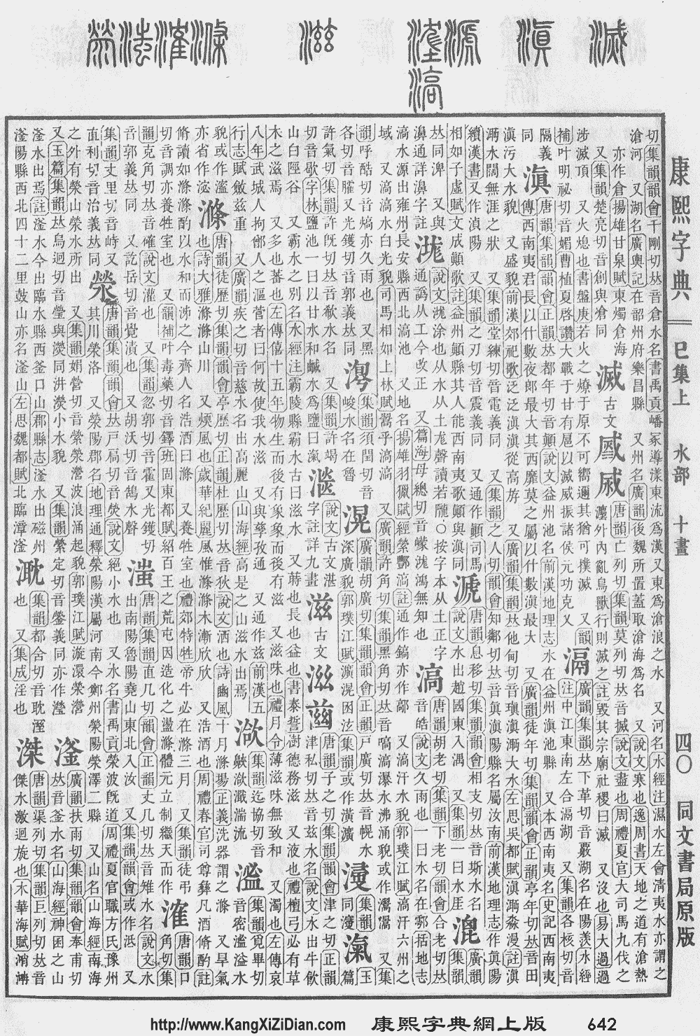
慈,…从心茲聲… (composed of 心, 茲 is the sound) 滋,…从水茲聲… (composed of 水, 茲 is the sound)
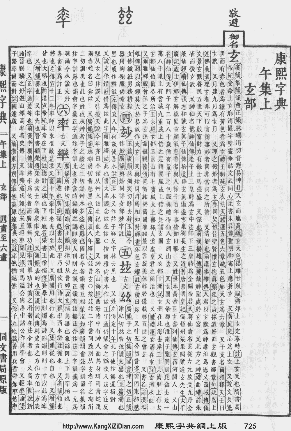
However, according to the Kangxi Dictionary (AD 1716) entry 玆 [3], it explicitly states that 玆 and 茲 are same sound but different meaning. It also quotes sources where the characters have been messed up, and the dictionary tries to distinguish it. Note that the entry for 玆 lacks the dots for 玄, because the word 玄 was Kangxi's personal name. It quotes Yupian saying 玆 is also written as 滋 (dotless 玄).
On the other hand, the main entry for 滋 [1] writes it with a dot. An inclusion of the dot likely implies it recognizes that 滋 does not compose of two 玄, but explicitly the form 兹. As the Kangxi dictionary was press printed, and the fact that the dot is consistently printed in the 滋 entry, it is clear that there was a deliberate effort to create two different word casts (字粒, the carvings used in a letterpress priting). This would imply a recognition that there exists two characters, one as 氵 + 兹, and one as 氵 + 玆.
Futhermore, 兹 does not exist as another character. However, the right hand side of the seal script version of 滋 and the seal script version of 玆 are exactly the same. This would imply that 玆 and 兹 are the same words.
This suggests that the Kangxi dictionary is contradicting itself into what exactly the right hand side of 滋 is supposed to be.
To note, 茲 is often hand-written as 兹 in Regular script, of which the Ming/Song Script is based on, which may suggest that Kangxi Dictionary had possibly, at some point of the editorial process, been mislead by the more common form, and used the incorrect seal script character.
According to Shuowenjiezi (Duan Yucai notated) (AD1907) (《說文解字注》段玉裁, Qing dynasty) writes 慈,从心茲聲 . A more explicit text exists at the 滋 entry, saying that 滋,从水茲聲 (composed of 水, 茲 is the sound), and pointing out that various dictionaries have got their Seal Script form incorrect, and thus are using the wrong form "玆" [2].
Most of the words with the ⺿ radical before the MOE standardization were often written as 丷 by people and calligraphers alike. During the MOE standardization process, characters whose etymology related to grass were assigned a standard form using the ⺿ radical, and those that were not (e.g. 夢) using the ⻀ or 䒑. However, the MOE notes during the standardization process explicitly said that characters containing 茲 should be written as 兹, and the single word with ⺿ radical. This was likely seen as an anomaly or unnecessary inconsistency by the people who drafted the local list, as the 滋慈 was written with a ⺿ radical from the first version.
Meanwhile for 於, not many other commonly used character uses 人 on the top right hand side. Personally, I have always written it with 丿一 instead of 人. All characters that consist of 方 on the left have the 人 part written as 丿一, such as 旗 / 族. Although the character 於's roots have nothing to do with 方 and 人, many other words such as 差 and 羞 have completely different structure in seal script, but have been assigned the same clerical script component simply for consistency and ease of writing. Using 人 at the top right of 於 would be inconsistent with all other words composed of 方 and 人; and differentiating it with words of different origin would provide little added benefit in understanding of the word. My guess is it was an explicit change to ease learning.
Teachers in Hong Kong in general adhered to the MOE standard until the promulgation of the local standard, but even so teachers are not mandated to correct minor differing forms. Also, no law requires media use appropriate fonts unlike in PRC. Given that the fonts used nowadays are primarily based on the forms standardized by Taiwan, it's possible that normal people would not see these forms printed outside of the education context. Proper fonts strictly adhering to the local standard were never populized, and an open-source font adhering to the standards are lacking.
It is debatable for certain characters of whether they should stick to the standard or not; I think it would be better to adhere to the standard for the first revision, then change certain characters to other forms based on actual use (with statistical justifications).
[1] http://www.kangxizidian.com/kangxi/0642.gif [2] http://www.gg-art.com/imgbook/view.php?word=%D7%CC&bookid=53&book_name=%CB%B5%CE%C4%BD%E2%D7%D6%D7%A2 [3] http://www.kangxizidian.com/kangxi/0725.gif
(Note I have used the scanned form intentionally; many online versions often messed up the characters and used them interchangeably, and did not make any sense)
kenlunde
commented
10 years ago @hfhchan You are seriously misunderstanding the scope and purpose of the Standardized Variants.
<9F9C FE00> corresponds to U+F907, which corresponds to Hong Kong SCS 0x8BF8. See: 9F9C FE00; CJK COMPATIBILITY IDEOGRAPH-F907; 9F9C FE01; CJK COMPATIBILITY IDEOGRAPH-F908; U+9F9C (as a bare characters, and not as part of a Standardized Variant) corresponds to Big Five 0xC074. Both glyphs should be available for Hong Kong use: U+9F9C is included by virtue of being included in Big Five, which forms the foundation for Hong Kong SCS; and <9F9C FE00> (U+F907) is included because it is part of Hong Kong SCS proper. About <6148 FE01>, such a Standardized Variant does not exist, and one is not necessary. There is a one-to-one correspondence between a CJK Compatibility Ideograph and a Standardized Variant, meaning that there are exactly 1,002 of each. If a single CJK Compatibility Ideograph has multiple sources, and if the representative glyphs for the sources differ, it is up to the implementation to use the appropriate glyph. In this way, the situation is no different than CJK Unified Ideographs. <6148 FE00> corresponds to U+2F8A6, which corresponds to Hong Kong SCS 0xFC77, and U+6148 corresponds to Big Five 0xB74F. In other words, both glyphs are expected to be in Hong Kong fonts, but at different code points.kenlunde
commented
10 years ago Thanks to Dr. Lu (IRG Rapporteur), I am now in possession of the printed version of 香港小學學習字詞表. It seems that pp 432 through 579 will be most helpful.

justinrleung
commented
10 years ago I have a print copy of 常用字字形表 (2012), which is the same list in the appendix of 香港小學學習字詞表. I haven't examined it with the print copy of the 香港小學學習字詞表, but I've found minor discrepancies between the glyphs in the online version of 香港小學學習字詞表 and the print copy of 常用字字形表 (2012).
(1) The middle dot in 必 is different.
香港小學學習字詞表:

常用字字形表 (2012):

This difference also appears in some characters that have the 必 component, like 蜜 and 泌:


It is interesting to note that there is no difference in other characters with the 必 component, like 密 and 祕:


(2) The left dot/slash in 示 is different.


This difference also appears in some characters that have the 示 component, like 票, 祭, 漂, 剽, 瞟, 驃, 鏢, 襟:


It is interesting to note that there is no difference in other characters with the 示 component, like 禁, 禦, 飄, 嫖, 標, 鰾:


It is also interesting to note that the 2012 常用字字形表 still has a left dot in 瓢:


kenlunde
commented
10 years ago I just checked all of the examples that you posted, and when compared to those on pp 432 through 579 in the printed version of 香港小學學習字詞表 that I now have (dated 2007), they are the same.
 beachmat
commented
9 years ago
beachmat
commented
9 years ago So are the Hong Kong issues solely to do with the characters in Hong Kong SCS? Or are there characters in Big 5 that also need different glyphs for Taiwan and Hong Kong?
hfhchan
commented
9 years ago In both big5 and hkscs. The CLIAC is currently reviewing the industry guidelines. I think the irg docs have mention of this.
beachmat
commented
9 years ago So basically you should use a HK font only for Hong Kong traditional text, and not for Taiwan traditional? I know that characters outside Big 5 come up often in Taiwanese text. In the past we used to use font vendor extensions. When it happened the other day I used a HK font which I guess was a mistake, because it would change some Big 5 glyphs as well, yes?
hfhchan
commented
9 years ago yes, you are right. however the glyph differences are somewhat minor. usually the differences are just distracting.
hfhchan
commented
9 years ago to note that the taiwan glyph standard is merely a standard, it is not that prevalent in daily use. In Taiwan and Hong Kong, the Monotype and Dynacomware fonts are usually used, which resemble (but not exact matches of) the glyph standard for Hong Kong and the glyphs used in traditional movable-type printing presses in non-simplified Chinese areas.
beachmat
commented
9 years ago So if I understand you correctly, the Big 5 glyphs in Monotype and Dyna fonts are what are used in both Hong Kong and Taiwan, and Taiwanese people don't worry too much if they follow a Hong Kong style and don't match the Taiwan MOE standard? If so, then the issues Ken mentions are basically to do with the HKSCS characters?
hfhchan
commented
9 years ago The Big5 glyphs in Monotype and Dyna fonts are what are used in both Hong Kong and Taiwan
Yes. Though the monotype and dynacomware fonts for both markets usually include both Big-5 and HKSCS characters.
Taiwanese people don't worry too much if they don't match the Taiwan MOE standard?
Yes, at least the fonts used in normal contexts, i.e. newspapers, press and advertisements, do not adhere to the Taiwan MOE standard (and will more closely resemble the Hong Kong glyph standards if they have used the Monotype fonts).
If so, then the issues Ken mentions are basically to do with the HKSCS characters?
No. Hong Kong standardized glyphs for many characters encoded by Big5 are also different than the MOE standardized glyphs from Taiwan. Such differences range from stroke differences to (systematic) use of different radicals/components in characters.
beachmat
commented
9 years ago Right, thanks. So basically there are differences in Big 5 characters for HK and TW, but Taiwanese people tolerate HK forms out of necessity? In that case, they should like Source Sans Han/Noto Sans, I guess. But just to make it more complicated, there is also the issue that Taiwan MOE forms are unpopular in Taiwan, yes?
hfhchan
commented
9 years ago Put it this way, the Taiwan MOE standardized form, established circa 80s, has favored certain character forms to better reflect their etymology. This has been absurd to the level that involved in the importing of a word component that originally only existed in the Running script, into the Regular script and Ming/Song script. It was seen as minor but distracting attempts to re-engineer written Chinese. Therefore, the uptake of the MOE standardized forms had been low due to its deviance from the customs and norms.
It is not until recently that this form was used in casual contexts as this form is used by the system default font (Microsoft Jhenghei) for Windows Vista and up. However, these standardized forms are rarely seen in advertisements and newspapers due to the criticism that these forms are neither natural or not aesthetically suitable. Source Han Sans effectively brings the MOE standardized forms to other platforms. (To note, it was pointed out that in an older thread that the traditional Kang-xi resembling fonts are more preferred by Taiwan people, and another argued the MOE forms are better. Nevertheless, the Kang-xi resembling fonts (provided by Dynacomware) are more popular in Taiwan. Therefore which is more beautiful is likely a preference issue.)
Meanwhile, the HK government has taken a much softer approach to the standardization in the 90s. Glyph differences from norms are generally at the stroke level. The HKSARG has refrained from swapping out components that are different to normal writing conventions. Thus, the HK forms are very likely to be more similar to the actual forms used by the Taiwanese people, especially those who have been educated before the introduction of the MOE standard into the primary and secondary curriculum.
The situation is never that clear cut, as the huge number of Chinese users means a huge variation in writing habits and preference of forms. The perceived majority preference could also be affected by confirmation bias. It would be infeasible to make everyone happy. Therefore I guess the approach Source Han Sans can take is to follow the national standards as strictly as possible where it matters most.
 kcwu
commented
9 years ago
kcwu
commented
9 years ago From the other point of view: Taiwan MOE standardized form is already taught in school more than twenty years. No matter the design is good or bad, reasonable or not, middle age or younger people are familiar with TW MOE form and portions of them feel this form is better/standard.
It's true that it is not so popular used. But to some extent it's chicken and eggs problem -- some people desired TW MOE form fonts but there are very few choices available. Since later 90s, less font foundries in Taiwan created new fonts. People are (kind of) forced to use non-TW MOE form fonts. And needless to say users' first font choice -- OS default font, Ming in Windows at that time -- is non-TW MOE form. BTW, the second popular choice -- Standard-Kai 標楷體 in Windows, is using TW MOE form. (I understand TW MOE form has some drawback, but I'm not here to argue that)
My main point is that TW MOE form is not so rare used and it may be not so fair to judge only by existing usage.
Sometimes there is an opinion to use HK form for TW or vice versa. No matter HK is softer, no matter TW MOE form, Kang-xi or Dyna is better or not, there are a small subset of component/glyphs conflicting between TW and HK. In that subset, both sides are very unhappy the writing style of the other side. No simple solution (single font) to fit all. That's the problem that this issue (#48) trying to solve.
hfhchan
commented
9 years ago Even with Hong Kong, the chicken and egg problem has occured, some parts of the Hong Kong standard have not found mainstream use, partially because lack of fonts that use these forms.
A good thing for Taiwan is that the new "Ming font" PMingLiu font in Windows Vista and up are in the TW MOE form. But bad thing is no font for Hong Kong is provided with any operating system. As also mentioned, the mainstream font used for Regular Script is Standard-Kai 標楷體 in Hong Kong as well, which have systematic differences with local norms.
So all and all, it is a good thing that Adobe is now experimenting with producing a font that respect the HK form separate to the TW version, so both sides can exist peacefully. :)
kenlunde
commented
9 years ago I can confirm that the scope of the Hong Kong glyph issue covers both Big Five and Hong Kong SCS proper.
The first stage will be to build an experimental Hong Kong font that repurposes existing glyphs to the extent possible. This will help to gauge the effectiveness of having a separate Hong Kong instance.
One particular difficulty in handling two types of Traditional Chinese in a Pan-CJK font is that the few applications that support the 'locl' GSUB feature have only one notion of Traditional Chinese, meaning that language-tagging cannot support both. In OpenType, both can be supported because there are separate language tags for Traditional Chinese in Taiwan (ZHT) and Hong Kong (ZHH). So, at a practical level, language-tagging cannot be relied upon to differentiate the two types of Traditional Chinese. Instead, selecting separate fonts, each of which include a different default 'cmap' table, must be used.
hfhchan
commented
9 years ago Suppose I use and specify the font as "Source Han Sans", locl aware applications will always render as the Taiwanese version, unless I explicity specify the font to "Source Han Sans HK", and have the corresponding Subset OTF installed?
In OpenType, both can be supported because there are separate language tags for Traditional Chinese in Taiwan (ZHT) and Hong Kong (ZHH).
Meanwhile, the Language-specific OpenType/CFF, OpenType/CFF Collection (OTC) and Super OpenType/CFF Collection (Super OTC) can contain the HK Glyphs, but if such, they will not contain the TW Glyphs?
beachmat
commented
9 years ago I believe the default language for "Source Han Sans" (ie not language-specific) is Japanese. Yes it would be good if InDesign distinguished between ZH TW and HK. But I guess there's other software that doesn't make the distinction either. Something else that still confuses me a little. When I got a missing glyph in a Big5 font with some Taiwanese text the other day, how come HK fonts had that glyph? I thought HKSCS was mostly for Cantonese. Is there overlap between HKSCS and other big 5 extensions, and font vendor extensions, eg Monotype?
kenlunde
commented
9 years ago @hfhchan: The experimental HK fonts will include the full glyph set, but the 'cmap' table will prefer HK forms when available, or the closest glyph for HK use. For experimental purposes, it is premature to define an HK subset. Also, my intention is to eventually support both TW and HK in the same glyph set, which means separate language-specific HK fonts and separate HK font instances in the OTCs.
I plan to file a bug against InDesign in order for it to distinguish the two types of Traditional Chinese via the distinct OpenType language tags: ZHT and ZHH.
@beachmat: Source Han Sans has no default language, at least starting from the Version 1.001 release. The default language depends on which language-specific OTF you use, or which OTC font instance you choose. About your second paragraph above, a screenshot would be helpful, along with details about the other HK fonts and the text you are trying to render. I strongly suspect that PUA code points may be involved. As of Unicode Version 5.2, PUA code points are not required for Hong Kong SCS, though there may be some lingering font implementations out there.
hfhchan
commented
9 years ago @beachmat
Something else that still confuses me a little. When I got a missing glyph in a Big5 font with some Taiwanese text the other day, how come HK fonts had that glyph?
A font that claims to be for Big5 doesn't necessarily include glyphs for all characters in Big5. Also, the Taiwanese text could have actually contained characters in Unicode that are not in Big5. Since commercial HK fonts usually have full coverage of Big5 and HKSCS, it's possible that your word processor or browser chose an HK font as the fallback. The vast number of similar words and cognates separately encoded in Unicode means that a user could have easily typed an unintended character that doesn't exist in Big5 (or the "big5 supporting font").
I thought HKSCS was mostly for Cantonese. Is there overlap between HKSCS and other big 5 extensions, and font vendor extensions, eg Monotype?
HKSCS contains certain characters that are in use in Hong Kong, which happen to include some very common simplified Chinese characters, obscure characters for names, and also invented colloquial characters, which represent sounds in Cantonese.
There are of course overlaps between HKSCS and other Big5 extensions, such as ETen: they may share the same overlapping codepoints, so certain text in Big5-HKSCS may show a different character if it were treated as Big5-ETen. The character 恒 in Big5-Eten would have a different codepoint in Big5-HKSCS. The HKSCS proper contains more characters than ETen proper, but the codepoints of characters are different.
Monotype has its own Big5 extension encompassing 471 user defined characters. However, modern operating systems use Unicode as the underlying basis for text processing, and browsers will convert your text into Unicode (if it is not already) before passing the text to render. Therefore, it is highly unlikely your issue has anything to do with extensions of Big5.
beachmat
commented
9 years ago Thanks for the informative replies. A couple of characters that have come up in Taiwanese text in the last couple of days are U+7740 and U+7ED2.
hfhchan
commented
9 years ago U+7ED2 (绒) is a simplified Chinese character. The traditional Chinese character should be 絨.
U+7740 (着) is both a simplified and traditional Chinese character. Its etymology is a calligraphic variant of 著. The Taiwan MOE regards it as an variant of 著, discourages its use and thus is not included in the Big-5 Character set. Hong Kong and PRC disagree and 着 is included in HKSCS and also in the GB standards.
In PRC and in HK, 著 and 着 are used for distinct meanings: 著 is used in the context of written works, e.g. "author 著者", "work(s) 著作", "famous 著名" 着 is used as preposition, e.g. "looking at 看着", or as a verb, e.g. "catch fire 着火", "apply color 着色", "lay hands on (meaning to start) 着手"
In HK, occasionally, the word 著 is used instead of 着, especially in older digital/digitized text, likely due to the widespread use of Big5 proper. However, the opposite is regarded as a mistake. In PRC, any swapping is regarding as a mistake.
beachmat
commented
9 years ago Thanks. Yes I came across another one which was simplified, so typing errors I guess.
beachmat
commented
9 years ago Is there a reliable way to tell if a font is designed for Hong Kong or Taiwan? Would someone be kind enough to indicate a few characters with the relevant differences?
kenlunde
commented
9 years ago Because the extent to which TW and HK glyph standards are covered by fonts is all over the map, the easiest way to ascertain whether a font was intended for use in TW or HK is to check the Unicode coverage. If there are no or very little Extension A (in the BMP) or Extension B (in Plane 2) code points, then the font is likely to be designed for use in TW, because most TW fonts adhere to Big Five, whose hanzi are all within the URO (except for two that are CJK Compatibility Ideographs). Fonts for HK, which support Hong Kong SCS, include over 500 Extension A characters, along with nearly 2,000 Extension B ones.
orangeparanoid
commented
9 years ago 
orangeparanoid
commented
9 years ago I made a chart to show the differences between some of the characters. (Taiwan versus Hong Kong)
hfhchan
commented
9 years ago @beachmat unfortunately no.
Foreword: I will refer to Taiwan and Hong Kong as specific "regions", and call the combination of the two regions as the "Traditional Chinese (font) market". I will also refer to the glyph shape in the Hong Kong Education Bureau's official reference materials for schools as the Hong Kong standard due to its de-facto nature.
First off, "designed for a specific region (Taiwan, Hong Kong)" can consist of very different criteria: coverage of regionally commonly used characters, and adherence to regional standard and/or regional norms. Note: I myself deem strict adherence to a Taiwan standard entails non-suitability for Hong Kong. The folks on the Noto issue tracker seems to disagree.
Second, most commercial fonts for the Traditional Chinese market do not distinguish between the two regions, and/thus do not adhere specifically to any regional standard. The regional norms may deviate slightly due to the education, but the commonly used forms are always recognizable from both regions. Popular commercial fonts usually choose the glyph shape that "just fits", balancing aesthetics, readability, etymology, and traditions at their own will.
Codepoint Coverage As mentioned by @kenlunde, you can check the code-point coverage. If the code-point coverage covers only Big5 or (especially) Big5E, one can conclude it was designed primarily for the Taiwan market. If the code-point coverage includes characters in HKSCS, one could argue it is designed for the Hong Kong market as well.
Note: Microsoft Jhenghei and Source Han Sans (TW) were designed to adhere to the MOE standard, and they also cover words in HKSCS. My opinion is that these fonts are only as suitable to Hong Kong just as much as PRC / Japanese / Korean fonts would be -- not suitable.
Glyph Shapes As @orangeparanoid listed, there are numerous differences in the glyph shapes. However, some of these examples may not be suitable to draw conclusions.
If the font follow the glyphs tagged "Taiwan" in all first 7 rows on the left, the last 3 rows on the left, and the first row on the right, the font is very likely to be targeting Taiwan market only. These are glyphical features that have virtually never existed in printed material for the last thousand years, until after they were engineered into the standardized glyphs by Taiwan. These glyph forms are not in widespread use in Hong Kong.
The other rows, however, have little value for drawing conclusions.
First, fonts that use glyphs tagged as "Taiwan" in the other rows are glyphical differences that have existed in fonts dating back at least centuries. Appearance of such forms would not suggest it targets any particular region.
Second, the glyph forms tagged as "Hong Kong" are indeed the forms specified by the Hong Kong standard, but are also used by the PRC and other regions. Most of these forms tagged as "Hong Kong" are strongly similar to the forms that have been used in mainstream print for centuries. These glyph forms are nearly universally used in popular commercial fonts targeting the Traditional Chinese market.
Despite popular commercial fonts likely having a closer resemblance to the Hong Kong forms, the deviation from the Taiwan glyph form is due to the principles in which the regional standards were derived, and does not indicate a preference or strict adherence to the Hong Kong standard. Font vendors choose norms/tradition over standards or etymology in varying degrees: Song (serif) fonts typically follow handwriting norms when concerning the radical 壬: it is rendered with a top slanting stroke similar to the PRC standard, while the Taiwan and HK standard illustrate a horizontal stroke. A popular font, MSungHK, follows traditional printed Song in the radical 呈. It usually changes the bottom component of the character 呈 to have a longer middle stroke than the bottom, but when this character is the component of 鐵, the bottom component is exchanged to 王.
Fonts strictly adhering to the Hong Kong standard are extremely rare. Currently the only commercially available fonts adhering to the Hong Kong standard are those from DynacomWare and have "香港標準" in their font name. To find fonts that have been specifically targeting the Hong Kong standards, one can observe the word 畢、於 and 潛:
For 畢: There is one big downward stroke in the Hong Kong standard like the PRC, while the Taiwanese representative glyph separate the downward stroke for 田 and the bottom component. The Hong Kong standard also breaks the component just under 田 into two separate "十" instead using one horizontal stroke across, which is not found in any other existing regional standard.
For 於: The top right hand side should be similar to the top of 旗, instead of consisting of 人 like as in the PRC / Taiwan standardized glyphs.
For 潛: You can check for a protrusion on the top right hand component. In pre-2007 version of the Hong Kong standard, the downward left stroke overlaps the top horizontal stroke, instead of touching it as seen in any other regions. This feature is not present in the current industry guideline[*], and has been removed from the Hong Kong standard since version 2007. However, the currently available commercially available fonts haven't been updated (yet).
The last stroke of the top right hand component of 潛 can also be compared: HK Version: http://pic.zdic.net/song/hk/100/1d/6F5B.gif TW Version: http://pic.zdic.net/song/tw/100/1d/6F5B.gif
However, it is unknown if all of these distinguishing features are here to stay: these features diverge from traditional/modern print and/or handwriting to different lengths. The Hong Kong government is currently revising the standard glyph forms with the two main font vendors DynacomWare and Monotype. The rarer and awkward glyphical features could potentially be purged.
[*] The HKSAR OGCIO also provides a set of guidelines of glyph shapes for the font industry. However, various glyph shapes departed from the standard by the Hong Kong Education Bureau, and the specification does not set out any criteria for conformance. As such the guideline has only ever been used by the government, when they compiled a Unicode font to cover the characters in HKSCS for reference.
orangeparanoid
commented
9 years ago I have checked both publicly available websites:
國字標準字體楷書母稿 http://www.edu.tw/files/site_content/M0001/mu/c5.htm?open http://www.edu.tw/files/site_content/M0001/mu/mua.htm?open
香港小學學習字詞表 http://www.edbchinese.hk/lexlist_ch/
My chart to show the differences between the characters are correct. I know that it is hard to see a commercial font following a Hong Kong standard. If Source Han Sans HK follows the Education Bureau's 香港小學學習字詞表, I know that the primary school teachers and students will benefit.
For Source Han Sans, I do not know what "standard" or "convention" will be adopted at last. There appears to be no information as far as I know.
beachmat
commented
9 years ago Thanks both for your informative replies. Very helpful. Orangeparanoid, if you're able to provide those characters as live text, that would be useful, but obviously don't spend too much time on it!
kenlunde
commented
9 years ago Issue #23 is consolidated here.
kenlunde
commented
9 years ago At this point, we're targeting the next update to be Version 2.000, which will make somewhat extensive adjustments to the glyph set, such as a greater degree of glyph-sharing across languages (particularly between JP and CN), which is intended to free up CIDs with which to address issues with existing TW glyphs that require glyphs to be added, along with addressing the HK issue that also requires glyphs to be added.
In other words, I am no longer planning to deploy experimental HK fonts, but instead to target the Version 2.000 update deploying the actual HK fonts and font instances, thus adding a fifth language.
 RyanChng
commented
9 years ago
RyanChng
commented
9 years ago That would be good! By the way @kenlunde when is the target release date for 2.000?
I am opening this new issue to indicate how we plan to handle the Traditional Chinese situation as it pertains to TW (Taiwan) versus HK (Hong Kong) usage, and will be closing Issues #6, #17, #18, and #32 because the intention here is to indicate the action that will be taken. Please reference these four closed issues for specific user comments and suggestions.
For those who are interested, the background is that we (Adobe and Google) made a decision to follow the Taiwan MOE glyph standard for Big Five. For better or worse, and mainly for the sake of consistency, we also decided to apply the Taiwan MOE glyph standard to the characters that correspond to Hong Kong SCS. Hong Kong SCS is an add-on to Big Five, so from a particular point of view this makes sense. We very much appreciate the feedback from the community about this, and will attempt to remedy the issue, though it may take some time and effort.
We are targeting late August to release the first major update to Source Han Sans (and the Google-branded Noto Sans CJK) that will address most of the issues that have been reported and confirmed as bugs. Below is the current plan for addressing the HK issue:
First, all instances of TWHK will be changed to simply TW, but the glyphs will remain the same (other than any corrections). In other words, the character code coverage will still be Big Five and Hong Kong SCS, and in a way that still follows the Taiwan MOE glyph standard. Note that most of the Hong Kong SCS characters also correspond to CNS 11643 characters, in Plane 3 and beyond. The Traditional Chinese (TW) subset OTFs may be changed in that the HK-specific glyphs are removed. This has not yet been decided.
Second, experimental HK subset OTFs and HK font instances (OTC) will be added, which will attempt to address the community concerns by repurposing existing glyphs to the extent that is possible.
Lastly, about the suggestion to use Kangxi Dictionary–style glyphs, doing so is beyond the scope of this project. One particular difficulty of implementing such glyphs is that there is no Sans Serif (黑体/黑體) typeface design reference or standard.