Team's Response
No details provided by team.
The 'Original' Bug
[The team marked this bug as a duplicate of the following bug]
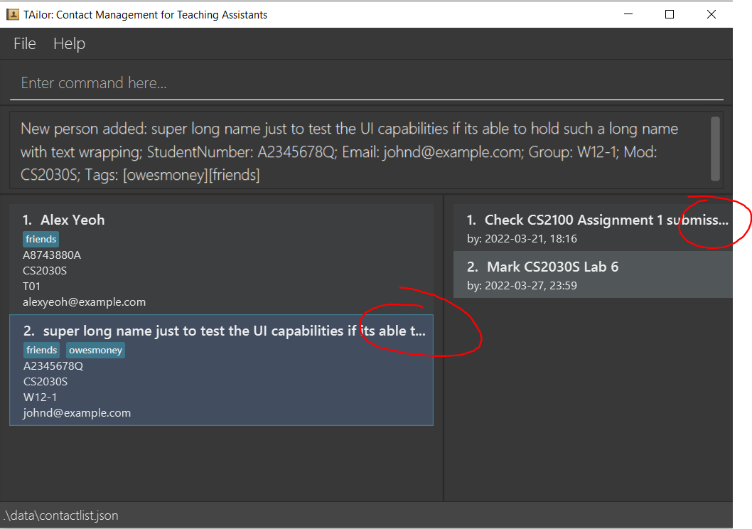
UI cutoff for certain elements
Description: Certain UI elements such as contact name and task name are cut off if window size is too small or names are too long
Steps to reproduce:
- Add a contact with a really long name
- resize UI to smallest
Screenshots:
[original: nus-cs2103-AY2122S2/pe-interim#3514] [original labels: severity.Low type.FunctionalityBug]
Their Response to the 'Original' Bug
[This is the team's response to the above 'original' bug]
Already stated in the User Guide that this can hinder usability and hence users should avoid putting in long names. Ie:
From newtask: There is no maximum length for the description, but using a long description may hinder usability and make it hard to see your tasks!
From add: If the entered student name has more than 50 characters, the entire name may not be displayed. A recommended usage is to use initials instead.
The given numbers as stated in the UG are meant as a suggestion, and it depends on the sizing of the window. Furthermore, CS2103T module website did mention about deliberate sabotage from extreme user behaviours.
These "issues" can be resolved by having the user resize the window to a larger window or even just entering a more succint description/name.
Hence: Either rejected or change to very low severity.
Items for the Tester to Verify
:question: Issue duplicate status
Team chose to mark this issue as a duplicate of another issue (as explained in the Team's response above)
- [ ] I disagree
Reason for disagreement: [replace this with your explanation]
:question: Issue response
Team chose [response.Rejected]
- [ ] I disagree
Reason for disagreement: [replace this with your explanation]
:question: Issue type
Team chose [type.FunctionalityBug]
Originally [type.FeatureFlaw]
- [ ] I disagree
Reason for disagreement: [replace this with your explanation]

Just Cosmetics