Team's Response
Hi,
Team TAilor would like to reject this bug.
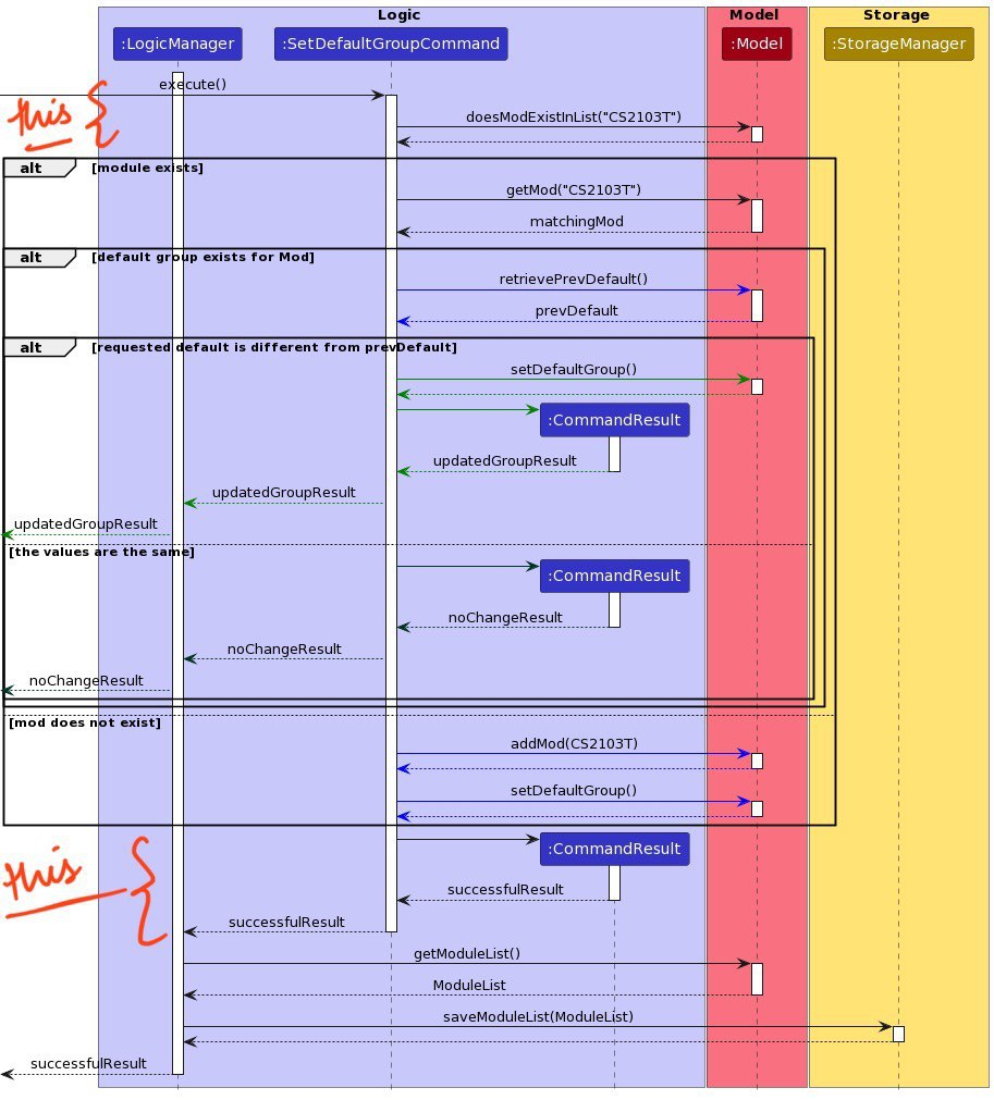
There has been an active effort made to simplify this image and what is left contained in this diagram is all necessary.
Firstly, all parsing information was extracted and placed into a separate sequence diagram as can be found in Fig 8 in the Developer Guide. The only parts of information that are in this diagram and not specific to the set-default-command are highlighted in the image below:

We can see that the proportion of common to command-specific information is extremely low so further abstraction there was tough and unnecessary to execute.
As for coming to the command-specific information, we agree that the nested if statements can be tough to look at but that is just an issue of automation that comes with using Plant UML. If the nested if statements were separated into another diagram, it would, unfortunately, still look equally clustered and 'hard to understand'.
Our website states: "(recommended: A sequence diagram should show internal interactions of at most one component i.e., treat other components as back boxes)."
As you can see, the creators of this diagram have stuck to that, there are inter-component interactions that cannot simply be omitted but the internal interactions are only elaborated (in minimal details) for the Logic Component. Function calls and value retrievals from other components are simply shown for the purpose of comprehensibility- no other details and workings are explored/depicted.
More active efforts were placed to make the diagram easier to understand. Differently coloured arrows were used per block to help make the relationships easier for the reader to observe and understand as well. The final storage section does not need simplification because they are simply 4 straight arrows with the text clearly displayed too. They only add to the length of the diagram and do not hinder the readability of the figure. Moreover, we made sure the image dimensions were not compromised; ultimately, the image takes up a considerable amount of space in the DG, is clear to understand, and zooming is always available for users who find they need:)
As such, we believe that after all the conscious efforts put into simplifying this figure, this is in its simplest, most comprehensive form. If they were to be broken down into multiple figures then the storage section would not hold much importance in solitary at all and would not achieve its purpose.
Yes, this is a clustered diagram (as a result of using Plant UML) but it has to be in order to deliver what we hope for it to do. We don't think it is a bug as it does not need fixing in our stance.
Items for the Tester to Verify
:question: Issue response
Team chose [response.Rejected]
- [ ] I disagree
Reason for disagreement: [replace this with your explanation]
This diagram is very hard to understand due to the many small details presented. Rather, should separate into several diagrams (for example)