 timpaul
commented
6 years ago
timpaul
commented
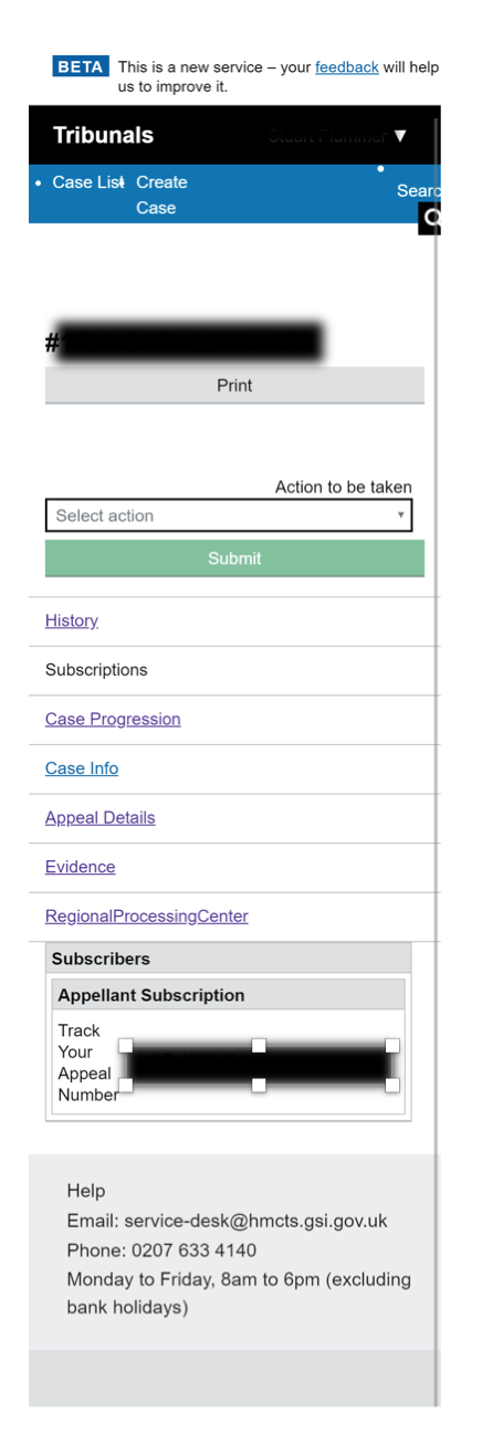
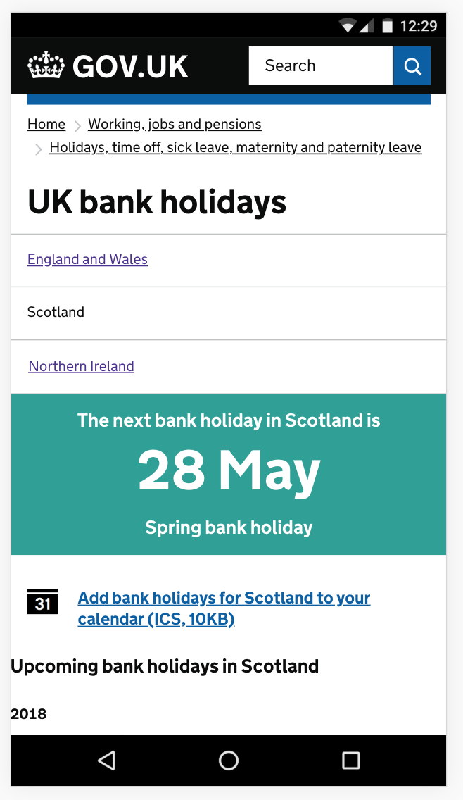
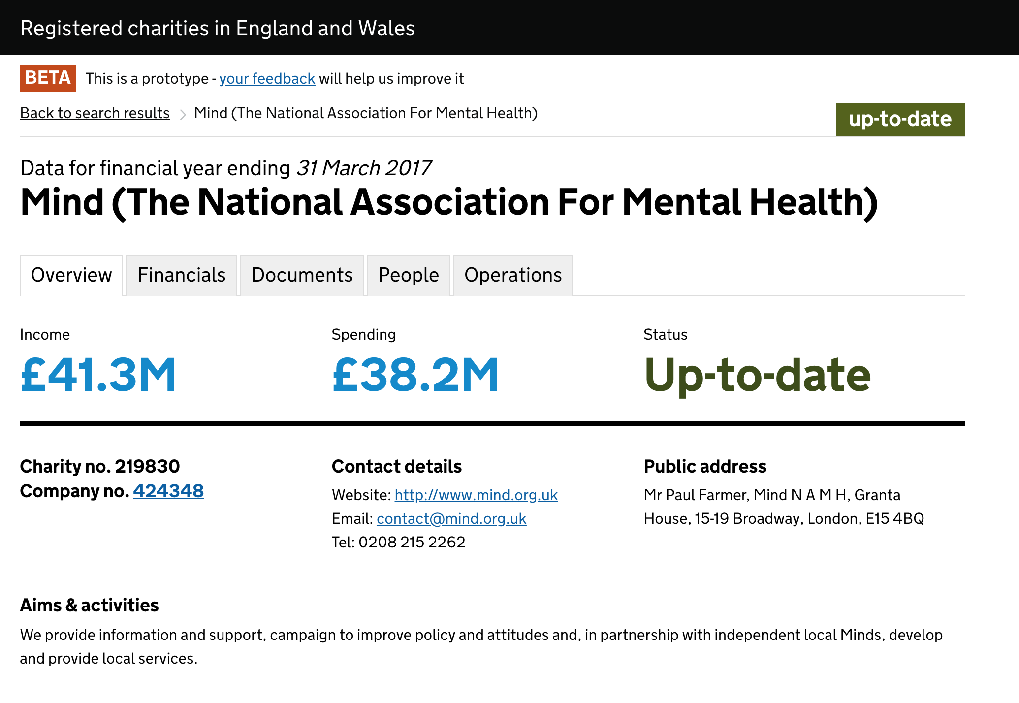
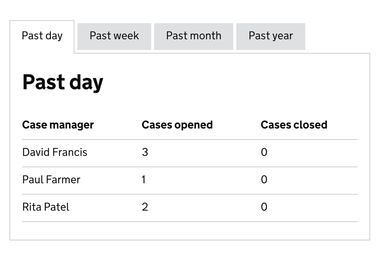
6 years ago @adamsilver and @trevorsaint have very kindly agreed to develop this component, using their work on tabs in the Reform pattern library. The Sass and JavaScript for their tab component is available on GitHub.
 joelanman
 adamsilver
 accessiblewebuk
 abbott567


 steven-borthwick
 jbuller
 ignaciaorellana
 alex-ju

 fofr
fofr


 36degrees
 detlevhfischer
 amyhupe
 dashouse
 dizzyack
 andymantell
 NickColley
 simon-westcott
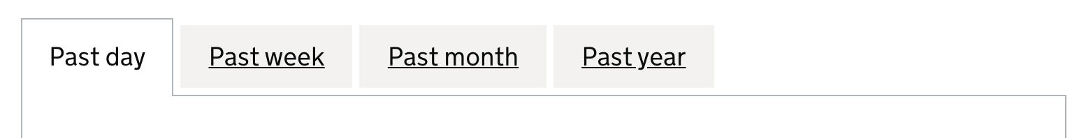
 armstrongb
 hopebristow
Tabs
Use this issue to discuss this pattern in the GOV.UK Design System.
Contributors
Related components
138 Tabbed navigation
Related links