 matthewrudy
commented
6 years ago
matthewrudy
commented
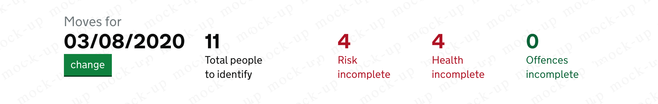
6 years ago I have a use case from a system used internally by HMPPS.
Previously implemented with gov.uk elements using the data class

I got it working by introducing a few new classes https://gist.github.com/matthewrudy/bc70462479a1e670ca88d4d254c6c1bc
Now looks likes
 Dean-A-Smith
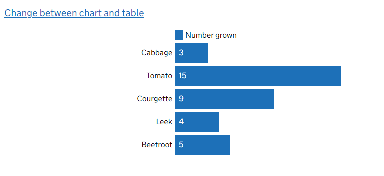
 alex-ju
 owenatgov
 lfdebrux
 petejobesdigitaldwp
 querkmachine
 asier-hmrc
What
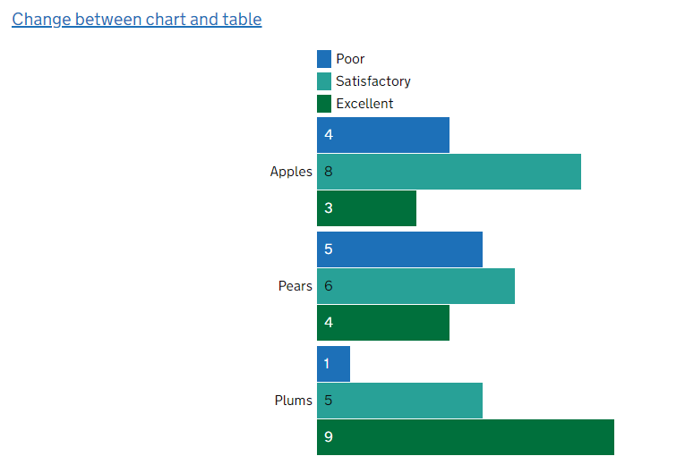
Styles for representing data in numbers, graphs, charts and diagrams.
Why
Anything else
You could to at reference in the issue on Dashboard page