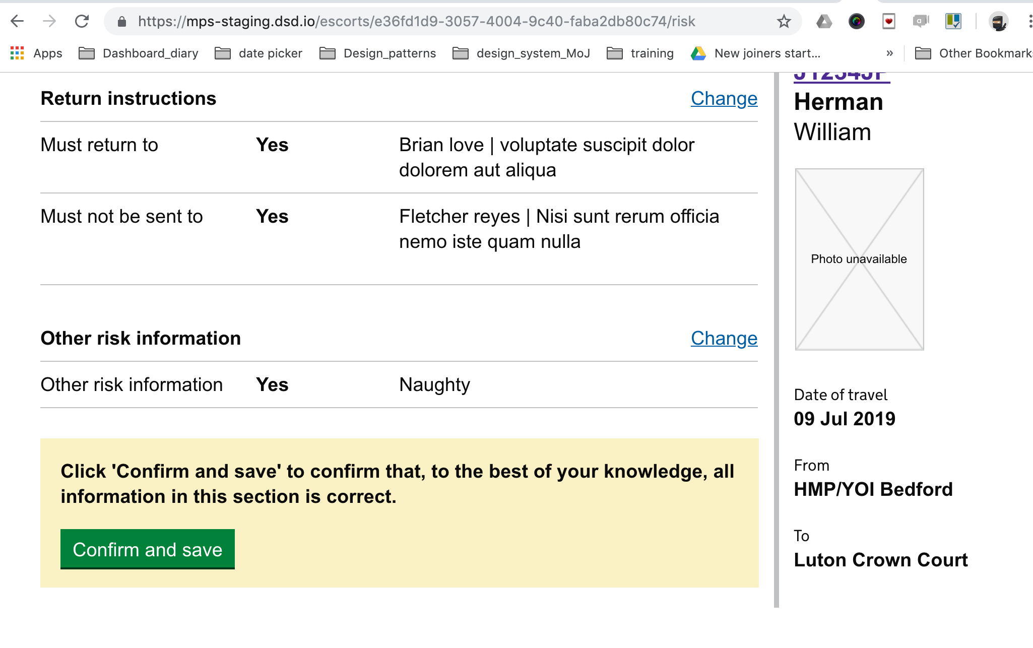
Open govuk-design-system opened 6 years ago
At HMRC we've come across the need for a submitter identity function within this pattern. That is, the need to know that the person submitting the information is the right person in the organisation. All the HMRC patterns we have currently assume that the person submitting has the right to declare. I wonder if this might be worth a variant?
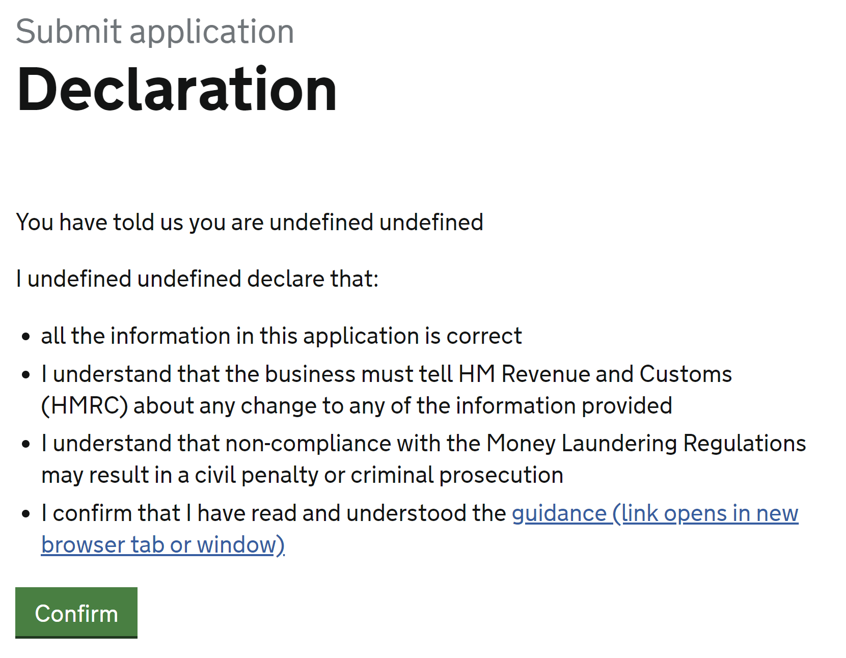
We are working on this variant in non-rep where we need to ensure the correct person is submitting. This is also the case for Fulfilment house and several gForms regimes as well such as VAT126 vat reclaim.
Is there any specific guidance around not linking people off from the declaration page? On Blue Badges we have a bullet point that we want included saying "you have read and understand the rules for using a Blue Badge". The original request was to have part of this text linking off to a PDF of guidance... This doesn't feel like a great idea. Especially as it's the last page before submission and there is a timeout on the service.
Any advice would be great, thanks!
@charge-valtech I agree that it is an odd time to take people out of a service, especially if it would take more than 15 minutes to read the guidance.
This has been a requirement for some HMRC services. I think giving the link makes sure someone would not have to find the guidance before making their declaration. Here is an example from 'Manage your anti-money laundering supervision'.
The link is to a topic page with 17 links that would take longer than 15 minutes to read and understand. See https://www.gov.uk/topic/business-tax/money-laundering-regulations
On 8th March 2019 the Design System team reviewed a Dropbox Paper document discussing the Declarations pattern.
The aim was to reduce the number of places containing guidance and code by:
Below is a record of the outcomes of that review.
If you need to, you can see the original Dropbox Paper content in the internet archive.
The draft guidance on Declarations has now been included with this issue and the Dropbox Paper copy has been archived.
Help users understand that the information they provide must be true, and what the consequences of providing false information are.
Use a declaration if there are significant consequences to the user if they provide false information whilst using your service.
Users don’t read long pages of +terms and conditions. If the consequences of making a false declaration are genuinely important then this should be communicated clearly and concisely.
If there’s a specific part of the service that carries the severe penalty (especially if it’s not something the user would expect) then explain the penalty at that point in the service.
In most cases, you should set out the consequences of making a false declaration - eg "If you deliberately give us false information, you could be fined up to £5,000". If you don't want to state the penalty (eg because it's really trivial), say something like "It's against the law to deliberately provide false information".
Don't cite legislation (no-one will read it). For example: "Providing false information is an offence under section 2(a) of the Financial Services and Markets Act 2000" is less effective than "Providing false information is a criminal offence. You could be fined or go to prison.”
It’s not clear that clicking on a checkbox carries any more legal weight than just having the user click a button.
There's some evidence that people have become so used to this technique that it no longer carries any significance, but more research is required.
There's some evidence that people are less likely to lie if they're reminded of the consequences before they start a transaction rather than at the end. You might want to consider this approach if the consequences are very severe. Keep it to a short simple statement though - don't link to or embed a long list of terms and conditions.
If you add a declaration to the end of a transaction, you must give people a means to go back and change the information they've provided. For this reason, the bottom of a 'Check your answers' page can be a good place to have a declaration.
If the consequences of making a false declaration are very severe, emphasising the declaration part of the transaction can reassure people that the service is taking them seriously. If your users are expressing reservations about completing a transaction because it doesn't feel 'important' enough, consider a signing ceremony.
For example:
Make it very clear which information is covered by the declaration. Signing ceremonies add extra work for people and may even put some user off the service. Only use them if you have evidence that they're helping. More about signing ceremonies.
Dan Ariely (author of 'Predictably Irrational') reports on various academic studies about honesty in his book "The Honest Truth about Dishonesty". It turns out that people are less likely to lie if they do the declaration at the beginning of the form, along the lines of "I promise that everything I write in this form will be accurate". He tried to persuade the IRS to put the declaration at the front, without success.
Should the full text of the declaration be visible, or is it acceptable for it to be available. Some services will have long +terms and conditions, and will typically include a line such as "you also agree to the terms and conditions", linking off to where they live.
Options for display of declaration text
The following appears at the bottom of the 'Check your answers' screen:
These ones don't have a checkbox.
Apply for legal aid
ePER (moving people safely)
Claim criminal injuries compensation declaration
Valuation Office Agency, Rent and lease details (RALD) form
None of the examples show an error message. What do people think of "Select if you agree to the declaration"?
On the Apply for a Divorce project we used a declaration at the bottom of the Check Your Answers page. A few things we learnt:
The 'Statement of Truth'
I believe that the facts stated in this application are true
This exact wording is required by all services in the HMCTS Reform programme. It is a standard text used in all sorts of legal contexts - sometimes minor variants eg 'I believe that the facts stated in this witness statement...' etc. In other work I've tried to nudge legal stakeholders toward this wording (at least as a starting point) since there's a precedent for using it in other services and users understood what it meant.
Has anyone done any work on error messaging for declarations where there is a compulsory check box used? For our service, we felt that users needed to manually confirm their consent, instead of just clicking a CTA, as it drove up compliance (non compliance could result in suspension of licences or large fines-DVSA lorry permits), and I know several services use it successfully.
The error message we use is: "Select if you agree to the declaration". I'd like to know what others use.
Hi Gemma -
If you've got some data on how much difference the check box makes, would you mind posting it here - or sharing it directly, if you prefer? For example, rates of compliance if the checkbox is used compared to rates if it's not used.
For the error message, I'd try something like "Agree to [the thing] to continue" or "Agree to [the thing] to finish your application".
Thanks, I will try. However, because it's an EU exit project, it won't be going into public beta until September-but I will feed back when I can!
Gemma.
On Fri, 20 Mar 2020 at 11:29, StephenGill notifications@github.com wrote:
Hi Gemma -
If you've got some data on how much difference the check box makes, would you mind posting it here - or sharing it directly, if you prefer? For example, rates of compliance if the checkbox is used compared to rates if it's not used.
For the error message, I'd try something like "Agree to [the thing] to continue" or "Agree to [the thing] to finish your application".
— You are receiving this because you commented. Reply to this email directly, view it on GitHub https://github.com/alphagov/govuk-design-system-backlog/issues/29#issuecomment-601653228, or unsubscribe https://github.com/notifications/unsubscribe-auth/AO4H5RK3DI63AECSL3I7NITRINHQPANCNFSM4ELRG2DA .
-- Gemma Stanaway Content Designer | Delivery Centre Telford | HMRC
What
Help users tell you that they've understood or agree to something.
Why
This is used on many government services including:
Anything else