 simonwhatley
commented
4 years ago
simonwhatley
commented
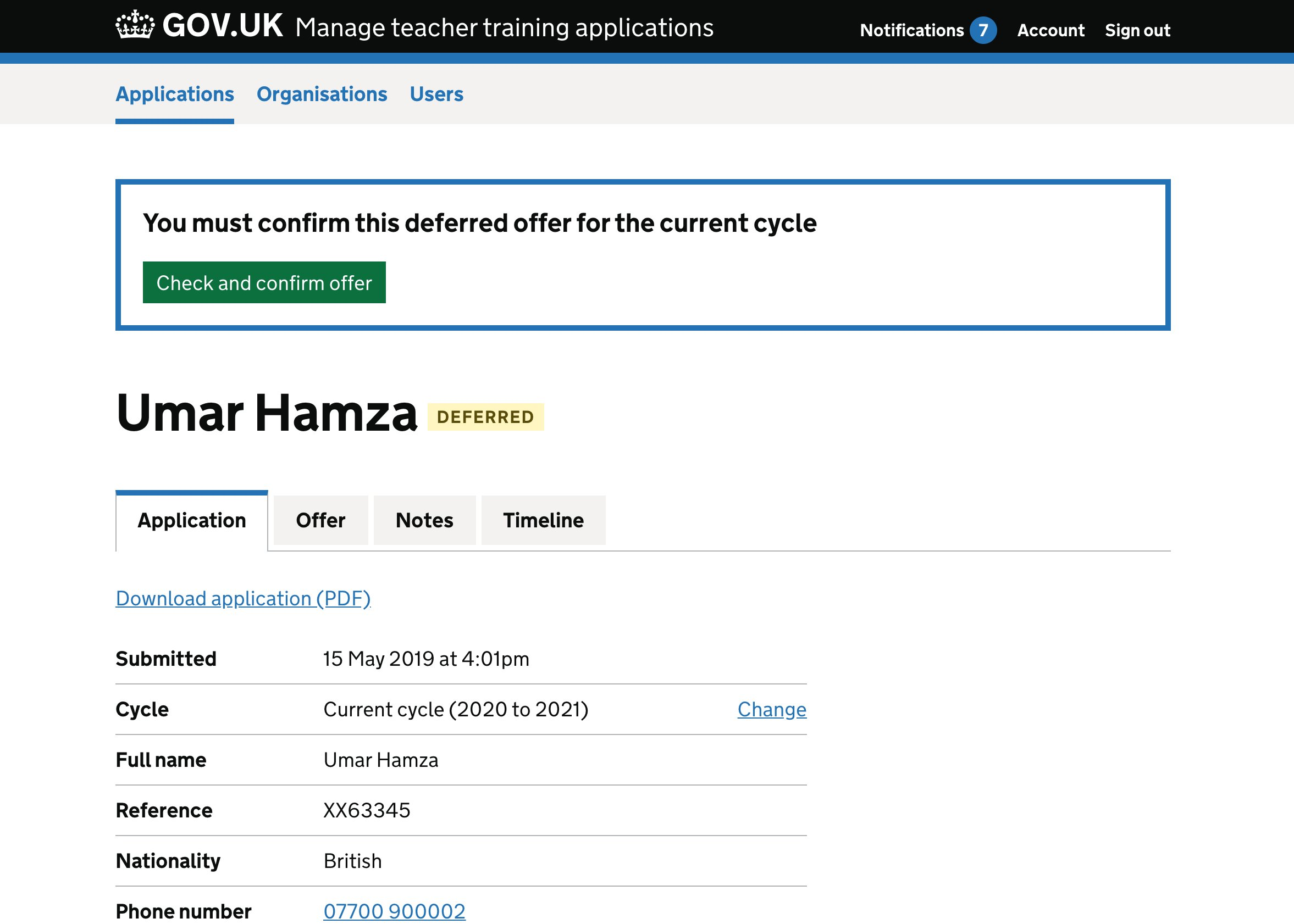
4 years ago At the time of writing, this page has two types of banners: Brexit/transition and 'national applicability' (a.k.a. excluded nations)
https://www.gov.uk/guidance/pet-travel-to-europe-after-brexit
Brexit / transition

National applicability (a.k.a. excluded nations)

We also have 'withdrawn' notices on GOV.UK, and 'history mode' that relates to policies from a previous government. For example, this page has both:
Withdrawn notice

History mode

 timpaul
 vickytnz
 adamsilver


 edwardhorsford
 mgifford
 mviegasb
 hannalaakso
 selfthinker
 joelanman
 christopherthomasdesign


 vanitabarrett

 CharlotteDowns
 neil-holroyd
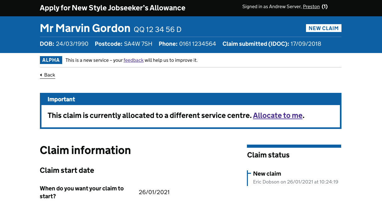
 RosieClayton
 First important Banner
The first important banner was seen and referred to as 'covid message'
First important Banner
The first important banner was seen and referred to as 'covid message'  Success Banner (which appeared above the first important banner when users added healthcare professional details)
 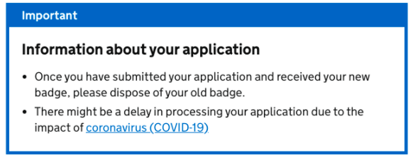 Second Important banner
  markhemsux
 .
. dominichurst-ur
 andrewhick
 LGrace8
 realitydust
Also known as: alert
What
An on-screen alert to notify users that something important has happened.
For example:
Why
Anything else