 ignaciaorellana
commented
6 years ago
ignaciaorellana
commented
6 years ago I had a chat with @hannalaakso and the example component is also referenced in the Timeout warning. We recommend for now to look at both issues in the backlog.
Open govuk-design-system opened 6 years ago
ignaciaorellana
commented
6 years ago I had a chat with @hannalaakso and the example component is also referenced in the Timeout warning. We recommend for now to look at both issues in the backlog.
 owenm6
commented
6 years ago
owenm6
commented
6 years ago We have updated our guidance which makes it clear to avoid modals in most cases. Timeout is one of the few cases where a modal is appropriate - https://home-office-digital-patterns.herokuapp.com/patterns/modal
 hannalaakso
commented
6 years ago
hannalaakso
commented
6 years ago Here's our draft accessibility criteria for modal dialogs: https://gist.github.com/hannalaakso/2641fc16d2158e60d551cd9da960b5da
Here's a Dropbox paper article that discusses Modal dialogs: https://paper.dropbox.com/doc/Modal-dialog-boxes-jbsTPoITg37IIc6ybjetM
 davidolsan
commented
5 years ago
davidolsan
commented
5 years ago The editable modal for backend admin course management

The modal window used by providers to enter/edit their course information while staying on the course list page.
 kr8n3r
commented
5 years ago
kr8n3r
commented
5 years ago accessibility review of native dialog
https://www.scottohara.me/blog/2019/03/05/open-dialog.html
tldr; I’m just going to say right now that the dialog element and its polyfill are not suitable for use in production.
 soniaturcotte
commented
5 years ago
soniaturcotte
commented
5 years ago We use a modal on Content Publisher for inserting particular markdown (inline images/attachments) into the body textarea.
There were two main reasons that we chose a modal instead of going to another page
Example of the modal: https://govuk-publishing-components.herokuapp.com/component-guide/modal_dialogue
 colinrotherham
commented
4 years ago
colinrotherham
commented
4 years ago We're about to test a modal dialogue to meet WCAG 2.1 Guideline 2.2 Enough Time.

All public services with session timeouts of less than 20 hours should be doing something similar, otherwise they're not meeting this bit of WCAG 2.1 here:
Success Criterion 2.2.1 Timing Adjustable https://www.w3.org/WAI/WCAG21/Understanding/timing-adjustable.html If a session is discarded after less than 20 hours, we must provide the facility to either:
- Turn off the timeout
- Adjust the timeout via a setting (make it longer)
- Offer to extend the timeout with at least 20 seconds notice
We'd be happy to contribute our component if it tests well.
Lots of work has been done by @alex-ju already:
https://components.publishing.service.gov.uk/component-guide/modal_dialogue
Initially we're trying the alertdialog ARIA role.
This applies to https://github.com/alphagov/govuk-design-system-backlog/issues/104 (Timeout warning) as well.
 edwardhorsford
commented
4 years ago
edwardhorsford
commented
4 years ago @colinrotherham is that 'Resume application' button active or are you using different button styles for this?
colinrotherham
commented
4 years ago @edwardhorsford It's focussed due to the guidance on the alertdialog ARIA role:
Unlike regular alerts, an alert dialog must have at least one focusable control and focus must be moved to that control when the alert dialog appears. Generally alert dialogs have at least a Confirmation, Close or Cancel button that can be used to move focus to.
We'll need further testing to confirm if this bit is correctly implemented:
When the alert dialog is correctly labeled and focus is moved to a control inside the dialog, screen readers should announce the dialog's accessible role, name and optionally description before announcing the focused element.
 joelanman
commented
4 years ago
joelanman
commented
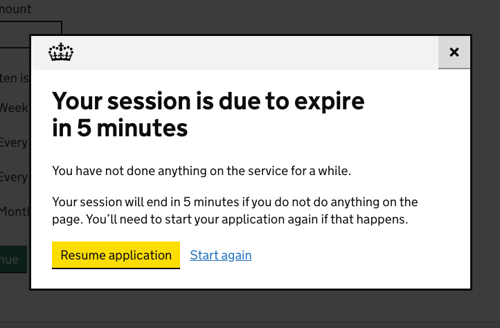
4 years ago @colinrotherham The screenshot says the session is due to expire in 5 minutes, and then that your session will end in 20 seconds, is that a bug? Would the content update in realtime?
edwardhorsford
commented
4 years ago @colinrotherham hmm, interesting! I might raise this on the button issue -it feels funny to land on a page with a yellow button when you've not actively focussed it.
colinrotherham
commented
4 years ago @joelanman It's a typo of mine, we fixed it for the user research session! We did look at realtime countdowns, and will hopefully follow up with further research (screenshot updated).
Other solutions are very "chatty" for screen readers when it counts down every second.
edwardhorsford
commented
4 years ago @joelanman It's a typo of mine, we fixed it for the user research session! We did look at realtime countdowns, and will hopefully follow up with further research (screenshot updated).
Other solutions are very "chatty" for screen readers when it counts down every second.
@colinrotherham I think the version I worked on with Alex announced every 30 seconds from 5 mins to 60seconds, then was faster after that.
colinrotherham
commented
4 years ago @edwardhorsford Yeah that’s our current plan. User testing showed one person expected a countdown.
colinrotherham
commented
4 years ago Hi @hannalaakso I've put an early demo here: https://modal-dialogue.glitch.me/
Wait 5 seconds and a alertdialog modal with focus-wrapping will open.
So far tested in Chrome, Firefox, Edge and IE9 – IE11. I'll need some polyfills adding to improve IE8 support.
Aiming to meet the principles discussed here: https://gist.github.com/hannalaakso/2641fc16d2158e60d551cd9da960b5da
All the source is loaded into glitch.me too 😊

Using the <dialog> component we've found lots of issues with .showModal() especially in Chrome (doesn't adjust layout on resize) and it didn't play nice with page scroll-locking.
We've worked around these and created a govukModalDialogue() component for our demo, should you want to follow a similar pattern and add this to GOV.UK Frontend.
This largely builds on the fab work of @alex-ju! https://components.publishing.service.gov.uk/component-guide/modal_dialogue
Would love to hear your thoughts.
What did you mean by point 7) about preventing search?
- Prevent user searching in the underlying page.
We can achieve scroll locking in most browsers, but looks like an event.preventDefault() touch event hack is required for iOS to achieve the same in mobile Safari—did you look into this too?
- Prevent scrolling of the underlying page
Also specifically for https://github.com/alphagov/govuk-design-system-backlog/issues/104 we'll look to make the text countdown (slowly at first) with aria-live in another iteration.
 alex-ju
commented
4 years ago
alex-ju
commented
4 years ago This largely builds on the fab work of @alex-ju! https://components.publishing.service.gov.uk/component-guide/modal_dialogue
Just to make sure the credits are given to the right people. The modal component above is a result of a twisted but apparently successful story of a prototype build by @hannalaakso and @edwardhorsford while we were working in the "Patterns and Tools team", which generated a lot of useful insights that were used a year later to inform the development of modal for Content Publisher designed by @soniaturcotte and implemented by me - although it could've been anyone from GDS doing the same work - and iterated based on user research.
Bottom line - I'm really happy to see a crystallised component as an outcome of shared work, insights and research.
colinrotherham
commented
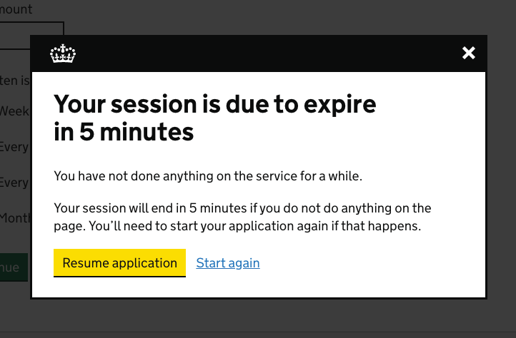
4 years ago Updated our prototype with the header + close button bar from GOV.UK Component Guide.
We did prototype a "light" version but stuck with the dark UI as it's already in use.
@hannalaakso Would you be interested in this becoming a Design System component? We've got more testing to come of course.
hannalaakso
commented
4 years ago @FeyAgape, @Ash-Wilson and @colinrotherham have kindly offered to develop this into a component for the GOV.UK Design System 🎉
hannalaakso
commented
4 years ago In addition to meeting the Design System contribution criteria, we have agreed that this component will meet the following criteria:
The contributor must:
The modal component must:
The component guidance (example of guidance) must:
The modal component must:
Where multiple modals are open, above criteria apply to top-most one.
 mattandrews
commented
4 years ago
mattandrews
commented
4 years ago Just wanted to jump in here to say we're planning to use this component on https://www.tnlcommunityfund.org.uk – we have a session timeout which we want to warn users about and hoped there'd be an existing GDS pattern!
I took the code from the repo here and modified it a little for our purposes – one change which might be useful generally is something to close any existing modals when opening a new one? In our case we show one modal to warn the timeout is approaching, then a second one to tell the user they've been logged out. I added some code here for a basic implementation of this, plus some changes to allow for dialogs without close buttons. Thank you for the hard work here everyone – we'll keep an eye on this component if/when it becomes an official part of the Design System!
 ellabishop
commented
2 years ago
ellabishop
commented
2 years ago Thought I should add in how we have been using this component in our service but in a slightly different way to the time out. We are using a modal dialogue on the 'Conduct a video appointment' service in DWP to confirm that a staff member wants to end the appointment. We went with this as we don't want them to move away from this screen. From the attendees point of view the appointment is still going until they confirm by selecting the 'end appointment' button. Although focus remains within the modal, the live video can still be seen and heard behind it.
The end button in the appointment can be seen as a destructive button, as once confirmed, none of the participants can get back into the call, so we have followed some of the guidelines set out here: https://www.nngroup.com/articles/confirmation-dialog/
This service has been used by Universal Credit work coaches for a while now with no issues reported. I've attached a screenshot from our prototype:
 hannalaakso
commented
2 years ago
hannalaakso
commented
2 years ago Just wanted to update on the work that was mentioned in https://github.com/alphagov/govuk-design-system-backlog/issues/30#issuecomment-553930704 - that work was started in https://github.com/alphagov/govuk-frontend/pull/1668.
But as was noted in https://github.com/alphagov/govuk-frontend/pull/1668#issuecomment-787948275, there are currently some other issues that are blocking this work. We plan to address those blocking issues as part of some upcoming work.
 lucilleharvey
commented
2 years ago
lucilleharvey
commented
2 years ago We've decided to use the modal dialog in a system we are developing for DfT. Our users complete a complicated reconciliation process to ensure numbers from different sources 'balance'. Users input data and need to reconcile this against counterpart data entered by other parties. These numbers refer to how much duty fuel suppliers have paid on their fuel and therefore how much fuel is counted under the RTF Order. These numbers have to balance and some entries need to be approved to allow users to complete the next stage of the process.
There can be a lot of data that is relevant when users go through this process. They can add in an ‘adjustment' which is a value and a given reason for why their numbers do not balance. It was important for these users to have the existing data still visible, to provide context around their data entry, whilst adding these adjustments.
We have also implemented this for a messaging feature within a modal dialog (https://design-patterns.service.justice.gov.uk/components/messages/). Our users need to query or discuss these entries with DfT approvers. It was important that this was done with the visible context of what the message was concerning, to reduce reliance on memory if directed to another screen.
This component was tested as part of our private beta testing. Our users were able to successfully use the component and use the contextual information on the screen behind to complete their tasks. It reduced cognitive load for participants as meant they could read the relevant data on the main screen to help inform the data they needed to enter, so they were not solely reliant on memory.
Users also commented that they liked the features being on the same screen which they were working on. They appreciated being able to complete all their tasks, adding data, and making comments from one screen.
We did encounter one usability issue for the messaging modal. We had both the 'add' and 'close' buttons next to each other at the bottom of the modal. One user typed out a full message and accidentally clicked close, thinking their message had already been saved and they could close the modal. This deleted their entire message. We plan to iterate and move the close button to the top of the modal


 selfthinker
commented
1 year ago
selfthinker
commented
1 year ago I've been investigating an issue with the modal window in the search on GOV.UK (which opens when you click 'Filter' when in mobile view). I thought I'd share because this will affect lots of other modal windows (including the one in the ARIA Authoring Practices Guide).
It turns out that neither VoiceOver on iOS nor TalkBack on Android support aria-modal. That means that when using mobile screen readers the virtual focus is not kept in the modal window and you can swipe past it through the rest of the page behind it.
This can be avoided by polyfilling aria-modal and properly hiding the rest of the page (via display: none or aria-hidden), but that's not always possible when the code for the modal is in the middle of the page (as it is on the search page).
(I've also shared this in #104.)
Also known as: Modal window, pop-up
What
A pop up window that appears over the current page and requires interaction before the user can proceed.
Why
Services using this pattern:
Anything else