Open govuk-design-system opened 6 years ago
We currently have accessible autocomplete and "country picker" prototypes.
Country picker consumes both accessible autocomplete and picker engine through npm
. The latter contains the sorting and synonyms functionality.
Feedback from @edwardhorsford suggests that the sorting and synonym logic in the picker engine is particularly coupled up with the country data and should stay as its own entity. Additionally, the picker engine has a jQuery dependency in Twitter's Bloodhound that it consumes.
We should therefore build the sorting and synonyms logic separately in accessible autocomplete.
We could look at the picker engine sorting functionality for ideas for sorting. It:
Each of these gives a score - we then sort by score by using a score, we can also have biases on some entries - which multiply the score this means that an entry with a bias of 2x (eg UK) will rise in the rankings, but not necessarily to the top, if it was only a very low score to begin with (thanks Ed!)
Here's an example (thanks Ed!) of what the current autocomplete without sorting logic does (only sorts alphabetically):
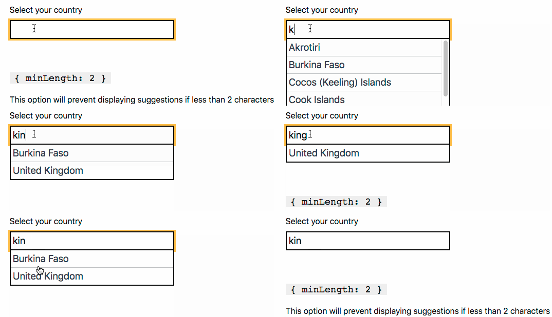
The example doesn't show synonyms but if we had them, it would make sense to rank canonical names higher than (potentially obscure) synonyms.
We should also test that the country picker that consumes accessible autocomplete remains functional.
Features to discuss are:
We could also consider deprecating some existing functionality in accessible autocomplete (and potentially bring some of it back in at a later point):
@frankieroberto has built a government organisation autocomplete that uses the accessible autocomplete and accepts alternative names.
The TEN prototype contains a simple example of synonym matching.
The current autocomplete imports Preact which is an alternative React, a library for building interactive UIs, and extends the Preact events.
If we were to switch to not using a JavaScript framework, we could give ourselves an awful lot of work to solve the problem of managing interactivity and state that has already been solved well in Preact. As Preact is only 3kb in weight and supports Progressive Enhancement (so that if the browser doesn't run JavaScript the user is presented with the native select
element), it would seem sensible to continue using it.
My 2 cents:
I think an MVP should be as minimal as possible while giving value.
I think the results algorithm should be plug-in able if possible, so people can write their own if needed, or extend the default.
I think we need sorting, as otherwise very unexpected results can happen as seen in the gif in the comment above.
I don't think we need synonyms, weighting or typo fixing for an MVP - not all autocomplete use cases will need them.
Not sure why we would remove functionality that exists, unless there's a reason for removing them?
The deprecation suggestion was due to the fact that at the moment we are getting issues raised for things like the autocomplete not working with the latest version of React. It's good to support React if there's a need but as we're still trying to move out of the prototype phase I think we should probably focus our efforts for now on getting the core product working.
Have there been any updates / recommendations on this? We've integrated autocomplete using jQuery UI due to a number of technical limitations. Bit of a write up below:
We looked at GDS's accessible autocomplete but limitations prevented us from using it. Due to the fact that the dataset being called on was dynamic we couldn't rely on the GDS default which is designed to work with pre-defined data sets (for example countries). We instead are making a call to our search service as the user types which ultimately meant we had to use a different library, jquery UI.
jquery UI Autocomplete: https://jqueryui.com/autocomplete/
The use of jquery UI was tested over multiple rounds of end to end accessibility testing and no issues were flagged. For those users who do not have javascript enabled the suggestions simply did not appear, this did not massively inhibit the use of the search function at all though.
Overall engagement with our version of autocomplete has been higher than expected. The following shows a comparison of those who performed a search vs those who interacted with autocomplete whilst doing so.
Interacted with search: 19687 Used autocomplete suggestion: 5375
That's 27.3% of users engaging with autocomplete
Hi, @ashleyanderton thanks for your comment, and for sharing your research.
The GDS Accessible Autocomplete can be used with a dynamic dataset, using the source
option. You can provide a function which can query your dynamic dataset and return results.
There's documentation and an example of a custom source
function here: https://github.com/alphagov/accessible-autocomplete#source
Let me know if you try it and get any problems.
Cheers @joelanman looks like this has been updated since we last investigated! (We integrated this almost a year ago now).
Good news though, we'll look to integrate Accessible Autocomplete and let you know how we get on.
Hi @joelanman , I work with @ashleyanderton and we have now integrated the accessible autocomplete and we are pulling in from a dynamic source with no problem,
The only issue/concern is that the input box is autogenerated by the library, are there any plans to allow the users to specify an existing input box?
I can appreciate that if JS disabled the autocomplete functionally would not work but we still need the input box as it would serve more than one purpose, in our case we use the input box value to run a search on a server.
Hi @trevorkapswarah
Glad you've got it working. Is the issue you reported that you can currently progressively enhance only <select>
elements whereas you need to progressively enhance <input type="text">
(as your list of options is too large to include in a select)?
Progressively enhancing an input was always something we planned for. My (now foggy) memory suggests there was some issue with IDs or something that prevented us doing it at the time - it would be good if it could be looked at though for services which need to be able to support users providing answers that can't be known in advance.
Hi @hannalaakso
Thanks for the response.
We would like to manually add an input element in our view markup and then bind that input element to the GDS autocomplete functionality.
<label for="my-autocomplete">GDS Accessibility Search</label>
<div id="my-autocomplete-container"></div>
We are happy with the other config options used on initialising the library functionality and can specify properties for the input box generated by the library.
@edwardhorsford yes it would be ideal for progressive enhancement of an existing input element
Thanks @trevorkapswarah.
It looks like this issue has been raised previously as well: https://github.com/alphagov/accessible-autocomplete/issues/213
Would you be okay to comment on that issue with your use case and requirements? 🙏
DfE Apply for teacher training has used this component really successfully and it has tested well in an accessibility audit ran by DAC 10 December 2019.
During their audit, they specifically praised this component (which doesn't surprise me as it's so hard to get right).
But one tester struggled to type their nationality, ‘British’, into the box and wanted the ability to select it from a list like a traditional select box.
I know that the Autocomplete component can be configured such that an arrow appears and the user can reveal all the options but @edwardhorsford also told me that enabling this feature caused many users to select from the list instead of typing because they weren't aware the autocomplete behaviour existed.
So it appears we're in a bit of a rock and hard place:
I wonder if this component needs different visual treatment to signify that this is a special type of component, different to a select box and and text box.
Currently using the autocomplete in a DfT system for users to apply for training funding. The autocomplete suggests all the items in the source and has tested well with users.
One use case, which was also questioned in a GDS beta assessment, was what happens if the item is not in the list? Currently there is no way to capture the user entered text if it is not in the source list.
We took the, not ideal, option of altering the JS to output a value into an attribute:
Is it possible to capture the user text, if it is not in the source list ,in a proper attribute? It might be a use case outside of the intended functionality but it would prevent altering the component which causes a maintenance overhead.
We're using this pattern on the Report wreck material service (Maritime & Coastguard Agency) and it's quite an interesting use case where this pattern has been very useful.
We've used it to consistently capture information about a shipwrecked vessel, which seems simple on the face of it but actually has some complications. The name of a shipwreck can be a known vessel name (hence the autocomplete) but if the name is not known then often communities make up names, such as 'bottle wreck' (because there were lots of bottles found on it). Even where the vessel name is known, it's not always simple as multiple ships can have the same name. This means the construction and sunk year are often very important too.
In terms of processing, autocomplete is important to ensure we're not getting multiple spellings of the same vessel and to ensure reports from the same vessel are linked together to aid in dealing with the reports.
Our solution includes the construction and sunk years alongside the vessel name in the autocomplete:
On selection of a vessel within the autocomplete, we automatically populate the construction and sunk year fields too:
We do this through an onConfirm handler within the accessible autocomplete options:
onConfirm: function onConfirm(val) {
if (val && val.constructed) {
document.getElementById('wreck-construction-year').value = val.constructed;
}
if (val && val.sunk) {
document.getElementById('wreck-sunk-year').value = val.sunk;
}
}
So far our user research suggests this solution works well for our use case.
Our user research on a DLUHC project where users are selecting organisations from a long list has revealed problems where some users are looking at their keyboard as they type, and do not notice that the suggestions are being made. This causes users to miss the correct names if they mis-spell them, and also causes confusion when a user submits the form without having selected a valid value (because they've typed an invalid value in the textbox and they miss the "no results found" indicator).
I can't find any other experiences like this in the comments above, though! Has anyone encountered these problems? Has anyone tried anything to make it clearer to the user?
So far we are expecting to rely on form validation after submission to force users to re-examine invalid data entry, but we'd rather change the experience ahead of submission if possible.
Our user research on a DLUHC project where users are selecting organisations from a long list has revealed problems where some users are looking at their keyboard as they type, and do not notice that the suggestions are being made.
This is pretty common I think - I've seen this happen in usability research too.
There’s a few things I've done to try and mitigate this.
If users are required to select one of the options in your list (ie they can't type in an 'other' option) then I think it might be better to style the autocomplete more like the default dropdown/select component that users likely recognise, with a down-pointing arrow on the right. This can help to convey to users that they need to select from a list. The downside to this is that more users may try to only use the mouse or keyboard to scroll through the whole list, rather than typing in some letters to filter the list first. However if they notice the blinking text cursor that may help. You could also consider using the hint text to explain that the options can be searched by typing (but users may miss this too). However, depending on the length of your list, it may be better to have some users needlessly scroll the whole list (missing the search feature) than to have some users typing in and missing the suggestions.
I've started exploring this option within this draft pull request called Select with search
On the other hand, if users don't have to select from the list, and can type in their own answer, then it might be better not to have a down pointing arrow, as that can cause users to select a 'closest match' answer, unaware that they can type in their own answer. In this scenario, I've explored displaying the suggestions list with a small gap below the input box, and an explicit 'Suggestions' header, in order to try and make it clearer that these are suggestions rather than an exhaustive list (like a dropdown).
You can see an example of this in a draft pull request called Input with suggestions. The component also supports 'synonyms', so you could add common misspellings and abbreviations to try and improve the matches.
Both of those are work-in-progress adaptations of the existing accessible autocomplete. I have been using a version of 'Input with suggestions' in a live service though, and it has tested pretty well.
Let me know if you have any questions, or find any of these ideas helpful!
@nick-golding-softwire @frankieroberto
I've seen this constantly. Lots of people look at the keyboard when they are typing, and only look up or at the letters on screen when they consider that their input is finished. It's very common for people who are less used to working with computers, less confident in their typing skills, or who have motor control or tremor.
I've always thought (and, I think, boringly mentioned) that this is a fundamental problem with autocomplete. I don't have an issue with offering autocomplete as an additional thing for the people who can benefit from it - which I accept, is probably the majority - but I definitely believe that autocomplete must been seen as an optional extra and not the only route towards successful completion of a service.
You can't make the presence of an onscreen bit of help more available to the user when they're not looking at the screen.
Instead, think about the conversation you're having with the user. For example, if they type (sometimes laboriously) a wrong name into the box, make the next step in the conversation something like:
"We couldn't find an exact match to your answer
Sri Crhistohper Wern
But we do have these answers that might be close, is any of them correct: ( ) Sir Canteloupe Banana ( ) Sir Christopher Wren ( ) Christopher Columbus ( ) None of these are correct, I'll try again
HInt: if you are trying again, try just typing in the first five or six letters and we will try to guess the rest. "
Thanks both. Our situation is definitely the first of the two @frankieroberto mentioned - i.e. they must select a value from an existing (non-editable) list - so perhaps that "Select with search" alternative might help. I agree @cjforms that having some useful validation after the fact will also help.
@nick-golding-softwire what you describe is very common. It's natural that some people won't see the autocomplete suggestions. However if the text is close you can often still match it on the server.
A few thoughts:
suggestion_synonyms
in the autocomplete to suggest items. But we'll also compare the string with the name and the match_synonyms on the server side to match items. This means users can type either form and it doesn't matter - we'll still match to the right thing.I'd be wary of styling the autocomplete as a dropdown unless it's a short list. I've round in research that styling this way will stop users searching the vast majority of the time. So long lists are cumbersome and any work you've done with synonyms won't help. But for short lists it's one to consider.
I've also blogged a bit on improvements my team has made to the autocompletes (that you could steal).
Improvements to our autocompletes Using analytics to understand where our autocompletes could be improved
Thanks @edwardhorsford those are useful suggestions and observations. I'll digest all this with the team and we'll test some of these options out.
We’ve chosen to prioritise ‘Autocomplete’ as one of our Upcoming components and patterns.
If you’d like to help, join the GitHub discussion page for Autocomplete. We’ve created it to make it easier for the community to discuss issues and options.
We've just added some guidance on how to 'share findings about your users' with us 📝. This will help us learn more about how your users autocomplete within your service.
Hello, we've come up against a usability issue with the autocomplete component in the service I'm working on. When used on an optional field, since the field is optional there is no validation included so therefore if the user types something into the autocomplete but no suggestions are found then they can still continue thinking the answer they have typed is valid. The problem comes at the CYA page the user cannot see what they typed because it wasn't on the predefined list. Has anyone come up against a similar issue? Thanks!
If the field is option, but the user typed something in and that something was not a match, then I think it should show an error.
agree with Adam, plus you might want to consider using the showAllOptions
parameter, which conveys you have to pick from a list
https://alphagov.github.io/accessible-autocomplete/examples/#tt-showNoOptionsFound
What
A text input that suggests options to the user as they type.
Why
Anything else