 36degrees
commented
6 years ago
36degrees
commented
6 years ago Now that the error messages we present use a simpler more instructional language, I think we are relying slightly more on the visual presentation of the error message to help the user understand that they have 'done something wrong'.
Thinking specifically about the way that a screen-reader user would encounter an error message:
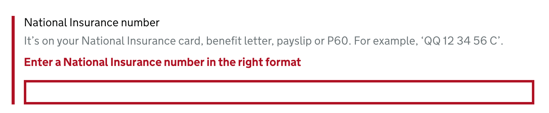
National Insurance number, text field. It’s on your National Insurance card, benefit letter, payslip or P60. For example, ‘QQ 12 34 56 C’. Enter a National Insurance number in the right format. You are currently inside a text field. To enter text in this field, type.
I don't think it's entirely clear that "Enter a National Insurance number in the right format" is being included here as an error - because the red and bold visual presentation is missing. We (hopefully) have the error summary at the top of the page, but I wonder if it is also worth adding a visually hidden "Error:" prefix to the error message:
National Insurance number, text field. It’s on your National Insurance card, benefit letter, payslip or P60. For example, ‘QQ 12 34 56 C’. Error: Enter a National Insurance number in the right format. You are currently inside a text field. To enter text in this field, type.
Thoughts?
 stevenaproctor
 maya
maya
 dashouse

 timpaul
 StephenGill
 gazjoy
 jfhector
 penx
penx GrilloPress
 joelanman
 adamsilver
 murfious
 CSTDev
 terrysimpson99
 jonathaninch
 LauraYoung258
 NickColley
 TJFDM
TJFDM paulwaitehomeoffice
 hannalaakso
 emma-cuthbert
 querkmachine
 SarahMFisher
 JillRichardsonPratt
 chrisclarknhsnet
 connorgurney
 martinbabic2
 hashmat-arshad
Use this issue to discuss this component in the GOV.UK Design System.