 amyhupe
commented
5 years ago
amyhupe
commented
5 years ago Dropbox Paper audit
On 15 October 2018 the Design System team reviewed a Dropbox Paper document called Create a password.
The aim was to reduce the number of places containing guidance and code by:
- migrating relevant, useful content into the Design System itself
- recording important research findings in the community backlog
- removing the original Dropbox Paper page
Below is a record of the outcomes of that review.
Review outcomes
Updates to the Design System
The Design System team will carry out the following updates to ensure that relevant, useful content from the Dropbox Paper file is added to the Design System.
- [x] Add content to the research section of the Design System guidance saying research is needed on inline password validation for users creating a password
Research and examples
The following example was shared in the original Dropbox Paper file and some further research is needed on whether using inline validation to help users who are creating a password is helpful:
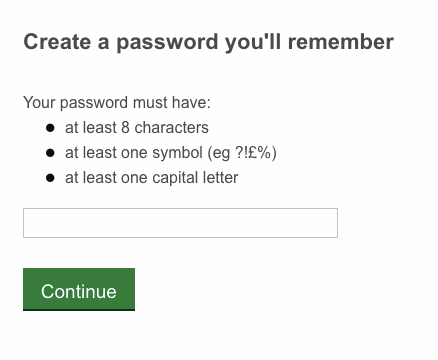
If you have experience or examples of using inline validation to help users create a password, please share your findings and screenshots in a comment below.
 joelanman
 fofr
fofr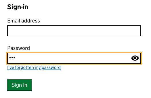

 idavidmcdonald
 stevenaproctor
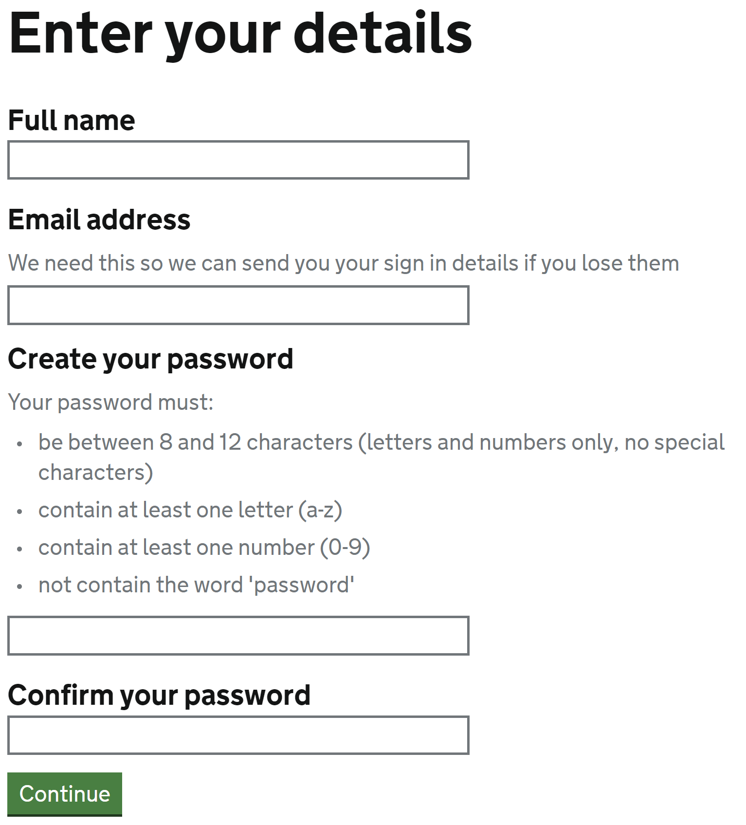
 NickColley
 RhysDavi-es
 36degrees
 hannalaakso
 terrysimpson99
 htmlandbacon
 philwolstenholme
 CharlotteDowns
Use this issue to discuss this pattern in the GOV.UK Design System.
See also Identifying users