Open govuk-design-system opened 6 years ago
Collating a few thoughts / experiments on <select>
's
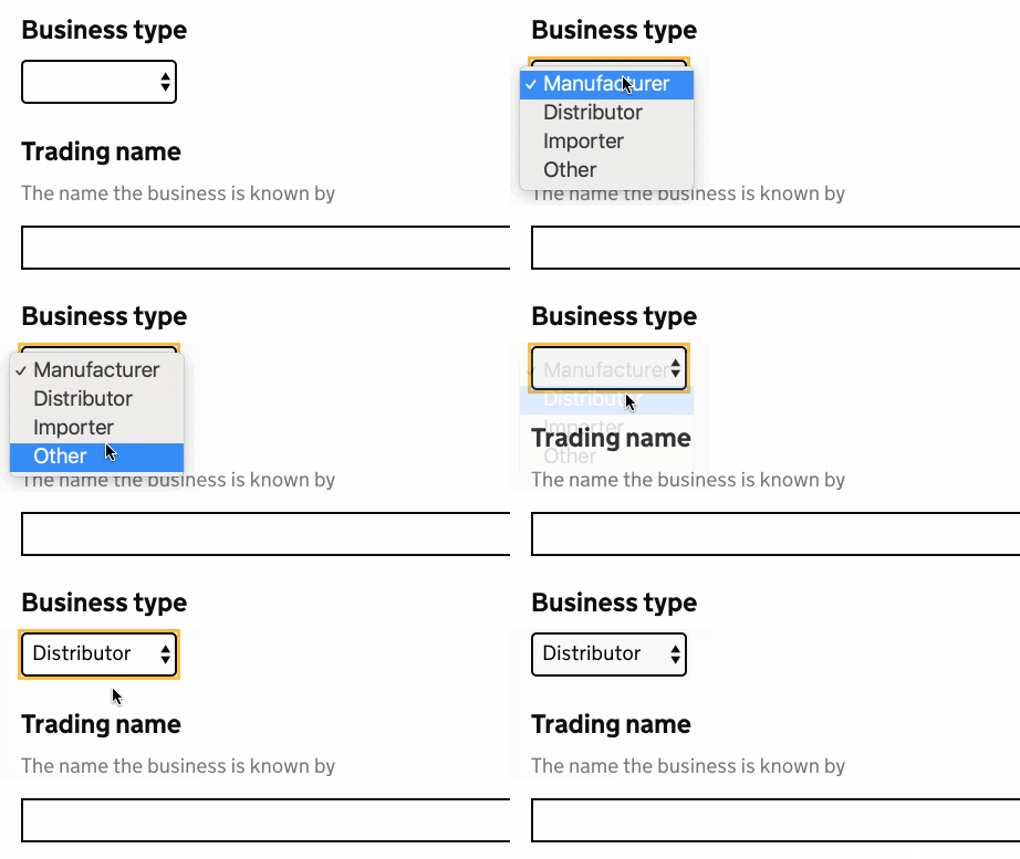
Although the current version of the <select>
component in GOV.UK Frontend has some styles it's appearance is largely dictated by the browser default. Therefore a <select>
in Chrome will look different to a <select>
in Safari, IE, Edge, FF etc. This can cause alignment issues if a select is used as part of a group of components and generally doesn't feel like part of the visual style of GOV.UK.
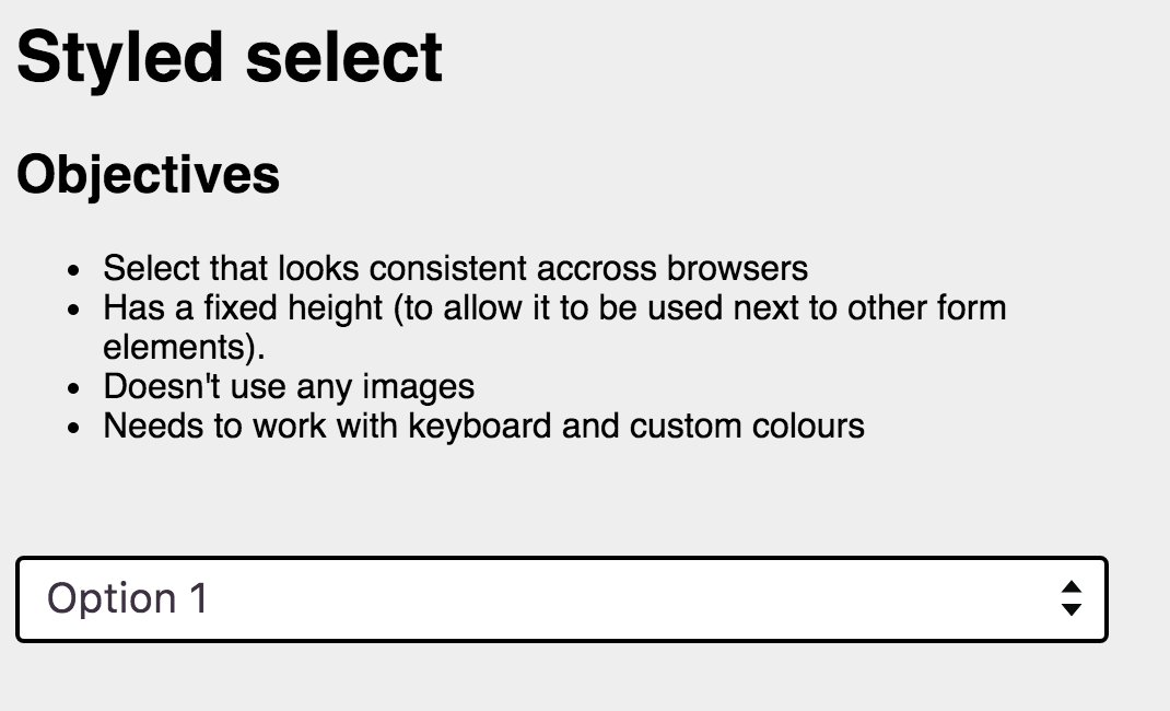
I have an example of a styled select experiment on this codepen
Using the default <select>
markup, the options that an iOS user will see will be cropped if they are around 30 characters (it may be fewer on a smaller device - test was done on an iPhone 7).
For this reason options should be front loaded to emphasise the differences.
Prefixing options like this:
has a greater chance of the important information being cropped off than if you front loaded the information that made the options different.
The <optgroup>
hack
You can force iOS to "shrink to fit" the full text of every option in a <select>
by adding an empty <optgroup>
to the the list of options. Of course if you are genuinely using <optgroup>
's in your <select>
's then this will also just work.
There is an example of this on this codepen
Please note the <optgroup>
itself has a physical size so if you add an empty <optgroup>
you will see an extra space at the bottom of the <select>
. In this example I have used display: none;
to remove this.
<select>
This idea is purely a conceptual untested experiment
As many of the usability issues of <select>
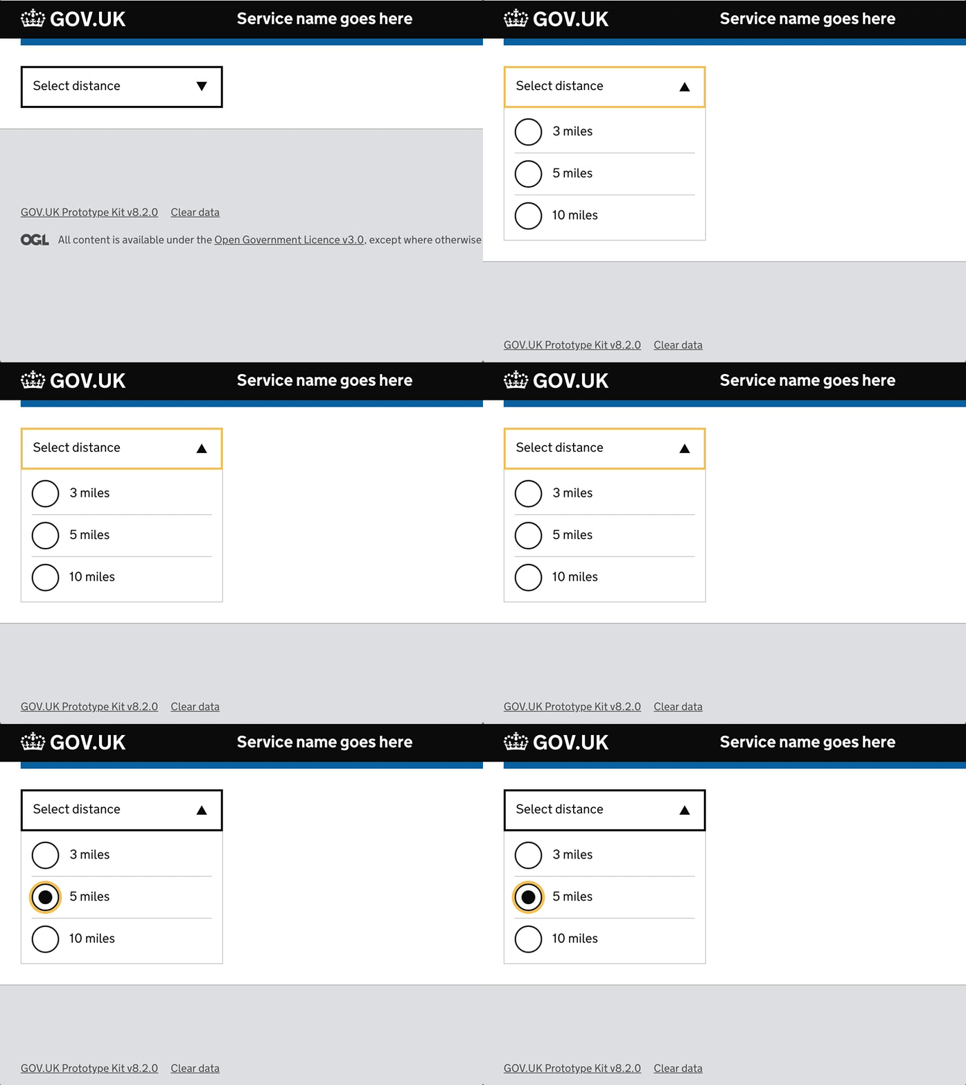
's are around the behaviour of the native HTML component, if you genuinely need to collapse a group of options creating a custom select component could be an option.
This is a quick example I put together which could progressively enhance a <legend>
, <fieldset>
using JavaScript to reveal a group or radios or checkboxes.
Although the current version of the
<select>
component in GOV.UK Frontend has some styles it's appearance is largely dictated by the browser default.
Note that there was a previous attempt to style the select element but it was never merged because we found there were issues making the (recreated) arrow indicator visible in browsers where the user had overridden colours.
Can we add some examples of when it is okay to use a select component? Or if we don't have any, we should more explicitly say 'We have not seen any examples of a select component being necessary'.
At the moment the current guidance "select should only be used as a last resort" seems a little vague.
It's a good question. The idea of the current guidance is to try other things before using a select, as we know they have various problems.
I think there's a good example of usage on Find a job (via @dashouse)
I'm referring specifically to the 'sort by' select. Caveat - I haven't seen any research on this particular example.
In this case, there is not much space to use radios - they would push the main content down the page a lot.
The select has the 'right' number of items in it, few enough that you don't need to scroll within it, which is a problem for users. But more than two, which would probably be better as radios.
Finally, the 'sort by' control is where users might expect it, from using other sites - at the top right, so redesigning the control and placing it elsewhere might not be a good option.
Subtly suggesting I should go get a job somewhere else with that link? ๐
I think there's a couple of options that are available to Find a Job here - One being to have radio buttons over on the left-hand side with the filters, the other being to have a horizontally aligned list, like a nav bar, in place of the select. In terms of accessibility, I would have thought the first would be better as then the filter/sort tools are grouped together which lets people refine what they are looking at it in the same place.
I'm pro avoiding selects, but we should keep in mind that there were a variety of issues uncovered in that research, and selects aren't always so bad. You're often balancing competing constraints and in some situations they may be the most appropriate component.
Skimming Alice's video, and from memory, the issues with selects were:
Issues 1-3 aren't a problem when there's very few options of a known length. I hazard 5 wouldn't be an issue if there were a pre-selected value (such as in sort-by filters). 4 and 6 might remain an issue - though I wonder if fewer options might help people know when they've not selected an item - as might auto-submitting.
A custom component like what @dashouse suggests above would be great. It might be able to accomodate multiple items being selected too?
FWIW my service is using the the autocomplete with showAllValues
to essentially simulate a select. A simpler component would be great to have.
I came here looking for more guidance on using the select component.
I'm using it temporarily in my prototype to simulate the autocomplete with showAllValues
.
I'd like it to be blank initially, and then let me pick from options. Regular selects can do this, but I can't see how you'd do it with the component.
I can see in the nunjucks that selected: true
can be set to pre-select a value - is this function documented anywhere? Pre-selecting feels relevant for sort-by
filters, but for general use we'd normally not recommend pre-selecting something.
If I don't preselect a value, it seems to default to the first value - how do I get it so I get a blank first entry? Skimming stackoverflow it sounds like some combination of disabled
and display:none
on the first option is the answer. Does the component support this?
I'd approximately like this:
One more from me!
Widths of selects - is it ok to use a width override?
Below our mobile breakpoint we set inputs and buttons to full width - but not selects. Is this intentional?
Adding govuk-!-width-one-half
seems to work - it goes full width below the breakpoint.
I'd like to suggest the guidance on selects be improved.
It doesn't give details about the usability issues GDS originally found (back in 2013 now), but more importantly, those issues all apply to long lists in selects, not small lists.
The guidance states "The select component allows users to choose an option from a long list." - but selects don't have to be for long lists. Indeed the example in the design system (sorting) is a good use for selects and is not a long list.
I'm not aware of any usability issues when there are a small number of options in selects. Often, radios may present a clearer choice - but that's quite different than "only be used as a last resort"
The other examples for radios, checkboxes have an example in error. But select does not. It'd be great to have one.
Particularly as the error state uses a different class for errors. "govuk-select--error"
The other examples for radios, checkboxes have an example in error. But select does not. It'd be great to have one.
Particularly as the error state uses a different class for errors. "govuk-select--error"
There's an issue to do that โ https://github.com/alphagov/govuk-design-system/issues/1049
The problem we've run in to when trying to add an example is coming up with a realistic scenario where it both makes sense to have an error state and it fits with the usage guidelines. The example used elsewhere on the page is for sort order, where it doesn't really make sense to have an error as there would always (?) be a default sort order.
If anyone has a good example from the service that we can use as an example, please add it to that issue.
joelanman wrote:
I think there's a good example of usage on Find a job (via @dashouse)
The example of 'Find a job' may illustrate a point about 'select' but it's not a good example that scales out to UI in general. It uses two forms of concatenation:
Each of those constitutes a language-dependent design and is best avoided.
"The problem we've run in to when trying to add an example is coming up with a realistic scenario where it both makes sense to have an error state and it fits with the usage guidelines."
I'd like to include an error on this component if a user leaves it blank. It's a mandatory field however I can't highlight it if they dont select an option from the drop down. Am I using the correct component?
Appreciate the select is a "last resort" but I think trying to find a perfect example of a good select as the criteria for an error is a tough one.
It might just be a case of finding an internal system example, where in a high density screen it would feature without a preselected value and just use that.
@haggishunt56 in many cases radios (single select), or checkboxes (multi select) are simpler options that work better for users than select
Is there a reason this doesn't have a h1 on the govuk design system website?
This was discussed on Slack, so attempting to record the answer here too. In the current example in the Design System, itโs unlikely that 'Sort by' would be the main question as part of โa one thing per pageโ flow โ it only makes sense as part of a more complicated user interface, such as a list of records.
If the select was being used to answer the only/main question on the page, for example when following the 'One thing per page' approach, we'd expect the label to be inside an <h1>
as per the guidance on making labels and legends headings.
Great thanks @36degrees and @edwardhorsford for your help with this ๐
@edwardhorsford did you ever implement a select with multiple items? Either way did you get any user research on how it performs, particularly from an accessibility perspective?
A custom component like what @dashouse suggests above would be great. It might be able to accomodate multiple items being selected too?
No I've not worked on a project that's done that, sorry.
Hi, I'm trying to adjust the Select component so its width is the width of the longest option in the drop down list (a design request). I can't seem to find a suitable way of doing this. Does anyone have any ideas?
@besscerule this should happen automatically with the GOV.UK Select component - are you using a different library?
this is the select we are using - which is the govuk component https://github.com/hmrc/trader-goods-profiles-frontend/blob/main/app/views/CountryOfOriginView.scala.html
i think it might be something to do with the layout template that is forcing it to be max width but i'm not sure
yeh there's something in your code as the default is content width. Might it be this? .withCssClass("autocomplete")
I've spotted an accessibility issue with this component. When it is viewed in the Safari browser on a MacBook and it has keyboard focus, only the yellow outline indicates that focus, for some unknown reason the thick black border is not shown. The yellow to white contrast ratio is 1.35:1, failing WCAG 1.4.11 Non-text contrast (AA).
Use this issue to discuss this component in the GOV.UK Design System.