Open govuk-design-system opened 6 years ago
To improve the skip link functionality, it is recommended to add tabindex="-1"
to the main
element so that it can receive focus and announce to the user that focus has moved.
Here we can see when the skip link is clicked that it is not announced to screen readers.
Adding tabindex="-1"
to the main
element announces the focus change.
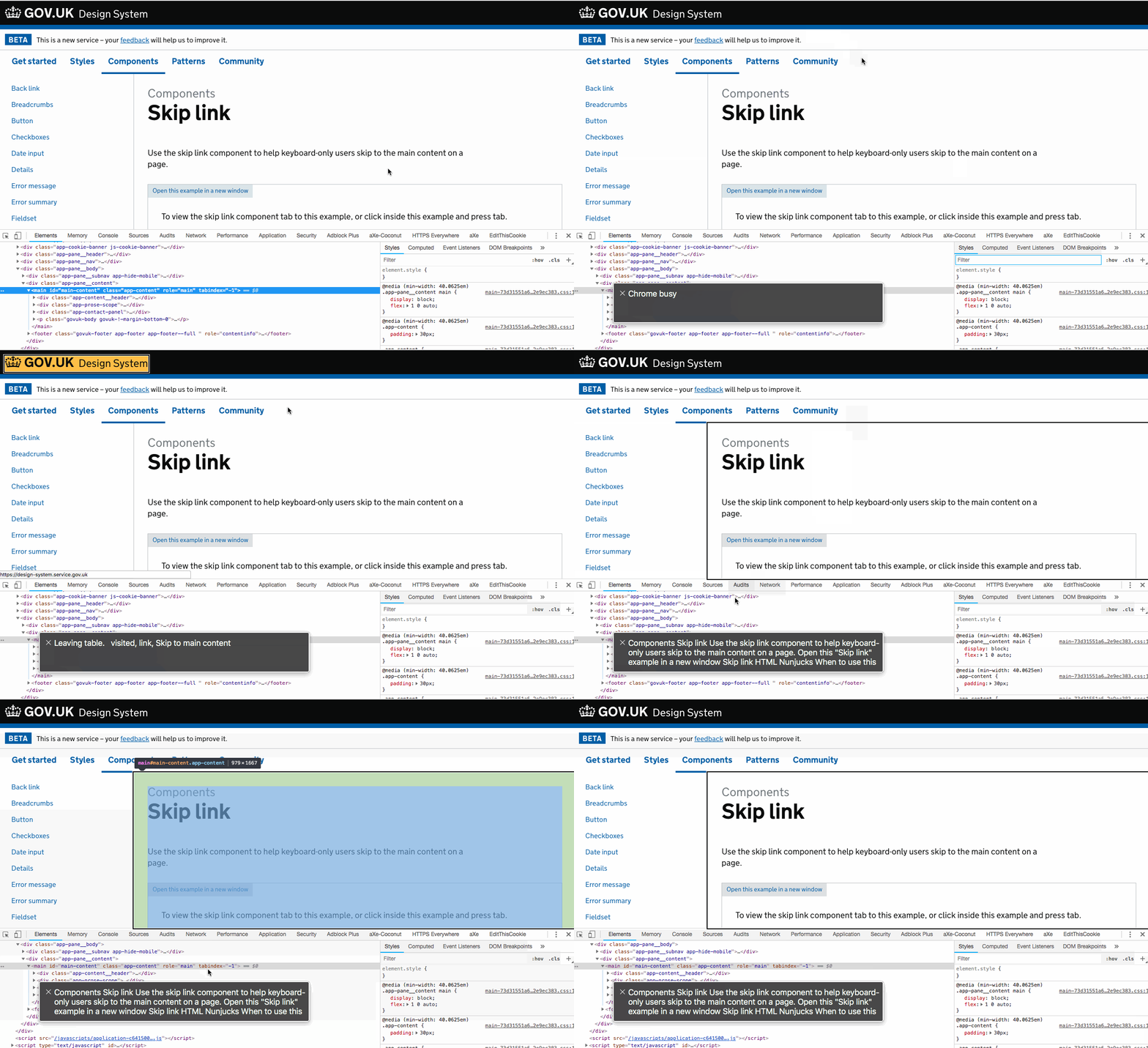
This was a feature in Elements but was reverted: https://github.com/alphagov/govuk_elements/pull/534
Putting tabindex on the <main>
element causes problems:
Consider a user interacting with an input field who clicks away from it to remove the focus style. Should they then hit tab they will be taken to the top of the page instead of the next form field.
GIF showing focus styles and tab order problem on Registers:
Some apps will display the browser's default focus styles around the main element
Thoughts on adding:
[tabindex="-1"] {
outline: none;
}
This is likely the only instance where I'd use outline
in this manner.
When clicking anywhere in the page focus will return back to the top
Interesting dilemma I've not considered. I suppose this is why some progressively enhance the skip link by dynamically applying tabindex
to the main
via JS on the click()
event handler. A bit of extra work but would solve the issue.
If not, wouldn't a fully working skip link be more desirable than focus shifting for a mouse user? I'm sure there are other negatives to be explored but curious what y'all think.
When clicking anywhere in the page focus will return back to the top
I can replicate being focussed on anything, clicking outside that thing, and my next focus is back at the top of the page in Chromium (Linux) regardless of the use of tabindex
. It would not surprise me that chromium simply takes this behaviour from webkit and thus Safari would behave the same.
As a skip link user I remember the bad old days when this KHTML bug meant clicking the skip link meant the viewport shifted to the new content, but my tab was stuck behind. Without the tabindex
Webkit, older Blink and IE 9-11 won't move keyboard focus with viewport focus.
Related
Many websites have an accessibility feature called skip links that help some users navigate the site. However, there’s a problem with basically all skip links on mobile devices, which hurts your site’s accessibility instead of improving it.
https://twitter.com/Real_CSS_Tricks/status/1030594374533558273
When we discovered skip links weren't working during testing accessibility of Elements, I reported the bug to Apple.
Since ages I've been using a better fix in my personal projects which fixes all in-pages links, not just skip links, and removes the tabindex the moment the focus moves away, not causing any of the issues above even if the anchored element is main
.
It would be useful to clarify that the skip should link to the main element* (or any exceptions) and the main element code to clarify outcome of the tabindex issue discussed above.
I was recently advised that the skip link should go to the 'Back' link, not h1. Can this be part of guidance here?
@terrysimpson99 since the back link is not considered 'main' content but instead a form of navigation we intentionally skip past it with the skip link.
When doing some testing of my own with ChromeVox I've noticed that the browser tends to save the focus state when you navigate away from a page, so that when if you come back to the same page a second time the focus will not be on the skip link. Does this matter?
I would think if the browser's behaviour is to leave focus where it was, then that's what users would expect when going back, since it's all they've seen.
Browsers used to cache sites so that if you navigated away and then came back, the old page was presented right there exactly as you left it. Nowadays, a buttload of requests go by every time (sigh) so who knows. But if a browser is doing a consistent behaviour, then I generally assume users of that browser expect that behaviour because that's what they encounter.
So if you're dealing with focus manually (you built an SPA or something), you may need to find out what browsers are normally doing and ape that. If they're all different, then you'll have to pick the behaviour that seems to make the most sense/finger in the wind.
I've seen a service where the Skip link is being flagged as an issue by Axe Core accessibility testing tool due to it not being within a landmark. Yet the Axe guidance itself says that such links are an exception to the rule https://dequeuniversity.com/rules/axe/4.0/region
What is strange is that the same issue is not flagged on other GOV.UK pages for Skip yet is the Phase banner is highlighted (using Axe extension at least). So there must be some discrepancy in their code or difference between the tools.
I thought it worth flagging as at least for others as a gotcha. Here's some discussion about the issue https://www.drupal.org/project/drupal/issues/3098828
Our service has a number of filters you can apply to filter a group of records. We recently used the accessibility personas to review these pages - and felt it would be good to provide a way of skipping past the filters to the results. As we add more filter options, the problem will only get worse.
Example use case: a user sets some filters, and then navigates to the submit button. The page reloads, and they must tab / skip past all the filters to see their results.
On GOV.UK search there's a skip link immediately after the search input - but I think this is optimised for ajax-ed results where you don't have a page reload. If you have a full page reload, it makes more sense to have a 'skip to results' link in the header.
This extends the govuk-skip-link
component to support multiple links in the header. If either is focused the area is visible.
This uses the :focus-within
pseudo selector to show the container if any child has focus.
If this isn't supported (IE 👋 ), then the approach falls back to two skip links shown in turn:
If updating results with Ajax, the govuk approach of a skip link below the input still make sense. We might explore this if we add live updating to our service.
The default href value of the skip link component is #content
, while the main content anchor on the page template is #main-content
. Should the skip link's default href value be changed to #main-content
, to match the page template?
I've no idea if other services rely on the existing default value, or would benefit from changing it.
But on our service, we need to use the skip link component (instead of relying on the built-in skip link in the page template) so that we can customise the link text to include a translation.
If the page template's main content anchor changes in future without us noticing, our skip link will no longer link to anything.
If we were able to customise just the text of the page template's skip link (rather than replacing the whole link), this would also solve our issue.
Hi @paulwaitehomeoffice, and thanks for this. Do you want to raise a PR for skip link and we can review that?
Use this issue to discuss this component in the GOV.UK Design System.