Open govuk-design-system opened 6 years ago
Here's how I iterated the task list for round 2 of testing:
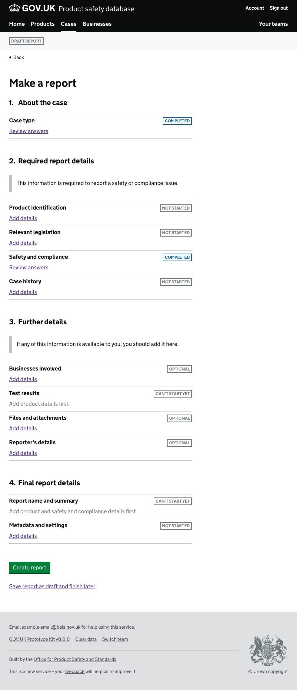
Changes:
Add details
rather than linking the name of the section.Review answers
once you've been in to a section - to distinguish it from sections you've not done.For this round, we tested with 4 officers - none of whom had much prior knowledge of our service.
Notes on implementation:
Findings:
Can't start yet
- largely because they did sections in order, and by the time they got to those sections, they could start.Save report as draft and finish later
- though our tasks didn't test this. We don't know / didn't test whether users thought they could save and return.Things we may try later:
Sections you've said you don't have data for
Showing all sections (like currently) but explicitly requiring users to go in to each. Once in the section have the user mark off Nothing to provide
or similar.Save report as draft and finish later
more prominently - perhaps on the right hand column.In a future version, whilst in one section we may ask details other details which end up completing other sections. For example - whilst adding details of products, we may ask if they have test results for those products. We can then mark the test results section as complete. I'll need to think how I can display this.
We had a lot of problem with users not recognizing the task list pattern as such so we decided to add some "TO DO" labels, at the moment we have 4 different statuses:
It has tested extremely well with users
We used a modified version of the Task List indicator 'tags' in the UK Emissions Trading Registry project. We changed the appearance of the indicators based on feedback from user testing. When lots of these indicators appeared together in a table two things tended to happen:
We redesigned the buttons and made the following changes:
When these were tested, users no longer commented on the buttons being 'dazzling' and were able to accurately identify the different types of items when asked. The 'urgent' styling helped them quickly identify things that needed their immediate attention amidst a larger table of mixed items.
Prototype and code available here: https://ets-alpha.london.cloudapps.digital/app/dashboard
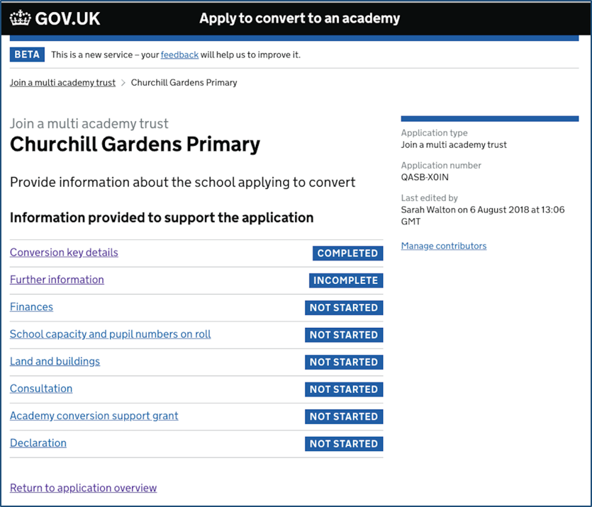
Our team also used a modified version of the Task List indicator 'tags' in the DfE Apply to Convert a School to an Academy project.
In user testing, users told us they felt 'overwhelmed' by the list of tags. One user described it as 'garish'. Similar to the ETS project I've referred to in a previous comment on this thread, I think it's the bold text and high-contrast that gives this element a tendency to dazzle when lots of them are presented together.
We borrowed from the UK Emissions Trading Registry project and developed a set of icons to replace the defaults:
The 'Completed' state actually is technically WCAG AA compliant, but uses a lighter font weight of 100. Given that this state uses a combination of grey text and a lighter font weight it requires further testing with a range of people with different visual impairments to ensure it's readable.
The visual hierarchy of the indicators aims to give 'Not started' sections priority over completed or in-progress sections that are less important to the user since we assume they have these in-hand.
An example of these indicators working together is shown here:
When clicking on a link to one of the sections, the user sees a page with the section questions presented in the style of a Check your Answers page. This is so that users can see in advance what information they will be asked for, and see answers previously given so they can more easily review responses provided by other collaborators on the application form.
When we followed the 'Check your Answers' pattern exactly, users missed the 'change' link on the right hand side of a question, and even when they did see it found it confusing if they hadn't already provided any information to 'change'.
Instead we provided a secondary button to instruct users to start a section which would take them into the page containing the questions to answer. After completing the questions on the page and returning, the button is replaced with a link 'Change your answers'. Users understood what they needed to do on these pages and no longer missed the buttons or links to navigate to the question pages.
'Secondary' style buttons were used instead of the primary button style because in many cases we needed to present several pages of questions like this. A large number of primary buttons overwhelmed users, and it also distracted from the primary button at the bottom of the page which is used to return the 'task list' page showing the sections that need to be completed. By making sure this was always the only primary button on the page, we found this was the main way users chose to navigate back to the major sections in the application form.
I thought I'd share my thinking around when and how to mark tasks as complete.
If a task consists of a list of questions—either on the same page or a number of pages—you can mark the question as complete as soon as those questions have been answered.
When the user clicks on a completed task you can show them a slightly adapted check answers page a bit like this:
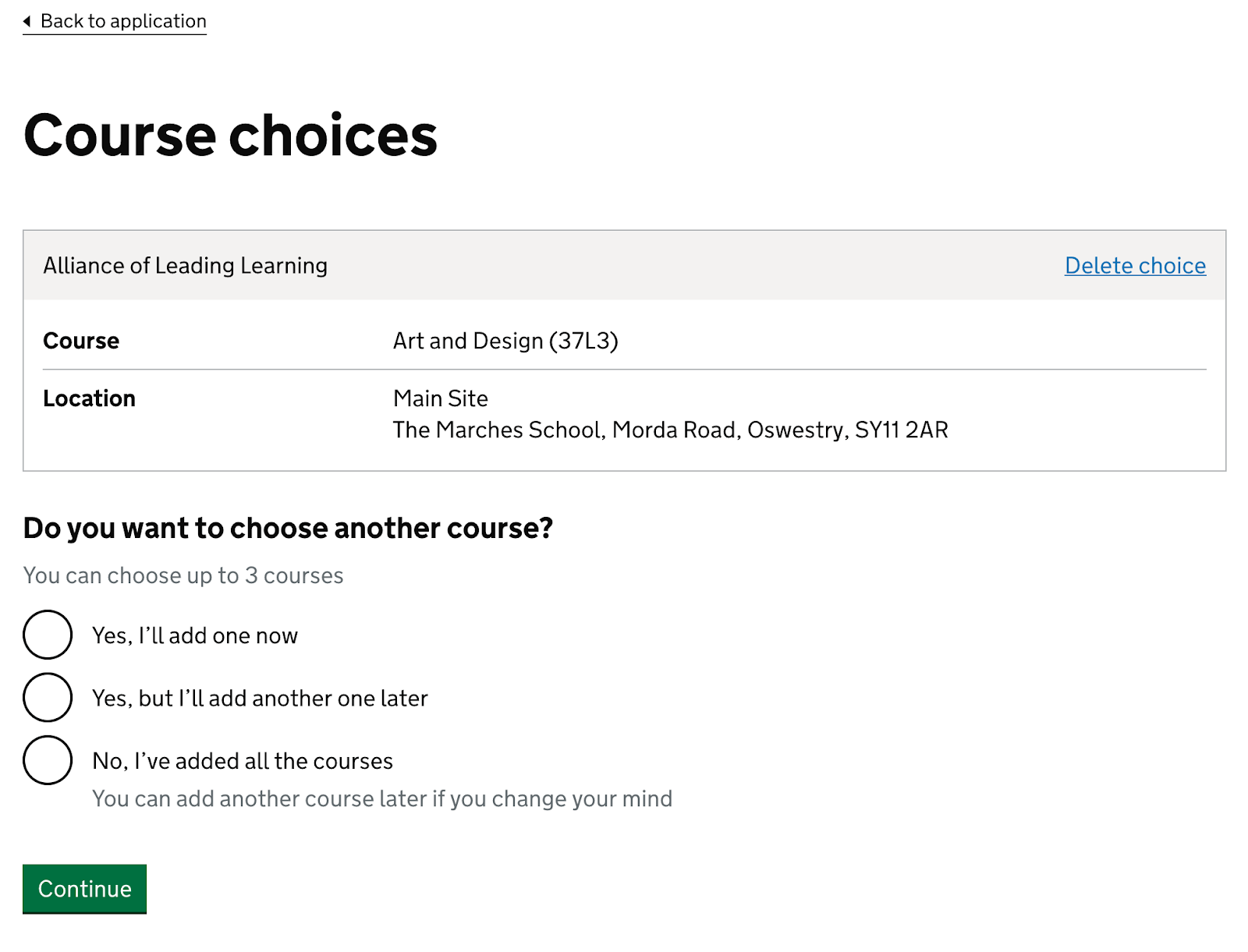
On Apply for teacher training, for example, we let users apply for up to 3 courses (and they have to choose at least 1).
There are 2 main approaches I can think of for when and how to mark this sort of task as complete. (Apply for teacher training currently uses option 2)
This option works like a ‘basic’ task in that as soon as it’s technically complete (or valid), it’s marked as complete.
For Apply for teacher training, the task would be marked as complete as soon as the user chooses 1 course.
But if the user gets distracted and intended to add a second course, some users could forget to do that because the task is marked as complete like this:
I think most users will remember to check their answers, either by clicking into each task or checking everything on a separate review page for the entire application.
Users on the Apply for teacher training service will see the review page when they click the ‘Check your answers before submitting’ task at the bottom of the task list like this:
See how the review page highlights incomplete tasks.
We could highlight tasks that are not as complete as they could be. For example, if the user can choose another 2 courses.
(Note: Apply for teacher training has a task which lets users add as many qualifications as they like. It’s probably a bad idea to prompt users to add additional qualifications just because the system recognises they can.)
Alternatively, you could let users mark tasks as complete so the system doesn’t have to infer it. But this could cause the following problems:
1. Users might be confused by the inconsistency
Having a mix of automatically and explicitly completed tasks could be confusing due to the inconsistency. (We’ve not got any evidence of this to my knowledge.)
Alternatively, we could also get users to mark ‘basic’ tasks as complete. But that seems unnecessary.
2. Users might forget to mark the task as complete
The user needs to know they have to explicitly mark tasks as complete. Depending on the implementation, users might forget. (More on this at the end of this comment.)
3. Users might worry that they won’t be able to make changes after marking the task as complete
The task list pattern lets users change their answers up until submission.
But asking users to mark the task as complete could make users worry that they won’t be able to make changes later. (More on this at the end of this comment.)
Currently Apply for teacher training lets users mark ‘add to list’ tasks as complete using a checkbox:
Our research shows that several users (both with and without disabilities) click the checkbox and then click ‘Back to application’ in the top left without clicking the green continue button. This fails to mark the task as complete as the user intended.
Possible additional downsides are that users:
Alternatively, we could use radio buttons like this:
I think this design would help users:
As part of our work to improve this pattern we have recently reviewed the statuses used on all the examples posted here.
We found that:
Because of this we'd like to propose that people should:
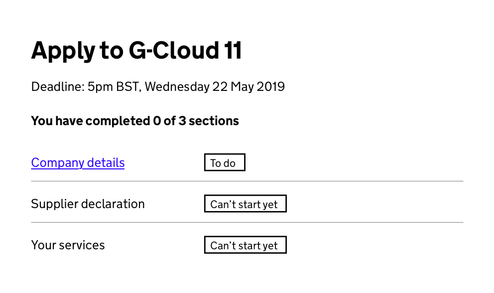
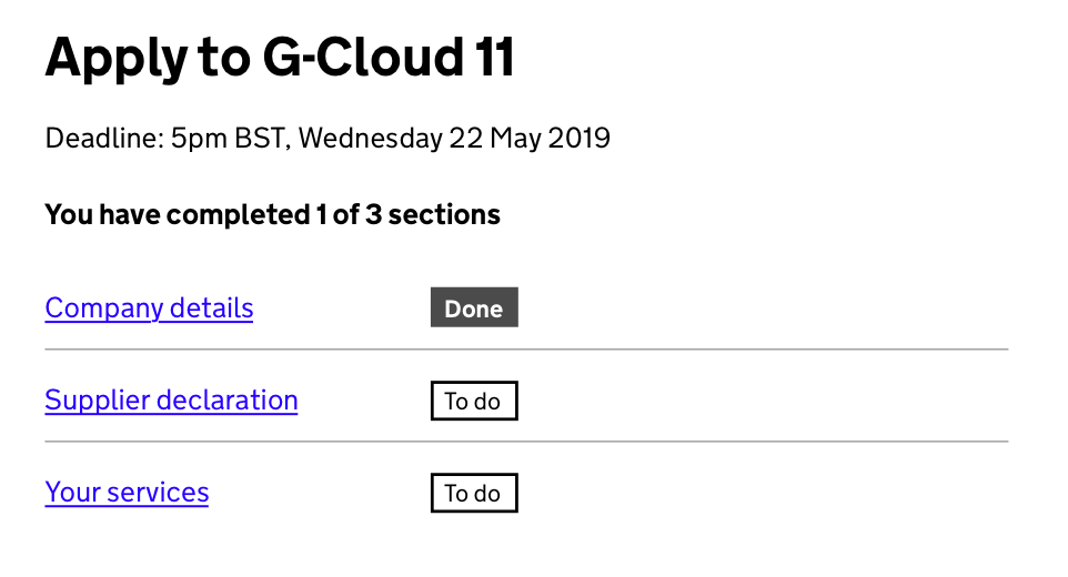
sorry just reminded me to post the version I worked on recently. We used 'To do', 'Done' and 'Can't start yet' - they all tested well.
HMRC did quite a bit of work looking into the status tags as part of this pattern https://design.tax.service.gov.uk/hmrc-design-patterns/status-tags-in-task-list-pages/
The content style guide says to avoid negative contractions. Is there any reason you propose to use 'Can't start yet' over 'Cannot start yet'?
Thanks for the feedback @ladine-cook - that's a really good point. I'll double-check with a content designer here and we'll change it, unless there's a good reason not to.
Hi @ladine-cook - I double checked and yes, we'll change it from 'Can't' to 'Cannot' - thanks for pointing this out!
sorry just reminded me to post the version I worked on recently. We used 'To do', 'Done' and 'Can't start yet' - they all tested well.
how does the 'can't start yet' information work for screen readers? I'm curious as to how the page is marked up to make it that clear (is there hidden text after '0 of 3 sections' saying that they cannot start 2)?
There was some discussion on Slack recently about implied hierarchy when using the status tags in this pattern. I had the same issue and ended up going minimum viable product, stripping the tags back to plain old text. This solved some readability issues, some issues where users went to click the tags, thinking they were buttons, and the fact that the blue background, high contrast tags look more important than outlines or tags with a different colour.
Here's the pattern that @lisadunn577 and I employed on our previous service to great effect, now in as an experimental pattern in the HMRC Design Patterns: https://hmrc-design-system-preview.herokuapp.com/hmrc-design-patterns/status-tags-in-task-list-pages/ Doesn't look all that glamorous, but it tested beautifully with users.
For a bit more detail, I wrote up a case study that expands on the iterations we made and fleshes out some of the rationale.
Just thought I'd share the comments and tweaks we've made to this pattern that has worked for us. We've been testing this pattern with users who need to check and confirm information is correct before being able to proceed. Users preferred "checked" over "completed" as there aren't any actions to complete. Users also found it confusing if "confirm and submit" was included in the sections to be completed as they wouldn't be returning to this page to see the sections fully completed.
Some Assistive Technologies have started removing the list role from lists that don’t have markers (bullets / numbers), so in some cases you do now have to set role="list"
explicitly.
An accessibility audit at the Department for Education (DfE) recommended the use of dl
for the task list rather than li
. This recommendation could be based on the contents of the task list. The GOV.UK Design System team would be interested to know why they think this particular type of data suits a description list, rather than a standard list.
The dl
element is commonly used to implement a glossary or to display metadata (a list of key-value pairs). From the HTML spec for the dl element: "Name-value groups may be terms and definitions, metadata topics and values, questions and answers, or any other groups of name-value data."
Semantically it feels more appropriate to represent the task list as a list of steps that the user needs to work through, rather than representing the steps as key-value pairs.
role="list"
Some feedback on the task list, we've been using it in prototypes for a public facing application and researching it recently, largely it's testing well with the exception of the completed sections count.
We've followed the pattern in the design system with the count showing the completed "sections", with numbered titles above those. All users have been confused why the numbers don't correspond with the numbered titles as they view those as the sections not the individual tasks.
@chrisadesign good feedback, thanks! I think a lot of services (mine included) have dropped the numbers, particularly where the tasks can largely be done in any order. It also means you gain a bit of extra space on the left...
Have you seen any users try to click the 'Completed' or 'Not started' labels in research? (This is a commonly-reported issue)
I'm also interested that you have "Submit and pay" as a task. Some services have this as a green button at the bottom, which either only appears once all tasks are completed, or which takes you to a page saying you can't submit yet if not all tasks complete. I don't think we have enough evidence yet as to recommend which approach works best.
Howdy. We've got a use case where we cannot save as we go so are not using the "In progress" tag. We're only using "Completed", "Not started", and "Cannot start yet". We've just run across a use case, however, that may mean we need a different tag altogether:
The TL is now inaccurate and confusing to the returning user who knows they've not only started that section but completed it. Hopefully, the more experienced user should know that they have to then add numbers for the new employer, but for the less experienced and those who will not know because they've had a bad day and have a lot on their mind or whatever, they could get confused and frustrated which could result in a call to the Customer Support Team.
I've seen in some of the above screenshots that some of you are using "Incomplete" or "Not completed". I'm wondering if this particular case warrants something that more accurately reflects the situation, e.g. "Needs updating".
I don't know yet if we could actually use it because I think we have an "on/off" flag which is why we aren't using "In progress". (our DBA is away at the moment), but if we could, we may need something other than what's on offer.
[EDIT] I should say that the team are thinking along the lines of changing all of the "Not started" tags to something like "Not completed" instead, which could be the simplest solution. It'll need testing nonetheless.
Howdy. We've got a use case where we cannot save as we go so are not using the "In progress" tag. We're only using "Completed", "Not started", and "Cannot start yet". We've just run across a use case, however, that may mean we need a different tag altogether:
- The user has completed a section called "Employer details" wherein they add / remove / edit employers associated with a scheme. This section is marked with the "Completed" tag on the Task List (TL).
- The next task in the TL is "Employer membership". This is where they add the numbers associated with each employer they've listed in the "Employer details" section. Once they've added all the numbers and hit "Save and continue", this is also marked as "Completed" on the TL.
- The user goes away and comes back (or maybe another user comes in) and adds another employer in the "Employer details" section and goes back to the TL where this section is still marked as "Completed".
- The "Employer membership" section is now marked "Not started" because there is a new employer for which numbers have not been added.
The TL is now inaccurate and confusing to the returning user who knows they've not only started that section but completed it. Hopefully, the more experienced user should know that they have to then add numbers for the new employer, but for the less experienced and those who will not know because they've had a bad day and have a lot on their mind or whatever, they could get confused and frustrated which could result in a call to the Customer Support Team.
I've seen in some of the above screenshots that some of you are using "Incomplete" or "Not completed". I'm wondering if this particular case warrants something that more accurately reflects the situation, e.g. "Needs updating".
I don't know yet if we could actually use it because I think we have an "on/off" flag which is why we aren't using "In progress". (our DBA is away at the moment), but if we could, we may need something other than what's on offer.
Hi @JodiB-TPR - When this happened on a previous service I worked on, the status we changed the section to was "In progress".
We didn't see any issues with our users by doing this but I would obviously advise you to do your own testing just to make sure. So it might be worth having a word with your team to see if this is possible from a technical point of view - and if not - how the system could possibly change to allow it.
Hi @JodiB-TPR. Interesting question! These kind of inter-dependencies between tasks in the task list are super tricky, and I suspect it's always worth trying to avoid them where possible. For instance, could you merge those two tasks as a single "Employer" task, where both the details and the membership numbers are added together?
In our service we have a similar problem, which is that depending on your answer to a question in one task (which course you want to apply for), an extra task can appear in the task list (Science GCSE, in this case – which is only needed for Primary courses). If you were to fill this task in, mark it as completed, and then go back and change your course choice in the other task to no longer need that task, then we remove that task completely – which is quite possibly confusing! Hopefully this is fairly rare for our service, as most users complete the tasks in order, but it is another consequence of having inter-dependent tasks... 😕
For instance, could you merge those two tasks as a single "Employer" task, where both the details and the membership numbers are added together?
No, because there can be hundreds of Employers for one scheme. The way our users work is they have spreadsheets with the numbers and prefer to bash them all in on a single screen. They keep the membership numbers separate. This is probably due to how our system was set up many many moons ago and our users have established processes around entering that information that we don't want to disturb too much. This would be a biggie to disturb.
I wonder if the 'Employer membership' section needs an extra tag in that situation.
So the status tag would change to 'In progress' and a tag would be alongside it saying along the lines of 'needs update' or 'update required'
?
We have tested the task list pattern for our service with 24 users so far and users are loving it! Out of the 24 users, 3 had autism and 2 had dyslexia. All the users said they really liked the completed tag, which stands out and users said that it gave them a sense of relief when they saw the completed tag.
Due to the nature of the service, where most users may find it emotionally draining to give information on things like dismissal, some sections are “optional”. They will have the chance to tell conciliators handling the case more later over the phone when they speak to them.
Please could we have another css style for “optional”, which has higher contrast? As you can see from the colour contrast checker, it would help to increase the contrast just a little bit. We had used the style for the "in progress" tag for “optional”, just for testing.
As some sections are “optional” in our service, we are not sure how we can add the message that says “You’ve completed 1 of 7 sections”.
Do you have any suggestions? Can we remove this bit?
We understand it helps screen readers, but may not be appropriate when there are sections that are "optional".
Your help will be much appreciated! :)
We are in the Alpha phase and we had also tested a version without the task list. Users preferred the version of the task list pattern, as they said they could get a quick idea of what information they needed to complete the form. Another reason why the task list pattern works so well for our users is that it allows users to complete some sections, then go and find the missing information and come back to the form later.
To put things in context below is little about the service.
This service allows claimants or their representatives to notify Acas of a workplace dispute and choose whether they want early conciliation or to get a certificate to the employment tribunal for a judge to decide. It is a statutory service, and claimants cannot access the employment tribunal without first making a notification to Acas. Acas receives around 120,000 notifications a year.
Early conciliation is a largely telephone-based service that involves speaking with individuals and organisations in the dispute. Highly-trained conciliators help parties understand relevant legal principles and assist them to reach a resolution.
Hope you have a nice weekend!
Any help will be much appreciated! :)
Many thanks, Sunil
As some sections are “optional” in our service, we are not sure how we can add the message that says “You’ve completed 1 of 7 sections”. Do you have any suggestions? Can we remove this bit?
"You have completed X of Y required sections [and U of V optional sections]"?
Thanks, @jbuller :)
Please could someone recommend, the best way to code "You have completed 1 out 7 sections" in an Alpha coded prototype? Below is what we are using to change the tag to "completed" when a user completes a section.
{% if data['employer-type'] %} Completed {% else %} Not started {% endif %}
Something like the above would be helpful!
We are using the task list page in the prototyping kit downloaded from the design system.
Many thanks, Sunil
@s-kathare one other idea you could consider is to make all the tasks required, but for the optional ones, make the first question a filter question asking whether or not the user wants/needs to complete the section. This reduces the need for a separate label on the task list, and also gives you more space to explain why or how the section is optional.
Thank you @frankieroberto that's a great idea and exactly how I'd hope it would work
Here's a live example from the Apply for teacher training service (which I work on). The "Adjustments" sections in a task list are both required, but start with a filter question.
... which links to...
As we explore the design of the (new) Task list component, I've been toying with the idea of adding tick icons to the tasks as they get completed.
A few early sketches below. This potentially might be better for screen magnifier users, or might work better on mobile?
@s-kathare
All the users said they really liked the completed tag, which stands out and users said that it gave them a sense of relief when they saw the completed tag.
This is interesting to note as we were looking to reverse the visibility of tags to ensure that tasks that needed doing were the most visible.
Example here: https://dfe-steveoc-snippets.herokuapp.com/task-list/highlights
Do you think this would cause issues for those users?
@frankieroberto Alternatively, colour the row?
It highlights the completed sections to give the sense of relief Sunil encountered, but is different enough from the tags on the other rows to register lower when visually scanning down.
Please do the tick, and please put a little box on the left to signify 'not yet done'.
You can do the colour as well, if you like.
Have a look at to-do list applications, and paper to-do lists of various sorts. They mostly have a box at the left that's empty and that is available for a tick to go into when the item is done.
@cjforms Is that not in danger of looking too much like checklists? The functionality is different and other indicators (tags) are to the right, so the indicator is then switched sides.
The tick adds meaning, though the alignment affects the ability to scan down the list.
Also, with to do lists, the user is the one who can mark as done, whereas if I've understood correctly, this will be the service which decides based on rules. So we might need to be careful to distinguish from to do list
I agree the indented ticks make scanning difficult. They look like some sort of bulleted sub-section. The checkboxes keep the left hand edge uniformly aligned and easier to scan, but a checked box can imply it can be unchecked.
Possibly they are in danger of looking too much like checklist. Another point of view might be that they are, in fact, checklists.
It's always seemed a bit odd to me that they got implemented with a 'tag for status that looks a bit like a button at a glance but isn't a button'.
@cjforms We're working on making them less 'buttony'. That and the uppercase has always been a problem for me.
@steve-oconnor I agree, uppercase has low readability.
@steve-oconnor @cjforms @nicprice @asier-hmrc thanks all for the helpful feedback - I should clarify that this is all work-in-progress / design exploration at this stage.
I've done another version indenting all the items so they align:
With this, there’s a question of what the initial view should be (when all incomplete) – should they all be indented still, or only once 1 of the items has been marked as completed?
Another option might be to "outdent" the ticks, although this would only work on wider viewports, and would have to switch to indenting when narrower I think:
@cjforms we recently added some guidance around marking tasks as completed which suggested that users can be asked this within the task itself (after all the required questions have been answered). I think this is probably better than an empty box appearing on the task list itself, as it's within the context of the task (for example, on the "check your answers" page)?
@frankieroberto What if the "completed" where to move right next to the task and away from the 'to do' column. Just a thought.
@asier-hmrc My problem with that idea is the visual "clutter" it creates. My eyes dart around the screen as opposed to scan down a list.
@steve-oconnor Yes I agree about the clutter. The "completed" tags are loudest on the page with its white-on-dark-blue style, maybe if they could be played down.
I think there is something intuitive though, about moving tags to one side away from the pending/to-do column as they get done. Using tag position/alignment as a status indicator to reinforce its content. We can't rely on colour. Glancing at the right hand instantly shows what is left to do.
Absolutely can't rely on colour, which is why there is an element of shade to the different statuses. This is being reviewed for the task lists specifically though. The completed status looks like a button and, for usability, we will be testing if it is better to give visual emphasis to incomplete rather than complete sections.
Still not convinced by moving tags around 😁
Here’s a current work-in-progress of the design for the ~Tags~ Statuses in the task list that @steve-oconnor and I have worked on:
Colour names are tbc (naming the 2 with transparent backgrounds is tricky!).
Our current thinking is that the CSS classes would be named after colours, for example govuk-task-list__status--blue
, rather than statuses govuk-task-list__status--in-progress
, as some services may use different status labels, depending on their needs and users. However the accompanying guidance pages may well strongly suggest certain pairings of status labels and colours.
The one exception is the red status, which we’ve labelled govuk-task-list__status--error
to try and strongly imply that it should only be used for a task in an error state (which should hopefully be rare).
We have done a lot of testing on this pattern on the Modernising lasting powers of attorney (LPAs) project. Here is what we found:
In our service, we also have a point at which information needs to be locked so that other users can sign. For this, we introduced a ‘Locked’ status. People understood this but did have questions for what would happen if they found out they needed to change information later.
Thanks @DanGuyMOJ
I'm especially interested in the topic of Lasting Power of Attorney (LPA) and similar directives, and I'd like to know more about this point: "Don’t list guidance or ‘read’ items as extra tasks—people get overwhelmed by too many steps"
For LPAs, there are many detailed and quite complex choices that people must make that will be recorded in the LPA and will then become binding, often in difficult circumstances. For example, I've seen people struggle with:
In your research, did the participants already have all their choices made about the different roles and who would fill them before they attempted the transaction?
or did they work it all out while filling it in? If so, when did they read the stuff that explained it all to them?
I'd also really like to know what you did in the research to check whether the final LPA as filled out was an accurate reflection of their wishes. (This is a known problem in medical consent processes and I suspect in the world of advance directives too).
Or was this research where they were doing the LPA from a scenario? I'm fine with doing that as it also has a value, of course!, but it would make me very hesitant about dropping guidance items.
I do appreciate the point that reading guidance (which in this case, I'd much prefer to frame as 'thinking about your decisions and discussing them with the people involved') for LPAs is pretty daunting. That's partly because these are decisions and discussions that many people do find extremely daunting. It's the only case I know of where the actual advice from a legal association is "blame it on your attorney" (see the section about 'Starting the discussion' in this from the American Bar Association Toolkit for Health Care Advance Planning - .pdf :)
At the Intellectual Property Office, we are currently investigating using this pattern in our replacement patent application service.
The problem The current service is a minimum of 14 steps long - users must go through each step to be able to apply, even though they don't have to supply information at every step (there are different types of patent applications, each with different minimal set of requirements).
Our users We have a very wide spectrum of users who use the service: from the novice member of the public to the legally trained Intellectual Property (IP) professional.
How it has tested The task list approach has tested well.
Feedback we’ve had is that dividing the application into smaller tasks makes the process much less daunting for novice members of the public. The legal professionals can also quickly complete only the tasks they need to (rather than having to traverse the whole application).
As we plan to house this behind an account, users can also complete it in their own time, rather than a single sitting – choosing the sections they want to complete when they have the information to add, in the order that suits them.
Testing with members of the public did identify the need for some brief guidance to introduce the different sections of the application. This initially caused us some issues as we wanted to avoid the page becoming too busy, but we worked with a content designer and found a solution which works for all users.
We have a preceding screen before the task list where the user selects the type of application they want to make – this then informs which sections are shown as required.
This is a recent change as we previously tried including this on the same screen as the task list. It had mixed responses from testing as some users struggled to make the connection between the section where they completed the individual tasks and the section where they chose the type of application they wanted.
We are continuing to iterate this revised approach, and still need to test it properly. However, we’re confident this change means the user will have a clear connection between the application type selected and the tasks they need to complete, whist retaining the flexibility to complete tasks in the order that suits them.
@nfren
At the Intellectual Property Office, we are currently investigating using this pattern in our replacement patent application service.
Thanks for sharing your research! Great that it is working well so far for you.
I’m curious that you are using the ‘tags’ on the right for Optional vs Required! That’s not a pattern I’ve seen before. Are you also communicating which tasks have been “done” as well somehow, or did you not find a need to do this?
Thanks @frankieroberto - hope you found it useful
We tried a number of different iterations of the tags, but found that 'Optional' and 'Required' have achieved the best results so far. They give clarity to the user on the minimal amount of information they must supply to support an application, while still giving them the option to supply additional information if they wanted to.
Once they have completed a task, the tag changes to 'Completed'. Additionally, if they part complete a task, the 'In progress' is used.
a while back I tested the task list pattern with a screen-reader user. they mentioned that it would be good if a link could be added to enable them to skip over the completed tasks and go straight to the other tasks.
I can see there were similar comments about this earlier, do you know if anything has been added to the code to address this?
Following up on the post @nfren shared last year. At the Intellectual Property Office, we are now nearing the end of our Beta phase for the IPO Transformation. Within the apply process, we have continued to make use of the Task list pattern and have iterated how we use it throughout our Beta.
Our requirements at the IPO are complex and therefore we have adapted the task list pattern in some areas to meet them. I will talk about this in more detail below.
In beta, we have made a number of further iterations to our task list. Some as a result of the new requirements and some to align with the standard pattern again, which has led to it testing better with our users:
Our main challenge when testing with users has always been how we communicate which tasks are optional and which are required. By returning more to the original pattern and adapting it in different ways, we have landed on a design that tests well with users in their understanding of optional/required.
Guidance only tasks have been removed from the task list. User research showed that novice users would read this before starting the service and our professional users would never have a need to access it. In replacement, we have provided in-context guidance within the tasks and developed a pre-apply guidance strategy.
Users have also appreciated the familiarity of the pattern - recognizing it from completing their tax return.
Overall, our task list is now consistently testing well with our users.
Use this issue to discuss this pattern in the GOV.UK Design System.