 joelanman
commented
6 years ago
joelanman
commented
6 years ago There don't seem to be any government services using maps yet - the apprenticeships example above is a prototype, and doesn't appear to be live (yet?)
Open govuk-design-system opened 6 years ago
joelanman
commented
6 years ago There don't seem to be any government services using maps yet - the apprenticeships example above is a prototype, and doesn't appear to be live (yet?)
 NickColley
commented
6 years ago
NickColley
commented
6 years ago Then Flood information service have an excellent example of using maps with alternative ways to view the same information to overcome the inherent accessibility issues with maps.
https://flood-warning-information.service.gov.uk/warnings
 joelanman
commented
6 years ago
joelanman
commented
6 years ago Excellent, thanks @nickcolley !
 timpaul
commented
6 years ago
timpaul
commented
6 years ago The Rural Payments service has mapping elements, but it's all behind a login: https://www.gov.uk/claim-rural-payments
 kr8n3r
commented
6 years ago
kr8n3r
commented
6 years ago please tell me the other one is Google Maps :)
 dannyleech
commented
6 years ago
dannyleech
commented
6 years ago Thanks @nickcolley, we have been doing more work with maps since but still early prototypes. In addition to giving them a more gov.uk style we've been exploring the following... Map interactions; keyboard access; fullscreen and browser history, feature presentation plus more. The big challenge is accessibility though. We have done limited testing so far but have more planned.
Here's a couple of screens. Drop me an email I can send login details.


 sanjaypoyzer
commented
6 years ago
sanjaypoyzer
commented
6 years ago We did some work around maps and helping people understand Parking Permits zones on the Verify Local project. In particular we made sure the right information was also available in text, making the map a progressive enhancement. https://verify-local-patterns.herokuapp.com/service-patterns/parking-permit/check/design
 frankieroberto
commented
5 years ago
frankieroberto
commented
5 years ago The Flood map for planning service displays flood data on a map, using an overlay on Ordnance Survey tiles, with a legend:

frankieroberto
commented
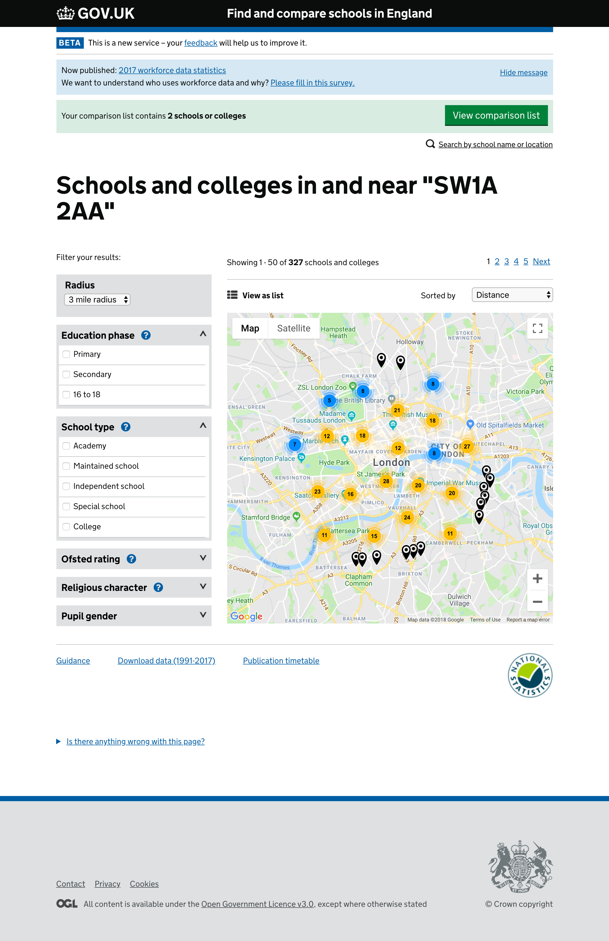
5 years ago The Find and compare schools in England has a feature to view the search results on a map (vs list) via a toggle. It uses Google Maps, with a custom overlay (with markers being "clustered" when close together):
frankieroberto
commented
5 years ago The Teaching jobs service displays maps on the individual job listing pages:

frankieroberto
commented
5 years ago Here's an example from the Check if you can get legal aid service:

(The map itself currently has a "development purposes only" overlay due to the Google Maps pricing model changes)
frankieroberto
commented
5 years ago The Search property information service displays a map on property pages:

It uses the Leaflet javascript library and the default OpenStreetMap tile server.
frankieroberto
commented
5 years ago The Find an apprenticeship service includes maps on the search results page and the individual listing pages:
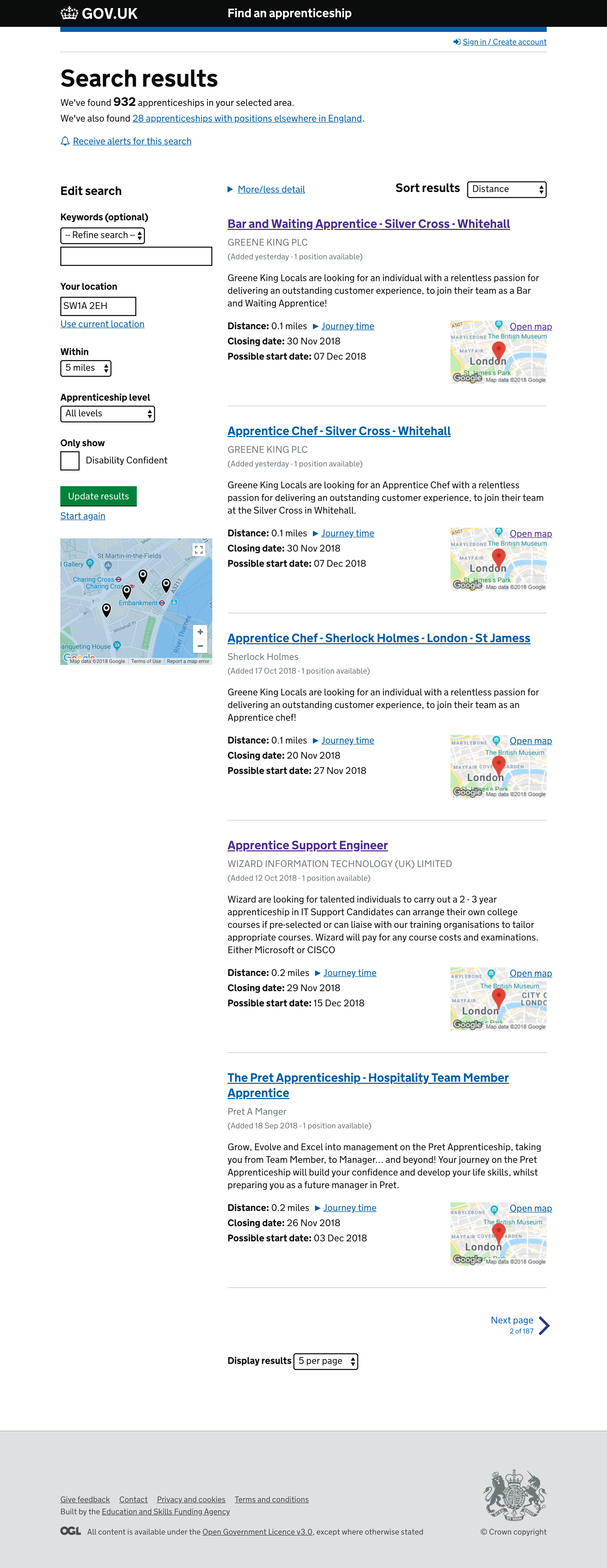
These all use Google Maps.
 fofr
commented
5 years ago
fofr
commented
5 years ago We're trialling a variety of Google Maps styles in user research at the moment for finding postgraduate teacher training. We want to show courses on a map so their locations can be more easily compared, the user need is around choosing a course with a manageable commute.

We've found that:
frankieroberto
commented
5 years ago The Life in the UK test booking service includes a maps to help users pick a test location:

 pripley-ea
commented
5 years ago
pripley-ea
commented
5 years ago  Future map for Marine Planning.
Here the key is part of the layer menu and the colour swatches are numbered so people with deuteranopia or protanopia (green or red colour blindness) can still read the map.
Previous design iterations had the key in a tab as the list can be quite large however we found users missed this. Having the key as part of the layer menu was readily understood by users.
We used the GDS colour safe palette where possible. In instances where more swatches were needed then Ordnance Survey also have developed a colour safe palette for further options. These can be adapted for our own purposes and changed to suit, testing for colour blindness in Photoshop and with users.
 nay-creative
commented
5 years ago
nay-creative
commented
5 years ago 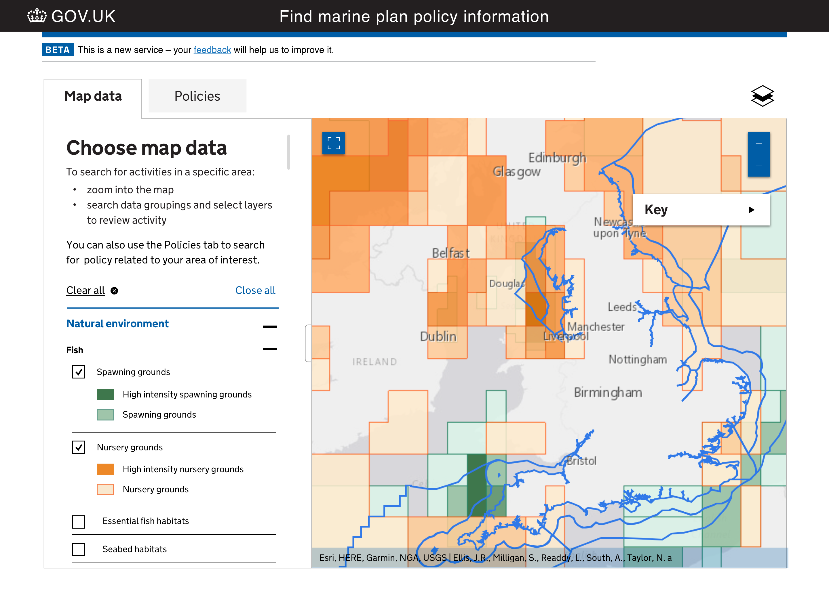
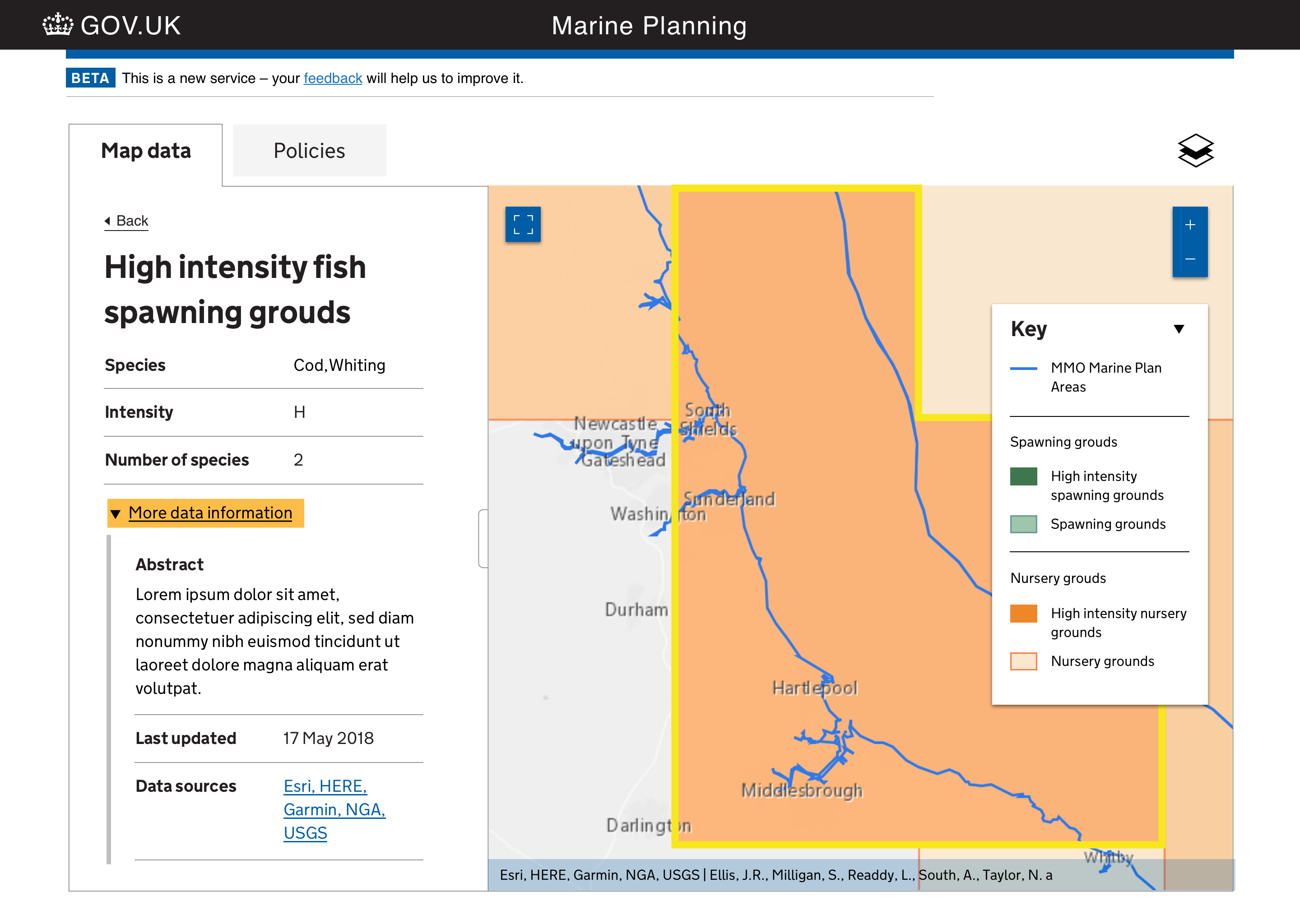

Beta sketch prototype for Marine Planning These screens are the latest versions of the marine planning service (following on from Paul's post above)
With a better understanding of the uses of the service, we now know that users of this tool do so to complete two separate tasks: 1) Interrogate map data 2) Review marine plan policy
Here the key/legend is presented with the data list and then presented as a separate key on the map when the list is not present. Clearing the selections and starting again will be easy as users will have a 'clear all' button.
The 'draw polygon' page is the way into the policy and the system will not return results without a drawn boundary. Testing showed that optional guidance copy here helps the user to better understand how to use the tool.
Myself and the team whole-heartedly welcome any and all feedback on these screens!
PS: We would also like some feedback on our potential list of names for this service
Find marine plans Explore marine plans Find marine information Explore marine information Find marine planning information Explore marine planning information
Many thanks
 JoeHMLR
commented
5 years ago
JoeHMLR
commented
5 years ago Very interesting choices re the key.
Our own experience matches yours, where a separate tab was not an effective solution as users kept missing it.
Incorporating the key on the map itself led to a different problem when some users to attempted to interact with it, mistaking it for the plotting controls on the top of the map display (it wasn't a drop-down). We didn't try incorporating it as part of the layer menu for fear that the same issue would occur, so it's interesting to see that in your testing this issue didn't arise.
The link to guidance option is similar to the approach we settled on, and in live service did evidence improvements in the user experience (reduced time spent on plotting) for LLC.
Finally, I'd suggest...on the basis only of anecdotal rather than quantifiable evidence that Find may work better than Explore, when helping users identify the service (our own professional users tend to search for specific datasets, and Find has a more focused emphasis than Explore. YMMV on this though, and it could be your own users will have different expectations.
I think the screens are looking very nice :)
Joe
frankieroberto
commented
5 years ago @nay-creative interesting developments! Looks good to me.
I would be tempted to include the colour and the full label from the key (eg "High intensity nursery grounds" rather than just "H") within the panel on the left when you select a particular area. That way people may start to get a sense of what the colours mean even if they don't open or look at the key?
As for name, my hunch would be to use "Find" rather than "Explore", on the assumption that most users are looking for some specific information rather than just general interest? I'd possibly avoid using "information" in the name, as that’s quite generic and doesn’t really communicate much (everything is information)? On that basis, "Find marine plans" sounds best to me – but that's a complete outside view!
Good luck!
 DavmonUXROS
commented
5 years ago
DavmonUXROS
commented
5 years ago Services With Maps - Cross Government Meetup - Edinburgh
Registers of Scotland are hosting the second Cross Government Meetup for Services With Maps on the 29th of August 2019 in our Edinburgh office at Meadowbank House.
We want to bring together the speakers and practitioners working in this space to share research, techniques, tips, hands-on practical skills and case studies from the field.
Specifically for this second event we hope to be able to provide some presentations and/or updates on three of the biggest topics that came out of the first meetup. These were:
· GOV standards and design patterns · Accessibility · Maps on mobile devices
Call for speakers
We’re looking for some speakers from this community to do some short presentations – sort of lightning talk stuff, 15 to 20 minutes long.
So if you’ve been working with maps please come and share your challenges, problems, war stories, findings or insights with the rest of the community.
Please email me directly if you wish to do a short presentation. The closing date for submissions is the 31st of July.
Accessibility
Please let us know if there are any specific requirements you have or if there’s anything we can do to help you take part in this event.
Tickets
These are available through Eventbrite
https://www.eventbrite.co.uk/e/cross-government-meetup-services-with-maps-tickets-64165995219
There is a limited amount of 50 available.
The closing date for tickets is the 8th of August.
 harry-wood
commented
5 years ago
harry-wood
commented
5 years ago If we're talking about standardising towards something I would certainly hope to see gov.uk favour Ordnance Survey or OpenStreetMap over Google Maps.
Of course the good old Ordnance Survey offers wonderfully detailed and accurate maps of our nation, and no longer quite such painful licensing arrangements, meanwhile OpenStreetMap is a not-for-profit free and open map provider which was also born in the UK.
Pragmatically, at a basic javascript level, there is an early fork in the tech decision tree between Google Maps or LeafletJS-based map development. The latter may be less familiar to many developers, but gives lots of freedom and flexibility.
Within the (largely free and open source) ecosystem of OpenStreetMap technologies, you get huge power over map presentations and even the ability to host a whole vector/raster rendering stack yourself. Options for this (e.g. things like OpenMapTiles) would let you look into designing a custom map style as part of the gov.uk design standards. I'm imagining stripped down black-n-white style maps fitting with the gov.uk website style (a bit like positron or toner styles). This might also include style variations geared towards vision imparements for greater accessibility.
 charleyglynn
commented
3 years ago
charleyglynn
commented
3 years ago Hi all,
I am a Product Manager at Ordnance Survey and pleased to report here that access to OS APIs will be free to Public Sector from Jan 2021. Now feels like a good time to promote the upcoming APIs - we are keen to support the efforts toward a consistent mapping capability.
OS Maps API provides pre-rendered map tiles in 4 styles and is available in 2 projections (British National Grid and Web Mercator) via OGC WMTS and ZXY.
OS Vector Tile API provides the same mapping but in a more lightweight, customisable format. As @harry-wood mentions above, this would allow us to create a style to fit the design system - OS cartographers could support this effort.
Please check out our copy and paste code examples created by @johnx25bd and @tmnnrs - these show how the OS APIs can be used in a variety of mapping libraries.
As you can imagine, we also have design patterns for different map interactions and would be happy to support further. Cheers Charley
 teddmason
commented
3 years ago
teddmason
commented
3 years ago @charleyglynn Hi Charley,
I'm lead developer on the flood information service, we host flood warnings and alerts here: https://flood-warning-information.service.gov.uk/warnings which we are looking to phase out with a full service refresh that is currently in beta here: https://check-for-flooding.prd.defra.cloud/
We currently use a Bing license for our background tiles and geocoding requirements.
https://osdatahub.os.uk/plans looks like a really good offering for public sector use, and I really appreciate the need for standardising mapping. However the throttling on the api is where we would have an issue:
– All our API data (OS OpenData and Premium) are subject to a 600 transactions-per-minute throttle for your live projects. This is equivalent to 100 concurrent users requesting a computer-screens worth of map tiles every 10 seconds. More about throttling in our FAQs.At our peak we have had 20,000 concurrent users, all of whom will have made mapping tile requests, and a majority of whom who would have made geocoding requests. Do you have any solution to this?
And also what is the support wrapper around the service, is it 24/7 and gold? I implemented some of the ordnance survey on Demand apis to a couple of our other services over the last 3 years, and we had a few instances where we had deprecated service and availability.
Thanks
charleyglynn
commented
3 years ago Hi @teddmason
Thanks for your interest. The new flood warning beta service looks great - some big UX improvements there 👍
Do you have any stats on your map tile requests per minute during an average day but importantly during a peak?
PSGA Members on the Authorised List i.e. Emergency Services under Category 1 responders, will have unthrottled access to all OS APIs, and this is also available to any member during a period of emergency response.
We have OS Names API (settlment names, postcodes, road names, railway stations and more) and OS Places API (detailed address data) for geocoding.
All our APIs have an SLA of 99.9% availability and we have 24/7 support.
Cheers C
charleyglynn
commented
3 years ago Just looping back here as the OS Data Hub and APIs were launched for Public Sector last week.
More information available here: https://www.ordnancesurvey.co.uk/business-government/public-sector-geospatial-agreement/data-hub-for-public-sector
If you are a PSGA member, you can sign up and get started with the 'Public Sector Plan' here: https://osdatahub.os.uk/plans
 CharlotteDowns
commented
3 years ago
CharlotteDowns
commented
3 years ago Department for Environment, Food & Rural Affairs has been working on a set of Map standards and starting to solve some of the problems around maps.
Particularly accessibility issues.
 msmithcti
commented
3 years ago
msmithcti
commented
3 years ago On the Report wreck material service (Maritime and Coastguard Agency) we're using maps in a couple of ways that might be of interest.
Firstly, as an input device. We capture the location an item of wreck material was found from the user. This might be a very specific location defined by coordinates (in the majority of cases) or some cases may be vaguer. For the more vague situations, we've used Leaflet to prototype map based input of a coordinate and radius:

Our research has found users have valued this input approach when compared to having to construct a description of what can often be vague locations on the seabed. In terms of the teams processing the reports, a specific coordinate and radius are often better than the poor descriptions that are sometimes provided.
Our second use for maps is within "Check your answers". Whichever method of entering a location has been used we display this alongside a map. During our research, our users have highlighted how this helps them cross-check the coordinates they've entered (where a single digit can move the point 100s of miles on the early) against the map to ensure it's in the region they were expecting:

As has been mentioned elsewhere in this backlog item, there are a number of accessibility challenges that we're working through with these two use cases.
frankieroberto
commented
3 years ago @msmithcti interesting, thanks! Have you looked at how well the interface works on mobile or touch screens? And how are you picking which map background service to use?
Would be great it you could share any findings from your accessibility work on this too!
msmithcti
commented
3 years ago @frankieroberto the drawing interaction isn't perfect on touch devices but it's certainly passable. When using a pointer you're able to place the circle and define the radius of it in a single, fluid motion. On touch, you're able to place the point but then have to edit it to get finer control over the position and radius.
In terms of map tiles, at the moment we're simply using OpenStreet map. We have discussed the use of nautical chart tiles as something to look into in the future. That is tricky in itself as our users could be a beachcomber who finds something on a beach, where a "land" map is more relevant.
We'll be sure to share our findings on accessibility once we've done some more detailed testing and improvements.
charleyglynn
commented
3 years ago If you're in the Public Sector and making maps then please check out the OS Data Hub.
OS Maps API and OS Vector Tile API are free to use for all PSGA Members via the Public Sector Plan and offer lots of options for mapping on the web, mobile and in GIS.
Example of OS Vector Tile API on Visit Scotland website.
You can find code examples here, including Leaflet, OpenLayers, Mapbox and ArcGIS for JavaScript
Tutorials here, for web developers, data scientists, GIS experts and digital cartographers
If you would like more info then please get in touch: charley.glynn@os.uk
If anybody is interested in starting up a Maps in Gov group/community of some sort then please get in touch - its an idea I've had for a while but would appreciate the views of others too. I used to run #Maptime in Southampton. OS has a lot to share in terms of cartography, geospatial data, geo data science and best practice for maps on the web.
CharlotteDowns
commented
10 months ago We've just added some guidance on how to 'share findings about your users' with us 📝. This will help us learn more about how your users use maps within your service.
What
How and when to use mapping interfaces. How to make sure that information in maps is accessible.
Example of "Find apprenticeship training" service
Why
Services that use this pattern:
Anything else