 joelanman
commented
6 years ago
joelanman
commented
6 years ago Open govuk-design-system opened 6 years ago
joelanman
commented
6 years ago  36degrees
commented
6 years ago
36degrees
commented
6 years ago There was a request for this in Elements.
 gazaston
commented
5 years ago
gazaston
commented
5 years ago Pagination from blog.gov.uk:

 leekowalkowski-hmrc
commented
5 years ago
leekowalkowski-hmrc
commented
5 years ago We need to make sure pagination links are big enough for touch screens, I think all the examples shared are not.
 glenjamin
commented
5 years ago
glenjamin
commented
5 years ago Are there scenarios where "jump to page N" is actually desirable to a user?
In practice I can see why next/previous is useful in a long list, but jumping to a numbered page is probably always going to be worse than providing the user a way to filter down the results to something manageable.
36degrees
commented
5 years ago One scenario I can think of is a user 'binary searching' a relatively small number of sorted results. For example, with an imagined alphabetical result set spanning 10 pages, if a user is looking for something beginning with 'N' they might jump to page 5 (guessing, based on the position of n in the alphabet) and then navigate from there to find the result they're looking for, which would arguably be a better experience than having to page through one page at a time.
I'd agree that providing a search or filtering interface would be preferred, but might not always be possible?
EDIT: Filtering and searching might be the sort of thing that would get dropped from an 'MVP', in which case providing the ability to quickly move through a result set as described above might be an easy short-term solution.
 mgilgar
commented
5 years ago
mgilgar
commented
5 years ago I think 90% of the times it should be enough to provide only the first X results without pagination and give the option to filter or seach. Less complicated for the user and for the developer.
Anyway, I can see the needs of the other options for some scenarios. I think it would be great if govuk can develop patterns for all of them.
Also, please specify what the url should look like.
 edwardhorsford
commented
5 years ago
edwardhorsford
commented
5 years ago Came here as my service uses / needs pagination.
One use case to consider: Where the user isn't looking for a specific thing (so search / filtering isn't necessarily relevant), but wants to review all the things. For instance, my user might want to review all the things created by Ed. They may filter for Ed as creator, and then want to read down the entire list of things Ed created.
On a personal level (and very much subjective to how I work), having numbered pages may help if people are noting down things of interest - I can review several pages and know that my interested things are on pages 1 and 3.
Numbering potentially gives an idea of how many pages of results there are - but there are other ways this could be achieved.
 tomwrightgov
commented
5 years ago
tomwrightgov
commented
5 years ago Wow, there is a lot of different styles in use out there in .gov sites.
My personal preference is for the ‘blog.gov.uk’ style. Labelling the links ‘Previous page’ and ‘Next Page’ is a lot more obvious then ‘Prev’ and ‘Next’ especially for screen readers. Listing links to the surrounding page numbers with additional links to the first and last page is also a nice touch. My guess is that this component can straight from the blogging engine and so is widely used outside .gov.
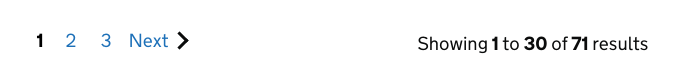
The thing I am most uncertain of is the use of item counts and pages numbers.
Is it better to say:
Page 3
or
Showing 21 – 30 of 100 items
Does the user care how many items there are?
Is it enough to just show the number of pages, as that it the quantity that the user is actually dealing with.
DO we show both number of items and pages, like land-registry does. Does that add any value? Is it confusing to the user?
leekowalkowski-hmrc
commented
5 years ago Well, the word 'items' isn't a geat choice of content, so I don't know if the user would care. In the Government Gateway's group management, we have 'Showing 21-30 of 100 team members' and I think yes, a group administrator could care how many team members were in the group (or matched their search criteria).
 mtallamy
commented
5 years ago
mtallamy
commented
5 years ago I thought I'd offer some feedback we received during private beta for our service. Our page closely follows the first example given at the top of this page, i.e. https://home-office-digital-patterns.herokuapp.com/components/pagination. In addition to further filtering, we've been asked by some of our users to add 'first' and 'last' page links alongside the 'previous' and 'next' links to help traversing larger data sets.
edwardhorsford
commented
3 years ago We’ve just added pagination to our service - which is a modified form of the MOJ pagination. See our PR adding it.
What it looks like:
Changes from the MOJ one:
aria-label to the nav, removing the paragraph.(page x of y) in the page title if pagination is visible.Some other implementation details:
&page=4 will take you to page 4. terrysimpson99
commented
3 years ago
terrysimpson99
commented
3 years ago  hopebristow
commented
3 years ago
hopebristow
commented
3 years ago We have used pagination in 3 places in our service for check and pay for multiple vehicles as part of the "Drive in a Clean Air Zone" service https://www.gov.uk/clean-air-zones. We also adapted a version of the MoJ pagination https://moj-design-system.herokuapp.com/components/pagination. Originally, we used a simple “next” and “previous” in one of these designs but users found this confusing and weren’t sure where they were in their overall list of vehicles when asked to find and make payments from a list of number plates that spanned multiple pages, often resulting in them failing to complete the task. When we changed this to match the MoJ pattern we saw an increase in the usability for users and all were successful in completing the task. All 105 users we tested with had no issues when testing this page with page numbers added.

 calvin-lau-sig7
commented
2 years ago
calvin-lau-sig7
commented
2 years ago The Design System working group reviewed this contribution in November and December 2021. They’ve approved it to be usable, consistent and versatile.
To get it ready to publish, the working group made these recommendations.
On the scope of this component, they made recommendations to:
On the design of this component, they made recommendations to:
On the guidance, they made recommendations to:
On the coded examples, they made recommendations to:
divider: true rather than type: ellipsis adamsilver
commented
2 years ago
adamsilver
commented
2 years ago The pagination component cannot be configured to show a line for ‘Showing 10 to 20 of 256 results’.

This leaves designers and developers 3 options that I can think of:
(1) Do not give users that information
The problem with this is that users don't get this information.
(2) Show the information somewhere "outside" of the bounds of the pagination component - for example, underneath as a paragraph

The problem with this is that designers/developers still have to implement this layout themselves and it's likely to mean that lots of different services implement the same thing inconsistently.
(3) Create a separate version of the pagination component to include this capability
The problem with this is the amount of effort it will take to do this plus keeping it in sync with any updates to the version in the design system.
I’ve not seen users struggle or complain when there’s no "Showing...", but:
 armstrongb
commented
2 years ago
armstrongb
commented
2 years ago Also in the ONS design system. @adamsilver
 simonwhatley
commented
2 years ago
simonwhatley
commented
2 years ago To echo @adamsilver's comments, I think that "Showing X to Y of Z results" is a fundamental part of pagination to help orientate the user.
Alongside the previously mentioned variants used at DfE, MOJ, HMCTS and the Home Office, Hackney takes the same approach (also allowing its removal), and ONS has a design variant.
For balance, it's worth noting Digital Scotland and the MOD design systems only show page numbers, DWP and HMRC don't appear to have a pagination component, and the NHS use previous/next.
The point "consider if users need the guidance and example to 'show the total number of results'" seems to have been taken to mean that "Showing X to Y of Z results" is not essential for the component. I don't think this was the correct interpretation of the working group's feedback.
 simevidas
commented
2 years ago
simevidas
commented
2 years ago Quick question: Would it make sense to remove the href attribute from the aria-current=page link? I just find it a bit odd that it’s possible to click and focus the current page link. In these pagination components, I prefer when the current page link is not interactive.

 Katecheshire1999
commented
2 years ago
Katecheshire1999
commented
2 years ago Does anyone know why my pagination doesn't seem to be linking to any styling? I copied the HTML straight from the pattern and all the other gov uk styles are working on the same page!

 querkmachine
commented
2 years ago
querkmachine
commented
2 years ago @simevidas You should include the href if using an <a> element, otherwise you should use a different element (like a <span>) instead. aria-current is also most effective if used on a link, as the purpose of the attribute is to provide context about which link in the group the user is currently viewing.
@Katecheshire1999 Are you using version 4.2.0 of govuk-frontend (or newer)? The pagination component wasn't present in older versions. If you're using the Prototype Kit, it hasn't updated to include the pagination component just yet.
 Beccawill334
commented
2 years ago
Beccawill334
commented
2 years ago @Katecheshire1999 Did you find a fix for this? Mine is doing the same thing even though I have the latest version of the prototype kit!
querkmachine
commented
2 years ago @Beccawill334 The Prototype Kit hasn't been updated to include the pagination component yet. A release that includes it is expected to be released next week.
 itsmestevey
commented
1 year ago
itsmestevey
commented
1 year ago We are looking to introduce pagination on Manage Incentives in HMPPS at the MoJ. Does anyone know whether there are any recommendations on how many items could/should appear before pagination takes place?
 sussexrick
commented
1 year ago
sussexrick
commented
1 year ago The guidance as currently published says only to include ellipses on larger screens, but the govuk-frontend default styles do not hide them on smaller screens. This seems inconsistent.
 CharlotteDowns
commented
1 year ago
CharlotteDowns
commented
1 year ago We ran an external accessibility audit for some of the components and patterns in GOV.UK Frontend in May 2023. In that audit, we included an example of the Pagination component. We’re adding results from that audit here so that we can:
The 'next' and 'previous' labels could use a bit more context. 'Next page'?
The ‘Next’ and ‘Previous’ links in the pagination do not possess additional link text of ‘page’ or similar to inform users of screen reading assistive technologies of their purpose when viewing the links out of context using the link text alone.
More detail in this issue:
We don't show the current page number / title in the pagination component. Users gotta guess!
The pagination method used does not indicate to users which page they are currently on and relies on the user to decipher this information from the context of the previous and next links, which some users may not be able to do with ease.
More detail in this issue:
Poor region label on the pagination for small # of pages. Change to something more descriptive.
The pagination region has been marked up within a element. However, this has been provided with an accessible name of ‘results’. This does not inform the user of the purpose of the region and does not convey that it contains the pagination options. As screen reader users will often navigate via regions, it is important that they are labelled adequately.
More detail in this issue:
 GraemeLaurenson
commented
1 year ago
GraemeLaurenson
commented
1 year ago Hi all - I’m Graeme, I’m currently an ID with RoS.gov.uk .. hope this is the right place to front this - if not .. my apologies and please point me in the right direction ..
We currently have an issue (and proposals) relating to using the pagination component in our Sasines Search tool. The benefits of this component are that it lets the user see the first and last pages, and the previous and next from the current page. However the default component is too wide - potentially over 600px. It has the duplication of 2 controls, the ‘Previous’ and ‘Next’ have the same effect as the numbers either side of the current page number (blue box) Proposal 1: We’d like to remove the words ‘Previous’ and ‘Next’ - still allowing the user to go to those pages - but saving 118px. Proposal 2: We’d like to remove the words ‘Previous’ and ‘Next’ as above and tighten up the spacing - but now saving 206px! We have user-tested with no issues.
The attached image demonstrates the usage/benefits.
Please can we have comments/advice with this - with the potential to propose a change through GitHub?
Thanks
G.
 owenatgov
commented
1 year ago
owenatgov
commented
1 year ago Hi @GraemeLaurenson, thanks for the contribution.
Whilst we appreciate the thorough outline of your proposal, we'd like to understand the need for a less wide pagination component. Going over the suggestions you made and addressing why they are the way they are:
GraemeLaurenson
commented
12 months ago Hi Owen - thanks for the response.
We have limited space to use the component - and while other (legacy) components would fit, they don’t offer the functionality. The users are all internal colleagues who will be trained on the journey and therefore there’s a factor of ‘learned behaviour’. We also have some preliminary research and users had no issues.
I've noted that the Digital Scotland Design System hides the ‘previous’ and ‘next’ text in smaller viewports. https://designsystem.gov.scot/components/pagination/middle-example
Which looks much tidier than.. https://design-system.service.gov.uk/components/pagination/for-list-pages/index.html (Try them at <768px window)
Is there a way an improved ’small viewport’ version of the GDS component can be built? It seems it would be useful for others too! I’m assuming however there are a lot of hoops to jump through?!
Interested in your thoughts Thanks G.
owenatgov
commented
11 months ago Hi @GraemeLaurenson. Thanks for the clarification.
In this case, if this setup works for your users then I would recommend simply changing the html of the component. You can do this by removing the span with class govuk-pagination__link-title from within the prev and next links. This will remove the text label. I would recommend setting an accessible name on the a tags that contain the prev and next links so that they still work for screen readers eg: adding the attribute aria-label="previous page" to the previous arrow icon link.
We are unlikely to implement this and deliver it via GOV.UK Frontend for the reasons outlined in my previous comment and our research that supports these positions, and because adding a solution for a specific use case creates additional weight on the component that could negatively benefit public facing services using this component. If you however are confident that this amendment works for your users then you can amend the component to suit your service.
 nasainsbury
commented
6 months ago
nasainsbury
commented
6 months ago At work, we have a simple pagination component which has a Previous and Next button.
There is some debate as to how these buttons should be styled. Currently the designers are proposing that Previous be a "Secondary" button, whilst Next is "Primary. I.e
I am of the view that both these buttons do the same "action" (in essence) and are of equal "importance", hence I'd have them styled the same.
Curious on thoughts around this when no number is included with the pagination component. TIA.
joelanman
commented
6 months ago @nasainsbury The GOV.UK Pagination component is here, including a numberless variant: https://design-system.service.gov.uk/components/pagination/ It uses links not buttons, and does not emphasise previous or next
nasainsbury
commented
6 months ago @joelanman , prior to our discussion, I reviewed this component and noted the following variances:
In the GDS example without numbering, the pages appeared to contain distinct content. Conversely, the example I presented showcases a semantic button. It executes JavaScript to "reload" content without necessarily directing to a new page. However, considering our utilization of Next.js, there's potential for it to function as a new link.
This observation potentially leads to another inquiry: In our pagination model, users are restricted from selecting a specific page to navigate to, only afforded the option of moving to the next or previous page, if available. This limitation stems from technical constraints within the API. Furthermore, we omit displaying the current "page".
Given that the "previous" and "next" buttons don't lead to entirely disparate content (as depicted in the image below), would this component still be appropriate for our use, albeit without supplementary text beneath each button?
Furthermore, regarding the discourse on secondary and primary buttons, our designers are prioritizing the "next" action. Your remark that the component "does not emphasize previous or next" prompts curiosity about whether this stance is intentional and if there exists a GDS blog post elucidating the rationale behind it. I'm eager to align with this reasoning, albeit currently lacking concrete justification beyond intuition.
joelanman
commented
6 months ago on using a javascript framework - we do have a requirement to use progressive enhancement:
https://www.gov.uk/service-manual/technology/using-progressive-enhancement
if you are updating the page using javascript you would have to make sure it is progressively enhanced, and that the javascript interaction is accessible for example to screen reader users. If that's the case, its possible you need gov uk secondary buttons: https://design-system.service.gov.uk/components/button/
We only use primary green buttons to highlight the main call to action on a page
nasainsbury
commented
6 months ago putting aside the PWA, and whether it's a button/link, the primary concern is around the styling of the "previous" and "next" link.
all examples I find online, the previous/next links are styled to look the same. in the example I've presented, we can assume it behaves in a non-framework style, and when you click next, it goes to website.com/search?page=3, and when clicking previous it goes to website.com/search?page=1.
we've followed the guidance on removing the button when you cannot go back or forward.
the main question is, would there be any reason to style the next/previous button differently? I can so no examples where this is the case, and in all the GDS examples they are styled the same. is there a specific reason for this?
apologies if I'm not explaining this well enough.
TLDR; Should the previous and next links be styled to look the same in all cases?
joelanman
commented
6 months ago We only use a different design (primary button) when it is a main call to action on the page (for example submitting a form). In all other cases the normal link or secondary button style is used, or the design of a specific component if it exists like pagination, tabs and so on. If you do user research and find another style works better you can feed that back in this thread.
nasainsbury
commented
6 months ago OK perfect. Thank you. I am also curious to see if we get any feedback about this, as the logic presented to me was that we want people to view more and thus wanted to give more attention to next than previous
appreciate the help!
Use this issue to discuss the Pagination component in the GOV.UK Design System.
What
Help users navigate through multiple pages. Typically used for pages of search results.
Examples
Multi-page pagination examples:
Previous / next only pagination examples: