 NickColley
commented
5 years ago
NickColley
commented
5 years ago I think it'd good to think about https://github.com/alphagov/govuk-frontend/issues/1205 as well if we did this.
Closed NickColley closed 3 years ago
NickColley
commented
5 years ago I think it'd good to think about https://github.com/alphagov/govuk-frontend/issues/1205 as well if we did this.
NickColley
commented
4 years ago Hover states in general could do with a review for example:
do not have hover states (perhaps more components too).
NickColley
commented
4 years ago Noticed the NHS seem to have responded to this challenge too (perhaps by DAC as well!).


I think this approach could potentially be problematic because the hover and the focus style are so similar a user could be confused what they're focused on and accidentally interact with wrong element.


This approach seems to be: 'if there is an underline, remove it. If there is no underline, show one'.
NickColley
commented
4 years ago Dave Hunter has shared some of the working notes for this iteration:
First iteration
Hypothesis
- Current hover and focus styles are too similar.
- Focus style needs to be more prominent.
If we make the hover style less prominent (by removing the yellow background) Then users will still be able to detect the link Because they already know where they are on the page.
Design examples
Link styles before
Link styles after
Link: colour NHS blue with an underline Hover: colour NHS dark pink with affordance of no underline and pointer cursor Focus: colour NHS black, background colour NHS yellow and border bottom colour NHS black
User testing
What we were looking to learn:
- Do the focus styles help users who rely on them
- Do the focus styles hinder users who don’t rely on them
We recreated pages of the NHS website in a prototype and set the participants tasks, including seeking information (navigating through pages) and filling in a form.
Findings
- All participants navigated with no problems
- Participants who didn’t rely on focus styles didn’t notice them
- Participants who relied on focus styles found them useful
Quotes
“showing me where I am, that’s good”
What next
We have more user testing scheduled in but considering our findings so far and the fact that our work is based predominantly on GOV’s work, we’re confident that the focus styles can go live.
Full document: https://docs.google.com/document/d/11AjdOgWC7ue1bit5AFyaneNwJYiudgLhf8nOxCWbn9M/edit#
A note on how they recruited participants:
At NHS Digital we have something called the Ability Network (it's for employees with a disability, long term condition and carers). We made contact with them and members kindly volunteered for user testing.
 christopherthomasdesign
commented
4 years ago
christopherthomasdesign
commented
4 years ago I've been doing a bit of exploration into this issue.
It's worth remembering that over 60% of GOV.UK users are on touch devices. So any work on hover states should only be seen as a small enhancement that acts as an extra affordance for mouse/trackpad users. It might be particularly helpful for people with cognitive impairments, low digital literacy or low vision.
I prototyped some different approaches to hover states, you can have a look at these in more detail here: https://design-system-mess.herokuapp.com/ (username:design / password:mess)
I started with an approach similar to the NHS example above – "if there is an underline, remove it; if there is no underline, show one". This ran into problems when using links on dark backgrounds, like in an interruption card (this component isn't currently in the Design System but many teams use it and it probably will exist in the future). If your link colour is the same as the text colour, and you remove the underline on hover, you lose the visual differentiator and it becomes unclear what you're selecting:


You can help this by using a tint of the original colour on hover. But then you run into the same problem we were trying to solve – the tint won't be distinct enough from the original link. I like the idea of not changing the colour on hover as a rule, and using a different visual change instead. It means that if your original link style is obviously a link and has enough colour contrast, the hover state will too.
An experiment I quite liked was using a thicker border on hover. I used an adapted version of the focus state styling, with a transparent background and the border at the bottom taking the same colour as the text:


Clearly, the hover and focus states may be indistiguishable to users with certain visual impairments, or using screens that don't show certain colours very well. However I think there are two changes in state that are particularly important:
At the moment I'm not sure how different the hover and focus states need to be from one another.
There’s the possibility that someone might navigate with both a keyboard and a mouse. Or with the mouse pointer left idle on the screen whilst tabbing through – that could make it unclear if a hover and a focus were showing at the same time. But not sure how common this is or what the impact would be. Any input on this would be appreciated.
Would be great to get any feedback on the ideas here or examples of how others have approached this.
Will also try and get something like this example into some user research to see how it tests. Let me know if you've got any research coming up and would like to add some new hover states into your prototypes.
NickColley
commented
4 years ago We should also test what these different states look like cross browser/ operating system.
 RosieClayton
commented
4 years ago
RosieClayton
commented
4 years ago We recently ran a round of accessibility research and included this change in the hover state.
We had 6 participants, including people with cognitive, mild and moderate motor impairments and low vision. 3 participants used dragon, 1 had a special keyboard with large keys, 1 used zoom magnification.
The hover states change didn’t effect any of our participants. The one participant with low vision did mention that he would have preferred the link to be a darker colour for greater contrast but he understood that it was a hyperlink. He zoomed in to use the hyperlink and increase the text size of it and he also had his iPhone on high contrast mode.
Overall this particular change didn’t have an affect on how he navigated the site or carried out his task. This was the same for all participants.
 hannalaakso
commented
4 years ago
hannalaakso
commented
4 years ago Representatives from the GOV.UK Design System working group reviewed a contribution for making hover states clearer in June 2020.
Based on a majority vote, the group decided that:
They also made the following recommendations.
Based on this feedback, the GOV.UK Design System team and the contributor have agreed to:
hannalaakso
commented
4 years ago We received some useful feedback from the Working Group for making hover styles clearer and will do some exploration to answer their questions.
Summary of Working Group feedback
New hover styles could be a breaking change for some users so we want to use the feedback from the WG to ensure that the hover styles work for different edge cases.
We have tested how the hover styles work for:
[ ] Text blocks eg. gov.uk figures

[ ] Text blocks with icons eg. Bank Holiday page links

[ ] Images as links
[ ] White backgrounds and non-white backgrounds (already done but we should check this if we change anything)
[ ] We have considered whether style could cause movement sickness or make it harder to scan content
As indicated to the WG, we also have post-review actions to:
We should also:
 MalcolmVonMoJ
commented
4 years ago
MalcolmVonMoJ
commented
4 years ago I just looked at this in the preview and the underline seems to almost touch the following line (Win 10 & Google Chrome). The focus state doesn't have this issue. Maybe adding a white background will sort the issue in a similar way.

 nnagewad
commented
4 years ago
nnagewad
commented
4 years ago Over on GOV.UK we needed to address the hover state for white text behind a coloured background.
The situation arose on the COVID-19 page, where the action link on the page's header doesn't have a hover state.
Rather than find a solution for this one scenario, is there a solution that works throughout GOV.UK?

When hovering over a white text behind a coloured background the colour of the text will change from govuk-colour("white") = #FFFFFF to #DDDCDB.
This colour was discovered when experimenting the limits of adding shade/darkening the white text, all the while complying with a11y standards of 4.5:1 colour contrast ratio, the AA grade for font-sizes that is less than 19px.
Experimentation/Discovery was made in this Figma file
Update will be made to the action link GEM as per solution to prompt conversation with the front-end community within GOV.UK.
See what feedback is within the community, based on that we can roll it out throughout GOV.UK
 chris-gds
commented
4 years ago
chris-gds
commented
4 years ago Related PR raised
 36degrees
commented
3 years ago
36degrees
commented
3 years ago Browser support for text-decoration-thickness has improved since we first started looking at this – technically it's been in Chrome and Edge since v87 and Opera since v73, but there's a bug in Chromium that means it doesn't work unless either text-underline-offset is set to something other than auto or text-decoration-color is set to something other than currentColor.
It looks like that issue should be fixed in Chrome 90, which becomes stable in April. As Edge and Opera are both built on top of Chromium, I'd expect both of those browsers to be updated with the same fix not long after.
Using text-decoration-thickness would allow us to do something like this, if we wanted:
https://user-images.githubusercontent.com/121939/105970532-61099e00-6081-11eb-9ecc-345c13bf196b.mov
It would need to be considered an enhancement as it would not work in IE11, Edge < 90 Early 2021), Chrome < 90 (April 2021), Safari < 12.1 (March 2019), Firefox < 70 (October 2019) – unless we also set the color or offset.
christopherthomasdesign
commented
3 years ago I've been doing some more work on links, building on Ollie's work above. I'm trying to solve two problems here:
The increasing support for a few CSS properties means we can now control more about how links look. I've had a go at making links that:
It's worth reiterating that these changes should be seen as an enhancement. For browsers that don't support some or all of these properties, the normal underline will still work.
Look at the work in Frontend at https://github.com/alphagov/govuk-frontend/pull/2089. Still some details to iron out, but something like this.
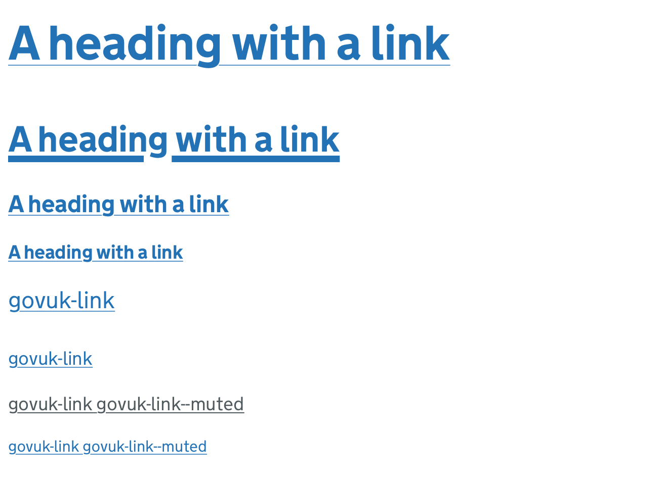
Before:

After:

I've added the following CSS to links:
text-decoration-thickness: 1px;
text-underline-offset: .1em;
text-decoration-color: govuk-colour("light-blue");
It makes all link underlines 1px thick, sits them a bit further below the baseline of the text, and uses a lighter shade of blue to make the line a bit visually lighter.
For the hover state, I made the line thicker and brought back the original link colour to make it stronger:

text-decoration-thickness: unquote("max(2px, .18em)");
text-decoration-color: $govuk-link-colour;
Here's how that scales for different sized text:

Hover:
The use of govuk-colour("light-blue") for underlines works well for blue links on white backgrounds, but obviously wouldn't work on darker backgrounds. Part of the rationale for using thicker underlines for hover states to make them more flexible for different backgrounds because they don't use a colour other than the link colour. So we should see if there's a more flexible way to do the underline colour tint. You can't use SASS tint functions on currentColor, and I don't think you can set an opacity on an inherited underline colour either...
I think we'd want to be fairly confident that any underline colour has at least 3:1 contrast with the background to pass 1.4.11 Non-text Contrast.
If something like that's not possible, we could either:
For some reason, every browser's implementation of text-underline-offset is different. Not massively, probably not critically.
On all browsers, the combination of text-underline-offset + text-decoration-thickness together means that when you hover and make the underline thicker, it moves slightly lower down from the text. I don't really see that as a problem but would be interested to hear if others do.
Another thing we could look at doing is making the underline offset on hover the same distance from the baseline as our focus state border. Again, I don't think there are huge gains here but it might look a bit more elegant or less jumpy.
I've done a bit of this but it would be good to test a bit more thoroughly on different versions and devices.
christopherthomasdesign
commented
3 years ago We sent the revised implementation of link styles and hover states to the working group in March 2021.
The group approved the changes, with the following main feedback:
We'll need to do a little bit more exploration to address these, covered in https://github.com/alphagov/govuk-design-system/issues/1578
This issue is from a May 2019 external accessibility audit report.
WCAG Reference: Usability feedback only, there is no WCAG related guidelines. Issue ID: DAC_Issue33 URL: Throughout
Screen Shot
Before hover
On hover
The colour change when a user hovers over a link is not clear and this was especially difficult for low vision users to determine.
Ensuring that the state change is distinctive would benefit low vision users in particular, while benefiting all mouse users in general.
Current Code Ref(s)
$govuk-link-colour #005ea5 $govuk-link-hover-colour #2b8cc4Low vision user comments
Solution
Offer a clearer colour change i.e. similar to that of the keyboard focus, or add/remove an underline when users hover over the links/buttons.