Good first issue
Open snowtimeglass opened 2 weeks ago
Good first issue
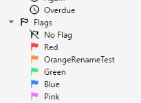
@snowtimeglass Which stroke width looks good for the default flag?
I like 1.5, I think the actual 'best' value will be somewhere between 1.5 and 1.75
@Giyutomioka-SS
The width of the star stroke is about 1.6. However, simply making the flag stroke thicker would make the size difference from the colored flags conspicuous. In other words, the flag would become conspicuously smaller when it gets colored.
Also, the inside of the pole would become too thin by the simple adjustment.
I think these results are undesirable.
If this suggestion (I mean, general proposal of this topic: "make the default flag stroke thicker", not a specific design above) is accepted, I would like to submit a PR.
The thickness of the default flag (
 I (maybe) understand its intent to express transparency, but it may work even with the same thickness as the neighboring star, which works in a similar role.
ic_flag_transparent) stroke is less consistent with other icons.For example:

Alternative example: (the width of the pole is wider than the colored flag's one)

Additional context Anki Desktop