 chenshuai2144
commented
2 years ago
chenshuai2144
commented
2 years ago Closed leshalv closed 2 years ago
chenshuai2144
commented
2 years ago  puxiao
commented
2 years ago
puxiao
commented
2 years ago 修改如下即可解决:
- <Menu>
-    <Menu.Item> ... </Menu.Item>
- </Menu>

+ const menuItems = [
+    {
+        key: 'center',
+        icon: <UserOutlined />,
+        label: '个人中心',
+    },
+    {
+        key: 'settings',
+        icon: <SettingOutlined />,
+        label: '个人设置',
+    },
+    {
+        key: 'logout',
+        icon: <LogoutOutlined />,
+        label: '退出登录',
+    },
+];
+ <Menu items={menuItems} />
更多示例可参考:
https://github.com/ant-design/ant-design/pull/34559/commits/72468a2015f5aa7397d9b41792adc8f50e4f93ab
 gudh
commented
2 years ago
gudh
commented
2 years ago anyone knows how to add className to menu item?
Seems there isn't a property for adding CSS classes
Before, v4.20.0, I was adding it directly to Menu.item
<Menu.Item className="blabla"> ... </Menu.Item>Update: I found the solution, actually className property is supported
        {
            label: (
                <div>
                    Login
                </div>
            ),
            key: '1',
            className: 'd-md-none', // <-- Just add them here
        },
zhugexinxin
commented
2 years ago
zhugexinxin
commented
2 years ago  在antdpro里已经将src/components/RightContent/AvatarDropdown.tsx文件做了修改还是报这个警告
 看起来是像是侧边栏的封装里报的
puxiao
commented
2 years ago @zhugexinxin 我看了一下源码: https://github.com/ant-design/ant-design/blob/master/components/menu/index.tsx
devWarning(
    !!items && !children,
    'Menu',
    '`children` will be removed in next major version. Please use `items` instead.',
);
devWarning = (valid: boolean, component: string, message: string): void => { ... }
devWarning() 第一个参数值应该为 false(无效) 时会发出警告。
按照 !!items && !children 这个条件,我们使用了 items,并且没有使用 children 情况下,其结果为 true(有效),确实不应该报这个警告了。
 zhouzyc
commented
2 years ago
zhouzyc
commented
2 years ago 一样问题:

看这个错误应该是侧边栏报出来的,目前还是一直存在
 Mankvis
commented
2 years ago
Mankvis
commented
2 years ago 同样的问题,暂未解决
zhugexinxin
commented
2 years ago @zhugexinxin 我看了一下源码: https://github.com/ant-design/ant-design/blob/master/components/menu/index.tsx
devWarning(
    !!items && !children,
    'Menu',
    '`children` will be removed in next major version. Please use `items` instead.',
);
devWarning = (valid: boolean, component: string, message: string): void => { ... }
devWarning() 第一个参数值应该为 false(无效) 时会发出警告。
按照
!!items && !children这个条件,我们使用了 items,并且没有使用 children 情况下,其结果为 true(有效),确实不应该报这个警告了。
layout版本我尝试升级到最新也是如此
Mankvis
commented
2 years ago
在antdpro里已经将src/components/RightContent/AvatarDropdown.tsx文件做了修改还是报这个警告
看起来是像是侧边栏的封装里报的
请问您这个问题解决了吗
chenshuai2144
commented
2 years ago 已经发布了新版本了,更新一下
 Es-Rell
commented
2 years ago
Es-Rell
commented
2 years ago 已经发布了新版本了,更新一下
@ant-design/pro-layout v6.35.0 最新版问题依旧
 dake0505
commented
2 years ago
dake0505
commented
2 years ago 已经发布了新版本了,更新一下
@ant-design/pro-layout v6.35.0 最新版问题依旧 V6.37.0 问题依旧
zhouzyc
commented
2 years ago 已经发布了新版本了,更新一下
新版本的npm似乎没有发布

 ImJasonIT
commented
2 years ago
ImJasonIT
commented
2 years ago @ant-design/pro-layout v6.35.0 最新版问题依旧
Es-Rell
commented
2 years ago 强制更新6.37.0已解决
 xingw-z
commented
1 year ago
xingw-z
commented
1 year ago 更新了 @ant-design/pro-layout@6.37.0 也没有解决
 zhangyuezhong
commented
1 year ago
zhangyuezhong
commented
1 year ago 我用antd 4.20.6,没有使用pro-layout, 也出现这个警告。
puxiao
commented
1 year ago 我看你们还在说这个事情,2 周前我忘了升级哪个包之后就不再报这个警告了。
后来 ant-pro 官方也升级了版本,目前最新版的 ant-pro,已经不报这个错误了。
 Junaid300
commented
1 year ago
Junaid300
commented
1 year ago I have impletement onClick event on Menu.Item `
` I was getting this warning  and changed my code to this. `` Now how can i implement onClick event ? choi2k
commented
1 year ago
choi2k
commented
1 year ago I have impletement onClick event on Menu.Item
<Menu > <Menu.Item key={1} onClick={handleLogOut}> Log Out </Menu.Item> </Menu>I was getting this warningand changed my code to this.
<Menu items={item} />Now how can i implement onClick event ?
const onMenuClick = (event: MenuInfo) => {
      const { key } = event
...
}

  const menuItems = [
    {
      key: 'logout',
      icon: <LogoutOutlined />,
      label: '退出登录',
    },
  ]

  const menuHeaderDropdown = () => (
    <Menu className={styles.menu} selectedKeys={[]} onClick={onMenuClick} items={menuItems} />
  )
try this?
Junaid300
commented
1 year ago @choi2k thank you it worked for me. I hope AntD community will update its documentation soon.
 buraketmen
commented
1 year ago
buraketmen
commented
1 year ago How can we use the Popconfirm component in this new design?
<Popconfirm
    title="Are you sure?"
    placement="leftBottom"
    cancelButtonProps={{ type: 'primary', danger: true }}
    onConfirm={() => this.deleteRecord(record.id)}
    okText="Yes"
    cancelText="No"
>
    <Menu.Item key="Delete"><i className='ik ik-trash' />Delete</Menu.Item>
</Popconfirm>
faysal-hub
commented
1 year ago
faysal-hub
commented
1 year ago warning.js:6 Warning: [antd: Menu] children will be removed in the next major version. Please use items instead. what about the link inside of the Menu.Item?? Thanks
      <Menu.Item icon={<HomeOutlined />}>
        <Link to="/">Home</Link>
      </Menu.Item>
peter-popluhar
commented
1 year ago
peter-popluhar
commented
1 year ago warning.js:6 Warning: [antd: Menu]
childrenwill be removed in the next major version. Please useitemsinstead. what about the link inside of the Menu.Item?? Thanks<Menu.Item icon={<HomeOutlined />}> <Link to="/">Home</Link> </Menu.Item>
Look at this example, there is a custom link in Items (Navigation Four - link): https://ant.design/components/menu/#components-menu-demo-horizontal
 EbokianKnight
commented
1 year ago
EbokianKnight
commented
1 year ago What if we need to render a badge or have custom styling for a single menu item?
buraketmen
commented
1 year ago How can we use the Popconfirm component in this new design?
<Popconfirm title="Are you sure?" placement="leftBottom" cancelButtonProps={{ type: 'primary', danger: true }} onConfirm={() => this.deleteRecord(record.id)} okText="Yes" cancelText="No" > <Menu.Item key="Delete"><i className='ik ik-trash' />Delete</Menu.Item> </Popconfirm>
Are there any updates regarding this problem?
 liuzhaowei55
commented
1 year ago
liuzhaowei55
commented
1 year ago 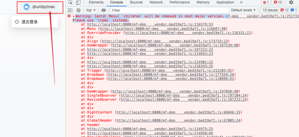
@ant-design/pro-components 2.3.20 @ant-design/pro-layout 7.1.9 鼠标移上去还是会有这个错误
 tanmaypanda-14
commented
1 year ago
tanmaypanda-14
commented
1 year ago warning.js:6 Warning: [antd: Menu]
childrenwill be removed in the next major version. Please useitemsinstead. what about the link inside of the Menu.Item?? Thanks<Menu.Item icon={<HomeOutlined />}> <Link to="/">Home</Link> </Menu.Item>Look at this example, there is a custom link in Items (Navigation Four - link): https://ant.design/components/menu/#components-menu-demo-horizontal
can someone convert this to the latest format
 leqnam
commented
1 year ago
leqnam
commented
1 year ago warning.js:6 Warning: [antd: Menu]
childrenwill be removed in the next major version. Please useitemsinstead. what about the link inside of the Menu.Item?? Thanks<Menu.Item icon={<HomeOutlined />}> <Link to="/">Home</Link> </Menu.Item>Look at this example, there is a custom link in Items (Navigation Four - link): https://ant.design/components/menu/#components-menu-demo-horizontal
can someone convert this to the latest format
Try this:
const onSelectMenu= (item: any): void => {
history.push(item.key);
}
<Menu
// mode=
onClick={onSelectMenu}
items={[
{
key: '/',
icon: <HomeOutlined />,
label: 'Home',
},
]} RagnorLixiaomeng
commented
1 year ago
RagnorLixiaomeng
commented
1 year ago in antd 5 what about the link inside of the Menu.Item?? Thanks,i still can't find the right way
      <Menu.Item icon={<HomeOutlined />}>
        <Link to="/">Home</Link>
</Menu.Item> kirasiris
commented
1 year ago
kirasiris
commented
1 year ago in antd 5 what about the link inside of the Menu.Item?? Thanks,i still can't find the right way
      <Menu.Item icon={<HomeOutlined />}>
        <Link to="/">Home</Link>
      </Menu.Item>
@RagnorLixiaomeng , @EbokianKnight
I believe someone already posted what to do about the children components of X menu; take a look:
const getItem = (key, icon, children, label, type, className, link) => {
  return {
    key,
    icon,
    children,
    label: <Link to={link}>{label}</Link>,
    type,
    className,
    link,
  }
}

const items = [
  getItem(
    'blogs',
    <i className="fa-solid fa-file-lines" />,
    [
      getItem('blogs-1', null, null, 'All Blogs', null, null, '/admin/blogs'),
      getItem(
        'blogs-2',
        null,
        null,
        'Add New',
        null,
        null,
        '/admin/blogs/create'
      ),
      getItem(
        'blogs-3',
        null,
        null,
        'Categories',
        null,
        null,
        '/admin/blogs/categories'
      ),
    ],
    'Blogs',
    null,
    null,
    null
  ),
  getItem("logs-1", undefined, null, "Logs", null, null, "/admin/logs"),
]

return (
  <Menu
    mode="inline"
    defaultSelectedKeys={['blogs-1']}
    defaultOpenKeys={['blogs']}
    items={items}
  />
)
That's what I came up with and it works great so far.
 rayyventura
commented
12 months ago
rayyventura
commented
12 months ago <Popconfirm
title="Are you sure?"
placement="leftBottom"
cancelButtonProps={{ type: 'primary', danger: true }}
onConfirm={() => this.deleteRecord(record.id)}
okText="Yes"
cancelText="No"
>
<Menu.Item key="Delete"><i className='ik ik-trash' />Delete</Menu.Item>
</Popconfirm>Any solutions to this. How to use a HOC with this new approach ?
 Sumanthbabu-Muthineni
commented
11 months ago
Sumanthbabu-Muthineni
commented
11 months ago import { Menu, Button } from "antd"; import { MenuUnfoldOutlined, MenuFoldOutlined, DesktopOutlined, PieChartOutlined, } from "@ant-design/icons"; import { useState } from "react"; import ReactPlayer from "react-player"; import Reference from "../videoReference"; import "./index.css";
// Function to create menu item object function getItem(key, videoid, icon, label, items) { return { key, videoid, icon, label: label || key, // set the label to the provided value or the key if not provided items: items && items.map((childItem) => getItem( childItem.title, childItem.id, childItem.icon, childItem.name, childItem.items ) ), // recursively map sub-options }; }
function AntNav() { const [collapsed, setCollapsed] = useState(false); const [videoUrl, setVideoUrl] = useState("https://www.w3schools.com/html/mov_bbb.mp4");
const jsonData = [
{
title: "Option 1",
id: "Copy%20of%20Virinchi_DB101",
icon:
// Convert JSON data to menu item objects
const items = jsonData.map((item) => { const { title, id, icon, name, items } = item; return getItem(title, id, icon, name, items); });
const toggleCollapsed = () => { setCollapsed(!collapsed); };
const getMenuItems = (items) => {
const handleMenuItemClick = (videoid) => {
setVideoUrl(https://dai.ly/${videoid});
};
return items.map((item) => {
  if (item.items) {
    // Sub-menu item
    const subMenuItems = getMenuItems(item.items); // Recursively get the menu items for sub-options
    return (
      <Menu.SubMenu key={item.key} icon={item.icon} title={item.label}>
        {subMenuItems}
      </Menu.SubMenu>
    );
  } else {
    const { key, videoid, icon, label } = item;
    return (
      <Menu.Item
        key={key}
        icon={icon}
        onClick={() => handleMenuItemClick(videoid)}
      >
        {label}
      </Menu.Item>
    );
  }
});
};
const handleMenuItemClick = (videoid) => {
setVideoUrl(https://dai.ly/${videoid});
};
return ( <div style={{ display: "flex"}}> <div className={collapsed ? "navWidth" : "navBarOverflow"} >
    {/* course Menu  */}
    <Menu
      style={{ fontSize: "1rem", height: "100vh" }}
      defaultSelectedKeys={["1"]}
      defaultOpenKeys={["sub1"]}
      mode="inline"
      theme="dark"
      inlineCollapsed={collapsed}
      onClick={({ key }) => {
        if (typeof key === "string") {
          handleMenuItemClick(key);
        }
      }}
    >
      {getMenuItems(items)}
    </Menu>
  </div>
  <div
    className={collapsed ? "videoPageContainer2" : "videoPageContainer1"}
  >
    <div className="videoplayer">
      {videoUrl && (
        <ReactPlayer
          //disabled download button
          config={{ file: { attributes: { controlsList: "nodownload" } } }}
          // Disabled right click to avoid downloading
          onContextMenu={(e) => e.preventDefault()}
          width="70%"
          height="100%"
          padding="15px"
          url={videoUrl}
          controls
        />
      )}
    </div>

    <Reference />
  </div>
</div>
); }
export default AntNav; got this error: warning.js:6 Warning: [antd: Menu] children will be removed in the next major version. Please use items instead...how can i rid off this warning,tried different ways,no use..
 dzcpy
commented
11 months ago
dzcpy
commented
11 months ago Actually why should it be changed in the first place? What's wrong with Menu.Item? And how to style the menu item?
 jonasmarco
commented
10 months ago
jonasmarco
commented
10 months ago Can someone help me? I did the implementation in a Next JS project, the issue is that here I use the Next Link to direct me to other pages and if I use the Menu items props, the clicks on the links do not work.
const menuItens = [
    {
      key: '/',
      label: 'Home'
    },
    {
      key: 'characters',
      label: 'Characters'
    },
    {
      key: 'episodes',
      label: 'Episodes'
    }
  ]
  <Menu theme="dark" mode="horizontal" items={menuItens}>
    {menuItens.map((item) => (
      <Menu.Item key={item.key}>
        <Link href={`/${item.key}`}>{item.label}</Link>
      </Menu.Item>
    ))}
  </Menu>
AnanduKarthi
commented
10 months ago
AnanduKarthi
commented
10 months ago export const MenuItems = styled(Menu.Item)
&.ant-menu-item-selected {
background-color: ${colorChange} !important;
}
;
I'm using the ant d menu as shown above to the extent to build my style component, how come after the update Im able to do that
 smile199705
commented
8 months ago
smile199705
commented
8 months ago 相同问题: 看这个错误应该是侧边栏出来的,目前还是一直存在
xdm这个问题解决了吗?
smile199705
commented
8 months ago 其实,为什么首先要改变它呢?Menu.Item 有什么问题?以及如何设置菜单项的样式?
你这边有解决吗?
 andyFang94
commented
8 months ago
andyFang94
commented
8 months ago "@ant-design/pro-components": "^2.6.18", "antd": "^5.9.0",
 junkiet
commented
3 months ago
junkiet
commented
3 months ago "antd": "^5.12.8" 也一样包错
 khamid4575
commented
3 months ago
khamid4575
commented
3 months ago const items = [
{
key: "home",
icon: <HomeOutlined />,
label: "Home"
},
{
key: "activity",
icon: <AppstoreOutlined />,
label: "Activity"
},
{
key: "tasks",
icon: <BarsOutlined />,
label: "Tasks",
children: [
{ key: "task-1", label: "Task 1" },
{ key: "task-2", label: "Task 2" },
{ key: "subtasks", label: "Subtasks", children: [
{ key: "subtask-1", label: "Subtask 1" },
{ key: "subtask-2", label: "Subtask 2" },
]},
]
},
{
key: "progress",
icon: <AreaChartOutlined />,
label: "Progress"
},
{
key: "payment",
icon: <PayCircleOutlined />,
label: "Payment"
},
{
key: "settings",
icon: <SettingOutlined />,
label: "Settings"
},
]
Warning: [antd: Menu]
childrenwill be removed in next major version. Please useitemsinstead.