apoch / curvature

A full-featured editor for working with Utility-based AI
Other
266 stars 23 forks source link

Bug: UI buttons on Behaviors, Behavior sets, Archetypes and Scenarios type almost not accessible. (Win10) #41

Open Goutye opened 6 years ago

Goutye commented 6 years ago

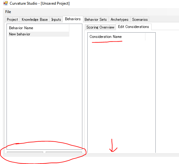
As demonstrated in the image below: image

The button to create Behavior/Archetype/Scenario is almost not accessible. Also, the Considerations UI inside Behaviors Tab (Edit Consideration) is not visible. Something similar happens in the Behavior set tab (right part)

Changing the size of the window does not solve the problem.

apoch commented 6 years ago

Hi, thanks for the report. I'm having trouble reproducing the issue. Can you check your display scaling settings for me and post the current values?

I'm testing the UI at 100% scaling. Is there a chance you're using a different scaling/DPI configuration? I can also experiment with fonts as it looks like your system font is different than mine.

Thanks, just trying to pin down what's going wrong here!

Goutye commented 6 years ago

Hi. Here are my current values: 100% (Recommended) 1920x1200

I don't remember having change any display setting on my Windows version. Despite working in Japan, this Windows 10 version is EN(US) (Language pack EN(US)).

I will try to check tonight on my home computer.

Edit: Never tried to build UI in C# yet, but I have some doubts on the behavior of the following lines:

this.InputFlowPanel.Location = new System.Drawing.Point(6, 19);
this.InputFlowPanel.Size = new System.Drawing.Size(400, 135);

It seems to be possible to set a margin instead of drawing from a specific relative location (If that was the intended behavior of the above lines). As for the Size, it should be adjusted automatically I guess. Anyway, no great experience on C# UI yet, I just read the doc and code quickly, so I may misunderstand part of the code.

apoch commented 6 years ago

I think that specific code is from this file which is an automatically generated module that sets up the default properties of the UI elements. The Designer.cs modules are all similarly generated by the UI editor from Visual Studio.

In that particular case the panel is "attached" to its parent control and should resize with it automatically (see some lines up). Almost all of the UI elements do something similar. WinForms is kind of gross in the way it handles automatic resizing, so this sort of silliness is common.

What bothers me is that this seems to be very machine-specific. I'm not seeing the incorrect sizing behavior across three different Win10 machines, and I know a few others have downloaded the beta and have not reported any trouble.

So I am naturally scared that this will go wrong for an unpredictable number of people :-/

Unfortunately without a reproducible case it's really hard to even speculate on what might be broken.

Goutye commented 6 years ago

Sorry for the late follow up.

I tried the latest release. while I still have some UI bugs, an annoying one (hiding totally the buttons of EditConsiderations) is now partially fixed (still almost fully hidden). The scenario buttons are still totally hidden, which prevent any simulation.

image

I tried the application on a similar PC (Win10), the bug did not appear. I guess, if no one else reports this bug, you can consider it unique to my setup. I have another computer to enjoy the application, so it is fine.

taoshang commented 6 years ago

I also have this bug in Win10.

apoch commented 6 years ago

@taoshang I am curious if you see this in a release package of Curvature, or in the latest source code version, or possibly both?

taoshang commented 6 years ago

@apoch I only try this is latest source code version.

taoshang commented 6 years ago

@apoch Sorry, I only try this in "Download the master branch" version.

taoshang commented 6 years ago

@apoch I have tested both version. I see this in both.

apoch commented 6 years ago

@taoshang Sent you a pull request since you have a fork of the repository available. It adds some diagnostic stuff to try and track this down. If you can think of any other useful information that could be collected, feel free to add it in.

taoshang commented 6 years ago

@apoch Window font face: 宋体 Window font size: 9 Autoscale factor X: 1 Autoscale factor Y: 1 Autoscale basis X: 6 Autoscale basis Y: 12 Autoscale current X: 6 Autoscale current Y: 12 Scenarios Autoscale basis X: 6 Scenarios Autoscale basis Y: 12 Scenarios Autoscale current X: 6 Scenarios Autoscale current Y: 12

2018_10_16_15_57 50

taoshang commented 6 years ago

Window font face: 宋体 Window font size: 9 Autoscale factor X: 1 Autoscale factor Y: 1 Autoscale basis X: 6 Autoscale basis Y: 12 Autoscale current X: 6 Autoscale current Y: 12 Scenarios Autoscale basis X: 6 Scenarios Autoscale basis Y: 12 Scenarios Autoscale current X: 6 Scenarios Autoscale current Y: 12

2018_10_16_15_58 03

taoshang commented 6 years ago

Microsoft Visual Studio Community 2017 Version: 15.7.6 Microsoft .NET Framework Version: 4.7.03056 Windows 10 x64

taoshang commented 6 years ago

if I reduce the font size in UI designer, the button will show. I guess I don't have the font you use. Could you tell me what's font in the UI designer? I can download it and try again.

apoch commented 6 years ago

Here's my settings:

Window font face: Microsoft Sans Serif Window font size: 8.25 Autoscale factor X: 1 Autoscale factor Y: 1 Autoscale basis X: 6 Autoscale basis Y: 13 Autoscale current X: 6 Autoscale current Y: 13 Scenarios Autoscale basis X: 6 Scenarios Autoscale basis Y: 13 Scenarios Autoscale current X: 6 Scenarios Autoscale current Y: 13

I think the problem might be that autoscale is not correctly set for the UserControls in the project. That would make sense with the difference in Y scale (12 vs 13) and the font size change you found. I will open another PR in a moment with an attempt at setting the autoscale properties the right way.

taoshang commented 6 years ago

@apoch the new merge has fixed most of UI layout bugs. But there is a bug here: 2018_10_18_10_10 19

taoshang commented 6 years ago

@apoch the down arrow button is still missing of response curve designer in right bottom.

apoch commented 6 years ago

@taoshang Interesting. I'm not sure why that element is different yet.

On that page from the screenshot, if you click the Wizard... button, there is a dialog that also uses the response curve designer UI - it's under the Apply Response Curve tab along the top, which has an Advanced mode on the left side. Does that response curve UI also have the down arrow missing?

Just trying to narrow down what Winforms behavior might be involved. Thanks for the screenshots and merges, it has been very helpful!

taoshang commented 6 years ago

2018_10_19_14_42 25 2018_10_19_14_43 15

taoshang commented 6 years ago

@apoch the response curve designer UI in "edit considerations" have the down arrow missing. no matter how I change the size of the window. the response curve designer UI in Wizard show all buttons. Thank you.

apoch commented 6 years ago

@taoshang I changed the placement of the down arrow button (and the height of the side buttons) to be manually controlled in code instead of by WinForms. The Wizard dialog and the main response curve designer should now look identical with this change. Will open a PR shortly.