atom / atom

:atom: The hackable text editor
https://atom.io
MIT License
60.14k stars 17.4k forks source link

Create icon #63

Closed kevinsawicki closed 10 years ago

kevinsawicki commented 11 years ago

/cc @tonyjaramillo

nathansobo commented 11 years ago

I like the bomb idea, but I'm in a gray area on whether it's a good idea to actually launch with images of a weapon of mass destruction. Here's a non-violent idea, if we decide against violence. It's supposed to look like the Apple command key (which I'm pretty sure they don't have a trademark on because it's an old symbol that predates them, according to Wikipedia). If anyone is interested in iterating on it, I have the Illustrator file.

Atom Command Icon Idea

benburkert commented 11 years ago

Dr. Manhattan Octocat. do it. do it.

nathansobo commented 11 years ago

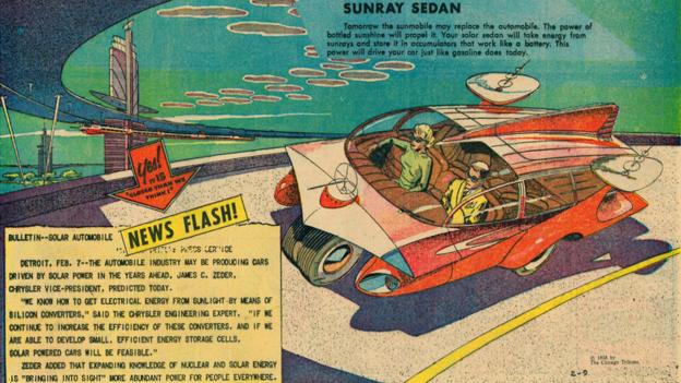
We've had a lot of discussions about a retro-future / atom-punk theme for Atom's visual materials. Like how people thought about the Atomic future in the fifties.

defunkt commented 11 years ago

I would love to explore the retro theme and something along the lines of "Atom". It seems like we'd be missing an opportunity if we didn't incorporate something recognizably atomic into the brand.

Would the Apple command key have any meaning for Linux or Win users?

jbarnette commented 11 years ago

http://atomo.com

kevinsawicki commented 11 years ago

Would the Apple command key have any meaning for Linux or Win users?

I think it would be recognizable but would feel a bit exclusionary, love the retro ideas though, especially the raygun.

bkeepers commented 11 years ago

I love the atomic energy lab concept, or something like an erector set. I like the analogy of Atom being something that gives you some basic building blocks, but it's up to you to build something useful with it.

On Oct 18, 2012, at 12:08 PM, Corey Johnson notifications@github.com wrote:

@tonyjaramillo those are amazing. But now that I see them I agree with you, associating GitHub with WMD feels like a bad idea.

I think the original idea for a retro theme came from the Rocket Ship that is on the Embarcadero.

Other images I like

— Reply to this email directly or view it on GitHub.

bleikamp commented 11 years ago

Random more things for inspiration:

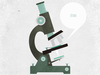
A microscope could be a another cool icon concept.

bleikamp commented 11 years ago

One more:

kevinsawicki commented 11 years ago

tonyjaramillo commented 11 years ago

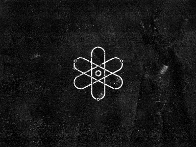
@bleikamp I like the microscope idea, it's different. A common symbol for atom is that nucleus with elipses and spheres circling it and I was hoping to get away from it, or at least mix it up a bit.

Great reference everyone.

bleikamp commented 11 years ago

A common symbol for atom is that nucleus with elipses and spheres circling it and I was hoping to get away from it, or at least mix it up a bit.

I agree, but I do like the simplicity and recognizability of that symbol if it was somehow GitHubified.

benburkert commented 11 years ago

how about electron orbits that make an outline of the octocat head.

On Thursday, October 18, 2012 at 12:03 PM, Ben Bleikamp wrote:

A common symbol for atom is that nucleus with elipses and spheres circling it and I was hoping to get away from it, or at least mix it up a bit.

I agree, but I do like the simplicity and recognizability of that symbol if it was somehow GitHubified.

— Reply to this email directly or view it on GitHub (https://github.com/github/atom/issues/63#issuecomment-9578110).

dreww commented 11 years ago

i found this logo recently (which admittedly is weapons-related, it's for the UK's atomic weapons development department.) atomic weapons establishment

i thought the electron flying toward the viewer was a nice take on the classic atom iconography.

jonrohan commented 11 years ago

Just had a sketch idea today thought i'd share.

image

nathansobo commented 11 years ago

f8575ff6-720d-11e2-8c4f-f86a26cae9bc

tonyjaramillo commented 11 years ago

Here are a few versions of the Atom icon based on @nathansobo's design. I still would like to explore the idea we were discussing in the rules of the GH universe issue and at the very least make make sure the styles are consistent. For example, some of the designs below use gradients which we generally don't use in Octocat or Hubot illustrations. Also, we need to think about color (or lack thereof).

Compiled images so you can see them at (or around) icon size: compiled

Various versions:

Nathan, I realize your design had 3 spheres in the center, I just wanted to try it with one to see how it looked. atom_01 atom_02 atom_021

These are the same 3D model just rendered from a different camera angle, and obviously 3 spheres in the center. atom_03 atom_04 atom_05 atom_06

Thoughts?

cc/ @kevinsawicki

nathansobo commented 11 years ago

I'm starting to be convinced that my design won't work well at small sizes... I tried a couple icon designs today myself and hydrogen definitely renders better than lithium when it's small:

Atom Lithium Icon Atom Hydrogen Icon

jonrohan commented 11 years ago

I'm liking the direction, and I definitely think the particle angle is the one to go. But these revisions I'm seeing are all missing the Retro-futurism style.
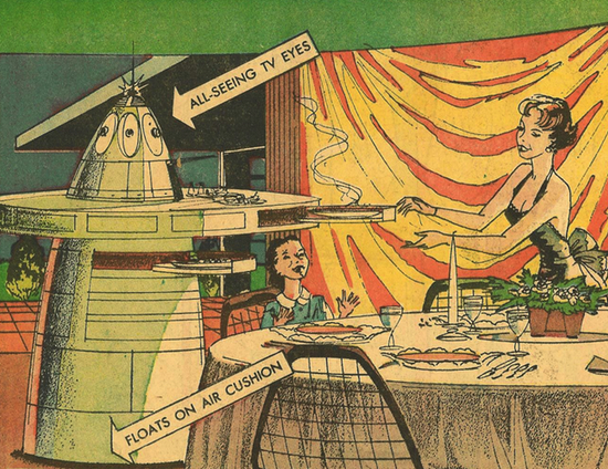
60s Futurism

The great thing about this art style is, the watercolor, yellows and blues. And everything that was drawn was just slightly outrageous but believable. Just remember, The Future is closer than you think!

nathansobo commented 11 years ago

I agree. I don't think my artistic skills were up to the task in a realistic time frame but I wanted to get something particle-ish as a last resort for the internal release. Hopefully you can hook us up with something more retro-future, because I love that aesthetic.

On Friday, February 22, 2013, Jon Rohan wrote:

I'm liking the direction, and I definitely think the particle angle is the one to go. But these revisions I'm seeing are all missing the Retro-futurism http://en.wikipedia.org/wiki/Retro-futurism style. 60s Futurism

The great thing about this art style is, the watercolor, yellows and blues. And everything that was drawn was just slightly outrageous but believable. Just remember, The Future is closer than you think!

https://a248.e.akamai.net/camo.github.com/824e3ffa508649ec63dce956009802c27d7804b0/687474703a2f2f6d656469612e736d697468736f6e69616e6d61672e636f6d2f696d616765732f467574757269736d2d4a6574736f6e732d3633312e6a7067

https://a248.e.akamai.net/camo.github.com/fd6f569e9729d8475a127b0f699c467449637b93/687474703a2f2f69636865662e626263692e636f2e756b2f77776675747572652f3632345f3335312f696d616765732f6c6976652f70302f30722f676b2f70303072676b74622e6a7067

https://a248.e.akamai.net/camo.github.com/f291ee9f906a77b344353efa76c80f922da85a0f/687474703a2f2f626c6f67732e736d697468736f6e69616e6d61672e636f6d2f70616c656f6675747572652f66696c65732f323031322f31312f313935392d637477742e6a706567

https://a248.e.akamai.net/camo.github.com/32e282961fd39c8422a5928896e4b1dfd6b22e8c/687474703a2f2f64313436366e6e773065783831652e636c6f756466726f6e742e6e65742f6e5f69762f3630302f3535383834352e6a7067

https://a248.e.akamai.net/camo.github.com/99f9783cad375ed39ea3744ad141eaea9b1acabd/687474703a2f2f7777772e636f6c6c6563746f72737765656b6c792e636f6d2f61727469636c65732f77702d636f6e74656e742f75706c6f6164732f323031322f30372f47756e732e6a7067

https://a248.e.akamai.net/camo.github.com/7cbadb65c675c9826281bb598c23e3e8656aaf38/687474703a2f2f7777772e736369656e7469666963616d65726963616e2e636f6d2f6d656469612f696e6c696e652f636f6d69632d626f6f6b732d66726f6d2d7468652d61746f6d69632d6167655f312e6a7067

https://a248.e.akamai.net/camo.github.com/5a54e30fb2e9a62e8c30afcd653eea074d8fcbba/687474703a2f2f7463746563686372756e6368323031312e66696c65732e776f726470726573732e636f6d2f323030392f30382f31373737342e6a70673f773d35393126683d333735

— Reply to this email directly or view it on GitHubhttps://github.com/github/atom/issues/63#issuecomment-13984853.

nathansobo commented 11 years ago

New one... by popular demand I tried a cat head. I kinda like it

Atom Glowing Lithium Cat

@orderedlist I think the increased contrast makes this pretty good at smaller sizes.

watsonian commented 11 years ago

I must say, I kinda love the octocat head in the center. :heart:

tonyjaramillo commented 11 years ago

@nathansobo I like the last one as well. I know eventually the intention is to go retro-future and maybe get away from using the Octocat in everything, but this is a good replacement for what you're currently using 'til we can tackle all the icons.

probablycorey commented 11 years ago

I like the icon, but I'd like to keep the octocat out of Atom for a two reasons.

  1. No octocat helps Atom stay stealthy in public.
  2. I don't want everything GitHub product to be Octocat branded.

Also, an animated version of this: https://f.cloud.github.com/assets/1300064/187370/b6ecbfe0-7d55-11e2-9f88-870de48daa69.png would make a great loading spinner .

watsonian commented 11 years ago

Is having it be stealthy something we want? Seems like having an icon in every developer's dock that has the image in it that is most closely associated with our brand would be a good thing.

nathansobo commented 11 years ago

I think there's a desire for stealth until the official launch. I question whether that little cat will actually be that noticeable in a coffee shop or something for a fleeting moment in someone's dock though. Should I replace it with a sphere? Three spheres? Then we'll get a bunch of annoying jokes about lithium.

On Mon, Feb 25, 2013 at 10:53 AM, Joel Watson notifications@github.comwrote:

Is having it be stealthy something we want? Seems like having an icon in every developer's dock that has the image in it that is most closely associated with our brand would be a good thing.

— Reply to this email directly or view it on GitHubhttps://github.com/github/atom/issues/63#issuecomment-14059063.

jonrohan commented 11 years ago

Then we'll get a bunch of annoying jokes about lithium.

There's only one Lithium joke in the world. Honest. Would I Li to you?

What is a cat made up of? Iron, lithium, and neon. FeLiNe

tonyjaramillo commented 11 years ago

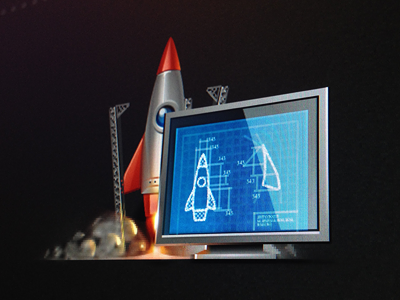
I attempted to create some concept sketches in the retro-futuristic style. I was trying to keep with the container idea we discussed earlier. If you don't like them feel free to rip them apart. If any of them feel like they're going in the right direction let me know and I'll flesh it out.

concept_01 concept_02 concept_03 concept_04 concept_05 concept_06

probablycorey commented 11 years ago

My favorite is:

https://f.cloud.github.com/assets/1300064/208230/4cefbca4-821a-11e2-8139-92c0328abf68.png

It is quickly recognizable as an Atom, but has that retro look. I like the other ones as well, but I feel like they emphasize the container too much.

On Feb 28, 2013, at 6:53 PM, Tony Jaramillo notifications@github.com wrote:

I attempted to create some concept sketches in the retro-futuristic style. I was trying to keep with the container idea we discussed earlier. If you don't like them feel free to rip them apart. If any of them feel like they're going in the right direction let me know and I'll flesh it out.

— Reply to this email directly or view it on GitHub.

jonrohan commented 11 years ago

Is going in the right direction. One idea/suggestion at larger sizes the icon should have a red button on the side of the container. Like :arrow_right: Don't Push this Button. :arrow_left:

orderedlist commented 11 years ago

I lrrrv this. For serious.

nathansobo commented 11 years ago

Looking nice! The container really adds some personality and opportunity for retro-ization to the basic Atom shape. Minor nitpick, but could the triangle implied by the electrons be pointing upward? Or maybe having it down is more playful...

I'd also love to see the final rendering having that vintage comic book feel from the earlier images you posted... with the washed out inks, textured paper. Corey is really into the idea of the icon having a "flat" feel, as opposed to more 3d and dimensional. Along the lines of the Chrome icon refresh. The first icon looks real, but the later is cleaner and moving away from skeuomorphism.

Icons

If we do want to go skeuomorphic, I think we should project through the medium of paper and ink... Like this POG cap: you can see it's made of paper... it's worn and faded. But on that paper there's a 3d image it's depicting. I like the idea of layers like this: we have a realistic portrayal of a flat but textured real-world object that itself has a cartoonish portrayal of our fanciful retro-future atom container.

POG cap

tonyjaramillo commented 11 years ago

I've created a couple versions of the icon. I got some initial feedback when I dropped it in campfire but I figured I'd post here to make sure everyone saw it. There are two versions on the dock, one with translucent glass, which I'm a fan of. But the particles are not popping enough, especially at small sizes, so changes need to be made.

atomicon_screenshot

This version is a little different than the above one. I removed the background swooshes. It felt too muddled to me at smaller sizes

atom_icon_v4

This is the WIP for the 3D-ish version, just so you can see where I'm at.

atomicon_3d_v1

@JohnCreek reminded me of the ever-important silhouette rule, so I created this test sheet to see how the icon read. I made a few different versions of the "swoosh" width and particle size. Personally i think the 3D version is stronger. Thoughts?

atom_icon_v4_sils

I'd love some help/feedback on version, color and just overall design.

kevinsawicki commented 11 years ago

:point_up: I really like this one and where it is going, would love to give it a try in-app and see how it compares to the previous one.

nathansobo commented 11 years ago

I'm not really liking the "atom in jar" direction. It just doesn't feel iconic enough to me... too much like a cartoon and not enough like a symbol. The jar adds a lot of visual complexity that isn't needed in conveying the core idea. It also doesn't feel serious enough. It doesn't correlate with the emotions I want to feel about my primary tool for writing code. It conveys fragility somehow... makes me think of lab rats and test tubes.

What direction do I want to head in? Well, I've tried to convey it with the current icon with the electrons spinning around the octocat head, which several people have mentioned to me that they like. Don't get me wrong: I don't think we can ship with the current icon as-is. It's not refined enough. But it's my best expression of the direction I'd like to move toward. It doesn't have to be exactly that, but more like it. Like what about something with a similar feel of the atomic symbol cast in aluminum? I just want to push toward something more minimal and symbolic, and less cartoonish. Simple. Clean. Retro-future minimal techno.

Also, what is it about the retro-future art that makes it look so retro-ey? I wasn't able to capture it in my own attempts and these icons don't seem to have it either. I really want it to feel more like artwork from the 50's.

nathansobo commented 11 years ago

And sorry, I know I said previously that I liked the jar. But after seeing it evolve my feelings have changed.

nathansobo commented 11 years ago

How can we make something with as much panache as the Chrome logo? Now I will stop commenting.

maddox commented 11 years ago

I just think it needs to be more square-ish to fill up its room in the Dock.

jonrohan commented 11 years ago

I have some ideas that I want to meet with @tonyjaramillo about. Maybe thursday if you're not busy?

tonyjaramillo commented 11 years ago

@nathansobo I understand you want to keep it minimal and simple, I'm all for that. Maybe the jar is not the solution. But I think just a simple atomic symbol isn't unique enough. If we're going to just do a very minimal symbol it needs to be different. So how do we do that? I don't think it can be the Ococat. After the design summit we decided not to Octocat-ify everything. The idea was that Atom and whatever comes after that, were going to have their own identity. They would relate to the Ocotocat in that they live in the same "universe", but each character/object/symbol belongs on their own "planet". There is a great repo on this in case you haven't seen it yet.

Personally I like the jar idea, maybe my design isn't the best representation of what it could be, but the idea did seem interesting me. And I didn't see fragility. I saw a symbol of contained energy, a tool that if harnessed could be very powerful. Something built on, and possibly used for, theories and experimentation. Great minds worked countless hours to encapsulate this power source for some purpose (we don't know yet), but it's available for all to use. I imagine an object like this would live in the same universe at the Ocotcat. But keep in mind I'm still very open to new ideas.

"How can we make something with as much panache as the Chrome logo?"

chrome

Simplicity and color. You can see what it looks like without color. Very simple. They added harmonious colors and soft shadows for more dimension. Maybe we could try something along those lines? Atom can be a simple shape and we could use color to give character.

@jonrohan I'd love to hear some ideas. I'll be in all day on Thursday and Fri. Grab me whenever.

jonrohan commented 11 years ago

Not too long ago, Hubot got sick, very sick.

image

It got to be where hubot would attack people at will. causing them to cry.

image

Oh no! What are we going to do? "I know what to do!" said the octocat

It was then that the octocat spent hours in it's lab, building a ship. "This ship will serve as a vessel to shrink myself down and let me explore the inside of hubot." she said

ship

So the ship was prepped, and away she went. To find the cause of hubot's error. Inside hubot, the Octocat came across a wide variety of things, that both shocked and amazed her. But what she didn't see was the malfunction happening TO THE SHIP. The octocat was still shrinking. DOWN DOWN DOWN to the very ATOMS that made up hubot.

atom

From the Atom, the octocat was able to re-write hubot, into a more user friendly language. When she returned to normal size the Octocat was made a hero, and they threw a party for her.

image

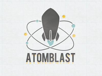
In all seriousness, this is a rough sketch I came up with for the atom icon. I think it captures the 60s futurism style.

image

screen

cc @github/branding @cameronmcefee

jonrohan commented 11 years ago

Oh, and I left out "At" is the atomic symbol for Atom

kevinsawicki commented 11 years ago

Play this video while reading this story.

nathansobo commented 11 years ago

@tonyjaramillo Yeah, I think you may be right about the uniqueness. It's definitely a symbol that's everywhere. And if we don't inject the Octocat into it it's pretty boring. Could Atom's planet be a parallel universe where the 60's aesthetic never changed but their technology advanced? RetroFutureWorld?

Jon turned me onto El Gato Gomez... I really dig her work... it's for sale on eBay. I love the super simple, flat shapes that are abstracted to their essence. And the off-center concentric circles depicting orbits. There's a lot of stuff in his gallery to mine for ideas. The icon doesn't necessarily have to be an atom. Maybe it could be some other simple iconic shape like Gomez's bad-ass rockets and flying cars.

Cool Future Image

nathansobo commented 11 years ago

What about a portal into space as the icon? That would be trippy. Also check out the awesome diagramesque art on the wall in this piece.

This one is killer

dgraham commented 11 years ago

Really digging RetroFutureWorld.

jonrohan commented 11 years ago

As an aside, I thought this "El Gato Gomez" was some dead artist who was at the front of this movement in the 60s.

After some googling, turns out he is a she. Crystal. She's very much alive, and sells her work in her spare time. https://www.facebook.com/pages/The-Art-Of-El-Gato-Gomez/196200323793414 http://www.ebay.com/sch/elgatogomez/m.html?_nkw=&_armrs=1&_from=&_ipg=&_trksid=p3686

Pretty rad. I'm gonna jokingly suggest we commission her to paint an "Atom" room in the office.

watsonian commented 11 years ago

s/jokingly/seriously/

cameronmcefee commented 11 years ago

@jeejkang is basically already steering us into the retro future with his Universe illustrations so I think it's a great way for us to head for Atom. Related: http://github.github.com/github-universe/

Also, we're putting all this work into these crazy ideas, when I think @tonyjaramillo may have already designed the icon without intending it.

screen shot 2013-05-01 at 4 23 44 pm

Let's kill the center orb, thicken up the motion line, and call it a masterpiece

nathansobo commented 11 years ago

This is a really important decision. I think we should keep exploring in different directions before settling on anything. Of course we'll never find something that everyone loves... but the night is young. Let's see some other iterations.