I'd like to tackle this in this wee's Backdrop website sprint :)
Closed ghost closed 5 years ago
I'd like to tackle this in this wee's Backdrop website sprint :)
I just came to bookmark this myself for the same reason :smile: But all yours @jenlampton!
@BWPanda if you want it you can have it!
Here's a PR that should (hopefully) fix this: https://github.com/backdrop-ops/api.backdropcms.org/pull/76 (it's my first time doing a PR with config changes!)
I started trying to fix the menu with CSS, but then realised that we don't even need the hamburger menu on the API site at all, since on small screens the menu is displayed below the content, so there's no worry about having it always fully visible. So I just turned off the hamburger menu and added some styling to remove the absolute position of the menu on small screens.
Here's an 'after' screenshot:

This looks fantastic @BWPanda! merged :) and thank you!!!
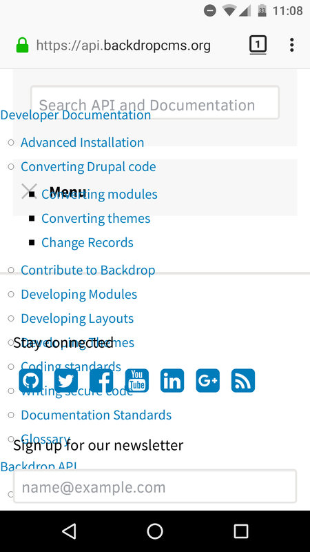
When viewing the API site (any page) on my Android phone (using Firefox or Chrome), the site menu (between the search box and the 'stay connected' block) is messed up. When you click on it to expand it, it expands over or under the surrounding page elements. Not only does it look bad, but some links cannot be clicked on because they're too low in the z-index.
Here's a screenshot: