 brendanlong
commented
7 years ago
brendanlong
commented
7 years ago It's interesting that we both did this at the same time, see PR #599.
The reasons I think my approach is better are:
- It doesn't require a completely different phone theme (the only media query I use is to remove the tagline from the discussion page)
- It scales fluidly in the range it supports (yours would have huge text on a screen that's 750px wide).
Also, I think yours has a bug where if you scale a desktop window to less than 750px wide, it makes the text huge. I assume you could fix this by making the media queries check if the device is a phone or something.
Mine doesn't scale as far as yours, but that's only because I didn't remove the sidebar.
 jeffkaufman
 jack-trikeapps
 AndrewPratley
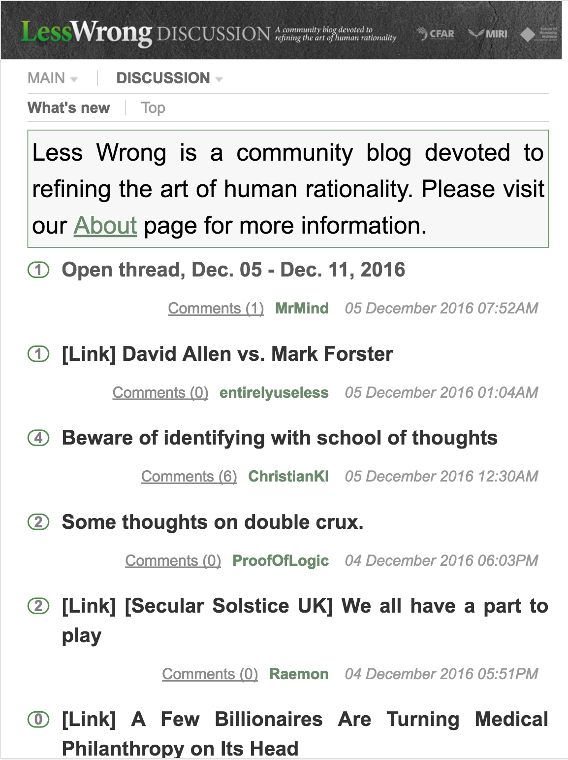
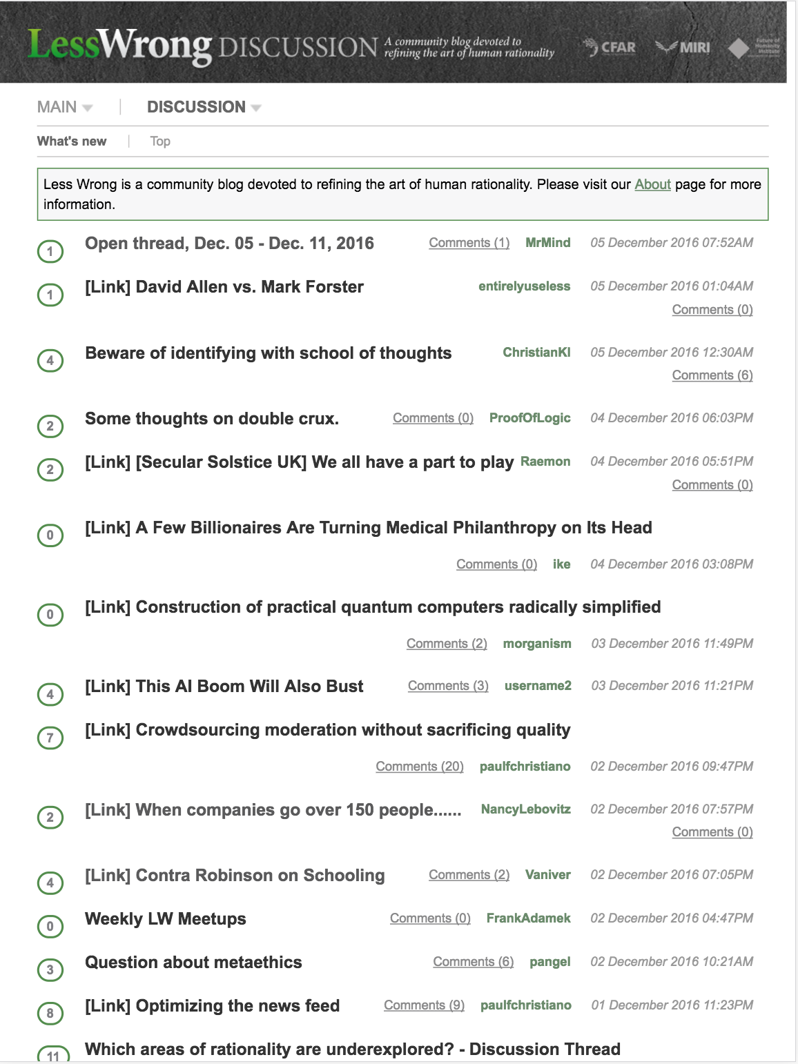
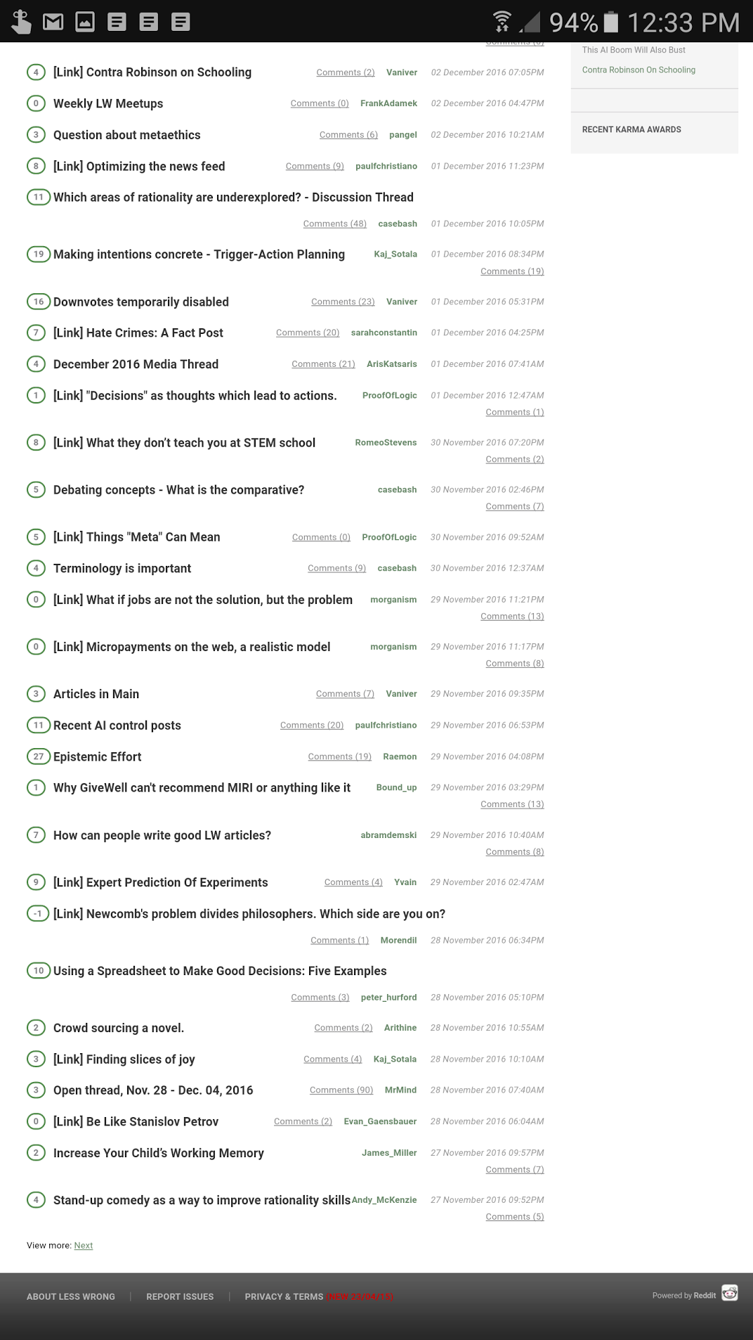
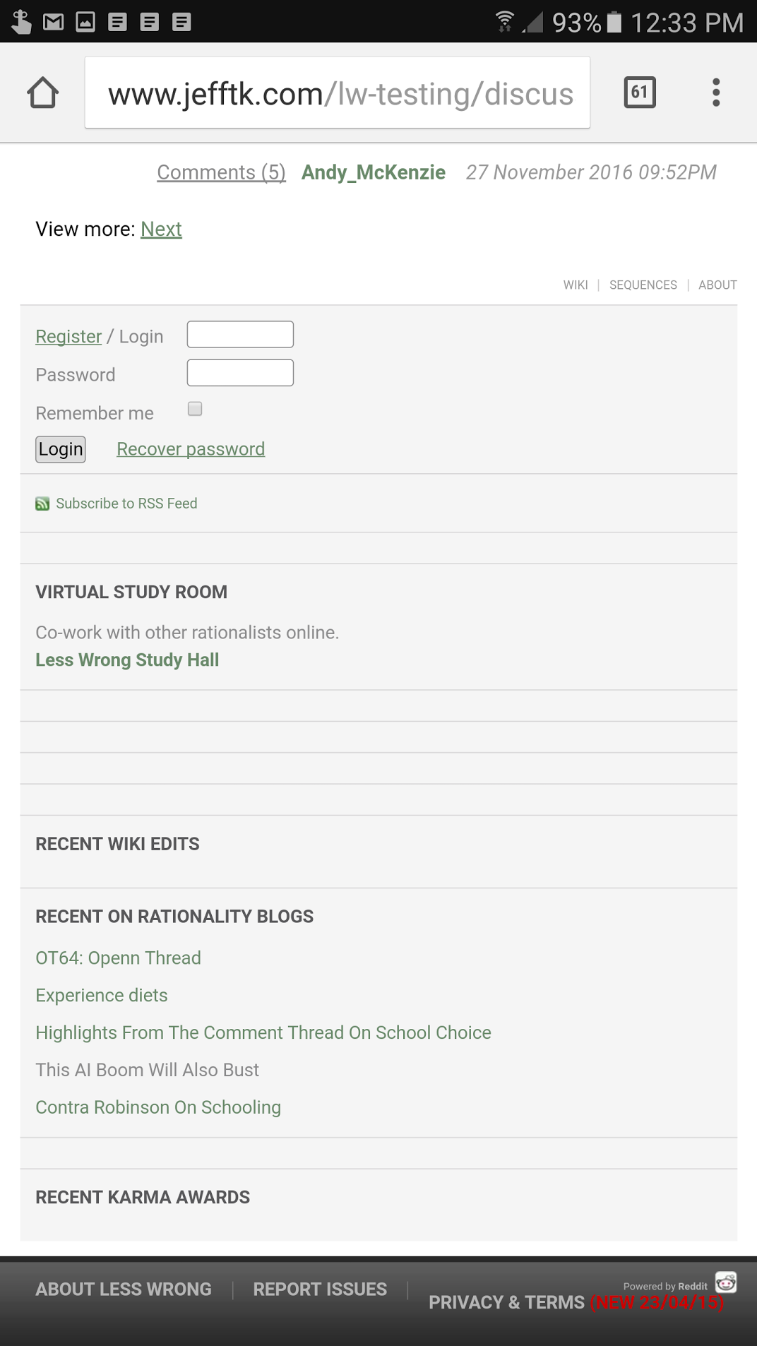
Improve mobile display by switching to a fixed 750px viewport and making things bigger to compensate. This change is adapted from https://github.com/tricycle/eaforum/pull/65, which took the same approach to the EA Forum.
You can see it live on http://www.jefftk.com/lw-testing/index
Here are some screenshots:
http://www.jefftk.com/lw-testing/comments-old.png http://www.jefftk.com/lw-testing/comments-new.png
http://www.jefftk.com/lw-testing/discussion-old-top.png http://www.jefftk.com/lw-testing/discussion-new-top.png
http://www.jefftk.com/lw-testing/discussion-old-bottom.png http://www.jefftk.com/lw-testing/discussion-new-bottom.png
http://www.jefftk.com/lw-testing/post-old-top.png http://www.jefftk.com/lw-testing/post-new-top.png
http://www.jefftk.com/lw-testing/promoted-old.png http://www.jefftk.com/lw-testing/promoted-new.png