Open benmiller314 opened 4 years ago
Reflection Since this semester has been so different due to the online environment I struggled to learn from most of my classes. On the bright side, I found this class to be an exception to this and I felt that I picked up a bunch of skills both in terms of learning specific software/languages as well as general design principles. One of the most helpful tools I picked up in this class were workflow (with regard to the checkpoints created for each project) as well as learning to use version control. While I have worked on projects using GitHub before I didn’t feel fully comfortable with it and through using it so much in this class I have become much more comfortable using version control. Additionally, the use of checkpoints/multiple drafts in this class helped me to space out the work I did on projects over the course of working a little bit every day for a week or two rather than doing the entire project in one go. This allowed me to reflect on my work as I went along with the help of the peer review comments I received each time. In general, I found this to be a great system for helping me to create the best projects I could in the given time span. In terms of being the most successful, I was very happy with how much I was able to learn in the website unit I really enjoyed making a website I could use in my internship applications, and while I found this unit the most challenging and time-consuming I was very happy with the website I created. I think something that surprised me during this course was my enjoyment of the sound unit. When the project was first introduced I felt rather unenthusiastic about it and had trouble initially with how to format my soundscape as well as just getting comfortable with Audacity. However, after working on and completing my soundscape I found it to be one of my favorite parts of the class (along with the website). My enjoyment of the sound unit is what prompted me to want to continue working in Audacity for my final project.
Soundscape: https://github.com/AlexaSpaventa/soundscape2020fall Link to project: https://github.com/AlexaSpaventa/soundscape2020fall/blob/master/soundscape_final/soundscape.mp3 As I mentioned previously this is one of the units I really enjoyed. In the soundscape, I created I wanted to focus on the coronavirus pandemic and how it has impacted college life. The project opens on a pre-virus scene at a football game and the song America the Beautiful quietly plays in the background along with the building sound of a person coughing and eventually this scene is taken over by news broadcasts regarding the virus. This was the portion of the soundscape I was the most proud of I liked the way the cough built up and the music mixed with the coughing slowly created an ominous feeling. In terms of what I’d do differently or revise, I’d probably touch up the ending with regards to the memorial portion of the soundscape. I felt the music from the news clips got in the way of the background music I was using. When the audio gets close to the end I am happy with the way I tried to create a feeling of hope as well as the nighttime bugs I recorded which causes the soundscape to end in a way that contrasts the loud beginning of the football game.
Visual: https://github.com/AlexaSpaventa/visual-argument-2020fall Link to project: https://github.com/AlexaSpaventa/visual-argument-2020fall/blob/master/final_draft/final.png Revision History: https://github.com/AlexaSpaventa/visual-argument-2020fall/graphs/commit-activity While I did enjoy this unit I’d say this piece is probably my least favorite in terms of the things I’ve made for the class. I liked the idea of using the virus to help promote an environmental issue such as in this case of air pollution. In general, I liked to text and the way I used color to highlight certain words and create a hierarchy. I also liked the image of the tree which I used layers to split in half to have one side alive and one side dead. Additionally, I think the person with a mask functioned well since this is such a common sight for people that it draws attention. In terms of what I’d change I’m not a huge fan of the grass and smoke images I used and I’d rather have them drawn in a way that better fits the other images in the piece so it feels more cohesive. Additionally, I did receive comments that it is somewhat unclear what cause I am targeting so I could potentially add some reference to a specific cause dealing with air pollutions to send people who view the image and want more information. Furthermore, I think this project went through the most in terms of changes from revision so I've also included a prior draft.
Website: https://github.com/AlexaSpaventa/website-portfolio-2020fall Link to project: https://alexaspaventa.github.io/website-portfolio-2020fall/. I found this project to be one of the most challenging since for me it involved relearning HTML and JavaScript and learning CSS. However, I definitely feel like I’ve gotten a lot out of making it in terms of both learning the languages and practicing web design. My favorite part of my website is my homepage. Making the scrolling menu as well as adding in the images and text for this part of the website took the longest partly due to it being the first page I worked on and also due to the menu. Additionally, I made the background for the other pages using GIMP to add things like the bar where the title goes as well as the university logo on the education section. I also used GIMP to recolor all the social media logos I used so that they fit the color scheme. Initially, I wanted to make my projects more interactive on the projects page but ultimately I ended up showing images of both projects that could be clicked in order to take the user to the DevPost page of the project rather than having the full projects posted on the website. Overall, the only big change I’d want to make would be adding more content as I have more projects and activities to showcase. There is also a minor scaling issue with the education section.
Fragmented Fantasy: https://github.com/jeepy33/Fragmented-Fantasy Link to website: https://jeepy33.github.io/Fragmented-Fantasy/ Link to Anchor: https://anchor.fm/fragmented-fantasy Link to Spotify: https://open.spotify.com/show/3PfPZF5OfdflqzsBNHnJx7 Since I enjoyed the audio unit so much this project was super cool to me. The general idea was to create small fantasy stories (all focused on the same fantasy world) that built off each other. Involved in the project would be a website (one place where audio could be found), episodes of the podcast, and a variety of logos for both the podcast itself as well as the larger stories that certain fragments were associated with. The team was broken into four-part. Kyle worked on the website, Brian made the graphics for the website, Jagr wrote and recorded and I edited the audio. Despite this, we also checked on each other's work and were able to do peer reviews as we each progressed so that everyone could feel that the project was moving in the right direction. For this reason, it felt very collaborative and so in addition to editing I also got to give my feedback on the writing of the stories and the different graphics that were created as we went. As of today, we have two episodes available both on the website as well as on anchor and Spotify. This is a project I plan to continue helping with after the completion of this class I plan to continue to help edit episodes and proofread the scripts for the episodes and just give my opinion on how the other elements of the project are progressing.
Reflection Going into this semester, I was very unsure about what to expect. I was nervous for this class because I thought it would be hard to adjust to online learning. However, I can confidently say this class adapted the best out of all the classes I took this semester. I gained a variety of knowledge and genuinely enjoyed creating in this class. What surprised me most during this class was actually myself. I never thought that I would be able to create a website in the short span of two weeks. Every time a new project was introduced, I was slightly concerned that I wouldn’t be able to pull it off. However, the structure of this class really helped me complete my projects with satisfaction. The checkpoints of each project were really helpful in seeing how work progresses through the creative process. Every process takes time, and it was nice to be able to take a step back and see where I was and where I wanted to go. Peer review was also extremely beneficial. I take people’s feedback very seriously because I believe it is important to keep improving. Sometimes we can get lost within our own work, and it’s nice to hear an outside perspective because after all, most of the time our work isn’t for just ourselves. This class has helped me get in touch with my creativity. I have always thought of myself as non-creative person. Coming up with realistic ideas has been a past struggle for me. I now have a developed better thinking when it comes to the creative process. What really stands out to me is the sound unit. I took the time to notice the sounds around me that normally blend in with daily life. I appreciated how the soundscape project pushed me to go that one step further. In past classes where I had to create projects, I felt like I was just pushing for a deadline and the outcome just was what it was. In this class I really pushed to make work that I would genuinely be happy with. I didn’t stress about deadlines and I let my mind lead me. It was not easy 100% of the time and there were times like during the website unit when I just wanted to give up and settle. Overall, I very happy with how all my projects in this class turned out. Looking at the course outcomes, there are several areas where I personally feel I succeeded. First, I do believe that I developed proficiency in a number of digital tools. Though I’m sure I still have a lot to learn about these different tools, I feel confident that I could use them for a future project. I enrolled in this class to do just what the title says: learn more about composing digital media. Being a digital media major, I am taking any opportunity I can to learn more about composing digital media. At first, I was a bit hesitant when it was said that we weren’t using a lot of mainstream tools. However, there are lots of benefits that come with being a diverse creator, especially in the professional world. I especially thought learning the basics of HTML and CSS was very beneficial and I am happy to be adding that to my resume. Another area I believe I succeeded in was appropriately revising work based on peer and professor feedback. How the public views and interprets your work is very important. Any project is a constant work in progress and improvements can always be made. I made the changes that my peers suggested, and I know this helped make my projects better. Being able to receive constructive criticism is part of the job and it’s how we improve. Finally, I think I also increased my problem-solving skills throughout this course. Like I said before, creating these projects wasn’t a walk in the park most of the time. I found myself frustrated that the vision in my head was not be executed properly into reality. I struggled the most with this in the visual argument and website units. I got stuck many times and had a lot of trial and error. I had to watch a variety of tutorials and even re-watch them numerous times. I do feel like my skill level did hold me back at certain times. However, time does exist, and I am pleased with what I was able to create over this semester. There wasn’t unlimited time to mess around and experiment, and I’m sure just a little more time with these tools will help me improve even more. Moving forward, I will take what I have learned in this class and continue to use it on my future endeavors. I want to continue developing my skills and seeing what I could do in such a short period of time makes me confident that I can go even further.
Soundscape Repo: https://github.com/leiawerner/soundscape2020fall Final Draft: https://github.com/leiawerner/soundscape2020fall/blob/master/Changedworld.mp3
My soundscape titled, Changed World, was made with the purpose of raising awareness for the prison system/a COVID society. A lot of prisoners with smaller sentences or convictions for smaller crimes were let out of jail due to COVID and overcrowding of prisons. I feel like being set free into a shut-down world is even more of a challenge than being released to the normal world. This is probably my least favorite project that I created in this class. If I was to do this over again, I would probably try to limit some of the vocals and make it more sound heavy.
Visual Argument Repo: https://github.com/leiawerner/visual-argument-2020fall Final Draft: https://github.com/leiawerner/visual-argument-2020fall/blob/master/Final%20Draft.png
When this project was introduced, I knew immediately that I wanted to something centered around mental health. I decided to focus on men's mental health because it is probably the least talked about even though men are affected the most by mental health. This project was somewhat difficult for me in the beginning. I changed my design multiple times and I was having a hard time sticking to a definite idea. However, looking back I think that it worked out in my favor. While I got more comfortable with GIMP by ideas kept changing and in the end I just kind of went with the flow.
Website Portfolio Repo: https://github.com/leiawerner/website-portfolio-2020fall Project :https://github.com/leiawerner/website-portfolio-2020fall/tree/master/Preview
Out of all the projects, this one proved to be the most daunting. I was very nervous and thought I wouldn't be able to pull it off. At the end, I was very pleased with my website and I learned a ton. I also had a lot of fun creating this website! It gave me the chance to express things about myself while learning the ins and outs of coding. My favorite part was being able to create my own logo and brand name. I was able to incorporate many different aspects of myself into one concise project. This was probably my favorite project that I completed.
I also received a lot of feedback on how my website didn't include a lot of the aspirational aspects. I changed this by adding a movie trailer, using GIMP to create my own logo, and use different fonts.
Consolidation Project Repo: https://github.com/leiawerner/Consolidation-project Visual Argument Revision: https://github.com/leiawerner/Consolidation-project/blob/main/Revision.png Website: https://github.com/leiawerner/website-portfolio-2020fall/tree/master/Preview
For my consolidation project I did two tasks. First, I revised my visual argument based on feedback. One of the suggestions that was brought up was changing the speaking bubbles too thought bubbles. I thought this was a good suggestion because my original intention was for them to be thoughts and I didn't't even realize that I had ended up using speaking bubbles instead. I also changed some of the coloring to make the theme more cohesive. Overall, I do like like this version better than my original.
The second thing I did was make improvements to website, which included making a whole new page centered around the message portrayed in my visual argument. I got rid of my original lifestyle page and made it a health page specifically focused on mental health. Another major critique I received was that my website did not adjust well when being resized. I added Flexbox and changed other formats to make my website more adjustable. I also changed my homepage to be more simplistic. Though a lot of these technical changes can't be seen in the images, the physical appearance of my website also changed a lot. I just wanted to refine certain details and make it more what I was originally envisioning. Website Commit History: https://github.com/leiawerner/website-portfolio-2020fall/commits/master
New Mental Health page using my visual argument and 2 other graphics I created:
Updated Homepage:
When considering the title of this class “Composing Digital Media” prior to taking this class I thought we would be solely focused on graphic design and just doing a lot of what we did for the Visual Argument project. I was pleasantly surprised though when we were giving the Soundscape and Website projects though, because I think it would have been very repetitive doing just the graphic design/visual argument work I imagined. Plus, I think doing the Soundscape and Website projects gave us a more well-rounded view of forms of digital media. In addition, while I thought that a class like this might hard to transfer online due to working in groups for feedback, I was pleasantly surprised that we were able to utilize breakout rooms and the hyperlinks to each other repos so we could look over each other’s projects (on days where we would give each other group feedback). I think that this class did the best adjusting to the online environment, which is saying a lot because some of my other classes don’t even involve any group work (which I think is probably the hardest part of being in a virtual environment). This is probably because without the group work people don’t feel the motivation to participate, therefore they just keep their camera off and don’t speak. So, I’m really glad that the Professor was able to find a way to transfer the group feedback/collaboration process to the virtual environment, because without it this class would not have been nearly as engaging.
I think one of my biggest takeaways from this class was learning more about how to use GitHub and Version Control. I have had a GitHub account for a while, because we created them in WiCs to practice Version Control, but I never really understood how to use it when we went over it during one meeting. I have always wanted to learn how to correctly use Version Control, because I was told that in higher level CS courses you do a lot of group projects where using Version Control is a must. Therefore, I am so happy that this class taught me that skill as I see myself using it a lot in the future. In addition, for the Website Project I made a portfolio website that I do see myself adding to and utilizing in the future. My current website does not have a live url, but I do see myself making it a live url in the future for potential employers to be able to look over. The Website Project was also a good way to practice using HTML (as I only had the very basic skills prior to this class) and I didn’t have any CSS experience so I also learned a lot in that regard.
Soundscape Project:
I was initially very worried about this Soundscape unit, because out of all the units it seemed to be the most out of my comfort zone. Since there is no visual element, I think you have to make sure that your sounds and music are really interesting, and I was worried that I would struggle with this since I was making my soundscape a day-in-the-life in the virtual environment. I titled my Soundscape “Virtually Alone”, because I was trying to highlight how lonely it can be in a day in quarantine in college as you can’t see many people and there isn’t much to do. I was very proud of how it turned out though! My roommate let me use her voice in the project to serve as both the teacher (to give people context of when I am in class) and at the end where we had a conversation about how lonely and repetitive it can be in quarantine with sad music playing in the background. That scene with our conversation at the end and the sad music I spent a while trying to find was probably my favorite/most proud moment of the project as I think it really helped me get across the “lonely” emotion. In terms of revision, I did go back and revise this based on the feedback that I had received. I extended the music throughout my piece so that way you could get the full emotional effect (ex: sad music sets sad tone) and I crossfaded the part where I did the panning effect. If I had more time, I might try and smooth out even more of the transitions to elevate the piece even more as there are some transitions that I still think could be smoother, but I didn’t have the time to smooth over everything. Link to repo: https://github.com/LLP37/soundscape2020fall
Visual Argument Project:
For this project, I made a visual argument called “Women in Computing, Now That’s IT…”, IT is a joke about Information Technology. I was trying to show in my visual argument that we need more women in the tech industry. This project was probably my least favorite to make, because GIMP was very hard for me to use. I made a pyramid with 15 male stick figures and 5 female stick figures to showcase the female/male ratio in the tech industry, but every time I would go to move one the stick figures I would accidentally move the background instead or I would click the stick figures but it though I wanted to edit it and not move it, etc. Overall, dealing with GIMP was a huge pain that kind of made me hate working on the project by the end, but I was happy with the final project. The only thing I decided to update for this project was to add citations in at the bottom right in a plain font for the images I used from Noun Project. I hadn’t realized that I needed to also put some credit on the actually image and not just in my Credits.md file, but this was definitely a good learning experience for making sure that I fully understood that the Creative Commons License has different types, it’s not just a singular type and what to do. If I were to do more revision, the only thing I would possibly change is consider doing the “W” with the women instead of having them in a row at the bottom like I discussed in my reflection for that specific project. I decided not to do this originally or in my final version, because we had been talking a lot about visual hierarchy in that unit, so my heart was kind of set on the pyramid as I think it’s very appealing to the eye in terms of visual hierarchy. When I tried out the “W”, the hierarchy was ruined for me and that the rows just looked very off since the female stick figures take up more horizontal space than the male stick figures. Overall, I really like my final project, but GIMP was definitely my least favorite application to use in this class. Link to repo: https://github.com/LLP37/visual-argument-2020fall
Website Project: For the website project, I decided to make a portfolio website that had a slight twist since I included a blog section. This project was definitely challenging since I didn’t have much HTML experience or any CSS experience, but I enjoyed working on it and seeing the progress (which I can look back on in the screenshots!). I decided to not go back and change anything about my website, because I was pretty satisfied with what I was able to accomplish and wanted to put more of a priority on revising my Soundscape and Visual Argument. If I went back to revise in the future, I would probably work more on the pages with the blog posts (when you click on image and go to page with full post text) to make those more interesting (Ex: add in more images). I would also play around more with the colors on my website as I really just stuck with light pink, white, and black. The other colors were only apparent in the images. I stuck with just those colors originally, because when I tried playing around with other colors, I didn’t find any that I liked but still went with the theme I had going. In the future if I had more time, I’m sure I could find something I like though. Lastly, I’m sure I will add more projects from areas other than just this class (for example CS projects). I did include a thumbnail of my initial Project page below though, so I could discuss my revision skills. I think my website was one of the projects that I made a lot of changes to after the feedback portion because my group members helped me realize I could do more aspirational criteria. At first, I had a simple layout where it just kind of went straight down the page with Project #1, 2, etc. but I took into account my group member feedback and added a grid layout so that I could meet more of the aspirational criteria. Overall, throughout the class I think I have learned to listen to my group members as they have fresh eyes and can help you see things that you can’t because you’re too close to it. Link to repo: https://github.com/LLP37/website-portfolio-2020fall Revision History: https://github.com/LLP37/website-portfolio-2020fall/graphs/commit-activity Group Feedback: https://github.com/LLP37/website-portfolio-2020fall/commit/3cd32acfc619aa698593ee3235e306a1e100abd9
Consolidation Project:
Link to repo: https://github.com/Maials268/Consolidation-Project-Walk-and-Talk
For this Consolidation Project, I decided to team up with Maia and Christianna who I had gotten to know really well from being together in Breakout Rooms throughout the semester. We decided we wanted to do some sort of branding project and made doing a podcast for college students with a website and graphics for branding. Maia was in charge of the website, Christianna did the graphics, and I was in charge of the podcasting episodes. The podcast is called Walk & Talk, because they are short episodes designed for college students to listen to on their commute to class. I really enjoyed working on the podcast, because it allowed for me to get more experience with Audacity and it was fun to play around with making the intro. I decided to have really fun, happy intro music followed my two cellphone rings before I do the intro talk (almost like I’m answering and jumping right in). I also decided to write transcriptions for all the episodes to take things to the next level and make the podcast more accessible for everyone. If I were to go back and make revisions, I would probably make more episodes and possibly play around with adding background music/sound effects during the episode. Though, the podcast episodes that I listen to regularly don’t have any background music during the episode (I hadn’t really considered this at all until I listened to podcast episodes for inspiration for ours).
Link to repo: https://github.com/Maials268/Consolidation-Project-Walk-and-Talk
Composing Digital Media was the first composition class that I have taken which did not focus on writing. Because of this, I feel that the course offered knowledge that I would not be able to gain from any other class. By removing text from composition, I was forced to see how composition is a multi-leveled task. There is more that goes into work and media than what appears on the surface. While it is harder to translate this idea on to an essay or paper, I did gain a perspective which tells me that composition is not a linear process. Composing essays can be thought of as a version controlled task. There are drafts and outlines, all of which can be reimagined into progressing renditions of the original concept. I could see myself using github for papers and projects in the future for an overall better submission. In particular, the lesson in which the class shared their composition metaphors and ideas really helped me to understand the reason why composing and version control software go hand-in-hand. At first, github sounded like a complex computer software or program. I learned however that it proves how rich the process of composition can be. My Soundscape Narrative was the project which I felt best showcased the non-linear process of composition. The process of creating the narrative did not necessarily begin from the intended start of the piece and end with the intended conclusion like it might with an essay. Instead, I found myself creating the middle of the narrative after finishing the ending. This is something I would never do when writing an essay. I have always begun with the introduction and ended with the conclusion. I have since learned that while this technique may work for me most of the time, I shouldn’t be afraid of pursuing an essay in the style that I created my soundscape.
repo: https://github.com/heh44/soundscape2020fall
Looking back, I feel that I was most successful during the first two units. It had the most intuitive learning of the course. It was easy to experiment and practice with the different tools of GIMP and Audacity. Each tool has an icon and text which appears when hovering over with your mouse. The drop down menus were also helpful in teaching me the functions of each tool. These features contributed to my relative success with the programs and my willingness to experiment. The html/css unit challenged me the most. The tutorial was helpful but was hard to stay engaged with. Unlike GIMP and Audacity, text editors have a different process to experiment with your projects. One must save and load their html page to view how their code changed the look of the website. This coupled with the fact that all tool usage and editing is done through rules which must be memorized meant that this unit had a learning curve. I found that this unit was much harder to translate your ideas into a website. It seems that html/css has the most internet tutorials available, which was nice but did not make the unit less challenging than the previous two. Internet tutorials helped me overcome several roadblocks throughout the course. I was thankful that there were hundreds of concise videos across the web. I feel that the area in which I most improved was my final submission of my Visual Argument. Compared to my first draft, which was clunky and awkward, I felt that my final submission for the unit project flowed much better and was more coherent. I think that my ability to fill in missing areas of my submissions is a strength of the work I’ve done. The peer reviews of my Visual argument all indicated that something was missing from the project. I felt that I was able to fix this.
repo:https://github.com/heh44/visual-argument-2020fall
I was surprised with how quick the website unit moved. I felt the emphasis on the “interneting is hard” tutorials caused a lot of uncertainty. Compared to the first and second unit, the website unit was less organized and I think other students would agree. My website submission reflected my basic understanding of html. I made it work, but I felt that it was not on par with the Soundscape narrative or visual argument.
repo:https://github.com/heh44/website-portfolio-2020fall
I was also surprised with how much freedom the course allowed. In writing courses, there is typically room for creativity, but this course felt like every submission could have thousands of different themes and styles. I believe that each of my submissions are unique and all are distant enough to have no clear influence from one another. This can sometimes be a difficult thing to achieve for the course instructor. It is hard to capture creativity and not have the composer feel lost. This course was able to achieve that. The consolidation project was the most open project in the course. I did not feel overwhelmed and feel good about my submission.
repo:https://github.com/heh44/consolidation2020fall
I may want to revisit html in the future, but for now, I think that I will take a step back from digital media composition. I believe that the Visual Argument unit was the most valuable unit to my education. With the extreme popularity of social media, the ability to make graphics and visual pieces will definitely come in handy. I can see myself using Gimp or photoshop in the future outside of class.
Reflection Creating digital media is something that I am very interested in. As a Computer Science major, I am used to creating some forms of media, namely websites and software. However, I have always had an interest in other forms of digital media. Two years ago, during my freshman year, I took a course on creating film. Turns out, despite my massive love for film, I was not actually good at creating it. Regardless of that, I wanted to keep trying to make other forms of digital media. When I started programming, I was horrendous, but I kept trying to get better. Now, after years of practice, I am much improved. This class offered me a chance to keep trying my hand at flexing my creative muscles and creating media. In my other classes, I usually feel like I am boxed into creating something specific. I don’t typically have the freedom to choose all of the content of my projects, and I absolutely loved that freedom. Rather than being told what to do, we simply had goals that we needed to achieve. I consider myself a creative guy, and this class afforded me the ability to show that. One thing that I learned from this class is the sheer versatility of GitHub as a form of version control. I have used GitHub for a couple years, so I brought that experience with me to this class. I had originally only used it for code, but it is surprisingly powerful with other forms of media.
Soundscape Soundscape repository link: https://github.com/KyleMaxwell1224/soundscape2020fall Final audio: https://github.com/KyleMaxwell1224/soundscape2020fall/blob/master/Project_Final.mp3
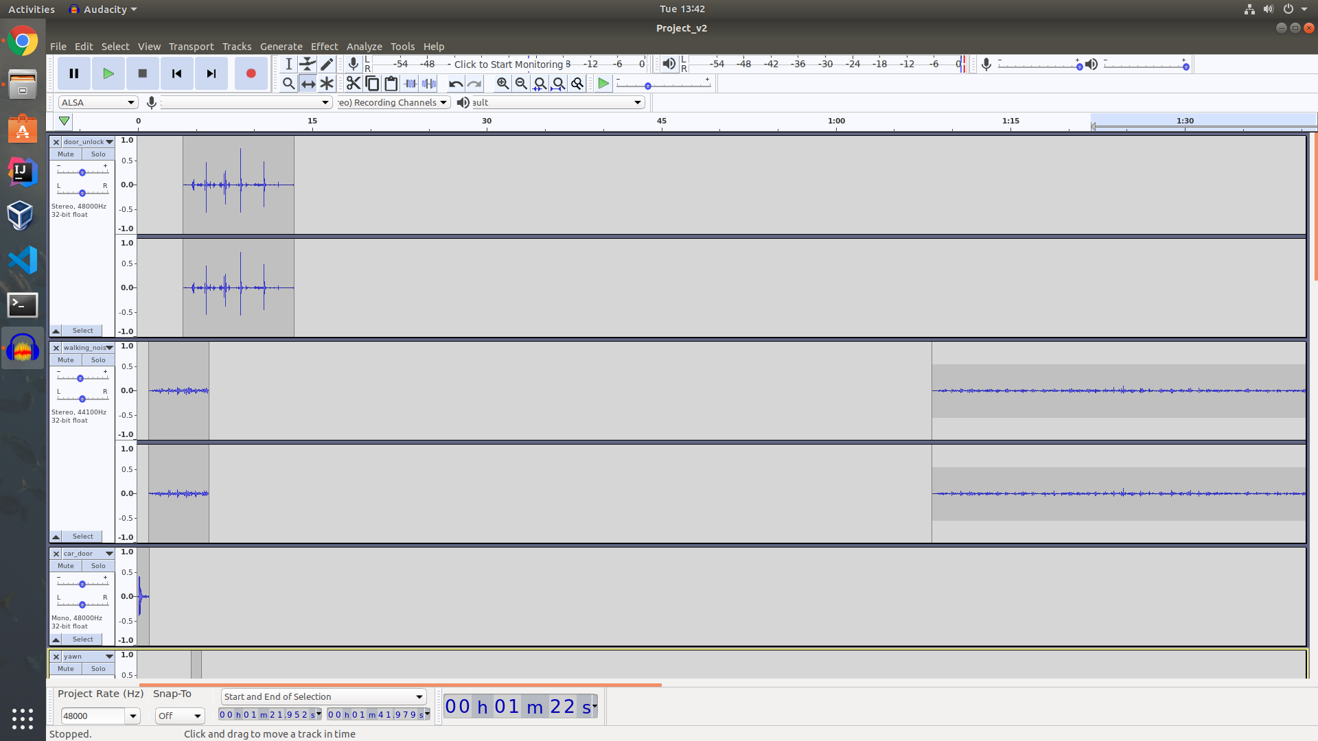
The first project that we were tasked with, making a Soundscape, was intimidating. Through my work with editing film, I was partially familiar with manipulating audio. However, I always had a video to pair the audio with, which made things much easier. My Soundscape, titled “The Shark the Pawn Shop Forgot”, tells the story of a toy shark that has resided in a pawn shop for years (not by his own choice). I think that if you really dug through my story, you could probably find some ulterior themes or social statements. However, this project for me was just an outlet to talk about things that interest me and to come up with a story that was fun (or at least fun for me). Looking back at my project at the end of the semester, there were certainly things that I would change. Namely, I would have made my story a bit more clear. In my head, I had this very clear idea of the story I wanted to tell. However, it was difficult to clearly tell the story I had concocted in my head. Other than that, I was happy with this project holistically.
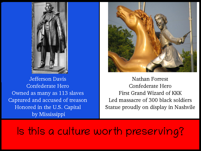
Visual Unit Visual Repo link: https://github.com/KyleMaxwell1224/visual-argument-2020fall Final Image: https://github.com/KyleMaxwell1224/visual-argument-2020fall/blob/master/final_project.png My visual argument project was based around Confederate Civil-War monuments. I think that this class afforded me the ability to show different sides of myself. The Soundscape was a goofy, Toy-Story-esque fantasy, and I wanted to go in an opposite direction for this project. This past summer, I worked at a start-up company, and I actually tried to use GIMP while working there (GIMP is now my go-to photo-editing software when I’m in a Linux environment). I very specifically remember opening GIMP, seeing all the confusing tools and options, and promptly closing the application. When I learned this project was to be done in GIMP, I was intimidated. After messing around with GIMP for a couple hours, I found it wasn’t actually as complicated as I initially had thought. The hardest part of this project was coming up with an idea that I was passionate about. As I mentioned earlier, I wanted to do something serious for this project. I reflected on things that I have heard in the past, whether it was on the news or things I heard others say. I landed on the subject of Civil-War monument removals. I enjoyed working with GIMP and creating my project. There are certainly things I would change though. When I look at my final image, I feel underwhelmed. I think that there are a lot of solid concepts at work; I like the color scheme, I like the text, and I like the external images I used. Despite the positives, I think that there could have been more small adjustments made to my piece. I would certainly modify the font, both the style and size. I would make the text pop more, more visually striking.
Website Portfolio Website repo link: https://github.com/KyleMaxwell1224/website-portfolio-2020fall Live website link: https://kylemaxwell1224.github.io/website-portfolio-2020fall/#/ Commit history: https://github.com/KyleMaxwell1224/website-portfolio-2020fall/commits/master The website project was my favorite by far. Even though I have experience making websites, I never really have much of an opportunity to create a website where I get to make the decisions about the content. Typically, a professor will assign a project where they want us to accomplish specific things. When I realized that I could make whatever website I wanted, I was overjoyed. I finally had the opportunity to make a website for a class where I could choose all the content. Because I had experience with HTML, I wanted to give myself a technical challenge. Rather than using vanilla HTML, CSS, and JS, I wanted to use a commonly used JavaScript library for web development called ReactJS. After struggling initially, I found it to be a really fun project. I’ve linked my commit history to this project because it shows how I incrementally improved my website. My classmates that gave me constructive criticism were especially beneficial. There were two things that I needed more of: color and content.
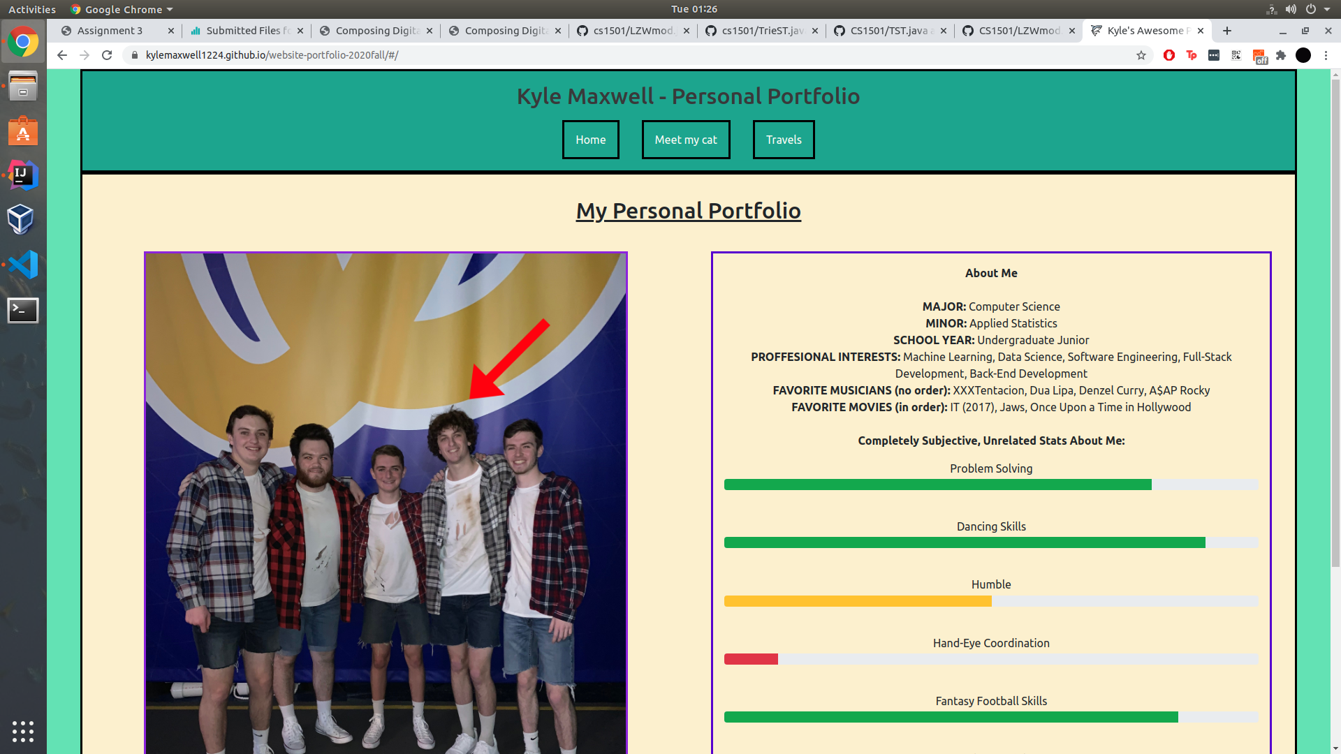
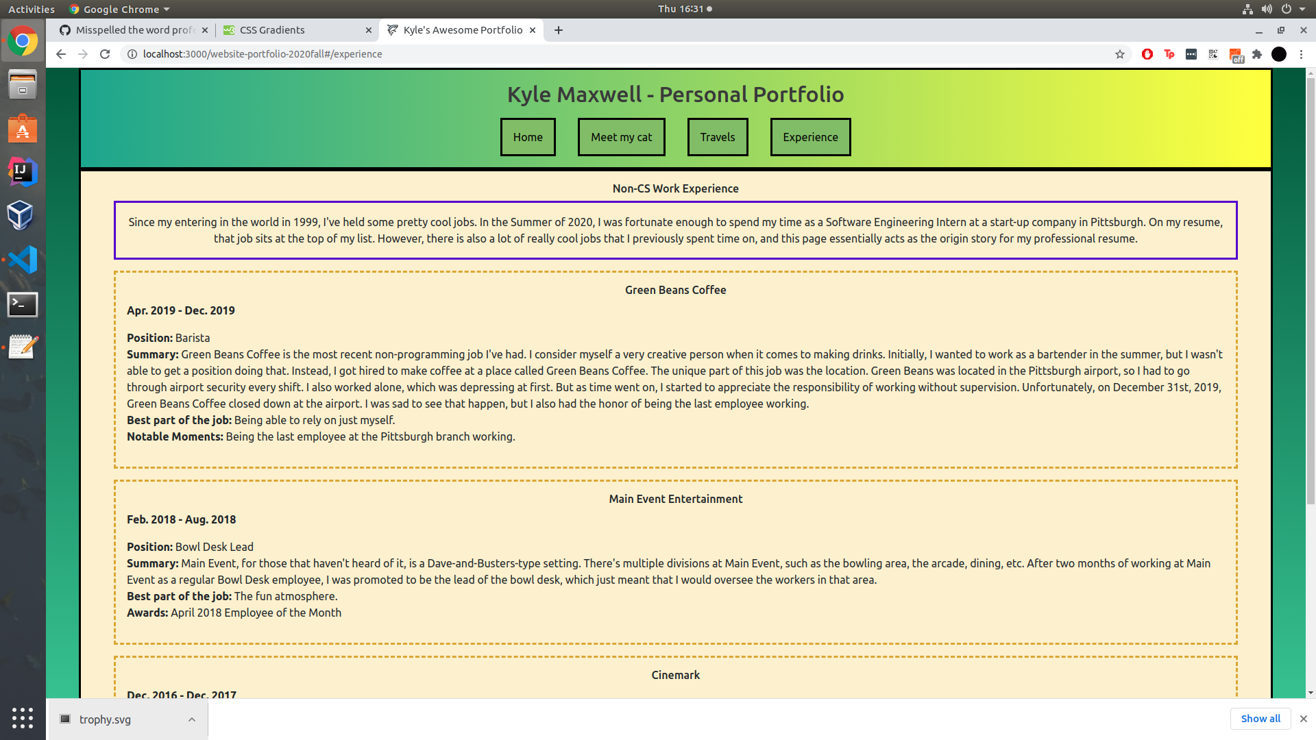
This is an early draft of my site, the one that my classmates critiqued. At the time, I actually thought that my site was completed. I felt that I had tapped every creative facet. After hearing the comments, I felt inspired to do more. I started messing around with gradients on my site, and I was pretty happy with it. This inspired me to keep making changes to my site to make it more visually appealing. One thing that I am most proud of about this site is the accessibility. I’ve attached an image below of an accessibility analysis of my website (you can view the tool I used here: https://wave.webaim.org/). Accessibility is something that web developers need to keep in mind as they develop a website, and I think I paid good attention to that.
Consolidation Project Link to website: https://jeepy33.github.io/Fragmented-Fantasy/ Link to Anchor: https://anchor.fm/fragmented-fantasy Link to Spotify: https://open.spotify.com/show/3PfPZF5OfdflqzsBNHnJx7 Fragmented Fantasy: https://github.com/jeepy33/Fragmented-Fantasy For my consolidation project, I worked with Brian, Jagr, and Alexa on a project called “Fragmented Fantasy”. After doing three independent projects throughout this semester, I was really excited to create a multi-layered group project. We worked on our parts of the project independently, but they were all interlaced. I created the website, Jagr wrote the scripts and recorded the podcasts, Alexa edited the audio, and Brian created the graphics that I utilized while making the website. I really enjoyed working with this group, it felt like we all helped each other and gave each other our advice and opinions. After looking at the final product, I am happy with a lot of the things we accomplished. We achieved a lot of work in such a short amount of time, and I am proud of our end result.
Starting off with the composing process, I think the concept of doing some reflection before you even begin can be helpful in terms of generating ideas. For example, in the generative writing/offline sketching we did for the soundscape narrative, we were asked several questions before we began which included:
In what places (physical, virtual, or imaginary) could you anchor your soundscape? Make a list. Anything you’re forgetting? Choosing one item from your list you could work with, for now, ask yourself:
I personally found this creative planning process particularly helpful in terms of being somewhat of an anchor, a way to make our thoughts more concrete. I know that for some individuals, their ability to think more imaginatively within an academic setting has weakened over time, and are more used to having boundaries laid out for them. I mention this to say, having more concrete structures in a generative process that could be considered possibly “too free-thinking” is incredibly helpful. Having the freedom to do “whatever you want” can be intimidating for some and having reflective questions that steer your thinking can make the task more manageable. Moreover, reflection was overall a large part of this course and I think it’s an important as well as a beneficial element of the digital composing process.
In the discussion of digital resources, I believe GitHub presents itself as an interesting form of “digital reflection”. Each time you have to make a commit message, you’re forced to think about any revisions, changes, or additions to your project. Going off this idea, I think that’s why it’s important to have meaningful commit messages because they allow you the chance to reflect on your creative process and think about how you have gotten from point A to point Z. I also believe screenshotting your work operates as a means to supplement this developmental process as you take into consideration each stage of your project. Furthermore, having a history of screenshots and commit messages provides a creator with the chance to look at past stages of a project and see if they want to re-incorporate anything that might have deleted. Additionally, I think screenshots and commit messages are helpful in terms of fulfillment which is an important part of the composing process as well. You’re given the opportunity to view how your project has progressed and reflect on how new facets of your idea have developed.
Another part of the composing process that we executed in this course which could also be applied in other digital media projects in the future, is the peer-review process. Having other people look at my work and provide comments on how I could improve was very helpful. When another person was viewing my work, it meant that someone could catch something that I missed, or based on my readme file they could let me know if they felt that the steps I’ve taken may or may not lead me to my desired final product. They can also confirm or challenge thoughts I’ve already had concerning my project. For example, in my soundscape narrative, a large amount of the revisions I ended up making after submitting my first draft pertained to length and dialogue. I already knew that my soundscape was long and there were moments where certain sounds dragged on for a lengthy amount of time so some of the feedback just reinforced that sentiment. I edited out a large amount of time that I felt was just dead space where sounds that only needed to be a couple of seconds were taking up too much space. Furthermore, I also think peer review allows you the chance to take a look at other people’s work and see how they have chosen to execute things. You can be inspired by certain methods of editing or design and that can be a way to foster your creative drive if you’ve hit a roadblock. Or being given the opportunity to view another classmates’ work during the peer review process can be a great time to ask questions concerning how they did something or what tools they used if you were possibly planning on executing a similar design, but you were having trouble successfully incorporating it into your own project.
Soundscape Revision screenshot:
Commit link: https://github.com/Maials268/soundscape2020fall/commit/943c6ce8b1e1231fe476abfd54275aa0bba59a6e
My major goals throughout these units were centered on learning about the basics of concepts and tools I had never used before but also pushing myself to go beyond that in small ways. I did not simply restrict myself to baseline because I had no experience, I instead pushed myself to a level of aspirational I believed I could achieve within my newly acquired skillset. Starting off this discussion with our Audacity-based unit, I felt that the process of working on our soundscape narrative was really interesting because it gave me the opportunity to explore tools that I had little to no experience with. I was initially pretty nervous because I’ve only used Audacity for a couple of projects in the past and even then, I only utilized a few functions on the application. My goal for the project was to create a narrative that had a spooky atmosphere while hitting both baseline criteria and attempting to achieve aspirational elements. I felt that for me personally working with Audacity was a mixture between trial and error and simply doing research to figure out what tools would give me the effects I desired. Something I was really interested in doing was using panning in order to enhance my audience’s experience. For example, I used it in an attempt to induce the feeling of one or more people walking. Another way I used panning was to create space positionality. An example of this in my projects was when I was trying to present the audio of someone walking upstairs, reaching the top floor, and then having someone follow, doing the same action. I believe my utilization of this tool was beneficial and strengthened my project overall.
Soundscape Repo: https://github.com/Maials268/soundscape2020fall.git
Soundscape Project: https://github.com/Maials268/soundscape2020fall/blob/master/HauntedHomeDraft2.mp3
Moving on to our second project, the visual argument, GIMP was another tool I was initially nervous to work with as it was completely new to me. I was familiar with Photoshop, although I had never used it, GIMP, however, was an image editor that I had never even heard of before. However, I jumped right into the creative process and attempted to execute my ideas to the best of my abilities. In all honesty, I didn’t enjoy GIMP and felt that there were too many steps necessary in order to complete simple tasks. However, in spite of this frustration, I knew I still needed to complete the baseline criteria of the project while also incorporating some achievable aspirational. What really got me through this unit were tutorials from a Youtube called Gurugal who explained how to execute specific design elements in an easy and comprehensive fashion. Two of their videos in combination with one another were the reason why I was able to create the outline of the two figures in my design. I had no clue how to do it initially and every video I watched at first wasn’t showing me the exact design I wanted. I eventually found one of Gurugal’s videos and was able to re-create the effect in my own work. Furthermore, in a revised final version of the project, I created a shortened ‘call to action’ link in the form of a bit.ly for it to be easier for my audience to remember.
Before:
After: Commit link: https://github.com/Maials268/visual-argument-2020fall/commit/93d60e946f22f9eb5b98fa558718082bb7f5ddcd
Visual Argument Repo: https://github.com/Maials268/visual-argument-2020fall.git
Visual Argument Project: https://github.com/Maials268/visual-argument-2020fall/blob/master/FINALVisualArguement.png
For the HTML and CSS project, I decided I wanted to create a personal website/portfolio. This unit was another instance where I had zero experience with the concepts we learned about. Part of me was excited to learn about new skills and the other part was kind of dreading having to learn incredibly difficult concepts in a short time span. While I did think the tutorial provided in-class was helpful, I did find myself watching/reading other tutorials in addition to the one provided for us that I felt were easier for me to grasp and were more straightforward with basic concepts. They also helped introduce me to different website layouts along with teaching me how to execute them in HTML and CSS. I was quickly able to learn the best and easiest way to create elements such as a navigation bar with tabs along with a header all of which were aspects of my website that I had drawn out in my initial draft.
Website Portfolio Repo: https://github.com/Maials268/website-portfolio-2020fall.git
Website Portfolio Project: https://github.com/Maials268/website-portfolio-2020fall/tree/master/docs
The Consolidation Unit was quite interesting because it allowed me to work on my skills in a group setting. In my group, I was in charge of creating the website. Although there was not enough time to learn a bunch of new skills, I was given the chance to practice old ones and sprinkle in a few new concepts. In terms of working to develop old skills, one of those included my creation of headers, however, I now had to incorporate a resized background image that included our logo. Moreover, a couple of the other new concepts I worked with included embedding audio and label usage. In terms of older skills, I worked on things such as image insertion, formatting, rows, and column. Being a part of the consolidation project also allowed me to gain awareness of a mistake I was making during the website creation process. I was using absolute paths rather than relative paths in order to do my image insertions. No one was able to catch the issue during the peer review session of my personal website due to my “alt” messages. However, group-work made me aware of the issue and gave me the chance to rectify it on both my personal website and group project website.
Consolidation Project Repo: https://github.com/Maials268/Consolidation-Project-Walk-and-Talk.git
Consolidation Project: https://github.com/Maials268/Consolidation-Project-Walk-and-Talk/tree/master/docs
In terms of what surprised me during this course, I was taken aback a little by the amount of creative freedom we were given. I do understand that this is a creativity-based course but the fact that we could choose any topic and just go with it was still surprising to me. Moreover, I liked that once an idea popped into my head during the brainstorming process, I was given the opportunity to bring it to fruition. Although there were still certain guidelines that I had to keep in mind, they weren’t stifling, I could kind of just “go with the flow” and see where my composing process took me. In thinking about revisions to the course overall, I’m not sure if I have any concrete ones in mind. Possibly having more time to get familiar with the GIMP software could be helpful but I’m not sure if that truly was an issue because we did sort of have an appropriate amount of time to familiarize ourselves with the software, it was just that it takes a lot of steps to do one thing and the interface itself isn’t very helpful.
Another part of this class that was interesting to me was the fact that you could carry this project beyond the course depending on what you ended up doing. I think this specifically applies to the websites we created and if you did one tailored to your own needs and interests. Moreover, I really enjoyed the audacity unit and would like to continue to improve my skillset in that area. The concept of sound narratives is incredibly fascinating to me and I liked to explore composing more work in that manner. I’m not sure if I would continue to work on any of these projects beyond this course, however, if I were to continue to develop anything it would probably be my personal website. Though there are quite a few changes and new skills I would need to acquire before I would feel comfortable enough to present in it any fashion outside of any academic setting.
Final Reflection
My experience in Composing Digital Media has proved meaningful and impactful. In April, I chose to take this class out of raw interest in computers and partially because it coexists with my current involvement in computer science and information science. My history of composing digital media in my own life consists of Adobe Premier, iMovie, Garageband, and some Logic Pro X. We obviously did not do any mandatory video editing in this class, but my background in Garageband and Logic helped with the soundscape project. After I jumped off the waitlist and into the class roster, I was excited to finally join the actual curriculum. One initial aspect of the class that proved to be more complex was Github. Prior to this class, I had heard of Github, but I truly did not know how it works. I did not have any knowledge about repositories, or forking, or Github Desktop. In reality, I did not completely (or even minimally) understand how to use Github until about halfway through the soundscape project when I almost lost some files. My misunderstanding with Github and Github desktop was a false impression of how files are accessed/stored/pushed/pulled. I did not realize that it starts with physical folders on my personal machine, allowing Github desktop to access them. I still have a lot to learn, but I believe that now having adequate skills to work with Github will be advantageous in the future especially working in the field of IS/CS.
Personally, the soundscape project was a great introduction to Composing Digital Media partially because of my previous experience using audio editing software. Although I've never used Audacity prior to this class, and although I found Audacity to be relatively counterintuitive, I maintained many mechanics of audio editing from prior experience.
Soundscape repo final product:
Here is an the Audacity view of my soundscape final draft:
At some point during the composition of this project, while trying to fix my aup file, I was moving folders and files around on my computer and accidentally separated my aup file with the data folder. I thought I lost my soundscape and was going to have to start over, until I had a zoom chat with Prof Miller and he helped me locate my files and put them in the right spot. However, some of my sounds were lost and I could not get them back! Luckily I had my rough draft .mp3 file, so I was able to use that entire file as one sound in audacity to keep the certain tracks I lost. The final product looks a bit wonky due to the long .mp3 file of the rough draft but it is not a big problem. I used my own sounds in combination with sounds I found on the internet, and I edited all of the above with Audacity's set of tools. I previously mentioned that I believe Audacity works counterintuitively and I believe this because of my experience with the consistent set of tools in other audio editing applications. I found Audacity to be daunting at first because I could never seem to get into a fluid rhythm, but as time went on I simply gained more experience and fluidity.
The second project, composing a "visual argument", primarily taught me how to use GiMP. In this process, I also learned about the use of specific visual elements. This includes the duality of Dominance & Hierarchy (contrast), Positive/Negative space, and Rhythm & Movement.
Visual Argument repo final product
I struggled to pick a topic for this project, and I ditched my original proposal idea to finally decide on making an argument about drinking water. I am an avid water enthusiast and my project aims to influence the same for others. In my visual project reflection I mention the problem on more detail, explaining how the average person does not nearly drink enough water on a daily basis. The project aims to show exactly how you are capable of drinking a gallon of water a day. In my project I set the goal mark at a gallon because no matter your size/sex/gender, a gallon will be enough for you (and then some).
This image is my unfinished visual project in the making. I went to bed one night thinking that this was my final product, but I woke up with different thoughts. Before this draft, I listened to my peer's feedback from previous drafts telling me specific things about font sizing and placement. Fonts were a big part of this project and we had multiple readings/discussions about choosing appropriate fonts. This knowledge carried onto the website project as well, with fonts being a major component of a web page.
My final draft for the visual argument:
As you can see, I changed the font sizing and shaping, trying to compose a more fluid and clean structure for the human eye. I believe there is still room for alteration here; the design could be adjusted to make certain parts of the image stand out more. I am pleased with this final design, however, as my first experience using GiMP was somewhat stressful and tough. Even more counterintuitive than Audacity, I found GiMP especially challenging when I tried to reach outside the box and attempt to use editing tools I thought I knew how to use. Overall, this project was a great example of composing digital media in the means of creating an image, and I am confident that image editing is an important skill for everyone to familiarize themselves with.
Website Portfolio
For my website project, I decided to make a design centered around the 1997 film Good Will Hunting. I love movies and this one in particular is one of my favorites. I have experience coding, but this is my first true experience using HTML/CSS on a bigger scale. I think that knowing these languages is a very important life skill and I am glad we incorporated it into our term. Unlike Audacity and GiMP, HTML requires more instruction and tutorials. These tutorials are structured very well, but are still difficult to completely comprehend. I struggled during this project due to time management and other complications regarding school, however I was able to push a final draft with multiple pages.
My final product contains a homepage, with links to the different specific pages about the film. Besides using HTML and CSS, the hardest part of this project was organizing the pages exactly how I wanted them.
Consolidation Project
For my consolidation project, I decided to enhance my website. After the website project, I felt that there were still areas that I wanted to change. To start, I edited the font on the front page to contrast more with the background. I also added the menu bar to all of the pages for easy access to each page.
Overall, this class has been a positive experience and I am certain I gained many skills I will use in the future, whether it be for school related projects or for personal use. The aspect of class collaboration was very helpful. Especially this semester with the complications of online class, having the students "decide" baseline vs. aspirational criteria is a perfect way to give power to the individuals in the class. In terms of the individual programs (Audacity, GiMP, etc.) I found it to be "you get out what you put in." Those who devote more time and energy towards familiarizing themselves with the digital environment will succeed. I plan and hope to remember my experience using these different devices. For me personally, as an IS/CS student, I believe that knowing HTML/CS is a very useful life skill. This class forced me to begin my knowledge and understanding of the language(s). As someone who is not extremely gifted at teaching myself complex skills, this class helped push me in a positive direction.
Course Reflection
Before actually taking this class, I had it on my Course Planner on Student Center for at least a year. I knew that I would be needing to take a writing intensive gen-ed, so I was doing research on classes I could take that would fulfill that requirement at some point and stumbled onto this class. I figured that this would be a fantastic writing intensive course because it would likely have something tangentially related to my major (computer science), and the course description sounded interesting and fun.
I am incredibly happy with the choice I made in taking this class because it has been one of the most helpful and informative courses I have taken during my time at Pitt. Not only was I able to strengthen skills that I already had, I was able to learn and apply new skills that would alleviate some of the work in other courses during the semester! Coming into this class, I was already familiar with recording and editing sound and somewhat familiar with GitHub, HTML, CSS, and JavaScript. While I had some experience using GIMP, it was surface-level familiarity (cropping, exporting, etc.).
Before diving in deep with the details about each project, I wanted to also reflect on this semester and how this class has affected my schedule. This is my final semester before graduating with my BS in Computer Science, and the work load I have had this semester was far more intense than I had imagined it would be. I was constantly working and under stress to get assignments in all of my classes finished. This class, however, was the one class where I felt I did not have to be in “work mode” in order to get things done. I was able to work on assignments in my free/personal time because there was something rewarding about creating something new and watching it progress. In addition, I knew that the effort I was putting into the class was worthwhile because the requirements were dependent on what we believed we could achieve as a baseline minimum. This class has been pretty essential in alleviating stress from other classes by providing a constructive, creative outlet that I did not need to worry too much about. I often found myself tweaking audio levels and effects in my free time during the audio unit, I spent a lot of my free time during the visual unit playing around with different ideas and tools in GIMP, and I spent hours during the website portfolio getting my designs exactly as I had envisioned them. Meanwhile, I was honing my skills for each of the assignments, which led to applying that knowledge in some of my other classes and even on future projects within this class.
Soundscape
Going into the soundscape unit, I realized that the ideas that I was conceiving for the assignment were too large in scope to reasonably complete in the time allotted for the unit. I eventually decided to create a soundscape that would follow my cat around my apartment, framed as a comedy-documentary type of project. I was worried when the first drafts were due because I felt that I had not recorded enough material; additionally, I was unsure of where to take my soundscape since it differed so greatly from my original idea. After receiving feedback and considering the parachute prompts that were provided to us as inspiration, I decided to go all in on making my soundscape a silly, documentary-like project. My goal was to take something mundane and make it much more interesting; I achieved this through careful sound placement (using panning, relative volume, and low pass filter) and an inner dialogue of my cat.
As I noted in the beginning, I came into this class with a pretty solid foundation of sound recording and sound design. Usually, I like to use GarageBand for any sort of recording that I have to do, but after taking this class, I have been finding myself opening Audacity to record and manipulate sounds rather than GarageBand. Additionally, while I had very basic experience with sound placement and relative volume, I never created any sort of project that used it to this extent. This gave me a fantastic understanding on how to create an atmosphere with sound, and adjusting certain levels to bring out or tone down specific parts of a recording.
I was able to apply the skills I learned during the soundscape unit to a movie that my roommates and I created for our roommate Corey’s Intro to Theater class. A few weeks ago, my roommate Corey asked for my help in acting out and recording a modern version of Romeo and Juliet. Corey was going to record our other roommate Zack’s voice for the narration while recording the video; I knew that there was a far better option that would take no time at all to edit into the movie. I grabbed my recording equipment, then had Zack record his line’s onto Audacity. I then went through the narration and equalized the volume and removed any hard consonant sounds that distorted the mic. I was incredibly proud to reduce the very hard “p” sound from the word “party” and make it sound natural, something I very likely would not have been able to do without the experience from this course.
Visual Argument
Visual Argument repository link.
I think I was probably the least excited for the visual argument part of this class because I frankly had no idea what I wanted to create for the project. After the first class of the unit, I decided that I wanted to create a visual argument that urged for action to be taken against climate change. This is one of the most important political topics for me, and I felt that I would be able to create a more compelling visual argument to support my stance on that specific issue than on the others that I was considering.
Reflecting back, I think that the visual argument unit was probably the most creatively liberating project that I have done in this class, possibly in any class. I have no background with graphic design or creating visual art, which I think allowed me to step more out of my comfort zone and embrace the principles of design that we learned about. I struggled a lot in this unit with finding assets to use online, so I created a lot of the assets of the visual argument by myself. To create the desolate looking Earth, I took the image of Earth that I found from NASA and manually edited the color palette. I finished this in a single ~4 hour sitting, which gave me a lot of motivation towards figuring out how I wanted to build onto the assets of the image that I already had. I feel like everything sort of fell into place for this project—once the key feature of the image was determined, it was a matter of fitting the argument in my head to the visual on the computer screen.
I think my biggest takeaway from the visual argument unit is being able to conceptualize at least a small part of a larger project, and work on creating a visual that illustrates that small idea from my mind. I feel that I often struggle when looking at the big picture when working on projects, but once I get an idea for a small piece of the full picture, I am able to brainstorm different ideas that build onto that small piece to create the end result. That’s what I mean when I say that everything sort of fell into place with this project—as soon as I had the image with the portion of “clean” Earth over the image of the “desolate” earth, I was able to expand on that idea incrementally. Each of the incremental additions to the project ended up carrying over to the final submission; there wasn’t a piece of the image that I decided to cut out entirely, only pieces that I felt needed modified to better fit the argument.
For example, my final revisions to my visual argument weren’t huge changes, but small changes that clarified my argument. The above thumbnail shows my project prior to the final draft stage and it links to that specific image draft. The feedback I received for this assignment was constructive, but I also noticed that some of the arguments of my image weren’t being articulated properly. Some of the advice that I was given and heeded was to try and make the image a bit more minimalistic. To achieve this goal, I reduced the title from three lines of text to a single line of text, removed the middle text and replaced it with the then bottom text, and finally added smaller font where the old bottom text went that linked to the article that inspired my project. In order to address my issue with articulating my argument, I removed any reference to the time remaining (as people were confused why I chose 100 seconds rather than 30 or 60 seconds) and added a link so that the reader could learn about the inspiration for the image if they were interested! After these revisions, I felt that I had a compelling argument that was articulate, yet minimalistic.
Website Portfolio
Website Portfolio repository link.
Before this class, I had taken a course called Programming Languages for Web Applications that taught the basics of creating websites and applications hosted on websites. I unfortunately did not take away much information from this class due to the switch from physical to online classes. I had been terrified of developing any kind of website ever since (which is silly in hindsight)—at least until I got to this unit. The HTML and CSS tutorials that we worked through for this unit were invaluable in my understanding of web design and coding in these languages.
I knew before this semester even started that I wanted to create a portfolio for future job applications, so choosing a topic for this project was incredibly easy for me. I actually struggled quite a bit with how I should present the content. I knew what content I wanted to include, but I had trouble with fitting all of the different pieces into the larger picture. For example, one of my first issues was how I wanted to present the images on my influences page. I had a lot of images that I wanted to use and no real idea where to present them or how. I decided that, for the Family tab, I wanted to split each of the paragraphs up with relevant photos to the previous paragraph. So, for example, when I wrote about my dogs, beneath that paragraph were three pictures of my dogs. For the other tabs, I simply added the photos beneath the paragraph, to match how I presented the content on the family tab. Below, you can find the initial draft for the influences page; while the thumbnail is linked to the draft image, investigating that directory in the repository gives a fantastic idea of before and after for the website project that I feel is worth checking out (if at all interested, of course). Also, quick note on the revision history for this project: I was not on top of uploading my progress pictures, so they were all uploaded as part of one of the last pushes.
Having worked through the presentation issues from above, I feel that I did improve the most and have been able to apply the most from this unit. Frankly, this unit rekindled my love for programming and helped me to see that I have a bit of a passion for web design. I worked a lot on getting the design and features that I had in mind just right, and was able to implement a vast majority of the features I had originally envisioned. As I said earlier, I was terrified of anything to do with creating a website before this class, so I would say that is some massive growth.
My improvement of web design skills can be seen in my consolidation project, where I show the website that I built/designed for my Capstone project. In the middle of our website portfolio unit, I was tasked with designing and building a webpage to host our project’s website. I was a little bit nervous at first, but applying the skills I learned from this class made the process extremely straightforward. To see the design for that website, check out my consolidation website 'Projects' page! Click the "School" tab, then the "Computer Science Capstone: PittCoffee" tab to see my design.
Consolidation Project
Consolidation Project repository link.
For my consolidation project, I decided to continue working on my website portfolio. While I was satisfied with the end result for my website portfolio project, there were a few features that I had wanted to implement that I hadn’t had the time to given the scope of the project. Since I already talked a lot about my processes in the previous unit, I will skip to discussing some of the features and how they have helped me in developing and improving previous skills I have attained in this class.
The main features that I wanted to implement for my final project consisted of the following: an updated or additional color palette, choose my own fonts, create a more fleshed out repository of projects, add animations to the tabs on my webpages, and separate my projects page into two separate pages. On the repository for my consolidation project, I list the reasons why I didn’t implement some of these features and detail my processes for implementing the other features. I was able to implement a new dark theme, update the fonts, add animation to the tabs, and add more to my project repository.
To present my code on the webpage, I used my skills from GIMP (acquired from the visual argument unit) to crop and merge screenshots of my code together into a single image. Obviously for the structure and functionality of the website, I used the principles that we learned during the website portfolio unit. I continued to develop my website with a heavier focus on mobile first development; I used flexbox and floats in order to get the structure of my content just right. I used the hierarchy skills we learned from the visual argument unit in deciding which colors I should use for my dark theme color palette, keeping a focus on the depth of the webpage and how the structure of the page plays into the visual hierarchy of the content. I tried to include the Romeo and Juliet movie I discussed earlier in my reflection, but GitHub LFS would not allow me to upload the movie for some reason. However, had that video been hosted on my website, I would have used skills acquired from all 3 units on my consolidation project (not including content that was already present, e.g. my soundscape)!
Going Forward
Going forward, I plan on using all of the skills that I’ve acquired or improved upon in this class in both personal and professional projects. As someone that does a lot of music recordings, understanding sound placement might help me take my music to the next level! The ideas I learned about visual hierarchy, negative space, and rhythm continue to shape how I view design in general, including web design, which I hope could progress into a career sometime down the road. The skills from the website portfolio unit are going to be used on a regular basis, as I plan to continue working on my website and other website projects when I can, possibly in a professional capacity.
Going into this course, I think I had an interest in composing digital media, but I wasn't actually quite sure what that meant. Based off of the title of this course alone, I was expecting it to be mainly, if not all, visually oriented, so it was a surprise to me to find out that we would also be working with sound and with coding. This course definitely encompassed much more than I was expecting, but because of that, I think I got more out of it than I was expecting. Admittedly, I was a little bit intimidated on the first day of class when we took the Tech Comfort Survey and I was selecting "don't know" or "discomfort" for a majority of the items, but I think I have come a decent way since then. I've played around with some digital softwares like the ones we worked with in this class before, but could never successfully figure out how to use them, so it feels nice to now have at least somewhat of a grasp on them. Looking back at the units and the course overall, I think one thing I've been successful at has been working on a project in stages or checkpoints and revising throughout the entire process of working on it. While this concept is not new to me, actually practicing it has been. If I am being completely honest, I am usually the type to work on a project all at once within a very short time frame, do a bit of revision towards the end, then turn it in. Of course I have always known this is not the best practice, but it's generally what is easiest and fastest. Having the deadlines of needing to turn in certain pieces of the project on certain days really forced me to do much more revision throughout the duration of composing the project instead of sort of hurriedly doing a quick revision scan right before fully turning it in, which I think was better in the end for the quality of my projects. Having the checkpoints for turning in certain pieces of the project was super helpful, and using version control/GitHub was also a good way to do it. Though I still don't think I fully understand or know how to properly utilize GitHub, making commits and being forced to put in a meaningful message that shows what changed and how is interesting to reflect on to see how the checkpoint or piecemeal process of composing a project went. I think what I was most challenged by in this course was composing things from scratch, or essentially making something out of nothing. Since many of the project prompts were so broad and open, I often found myself struggling to come up with an idea that I actually liked and wanted to build upon. I think this also played into me being particularly challenged by the coding/markup unit and building a website. I've built websites before using platforms like Wix, where they have prearranged layouts and features to help you build, but having to build one completely from scratch was very challenging for me. While I had no prior experience with coding, I also think the prospect of creating something from nothing in terms of a website played into the challenging nature of the project for me. I also think this concept of making things from scratch is the reason why I found myself enjoying the visual unit the most. It felt easier for me to look at an array of pictures and figure out what I wanted to do with them than it did to hear a sound snippet or type a block of code and figure out what to do with it. For some reason the visual unit and working with images and pictures just felt more tangible to me, and thus easier to work with. I've always considered myself to be somewhat creative, but I think my creativity has generally stemmed from being able to work with a specific prompt or task and make it my own. This class really forced me to go beyond that and stretch my creativity to come up with something all on my own, which hasn't always been enjoyable, but certainly valuable looking back.
Soundscape Unit**** repository: https://github.com/carlystanford/soundscape2020fall project: https://github.com/carlystanford/soundscape2020fall/blob/master/soundscape%20final%20draft.mp3
I was excited about the prospect of working with sound, because I wasn't expecting to, and I think audio storytelling is very interesting. This project was the first instance of me realizing the challenge of composing digital media from scratch, though once I was able to browse through selections of sounds, the ball got rolling and I ended up having a good time with it. This project was also the one where I think it was really clear that the medium you are using to compose can really effect how you decide to go about arranging your piece and telling a story. My initial proposal for this project ended up having to be scrapped because when I started to actually work on it, I found that using just sound for that particular concept was going to be really challenging because I would've had to use different languages, and I would've had to switch between two completely different scenes and figure out a way to signal that using only sound. I found Audacity to be the most intuitive program to learn out of all of the ones we explored this semester. I didn't have any experience using sound editing software before, but once I learned the basic tools of Audacity it was pretty easy to get the hang of. Even when I didn't quite know how to do what I wanted to, it was pretty easy to figure out with a quick Google search and a tutorial.
Visual Argument Unit**** repository: https://github.com/carlystanford/visual-argument-2020fall project: https://github.com/carlystanford/visual-argument-2020fall/blob/master/finaldraft.png
The visual unit was probably my favorite of the semester. As I mentioned earlier, I found working with visual elements to be the most natural for me and the least challenging in terms of composing and synthesizing a project. Something about images felt more tangible for me than sound and easier to make something out of. For this project, I wanted to focus on the environmental impact of animal agriculture and meat production, without feeling pushy or overbearing in terms of promoting vegetarianism or veganism. This unit was also the one where I felt the process of revision throughout creating the project was the beneficial. Looking back on screenshots of my earlier work and thinking about earlier versions of the project, it's interesting to see how it morphed over time, even in little ways. https://github.com/carlystanford/visual-argument-2020fall/commit/a813ce71491334b1cc26c6c36fa7b8c0ad68fd70 In this screenshot of an earlier draft, though the draft was not fully formed, my plan at that point in time was to pretty much proceed in the direction of a single-color background and offset map. As I continued to work on this draft, something about it felt sort of incomplete or plain. This was when I decided to play with the positive and negative space, and I decided to segment the background into three blocks. I kept the descending width of the words to keep the element of rhythm, and I straightened out the map since the color blocked background made the straight orientation of the map feel more natural. Had I not been working on this project in the checkpoint/draft method, I probably would've have put together something like the first draft, maybe done a little bit of touching up, and then turned it in, but I think the end result is much better.
Website Unit repository: https://github.com/carlystanford/website-portfolio-2020fall project: https://github.com/carlystanford/website-portfolio-2020fall/blob/master/docs/website/index.html The website project was by far the most challenging for me. For my website project, what I had in mind was a baking blog type project, but what ended up coming of it was more of a brief baking portfolio highlighting some recipes I have made. Learning html and css was what I found the most challenging to learn out of everything this semester, and honestly I'm not really sure why. When I would complete tutorials and then go into my own code and try to implement what I just learned, it never quite worked out the same way, and something would always go wrong but I could never figure out what. I think if I had much more time, as in a few months or a semester's worth of time, I could figure out html and css more comprehensively and be more comfortable with it, but in the time frame of this unit I just couldn't make it work for me. I also think this unit was the one that most prominently highlighted the challenge of creating something form nothing, as I discussed earlier. Looking at a blank Atom screen and having to create my own code to make a website was quite intimidating for me. Ultimately, however, I think that coming out of this course with at least some knowledge of coding and html is valuable compared to the complete lack of knowledge I had coming in.
Consolidation Unit repository: https://github.com/carlystanford/consolidation-project project: https://github.com/carlystanford/consolidation-project/blob/main/podlogo.png For my consolidation project, I initially had a very ambitious proposal. I wanted to create a podcast episode with accompanying cover art based on the same topic I focused on in the visual argument, sustainability in terms of animal agriculture. Meatless Monday is an actual campaign run by the Monday Campaigns, a public health initiative promoting sustainable behavior by making behavior changes on Mondays. I was hoping to create a podcast and cover art design as a pretend podcast associated with the official campaign, as if the Monday Campaign decided to launch a podcast specifically about Meatless Monday. This was a bit of work for one person to complete, so my original plan was to create the podcast episode and then create the cover art design if I had time. Unfortunately, during the last week of classes I was pretty sick and was not feeling up to complete this entire tasks, so I switched up my plan a bit. I decided to do the opposite, and complete the cover art design as my primary project. I tried to create something that fit in with the branding of the actual Meatless Monday campaign based on their website, so I chose a font that was sort of block-y and playful, but slightly more modern. I went with the light green background and dark green text because green is often associated with the environment and sustainability, so I thought it was fitting. I wanted to emphasize the title text and draw attention to it, because if a person were browsing through podcasts on their phone, the emphasized title text might catch their attention and prompt them to further explore the podcast. I thought the burnt orange oval behind the text did a good job at drawing some more attention to it, and the burnt orange color fit in with the sort of earthy color scheme. I put the pile of vegetables at the bottom of the image to further allude to the content of the podcast, and to add some variety of color to the image and make it a bit more interesting, without being too overwhelming. To do this I found multiple images of vegetables, and used the free select tool to extract them from their backgrounds to past on top of the main image. I was playing around with the concept of having some single vegetables scattered on the background to give the effect of them falling from the top of the image into the pile of vegetables at the bottom, and to add a sense of rhythm, but once I actually tried to accomplish this I found it looked messy and didn't really come off the way I wanted it to.
Overall, I think a lot of the skills I learned in this course have been very valuable, and I've mostly enjoyed the learning process. I think the visual unit, and learning GIMP will be the most transferable skill. I've already used GIMP in another class this semester, to create a mock advertisement in an advertising class. I've also done smaller projects before for friends to help them with social media for their small businesses, so I think being able to use GIMP to create materials in that sort of setting would be very useful instead of having to use a different, simpler program. I'm not sure when I'll use Audacity again, but the skill of adjusting storytelling methods based on the medium of storytelling is a skill that I'm sure I'll use again in future writing classes. I think the most important skill I've learned in this class has been learning to create something from scratch, and to be truly creative in my composition when not given a lot to work with. I think this will make future works of composition, particularly in writing, feel much easier when I think back to what I have accomplished in this class.
Jagr Krtanjek - Final Reflection To start in reflection of my experience in Composing Digital Media, I’d first like to visit the skills I’ve found most valuable and want to keep with me. While I learned a lot of techniques for organization of visual media, I had a decent amount of experience already composing visual media. The units where I learned the most, and where I want to propagate the skills I learned from would be the soundscape and website units. While I have done some playing in garage band and some necessary editing of sound for video production, I never have had to tell a story through sound as the only medium. This was my opportunity to learn that skill. Audacity being a free resource, was also a valuable tool to have in my arsenal as I now am pursuing a podcast. The website unit will most likely be the most useful to me as I pursue a career in computer science. While I was versatile in multiple different coding languages before this class, HTML and CSS are two things I did not really have at my disposal. I had some experience with JavaScript, but after the website unit I now can develop an entire website from scratch. This will give me more career options, let alone also serving as a resource since the website I made was my personal portfolio website.
In terms of the goals of the course, I feel like I have been challenged to put in more effort than I normally would in my work. This is ami9nly because I have a very reach the bar work ethic. The aspirational goals for every unit have really allowed me to work harder in order to achieve success. I would also attribute to the rise in effort/motivation because the nature of the projects allows almost complete creative freedom which is very exciting to me. I would also say learning html css, and audacity were hard for me since I haven’t explored them before. They didn’t take super long to learn but the fact that you could delve very deep into them to get more results allowed me to push myself. In terms of strength of the work that I’ve done, I feel like I always have a pretty clear creative vision for whatever I’m working on and can usually express it well. I feel like the soundscape had a clear message and the website had an excellent theme and execution. A place where I think I could have improved was my visual argument. While the original piece was amazing and I made significant revisions to it. I think the revisions I made changed the piece for me and I would’ve preferred almost starting over than just altering the draft like I had. The issue as to why I did not is due to the fact of school deadlines. Had I prioritized my time better, I would’ve had plenty of time to remake my visual argument how I envisioned it should’ve been after draft and suggestions, instead I just altered the draft to match the corrections. In terms of how I most improved, I would say that I improved most in my ability to bring a common thread throughout a piece, and follow through. I was very proud of myself on the website project, because I learned from my visual argument and when I did not like my draft of the website, I went ahead and remade the whole thing with original art and designs. Learning new tools to imbed code and videos, I went above and beyond on that project and I believe it reinforced to myself the work ethic that I should enter in everything with.
In terms of surprise for the course, the only ones I can think of were happy surprises. I loved the fact (which I already mentioned) that each project allows for creative freedom. I think that encourages students to put more effort in when they can pursue a topic they are inherently invested in. I was surprised by this because the unfortunate truth is that generally even classes like this one are generally (in my experience) very structured in terms of topics. Either focused on specific works of literature or current events etc. Definitely don’t change what you have, it made the course really enjoyable all around for me.
Moving forward I plan to continue my podcast that I started as a part of the consolidation unit. I also plan to do a revision of my final website portfolio to add a mobile layout as well as revisiting more features I can add in JavaScript.
Soundscape Unit GitHub: https://github.com/jeepy33/soundscape2020fall MP3: https://github.com/jeepy33/soundscape2020fall/blob/master/src/final/TheCycle(FINAL).mp3
For the Soundscape unit I made a reflective piece of my daily routine during quarantine called "The Cycle." I really wanted to convey in this piece the feeling of dread that I felt daily living in times of covid. The summer was really hard for me and I tried to express that feeling in this piece. The lack of social contact, the feeling of being locked in, along with the endless stream of negative news really put a damper on my style.
Visual Argument Unit GitHub: https://github.com/jeepy33/visual-argument-2020fall
For the Visual Argument unit I chose to reflect on a topic I feel strongly about, that creativity should be expressed in order for a healthy mind. As someone who prides himself on his creativity, I truly believe that it is important for the mental health of our society to express themselves. As a STEM student in school there was a kinda vibe amongst my friends that creative things were for liberal arts majors and a vibe amongst the artists that math and science was for nerds. I really believe that both sides should experience the other. As especially as I witness the lack of creative outlets for so many working adults, I believe that it is imperative for humans to have a creative outlet.
Website Portfolio Unit GitHub: https://github.com/jeepy33/website-portfolio-2020fall Live Page: https://jeepy33.github.io/website-portfolio-2020fall/
The Website Portfolio unit was the most valuable to me in multiple reasons. Firstly, It allowed me to get a grasp of HTML, CSS, and JavaScript which I had been wanting to learn for a long time. Second, I used the project to draft my personal portfolio website which will be very important when applying to jobs and internships in the future. I am also the most proud of this project, not just for how it turned out but also for my revision skills.
Revision Example
Below is the original preview for the project, and then what I did to revise the website afterwards.
This is the best example of my revision skills. After reflecting on the website, I decided to go for a more minimalistic look, changing from a multipage site to a scrolling site, and doing all original art. This was a huge undertaking, but in my opinion it paid off in full, the minimalistic style is much more appealing for me and the new website is easier to navigate.
Consolidation Unit
GitHub: https://github.com/jeepy33/Fragmented-Fantasy Website: https://jeepy33.github.io/Fragmented-Fantasy/ Spotify: https://open.spotify.com/show/3PfPZF5OfdflqzsBNHnJx7 Anchor: https://anchor.fm/fragmented-fantasy
The Consolidation Unit was probably the most fun I had on a project. I worked with Alexa Spaventa, Kyle Maxwell, and Brian Sostek to produce Fragmented Fantasy, a collection of fantasy short stories based in a fantasy world of my own creation. The map above is of the fantasy world represented on the website and in the podcast. I was responsible for narrative development and recording the narration. I also assisted with some visual design, website bugs, and podcast management.
Final Reflection (Lucas DiBlasi)
I learned a lot in this class, and most of it was highly practical, which I really appreciate. I’ll try to give an overview of some of the things I think I learned here, but as one of my high school English teachers said, writing is an act of thinking, so I think I’ll be able to better articulate what I’ve learned once I’ve described the projects in detail. Briefly, though, I think I’ve learned about how to approach learning a new piece of software, which is invaluable, as well as how to break down new projects in those pieces of software. I think I learned a good bit about graphic design, or at least how people who do graphic design work on icons and graphics and layouts. I also learned a ton about front-end website development and how that interacts with graphic design. Last but definitely not least, I’ve learned how to better utilize version control, and I’ve started to use that in as many areas of my life as possible.
Soundscape repo link: https://github.com/LDib/soundscape2020fall
The soundscape was certainly the project where I felt the most comfortable, because I have a lot of experience with audio editing software and recording sounds, as well as taking a unit in another class that informed me about some of the theory behind soundscapes as a digital media (and way to preserve a very fleeting part of the past). For that reason, what I learned the most from the soundscape unit centered around process. First of all, it was my first real usage of git and github in this class, and that took some wrangling, but I really think I started to get the hang of it and loved the security and process it gave to the project. Additionally, the idea of a “preview” as we called, or just starting the project at all, has become super helpful for me. Just opening the software, having a look around, and beginning to work is a huge step in the process, and makes creating a project in a new space much less daunting. Doing that with this project was very helpful, as I hadn’t really used Audacity, and once I’d done that, the rest really fell into place. The last thing I’ll talk about that I learned from this project, which will come back in the consolidation project, was that there’s sort of an 80/20 rule to project creation. That is, the first 80 percent of the project takes about 20 percent of the time, and the last 20 percent of the project takes about 80 percent of the time. Another way of saying this is that there’s diminishing returns to editing, even though the devil is in the details, and good projects need good editing (or whatever makes up that last 20%). My project was a couple seconds too long, and I didn’t want to go back and edit it. You can see how long it is in the thumbnail, and how there are some audio files that don’t overlap as much as they could. If I’d gone back and spent some painful hours editing it so it was shorter, it would’ve improved the whole thing without changing the content very much, but I didn’t, and because I didn’t it wasn’t as good as it could’ve been. I still thought it was a reasonably good project though.
Visual Argument repo link: https://github.com/LDib/visual-argument-2020fall
The visual argument was the project I had the least experience going into and was consequently what I learned the most from. What struck me the most is kind of hard to explain, because I often get annoyingly abstract with the way that I think about things. What I took away the most from this project was how people who work in graphic design, um, work in graphic design. I didn’t understand what tools they used, and how those tools might be used to create logos and the like, and with the examples I saw using GIMP, I get it now. I can conceptualize how I might create an album cover for myself, or a logo, or a graphic for a tweet, or anything like that, and that is incredibly useful moving forward. That said, this particular project is not very good, and I’m okay with that because it was my first try at this sort of thing. It was a great base to work off of, and I’m much more happy with what I created with GIMP for my final project, which I’ll talk about later, and I needed to create this project first in order to learn how to move around in GIMP. Additionally, this project really drove home how good open-source software can be. I am not nervous for graduating college and no longer having access to the industry standards, because I know open-source and other free software will do just fine. I am trying to create the best music I can, as I am a musician as a half-hobby, half-actual-career-goal, so I’m going to pay for the industry standards in that field. But if I want to create a cool-looking single cover and can’t afford to pay a professional to do it? I can now do that myself, and that is invaluable. Actually, I suppose it is exactly valuable in the amount I would have had to pay the professional, but it’s very valuable to me.
Website repo link: https://github.com/LDib/website-portfolio-2020fall
I had taken a class that went through a lot of the theoretical basis for how back-end as well as front-end website and app creation works, but not only did a bunch of classes get cancelled, we didn’t really have any projects to work on, so while I understood how things fit together, I didn’t have any actual experience. The “Internetting is Hard” tutorials were immensely helpful in this regard. It was a lot of work, to be honest, to get through just the tutorials that were recommended, which wasn’t even all of them, but I’m very glad I did it. I chose to create a website for me that I might actually use for myself as a musician for this class, and I think I’m going to actually use it that way, but even if I don’t, this first attempt (and the second attempt, which was my consolidation unit) was a great introduction to creating my own website. I also learned a bit that I didn’t know about how websites are hosted, and how Github will do that for free up to a point at which I’d be happy to buy more space, which was something I was concerned about. I love formatting code well, and I think for this project I did a pretty good job of making my HTML look good, even if that doesn’t make the page look great. In fact, here is a screenshot of my website with the HTML code essentially done, or about 80 percent of the way there:
Once I had that done, I just need to mess around with CSS and make it look good. During that process I learned a ton about CSS as well as how to implement it using developer’s tools in a browser. For the first two projects, what I learned was a lot more conceptual, but for the website project, what I learned was almost entirely concrete. I used the knowledge from the first projects (version control, spreading out work, leaving time for editing, just beginning a project to see what was up, etc), which was incredibly helpful for structuring this project, but most of what I did was very practical learning and immediate application of coding knowledge. However, I didn’t love how my website looked when I was done. I thought it looked very 2000s in layout, the links weren’t styled well, and the font was default. I was proud of what I’d done, but wanted to put in more work, so that’s why I chose continuing to work on my website for the consolidation unit.
Consolidation unit (website but different branch) repo link: https://github.com/LDib/website-portfolio-2020fall/tree/Final-Project-2020fall
I still feel like my website isn’t done, but I’m sure I’ll always be changing and improving it, and I think I made a lot of significant changes during the consolidation unit. However, remember from earlier where I was talking about that 80/20 balance? I feel like I was mired in the 20 percent for a lot of this unit. That’s completely necessary at some point, but it was a little annoying to make a one-line change at the very beginning that made a huge difference in presentation (opacity of the main page), and then write probably 100 lines of code that made minor or unnoticeable (but important!) differences for the rest of the time. I’m going to briefly go over what I did so that you don’t have to read through all my code, as well as talk a bit about what I learned from each thing. If you feel like it, it’s possible to follow along with what I’m talking about with my commits, because that’s what I’m using to remember what I did. I started with some organization and goal-setting before showing my website to my family for some feedback and coming to the conclusion that I needed some opacity in the main page. You can compare the final of the website unit to this one for that difference, because it’s huge (in my opinion). The opacity there with the trees bleeding through as a background in the middle and lower parts makes it look much, much better in my opinion. I also changed up where I did and didn’t have lines and their thickness, so the page looked smoother. Then, I spent a long, long time making the main header (“Nicolo”) centered and the social media buttons a) look like buttons and b) go the right side. Turns out the easiest way to do that is to make invisible buttons on the left side and use “Space-between.” I tried a million other ways that didn’t work. Then I changed up the links (color, hover color, underlines, etc) so that when I showed it to a family member they could correctly identify what links there were and where they’d take them. I did some invisible but important semantic HTML work before creating and placing two gimp images that are pretending to be album covers. My previous work in GIMP and some helpful tutorials made that go smoothly, even though I’m still working on GIMP as a tool. Finally, I spent a ton of time looking at and learning about fonts and web fonts in particular. I feel like I made myself a semi-expert in fonts in one long (it was like 4-5 hours of just looking at and learning about fonts) day. The ones I eventually chose are something like placeholders. I think the main one, Montserrat, looks good, but I want a much more psychedelic looking one for the “Remain Vibrant” box.
To wrap this up, I really did learn a ton of useful processes and information in this class. Most helpful in composition was the idea of version control and just starting a project. Conceptually, I’m very glad I learned about all of these types of tools. I feel that, though it’s far from perfect, my final website project was the most successful, because I learned so much and it’s an at-least-okay looking website. I was most challenged by the visual project, but I think that my GIMP creations for the website redeemed me a little bit, I’m pretty happy with them. HTML and CSS are probably my greatest strengths and I’ve improved the most at them, but there’s always more to learn (and there’s JS and Python to delve into). I am excited to have more ideas that can come to life (with the help of tutorials) in GIMP, even though that’s a tool I don’t really know how to use quite yet.
This class was really well-structured in my opinion, and I was continually surprised at how useful some of what I think of as the “slower” elements were. What I mean is the times when we were told to pause and reflect, and the times when we were told to state specific goals, and when we were told to freewrite to interesting questions, and all that. I reflect too much in my own life, I am a constant overthinker, so I actually force myself not to reflect quite often, and just dive in. Sometimes, when we needed to reflect or write, I was a bit annoyed, but more often than not something very useful would come out of it. I still think spending an entire class coming up with criteria is a bit of a waste, though. I think the same thing could be accomplished in 20 minutes with people giving feedback on last year’s goals.
Moving forward, I’ll be spending a ton of time on music, so I’ll implicitly be working on soundscapes. I am excited to use GIMP when I want to create graphics that fit my musical aesthetic for social media, an album cover, or my website. I’ll also be spending a lot of time on website design, because it’s both directly useful for my musical career as well as for my auxiliary career, which is essentially looking like it’s going to be website design, graphic design, or something tangential to that. Thank you for a really practical, well-structured, and well-taught class!
When I was deciding on a course to take to fulfill the writing component for my degree, I found myself in a rough position. Along with a supposed writing course, I would also be taking two different chemistry labs, as well as three other classes. Also, writing is not my strongest suit. I had accepted that I would have to take these courses, and practically spend all of my time on this semester. Biting the bullet on that end, I tried to find a writing class that I would at least get the smallest amount of enjoyment out of, which led me to discover this course. Looking through the description of the course, I assumed that it would be more of a writing class based on formulating criticisms and writing reviews on media, which I at least had the smallest amount of exposure to through my time at WPTS radio. Instead, I found myself surprised by the class structure, and only for the better.
Immediately for the course, I found myself pleasantly intrigued and excited about what we were creating in the Soundscape Project. The ideas of taking field recordings or other "found footage" and arranging them in an interesting way to paint a narrative peaked my interest. This was mainly because as the pandemic started, I found myself experimenting with my music tastes. This included listening to music that had included these ideas of field recordings and soundscapes. With my project, I didn't want to create something that was fairly similar to the field recordings that I have heard in the past. I wanted to create something that took away the "natural component" that seems to be found in field recordings. The result was Experimentation.
This project detailed a scientist going into a secure lab setting and performing tests on a test subject, until the test subject breaks out of containment. The title "Experimentation", while correlating to the story, is also connected to how my interest in the project came about, and also the way I had gathered the audio. Considering the setting was a place that I have no way of accessing, I filled in the gaps by either gathering sounds online, or creating them from scratch using other software I had worked with in the past, including Famitracker and MAX/MSP, two different audio workfaces.
With the start of the Visual Argument Unit, I found myself significantly irritated. Not with this class, but just with everything else. All of my other classes have finally come out in full swing, and had no hesitation assigning projects that I would have to work on. Not only that, but the chaos of the impending election was also out in full swing. Even the internet, the place I normally go to get away from the real world, was infested with political propaganda and non-stop arguments, which seemed to only amplify in the real world. The constant stories about different protests and other chaotic events helped me realize something. It never seemed like this constant real world chaos was happening this often years ago. This gave me inspiration for my Visual Argument Piece, Thought Collective.
For this piece, I wanted to create something, while not using too many resources. This led to the minimalistic design choice, but was eventually meshed with realistic backgrounds, to greater portray the narrative. I also tried to mimic the styles of an internet meme, as to greater correlate the project to the internet.
When the time came around for the Website Portfolio, I found myself drained. My one lab instructor seemed to disappear off of the face of the Earth, while the TA kept on assigning things. Deadlines overlapped for multiple different classes, and professors were rushing to get classes to go back in-person. Personally, I felt that this class had been placed on the backburner for me, as it had seemed to cause me the least amount of grief at the time, and I shifted my focus to confront all of my other projects in my other classes. This resulted in me not really having an idea for what to do for the Website Portfolio. I didn't really have an idea for what I could convert into website form. I just decided to take a softer swing at this unit, and made a website based solely on myself. Unfortunately, I do not feel like this lived up to what I wanted it to be. I spend 90% of my time working on the arrangment of everything and not the content.
Finally, the semester was winding down. Finals were approaching, and the projects were nearing an end. At first, for the Consolidation Project, I just wanted to take it slow and just revise one of my pieces, but as time went on, I didn't feel like this was right to do. Instead, I wanted to do something that I feel would benefit me, rather than just arbitrarily meeting the goals of the assignment. I decided to make a music piece.
For this music piece, I wanted to take inspriation from the soundscape project, except using it to align more with the music that I had been listening to, as mentioned earlier. Many artists that I listen to, such as Swans and Godspeed You! Black Emperor, used field recordings as part of their music pieces, along with long ambient droning sounds. My project tries to mimic this style, while also incorporating some of my own elements, such as tape modulation and synth arpeggios. I had also planned on incorporating a guitar solo in there too, but technical difficulties prevented me from doing so. There is too much latency between my guitar and my computer, preventing me from recording in beat with what I had already arranged. This, along with the rapidly approaching deadline, left me to submit a piece that is not really "complete", in my opinion. With a bit more time, I could reach a final product.
Everything in this music piece, with the exception of Ben reading the poetry, was created solely by me through applications such as Audacity, Ableton, and Max/MSP.
I'm running out of words, so I will try to keep this short.
Looking back on this semester, I cannot think of a class I took this semester that has been more structured and best adapted into the online format that we were forced into during the pandemic. Likewise, this class helped me learn more about myself, as cheesy as that sounds. As stated before, I've been considering attempting to make music, but I never found myself actually taking the steps to do so. Going forward, I even plan to try and create more music. Overall though, I had a great time with this course, perhaps even my favorite course this semseter.
Coming into this course, I wasn't expecting to build any skills from the ground up since I have had experience with all the topics of this course in one way or another in the past. While I had never edited in audacity before, I've done some video production in the past and was familiar with moving assets around a similar timeline. I was the photography editor for my high school's yearbook staff, so I have lots of experience designing layouts in photoshop and illustrator. I am a computer science major, so I am very comfortable with editing code. Lastly, I have used git almost every day since my first day as a CS student. So, my goal with this course was to dust off these skills since I hadn't used most of them in a few years. Additionally, I saw this course as a much-needed creative outlet amongst the chaos of this year and my back-breaking course load this semester. Most of my classes have assignments with strict boundaries and oftentimes lackluster final projects. (Let’s just say I won’t be phoning home about the 5 million physics 2 assignments I had to do this semester) This class' projects allowed me to express whatever I wanted, with minimal constraint other than the medium I was using for that expression. I’ve had very few classes in my life that have been that open-ended. Looking back at what I chose to do with that freedom for each of the assignments, you can see a sort of timeline for where my head was at throughout the semester. Towards the beginning, I had just moved back to Pittsburgh and spent a lot of time at the store, so I did a project about going to the store. When the next project came out, I had just found out the band would be allowed to play at a couple football games, so I did my project about the band. And when the website project came out, I had just built my first computer. So, I naturally decided to make that the subject of my website.
Working on the projects in this class throughout the semester has been a bit of a stress reliever. Going forward, I plan to continue to use the creative skills I've dusted off as an outlet for me in the coming semesters. I didn't expect this course to be the type of mental breather that it was, but I am very grateful that's what it turned out to be.
Audio production was by far the area I had the least experience in before this course. It was, therefore, the most daunting assignment for me personally going into it. I was fighting with Audacity to get my soundscape narrative relatively close to how I wanted it to turn out for the entire assignment. Since I knew very little about it, I chose to make my project about something very familiar to me: a trip to Target. I wanted to create a soundscape that allowed the listener to experience what it's like to be inside my head while shopping at Target, as I am always fighting the internal battle to buy only what I need or every new item target sells that I didn’t know I needed till I entered the store.
Whenever the visual argument project was assigned, my mind was entirely focused on getting to play in the Pitt Band again at a football game. So, I made a poster advertising the band and encouraging people to join. I also saw this as an opportunity to try something I hadn’t before, which was to work off an organization’s given style guide to design something. After a little digging, I was able to find Pitt's style guide (here) One critical component for this project were images from the band’s massive photo archive available to its members. I am proud of the final product I created in this unit, and while it's not a pixel for pixel in line with Pitt’s style guide, it has a lot of the key components such as fonts and color choice.
After just finishing building a computer (something I’ve wanted to do for upwards of 5 years now), I thought it was appropriate to create a website to show it off a little. In addition to utilizing my computer science skills, this project allowed me to put my photography skills to work to get the “beauty shots” of my computer. (I really pushed my creativity to the limits when it came to making a makeshift studio for this part. Peep the image at the bottom ) The final product from this stage in the semester was decent, in my opinion, but I knew given more time, I could make it even better. That is why I chose to use it as the starting point for my final project.
Choosing to revise my previous website project for my final project in this course was likely the best option for me. With the endless amount of work I had coming from other classes, it would have been infeasible for me to come up with and create a whole new project from scratch. Also, I genuinely wanted to improve off my previous work, as I knew I could if I put just a bit more time into it. I wanted to make the website seem as modern and responsive as I could within the time that I had. To accomplish this, I used a mix of the many tutorials on the interneting is hard website as well as countless stack overflow posts. I added a parallax background to make navigating the website feel much more like a modern product page (my goal was to emulate apple’s style as much as I could, while I don’t think it's quite at that level, I am proud of my end result) (also I have big respect for the web designers who work for apple, they really know their stuff). The hardest part of refining my website was making it more mobile-friendly. This took many cups of coffee and a lot of headbanging to get right, but I finally got it to where you can view my website on a desktop, tablet, or phone ( or at least my desktop, my iPad, and my iPhone 8 plus, I didn’t have the time nor the resources to do more extensive device testing, so your mileage may vary) (also, in case you weren’t aware, the ‘mobile’ views in chrome’s developer tools does not accurately display how a website will show up on your phone all the time, particularly when you use a fixed background. This caused a lot of headache while I was debugging).
Introduction: When I decided to switch my major from Computer Science to Digital Narrative and Interactive Design, it was because I hoped to take more classes like this one. Learning about technology and trying new mediums has always been extremely intriguing for me and as a result, I always have the most interest in classes that combine English with technology. Unfortunately, I was waitlisted for this class so I joined everyone two weeks later, but I am so glad that I decided to stick with it. Composing Digital Media has been one of, if not the most, beneficial courses from my time at Pitt; I will definitely be bringing my knowledge and acquired skills into the real world. Beyond the three main units we focused on, I felt like I learned so much more than I knew prior to this class. Before this class, I had a strong history in various programming languages such as Java, Python, SQL, Scratch, etc. I also had experience using iMovie, GarageBand, Canva, and other software that create forms of digital media. However, the integration of Audacity, GIMP, and Atom challenged me to go outside of my comfort zone and try new tools that I was previously unfamiliar with. I went into each unit with a blank slate and came out feeling very confident with what I accomplished. As we have discussed many times, this semester looked a lot different than all of the other ones because of coronavirus and the adjustments we had to make. While many of my professors struggled to adjust and made learning more difficult, this class was one that I was excited to partake in every Tuesday and Thursday; I would look forward to seeing what the lesson plan had in store. The professor did a great job of channeling the losses from being on Zoom to create positive experiences. For me personally, I really enjoyed using Github Desktop to keep track of our own progress, although a lot of times I would forget to consistently push and pull the commits. A lot of times visually seeing my accomplishments made me more motivated to try my best on the projects. Additionally, by not being in person, we lost the same type of feedback, but with breakout rooms and giving each other suggestions on Github, we were able to encourage each other and give advice in new ways. With all of this being said, I would now like to highlight the different projects I did throughout the semester.
Soundscape: When I started using Audacity, I was very confused because I joined the class when this project was being started, and previously I was used to iMovie and GarageBand. However, I used this new software as a way to challenge myself and try to play around with as many tools as possible. I came up with the idea of focusing on someone traveling through an airport on their way to Miami, and I used a variety of sounds from the internet as well as my own recordings. Overall, the more I used Audacity, the more comfortable I became, but it was definitely challenging to navigate at first. The hardest part was honestly downloading all of the audio into iTunes to convert them to .mp3 files and then uploading and trimming them into Audacity. I also had difficulties with merging the project on GitHub Desktop because like I said, I missed the first two weeks of material. However, after talking with the professor on Zoom in a breakout room, he took control of my terminal and fixed the issues. As far as updates, I decided to add a German/English airport announcement over the intercom that I found online. I felt as though there was an awkward pause during the bathroom scene, so this made it more realistic because airports usually have boarding updates on the speakers in the bathroom. Soundscape Repo Soundscape Final Revised Project Link to commit of final revised version: https://github.com/csk32/soundscape2020fall/commit/089f7b70e1ada9481164de3fdcb73194defe1568 Link to commit before the revisions: https://github.com/csk32/soundscape2020fall/commit/6dd94c0c74f35b6d6288d973937b3a06b6aca04c
Here are screenshots of the beginning of this project vs the final revised version:
Visual Argument: I have always had a strong passion for graphic design since I was in high school. It all started when I was required to create a lot of apparel and posters for the student government association and the athletic department, as I was super involved with both of those. Additionally, I landed an internship in Columbus, Ohio to work with a custom apparel company called InkMyGraphic where my experience really expanded. However, with the introduction of GIMP, a software that I had previously never heard of, I felt like I was almost taking a step backward from what I already knew. Previously I was used to using Canva and the templates provided on InkMyGraphic and CustomInk, so starting fresh was very difficult for me. Despite that, this project was probably the easiest and most insightful one because eventually, I hope to get a job in graphic design. With all this being said, I decided to make this project take the form of a call-to-action, and I wanted to specifically bring awareness to the epidemic of human trafficking. Since I struggled with how to use GIMP, I turned to YouTube for a lot of tutorials and after a lot of trial and error, I finally figured everything out and was able to utilize the various tools that were offered. By making us take screenshots of our progress, it was clear to see how much my skills expanded in such a short amount of time. Beyond this, my ideas for the graphic also expanded as the unit went by. If I could have, I would have created many different statistics, but I needed to keep it engaging for the viewer. As a result, I revised the final version by offering a link and QR code to scan where people can find even more information, if interested.
Visual Argument Repo Visual Argument Final Revised Project Original Visual Argument Screenshot Link to commit of final revised version: https://github.com/csk32/visual-argument-2020fall/commit/c9780f4e141ab6da669d83348489ef321e300259
Here are screenshots of the final version vs the revised final version:
Website Portfolio: I was first introduced to HTML and CSS in my AP Computer Science Principles class four years ago in high school. When this unit started, I had forgotten almost everything I learned and we used Notepad at the time, so Atom’s format was completely new for me. If anything Atom was more organized and structured which I enjoyed. However, this was definitely by far the hardest project to tackle and I found myself struggling a lot with following along with the online tutorials. While a lot of it was really helpful and refreshed my memory, a lot of the final products looked different than they were supposed to. This created a lot of frustration, especially when I tried to use the tutorials as a blueprint for my own website. Regardless, I decided to be different from the majority of my peers and I made a website that features seven quick and easy dinners for seven different days of the week. As someone who has always enjoyed trying new recipes, this website was really fun for me to do, beyond all of the stress that it caused me. A lot of HTML went into creating my website because there were several pages, but I also changed a lot after we got feedback from our peers. Before the suggestions, I did not even have a CSS page or a navigation bar to go between pages, so I ended up changing a lot. In the #14 final website reflection, I wrote about how I struggled a lot with the flexbox, grid-layout, and floats. I additionally wish I had more time to make my website visually more appealing. Unfortunately, with the overwhelming amount of work at the closure of this semester, plus traveling home, out-of-state, during a global pandemic, I had no time to make new changes to my website. The last version on Github is the last that I did for it, which was the final version for the website project. However, I am still very impressed with what I was able to accomplish and I was proud of the outcome despite all of the obstacles I faced.
Website Portfolio Repo Website Final Homepage File Link to commit of the final revised version: https://github.com/csk32/website-portfolio-2020fall/commit/d56f50c4f1a7bb778149d54c894b1b493f5f31cb Link to commit of the original homepage: https://github.com/csk32/website-portfolio-2020fall/commit/0663c99942c82096c6c0e5013466473575e99982
Here are screenshots of my website’s homepage before and after I received feedback from my peers:
Consolidation Project: Throughout the semester, I was able to get close with Lydon and Maia because we were consistently assigned to the same breakout rooms. We knew for the final project that we wanted to do something with branding, and we decided to create a podcast called Walk & Talk. The purpose of this podcast was to discuss different aspects of the University of Pittsburgh from multiple student perspectives. It was really cool to see all of our ideas merge as we tackled this project together. While in other classes it was hard to do group work via Zoom, we were all able to collaborate effectively, even if it meant having to leave class to record ourselves talking over Zoom. Lydon was in charge of making the audio for the podcast, Maia was in charge of the website, and I was in charge of creating the graphics. Overall, we did a good job of equally splitting up the work and each of us was creative in doing our part. I personally decided to use Canva to create all of the graphics for our website and the majority of what I made did not need to be used for the final website. While Maia and Lydon did help me decide what our logo should look like and how the headers should be formatted, I created a bunch of various social media posts and let Maia decide which ones she wanted to utilize. Since I am very indecisive, I allowed them to choose between around ten different logos and then we adjusted the one they liked to match the theme of the podcast and Pitt’s colors as well. Additionally, I created the banners for the website that explained the different episodes of our podcast. This project was all about creativity and having the freedom to try new things, so seeing it all come together slowly was an amazing experience. As previously mentioned, I really enjoy creating graphics so while this project was stressful because of the limited time we had, I took full advantage of the opportunities. In total, I created 28 graphics via Canva, and some went unused. For some reason the files can no longer be found in the repository Maia created, so I had to create my own repository that only has the graphics.
Consolidation Project Repo Personal Repo for the graphics I created Website Final Homepage File A zip of the various graphics for easier access: graphics for consolidation project.zip
Here are screenshots of the final homepage of our website:
Conclusion: Overall, this class has been one of my favorites thus far at Pitt and I plan to carry everything I learned with me in the future. I especially enjoyed how open-ended everything was and how we were all able to express our creativity in endless ways. I definitely will be recommending this class, and this professor, to my friends if they are looking for an extra elective or English course. The skills that I have gained from this course will be beneficial to me in the real world for various reasons. Ideally, I hope I get to expand on these projects in other classes as a lot of the work will probably overlap for the Digital Narrative and Interactive Design major. I also eventually plan on showing off the work that I have achieved to my family and friend. Personally, I have to admit that this class is one of the few positive things that have come out of this global pandemic for me, and for that, I am beyond grateful. I also have no suggestions for improving or changing the assignments other than maybe allowing more time for the HTML and CSS unit; however, I understand this semester was cut shorter than the average one.
Reflection
I really enjoyed my time in this class. I think that Composing Digital Media offers a variety of skills that simply aren’t possible to learn in other writing-based classes. Between working with audio software, image manipulation, and coding through HTML and CSS, I’ve picked up a ton of useful skills that I can easily use in the future. I’m very happy to have learned to use audio software, because I recently began taking guitar lessons and I think it would be fun to mess around and create something music-based as I learn more. I also think that it was extremely useful to have learned how to layer sounds amongst one another to make multiple sounds cohesive enough to feel like they’re all coming from one place. The soundscape relied heavily on this, and I think this skill could be useful for an audio work in the future. It was also good to learn about techniques for recording sound, and how important it is to try to avoid background noise. Next, the image manipulation software was also really useful to learn. I think I got a pretty solid grasp on GIMP from the first project and making icons for my consolidation project, and I believe the skill could be used for many things in the future. With any organization I’m apart of in the future, I would be able to help with making graphics about the organization or information about events. I think that it’s super important for a company or organization to be able to make professional looking graphics to get information out, because it makes the group look more legitimate. Lastly, the skills I learned in the coding portion of the class are very nice to have and could be extremely useful. Learning to code information into a website through HTML and structure it/arrange it with CSS was super difficult for me personally, but also the most gratifying. It sometimes took me a really long time to get even a small change done in the code, but when I saw it reflected in the loaded website, it really felt worthwhile. I think that the coding skills I learned could be widely useful in my life. If I ever were to start a business or hold an event in which I wanted to spread word about, having a website for it would be crucial to have a place with all the needed information. I now have a foundation for the other skills I would need to learn to accomplish something like this. It would also be super convenient to make a more personal website for friends and family, to commemorate and event like a wedding or a birthday. Just sending everyone who wants to see it a link would be a lot easier than sending it all individually, and it’s something that I hope to try out in the future. I also think that reflecting on each project after it’s completion and spending time thinking about the projects before starting them were very useful skills to learn. It’s easy to just dive into a project headfirst without have a solid plan to fall back on when you get stuck, but thanks to Dr. Miller’s focus on spending time thinking about the project before starting it, I had a good idea of what I wanted to accomplish with each project before even starting them. I think this helped a lot in situations when I got a little stuck in terms of where to go or what to do to finish the project up. Reflecting on the projects was also something important that I improved on in this class. Doing this was a good way to really notice how you’ve improved by making something, and it becomes very clear what you can do after a project that you weren’t able to do before. It’s a nice way to cap off a project, just as were doing it now to cap off the entire semester. Now, to get into the specific projects for the portfolio.
Soundscape
Repository Link: https://github.com/kevdliedel/soundscape2020fall Final Audio Link: https://github.com/kevdliedel/soundscape2020fall/blob/master/Soundscape%20Project/RunningThroughOakland.mp3
My soundscape was an attempt to bring the listener along on a run through South Oakland. I had to layer multiple sounds like footfalls, music, birds and cars at different points in order to make it sound like the soundscape was actually occurring in the environment. Working on the project made me realize how even in a simple situation, like walking up the steps to go into my apartment, there are multiple sounds occurring such that it sounds weird without them. I had to take a recording of the background noise in the hallway, which were made up of things like the a slight buzz from the lights and quiet sounds from the AC unit in the building, because it sounded really strange in the soundscape to go up steps with complete silence otherwise. I think it was definitely useful to learn these layering skills because it made me more comfortable with the program and made me think a lot more about the different sounds in an environment and how to make sure they’re there (or aren’t!). One example of having to cut out sound that usually occurs is the wind when I was recording my footsteps for the running sound. I tried to go run outside and record it but you couldn’t even hear it from the wind hitting the phone. To avoid this, I ran in place on my balcony outside, where there were walls to help prevent the wind. I think the soundscape helped me to think more critically and solve problems that I wasn’t anticipating, both useful skills.
Visual Argument
Repository Link: https://github.com/kevdliedel/visual-argument-2020fall
I enjoyed making my visual argument a lot. I worked with a hypothetical problem to make an argument. I decided to look to a future where we destroyed our planet to the point where we had to leave it. I created an image showing the landscape of a burning Earth, contrasted with where we would be going, which I decided would be Europa, one of Jupiter’s moons. It was fun to layer images over one another and crop things from larger images to serve their purpose in my own. Like I said, I think these skills would translate to making real arguments or spreading information in an interesting or eye-popping way for a company or organization, which I could realistically help to do in the future. Website Portfolio
Repository Link: https://github.com/kevdliedel/website-portfolio-2020fall Project Link: https://github.com/kevdliedel/website-portfolio-2020fall/tree/master/MY%20WEBSITE
Creating my website was definitely the hardest project to tackle this semester. I struggled with knowing exactly what to do in my code in order to have my site reflect what I wanted to visually and structurally. However, I think that the skills I picked up by creating my website may be the most useful out of all the ones I learned this semester. While I’m not a CS major and I don’t see myself having to code professionally or anything like that, I think it’s really beneficial to have a better understanding of how the things you see on the internet work and how they’re made. Like I said, I could use the skills I have now to make basic stuff for my family and friends to see, and could even possibly work on building the skills I’ve acquired to create something more ambitious. Regardless of whether or not I do, I’m very happy to have learned a little bit so I at least have the option to get better at it in the future. When I initially handed in my website, I wasn’t super happy with how it came out. I thought it looked a little boring and basic, and the pictures were bunched up. It didn’t look like a finished product to me, so I decided to work on upgrading it for my consolidation project.
Consolidation Project
Repository Link: https://github.com/kevdliedel/website-portfolio-2020fall/tree/WebsiteConsolidation Project Link: https://github.com/kevdliedel/website-portfolio-2020fall/tree/WebsiteConsolidation/MY%20WEBSITE
As I said above, I worked on my website for the consolidation unit. I focused on making what I already had look better and added a few new things as well. I decided to consolidate some of the skills I learned this semester to make icons for each area of my website. I made these icons using GIMP and got rid of the simple buttons I had prior to making them. Next, I changed the background color for the whole site to silver from white, just to make it look a little more interesting. I liked the gold and silver theme I ended up having. Then, I changed the fonts from the default html font to make it look more personal, and I added spacing between each photo on each page in order to make the pages look less jumbled. Lastly, I did some light editing of the text throughout the site and added absolute links to the official sites for each area to offer more information on each place. I had a much better time working with the code on this consolidation project, likely because I already had the bulk of it in place and just had to focus on making it better. I didn’t feel lost doing any of it this time around, which was very different from when I initially made the site.
All in all, I really enjoyed this semester and everything I’ve learned throughout it. Thanks Dr. Miller!
When I began Composing Digital Media, I was actually ready to drop the course by our second day. I, for some reason, was not expecting the course to revolve around the types of technology and mediums than listed. Once I saw the description of a coding unit at the end, I panicked immediately because the concept was foreign and extremely daunting to me. I had never experimented with coding before and throughout all my high school life and up-till-present college career, I viewed computer science/ coding as one of the hardest educational endeavors. But I somehow decided to stay put and see where the class took me. I wanted to learn some helpful new skills, but I was really nervous. And as the semester progressed, my nerves were rightfully placed. Digital media is challenging for sure, and working at a fast pace to compose new projects while juggling learning how to actually use the program itself is stressful. When we began, I didn’t even understand how to use GitHub for the longest time (at one point, I was trying to use Atom to push a data file for the soundscape preview)! But I am so glad I stuck around, because I was able to learn skills that I may not have had the opportunity to learn anywhere else!
In terms of the class overall, I was initially confused as to how it was considered a composition course- something that counted as a writing intensive on my transcript. The only other composition course I had taken before was the year prior (fall semester freshman year), which was Seminar in Composition: Gender Studies. In this class, we read lengthy academic essays and also wrote multiple ourselves. But this class was a cool surprise on the meaning of composition. We were constantly creating and composing, and still making drafts even though they were not in the form of essays.
What has been most helpful to my thinking about composing is probably version control and drafting. I am someone who becomes anxious after making changes in my work, due to the fear that I will make the wrong move and ruin what I have created. The ability to make commits and recall those commits later is so helpful in boosting my confidence to try different paths in my projects without the worry that I will permanently damage something. I do not feel as held back. I think this mindset is something I will want to remember and continue for future digital composition because you have to be able to keep editing and experimenting to come to a final product that you really feel proud of. Furthermore, I think that peer review overall is very helpful while composing. I often spend larger chunks of time working in fewer sittings rather than working in small segments over a long course of time (which I know I should not do, but it is due to my own inability to plan ahead...), and it’s difficult to step back to evaluate after being engrossed with one thing for so long at a time. Getting peer review comments is my window to look at my work with fresh eyes and see what I missed.
Soundscape Repo: https://github.com/shreyababu/soundscape2020fall
For me, the units increased in difficulty in the exact order we did them in; thus, the soundscape was the easiest for me. I have been using Audacity since 6th grade, and used it frequently from 8th grade all the way until I graduated high school due to my involvement with documentary making for those five years. I often had to edit sound clips from interviews we held and background music we wanted to play. But I definitely did feel challenged with the task itself- creating a story without the visuals. As I just mentioned, my experience is in documentaries, which is mainly about the visuals in the story to me. I felt challenged in even coming up with an idea that could be depicted with only sounds. Once I got working, however, I did end up having a lot of fun composing. I felt most successful with my introduction scene of my soundscape, which was a dinner party during New Year’s Eve (2019). To put this together, I combined many different sound clips, such as guests talking, guests laughing, glasses clinking, shuffling dishes, etc. I then searched pretty long for a clip of people counting down from ten, concluding with a cheer of “Happy New Year!”. After I added that in, I played multiple sounds of people cheering, cars honking, and fireworks exploding. This entire scene ended with a very eerie and chilling noise meant to alarm the audience of something bad happening, which served as the segue into the horrors of 2020 and onwards. I felt really proud of this scene because to me it felt realistic; I could imagine walking into a large NYE party and experiencing this exact same environment. I loved that the sounds melded together easily, but I could individually pick out the specific little clips I had placed there while listening. If I had more time, I would’ve tried to create a 3D environment with panning, and also make the news clips overlap at a more gradual pace rather than all at once, both of which were noted in the feedback I received from you.
Visual Argument Repo: https://github.com/shreyababu/visual-argument-2020fall
When starting this project, I did encounter a great deal of difficulty with GIMP. I had some experience with Photoshop from a photography class last year, but we used it minimally because we mainly focused on using Adobe Lightroom to edit our work. The tools are pretty similar between GIMP and Photoshop, but I forgot a lot about how to use them! To make matters worse, I got forced into using the “Core Pointer” instead of the expanded tools menu, which really threw me off. I struggled with adjusting the sizes of the individual layers and exporting my files. But after sending many emails to clarify my questions and watching tutorials online, I slowly started to get the hang of GIMP. And after I figured out my rhythm, I had a lot of fun creating my visual argument. But besides the big challenge of figuring out the program, I also had a tough time doing all the details that my project required. I wanted it to have a detailed and somewhat sophisticated look, as the subject matter (RBG’s death and the future of the Supreme Court and women’s rights) was in no way whimsical. I had to manually draw the statue figure and all the folds within her clothing, as well as her platform, her arm/hand, the books, and the wrecking ball. However, I do not have a drawing tablet or even a stylus. I had to do all my drawing using my finger against my laptop, which is touch screen. This created the challenge of immense time consumption and honestly, deep fatigue. But after my first full draft, I was able to receive really helpful feedback and transform my pretty undone-looking piece to something that felt complete. Some of these suggestions included adding any color to the background, actually writing RBG’s name somewhere on the canvas, adding earrings to RBG’s head, and extending the size of the books to make them more visible.
Here’s what it looked like before:
And after:
I felt very successful in the end with the look of RBG’s statue, because it took a lot of time, energy, and focus!
Website Repo: https://github.com/shreyababu/website-portfolio-2020fall
Well, here comes the hardest part: my website. This unit is what daunted me from the beginning, and I came into this one with the least experience of all the units thus far. Being a student of sociology and political science, I had no interest at all in ever learning how to code or exploring any skills overall in the CS world. Why would I need to have these skills for the future? But even though the website unit was my least favorite, it also was the one where I learned the most. I am now really grateful to have been given an introduction into websites and HTML/CSS, because I realize now that knowing how to do what we did for this unit is important for everybody, no matter your career or educational goals. As someone interested in social justice, the legal world, and politics, I could build a website to serve as an educational tool relating to any of these topics. In fact, that is what I did for my project! I built a website dedicated to informing viewers about the Rwandan Genocide, and other situations of the same seriousness in today’s world. Even though there’s more I could have done with the website if I had the time and knew how, I was pretty proud of the end result. It is a pretty basic site, yes, but it is miles above any site I thought I’d be able to create and it pushed me pretty hard outside of my existing skill set and comfort zone. The only reason this was my least favorite unit was probably because it caused me the most stress, since I didn’t really know what I was doing for most of the time. But I am glad I was able to achieve creating even just a simple end product, because I know I now have a good foundation to keep building upon my current skills with coding. This was my simple success, and my challenge with this unit was basically just the entire project and process. I didn’t even know that you could make a website from scratch like that (I honestly don’t know how I thought it worked...)!
Consolidation Project:
Repo: https://github.com/shreyababu/website-portfolio-2020fall/tree/finalunit
For my consolidation project, I decided to add another tab to my Rwandan Genocide website from the previous unit. Therefore, I pursued my final project alone. This tab is about Rwanda itself, and includes a GIMP graphics that I created. The only part of my original website that talked about the Rwandan Genocide was the documentary on my index page, though this documentary is pretty comprehensive in detailing the events that occurred in 1994, and also includes information on post-genocide rebuilding in Rwanda. I thought it would be nice to have one page dedicated to interesting facts about Rwanda, because it is a pretty fascinating country. I think I hit all the baseline criteria for this project; I integrated at least one of the digital media forms (web), I used design strategies, credited all resources, and had a growth in my abilities from the beginning of the year. I also slightly ventured into the aspirational criteria by integrating two forms of digital media (web and visual) and by hitting many of the aspirational criteria from the web unit. I was able to add an interactive Google Map, gif images next to the map, info boxes that grow when you hover, and a picture slideshow that you can scroll through (using some java script). These were some things I was really proud of and felt successful in. I feel like they show growth in my abilities. I was not able to work in a group/ collaborative setting, which I probably would have done if I had more time to plan, organize, and reach out. Unfortunately, during the time of this unit, I was dealing with multiple other major papers, projects, and weekly assignments, coupled with immense end-of-semester stress and some other personal problems.
During the course, I was surprised by the rhythm you are able to pick up on a certain application while working through a project. This applied especially during the visual argument unit; once I figured out all my confusion with GIMP, I enjoyed a nice flow while composing. I was also surprised at the vast variety of paths you are able to take for each project; I feel like each of us in the class did something different for each unit which was cool to see.
For a suggestion for a revision in course structure, I would say we could possibly turn the criteria brainstorming into one quick group session instead of breakout rooms for almost a whole class. I felt like there was often the exact same things said throughout most of the groups with the exception of a few comments that sparked debate. If we did a group session, we could just all brainstorm and then talk about the few ideas that people were unsure about. Overall, this course brought me great progress in my digital media skills. I had never done projects similar to any of the units, and now I feel relatively comfortable doing all 3 in the future. This class challenged me to stop relying on extreme structure and find my own creative flow, and to learn as I went along!
Reflection When I read the description for this class, I wasn’t exactly sure what to expect. I thought it was going to be a typical graphic design class, which I already had some experience, but wanted to expand my graphic design portfolio. However, what I discovered in this class is that “digital media” is an extremely vague term and refers to much more than graphic design. I was able to improve my mixing/mastering of audio, something that greatly applies to me as a musician, build upon my strong foundation of graphic design, and rebuild my personal website from the ground up using new HTML, CSS, and JavaScript elements I discovered in this class. I also learned how to comfortably use GitHub, which is a necessity for a computer science major. I had used GitHub last year but didn’t really understand what “pushing,” “pulling,” and “forking” were, but now these words are obvious vocabulary for me. Let’s take a look at the projects I created this semester. Project 1: Soundscape Github: https://github.com/briansostek/soundscape2020fall Final draft: https://github.com/briansostek/soundscape2020fall/blob/master/Carnival.mp3 Upon reflection, this project taught me the importance and difficulty of mixing audio. In the music industry, mixing is a vital skill to harness, and I was shown how hard it was just to get the relative audio of two or three tracks to sound correct. Prior to this class, I had never heard of a soundscape. But after the first day of class, I headed to google, and my head filled up with ideas of what I could create. My first idea was capturing the sounds from my bedroom on a summer morning, the setting of my first zoom class: birds chirping, and a lawn mower. I originally thought that soundscapes typically did not include dialogue, or even a plot. It was my impression that it was a collection of sounds reminiscent of a specific place’s ambience. This notion was quickly erased after listening to the examples on the class page. I realized that the possibilities of a soundscape were nearly infinite. So again, my brain flooded with potential soundscape ideas. I believe that the choice of what I was going to make was the most difficult part of the process. Once I completed my proposal, everything was smooth sailing. But making the proposal was not a mundane task. I was between two thoughts, but I ended up going with the boardwalk soundscape. Once I ultimately decided to go with the boardwalk idea, I had to decide what each of my assets would be. After deciding at least what the ambience assets were going to be, I was ready to start working in Audacity. I learned audacity is old software that required some time to get used to, but once I tamed this beast, I was able to make progress through my soundscape much more easily. Here was my work at the start when I wasn’t quite a master of mastering audio.
By the end, I had mastered the dialogue, and split the parts up into two tracks labelled by who was speaking, and under what context they were speaking (outdoors, shouting, etc.)
Project 2: Visual Argument Github: https://github.com/briansostek/visual-argument-2020fall Final image: https://github.com/briansostek/visual-argument-2020fall/blob/master/Final%20Draft.png As I mentioned earlier, I had some experience in graphic design in high school, mostly with Adobe Photoshop and Illustrator. But I wanted to try to use GIMP, as I realized I would not have access to Adobe products for my whole life! My visual argument is a poster that supports the option of going to trade school as a great alternative/substitution of going to college. The stigma that trade school is “bad” compared to college is dangerous for our future economy and for our youth. Not to mention, this stigma is mostly false. I learned about this in my English class in high school. We compared numbers of salary, as well as the level of happiness of college graduates and trade workers. On my poster, I only compare the amount/lack of debt of these two options over the same amount of time (a 5-year period). I was proud of how this project came out because I believe it is a very effective advertisement for trade schools. The color palette for the image was carefully chosen and is consistent and simple. The concept of the advertisement can be easily interpreted, it is comparing the cost of college to trade school. Here’s a look at my first draft:
I thought this was the right idea, but it was not modern enough, so I used the gradient tool as shown on the right to add some modernity. Here was my final draft, which featured logos clearly indicating which receipt was which, and I moved the “punchline” of the text to after the receipts at the direction of my peers.
Project 3: Website Portfolio Github: https://github.com/briansostek/website-portfolio-2020fall Website: https://briansostek.github.io Revisions: https://github.com/briansostek/website-portfolio-2020fall/commits/master
As previously mentioned, I was able to accomplish the goal of replacing my old, outdated website. However, I wanted to keep some elements from the old site that I enjoyed. I decided to scrap the old website’s source code entirely because the code was messy and hard to follow. There were a few things about my old site that needed to be changed. Here’s a look at my old nasty website.
Maybe this image is cherry picking, but as shown, my old website was not quite responsive to display size. However, I improved on this feature on my new site after receiving some suggestions from my peers after the initial draft.
I created a great video background, which was one of my proudest achievements I had during this course. This is how the site looks now:
The background changes with a slideshow function I created in javascript, and the top of the screen has a “typing” animation I created in javascript.
This project improved on my foundation of web design skills that I began in high school. I learned a lot of new tricks from the HTML/CSS tutorial. Not all of them were needed for my portfolio, but I know I will use them in the future. All in all, the final website accomplished the goals that I set for it. I wanted it to be modern and scalable. I cannot wait to show this site off to employers in the upcoming internship recruitment season, and it is a great location to house all of my projects from this course, in addition to my coding projects. Project 4: Consolidation Project: Github: https://github.com/jeepy33/Fragmented-Fantasy Website: https://jeepy33.github.io/Fragmented-Fantasy/ This consolidation project was a last-minute move for me, as I was about to do my own project after attending the introduction to this project asynchronously. The next class, in a spur of the moment decision, when my classmate Jagr announced to the class that he was looking for a logo maker, I hopped on the opportunity. That class, Jagr and the rest of the Fragmented Fantasy group filled me in on what they needed me for. I got to work right away, sketching my interpretation of what the other group members’ concept was. I was tasked with making the art of the website, including the logo, the design for the page containing the script of the podcast, and choosing a font for the text.
This was my original concept, but I changed it in favor of a more readable logo. There were too many F’s on this logo. I just kept the handle concept and had two swords cross.
At the suggestion of my peers, I changed the background of the logo from a green circle to a wax sealed crest, which I used a bevel effect for.
I also made a shelf and a plaque, for each “scroll” of the podcast to be placed on.
This was the main framework for the website, which Kyle designed.
Overall, I had a great time in this class, and as mentioned I have acquired countless useful skills that are really universal, applying to anybody’s major in this day and age where we are constantly surrounded by digital media. I haven’t had a class in my 15+ years of education that allowed me to express as many creative outlets as this class did.
Reflection
This class was my favorite of the semester! I learned so much, enjoyed having conversations with my peers/breakout room, and felt super comfortable and welcomed in the learning and teaching environment, despite the class being online and remote. I already had experience with the mediums of the first two projects, but even though I have that experience, I still learned a lot more than I initially thought I would. I learned about the different softwares we utilized, because I have never used them before, and I learned about different techniques that are unique to each medium. I will be able to explain it better as I get into the reflection for each individual project.
Project 1: Soundscape Link to Repository: https://github.com/trinitymccool/soundscape2020fall
Out of each project that we have done this semester, the soundscape narrative is the one that I was most experienced and familiar with. As a film major, I have a lot of practice editing both video and audio, and being able to make video and audio into a story or narrative. Going into the project, I knew I wanted to tell a story using only audio, rather than portraying a concept or thematic soundscape. I think storytelling is an amazing and immersive medium, and it is one of my favorite things to do, so I was excited to incorporate something I love into the class. I was initially struggling to think of what story I wanted to tell; it was harder than usual to think of what I wanted to tell because obviously, I could only rely on audio cues and no visuals. I decided on telling the story of a pizza delivery driver who runs into trouble because each scene in the soundscape incorporates different audio cues to juxtapose the previous scene-- cheery restaurant ambience, ominous driving, suspenseful walking, the dramatic irony of the delivery driver talking to the antagonist of the story, etc.
This ended up being most of the final look of the soundscape. It was around 5 minutes long, with lots of layering of different audio clips. Using Audacity was a little bit tricky to work for me, as I have never used it before, so the vast amount of layering clips is because of my inexperience with the software; I wasn't quite sure how to organize each clip successfully. Although it wasn't as organized as I wish it was, it wasn't confusing to navigate, and still enjoyed putting all of the clips together! Overall, I'm pretty proud of this project, and would love to make another soundscape narrative in the future.
Project 2: Visual Argument Link to Repository: https://github.com/trinitymccool/visual-argument-2020fall
Going into the visual argument project, I was a little nervous because I have experience using Photoshop and other softwares like it, but not as much experience that I had with audio editing. I had experience with implicitly expressing meaning through images as well, but only moving images (with my films) rather than using different layered clips and pictures. However, I took what I already knew and gave it my all and created something that I can be proud of. I wasn't quite sure what argument I wanted to visually express with this project because there are a lot of concepts and issues that I am passionate over and try to raise awareness of. I ended up wanting to express the concept of Memento Mori because I think it is a really awesome concept with a lot of history behind it, and not too many people know what it truly means; on the surface, the translation to "Remember you must die" is extremely morbid, but it means the exact opposite, so I wanted to try to express that.
This was the final product of the visual argument. I followed my peer's advice by making the flowers smaller and the text more consistent. I wanted the centerpiece of the visual to be the skull, since that is a classic symbol for Memento Mori. I added in the translation, as well as "Unum Vita" and "a single life" to further emphasize the true meaning of Memento Mori-- we only have one life, so we should try to make each day better than the last; we must live exceptionally. The visual still looked bland, though, so I added in the flowers to add a pop of color and contrast. I think the flowers also add to the message in an effective way because the rest of the piece is dark, and sometimes bleak, but the flowers are a colorful and beautiful part of life that we should focus on, rather than the dull, boring parts of life.
Project 3: Website Portfolio Link to Repository: https://github.com/trinitymccool/website-portfolio-2020fall
Going into this project, I was extremely nervous. I had absolutely no idea how coding or computer language worked, and I have never done anything even remotely close to programming and coding. I was completely clueless...and honestly, even though I learned a lot, I'm still a little lost. However, Ben taught us a lot about coding and made it easy to understand, even to someone like me, who was absolutely confused. The experience was made to be much more enjoyable this way, and my breakout room was happy to answer any questions I had, too. The "Interneting is Hard" tutorials helped a lot too, and they are literally what I based my whole webpage off of. Some of the tutorials were challenging, and I am unsure if I completed them correctly. Quite frankly, I can say that it is an objective fact that my webpage is the worst, ugliest, most horrible, and least functioning webpage ever created (LOL). I really tried my best, and most of the things work, but it is just terrible in my opinion. Especially after looking at everyone else's website, it makes me wish I could be as good as what they did! Props to them, they are super talented when it comes to that kind of stuff, I learned that this isn't my kind of thing. I tried and tried and tried to fix what was wrong with my website, but nothing seemed to work, even after collaborating with other people, so I just left it as is. Although it is ugly, I am still proud of myself for even getting something onto the webpage, because that is one thing I never would have thought I would ever be able to do in my life. It is ugly but I am proud.
Consolidation Project: An Auditorial Approach to the Kuleshov Effect Link to Box file containing project: https://pitt.app.box.com/folder/126362149976?s=w6qip04g73s5re4tbtscq6jxueut8ceg
Going into the final consolidation project, I knew I wanted to further emphasize the soundscape narrative, visual argument, or both. I also wanted to add in something I was really experienced with-- knowledge of film theory and history. I decided to mix the concepts of a soundscape and a visual argument with something known as The Kuleshov Effect. The Kuleshov Effect is an editing technique in filmmaking that allows the viewer to derive meaning from a sequence of shots, usually involving a person, even if the person looks emotionless. Although the person has the same neutral expression in each clip, the shot in between the persons face says what that person is feeling. Here are some examples: I mixed various soundscapes with the Kuleshov Effect to produce a project that is sort of an extension of both the Kuleshov Effect and the concepts of previous projects I have done (soundscape and visual argument). I used a relatively static clip of my face looking neutral, but instead of putting in different clips of random things (soup, a woman, etc.), I added in different songs that portray different feelings. I added in songs that feel angry, sad, happy, in love, etc. Instead of the video clips giving meaning to the neutral expression, the music/soundscape is giving meaning to the neutral expression.
Overall, I loved this class so much, and it will be one that is truly memorable when looking back at my college years!! I learned so much about things I never thought I would ever know a thing about, and learned more about things I am already passionate about. Super fun class and great atmosphere! I'll miss it.
Reflection
I took this class to further my digital media skills for content creation and ended up finding this class way more useful. I specifically found the website section useful as I will be going into the tech/mathematics field and this knowledge will be useful for me. I found that out of all of my classes I felt that this one was handled the best online. I really enjoyed learning new things in all of these programs, especially audacity. I have already used my new found skill in audacity working on a game creation project.
One of my favorite things about this class was its way of pacing itself for people of all different skill levels. I never felt rushed or held back during this class. Even with getting sick, I always felt I was learning something. Overall, I feel like I have learned a lot of valuable skills in this class.
SoundScape Repository: https://github.com/JTH74/soundscape2020fall
I came into the soundscape unit a little overconfident. Having worked with audacity and audition prior to this, I believed that I would breeze through this section. I feel that in this section I was able to learn so much more than I ever knew prior. For my project, I chose something close to my heart. I chose a war scene since my grandfather served in the Vietnam War and through this venture I found out a significant amount about his experiences and the hardship that is part of the war. In my scene, I decided to create a solid ambiance with the constant sound of the battlefield and tied this to a story between two soldiers where one is fatally wounded. This captured the chaotic and horrifying emotion that my grandfather told me about during my research for this project. The parts of this project which challenged me the most were getting the balance correct and using effects. Using effects in audacity was entirely new to me as I started this project. The part that I was most impressed with myself for was creating the feeling of a helicopter flying overhead by fading its audio from the right to the left side while increasing and decreasing the volume. Linked below is a screenshot of my project.
Visual Rhetoric Repository: https://github.com/JTH74/visual-argument-2020fall
In this project, I decided to tackle the current issues of the united states with a propaganda poster for the Black Lives Matter movement. Around the time of this project, the BLM protests were in full swing so this inspired me to shed some light on the whole situation. I found that I learned a lot with this section. I really learned how to refine an image and use layers more effectively specifically. In this image, I have yet to add the BLM symbol but I had done most of the blending. I chose to blur the faces of the cops in order to create a focus on the man with the mask and to draw attention where attention was wanted. In the final rendition, I added the BLM symbol and did some refining. The image below shows the final product.
Website Repository: https://github.com/JTH74/website-portfolio-2020fall
For the website, I decided to make a page for the charity organization I run. I felt this would both help me personally and be a good challenge. I went with a simplistic design based on navigation. The home page served as a hub to start at and all sections we're able to be navigated to from there. Each page had its own function whether it was to state the mission statement or list the events and describe them. My favorite feature however was the dropdown bar in the top right as seen below. This project was a weird one as I was on medical leave while doing this so my only feedback was through Professor Miller. I took this feedback to heart and changed everything to fit it and more. listed below is the feedback. This unit ended up being my favorite as I feel I will be able to use this for the rest of my life. Below are images of the final website. On top of the aforementioned features, each page had a support form that anyone could fill out to email me.
Consolidation Repository: https://github.com/JTH74/Final-2020-fall
For my final project, I chose to add a media page to my website. On this page, I included links to where the tournament was streamed along with clips from the tournaments. I also added the media page to the drop-down menu. I feel that this page tied the website together. The media page is shown below.
Overall, I really enjoyed this class. I feel I have learned a lot in every program we were trained in. This class will help me in the future both for content creation and for future jobs. I am really glad that I took this class.
The final portfolio will consist of a single post containing:
In addition to the portfolio, or as preparation for it, please do take the Tech Comfort Survey – among other things, it will give you a space to officially let me know whether and how I can use your work as an example for students in future semesters.
Finally, if you haven't yet filled out your OMET, please do! See lesson 27 for why it's important.