Open benmiller314 opened 4 years ago
I signed up for this class mostly to fulfill a gen ed but also because I found the subject matter of the class to be really interesting. Creating media has always been a subject of interest for me and I think this class opened some opportunities for me to try new forms of media that I had never worked with before.
The sound unit was definitely the one I was most worried about considering I had never really done anything with sound before aside from editing one video freshman year. While I did play instruments in middle school and high school, I didn’t really think that would totally translate over to creating something like a soundscape. But while I was trying to decide what to do my soundscape on, I realized I could take advantage of the musical knowledge that I had and use that in my soundscape to create a rhythm. So while it wouldn’t completely be a song, there would be some musical qualities to it.
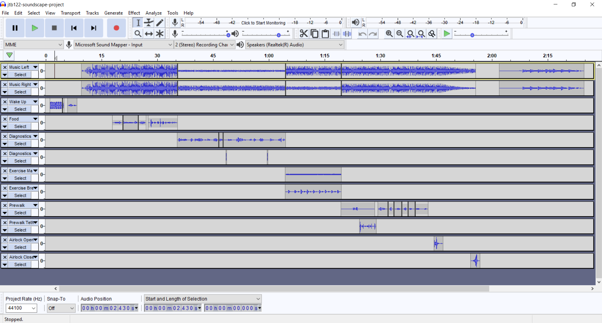
For my soundscape I took a lot of common sounds that could be found within a kitchen and through rhythmic repetition created a story of someone cooking food. Most noticeably I wanted to take advantage of a variation of speed to convey different emotions throughout the cooking. The repetition of sounds would allow for the difference in speeds to be brought out more.
I think the most difficult part of the whole soundscape was trying to get all the sounds to line up properly and to the beat in Audacity. At least to my knowledge I couldn’t really find anything that allowed different clips to line up by a certain interval easily. Also I couldn’t really record most of my sounds until I got around to actually cooking and since I usually only meal prep once a week on Sunday, I didn’t get to record my sounds until relatively late into the project. I had to start with some temporary sounds that I sourced online to create my basic framework and one of the things I was most worried about was it not sounding as good when I switched it out for my recorded sounds.
Visual media was one that I was a lot more familiar with, I worked with photoshop a lot for digital art so I was pretty familiar with all the tools I had available. While it wasn’t like instagram where you could straight plug and play different filters, and took a little bit of adjusting and digging around to recreate, I didn’t have nearly as hard of a time finding the different tools I needed to create my peice.
For my visual unit piece, I did an Instagram vs Reality image using three different fruits. There would be a filtered and unfiltered side and I would also have drawn faces and limbs for each of the fruit. The goal of the piece was to convey the unrealistic standards that have been set that all the filtering and photoshop that people use to make their instagram images attractive. I think the hardest part of the whole thing was getting the message to be obvious enough in one glance but also not be too over the top that it was borderline ridiculous. I still feel like I could’ve exaggerated some parts of the piece a little bit more to make things more obvious but it is what it is.
The web unit I had the most mixed feelings about. I’m personally not a huge fan of CSS - I’ve had more than enough of my fair share of CSS bugs that I’ve had to fix for work that have no rhyme or reason behind why it doesn’t work. On top of that I’ve never really done a straight up web page before but I know HTML pretty well which made things just an awkward amount of difficult. I think this was actually the one unit that I wasn’t a huge fan of, mostly due to personal reasons and had the hardest time finishing. I have done webapps before but more focused on the functionality and backend rather than the site design. On the plus side, at least now I know I definitely wouldn’t want to be a web designer.
For my website I decided to do a site of various statistics for the games I’ve played last year across different platforms. I wanted it to be similar to many different site’s “A year in review” type deal but obviously simpler since I’m not a HTML wiz. I wasn’t exactly sure what statistics to use and since I didn’t actually have any of the nitty gritty data on my gaming statistics asides from what Steam chooses to reveal to me, I couldn’t go too crazy with some of the statistics that I chose.
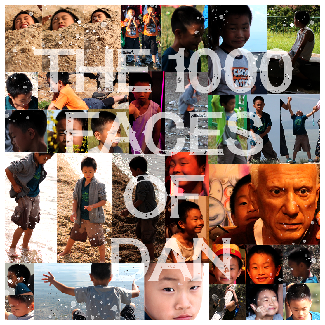
For the consolidation unit, I decided to head back to photoshop because I enjoyed that unit the most and taking what I had learned during the visual unit, I wanted to create something else using these new skills. I didn't go too crazy given how short the unit was, but I went through around 500 some pictures and picked out 35 pictures that had my brother in it and cropped each image to only his face. Then I took those pictures and made a collage of them. I also lightly edited each picture to bring the collage together better. My brother tends to make really silly faces in pictures so I thought this would be a fun project to do and I got to revisit photoshop and use some similar but also different tools within the program.
I think one of the things this class has really helped me with is thinking outside the box and adapting an idea to the resources that I have. Especially given the amount of time that I had and the familiarity with the different softwares. I noticed a pretty big difference between the amount of stuff I added to my Audacity project versus the Photoshop project. Since I was spending less time trying to learn the software I was able to spend more time actually using the different tools available. That’s not to say that spending time learning new software isn’t valuable. I just found it interesting to see the difference in how I approached a project depending on the familiarity.
Edit: Totally forgot about the consolidation project.
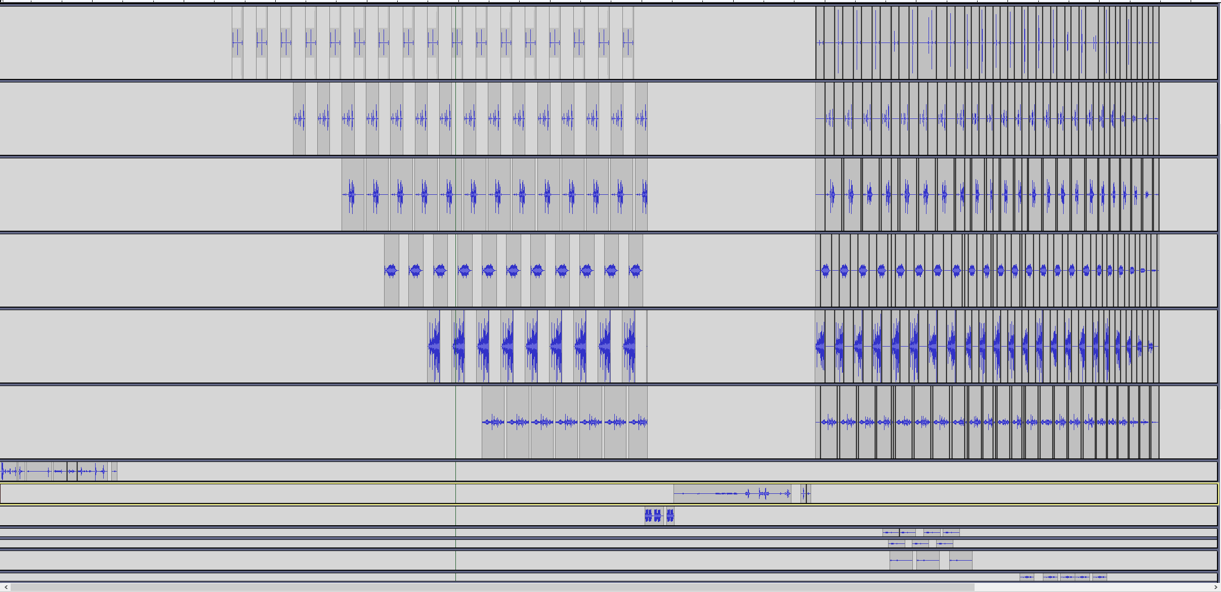
Project # 1: Soundscape Narrative Repository Description: This narrative's goal was to portray what it would be like for a family to find out their child has been diagnosed with cancer, and all of the ins and outs of that process. I wanted to focus on the emotions surrounding this entire process and tried to elicit that sympathetic and sad reaction from the audience. It becomes repetitive in the middle to show how constant hospital and doctor’s visits are when a child becomes sick. The idea came from my connection with The Children's Hospital of Pittsburgh. I am heavily involved with Pitt Dance Marathon and have developed a very good relationship with some of the families with children that have been in this hospital since they were born. I am constantly being inspired by their resilience and care with their children and wanted to give a little insight into what this experience is like for families.
Project # 2: Visual Argument Repository Description: This project is an attempt to recruit new members to join the student organization Pitt Tonight. Pitt Tonight is a late-night- style talk show that has episodes hosted once a month that include comedy, interviews with guests, and musical performances. This is showing one of the main spaces we use for episodes (the Charity Randall Theater inside the Stephen Foster Memorial building). It is supposed to send the message that this show is Fallon-style and draw people's interest. People who are passionate about any of the topics mentioned on the visual will hopefully see this and want to know more about what this organization does. This was my least favorite project, because I felt I did not portray my visual editing skills to the highest degree I could have, but I would like to work on this image in the future for actual recruitment to this club!
Project # 3: Website Portfolio Repository Description: This website is a tribute to the club I have dedicated most of my college life to. I have poured my heart and soul into Pitt Dance Marathon. I have been on the board for 3 years now. I created a webpage for PDM with multiple tab options in the navigation bar. It explains what PDM is all about, gives a little background, has all the members, and provides links directly to our cause and actual site to donate. I am impressed with what I have come up with considering the fact that coding is entirely new to me. Something I struggled with was changing the font, and never ended up figuring it out. I am excited to have figured out how to make pictures into clickable external links on my "Our Cause" page and made one of my nav bar buttons navigate entirely to another website to donate to the cause.
Project # 4: Consolidation Project Repository Description: This is a new graphic for the club I am a part of called Pitt Tonight. I have uploaded our old graphic to my repository to give a reference of what I am working with. My friends in the club and I have been talking for months about workshopping the old graphic, so I used this project to do it. I am pretty pleased with what I've come up with. I used Photoshop and InDesign heavily with this project because I understand it much better than I understand GIMP. With Photoshop, I edited the Cathy image to fit inside the cirlce. In InDesign, I created depth by placing the Cathy behind the crescent moon. The color scheme was chosen to go along with the new retro colors of Pitt. The crescent moon fits nicely into the circle to create cohesion, and the text is written on a path to fit on the inside line of the moon as well.
Project Draft: Website Portfolio
Original 'Meet the Members' commit This draft from the website portfolio project shows how much I improved on just one page of the website I created for PDM. I had a lot of trouble figuring out how to caption each picture and format them to be in groups/subsections. After asking Ben a lot of questions and through the use of asking Google, I was able to figure it out. If you compare the final product to just this commit, you can see intense improvement, which is exciting!
This class has been adventurous, challenging, frustrating, and rewarding all at once. I genuinely believe that having this class at the same time as another digital media class that was also very project-based has definitely refined my skills, taught me new concepts, and increased my level of patience. When it comes to thinking about composing, the best advice I received was just thinking about the present. Whenever we did prompts at the beginning of each project unit, we were given ideas to think about in the current moment: what was on my brain? What immediately came to mind? What was going on in my life? That definitely helped me find inspiration, because whatever was on my mind at that moment felt very important. It brought out what I was most passionate about, especially if that topic was on my mind across multiple projects. As for future digital composition, I would like to remember most specifically HTML and CSS coding and visual theory. I appreciated most the peer feedback I was able to take (and give), because it helped me develop ideas and see my own project in a different light. I stared at my own work for hours, so it was refreshing to have at least one new pair of eyes looking at/listening to my work. For example, I enjoyed the feedback I received on my consolidation project from both Angeline and Ben reinforced that I needed to add texture to my graphic design of my club’s logo. Having both of them point out the same thing showed me what I was clearly missing.
Looking back at unit goals and overall course outcomes, I feel that I was most successful in the soundscape unit and the consolidation unit. The most challenging for me was the visual argument unit, and I also struggled slightly with the website portfolio. It was always difficult for me to express visually all of the ideas I had in my head. Even after writing them down and creating a sketch of what I wanted it to look like, execution was pretty difficult considering I was starting fresh with nearly every platform we used in class. My strength in the soundscape narrative came from, honestly, believing that the “full draft” meant the entire project had to be completed to our best capability. After coming to class and seeing that most people had mostly (rather than fully) completed their own projects, I realized that class period was more for seeing what there was to add on to the project that was missing rather than revisit and edit. However, this put me at an advantage because I had a project that I felt I completed fully, so the feedback was extra helpful. There was more content for my peers to critique, so I had more content for revision before submitting the final piece. I wish I had done that with all the other projects, but that is probably why I felt I had mist success with the soundscape. As for the website portfolio, although I struggled with this one, I do think there was a lot of improvement over the course of the whole project. It started as a very simple website design, but I was really proud of each edit I made. I worked on the flexbox layout, figured out how to hyperlink images, and was able to make a navigation bar with a button that even navigated away from my site and to another site altogether. Figuring out basic coding as well as CSS layout was incredibly difficult, but Google was a great tool to use in this case.
Honestly, it surprised me that we used some software that is not common/typical for each project – mainly for the visual argument unit. I have probably said this so many times in other reflections, but I just really struggled with GIMP. I would highly suggest allowing students to use whichever platform they feel more comfortable with rather than making it nearly a requirement to stay with GIMP. This is definitely more of a personal opinion, just because I kind of think I struggled more than most. In my opinion, even though apps like Photoshop, InDesign, and Illustrator cost money, most jobs/companies post-graduation are looking for proficiency on the Adobe software specifically. It is more common, and if a company wants you to use them, more than likely, they will be the ones paying for it. If it is a commissionable freelance project, one would just include the subscription to Adobe in the price of each individual project. Other than that, I know Audacity is very commonly used (in university at least) and introducing basic HTML coding is super helpful as well, regardless of the software. GitHub at first seemed weird and difficult, but I got the hang of it, and my dad even said his job (he is a software engineer for Wells Fargo) is switching over to the use of GitHub for some of their bigger projects.
Going back and taking a look at my original “Tech Comfort Survey” answers, I was MUCH too confident in my skills with certain technology. Retaking the survey, I reevaluated my skills more realistically. This made it look like my skills declined, but I just unrealistically ranked myself before. I would say my skills still improved immensely across each project from beginning to end, as previously explained earlier in this reflection. I will continue to refine these skills in later classes related to digital media. Furthermore, I will probably continue to work on the visual argument as well as my consolidation project because I will probably use them for my club (Pitt Tonight). I am excited to use these new skills for various projects across different clubs and potentially later in my career as well.
Entering this course, I was so excited to be able to get hands-on formal, learning experience with different digital platforms. I wasn't exactly sure what this would entail, but I knew that this was something that greatly interested me. Throughout the course, I found the concepts and software used to be challenging, yet extremely rewarding once I was able to learn to navigate my way around it.
In regards to coming up with ideas for composing, I feel like it is very important to take a minute or two to brainstorm all that you can and to just breathe; enable your mind to roam freely. Many of my ideas stemmed from things that I was passionate about, ideas that I've always wanted to bring to life, or issues that were currently on my mind. The same can be said when it comes to learning how to use various digital tools for future composing -- just take a second to relax and breathe. It may be frustrating, but if you just take a couple of moments to collect yourself, there is nothing that cannot be overcome. I felt extremely anxious about learning how to use Github, in the beginning. I could not understand the different terms: fork, repositories, commit, pull, push??, and my mindset became so negative. However, reaching out to peers and the professor about any questions I had proved to be very helpful. Now, I can proudly say that I was able to achieve in finishing this semester, attaining more knowledge about how to use Github than I could have ever imagined back in September 2019.
Looking back at unit goals and overall course outcomes, I feel like I was most successful with the visual argument/consolidation unit. Both of these projects utilized Gimp, which I had used in the past. I am also more passionate about visual design, so I found it easier compared to other units to not only spring up ideas but also to be able to have the ability to bring those ideas to life. I actually tried to create a third visual argument on my own time but using Adobe Photoshop instead of Gimp. I wanted to recreate something similar to my past projects using the same tools and techniques, but I found that Adobe Photoshop is actually a bit trickier to use than Gimp. For example, in Gimp you can easily check a box to solely crop a single layer. However, in Photoshop there is no (simple) way to crop an image for a single layer only -- or at least I could not find tutorials on the Internet for this.
The most challenging project for me was the website portfolio unit. It felt like I was constantly gambling on whether my code would actually work every time I opened up my HTML file in the browser -- I would change one thing and the entire layout would become discombobulated, I would change it back and suddenly my images don't show. I actually became so frustrated, I took the skills used from the visual argument unit to create my own graphic for my landing page. Although this unit proved to be very difficult for me, I feel like I definitely improved my literacy for HTML and CSS, and I've taken away a lot of understanding about the basics surrounding creating a website.
The most surprising project for me was the soundscape unit. I actually felt the most pessimistic about this project because I wasn't sure how I would be able to tell a story using only sound when I am such a visually-focused person. Although I do wish I was able to gather more sounds to make my story last a little longer and be more refined, I am pretty proud of what I was able to accomplish in such a short amount of time when my goal was supposed to be telling the story of the circle of life.
This course was incredible. I'm so happy that I took it and persisted even when I felt like I was at a block. Professor Ben led and encouraged all students to succeed and was there for any questions or issues. Ben constantly provided helpful feedback that enabled us to all grow. I can confidently say because of this class, I have grown so much in my understanding of digital tools.
Soundscape: Circles Respository Description: As mentioned earlier, this was my most surprising project. I wasn't sure how it would turn out, and there are still a lot of edits I would make to refine this a little bit more. However, with my current resources, I am pretty pleased with the end result. This audio project describes the circle of life. It begins and ends with the same sound. I thought this narrative would be interesting to tell through sounds because although this particular story may not reflect everyone's lives in the same way, many people may still use the sounds that they are familiar with and apply them to their own lives. With auditory arguments, the visuals are filled in and customized by every listener. The purpose of this was to show the simplicity of life -- we sometimes become too fixated on certain things, overthinking and become stressed, when in reality it is nothing but a minute, minuscule part of life. This soundscape emphasizes that life goes on, moving in circles. What do we want to pass on or improve to the next generation?
Visual Argument: The Model Minority Myth Repository Description: This project focused on an issue that I was passionate about: breaking the model minority myth. It highlights how stereotypes can place unrealistic expectations on many Asian Americans. The cracks on the featured person in the argument can be interpreted in two ways: 1) breaking out of this stereotype or 2) breaking from the burden that society has placed on to them.
Website Portfolio: Pittsburgh's Top 10 Most Instagrammable Spots Repository
Description: The purpose of this site was to create a fun and bright list of photo ops in the Pittsburgh region. Because this was a listed 'blog post' style website, I did not feel the need to include a drop-down menu of all of the pages because I felt like that sort of defeated the purpose of the user having to click through each page to see what is the #1 spot. As mentioned previously, this project really tested my patience, especially when doing layouts. When I initially began to use styling code, my float layout did not turn out the way I wanted to. Fortunately though with the help from Ben and my classmates, I was able to achieve the final product.
Consolidation: #iAmNotAVirus Repository Description: This piece was an extension of my first visual argument project that brought awareness to Asian American and Pacific Islander (AAPI) issues. Again, advocating for these issues is something that I am extremely passionate about. I think I actually was able to improve my technique a lot in this version compared to the Model Minority one -- everything seems a lot smoother, and I learned more tools in Gimp that I could use.
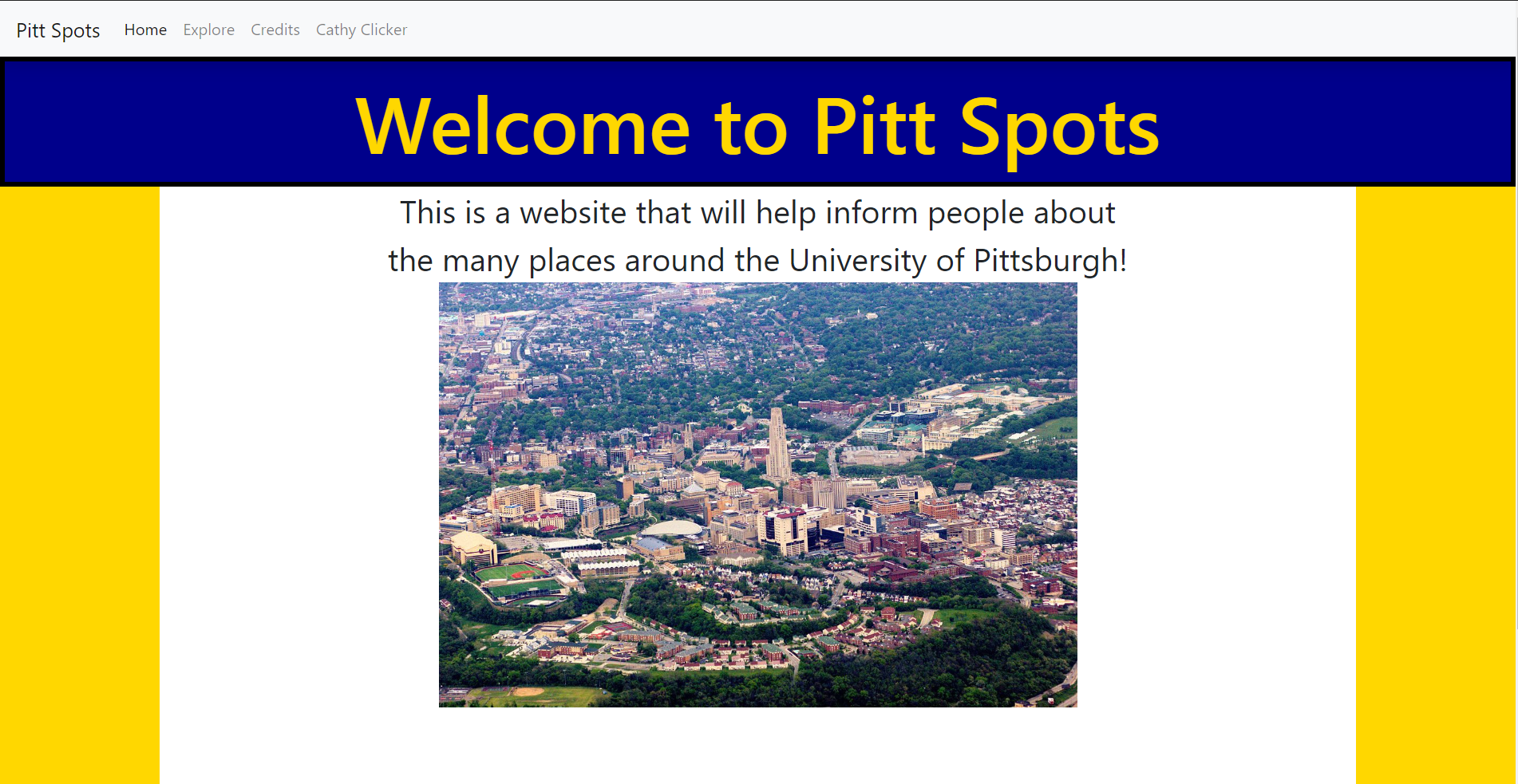
Going into this class, I really had no idea what to expect. All I knew was that out of all of the class I could have taken to fulfill this requirement, this seemed like the best one. After all that I’ve accomplished this semester, I think that I made the correct choice. This class has given me a lot of exposure to various forms of digital media that I, on a daily basis, am a consumer of , but rarely ever produce myself. Throughout the course of this semester, I’ve learned how to create a sense of environment and narrative using only sound, convey an argument that relies mainly on image alone, create my own website where I can display anything I want, and work with others in a digital setting to create something that can be accessed from anywhere. My general approach to composing media like this was to first, come up with some base idea. Once I had that, I would ask myself, how can I make this special by taking advantage of the tools that I have available? Each unit had different ways of making this happen. I think my biggest success of the semester was my soundscape narrative. Working with sound was something that I had never done before. I had always been very interested in it, but I never had the push to actually try it out. When I first got the idea for my sound narrative, I knew that I was going to have dialog between people. I decided that I wanted to have a normal night for two people living together to turn upside down as an emergency alert broadcast starts to play on their TV. For this to not feel fake, I needed to first create a virtual environment completely out of sound that could be used to create the sense that these characters were real people in a real place. This would not have been possible without the freely usable sounds that I was able to find on the internet. For the most part, everything that was in my soundscape was something that I found online. Ambient room noises, kitchen noises, cars passing by, police sirens, TV programs, emergency alerts. All of this was available for me to use for free, and without it, my idea would have been impossible to make a reality. In addition to this, Audacity offered tools that I could use to manipulate these sounds to fit exactly what I needed. It allowed me to repeat sounds, fade them in or out, cut them apart, make them feel close or far away, and in the end, combine all of them together into a single experience. As you can see, I was able to combine so many different pieces into one cohesive product. There’s no way that I could have made something like this without the use of digital tools. For the visual argument unit, I didn’t find GIMP to be as intuitive as Audacity. Manipulating images was something that I was more familiar with than manipulating sounds, but still, it proved to be more difficult. The argument that I chose to convey was that people are too controlled by their phones. My approach to conveying this argument visually was to personify a person’s phone. The light from the phone would illuminate the person’s face, while everything else would be dark, and a shadowy figure would lurk in the darkness around the person, controlling them like a puppet. My first attempt at making the contrast between light and dark was quite crude. This really did not live up to the expectations that I had set for myself in this project. I originally had a layer of darkness that I just cut a triangle out of. To make this look better, I kept the whole darkness layer, and in addition to it, I drew a gradient of darkness with a brush tool that was able to make the center, where the phone was, appear brighter. I also made the light a blue aura instead, which I think looks much more realistic. The hardest part of this unit was finding images that I could use. There weren’t many useful images that I could find for free, so I really had to improvise. The shadow is actually made out of cartoon snakes that were blacked out. The chains that you can see in the final draft weren’t originally curved, I had to use a box transform tool to bend them like that. This is once again an example of how I was able to bring my vision to life by the means of digital tools. I’m not artistically inclined, so there is no way I would have been able to draw something like this without using resources like I did. I thought that the web unit was fun. Being a CS student I was very comfortable with coding. I struggled a lot with CSS. It’s really something that I need to work on a ton because of how relevant it is with what I want to do. My idea for this unit was to make a website that people could use to virtually explore some of the spots around campus. For the places I included, I had a few images and a description. The main objective that I had with the web unit was to make my website very interactive. I think I accomplished this pretty well by using Bootstrap and JavaScript to do fancy things. In addition to a small clicker game that I made, I was able to store images and descriptions in a clever way, by storing them as data attributes in buttons. Clicking on these buttons would trigger a modal to pop up which would dynamically load these data attributes. This made it so I didn’t have to make a modal for each spot that I wanted to show, that would have been a confusing nightmare. Inside of this modal, I was able to embed an image carousel that would scroll through the images that I included for the spot. I think this was my biggest success in this unit. This being said, I think this is the weakest entry in my final portfolio. I focused too much on getting the interactivity done that I neglected the style heavily. In the future, I’m going to need to refine my styling skills a lot more if I chose to go into the field of front end development. This unit also was my first time using GitHub pages, which was actually surprisingly easy to set up. You can click on the thumbnail to view the repository, or click on the link below to go straight to the website. https://mdludwig.github.io/website-portfolio-2020spring/index.html Last up is the consolidation unit. Since Dilan and I are both CS students, we decided that we could probably make a cool web app and deploy it through GitHub pages. And we did, we made a fully interactive Connect 4 game. To accomplish this, we used React. React is a JavaScript framework that allows you to easily make responsive web pages. React essentially uses JavaScript to generate HTML in a way that is constantly refreshing anytime data changes. In the case of our game, when a play clicks on the board, the whole board is rerendered to show the new state in which the game piece has been dropped in. React components allow you to create properties that can be updated based on different events and conditions. An example of this is the individual tiles that comprise the board, they contain a property that changes the className depending on which player’s turn it is. This allowed us to easily switch between different CSS rulesets for each iteration of the game. Another cool part about our project is how we were able to deploy this all to GitHub pages directly. Theoretically, we wouldn’t need to push anything to the repository at all, but that would prevent us from getting each other's changes. This was my first experience with React and it was super fun. https://dilan-dio4.github.io/cdm-final2/ I’m extremely glad that I took this class. I think my skills as a digital media producer have improved so much over the course of this semester. While most of the tools that we use aren’t necessarily the “Industry Standard”, I still think that this was a great introduction to all of the amazing things you can do as a result of the digitalization of media. I know that I'll be able to use the knowledge that I gained here to become familiar with even more digital tools.
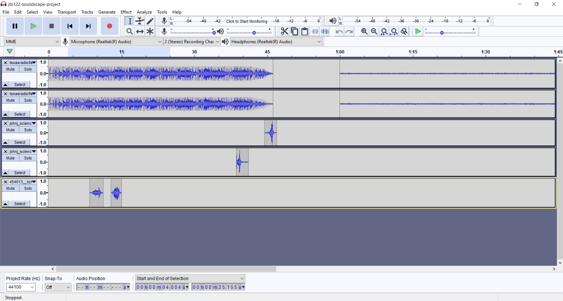
This unit was certainly the most difficult one for me. Going into this project, I had zero experience with Audacity and audio editing software in general. Recording and inserting audio was extremely simple and came easily to me, but I never became fully comfortable with the Audacity interface. Simple tasks seemed hidden or overly complicated. Visually, the project became clustered and disorganized quickly. Fortunately, I was able to get down the basics of splitting, dragging, and duplicating tracks, along with volume control.
The idea that I had for my project was a friendly conversation between two friends about what they were doing that weekend, interrupted by social media and cell phone usage. I was going to edit in cell phone sounds such as ringing and notifications. These sounds were to be gathered from free-to-use sources and utilized to interrupt the flow of the conversation.
In retrospect, I would say that I sort of accomplished my goal. I think that I did a fine job of editing in the sound effects and splitting the conversation audio around the interruptions. If I could do it again, I would have had the conversation more driven by the interruptions, rather than just paused. I think that if the conversation derailed into the space of cell phones and social media, then the goal of the project would have been clearer to someone listening for the first time.
This project was intriguing to me because I have had some previous experience using GIMP. I think it's great software because it's easy to use, extremely powerful, open-source, and free. Doing this project reinforced all of this, as I had a blast the whole time. Since the software is so easy to use, I was actually able to try different things with the use of layers and ctrl-z.
My idea for this project was a continuation of my previous project in that I wanted to do something involving cell phones and social media. In this case, I was going to be more poignant in my argument about cell phone addiction. I wanted this piece to be more of a statement.
I am very happy with how this turned out. The times in which I have used GIMP in the past have always involved editing photography, so it was cool to actually compose an entire piece with GIMP, utilizing the previous skills that I had brought with me. I certainly learned about using my skills, that I learned in a different context, in a new way and I'm very happy about this project in its entirety. I took the idea of elevation that we learned in lesson 9 where we read about dominance and hierarchy. The goal of this technique in my piece is to give prominence to the text and the silhouette.
Of the three projects up to this point, I was most excited about this since I have much experience with web design. I started with the design and came up with the idea for content after. I am a fan of material design and I wanted to do something where I could utilize 'cards'. Cards are a very popular element of the material design and they utilize the same idea of elevation that I took advantage of in the visual argument. Regarding content, I decided to do a cooking site for two reasons. One, it is something that I'm passionate about. Two, I thought it would be cool to give each recipe its own card on the home page.
The overwhelming majority of my experience with web development has involved more complicated web-applications. So, I was excited to do something static. Unfortunately, due to COVID 19 related relocating, I was unable to flesh out the site as much as I wanted to. I wanted to add responsive images to each of the recipes. One of my favorite things about my site is the use of particles.js to give the background a live snowing animation. This is a great open-source JavaScript library that creates live, dynamic background animations. All in all, I think the site is pretty well done, it is responsive, organized, navigable, and utilizes JavaScript.
For this project, I teamed up with Matt Ludwig and we created a Connect 4 game in the web browser. I was aware of Matt's experience in web design, so when I realized that we could collaborate on this project I contacted Matt to see if he was interested in doing something together.
I had the idea of doing a website more complex than that of the website portfolio. I though a simple game would be fun to create and a good challenge given the scale of the project. Matt had the idea to use React to create the game. At first, I was hesitant about this because I thought this might be overkill, but looking back on it this was a good idea for handling state management and it was super easy to deploy to GitHub Pages with react-gh-pages at https://dilan-dio4.github.io/cdm-final2/.
Matt implemented the game logic (using component state), while I did the layout and styling. The result is a Single Page Application where two users can play Connect 4, in which winners are notified. Also, the site features a 'new game' button and light/dark mode.
I was happy to do some collaboration towards the end of this course because at this point, as a class, we were comfortable with the project lifecycle. Throwing a collaborative aspect into the mix was a lot of fun especially because Matt and I could utilize our similar CS-related skills.
This class was a very unique experience. We touched on many different topics. I learned new skills at some points and refined my skills at others. I think one of the lasting lessons that I learned in this course is proper peer-review. We talked a lot about how to be effective and objective when giving peer-review. As a result, I was able to give higher-quality feedback to fellow classmates. An unexpected result of this was that it changed how I reviewed my own work. Receiving peer-review from my classmates in this manner helped me improve my projects.
An idea that has stuck with me from this class is the mediative brainstorming that we did throughout the semester. I'm glad that we did this throughout the semester because the process was reinforced at the beginning of each project. Getting rid of external distractions assisted me in conceptualizing the goal that I would eventually set myself. Broader than just composing digital media, I believe this will generally be a beneficial skill for my future.
Looking back on the course, I think that I was the most successful in the visual argument unit. Not that it was necessarily my highest quality project, but it was the project in which I was able to learn new skills, use old skills and create a piece of digital media that I am proud of. My least successful project was the soundscape. The main barrier for me was my familiarity with the interface. Looking back, I should have learned the software before starting the project. That way, while working on my project, I would have spent less time learning and more time creating. All in all, I had a great time in this course and I'm sure that I will apply what we learned in the future!
Soundscape: A Loud Night Out
Description: My soundscape narrative tells the story of what it is like to go out to the bars as a Pitt student. In the beginning, the sounds are clean, but as the night goes on conversations and noises become a little more disjunct and chaotic. I wanted to create something that sounded a little messy at times to depict the wild environment of the bar scene on the weekends. Many of the sounds and dialogs that I used are actual field recordings that I was able to collect from Southside. I got my friends and roommates to participate so that I could create something that was realistic and authentic. I was strategic in how I edited certain tracks and played around with the volume for each to capitalize on certain sounds and noises. Overall, this was my favorite project that I completed this year because it was the most fun to make and I’m really happy with the results.
Visual Argument: Not So Little Women
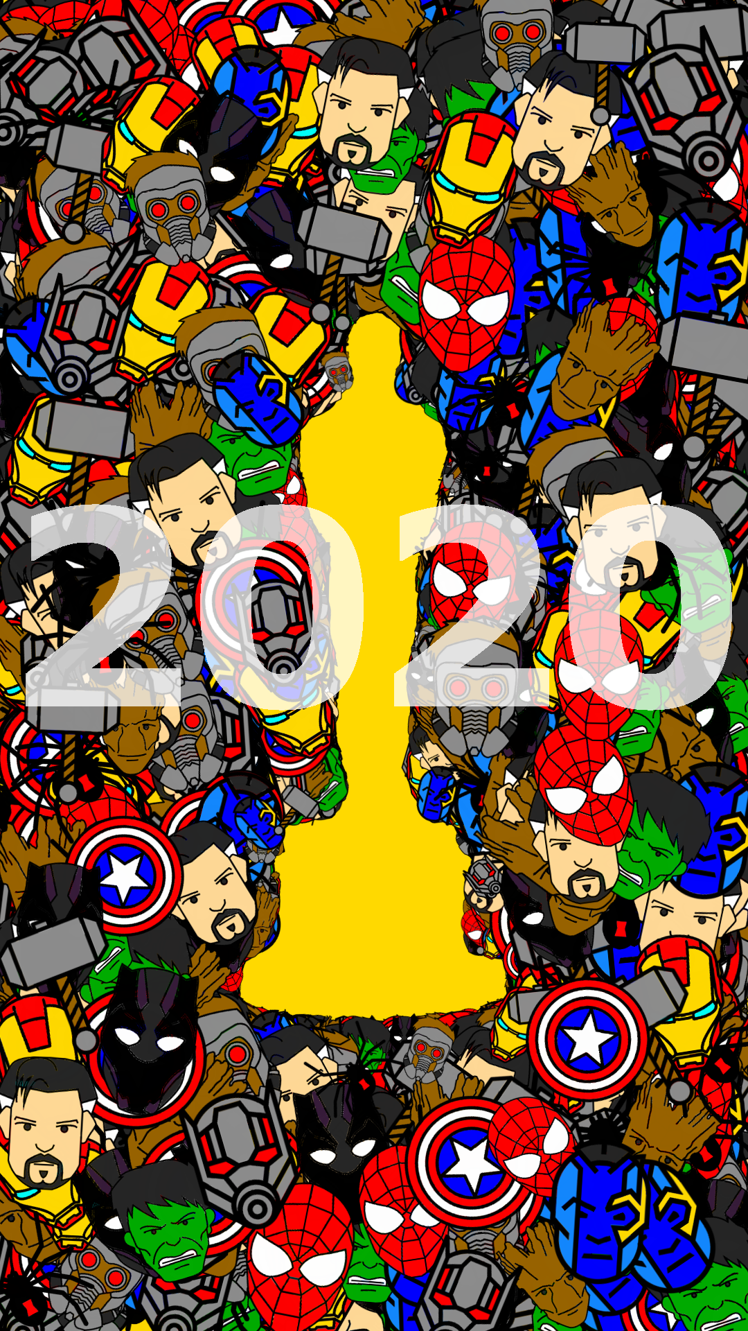
Description: This past year there were several talented female movie makers who were not considered for the 2020 Oscars. My visual argument aims to honor the underappreciated and unrecognized talent of female directors from this past year. With the release of the remake of “Little Women”, I decided to do a play on the words and make a visual argument that advocated for more female representation in the film industry. I used the actual posters for each movie and strategically faded them behind a statuette of a female Oscar award. I also added a border at the top of the page and chose to incorporate the actual font and colors used from the Oscars website. I feel as though this project showed the most growth in terms of where I started and where I ended. My rough draft was really sad looking, and had very little depth to it. I think the difference between my final and rough draft is huge and shows how much I learned in utilizing the GIMP tools.
Website Portfolio: The World of Pop Music
Description: For this unit I decided to create a website that broke down the pop music scene from the past, present, and future. I included a home page which contains an overview of my website and links to rest of my pages. My past, present, and future pages all mirror each other stylistically and in terms of layout. My final page is an About Me page that introduces who I am as well as provides a place for viewers to leave and send me feedback on my website. I chose to use bright colors of pink and royal blue to make my page colorful and engaging. This was definitely the hardest project for me, but overall I found this project to be the most rewarding.
Consolidation Project: Sounds of Quarantine
Description: For my consolidation project I decided to create a new soundscape narrative because that was the unit I liked the best, and I wanted to play around with some of the other audacity tools that the software has to offer. This narrative depicts an average day during quarantine for me and my two roommates. It begins and ends in the same way; showcasing how social distancing and quarantine often feels like a loop where days and time are strung together. Even though life is boring being cooped up all day, the littlest things make me happy and help me to stay positive at a time when I am isolated from my family and friends, i.e. tiny tacos. I recorded almost of my entire project and I specifically used the right and left volume tool to show where certain things were in my apartment. During the cooking scene, the sounds using the left volume track represent that I was cooking in the left side of my kitchen, and vise versa for the right. I found that making this soundscape narrative was a lot of fun and easier given that I was much more familiar with using audacity.
Reflection:
When I first signed up for this course, I thought it was going to be more of a lecture style class that taught digital media from afar. I was actually a little surprised walking into the first day and seeing computers at every desk. I have never taken a class like this before, but nonetheless, I really think that this was one of my favorite classes that I have taken at Pitt because it has such a hands-on approach and it encouraged creativity and collaboration.
Prior to this class I had little to no background in working with audacity, any kind of visual editing software, or html and css skills. I had never even used photoshop and the one fancy app I have on my computer is garage band—an alternative sound software that I used in tenth grade to make a pregame song mashup for my high school soccer team. This class has taught me numerous digital skills that I hope to use in the future as I am pursuing a career in public relations. Technology is a such a viable way of communicating information, and I know that the website design skills and visual editing tools that I have developed will definitely help me when I am (hopefully) working for a successful PR firm one day.
I think one of the best things about this class is that I had so much freedom to create basically anything I wanted. I’m so used to being confined to strict prompts and guidelines from other writing courses, but here I was able to essentially create whatever I so desired whether it was professional or not. The beginning of each unit was always my favorite because I especially liked the preliminary writing we did. It was a really nice way to start off class by writing, thinking, and reflecting. This helped me to better collect my thoughts and get more engaged with my individual projects. It was never difficult for me to come up with an idea or concept, and I think this aspect of the class was a big factor. In the future I hope to use this strategy when I am coming up with other ideas for papers and projects.
The biggest challenge in this class was definitely making my website. Even though I produced a website that I am really quite proud of, I ran into so many issues and watched more html tutorials than I can count. I think my website looks good on the outside, but there are quite a few problems with my code such as me deciding to format my images in terms of pixels and using certain design elements in html instead of css. Many of this could probably be fixed with more time, and more YouTube tutorials, but by the end of it I was happy with how it looked and I called it done. If I were to do a revision of one of my projects it would be this one, but I feel as though I would definitely need some in-person help.
I feel as though I have been most successful in terms of making a successful soundscape narrative, and this is what inspired me to create another one. I really liked my idea that I came up with of telling the story of going out to the bars in Southside. I feel like this is not something that a whole lot of other professors would appreciate or accept, but I am grateful of how much creative freedom I was given to create what I wanted to. I think what made this project so rewarding for me was the feedback that I received during the peer review. A lot of people really liked my project and gave good advice for how I could improve upon it. I think it is always beneficial to get feedback on something you write or produce because even if you really like your ideas, your audience might not fully understand or get behind it like you want them to. In creating digital media you always have to keep your audience in mind because your work is put out there for everyone to see. Throughout this course, I frequently asked my tablemates for help and feedback as well as my roommates and friends. Technology is great because it enables people to collaborate in ways like never before.
I think if there was anything I would change about the course structure it would be to offer more video tutorials. I thought that the “Internetting is Hard” tutorial was useful, but it was more helpful for me to actually watch people talk through it and demonstrate it in a video. Overall, this class was really beneficial for me to take, and I am actually really proud of the projects I created. Being given so much creative freedom allowed me to really enjoy this class because I was constantly excited about what I was making whether it was a soundscape narrative, visual argument, or website. I feel as though I have really gained so much knowledge about producing digital means of communication, and I know I will take these skills with me as I pursue a career in public relations.
Starting this class, I had virtually no skills in composing digital media. I knew that I had a lot of things to learn and a lot of room to grow. I typically retreat when faced with things like this; I don’t like to be wrong or bad at something. However, this course challenged me a lot and made me better at pushing through things that are uncomfortable. I also realized that sometimes I expect too much of myself, and I have to be okay with not fulfilling what I wanted to do originally. On the other hand, I also learned that I am capable of more than I think I am.
Something that really helped me in the process of creating these projects was the brainstorming period. In other classes I would usually go with my first idea and just figure out how to make it work. I actually really enjoyed going through all of my current thoughts and interests so I could pick a topic that worked with the assignment and me. I also valued the lessons in the visual unit on positive and negative space, hierarchy, rhythm, etc. Thinking about these elements helped me feel more creative, and also create more dynamic pieces. Another thing that was helpful to the process of creating these projects was working with peers. Getting feedback was useful some of the time, but I think our peers are often worried about offending you or being too harsh. So, I think what was most helpful was just looking at other people’s projects. Doing this just jump-started my creative process if I felt like I was stuck. It was nice to see something cool in someone else’s project and try to use the same element in my own project. Even just seeing some really creative projects made me want to work harder on mine.
In regard to my personal improvement and success, looking through my projects is interesting. With my sound project, I didn’t push myself as much as I should have. I used tools I already knew how to use and I picked a really easy topic. By the time I got to the consolidation unit, I couldn’t actually believe what I had chosen to produce. I never would have thought I would be able to (or willingly want to) create my own webpage from scratch that holds a podcast-style tutorial and homemade graphics. That sounds crazy for me to even type. I think having one-on-one time with my professor was the most beneficial thing I did. He made me feel confident while also bringing up things I can do to make my projects better. When I needed help, he pushed me in the right direction so I could keep going. I think it surprised me how much I asked for help and how much it actually improved my projects.
Moving forward, I would really like to use these skills in other courses. I don’t think my coding skills are good enough to create my own personal website, but I will definitely use those skills to display projects in other classes. I also think that the sound project was a great lesson. I never consider using audio in my projects because I don’t like hearing my own voice. But, getting more comfortable with Audacity and my own voice during my final will encourage me to incorporate sound into future works. I am grateful that I learned how to use GIMP because I have never used a software that is more complex than Microsoft Paint. Having a background with GIMP will make me less nervous about exploring things like Photoshop in the future.
Soundscape: The Burgh to the Big Apple Repository
Description: This project is an audio journey from Pittsburgh to New York City. I wanted this project to serve as a preservation of my trip. I made it very personal with clips of my family’s voices and sounds from my everyday life. This project was pretty simple, and I wish I had challenged myself more. I was nervous because it was our first project, and you can see that I didn’t take my brainstorming far enough. After listening to some of my peers’ projects, I realized that I could have done a lot more with mine. That was a big lesson that I carried through to my other assignments.
Visual Argument: Helping the Earth One Bag at a Time Repository
Description: I created a flyer for this project. My vision was that it would hang in grocery stores and markets to remind people to bring their own bags in order to use less plastic. The brainstorming process was much more successful with this project. I am very passionate about environmental issues, and I felt that I could make a strong argument regarding that topic. It took some thinking to iron out what I wanted to do, and I still got stuck in my ways for a bit. My first draft of the project was really lackluster:
I realized that I could do so much more with it, even if it wasn’t my original vision. I tried to incorporate our lessons on hierarchy, negative space, rhythm, etc. to make it more interesting to look at. I used tools I had never heard of, and I made many changes to the visual. I am really proud of how it turned out, and I am confident now that I could create my own visual for anything I need in the future.
Website Portfolio: Pitt Pups Repository
Description: This is website that I created as a fun way to look at pictures of dogs. I wanted to have some fun with this project after taking on a pretty serious topic on the last one. I knew this project would be challenging, so I picked a topic that was simple and really fun to work with. I accumulated pictures and bios from my friends of their dogs and actually curated a website to show them off. I was disappointed at first with how amateur my website looks. In the end, I had to be proud of what I did because I had never done anything like it before.
Consolidation: Guitar Tutorial Repository
Description: For my final project, I wanted to make something that incorporated all of our previous units. I decided to create a webpage to teach a song on guitar. I knew this was something I enjoyed, but also would take some work. The audio provides a step-by-step tutorial that refers to the visuals. The website puts them all together on the same page. I think this is a good representation of me and everything I have learned.
I really enjoyed this class. I think it pushed my limits and forced me to learn new things that I was not comfortable with before. Digital media is definitely outside the realm of communications but still inside of marketing which is what I eventually would like to do. Media composition in platforms such as gimp and photoshop are extremely important in marketing and allow you to create your own campaigns instead of outsourcing them which can cost money. Same goes for website creation. Being able to create your own working and visually pleasing website can save money that can go towards other projects and still be within budget. Those are the two most important things I would like to remember and strengthen from this class as I may have to do it after school where ever I end up with a job. I feel I was most challenged with the visual unit and that is part of the reason I went back to do more work on it. I was held back by my unfamiliarity of the platform and to work through it I needed more practice. I have gone back to gimp several times since the first project and was able to do some editing to help with PowerPoint design for other classes. One of the biggest things I needed to do was change colors of icons from flaticons.com. They are a great free design tool to use and it became even more helpful when I knew how to change the color of them and take out the background in png format. I was the most successful in the sound unit, which is ironic because it was the first one. I thought I was getting a hang of things but everything just got more difficult as we moved on. I think overall I was lucky with my sound project because all of the sounds I needed I basically found for free. If I had to make more of my own sounds or take them from other places I feel my project would have been much more difficult to carry out. This was also the project that the reality came the closest to my beginning goal. When this project was assigned and I thought about what I wanted to do with it the soundscapes project is the one that came out the closest. What surprised me most about this course was the possibilities of CSS and how much more I appreciate the websites I visit now. Every aspect of the website has to be coded and designed and most of my friends, the computer science ones, did not even know CSS to help me out. It shows how advanced of a language it is and the infinite possibilities it can be used for. CSS is something I would really like to get better at so that when I start a small business I am able to publish a visually pleasing website of my own. Web design can be expensive and when starting out it is important to spend as little as possible and save money in the budget for other important things that can sell your product or service. Moving forward I am actually challenging myself to take another digital media class next semester to better myself and prepare for the professional world. I will hopefully work on new projects or even work further on projects in this class I made next semester. Also hopefully I am able to use some digital media during my internship this summer (If it ever happens) with QVC. I accepted a position on their marketing Ecommerce team during the semester and am excited to still hopefully fulfill that position and get hired full time after school. Overall I think the course was run very well I think you do a good job of easing everyone into the programs because some people (like myself) have had zero experience with this stuff. You do a very good job of keeping the environment stress free and make yourself available to students whenever they may need. The issue cues and class forums made it easy to see what other people were doing and how they were doing it. I used ideas and processes from other people’s posts on the issue cue multiple times and even was inspired by some of them for my own projects. You have been a great teacher and I really want to thank you for understanding the real side of life outside of this class. Going back to work on top of all of my other school assignments has been tough and stressful but you never made me feel you were pressing me to choose one or the other. Some professors do not understand the adversity that students go home to and I am grateful you have seen the human side of all of these events. I really want to thank you again and I will miss your class next semester. https://github.com/Tomasco16/soundscape2020spring https://github.com/Tomasco16/visual-argument-2020spring
https://github.com/Tomasco16/website-portfolio-2020spring
https://github.com/Tomasco16/GImp-project-take-2 If this does not load right the word document with the correct requirements and formatting is here: Digital Media Final Reflection .docx
Final Portfolio Soundscape: Repo My goal was to make my soundscape a story, a narrative that you could follow from beginning to end. It follows a woman from getting into her car to being on her drive and getting into an accident. This project originally made me kind of scared of this class. I had a pretty hard time getting the hang of audacity but eventually I felt comfortable and was able to make something I am actually pretty proud of.
Visual Argument: Repo This project was my favorite. I felt like I was really able to make an argument on an issue that I am very passionate about - the pink tax. I basically had a finished project in one week that tried to encompass several aspects of the pink tax. It was fine, but it didn't seem to get my point across or grab attention. So I decided to focus on the part of the pink tax that bugged me the most, the tampon tax. In order to refine my project I focused specifically on the luxury tax placed on feminine hygiene projects. I knew that this is an issue that is easily looked over so I wanted to do something with my image that really grabbed attention - like a bloody crotch stain on a cartoon woman. I also used the cartoon image of a women to represent the fact that 1 in 4 teenagers have missed class due to lack of access to period products. Bottom line is, feminine hygiene products are a necessity, not a luxury and should not be taxed as such.
Website: Repo This was the first project where I stuck with my original plan all of the way through which I, for one, am really impressed with myself for. It's not something I do very often. For this project, I made a website for a club I am in at Pitt, Kindness Cookies. The main goal of the club is to spread kindness and mental health awareness through the simple act of handing out cookies in the library. The web page is broken up into three div's with a logo in the first that I made in GIMP. The second is a nav bar and the final contains a section determined by the button pressed in the nav bar. After receiving feedback on this project, I returned to it to make the options in the nav bar easier to read. I had worked with html a little before in a class, Intro to Engineering Analysis. In that class, I had learned to use frame sets which are now outdated. At the time I did not know this so here's what the original version of my site looked like. Although it took some convincing, I am happy with the more up-to-date look of site using the divs.
Consolidation: Repo For the final project I wanted to take the opportunity to do something I wasn't able to do in the website project, incorporate javascript in a website. I knew I wanted to make a jeopardy-style game and my sister gave me the suggestion of making it Kardashian/Jenner themed. I'm pretty happy with the over all project. I managed to incorporate several javascript functions and finally disable buttons after they were pressed, which I struggled with for like a week. Turns out I needed to change "ID" to "Id", even though "ID" is what the autocomplete text is... whatever. My main disappointment with the project was that even after hours of trying, I could not get the score tracker to work. The only redeeming part of it is that it does make more sense for the game to be multi-player anyway.
Reflection: The main reason I took this class was because it satisfied my writing intensive requirement and I always wanted to learn Photoshop. Honestly, I thought that this would be my fun, blow-off, easy-A class for the semester. It ended up being a lot more work than I thought but definitely still fun! The first project was the soundscape and it was definitely intimidating as I had never worked with any sort of audio editor before. My first run at it was pretty much a bust. I got a little over ambitious and got super frustrated. Eventually I just sat down with audacity for a couple hours and managed to make the first 30 seconds or so of my project. At that point I was able to breathe a little and really focus on the creativity allowed to me with Audacity instead of the frustration of working with a new software. The second project was the visual argument. GIMP was definitely more touchy than I was prepared for but eventually I got the hang of it. My main struggle was having to select a tool in order to move stuff around instead of just clicking and dragging. Being able to work with a subject that I am passionate made me excited to work on this project. It also showed me the possibilities of digital media to help inspire real change. Even writing about this now makes really fired up about this issue but also super proud of what I made! I talked a lot about the website in the portfolio so I won't go too much into it here but again I loved getting to work with something I was passionate about. I am one of only five members of Pitt Kindness Cookies and the only one not graduating next year so soon it will be just me (plus some fresh recruits hopefully). This has me thinking about the future of the club and hopefully expanding. This could definitely mean making a website for the club and after this project I think I could really do it! The consolidation project was a struggle for me for several reasons. I knew pretty much right away I wanted to work with HTML again and try adding javascript this time around. I had worked with adding javascript to HTML pages in the same course, Intro to Engineering Analysis, but it was all about forms. I do think I made a fun game but definitely wish I could have done more. Unfortunately, working from home ended up being pretty difficult for me. I have also returned to my job at Giant Eagle after losing my on-campus job. Seventeen people from the front-end alone took leave due to the pandemic so the rest of us have been working crazy hours to keep the store running. Because of this I wasn't able to do all I wanted with this project that I would've hoped to accomplish with more time. Despite the rocky ending, I really enjoyed this class. I came with basically no knowledge of digital media and now have an incredibly solid base. My favorite part of the class was being able to use the new software to work on things I was passionate about. I will definitely be using GIMP again and hopefully even making a real website for Pitt Kindness Cookies! I will miss this class next semester and definitely recommend it to my friends!
My biggest piece of advice for my past-self would be: create a list of goals, and revise as you go. I did not do this for my first project (Audacity), but I believe that was in part because my goals ended up being feasible for the project and my ideas did not really change as I went. However, with later projects I found myself looking at my original goals and thinking—that is not what I want anymore. It felt way more encouraging and organized to look at my goals and say, ‘oh, that isn’t going to work with my idea anymore, but I think this goal would be better’. Instead of just deleting a goal, I would replace it. For example, I realized a sticky nav-bar wasn’t really fitting to my HTML site because the content on the pages wasn’t very long. Instead of just cutting that goal, I thought ‘what else can I do with my nav-bar?’, and decided to revise the goal to adding a drop-down menu to it. This pushed me to do a lot more in my projects and, in the end, I think helped make my projects way more prestigious than they would’ve been without it. I definitely want to continue this with future projects, both in digital composition and not, because it kept me on track and pushed me to explore what I could do with each platform a lot deeper.
Every single project I completed in this course I am incredibly proud of, especially because I had no experience with the platforms we had used for any of them. I think I felt most challenged with Audacity because it is where I felt most uncomfortable—I have worked with graphic design and code before, but never really audio. While I think that may have been the project that challenged me the most, I think the one I am most proud of is my HTML project. It was the one that I definitely spent the most time on because I was really eager to get the exact results I wanted and, in the end, I felt most successful in achieving my goals. I think the thing that has held me back a lot in this course was actually transitioning to online courses (sigh). My overall course load increased greatly, and I realized it was not very reasonable to revise every project to perfection as I had been planing for quite some time. I think I will end up going back and playing around with GIMP and my HTML site after this class is over purely because I want to, but the time limit I had really held me back.
I felt as though the tutorials, research, and trial-and-error that these projects took were all strengths of mine. I surprised myself with the commitment I had to perfecting little things: taking about three hours total to get the perfect glowing silhouette of the figures in my visual rhetoric project, or trying every possible fade-in effect—including manually using the envelope tool—to figure out the perfect approaching-leaving fade for the walk sign clip in the Soundscape. What I feel like I have really improved in is revising as I go. I have always finished a project to make sure I had everything done and then gone back to tweak (I did this with the Sounscape—started with baseline criteria then went back and added in aspirational criteria). As I went through the projects in this course, however, I realized how helpful it was to adjust my plan as I went. Starting with GIMP is when I really started revising as I went, especially revising my goals each time I reimagined what the final result would look like. I also stopped beginning with baseline and then ‘editing-in’ aspirational, as I realized that was holding me back creatively, in a way. Challenging myself as I went really pushed me to improve my overall skill-level with a program as I went. I think one thing that really surprised me throughout the course was how diverse the projects were. It definitely felt like a curveball when we moved onto each new Unit: new jargon, new goals, new focus, etc. I am one who rolls with the punches really well usually, but this course definitely challenged me in the beginning of each unit, which is where I struggled most. As I said earlier, I definitely would advise future students to watch tutorials before doing the project to help envision what is possible and get a feel for what the actual work is going to be like. It is ten times less overwhelming when you watch a few tutorials before you brainstorm and realize the ideas you had are not going to be as feasible as you first thought. I used a lot of tutorials throughout the Audacity and GIMP sections more than before, because I felt like they provided a lot more freedom in what was possible. For HTML and consolidation (I did Twine), however, watching tutorials before getting set on an idea was insanely helpful. I used tutorial series and ran through them, then came back to them as I saw necessary throughout the project. Twine: https://www.youtube.com/playlist?list=PLklITFhXtPCCKadv-0Gcbqoj3OCev695D HTML: https://www.youtube.com/playlist?list=PLoYCgNOIyGAB_8_iq1cL8MVeun7cB6eNc
I watched a lot of other video tutorials as well, but I felt like these were the most ‘short and sweet’ videos that helped you with general concepts, while other videos I searched for were more specific to what I was trying to accomplish!
The only other thing I would recommend as a change to course-structure would be revising project-specific goals throughout the project. It was really helpful for me doing this, and I wish I had started sooner! It helped keep me on track as the focus of my projects shifted/adapted as I went. It was nice to not look at a goal list where I saw things that I originally wanted to do and then decided not to—instead of crossing an original goal off, I began replacing it.
While this class was definitely outside of my comfort zone, I really enjoyed the challenge it provided me. I do have a pretty set plan for my courses over the next three-four years, but I have been looking into pursuing a Digital Media certificate. It has been really tough disciplining myself to do classes from home, yet I found my digital media projects quite enjoyable at home—maybe because they have more of an ‘independent project’ feel than my other courses. This makes me think I may look into online courses of certifications for different digital media platforms (especially HTML, which I seriously enjoyed and struggled with simultaneously). One of the best skills I have learned in this class is finding CC materials! It is embarrassing how little I knew about this kind of thing and the blatant lack of knowledge I had on the resources available to me. I definitely see myself utilizing Audacity, Twine, and GIMP for projects in other classes as they are really unique platforms for presenting information and could add personality to otherwise pretty bland projects. GIMP has become a go-to, actually, because I have used PhotoShop and other digital developers in the past, but certain aspects of GIMP are more attractive to me (the interface is super user-friendly now that I am used to it, there are tutorials for anything and everything GIMP online, and it is free!). As a CS major, I expect myself to experiment with a lot of different platforms throughout my collegiate career and I think this course taught me really useful skills, not just platforms, that will help me when approaching tools I am not yet comfortable with.
https://github.com/haileytrampel/soundscape2020spring.git
When brainstorming my concept for the soundscape unit, I decided I wanted to piece together a walk to class. To quote myself, “I wanted to put these things in to concrete, into a form I can look back on years from now when I forget just how impactful making my way to class can be”. I guess I was a bit ahead of my time on saying I took those walks to class for granted, now that my biggest walk to class is my kitchen to my bedroom. One of the things I really learned with the Soundscape was using Github and Github Desktop. I had used Github and git with Python before, but it really changed my perspective seeing how useful they could be to projects in other forms.
I think the section of my repo most interesting to look at is the assets folder. .m4a files were sounds I recorded myself, which was a huge challenge purely because of how uncomfortable it was for me. Something this unit also really taught me was about utilizing resources available to me—my project would not be nearly as accomplished if I hadn’t access to CC files (the .wav and .mp3 files in assets). Below I included my first draft (rough around the edges, an obvious discomfort with any Audacity tools) as well as my final draft (much smoother and streamline, thanks to a lot of trial-and-error with different assets and effects). If you want to view the first draft and final draft, just click the progress shots below and download from the repo!
As I said earlier, I wish I had revised my goals as I went because I feel like this project became very cut-and-dry in my mind: I accomplished the criteria and goals I wanted, and called it a day. I would love to see what I could do with Audacity now that I am comfortable enough to really challenge myself.
https://github.com/haileytrampel/visual-argument-2020spring.git
I think one of the strong-suits of my visual rhetoric is that I followed through with my overall goal and accomplished what I wanted—creating an emotionally powerful image for the desired audience (albeit it was a small audience!). For my visual argument, I wanted to emphasize a word: growth. I decided to use my father’s life as the visual component, because my siblings and I grew up with his stories as an inspiration for persistence, self-growth, and optimism. I had a lot of different ideas I wanted to incorporate, which ended up being more aspirational than I could’ve expected (each little part took a lot longer than expected), but overall I really think it was worth the time I committed to it.
In my earlier drafts, I did a lot of the basics for what I wanted. This was a lot of time spent just experimenting with tools and getting major pieces done, especially the background. Peer criticism was really helpful in that it allowed me to see my project from someone without the backstory’s perspective (which is why the halos were added in, after I kept getting the question “who are those people in the sky?”). I think the sunbeams were the most influential and important aspect of this piece, and it is proof that going through four or five tutorials is more than worth it. You can view the different drafts by clicking on the image.
If I were to go back and do this unit again, I would take my current advice and watch a few hours worth of tutorials before planning my project. I think I could’ve created a better mental vision with what was possible with GIMP tools before beginning and probably had more time to challenge myself instead of spending so much time trying to accomplish things that there were no existing tutorials for. Once my finals are over, I plan on going back and altering this piece a little more. I want to see what else I can add to tell the story with a bit more strength, and then I envision myself printing it out and writing a few sentences on the back to give as a gift to my dad. I considered doing this as my revision project, but it felt too personal and I also felt it was less challenging than I wanted my consolidation project to be. However, it seems like the perfect way to continue growing and honing my digital media composition skills past this class!
https://github.com/haileytrampel/website-portfolio-2020spring.git You can access the live site here.
The website was by far my favorite unit we have done this entire year. It took the most effort and definitely the most time, but that was because I really challenged myself to go above and beyond with this. I struggled a lot but have always wanted to learn HTML, so I felt like it was worth the extra commitment. I chose the topic of ‘Keeping the Oldies Young’, as I always have friends telling me they love the ‘old music’ I listen to. I found this a fun way to incorporate text (a lot of research), graphics and images (a lot of tutorials and CC images later), and—my favorite part—actual music.
I started out making each page with pretty basic content so I could add to the stylesheets as necessary. I constantly readjusted my goals as my vision for the project changed, and it really helped me to stay focused on the project and push myself to keep trying when certain aspects were not working out. Getting the Elton John images to work with flex box and opacity took a lot of trial and error, but is one of my favorite parts of the site.
Also, I incorporated a GIMP logo into the home page of the site, which was about an extra hour or so of work and a few tutorials, but was really worth it. I would love to add some form of audacity audio into the site later on, but couldn’t find the time before the due date.
Many of the online HTML workshops I have been looking into encourage you to work on building a site as you go through, so I actually plan on continuing with this site through the summer while I teach myself HTML. I think it will be a really nice way of improving my skills with this language while also encouraging myself to continue with studying digital media independently. There honestly aren't any major revisions I would make to this because of how many revisions I made as I went, but I would love to build on it in the future.
https://github.com/haileytrampel/Consolidation-Project.git You can acmes the live site here.
My consolidation project was really enjoyable. I ended up watching a ton of tutorials, reading through articles, and researching the three different styles of Twine while making mine. I chose to do a Twine that could fit into my Website (as they are both HTML based), and decided to focus on my all-time favorite artists, Johnny Cash. I thought it would be an interesting way to teach myself a new platform and also further hone my skills with CSS.
It ended up being really tough figuring out the CSS specific to Twine because it is slightly different from HTML-CSS, so I definitely did not get done as much as I wanted to. Once again, I ended up tweaking my goals as I went and changing my mind on a lot of things. I switched from simply telling a story to giving the user an option between learning about Cash’s life-story or ‘building an album’, and I really loved working with Twine in this way. It has a really unique user interface that is really friendly for information that you want to present page-by-page. I ended up tweaking my nav-bar from my Website to work with Twine and could not get it perfect, but in the end it did what I wanted it to and I actually am pretty proud of that!
Overall, it was fun to see how information could be displayed in a different way and the Consolidation unit definitely reminded me how much fun it can be to throw yourself into an entirely new platform.
I guess all I can really start this off with is... wow. Last semester, I had my first gen-ed class that I honestly considered dropping early on because I thought I would hate it, but I stuck with it and ended up enjoying it far more than I expected. And, well... it's happened again. Not that I considered dropping the class, but coming around the first day and hearing I was going to have to do audio mixing scared me a bit, and I had a feeling I wasn't going to enjoy this class. And boy, was I wrong. The soundscape still was my least favorite of the projects we did (more on that later), but overall this class has been a total delight, partially to my surprise.
Turning to a guiding question for some direction, I would say that one lesson that I've learned and would like to take away from this class is the benefits/detriments of the various affordances of different forms of media. I first learned about affordances in SCI's Big Ideas in Computing and Information class, and this base knowledge helped to really make sense of the affordances of different "media mediums," if you will. From text to audio to image, there is decreasing linearity, which can often be beneficial in media, though with that it becomes more difficult to direct the focus of the viewer. While we didn't discuss video media in class, this logic can be applied there, and it can be inferred that the linearity is similar to audio, but with more opportunity for various focal points. This ability to analyze media formats is a great skill, and one I'd love to hold onto going forward.
Looking back through the units we did, I'll start at the beginning: the soundscape, or as you called it, the spacescape.
I would absolutely consider this unit being where I improved the most; I went from next-to-zero knowledge about Audacity and audio mixing to a fully finished soundscape that I was, honestly, quite proud of. The biggest media challenge here, rather than tech challenge, was how to really convey feeling through just audio and building an atmosphere. I accomplished this through music, which did take focus for a lot of the time, but still allowed the main events to be the main focus, this duality coming as a great result of audio as a medium. While it could have certainly been better, I was overall very pleased with the outcome - I achieved a lot more than I expected, going into it. Audio is still and likely will never be my strong suit, my heart shall always lie with code (unsurprising, based on my other projects), and thus it was my least favorite of the units.
Early screenshot of progress.
(Nearly) final screenshot of progress.
Honestly, I consider the next unit to be my most underwhelming: the visual argument.
My final project.
Well, underwhelming may not be the best word, but still the one I feel the least accomplished with. After learning Audacity and feeling pretty satisfied with my work, we reach the Gimp unit, where I... barely used Gimp. While I'm pleased with the output, and I think it looks really clean, I didn't learn much. I have some prior Photoshop experience, so it wouldn't have been as steep of a learning curve as Audacity was, but there's still much more for me to know with photo-editing software, and I didn't really gain that with this project.
While creating this one, I had a ton of fun getting the code to work out to build the silhouette - You got to see many of the struggles throughout the process. The difference in the collage from the very beginning to the end was a massive jump in quality, and again, I'm very pleased with the result, I just feel that I could have learned more had I done a project properly in Gimp.
Very early screenshot of progress vs. final screenshot. I love the contrast here.
In the next unit, I think I really got to show off my total lack of artistic talent: the website.
I guess I should clarify that one. Well, I guess I just mean that on account of the regrettably somewhat horrible color palette. I'm exaggerating, but even then, looking back... it's not pretty. The overall layout of the website feels some level of outdated, but such is my art style, apparently. For achievements in tech, I'm quite pleased with myself - I learned HTML far more in-depth than I had previously known, I learned CSS from scratch, and Jekyll was brand new to me entirely. I had never embed JavaScript into a site before, which was a big success. This unit was also my introduction to responsive design, an extremely important topic in game design, which is where I'd love to end up.
If I had to put a label on this project, I'd probably call it the one in which I learned the most applicable skills for the future. While may never use Audacity again, I'll certainly manage websites in the future. This unit was one of the most fun, and I seriously enjoyed working out all of the weird bugs we encountered throughout the process, and I really just loved every minute of the project.
Early testing version of the home page.
The final look of the home page.
And now, for the grand finale: the "consolidation" project.
Well, I wouldn't exactly call it consolidation. Does it build on what we've done so far? Not really, no. Are the ideas transferable across the media format? Sure. But was it ambitious? Absolutely. May I introduce to you: Off the Rails.
Screenshot of the main game in its current state. Sorry about the private repo.
Okay, so it may not be the first time you're seeing this, but just in case: For our final project, I've decided to create a fully playable game! While it may not be the most polished version it will reach, and the gameplay could change in the future, I wanted to push myself to create a working product. I have hopes that, in the future, I could turn this into a commercial product, which is the reason for the repo being private. But, if you'd like to play the game, I'm going to (try to) keep up with posting newest versions of the game here.
One of our guiding questions discussed further revisions, and as mentioned, I would love to continue development of this game, going so far as to add a proper campaign mode, possibly with some basic storyline to go along with it. Currently levels can be completed with any possible solution rather than just the intended solution that uses all of the tracks, so I'd like to implement gems you can pick up found along the "correct" path. These gems could potentially buy different cart colors, or something else entirely. All in all, I've had a great time developing this game and I'd love to continue further down that path. It's come a long way, after all.
Old screenshot. Functional, sure, but certainly not polished.
So, going back to the beginning, this course has certainly been a pleasant surprise, and has given me further hope for gen-eds going forward. Composition was never my shtick, and this course has been much more fun than any other research or business writing class could have been, so I thank you. Thank you very much. Until next time.
This year hasn't exactly been... "as planned" for anyone. No one could know what kind of crap was going to go down, and adjusting was easier for some (myself included) more than others.
However, in a time of hardship, sometimes you need a class that makes you look inward, and this class lived up to that. To be fair, I actually expected that, as "Writing With Style" was probably my most beloved class of all time, which also set the bar pretty high for a Digital Communications class.
This class pulled through both of those challenges, remaining accessible and true to its nature as being a place where actually putting emotion and personal feelings into the work feels rewarding. The templates are open, the guidelines wide, and the room for improvement is vast. Anyone of nearly any level can come into this class and improve on SOMETHING, and all of the factors that made this class also made it great.
Without getting too far I'd like to at least hit on a few "guide" questions
A) For the most part, I think what I'll remember most for composition would be the process BEFORE HAND. Taking a minute to relax, and set aside all that you have eating at you, all the things tugging you away from your ability to compose... and just breathing. It's beyond effective, even if it seems a bit campy.
B) I found the most success with the message of the Gimp section. I love that damn poster, and I don't want to talk more about it because I plan on using it in my closing statements! On the other hand, my biggest failures and challenges surrounded the website, which nearly convinced me to give up. In the end, though, it came through... kind-of. I realize the images came out wrong, even in my final draft, and everything pointed to me using it in my consolidation project, but I think social distancing myself from that project was more for it's protection than mine, as that recycling bin on my desktop was looking mighty tempting.
C) What surprised me during this course? Could I get away with saying "The Plague?" But in all seriousness, I wasn't exactly surprised, I was more-or-less repeatedly confirmed to have been right that you put together another in-depth class that allows for freedom and thought-provoking content, and that's not just to make you feel good, the class style just genuinely makes me so happy something like it exists on campus! I said this with "Writing With Style," but I genuinely sometimes forget this class was something I signed up for, as it feels wholly unique as something I would do in my free time.
D) I plan on expanding my composing tools every time possible! The website design process is probably one I'll have to dust off long after the others, but I absolutely see myself having to come back to it for some project or another. The other sections, however, will be used nigh weekly. Photoshop, Sound Editing, Scene Composition, or general work practices all are on my schedule today alone!
Anyway, lets go back to the soundscape... which I forgot I had to do at least twice, due to the lack of coordination on my part. Originally it was going to be a mock-up of what all of my online friends would sound like if we were actually hanging out together, rather than over 300 miles of Fiber Optic Cable. Instead I couldn't get them to work together and NOT swear.
If anything it's a testament to how difficult it can be to get 5 people online simultaneously (something preventing us from hosting classes, so how coincidental is that?)
Regardless, the project had to quickly evolve to a solo-recording, and became what it is now... A barbershop. One of my friends joked with me about it being a rip on ASMR, which was largely unintentional, and possibly an byproduct of ASMR being (in essence) REALLY detailed soundscapes when done "correctly"
Either way, the hardest part of this project was holding my breath during the takes because the minimum GAIN on my microphone was picking up what sounded like a horse that had just run a marathon whenever I was near the receiver.
I think its comfy
Then came the GIMP project, which soon became photoshop, but I think that having the option of using a different software was for the best. I am now proficient with GIMP, but getting some practice with a different style of image editing (more artsy than the thumbnails I am used to making) was beyond worthwhile, even if my first few attempts were less than aesthetic. Heck, alot of the progress shots really meh.
But, like many of my projects, once I found an idea that started to click, man I jumped on it. At the time I think I was less satisfied with it than I am now.
Heck, the project that resulted is something I want to hang on a wall because I feel tied to it now. I even considered making a "theme" for my Consolidation Project, where I just made a series of similar posters for an inspirational overload, but I felt like trying to turn the first one into a template would remove its soul, if that means anything. I liked it being unique I guess.
Then comes the "Strugglebus" that was the website, which I think I've discussed enough, but taking a breather and relaxing before coming back to this one was a MUST.
And after that comes my screw-up. The consolidation project, which is more a video than a return to a previous project, but I felt it contained elements of everything besides HTML. The video needed plenty of sound editing, a thumbnail, and plenty of reflection.
In the end... I felt like that last one was a let-down. It was less of a pre-meditated project, and more of an emotional outlet. Things have been weird, the world isn't right, and the least I feel I could have done is a quality revision of a past project, but instead I just broke stuff on video. Maybe that was what I needed, but I don't feel like I was reaching for anything, just doing, like I've been on autopilot these last few days. I feel empty, nervous, excited even but I don't know what for. So in the end, this last project became an outlet that meant nothing, it just... exists, thrown out into the internet along with this word vomit of a conclusion because I'm struggling consolidating my feelings, let alone a Final for a class that was nothing short of great.
Links to all Repositories Soundscape https://github.com/Bmb154/soundscape2020spring/tree/master/Barbeshop Gimp https://github.com/Bmb154/soundscape2020spring/tree/master/Photoshop%20Project%20SPRING%202020 Website https://github.com/Bmb154/WEbpage-stuff Consolidation https://github.com/Bmb154/Consolidation-Project-Real-
I can confidently say that I did not know what I was getting into when I registered for Composting Digital Media (CDM). This being my final semester at Pitt, I chose this course as the final elective for my Digital Media Certificate. Throughout the term, I have been challenged to develop as a communicator, learn new things, and stretch past my comfort zone. In doing the four core projects, I have not only discovered more about my own personal ability, but also came to a place where when people ask me what Digital Media means in the scope of my degree, I feel like I am able to give them an actual answer.
For each section in this course, we have created a draft, received peer feedback, and revised for the final submission. Although I have done a lot of graphic design work for my previous internships and classes, the specific feedback process that we conducted in CDM has taught me a lesson that I will carry with me as I create graphics in my future. More specifically, when examining my peers’ projects, I was asked to first explain what I saw/heard, as did my peers when they reviewed my work. Through this exercise, I realized that certain elements need to be explicit in order to deliver my intended message. Just because I knew what my projects were supposed to mean does not automatically mean that everyone else does. When I received feedback from my peers and they described what my project was, it often didn’t exactly align with what I thought my project was. I can offer my soundscape project as a specific example. My full draft was a composition of various sound bites that I compiled to create the story of someone on a hike in the woods who climbed a final incline at the end to reach an expansive view. I wanted my soundscape to feel as realistic as possible, so I did not include any speech. I discovered with the peer feedback that using heavy breathing and wind sounds alone (amongst a few other things) did not deliver the story of the hiker reaching a peak. For my final draft, I added voiceover narration to explicitly describe the journey that the hiker was taking. This taught me the important lesson of looking at my work through a different lens (or listening to it with different ears) in order to critically analyze its effectiveness.
Looking back at CDM as a whole, I have found that my greatest success has come from breaking past my personal barriers. These often came in the form of technological ineptness. For the sound section, I did not quickly understand the functions of Audacity. For the visual section, I wanted Gimp to operate exactly like Photoshop and InDesign, and got frustrated when it didn’t. For the website section, I not only knew nothing about programming/code/etc., I had the mentality that I could never understand it. There were certain baseline criteria that I felt like I could never achieve. For example, one website baseline criteria was to successfully display our website locally in a web browser. I did not really understand what that even meant, let alone how to achieve it. When I faced barriers like these, I chose to accept the challenge rather than decrease my goals. With that being said, another important lesson that I have learned throughout CDM is how to set difficult, yet rational goals. There were times when I initially found some aspirational criteria to be too intimidating, and considered removing them my list of goals. I realized that it was much more rewarding to take the time to at least try the aspirational inspirations, because I usually discovered that they were actually attainable (like loading my website on to GitPages).
This leads me to discuss how CDM surprised me. There were aspects of each project that seemed unachievable to me. I felt very accomplished last Fall when I took Integrating Writing and Design and learned how to used Adobe InDesign and Photoshop. I think I subconsciously decided that the Adobe Suite was enough for me. Fast forward to the beginning of the Spring term when I began this course and was told that I would be working with three new programs (if you consider Atom to be a program)! At first I was disappointed because I thought that in CDM I would be able to continue mastering technology that I already knew. After now working with that new software, I am surprised to say that I am glad that we did. Although I probably won’t be using GIMP or Audacity in my future career, the process of challenging myself to learn something new is a skill that I can carry with me forever. Moving forward, I will continue to develop my digital media skills with this new confidence. Seeing that I am graduating this semester, I won’t be revisiting any of my CDM projects in other undergraduate courses. I do, however, hope to use my graphic design experience in my career, and plan to implement the lessons that I learned in this course into those future projects.
Soundscape:
As previously mentioned, my soundscape narrative follows a hiker on their favorite trail. I chose this subject matter because I felt like it was an experience that I have had several times, and could easily recall the sounds that score it, using my favorite trail as inspiration. I “leveled up” a few times during this project. Some notable examples are when I discovered that the “amplify” effect didn’t directly increase the volume, and the use of the left and right speakers to add a directional effect to the dog barking at a squirrel. Like I mentioned in the earlier reflection, a lot of the feedback that I received for my first draft referred to some uncertainty about the plot of the narrative. I also attended office hours and we discussed how I could describe the specifics of the soundscape more explicitly. It was ultimately decided that I could maintain the subtly and peacefulness of the natural sounds, while including brief self-recorded narrations to set the scene for the listener.
Repository: https://github.com/onewport23/soundscape2020spring MP3: https://github.com/onewport23/soundscape2020spring/blob/master/soundscape%20project.mp3
Visual Argument:
For my visual argument, I wanted to develop a unique way to discuss something that I feel passionately about—responsible recycling practices. In order to do this, I used the chorus from the 80’s hit “It Takes Two” by Rob Base and DJ E-Z Rock to emphasize the need to 1.clean and 2.dry recyclable plastic before disposing of it. I wanted the style of the composition to match the 80’s theme, so I used the GIMP paint brush tools to create an airbrush effect behind the images and text, and a ripped paper-look behind images to suggest they were ripped out of a magazine. This was the most challenging part of the project for me because I had to adjust to the GIMP platform, and learn how to navigate the layers and During the peer review, some of my classmates expressed that the composition of the text in the first draft made it confusing to read (with “1. Clean”, and “2. Dry” in the middle). To fix this, I airbrushed the back of the main message (“It takes TWO to make a thing go RIGHT”) to distinguish it from the “1. Clean” and “2.Dry.” If I were to revise my visual argument, I would revisit the paper-tear paint to maybe add some blurred edges to make it look more realistic. I would also attempt to add a gloss effect on the images to add to the magazine style.
Repository: https://github.com/onewport23/visual-argument-2020spring
PNG: https://github.com/onewport23/visual-argument-2020spring/blob/master/visual%20argument.png
Website:
The Website project was definitely the most intimidating to me. Understanding HTML and CSS (which I did not know existed until this section) seemed like an impossible personal feat. For this reason, I not only had to challenge myself to meet all of the baseline criteria, but I also had to be patient with myself along the learning process, endlessly revisiting tutorials until I got a concept down. Because I have pursued degrees in Marketing and Digital Media, and much of my professional experience has involved writing and graphic design, I wanted my website to be a one-stop shop for all of my portfolio materials. Although seemingly minor, one of my greatest “level ups” in this project was when I figured out how to load images onto my webpages! As you can tell, in my first full draft, I was still learning how to implement to very basics.
Commit link: https://github.com/onewport23/website-portfolio-2020spring/commit/330a7e9ea89adf86947b59f5ffef7609b4826efe
The group feedback was especially helpful in this section because several of my peers pointed out broken code in my HTML and CSS. Using their advice, I was able to start seeing results in the CSS style that I was writing. The peer review process was also helpful because I was able to see what my classmates were doing for their websites, and simply seeing how they wrote their code and organized their CSS cleared a few concepts up for me (i.e. how to upload a background image). For this final draft, I was just pleased to have my own content on a website! With that being said, there was a lot of room for me to improve.
Repository: https://github.com/onewport23/website-portfolio-2020spring
Final Draft: https://github.com/onewport23/website-portfolio-2020spring/commit/d38f035998f4aa5a286d6910cde65f2a02555204
Website Revision:
Because I wanted to possibly use my website to give to recruiters during my job search, I decided to revise my first website draft for the last consolidation section. Because I spent most of the first project learning the basics of CSS and HTML, I felt like I didn’t have the time to refine the style of my website. Using some class Zoom time, office hours, and google tutorials, I was able to make some pretty significant changes to my first draft. I fixed my images so that they were responsive to webpage resizing (see profile image on home page and design portfolio tab). I moved the menu bar to the top of the page to and changed the fonts and colors to make the overall layout cleaner and more professional, as well as adding links to my other pages so that a viewer could navigate more seamlessly in between tabs. I also edited the ocean background image in Photoshop with an “oil paint” filter to add some extra stylization, in addition to editing the stylesheet so that the image spread and resized with the webpage, rather than repeating when the page widened. In addition, I implemented a grid layout on my home page and Website Portfolio page to improve their layouts. With the huge help of my Professor (thank you again!) I also finally executed a JavaScript image carousel in my Design Portfolio tab, which massively improved its look and functionality. Lastly, as previously mentioned in the reflection, I loaded my website onto GitPages, so now I have a functioning link to share!
Repository: https://github.com/onewport23/website-portfolio-2020spring/tree/Website-Revision
Link: https://onewport23.github.io/website-portfolio-2020spring/
Repository: https://github.com/mjb-123/soundscape2020spring Repository: https://github.com/mjb-123/visual-argument-2020spring Repository: https://github.com/mjb-123/website-portfolio-2020spring Link: https://github.com/mjb-123/website-portfolio-2020spring/tree/master/website Repository: https://github.com/mjb-123/cdm2020spring
I really enjoyed this class. At first, I signed up because I heard it was a class the gives you writing credit without having to write. That being said, I have really enjoyed digital media-esque things since middle school, so this class was right up my ally!
I had a little bit of experience in every unit that we covered this semester, but I'm happy to be able to dive in to get more experience in a more structured manner. I feel like this class is one that really focuses on real-world use. Every unit had a direct translation to how jobs and hobbies would utilize each skill, and on top of that, we used free software that taught us how to adapt to different environments. Consequently, I have also learned a lot about design and narrative in this course. As a Computer Science major, I had a pretty strong background in many things technical, but I needed an extra push to work on my design and writing skills. This class gave me that push while utilizing my technical background as a means to display these new skills. I could definitely see myself using what I learned in this class for my hobbies, if not for my future career.
Specifically, I think I should continue to focus more on the non-technical skills that I previously mentioned. My coursework is preparing me for a job to implement something somebody else has written or designed, and I think that if I hone these skills enough, I may be able to create something all of my own. The most challenged I've been in this class wasn't typing code or editing objects, but rather thinking about more big-picture things. Is the color scheme of this poster appealing? Is the story this video is telling interesting and informative? These are some things that I don't normally have to think about when I'm working, so it is really refreshing to work those parts of my mind. I still look back at some of my design and writing skills and see all the flaws in them, and I think of what I could have done differently. I look at my poster color-scheme and think "huh, that looks a bit off, how could I make it look better?" Moving forward, I feel these are some things that I should focus more on, so I may be more well-rounded in my work experience.
The soundscape project was a nice return to audio editing that I haven't done since a middle school history project had us make podcasts. Of course, that project was just me talking over some music with some rough cuts done. This project allowed me to get into much more detail, and I discovered many more things than I thought was possible with Audacity. Instead of some rough cuts and talking, I tried to use the software to its fullest potential. I shifted audio left/right, added an equalizer to make dialogue sound cleaner and more in-character. I made subtle splices to fix issues in recording. I had to balance multiple layers of sounds seamlessly to create an atmosphere from scratch. I chose this specific thumbnail because I feel that shows off this balance the best. You can see all the cuts, pans, and adjustments I made to blend together a story. I was on a western films kick during this unit, so it just made sense to me to base this story around a cliche in one of these films. Link to repo: https://github.com/jerols4/soundscape2020spring Link to file: https://github.com/jerols4/soundscape2020spring/blob/master/Jeremy_Olin_Wild_West_Soundscape.mp3
This project may have been the one that I struggled most with along the way. At first, I couldn't think of a good poster idea, then I couldn't think of a good poster design, then I had trouble making what I had in my head come out in the software. Though, by the end I feel as if the final result came out much better than I ever anticipated going into this project. As I previously stated, I am good with the technical aspects like working with photo-manipulation software, but I am not as good at planning out a design and rhetoric. I am grateful for the brainstorming activities we did in class, as well as the design overviews, since these both really improved how I went about making this poster. I chose to thumbnail both the first draft and the final draft, since this project had such a stark difference. The gritty black and white with default text fonts and oddly size photos in the first draft look much more mediocre and boring to me than the final design with colors, contrast, properly aligned and sized photos, and typography that fits the narrative. Link to repo: https://github.com/jerols4/visual-argument-2020spring Link to file: https://github.com/jerols4/visual-argument-2020spring/blob/master/visual_argument.png
The website unit is probably the one I was most comfortable going into due to my previous experience. I had already made a website before to show off my computer science projects, and I had worked with a school club to make websites before that. This project was another situation where I feel fine using the technology at my disposal to make something that is already planned out, but the design and planning is what had me struggling. I have always really wanted a website to show off my hobby of photography, but I never had the drive to make it until this unit. Going into the website, I knew I wanted a very minimalist design that still looks nice, so I messed around a lot with design tools like Google's material design and Adobe's color. I had also only really worked with Bootstrap, and at a time before flexbox was really a thing, so I focused a lot on the tutorials we did for homework on the CSS sections. I feel this project is what I got the most out of in the long run, mostly since it has the most relevance to my career path, and because it let me show off another hobby that I had. Link to repo: https://github.com/jerols4/website-portfolio-2020spring Link to website: https://jeremyolin.com/website-portfolio-2020spring/index.html
I have always been really fond of video work ever since I took media classes in high school, and I thought it would be the perfect way to combine a visual rhetoric with an audio soundscape. I didn't have any idea what kind of story I wanted to tell, but then I realized that we are in an unprecedented time with a pandemic the like of which are only seen once in a century...so why not make a video about that. It also amazed me how empty the Pitt campus was for an active semester, and I wanted to convey that contrast to people familiar with the area, but not able to experience the emptiness themselves. I had recorded videos before, but I really have been itching to work on my videography skills more than just pressing record and dragging the file into editing software. I spent a lot of time planning out shots, changing my camera settings to set up color grading in the future, and collecting different footage to use. I then followed many different tutorials showing me how to color correct and color grade for more interesting visuals. Then, I made a script and recorded audio and edited it in Audacity to sound crisp and clear. Finally, I combined all of these steps into a coherent video that I think turned out really well.
Link to repo: https://github.com/jerols4/consolidation-unit-2020spring Link to video: https://youtu.be/W_jb3Cu55oY
The soundscape project was definitely the most out of my comfort zone. Being a computer science student, I'm pretty well-versed on the computer and have at least a little experience in most aspects of the digital realm. That being said, prior to this project I had absolutely zero experience with anything related to sound manipulation. This project was so fun for me to express my creativity and make a final project that I'm very proud of. I chose to base this project on the overtime period of a championship hockey game. Hockey is my favorite sport, both to play and watch, so I thought this would be a great way to turn one of my passions into a narrative piece. Typically you focus on visual cues and the look of the game when watching a hockey game. Creating a completely audio based soundtrack of a hockey game allowed for a unique spin. Forcing the listener to pay attention to sound cues and be able to close their eyes and imagine their in the middle of a historic sports moment was a really cool spin on something typically experienced visually.
I previously mentioned that I had very little experience with audio editing, and that also holds true with picture editing. I took a photoshop class in highschool five years ago and remembered absolutely nothing from it so I came into this project with no experience that I could remember. This unit was my favorite because I don’t often get to express myself in a visually creative way. Doing anything art related has always been very challenging for me (I can barely draw a stick figure) so this project was a great way to expose me to a different realm of art and I ended up loving every second of it. To have an idea in mind and be able to execute it was awesome for me. I have lots of ideas in mind but always struggle getting them on paper and this project pushed me to get past that bump. I am a diehard fan of anything Philadelphia sports. I grew up watching these teams for my entire life and rarely miss a game. I wanted to create a piece that expresses my passion for Philly sports by showing that the future is bright for the city. I chose a promising new player from every team that I felt best encapsulates the mindset of “The Future Is Here”. It took awhile for this piece to come together but I am so happy with the final product.
Being a computer science student, this project was one that I came in with the most experience with. I have a good background in coding and I was able to transfer those skills into this project. That being said, I had barely ever written anything in CSS. I have made websites before, but everytime I use premade stylesheets (usually Bootstrap). This project opened my eyes to a whole other realm of website creation. I knew you could do a lot with CSS, but never had the desire to try it for myself. In the past I’ve always opted for the more technical aspects of website creation like JavaScript. This project was a great way for me to put my experience with coding together with what I learned in the visual argument project and create a sharp-looking website while learning a new language. For this project, I wanted to create a place that I could show off the variety of skills I’ve learned in this class. I wanted to create an online portfolio to showcase how much I actually improved in my digital media skills. I can already tell this website will be something I can look back on in five, ten, twenty years and see what skills I was developing in my Junior year of college. Going into this project, I knew the basic layout I wanted my website to represent. Implementing that layout was very challenging as there needed to be many divs and classes just to make the layout look nice and presentable. I took what I learned in the visual argument project about flow and rhythm and applied those same concepts to make my website nice to look at.
I enjoyed the visual argument project so much that I wanted to create another one. I used this opportunity to use what I learned in the first project and build upon those skills and brand new ones to create an even better piece. The ability to create something artistic was foreign to me and I fell in love with it during my original visual argument and I had to make another one. For this one, I decided to make an album cover of all my favorite artists who have unfortunately passed away. All six of these artists have made an impact on my life and the music industry as a whole. I wanted a way to commemorate them as individuals and their careers in a piece that reflects on their lives as influential members of the music scene. I put a lot of time into this homage and I’m extremely pleased with how the final product looks.
I initially took this class because I didn’t want to take a traditional writing intensive class (I’m a terrible writer) and I’m intrigued by the digital media realm. I had absolutely no idea what to expect when I signed up for this class. With the amount of skills I’ve learned throughout the semester this class is one of my favorites that I’ve taken in my college career. Usually gen eds for me are filled with useless information that I will never need and never use, but composing digital media taught me skills that I will hold on to for the rest of my life. This class introduced me to a whole new side of digital media that I knew existed, but never touched before. To have this newfound skillset is something that I could definitely see use for, whether personal or professional, in my life. I can say for sure that I will be continuing to create new pieces using GIMP. I absolutely loved the creativity it offered me and I have found a whole new way to express myself artistically.
This class easily became my favorite class to go to. All of the projects were so unique and fun! The Soundscape project was by far my favorite. There was a lot of creativity needed and my friends and I had a lot of fun making it. I recorded small clips of my friends talking and created a fake party by recording loud music, people talking, beer pong balls and glasses clinking. The first half of my soundscape project I am cleaning and during this past I was cleaning so it wasn’t too hard to put together such as the laundry, dishes and sweeping sounds. I also recorded parts of me speaking to my Alexa saying “Play cleaning music” or “Play party music”. I added this part to help the narrative and the listener to understand what is happening next. I played around with a lot of tools in audacity and was able to overlap a lot of sounds. Gradually I made the sounds towards the end of the party get louder as they overlapped more and more and then all together the background sounds end as the door shuts and that indicates that everyone has left. I had also outsourced 2 sounds by fir use for the music as I needed it to play more clearly but besides that 85% of the sounds were recorded by me. Link to Repo: https://github.com/kss73/soundscape2020spring Link to Project: https://github.com/kss73/soundscape2020spring/blob/master/Project%20Draft.mp3
I found the rhetorical visual argument project to be a little challenging. I had also wasted a lot of time in the beginning going back and forth between two different proposal ideas. I felt that I had two very interesting idea but being new to GIMP it was hard for me to put it together. Once I started understanding the different tools I had trouble with the layering of the project. I had to restart my project multiple times as the software kept glitching for me. I was finally able to put together my multilingualism idea and I cropped out people of all different ages and races. I colored their faces to take away the attention from their faces and just focus on emphasizing diversity. I then added a background filled with major landscapes from around the world and added an airplane. This would emphasize travel around the world. I finally added clouds above all the people and in each cloud, there was “Hello” written in different languages. This was the final argument I was making which is to motivate everyone to learn a new language regardless of the age, color or sex everyone should learn a new language. This brings people together and makes people more open minded and open to others cultures. I changed the opacity of the background and of the clouds to make a few clouds appear more forward than others. I feel that through this project I feel very comfortable using GIMP in the future and overall was happy with the outcome of my project. Link to Repo: https://github.com/kss73/visual-argument-2020spring Link to Project: https://github.com/kss73/visual-argument-2020spring/blob/master/Multilingualism.xcf
I am currently taking an introduction to Web Development class so I felt that I knew the basics of HTML and CSS. When I first created a draft on my home page before spring break it was using everything I had learned in my web dev class. I was able to implement a background image and add tech shadowing and different colors and fonts. I had laid out 5 pages for my website which are – Home Page, Menu Page, Careers Page, Contact Us Page, and Reviews Page. I shortly discovered semantic.ui when I was searching up different examples of restaurant websites. Semantic.UI was a huge help during this project as I was able to add really cool styling techniques such as the cards in my Menu Page and the Drop-Down buttons in my career page. I found this project to be really fun as it started to feel like this was a real café as I added more pages. I really enjoyed picking out the pictures and making the website look as aesthetically pleasing as I could. I added a sticky nav bar which remained the same on each page and I picked pictures that would remain clear if they are taking up the whole background of the page. After receiving feedback, I was told I was missing a few baseline criteria. I had forgotten to add attributes to all the images I added and give credit to the places I got them from. I went back and fixed those errors and have successfully added attributes to each picture. My favorite page is the Menu Page as I feel that I added pictures that make the café look really impressive as well as simple and short descriptions for each. Each page as minimum content as I wanted the website to overall be pretty simple and the main focus be on the images. I also added different elements such as hover, links and drop-down buttons. In the Reviews Page I added JavaScript making the page interactive as you can click on the hearts and rate how many hearts you want to give the café. I noticed this page didn’t make much sense as I would be adding the reviews and the viewer would be rating? I ended up deleting that page as it was confusing. I also had 4 separate CSS style sheets for each page and I deleted that and linked all the HTML pages to one single CSS style sheet. After making these changes upon receiving the feedback, I am very happy with my website and how it looks. Link to Repo: https://github.com/kss73/website-portfolio-2020spring Link to Website: https://kss73.github.io/website-portfolio-2020spring/
For this last part I wasn’t too sure what I wanted to do but I wanted to create something new and fun. I had downloaded adobe illustrator as it is similar to GIMP and I started playing around with the different tools. I found illustrator to be a lot easier than GIMP in terms of navigating where the tools are and what they do. I watched different tutorials on how to use illustrator and I saw many people doing flat illustrations. I decided to give it a try and absolutely loved the outcome! I wanted to create a comic out of it however, I really liked the simplicity of it as it looked like Pop Art. There were many layers to this illustration and I had to overlap a lot of them. While learning how to use all the tools and making this illustration it ended up taking me 7 hours straight as I sat at my computer focusing on each and every detail making sure I was able to capture everything. I was really happy with the end result as it looked pretty realistic. I sent a few of my friends my finished product and they requested me to make a flat illustration of them as well. I created another one of my friend and I already saw a great progress from my first image to the second one. I have attached both of the images and in the second one I was able to practice on my shadowing and highlighting techniques. I noticed in the first one I outlined a lot of parts with black which made it look like an illustration, however in the second one I focused mainly on the shadowing and it definitely turned out better than the first! I feel like learning this was a huge accomplishment for me and I will be using this in the future to make logos or other cool things for organizations. I really enjoyed making these and will be making a hobby out of this while in quarantine! I am very happy with my results! Link to Repo: https://github.com/kss73/consolidation-unit-spring2020
The final portfolio will consist of a single post containing:
In addition to the portfolio, or as preparation for it, please do take the Tech Comfort Survey – among other things, it will give you a space to officially let me know whether and how I can use your work as an example for students in future semesters.
Finally, if you haven't yet filled out your OMET, please do! See lesson 26 for why it's important.