benmiller314 / cdm2020spring

website codebase for Ben Miller's course in Composing Digital Media
https://benmiller314.github.io/cdm2020spring
1 stars 5 forks source link

Forum: visual arguments are everywhere #6

Open benmiller314 opened 4 years ago

benmiller314 commented 4 years ago

For homework after lesson 9, I'm asking you to find and photograph an example of an argument being made through graphic or visual design. (Note that arguments can be explicit – right there in plain text – or implicit, even subtle. Often both kinds of claims will exist in the same artifact, and will interact.)

Once you've found one, post a picture of it here, and tell us more about the image:

haileytrampel commented 4 years ago

IMG_0060

I found this graphic hanging in the hallway of my dorm building. It is a flyer with a rather explicit argument: an invitation to a "Language Coffeehouse" in the William Pitt Union, where you can learn how to order tea in other languages. While this message is explicit in the text provided on the flyer, there are many implicit influences on the argument.

For dominance, it is clear what is most dominant: the tea cup. It is the largest image on the paper, centered, and has a louder pattern than any other part of the flyer. Next would be the words within the tea cup, which stand out on their blank base against the busy pattern that surrounds them. These are words for tea in many languages, emphasizing that tea will be served and the focus will be learning languages. Next in the heirarchy of dominance would be the title "Language Coffeehouse". It is not only in all capitals, but also the only bold plain text, making it stand out compared to other pieces of text. Finally, the symbols at the bottom are the third part to catch your eye. The creator uses both style and proximity to make some stand out more. While some are rectangles, squeezed-together (making them much less prominent), few are other shapes--for example, the singular round OCC as well as the Pitt scripts stand out already, in addition to having more negative space around them than others.

For positive and negative space, there really is very little negative space. This is not particularly a good thing, as the flyer seems very busy and almost overwhelming. This is necessary to the function, though, as there is a good amount of information to communicate to an audience that may only glance at it.

Finally, for rhythm and movement, there is basically no visual unity except for with the organizations at the bottom (most are rectangles with a grey background, serving as backgrounds for organization names). There is a sense of movement created, though, by the hierarchy of dominance. The dominance drags your focus down from the tea cup, to the text, to the organization names.

For the most part, I feel the it is well designed to make the argument. I walked away knowing what the event was, where it was, and with a general idea of what would occur there. On the other hand, some of the design does undercut it, drawing attention away from the most important parts. In all honesty, the organizations given at the bottom are very distracting and do not really help to convince anyone to attend. It seems like information that would be better provided at the event or with a line like "for more info, visit...". It was the one part I felt unnecessary and even detrimental to the piece.

angelinepeng commented 4 years ago

For this assignment, I immediately thought of the changing billboard on the rooftop at South Highland and Baum. Although these are not photos that I took myself, this is a great example of visual design "in the wild", so close to home.

image

Called the Last Billboard, this was a monthly changing billboard that allowed for artists and those around the world to publish their thoughts, utilizing this heavily visible piece of art and space.

The design is minimal using just a black wooden board with white letters. The white letters are accentuated with the simple backdrop. I think it is a very dominant piece considering how large it is. The hierarchy of the artwork is also implied due to its height (located on a rooftop), looming above everyone else who is walking on the ground or in their cars from below. There is a good use of positive and negative space. The billboard is in the sky, which essentially is blank, and there are not too many words that overwhelm the viewer. It is simple in design.

Yes I think that it was effectively designed. Its simplicity, but large-scale draws attention from everyone who passes by, thus enhancing the argument it is trying to prove.

lumiio commented 4 years ago

This is the mouse pad that I use at work.

IMG_1478

The use of negative space allows it to create designs with the leaves of the green flower, representing a sort of connection between each product that Bentley provides and sustainability. The contrast in color between the dark blue background and the light green of the flower makes it a focal point which brings more emphasis to again, the sustainability. The variety in size of the petals also guides the eye through the different illustrations.

I think the design is definitely effective at portraying the idea of sustainability.

JakeBaumbaugh commented 4 years ago

20200205_180246

The visual argument is pretty clear in this one; it's a largely informative poster with the goal of making sure you know how to handle an alcohol emergency and encourages you to be smart and take these steps for the safest possible outcome.

Positive/Negative Space: It doesn't play a whole lot with the concept of negative space, though the words written over the solo cup in white give an effect similar to that of negative space, appearing with a secondary color in the image over the main imagery. As a plus, the "Know Your Limits" logo plays with positive/negative space, with two words appearing in negative and one in positive.

Dominance/Hierarchy: The poster certainly plays with these ideas, with the most prominent message meant to catch your attention being the biggest, going so far to even put emphasized words in another color. The smaller bulleted text below is further information related to the topic represented largely.

Rhythm/Movement: The dominant text at the top catches the viewer's eye and introduces them to the topic of the poster, after which the viewer's eyes to go to the text below to get more information on the previous topic. The poster doesn't use rhythm in its design, but the intended movement throughout is present due to the hierarchy of the text.

Thoughts: I would say the poster effectively gets its point across and conveys its message of being safe in case of an alcohol emergency. The imagery of pong cups certainly makes the viewer think of alcohol and any personal experiences they may have with it, and the text draws their attention further to what it has to say. The information itself could be communicated better, but the overall message to be safe is obvious.

MDLudwig commented 4 years ago

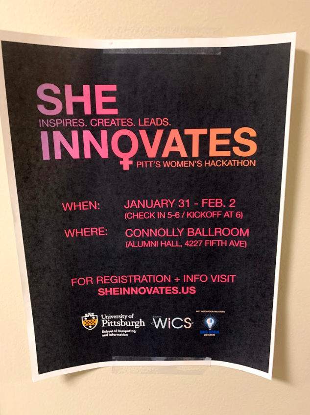
Here is a flyer that I came across in Sennott Square for the She Innovates women's hackathon. The argument presented here is the fact that women are innovators and leaders, even in a field mostly dominated by men.

Dominance and Hierarchy: The phrase "She Innovates", which is the name of the event, are larger than the other words in the message "She Inspires. Creates. Leads. Innovates". The words are all in pink against a black background, making them very noticeable at a passing glance. The "O' in Innovates is the female symbol. When someone sees this, they will immediately know that this is a women's cause.

My thoughts: I think that this flyer is great for what the event is trying to do. While the event is meant to empower women in computer science by directly coming together and having their own organized event, the flyer also has a good effect on men. If you look at this for even half a second, you'll be able to read "She Innovates" because of how large the words are and how they pop against the background. Men in computer science will see this and be reminded that women too are important in the field.

Tomasco16 commented 4 years ago

IMG_4025 (5) Finally! Here is the file I have been trying to upload for an hour and wow am I frustrated. first it wasn't the right type of file to post so i had to figure out how to convert it and after finally doing that it was too big to post so I had to go back and redo everything several times before I finally figured it out and got to post it. Honestly this is all stupid and I'm pissed off. Without further ado: I found this handmade tile set cemented above cemented above a sewer grate on the culturally abundant South Street, in Philadelphia PA. Given that the trial happened today the message is pretty obviously calling for president Trump to be impeached with some clever letters and fruit. This image being positive or negative is very up for interpenetration. My view is more negative because although he definitely did illegal things and is undoubtedly an asshole seeing the sitting president be impeached is seldom a positive. I could see the other way of an optimistic person looking to the future after impeachment and viewing this image as a positive, but as a whole i find it to be negative My thoughts is that this is an extremely well placed piece of art and visual rhetoric. it is in a crowded place for so many people to see, is hand made, and was funny/memorable enough for me to take a picture and remember it for this project.

pt.2 Even after typing about how I am irate with this blog post I am finally ready to settle down because I figured it out. Got the picture to the right file type, got it to the right size, about to hit that big green button that means everything is good in the world. The first thing I see if this picture facing the wrong way. I don't know how this happens, I don't know how to fix it but after four tries I give up. You people can flip your computers over to see it, or just read it upside down because it's caused me soooo much trouble and doesn't change the meaning at all. I really thought I had it too. on the one try I had this genius idea that is I flipped the base picture upside down then emailed it to myself again than it would upload upside down but that would actually be the right way and nobody would even know the difference... NOPE this one still is facing the wrong way and switching back between all of the versions they just are all the wrong way. Needless to say I am sad.

jerols4 commented 4 years ago

image This is a Steelers flag my roommates have hanging up that I (regrettably) have to walk past every day. The message is pretty simplistic, but powerful. For those (like me) who are not fans of the local NFL team, the argument this flag makes is to intimidate you. It lets you know that whoever hung and made this flag is a Steelers fan, and that the area you are occupying has Steelers fans in it. If you aren't a Steelers fan, this flag implicitly comes with a beware inserted above it. It wants you to know that the area you are in is for Steelers fans and Steelers fans only, and you should conform or otherwise keep quiet. If you are a Steelers fan, the message is quite different. It welcomes you, gives you a sense of pride in the area you grew up in. It says "hey, the people that live here are one of you're own; you're safe here."

The dominance and hierarchy back up this message. The two biggest words are "STEELERS COUNTRY." All caps, bold, huge letters made to be the first thing that catches the eye. The gold text contrasts with the black background, making it stand out even further. After that, the smaller Steelers logos catch your eye. Their round shape breaks up the blocky text, making them contrast with everything in the middle of the flag.

As for the utilization of the space, it is as basic as it gets. The text is dropped on top of the black background, and the two logos in the corners do the same. I think the power behind this design is the simplicity, and I feel that the less positive space, the more potent the message is. In fact, I believe that the Steelers logos in the corners take away from the message by adding more to the positive space, probably at the behest of fans wanting to see their team's logo on the flag.

Lastly, I feel that this flag has very little movement, but this is a feature, not a bug. The flag is (ironically) supposed to be rigid. It is supposed to be bold and imposing. If there was too much bouncing around, it wouldn't seem this way. It has a very unified rhythm to it, and that is what makes it so rigid.

I think in terms of the argument I believe this flag has, it is quite effective in putting forth that argument. The big, bold, rigid, contrasting gold text on the flat, black background really makes it intimidating. As I previously said, I think if it were even simpler and removed the team logos from the corners, this message would be even more striking.

emmawooten12 commented 4 years ago

UNADJUSTEDNONRAW_thumb_33ee This is a flyer created for an event hosted by PDM. I happened to have the .jpg of it on my phone already, which is clearer than a picture of the actual flyer. The argument presented here is to persuade readers to come to this event and encourage them to register for the actual dance marathon.

As for design, I think this flyer demonstrates dominance and hierarchy particularly well. The words "Flashback Friday" are bigger than all the others, brought to the front, and full opacity. The pictures in the back are somewhat more transparent, emphasizing the words in front even more. The words on the side definitely display hierarchy, where the title is larger and then draws your attention to the words on the side to find out more information. The use of different colors also calls for specific attention; if the reader gathers any information from this flyer, it should be those words colored in yellow.

Personally, I think this flyer is a little cluttered and does not used negative space enough. However, I do think it gets the point across that it is an attempt to increase attendance at the event and also potentially increase participation in the later events. The dominance and hierarchy features definitely help advance the message. It is catering to an audience of college students whose attention spans are short, and aims to get the point across quickly.

ktdemay commented 4 years ago

pitt_ad This is an ad to recruit people to Pitt. It's meant to inspire prospective students and lure them to this university.

Positive/Negative Space: There's not much to do with negative space in this poster. I guess if you consider cathy in negative space then that but I don't think so. The only other thing of note is the top to make it look like it was painted.

Dominance/Hierarchy: The text is clearly the most dominant feature of the poster. It's large and near the center to create a focal point to draw the attention of the viewer.

Rhythm/Movement: The rhythm of this ad is very clear. It wants you to start with progress and end at still. There's even an arrow to help you see where to start your eyes which is pretty neat.

Thoughts: This poster is very simple and achieves its goal of making people think about Pitt. Its goal may not be to recruit students but rather just to get them thinking about Pitt. It also can be seem as a motivational post to inspire current students.

katmiller10 commented 4 years ago

6caaf06c4dd883f6bd2542d82dfa5c9e

This is a fan-made movie poster that came up on my twitter feed a year ago after the movie Ocean's 8 was released. Besides from me really liking the movie, I saved this poster to my phone because I thought it looked cool and it was a clever way of telling the story of the movie. Ocean's 8 is a remake of the classic jewel heist film, Ocean's 11, but this time with an all star cast that includes all females. I liked how in this poster the movie wasn't selling the specific actresses that were in the film but instead the fact that the movie revolved around 8 people who were all women.

There is very little negative space in this photo because there are people filling out the entire poster. Your eyes don't really have time to rest other than looking at the red women and the movie title. In this particular visual argument, color and size give the poster its dominance. Your eyes are immediately drawn to the red because it is a bold and different color than the black and white that fills the rest of the poster. This visual argument has a repetitive rhythm which allows the viewer to be able to point out part of the poster that is different from the rest, that being the 8 consecutive women standing together and the movie title.

I think this visual article was created to depict the story of the film, which in part is an argument in itself. Even if the movie title was not shown on the poster, I would still be able to identify exactly what film it was given the use of patters and color that it gave to make the 8 women stand out.

onewport23 commented 4 years ago

IMG_4989

These posters were all around campus last year (my roommates and I, all business majors, swiped this one for our apartment). They're were several variations of this poster - some for computer science majors, others for communications majors, etc. These flyers are advertising "student.robinhood.com," which is seemingly an online service that offers free stocks to students who are interested in investing.

When considering the different elements of design, this poster incorporates hierarchy, positive and negative space, and rhythm. To start, the designer implemented font size and color to make "hey" and "business majors" the dominant messages. I'd argue that the second element in this design hierarchy is the "no suits" image, primarily because of its forward placement and red color.

In terms of positive and negative space, the designer chose not to minimize the design's negative space. I find this to be detrimental to the poster's overall objective.

The eye naturally notices certain elements before others, and an effective design creates movement to strategically deliver a certain message. My personal eye path starts at "business majors" (maybe because it relates to me," then "HEY" behind it, over to the "no suits necessary" image and text." That brings my focus down to the billboard at the bottom that delivers Robinhood's call to action.

I think that there are both explicit and implicit arguments in this design. Because I am currently taking a media theory course, the "hey business majors," made me think of Althusser's theory of interpellation, which suggests that society is always a subject of the media text; as if the text is saying "hey YOU." For this reason, I would say that the explicit argument is that business majors are a key target for Robinhood's product, which applies to the common courses that many business majors take. The implicit argument lies in the "no suits necessary" message. In my opinion, this suggests that anything involving a suit, or professional apparel, implies the traditional way of making money, usually requiring greater experience/expertise. With that being said, Robinhood's subsequent implicit message is that their product is easy, and doable for the average college student.

Although I find this design aesthetically appealing, I do not believe that it effectively delivers the key message. I find that despite its catching my attention, it didn't easily communicate to me, the viewer, exactly why it should interest me. I had to really investigate the Robinhood website to understand exactly what service they provide. Perhaps a better use of negative space, or hierarchy, could be implemented to deliver their argument more effectively.

Dilan1020 commented 4 years ago

bucks_poster

This is a promo poster for a basketball game that came up on my Twitter feed today. I chose to use this as an example because I think this poster, along with the many others posted weekly, use many of the graphic design elements that we read about. Specifically, I think this is a great example because the graphic design's argument is clear and quickly recognizable.

Positive/Negative Space: This is the a significant feature of this poster. The white/grey background actually takes up a large area of the image, about 50%. But, the artist uses space effectively. The players and other elements in the foreground have a "cut-out" effect which makes the image appear layered. The large amount of negative space allows the artist to use a lot of these "cut-outs" without making the image feel crowded.

Dominance/Hierarchy: In the image, the featured players are very large. This draws the viewers attention (who is likely a sports fan) to see players that they probably recognize. Recognition of these players is important to the argument of the piece that I will get into later. By putting the teams on separate sides of the image makes it seem these two teams are probably playing each other. The border of the elements in the foreground give a great distinction in color to the pale background, which draws our attention.

Argument: The most important element in this image, which uses all of these attributes, is right in the middle. The note tells the viewer when and where this game can be watched, which is the end goal of this poster. It is even in the foreground of the foreground by being layered on top of the players. The yellow fill color and black border once again draws the users attention to tell them "this game is awesome and you can watch it on TNT".

These sports promo posters are used frequently and are very good at doing their job. The artists of these posters utilized the attributes that we read about, including positive/negative space and dominance/hierarchy. The layering of the poster effectively draws our to exactly where the artist intended.

Bmb154 commented 4 years ago

SmartSelect_20191007-200006_Spotify

I was tempted to use the advertisement for "Head over Heels" in the basement of CATHY, but... when I stumbled upon this image, I could NOT pass it up. The pure ridiculousness, the 90's color palette, the horrendous formatting of the text... I love it! The graphical design here is clear and concise, until you get to the message, which is LITERALLY jumbled and nearly incomprehensible. The "Miss-Spelling" of the word "Idiosyncrasies), the variability in the font size, the rainbow of colors used for the text, EVERYTHING IS PECULIAR AND STANDS OUT. It is the pure embodiment of an idiosyncrasies, and that might just be its "message"

First and foremost, I have to discuss the dominance of a crab doing a trick on a scooter. The pure dominance of the shading, its THICK black borders, it stands head and shoulders above the rest of the non-text components of the image. The dual triangles behind it only push it further forward, leaving the simple background in the dust. Beyond that, the whole crab forms a straight line when combined with the scooter, that points directly to the word "IdiO+SyNCRASies" in the othherwise empty bottom right of the image.

Beyond the focus on the center of the image, not much is actively filled, leaving the background to perform its function of not drawing more attention than the tricking crab (which I dont know if one COULD design a poster that draws more attention than a tricking crab, but that is a whole 'nother discussion), and leaving a clear non-busy space for the text to take up.

Lastly, I kind of wanted to touch on the uncertainty of the spelling of Idiosyncrasies. The + might very well be a lowercase T, but its very difficult to tell, giving me the feeling that it could be a secondary message towards the idea of IDIOT syncrasies. It leaves a peculiar level of ambiguity that only enhances the poster's intent of standing out.

Truly Idiosyncratic.

hannahlangmead commented 4 years ago

I saw this ad scrolling through Facebook. My friend is asking for donations toward this cause for her birthday. I usually mindlessly scroll through the website but this ad actually caught my attention. The purpose of the ad is to get people to donate to Relay for Life or participate.

In regard to dominance/hierarchy, the message is in the middle of the screen in big capital letters because it is the most important part. The color being so contrasting to the background also makes it stand out. Also, the people in the background are large as well because it makes the cause personal and gives more context to who you would be helping with your donation. Positive and negative space aren’t utilized in this ad Rhythm and movement is the most evident I think. The background has repetition of the long rectangular pictures that give the ad symmetry. The color is bold, which is what caught my eye in the first place. The straight lines of the pictures and the ones outlining the words give it structure and strength.

I think this ad is very effective because it made me want to know what it was for, but it also is very clear what the message is. I think the pictures convey the emotion needed to inspire someone to be interested in the cause.

Screen Shot 2020-02-06 at 1 13 04 PM

anngx commented 4 years ago

This sticker on my roommate’s laptop argues for the welcoming of refugees as well as the implementation of open borders. Originally, this design caught my eye because of its white letters, which stand out amongst their black backdrop. Its limited color palette includes only the colors black, red, and white, which harmonize and tie the design together as a whole. The white, or negative space, allows the design to feel uncrowded and makes it easily legible. When placed against black or red, this white stands out and serves to highlight certain parts of the design. For example, it allows the white star within the red circle to stand out against its background.

Moreover, this design contains the repetition of circles and stars, amongst other shapes. These shapes together add a sense of rhythm to the design which keeps viewers’ eyes moving across the piece. The star shapes are arranged in a triangular position, which in conjunction with the circular shapes made my eyes move in a circular path. As for dominance and hierarchy, my eye lands on the biggest star shape whenever I first look at the piece. Then they move to looking at the smaller star shapes. This in turn makes my eyes look at the words in the design. The shapes and their respective sizes really push and determine where the eyes land and when. I think that the sticker is designed effectively because the argument is explicitly laid out, and the negative space draws viewers’ eyes directly to it. IMG_9866

Rvonderhey commented 4 years ago
Screen Shot 2020-02-06 at 12 55 14 PM

I found this graphic in the Benedum engineering building. The poster is an advertisement for the 2019 undergraduate research program. The argument for the poster is written right on it. They would like you to join the undergraduate research program. The lightbulb; however, is also trying to get across the idea that this would be a smart decision. Dominantly you first notice the lightbulb/ brain and the “2019”, which is trying to get across there is limited time to sign up for the program and it’s in your interest to do it. The poster is not overwhelmed with images or words. The design is meant to be easily interpreted as you walk by. The use of lines outside the lightbulb expresses that it’s on even though you wouldn’t be able to tell otherwise. I believe the design is effective and the argument it’s trying to make is creative.

mjb-123 commented 4 years ago

poster

This is a poster I see everyday on my way to practice and it is supposed to remind us to stay really hydrated and drink a lot of water throughout the day. Even though I see this poster minimum 5 times a week, I still find myself not drinking any water. Overall, I would say the sign catches my attention and has little cartoon characters on them that make it look more like a game of how hydrated can you be instead of just a lifestyle choice. Behind the backpack sitting there, it lists off some reasons why drinking water is so important, especially to athletes.

I think the use of negative space here was good to emphasize the main point of the illustration and to make sure it wasn't too busy or distracting to someone reading it. The background color is neutral and your eyes immediately go to the little cartoon characters or the huge HYDRATION MATTERS printed boldly at the top. I think even going with a lighter background color would've been more helpful so the words in black ink were even easier to read.

The poster was created to obviously make sure people remember to drink water throughout the day, especially after a tough work out, but I think it is also to prevent any other health issues. If your muscles aren't working properly because you haven't had any water, then you put yourself at risk at hurting yourself. So while the main message may be as simple as "drink water" the underlying reason is that they don't want you to get hurt so that you can enjoy your sport.

sydneymasterson commented 4 years ago

SF_ad

This is an ad for State Farm that I saw on facebook.

Positive/Negative Space: The positive space in this ad shows a woman, the logo, and a short description of the savings offered in this ad. The negative space includes a car, cause ya-know - car insurance, and a home and a front yard.

Dominance / Hierarchy: The dominant feature in this ad is the woman standing in the foreground. Your eyes are initially drawn to her. After that they go to the State Farm logo since it is a white color. Then there is the red car, and finally the smaller letters giving the more specific details of the add. The background house and lawn are the least dominant.

Argument: The main purpose of any ad is to sell something. In this case - car insurance. While the logo, woman, and car are the most dominant features, the main argument comes from the smaller text which goes into detail of just how much money the average State Farm customer will save.