benmiller314 / cdm2021spring

Source files for a course in Composing Digital Media at the University of Pittsburgh
0 stars 0 forks source link

Final Portfolio Reflections #14

Open benmiller314 opened 3 years ago

benmiller314 commented 3 years ago

By the end of our final exam slot, please reply to this thread with a single post containing the following:

  1. a prose reflection of at least 800-1200 words (1200-1800 recommended), reflecting on the course and framing the portfolio’s contents in terms of your learning and goals;
  2. representative thumbnail images, hyperlinked to final rendered versions of your four unit projects, i.e. Soundscape Narrative (.mp3), Visual Argument (.png), Website Portfolio (live url or index.html), and Consolidation/Integration (ymmv);
  3. links to your repositories (whether on GitHub, Box, or Drive – just make sure I can access it) for each of those pieces; and
  4. a thumbnail of at least one specific prior draft, hyperlinked to a specific commit/file in the revision history, allowing you to talk about your revision skills.

PS: In addition to the portfolio, or as preparation for it, please do take the Tech Comfort Survey – among other things, it will give you a space to officially let me know whether and how I can use your work as an example for students in future semesters.

by-lynn-priestley commented 3 years ago

I think the biggest thing I learned, and something I will take with me for future digital media composing, is that I should let the platform or tool I’m using play a role in guiding how a project gets executed. When experiencing a new platform at the start of the semester, I found myself getting frustrated by how I couldn’t make it do the thing I had envisioned in my mind so perfectly. I was coming from a background primarily of pencil and paper artwork. I wasn’t limited by computer code forcing layering to work in a certain way before and found this to be a cumbersome method of creation at first. I also went from one tool that could do it all, to having to watch hours of LinkedIn Learning to find one small tool in a haystack of other tools to solve each problem. Eventually though, I stopped seeing it as limiting when you pointed out to the class that these constraints afford us things that a sketchbook, for example, might not. By the visual rhetoric project, I started to view the assets not as puppets, but as actors in my project. The way they aligned gave me new ideas that completely changed my initial sketches. For example, looking at my original concept and early commits for my visual rhetoric project, I had initially planned to have the text erase the body icons, to represent the erasure that results from designing for. It soon became apparent that I could not create a solid enough background with the icons to make the erasing text legible, given that the contrast between my non-icon background and the text was problematically low at the time. I noticed, though, that the text aligned with the heads and revised the concept to make letters “erase” the heads in a more subtle, but more readable version of my initial idea. Constraints became guides, arrows toward a final project I could never imagine at the beginning. I learned it was far more advantageous to dance with, rather than forcibly execute, an idea.

I feel like I was most successful with my visual rhetoric project. I learned a lot about accessibility for the project as I went, which meant I was constantly updating the color palette, increasing the negative space, and adjusting the background pattern so the font could avoid being condensed. The slogan itself changed a few times between the start and finish. I relied heavily on feedback from those around me to see if changes made things more or less understandable (like when I removed the not-equal sign from my message). The commits show changes, such as a cane effect I was trying out, that never made it to the final project. I think with that project I was able to establish real clarity of message through effective visual hierarchy (for example, the color/size change of the “Design with” text). On the flip side, I felt the most challenged during the website unit. The word “fix” is featured in 6 of the 30 commits I made for the website building portion of this repository, to give an idea of the battle that occurred with bugs. A lot of my commits also have comments with questions about why a certain h2 is displaying the way it is, followed by a “fixed _” commit that involved a minor tweak to the CSS or a further div wrapping in the HTML. Particularly when it came to the stretch goal of trying to implement animation (I wanted to have a typewriter effect for the website’s subtitle), I really struggled with getting JavaScript to work. I had never actually used that language before, so it was difficult for me to piece together the syntax enough to understand where in my HTML it needed to go. However, I worked around that barrier by finding a way to add a similar animation effect with CSS, which I had become more familiar with toward the end of the project. Overall, especially thinking about the process of coming up with and creating the unit consolidation project in a short period of time, my strengths are in the brainstorming phase, creating flexible iterations to pace myself from the minimum deliverable to stretch goals, as well as creating pieces with clear visual hierarchy. I think I came away from this course improved in my ability to rapidly learn a new platform interface via experimentation (the soundscape project especially challenged me with that), as well as stronger coding skills (in the website unit) to add to what I’ve been learning about Python in another class. With coding specifically, tricks like wrapping divs in CSS borders temporarily to test scope, similar to the idea of adding extra print statements in Python to seek out hidden bugs, have proved to help slow my thinking enough to catch what mistakes I’m glazing over.

I think I was surprised by the sound unit and how relevant it was to the rest of the class. I initially saw it as kind of separate, since the other two projects were so visually based. Admittedly, I was kind of dreading it and was just wanting to get through it so I could get my hands on Photoshop. However, not only did I end up really having fun with finding out the voices I could mimic through effects (for example, the reverse-reverb-reverse trick I used for the passenger voices), once I actually got into Photoshop and started with layers, I realized how relevant working with Audacity was to building an understanding of modularity. The way effects could be applied to isolated clips was almost a perfect one-for-one for the way filters can be applied to individual visual layers, affording high levels of control. Realizing that connection helped me to lean on the platform’s visual representation of modularity (the layer-listing panel in Photoshop), similar to how I had learned to rely on Audacity’s visualization of how the audio clips layers and interacted with one another. I think by training my brain to think modularly in a realm so far out of my comfort zone was a good way to “jump into the deep end” from the start and really challenge any assumptions I had about digital media going in. Looking back on the course, I think the current order of projects is really effective.

Moving forward, I plan to continue developing my digital media skills with classes like Projects in Digital Composition (which I’m taking in the fall). I would like to expand on the Spoonie magazine cover project that I did for the unit consolidation, potentially making it into a full magazine. Outside of the classroom, I plan to work on a portfolio website this summer, to keep working on my HTML/CSS skills.

To directly introduce my projects, my soundscape played with the idea of “train of thought.” I worked with mixing pre-recorded sounds of various trains (stopping, starting, traveling, etc.) together to make one coherent train journey. I also recorded my own voice and manipulated those clips with different distorting effects (returning to the above point about modularity) to create different characters from one voice.

With my visual project, I wanted to make an argument for inclusive design. Working with the concept of visual rhythm, I used the icons matching in general style but differing in their depiction of their bodies to emphasize human variability and the subsequent necessity to design with the variability rather than making assumptions designing for it. As mentioned above, to try to practice what I was preaching, I spent the initial part of the project researching how to make work visually accessible, and there is a file with research notes featured in the repository.

For the website, I created a mock business website for a bookstore-café that my friend wants to open in the future. Here, modularity through CSS tools like z-index and Flexbox helped me format key elements like the typewriter image and the pinned sidebar images, to give the website the feel of a page being typed out and getting images stuck to it. Learning about the affordances of Flexbox definitely altered parts of my initial vision for the site, but it was to my advantage, as it helped the site ultimately be more responsive (like the navigation bar changing to flex-direction: column for small screens).

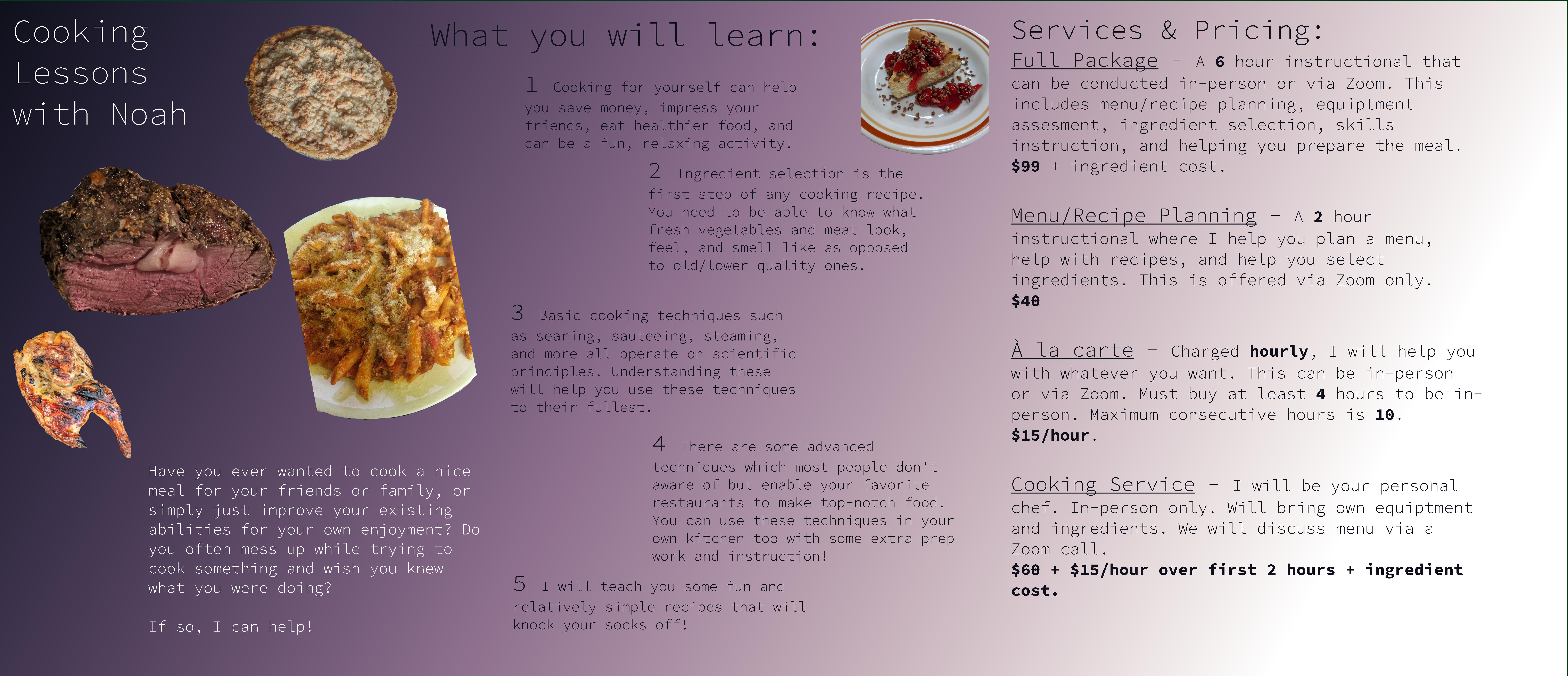
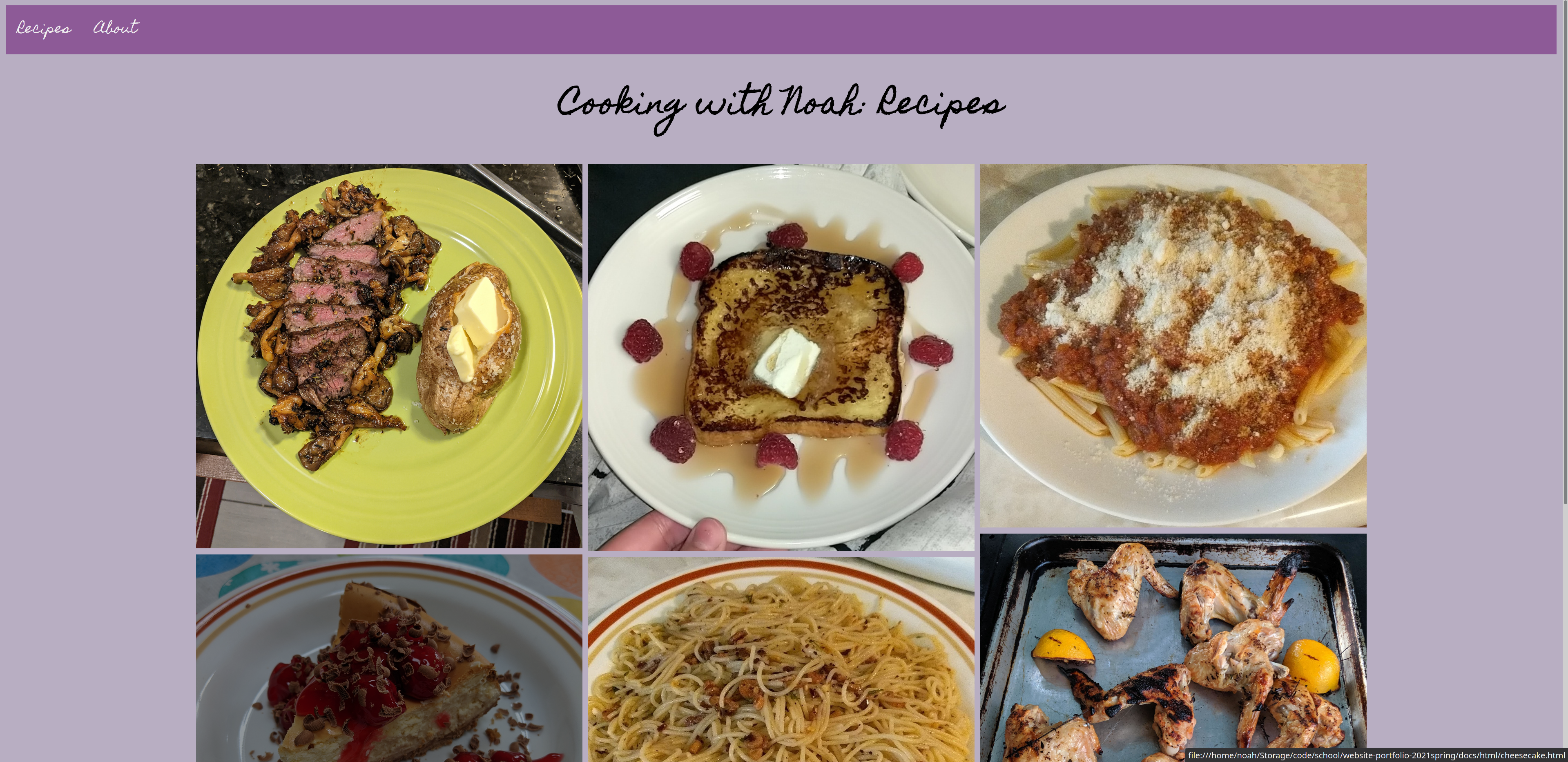
Lastly, with my unit consolidation project, I wanted to make something that practiced the visual argument unit’s skills, like font matching and visual hierarchy. I also wanted to work on my Photoshop skills with photographs, instead of graphics, which meant I expanded into new tool territory like layer masks, effect filters, and using an above layer to color a lower layer. The project ended up being in two parts. The first, my minimum deliverable idea, is made for an audience unfamiliar with chronic illness/the spoonie community, as a visual that includes reference to “The Spoon Theory“ essay. The second version incorporates that image into a mock magazine cover that is made more with the spoonie community in mind as the target audience.

Soundscape thumbnail1

Visual Argument thumbnail2

Website thumbnail3

Unit Consolidation thumbnail4

Repository links: Soundscape: https://github.com/cap-alt-delete/soundscape2021spring Visual Rhetoric: https://github.com/cap-alt-delete/visual-argument-2021spring Website: https://github.com/cap-alt-delete/website-portfolio-2021spring Consolidation Project: https://github.com/cap-alt-delete/consolidation-unit-2021spring

Revision thumbnail5

reaial commented 3 years ago

The links to the repos are below:

Soundscape repo: https://github.com/reaial/soundscape2021spring.git Visual argument repo: https://github.com/reaial/visual-argument-2021spring.git website repo:https: https://github.com/reaial/website-portfolio-2021spring.git final repo: https://github.com/reaial/finalportfolio2021spring.git

The only edit that was made to the soundscape repo was fixing the credits so that you know that I was the one that made the music

This entire class has been a lot more fun, and informational than I expected it to be when I signed up for it last fall. There were a lot of things that I did not know prior to this class, and I am happy that I am leaving with these new tools. I was able to learn about things that I would not have before and in new forms of media that I had always wanted to explore, but have had the chance to do so. I am one that chooses to stay in my lane as far as the choice of arts that I use, and that is normally music. After this I am happy that I was able to finally learn photoshop, and how to create my own website using HTML.

The links to the final of each project are below: soundscape final edit: soundscape.mp3 visual argument: photo 1- BLMvisualArgument.png website: I removed from this repo, and moved to consolidation
consolidation: photo 2- BLMredoargument.psd photo 3- finalphoto.psd website: https://reaial.github.io/finalportfolio2021spring/#sidenav-open

In terms of what was the most successful, I do think that this would have to be my visual argument. Like I said above, I normally stay in my lane when it comes to different forms of art, but this is one that really turned out better than I had hoped or even expected. I really do think although there were only a few components here and there in each of the arguments presented then it was a less is more topic. Trying to reach the most powerful state with the least amount of work. The unit that I think held back on the most is my soundscape. Although I did make my own music for it, I do feel like I could have done a lot more to create and really amplify the way that life goes now a days during the pandemic. Maybe gathering more samples of audio, or even using something better to record them. I do feel like this is where I could've made improvement.

The projects inside of my portfolio I am proud of, and I think that now I was able to fix some things that were pointed out in my comments prior (visual argument). While I also think that I made it a little easier for consumers to come and interact with the medium that I was using (both the website and visual argument). I was really able to hone in on those aspirational requirements that I wanted for the website with the little bit of extra time that we were given for this unit. While I also think I hit a few more aspirational things for the visual argument as well with the other two that were added to the series.

In terms of the visual argument I was able to turn the one photo that I used at the start of the semester into a series. With that being said I took the feedback that I received from Ben specifically in order to make the text better, and find ways to make the other images that I am using stand out, and fit in without it seeming as though things have been cut off. While I also remembered the comments that my class mates made, and made sure to stick to what could appeal to those looking at it without the vision that I have in mind.

Screen Shot 2021-04-23 at 3 57 30 PM Screen Shot 2021-04-15 at 9 44 25 AM

The with the final image you can see that I kept in the officers for a little more of an added effect to the argument that is going on here. I also think that the skilled that I honed in on was being able to use text as itself. In my first visual argument this gave me more issues than I thought it would, and in these last too I was able to incorporate them with ease, and provide slight detail to the simple project. Another skill that I was able to really enhance was using the select and mask tool. In the first object with the fist this gave me a lot of trouble from the start, and by the third argument, I did it with ease. I still have a lot to learn as far as PS goes, but I am glad I was given the opportunity to work on it. I enjoyed it a lot.

The website is also what I worked on in order to improve how it worked and how it looked visually. I was able to add different forms of media, fix the header like I wanted too, and add a comment section using the issues que! So, feel free to debate with me there, and interact with the website (its live!). While I was also able to finally get the spoiler feature to work ( while it is not a button) it still hides the material that I want it too.

Screen Shot 2021-04-22 at 12 19 45 PM Screen Shot 2021-04-22 at 12 19 50 PM Screen Shot 2021-04-22 at 12 20 25 PM Screen Shot 2021-04-22 at 12 20 29 PM

With this the website is a little cleaner with a lot more whitespace to not take away from my reasoning for the ranking of the movies! I was hoping to get a sources in the footer set up so that there are no claims to the material and you can see it on the webpage, but in the end it seemed like building another page might be the way to go for right now with how much information is in the sources rtf.

As far as what surprised me about the class, it had to be that we did HTML, and not base level java. This is just because when I hear coding I instantly think Java. I do think that learning HTML was a lot of fun, but a little confusing from the other syntax that I had learned in the past with Java. I also did not think that the sound unit would be set up the way that it was. When I heard that we would be using the medium of sound I instantly thought of music. I really did enjoy what we did instead, it made me more aware of what was going on around me, and how it makes the particular mundane life we live feel more interesting. This is when we take the time to tune in to it. Lastly the visual argument was not what I thought it would be. I thought that we would be analyzing a particular argument, or all would have to do the same topic. All and all this entire class I was surprised at how it was structured in the way that made us have to be creative on our own, and you gave us the liberty to run with our ideas to see if they would land or not.

I know this really isn't technically content that was a huge huge deal, but learning Git! Since this website is free I will begin using this a lot more in terms of keeping my code up to date, and being able to collaborate when needed. While also just having somewhere that backs up all my files I am working on for something is very beneficial and I would have never heard or used it if it weren't for this class.

I will most likely continue to work on my skills with PS because I can see a job in the near future where I might need that. I also think that I will continue to learn CSS and HTML so that I know another two languages making it a little easier to say that I know those skills on my resume for digital media centered jobs. I do think what I will focus the most heavy on will have to be the HTML for now, especially because I do want to get a website up and running that houses information about me, while I also think that I might even work on making my hidden items into a small button. It sounds like it should work, and I have nothing better to do over the summer, so taking on that project should be interesting.

Lastly, I want to say thank you Ben for a great semester! You have been one of the best professors that I have had at Pitt, and I hope to have you in another one of my classes down the road.

annaruz commented 3 years ago

I definitely have a much more extensive knowledge of digital media than I did at the beginning of the semester. This class really challenged me creatively in a way that none of the other classes I have taken at Pitt ever have. The generative writing exercises that we did in class helped me allow myself to take the time to slow down, think, and write. I want to carry this forward into my future coursework as well as into my career. Oftentimes when I feel stuck with a project, I fail to take the time that I need to think through it. This usually leads to more frustration, and I want to use generative writing during these moments. I have already implemented it when choosing a topic for my final paper in one of my Spanish courses, and it was very helpful.

I feel as though I have been most successful in my web creation, probably because this was the only media design form that I had prior experience with from a semester-long web design course in high school five years ago. I was the most excited about this project from the beginning of the semester, and I felt more comfortable challenging myself to learn as much as I could with HTML and CSS having some preliminary knowledge to work from.

I am very detail-oriented which translates into my work, and these smaller details are most of the things that I am the proudest of in each of my projects. For example, I loved the slight hammering sounds of elves working in my soundscape, the placement of the apple over the banana in my visual argument, the inverted colors on the buttons when hovered over on my website, and the rounded edges of the photo grid in my consolidation project. I am also very proud of my perseverance which led to my biggest improvement throughout the semester which was on my visual argument. From its preview and draft stages (pictured on the top) to the final product (pictured below), the product changed a lot (for the better). The preview from my commit is linked here, and the progression from preview to draft to final is shown in the image below. preview-to-final In this case, simplifying the design and going back to the basics of movement was very effective for me, especially since I am an over-thinker. This project made me face a lot of mental blocks in terms of creativity, and I really had to be patient with myself and not give up on the project. In the end, I really like my end product, and I think that it reflects the compositional skills that we learned in class in terms of contrast, movement, font choice, and visual rhythm.

The most surprising aspect of this course to me was the way that it challenged and sparked my creativity making me realize that this is rare in my coursework. As I have mentioned previously in class, most of the time we are just writing papers in Microsoft Office for our classes where words are our only creative tools. This class was surprising in that it made me realize that there are so many other platforms and tools that I can use to convey messages. Having the Resources page for this class was very helpful to direct me to websites where I could find legally usable sounds and images. The quick timelines were a bit challenging this semester, but hopefully next year we will be back on a normal schedule so you will not have to worry about another condensed semester.

Moving forward, I am not sure where I will directly use any of the digital media skills that I have developed over the semester, and I know that they will still serve me even if I never use Audacity or GIMP again. I will not be taking any more digital media courses, but I will still use these skills in other capacities. Having more creative outlets than I did at the beginning of the semester is a great asset for me in future courses and in my work opportunities. Rather than being limited to Microsoft Office software, I can now create websites or graphic arguments for my assignments if I want to! In fact, this semester, I was asked to create an infographic for my Theories of Persuasion class, and I submitted the visual argument I had made for this course. I got great feedback from my professor, and it was lovely to see how my new skills are already overlapping with other courses in ways that I would not have predicted. I also had the opportunity to choose to submit a paper or a PowerPoint presentation for an assignment in my health communication class this semester. I chose to create a PowerPoint assignment, and I used the compositional aspects that I learned in this class in that presentation like left-aligning my text, effectively combining visuals with words, and using color contrasts to draw the viewers' attention. I also learned a lot about Fair Use and Creative Commons Licenses which will likely come in handy in the future.

For this course, I completed four major projects: a soundscape, a visual argument, a website, and a consolidation project.

Screen Shot copy During our first generative writing exercise for the sound unit, I came up with the idea to bring listeners to Santa's Workshop in the North Pole. As mentioned above, I pay lots of attention to the smaller details, so things like picking out the song that the elves would be listening to in the workshop was very important to me. I had a lot of fun playing with different tools and effects in Audacity. The envelope tool was definitely a game-changer for me. I think that this project turned out very cute. My full repository is linked here.

photo My visual argument, as I mentioned earlier, was the most challenging project of the semester for me. However, I kept working with it until I liked how it looked, and I am glad that I did! You can see the movement and use of color in the designed photo above. My full repository is linked here.

website This website was the most fun project for me this semester. With this project, I created a website with six HTML pages to review every class that I have taken at Pitt. It was a fun way to practice HTML and CSS and highlight some of the funny stories or accomplishments of my coursework at the University of Pittsburgh over the past three years. I am incredibly proud of this website. Click the image above to see the aforementioned buttons that invert their colors when they are hovered over on the webpages. My full repository is linked here.

final For my final project, I wanted to continue to work on website creation since that was my favorite media form that we worked with this semester, and I also wanted to challenge myself in the visual design area by using tools that I had not tried out before on GIMP. To combine these, I decided to make a logo and website for a fake daycare, Caring Casa. When you visit my webpage, it may not seem like I did much visual editing for this project, but I did a lot of work on the logo to get it to its current state. The original photo of the house is located on the left, and the image on the right is my final logo. The house image is from Jacques Bopp from Unsplash. og-to-logo First, I removed the background using the intelligent scissors and eraser tools, and then I used the heal and clone tools to cover the railing on the stairs in front of the house as well as the plants in front of the house that went into the house's white paint. I made myself not take too much time trying to do this since it was just for the logo which would never be large enough for people to see it closely on my website. This was difficult for me, as a perfectionist, and I think it serves its purpose well in its current state even if it is not completely perfect. I then drew a heart behind the house to give it the child-like effect that a real daycare would have in their logo. For the coding portion of the website, I also challenged myself with some aspects that I had not tried before like using JavaScript, making a photo grid, embedding a calendar and a map, adding a footer, putting in a form, vertically aligning text with an image, and putting text on top of a photo. I hit a road bump with this project when I lost my first full draft trying to upload it to GitHub with GitHub Desktop (I guess these are two other platforms I need to continue learning). After having a bit of a breakdown over all of the work that I had lost, I got most of the previous work that I had done on the website redone within two or three hours of work. I am very proud of myself for pulling it together, and this experience let me see all that I had learned in HTML and CSS by having to redo it. The aspects that had taken me days of trial and error to figure out like how to implement JavaScript into HTML or silly mistakes like forgetting to put the image folder name before the photograph name on img elements did not go to waste because it was much easier for me to pull on what I had learned. I am very proud of the end product, and I could still spend weeks working on it and tweaking a few things to try to make it perfect. I think that it was the perfect project to end the semester with by culminating the skills that I learned throughout the course of the semester across each of the prior four units. My full repository is linked here.

Overall, I am ending the semester very proud of the work that I put into this class and very happy with the skills that I am leaving with. Thanks, everyone, for a great semester!

aer84 commented 3 years ago

In my original letter to myself at the beginning of the semester, I knew that I was excited to take this class until I saw the third assignment, coding. Coding has always been something I have written off as a skill I would never be able to develop. But it wasn’t just coding that I was worried about as I often felt this way throughout each project. I thought my ideas were too obscure, would be too hard, or just wouldn’t work. I tried to keep in mind some advice from my dad throughout the class. Whenever I would call my dad and tell him I was feeling nervous about everything going on, he would always pose the question, “how do you eat an elephant?” The first time he posed this question, I was confused but he explained that with big tasks you need to look at them in pieces, not the entire elephant. Although I’ve never wanted to eat an elephant, I kept this advice in the back of my mind. Using this mindset helped me focus on the project at hand rather than worry about something that would happen later in the semester. For example, with the soundscape, I started to find that with every addition of sound, I became more confident in my digital media skills which would then translate to new confidence for the next project. This is also seen on my Photoshop project. I was nervous about how the project was going to look in the end. Instead, I started looking at each aspect of the picture with Cameron, the background, the quote, and so on rather than the entire project which was more manageable.

But then, the day that I had been dreading the most came and I had to start considering a website that I could create. Even though I was still nervous, I was able to concentrate on each element of the website and eventually created a project that I was proud of. The advice of focusing on one element rather than the entire project helped me create a timeline for when I wanted to have certain elements complete as well as have small victories. This advice proved very helpful in several ways because I would be able to consider different layers for each assignment. With the soundscape, I had to think specifically about each layer of sound that I would need to transport people back to a packed movie theatre. Then I had to think about each layer with Photoshop to bring my message featuring Cameron Frye alive. Then, when I created a website, I needed to consider each

element and how they would interact with each other to best communicate the message about living sustainably. In hand with modular thinking, I was able to consider design hierarchy from the reading. This allowed me to consider which elements needed my attention the most or which ones I could leave for another day. In my projects I found that it was the conversation in my soundscape that kept the audience engaged, Cameron looking down at his phone, and the living sustainably page on my website. This way of thinking is something I want to keep remembering for future digital compositions.

Along with this style of thinking, I learned about some new tools from this class that I will have to keep in mind when I create digital media in the future. Tools like Audacity, Codepen, Creative Commons, Unsplash, and Freesound were very helpful in each project I used these tools. I’ve used these tools for other classes when I needed royalty-free music or non-copyright pictures too.

Using modular thinking was something that enabled me to have several successes throughout the semester, but these victories were overshadowed by my skills with coding. The fact that I willingly made another website from code for a final project is the biggest success that I was not expecting from this class. Not only did I code another website, but I also tried out grids and learned how to do them when I was completely happy with using flexboxes. I learned how to create a grid and use the Inspect element on Firefox to see how each Grid would line up. I also used the transform function and have a better understanding of media queries now. If you visit my website and the browser is not big enough, you will be asked to make it bigger for a better experience. When I coded my first website, I tried to make it responsive, but I was unclear about what I was doing. Now, I honestly think I could go back and update it to make it better.

Abby's Bookshelf:

Media Query Home Page

I wish I had my first project that I made for my Web Design class because there is such a difference in each project (but just try to imagine an Alice Blue webpage about social media). Although I don’t have my original coding project, I do have screenshots from my first attempt at coding compared to the final project. The tutorial, “Interneting Isn’t Hard” was an important tool that led to my success in this project.

First Attempt:

Home Page Start 1

Let's Talk Sustainably Final Project:

Home Page Final

For my final project, I also made small fixes to my projects, specifically my sustainability website and my ASSETS files. I made sure that my websites had a better load speed by compressing the images (I even tested it out online). Additionally, I made sure that everything was credited correctly, including the quote from Ferris Bueller's Day Off. (The following speed test is from my Abby's Bookshelf Website).

Testing Speed

In general, I would also say the fact that I continued to challenge myself with each project is a success for me. This semester felt like I was always working since I have two part-time jobs, I was the Vice President of my fraternity, and still had a normal workload. But I didn’t let those other commitments prevent me from challenging myself in this class and learning how to compose digital media. Each time there was a barrier that shook my confidence, I would do some research to get past those issues, or more commonly, I would talk to Ben after class or during office hours. I found that talking through issues was more helpful than just struggling with them myself. The aspirational goals and baseline criteria also helped me through the challenges I was facing. Such challenges included making Cameron look down at a phone without having cellphones in the 80s. I had to take images from the movie, reference images, and often painted parts of the picture that were missing. I used the brush tool to create Cameron’s pants and the blur tool to make them look more realistic as seen in the following progress shot.

Third Try - Sticking with this design?

Despite these successes, there were problems throughout these projects. The biggest hardship that I dealt with during this class was trying to sort out my ideas and get started. Some helpful advice I received for this problem was from Ben. He advised that I should remember to take a step back to come up with my vision. I often felt overwhelmed with all the directions I could go for each project. In particular, this final project was overwhelming since it could have been any of the platforms we used throughout the year. However, Ben’s advice about taking a step back and creating lists of interests, passions, and so forth was helpful. I know I spent a lot of time talking through ideas with Ben during office hours or after class, but this technique proved to be super helpful. I was able to use this technique in each project without even realizing that I was doing that necessarily. This is something I will keep with me as I continue to compose digital media. Rather than letting myself get overwhelmed with all the potential options, I’m going to create lists and use them to focus my creativity rather than let it get the better of me.

During this class, I think I was most surprised by the freedom I had with each project. Usually, there are so many requirements that dictate the content for each project. However, with this class, it almost felt like the requirements were built around the project we choose. Although at first, this felt overwhelming, I was able to use my creativity to create a piece of media I loved and was proud of. I was also happily surprised that I didn’t have to work on a group project over Zoom but still had the chance to talk to people about projects in breakout rooms. I’ve done a lot of Zoom group projects this year and having one less group project was appreciated. I don’t think there are any suggestions for revising the structure or assignments since they were all straightforward.

Little Fires

Moving forward, I plan to continually update my final project, “Abby’s Bookshelf,” with books as I finish each one. I hopefully will finish several of the books this summer and will have more pages to add. Additionally, I want to learn about the other Adobe Creative Platforms so I can use them to create digital media in the future. Specifically, I hope to utilize LinkedIn Learning to learn more about Adobe Creative apps. Moreover, this summer one thing I’ve wanted to do is redesign or design my own board game. I plan on using Photoshop to create the game piece elements. I’ve also had the opportunity to use my digital media skills for other classes like my Filmmaking 1 class when I added music to my visuals that help tell the story of a lonely Zoom University Student. I know there will be additional opportunities to continue developing my digital media skills and I’m excited to think through other projects for the summer and the future.

Repository Links (Click the Images to see the final versions, i.e. mp3, png, live web page) Soundscape: https://github.com/aer84/soundscape2021spring.git Final Soundscape

Visual Argument: https://github.com/aer84/visual-argument-2021spring.git Cameron

Website Portfolio: https://github.com/aer84/website-portfolio-2021spring.git Living Sustainably Final

Final Project: https://github.com/aer84/abbys-bookshelf.git Home Page

Gley21 commented 3 years ago

“You can’t learn to play piano just by reading about the piano; why should we expect any differently about writing in any form?” That was a quote from Doug Hesse, one that was included in the Welcome Letter to this class and one that I think really sums up the skill that I have learned from this class that I will be applying to all my future endeavors (not just those in design or writing either). When it comes to building things in the digital media space the best way to learn is to do it. I found myself stalling on the website project because while I read all the tutorials and handouts, I was hesitant to actually get my hands dirty and start trying out what I read. It actually took me coding most of my website and having it not work for some of the layout aspects of HTML to ever click. While it was tougher to go out and do instead of just reading, I never would’ve understood anything if I had simply read the tutorials and then filled out a template.

That specific lesson is one that is going to stick with me, but certainly doesn’t reflect everything I have learned over the course of this…course. Looking back at the course outcomes on the syllabus reminds me just how much I was able to accomplish this semester. One course outcome that sticks out to me is “revise in response to their own reflections and feedback from peers and the teacher.” If I’m being honest, most of my college career has been spent turning in first drafts of papers and projects and never really bothering to look them over or revise them. This class has changed that and has shown me just how much better my work can be if I take the time to get other to look at it, critique it, and be open to suggestions. This was particularly the case with my visual argument project. I was stuck in a creative rut for the majority of the project and what I turned in for the peer comment portion of the class was not something I was particularly proud of. In most classes that didn’t offer this peer feedback time I would’ve just turned in the project as it was to get it out of the way. However, here I was actually really excited to receive feedback and revise my work, because I knew I could do better. By the end of it, thanks to comments by classmates and my own willingness to accept the criticism, I created something that was both better than the original and something I was proud of. I changed the perspective of the image, the background, the font, the size of the images and words, and the general layout of the design. This total overhaul never would’ve happened without feedback. Here is my first draft and my final project to show just how much that revision helped.

Draft: VisualDraft

Click here to see the comments that helped make it better.

Final: VisualCollageFinal

The most challenging part of this course was spending the time to learn how to use the different mediums to accomplish what I wanted. It could be a little frustrating at times when I would think of something I would want to add to the project (particularly for the visual argument and the website) and not be able to execute it without a lot of trial and error, googling, and reading. What helped me overcome this was how interesting it was to learn how to use new features of each program and how fulfilling it was to be able to use a digital space to help creative visions come to life. Even though there is a learning curve that can at times be steep, I never would've been able to accomplish what I did without finding harmony with digital programs.

I wouldn’t say anything really surprised me about the course (thanks to what I would say was the easiest to understand course outline a teacher has ever provided). The only real revision I would suggest is maybe allotting one more week for the website tutorial homework. I found myself learning some things in the tutorial later than I needed them. As I was working to turn in my first draft, I would struggle to implement a feature and get it to only kind of work, and then see all that time I spent figuring it out could’ve been saved if I was a little further along in the tutorial. I’m not sure how this could be helped because the course can’t get any longer but maybe recommending doing a few more lessons a week would help.

I’m excited to continue to use the skills I’ve learned in this class far into the future! I’m definitely going to work on my website and want to use it as a space where I can share the things I do with the world. I also can think of a few other websites I might want to build (I’m thinking about making one for the Spikeball club here at Pitt). I won’t just use website design in the future though. The skills I have picked up with Audacity will continue to help me make the podcasts I work on better and more immersive. Working with photoshop has definitely strengthened my grasp on visual design concepts and being able to do things like make posters and logos will always come in handy.

That’s what I hope to do, now I can introduce what I have already done!

My soundscape was based on a walk I took at the beginning of junior year. It was an impromptu adventure that me and my roommates took that ended up being really impactful for me and something that I still reflect on to this day. In the soundscape, I wanted to take the listener on that same walk by narrating the steps I took and adding sounds from the world around me at each stop I made. The narration was split up and when the sounds of the stops played there was no narration, so that the listener could lose themselves in the scene crafted by the sound and gain their own insight while listening.

soundscape-screenshot

Soundscape Repository: https://github.com/Gley21/soundscape2021spring

My visual argument stemmed from my love of philosophy. I wanted to make a fun image that shared how I believe that studying philosophy helps unlock your mind and open up a new way of thinking. Reflective of that idea was my use of the word "philosokey" to make the image of the key. Same thing with making the brain the lock itself, I wanted to show different ways that thinking outside the box could reveal themselves in the image.

Philosokey

Visual Argument Repository: https://github.com/Gley21/visual-argument-2021spring

The idea for my website came from an idea I had awhile back that I never was able to actually do because I never knew how to make a website, so the timing of this project was perfect. I wanted to build a space where I could share my thoughts and my work and take people along as I grow and change as a person. That's really the central idea for the site, growing and changing and sharing that. I wanted to make three separate pages focused on what could be thought of as the three aspects of a person: heart, soul, and mind. On each page there is content appropriate to each aspect of a person and people can check out where each part of me is at a certain point in time.

website-screenshot

Website Repository: https://github.com/Gley21/website-portfolio-2021spring

GitHub Pages: https://gley21.github.io/website-portfolio-2021spring/

My consolidation project ended up being two parts. The first part was my original plan of making a website for a poem I wrote in memory of Mac Miller. I wanted a place to display it and give the words a little more life than what they had just in a word doc and I felt the website was a perfect place to do that. It also gave me an opportunity to try out some JavaScript, something that I never got around to trying out on the original website project. It took a long time to get the hang of how Java worked but once I figured out how to add jQuery to the site I was able to find some sample code that helped me achieve the effect I wanted which was fading in text as you scrolled through the site. I used some code from a tutorial to achieve the fade in, but then I edited myself to also add the fade out effect once you scroll past an element. I also was able to add a script enabled button at the end of the poem that takes the user back to the top of the page and refresh it so that they can read the poem again.

yt-addition

Consolidation Repository: https://github.com/Gley21/mac-miller-poem

GitHub Pages: https://gley21.github.io/mac-miller-poem/

The second part consisted of some small edits to my original website project that Ben recommended. I changed the max width for the page that it didn't extend edge to edge and get too big when the screen size goes up. I also added alt text for the images and credited my sister more directly for her work in my repo. I also added two simple media queries that changed the flex direction of two elements to column and it fixed an issue where one of my playlist iFrames would disappear on smaller screens. I didn't have time to do it, but I'm also going to look at how to use Jekyll to create a blog that is local to the page and I hope to continue to work on the site after class.

Media Query Commit

The consolidation project really helped me get my feet wet in the world of adding JavaScript to a website. It took a ton of time to actually understand how it worked, why something like jQuery is extremely helpful and makes your life easier, and how it can make a website really interactive. I got a chance to use a brand-new aspect of website design in my project and that was really exciting. I feel like this was a successful consolidation project because I took the design ideas we learned throughout the course and used what the medium of web design provided me to build the site. I used JavaScript as a unique way to focus the reader's attention on individual stanzas as I faded them in and out of view. The colors I chose came from a poster that I have from Mac's Circles album to tie the website both together as one page and in with this work. I also wanted to give the website a slight soundscape aspect too it which is why I included the link to the playlist of songs I reference in the poem. This way the reader could read a stanza, and then go listen to the song to get a sense of where Mac himself was at the moment in time I refer to.

The website revisions, while slight, again helped me try out something new with using media queries. It also gave me another opportunity to respond to feed-back on my work, something I now actually look forward to quite a bit.

This was one of the most rewarding classes I have taken at Pitt. The combination of learning new things and then executing them to create projects that would've been beyond my abilities in the past was a really awesome thing. Thank you Ben for helping make this an awesome semester, and thank you everyone for making this class great! If you happen to read this, good luck wherever you are headed and don't forget to take a walk every once in a while.

anatems1 commented 3 years ago

This course has shown me a lot of new ways to digest and create different forms of media. From what I believe was the very first class or so, we visited the “Playing Manovich” website. After the discussion we had about the key affordances in class, I started to open my eyes to the language of new digital media. One thing that really stuck out to me the most from this resource was the idea of modularity, or how every piece of the media is created by manipulating numerous components individually and how they all come together in the end in the “big picture”. This idea was very prevalent in all of the units that we went over in class. Similarly, when we were doing the visual argument unit, we also visited Julie Thompson’s short lessons in graphic design which shed light on some graphic design vocabulary that I have heard before, just never actually understood exactly what they meant. Additionally, the peer evaluations of each other’s projects really helped me see all of these different aspirations and features that were part of each project. This was not even specifically the feedback that I was given but having the ability to see what others were doing and breaking apart their projects helped me understand the different components of composing digital media. I hope to be bringing this with me in my future digital media composition, and I noticed that I have already started to take mental notes about the different components that I see demonstrated in other people's work. Throughout the composition of each of the projects, there were a couple of hurdles I had to jump over to discover where my strengths and weaknesses were in the media world. Something that was easy for me was having an idea for what I want to do for the project (big picture) and visualizing how I want the final product to look like. What got challenging was figuring out exactly how I needed to get the final product. Obviously, there are many smaller intricacies (solidifying the idea of modularity) that are glued together in the final product. This is also where I found myself becoming obsessed with the small details in the projects. Sometimes I would spend too much time trying to perfect these small details that I would take away from time to be used toward the big picture of each project. If I had more time on some of these projects I would be able to have these little details perfected to my liking, but obviously, in curriculum mode, we are restricted on how much time we can spend on everything. This would not be a challenge, it would actually be a strength, in any future projects that I am working on (assuming I have more time to work on them). Having a set baseline criterion allowed me to get on track with each of the projects because this was my original goal to meet, but the aspirational criteria were where I was able to really express my understanding of the medium expression. I was surprised at how much I enjoyed digging into the aspirational criteria, rather than just submitting the project to just get a grade. At these points, I really wanted to demonstrate more with my projects because I became really engaged in whatever software we were using. If I only made my projects align with the baseline criteria, they would just be kind of boring in my opinion. Maybe I am considering the aspirational criteria also to be more than just a grade, but rather a way to express my creativity and imagination in the project. Please enjoy the contents of my final portfolio for this class. It consists of a soundscape ("Quintessential Getaway"), a visual argument ("FowardWithFuture"), a website ("Structural Engineering"), and another final consolidated project ("Stonk Market").

Quintessential Getaway - Soundscape Portfolio Repository

In regards to modularity, my soundscape was a clear representation of just how important all of the little pieces are in the "big picture" of things. Each of the small recordings were all tweaked to deliver a fluid final production. There were some suggestions from my classmates that allowed me to stitch the transitions together to make the piece sound very good. If you close your eyes you actually feel like you are going on a mini-vacation to the beach! The longer tracks seen in the following image were typically external sounds that served as the "background" to the "foreground" or the main narrative of the soundscape. In combination with the tweaking of individual track volumes and stereo location (L/R), I was really able to distinguish the meaning of dominance and hierarchy within the piece.

FowardWithFuture - Visual Arguement Portfolio Repository

I have only ever used the photo editing software GIMP to resize images to put into reports prior to this class. In the visual argument below I wanted it to be known that whatever happened in the past does not affect your future. This does not only apply to negative things either, this also applies to positive things as well. I was able to do this by creating an image where you are almost quite literally looking into both the past and the future. The past in this case is distorted and the distance is much greater than it is to the near future because it is impossible to go to the past, and if you keep heading in that direction you will be stuck there for a while. I used a series of hierarchies along with positive and negative space to enhance the meaning of the image. Some comments from my classmates included flipping the character on the right to be facing the future rather than looking back on the past. Once again highlighting the importance of the small details that contribute to the big picture.

Structural Engineering - Website Portfolio Repository

Prior to this class, I have had some exposure to HTML and javascript from another intro to computational analysis class that I had taken freshmen year here at Pitt. That being said I have never formatted any page with CSS stylesheets or have I used javascript for anything more than a simple form to make calculations for areas, etc. I think that this project is where I began to show some of my strengths as well. Part of the reason why I am in Civil Engineering is that I am a very technical and analytical person, which was perfect for this project. I really started to dig into javascript more here and also focused on the idea of the flow of attention for the viewer. In HTML and CSS there is a very important distinction between hierarchy and dominance. What do I want the viewers to see first? In this case, I wanted them to see structures. The large image of Pittsburgh is probably the first thing that the viewer sees next is probably the header with the truss. All of these elements are customizable as well, the user can choose which color they want and if they want it to be in dark mode or light mode (all done with JS). The Interneting is hard to resource allowed me to step back into the world of HTML and further my understanding of how modular a webpage can be while maintaining the importance of an overall theme!

Please use this Link to see the website in action.

Stonk Market - Final Consolidation Unit Portfolio

This project, which I am most proud of, is where all of what I have learned in this class was able to come together. I paired the two units of the website portfolio and the visual argument together to really put my skills to the test. When someone first visits this website they are greeted with awesome animations of stock charts traveling across the screen from one computer to another with advanced javascript coding. I really became addicted to javascript and I am VERY comfortable using it now. In the website portfolio, it was a challenge for me to get used to the new syntax and everything. Something that I am shocked at is that I built this program from scratch! I did not take any template online, other than some areas where I needed to do research on a particular element that I wanted to include.

I also highlighted the use of visuals in this project, as it is actually primarily a visual-based project and more of an interactive image that is available online. I recognized how important it is to find resources that you are legally allowed to use, and if there is nothing out there that you want to use, you can create it yourself! The logo that says "Stonk Market" was completely drawn by me using the ProCreate app I bought on my iPad (specifically for this project actually haha). You can see below how I was able to modify all of the images to suit my website. I also very distinctly established hierarchy in the elements. This was done by creating the various layers on GIMP and then ordering them with "z-index" on CSS. Of course, I want to distinguish the use of modularity in this project. There are SO MANY elements on just this one page that work together to serve as one application.

There are a couple of more things that I wish I could have done with this project, however, that I hope to finish one day soon. I would like to use Real data on this website rather than just random numbers that are a function in JS. I am going to have to do some research in incorporating the use of APIs on HTML or implementing a python code to be able to get real-time data scraped from somewhere online. I also want this to be mobile-friendly, right now I did not have enough time to establish media queries for smaller screen sizes but this is also something I would like to do in the future. (Along with many other things as you could tell).

Please use this Link to visit the live website.


Finally, the thing that stuck out with me most of all throughout all of these projects was revision history and version control. The use of GitHub and the GitBash software version control is an amazing way to organize files. Prior to my use of this software, I would constantly be saving over the same file and not being able to go back, saving with a different name, and having multiple copies of basically the same content, or just a plain mess of organization of files. The ability to go back to previous versions of the project or seeing when things changed is too good. I can't believe I made it this far without using this kind of software and I will 100% be using this throughout my career for any projects that I will work on in the future.

young1m030 commented 3 years ago

Going into my last semester of college, I only had one extra credit I needed to graduate. I was planning on taking a one-credit gym course or another writing course, but I decided to take Composing Digital Media because I wanted to elevate my skill set heading into post-grad life. Now that the semester is over, I can confidently say that I'm so glad I decided to take on the two extra credits!

As I head out into the real world, I'm really excited to take these lessons with me and continue to build on these skills as I engage with different opportunities. A lot of jobs in PR/communications often ask you to have experience with a million different things, so I'm really thankful to have had this opportunity to start. One skill set I've been seeing more frequently in job applications is HTML and CSS, so I've decided to include that in my resume, even if I'm not quite proficient yet.

I'm going to go backwards with my overview of the projects.

In the case of HTML/CSS, I definitely plan to continue updating my website — a portfolio of my editorial, audio, and visual work — and learning new ways to incorporate the work I've produced in the ways that best highlight the nature of the work. This will definitely be a challenge without Ben's office hours, but I plan to continue utilizing the Interneting is Hard guides (and any others any of you find useful, drop them here!).

Here's a link to the site: https://young1m030.github.io/website-portfolio-2021spring/index.html And the repo (I think I tried to make a branch for the revision portion, but I'm, pretty sure most of my pushes went to the original branch.) : https://github.com/young1m030/website-portfolio-2021spring

This project definitely challenged me more than any other — having had absolutely zero knowledge of any coding. I still don't think I grasped it quite as well as I would have liked to by this point, but the finish line has no expiration date!

When working on my revisions for the portfolio, I really appreciated Trent's comment that working with code and seeing it working was like writing a script and then seeing actors perform it. This certainly did feel like two very different parts of the same medium, and that was helpful to keep in mind especially when I was working on my CSS, and had a hard time remembering how certain lines/functions would look once they were applied to my HTML. I also appreciated Grace's analogy that this project felt like a splinter, in that it kind of sucked, but once you got the splinter out/finished the code, it was super satisfying! I like to look at how my home page first looked — one place from which I really had a hard time moving forward — to how it looks now.

home page draft.png

home page final.png

I never could have imagined doing something like this without the help of Wordpress or Drupal (two systems which still confuse me sometimes)! When it comes to anything with a visual component, I tend to perseverate on projects so that I never feel like they're fully finished, and that's definitely the case with this website, but I'm still very proud of everything I was able to accomplish. I would like to display my visual and audio work a bit better — maybe some kind of carousel for the pictures — and I think I would like to have photos to complement some of the text-heavy spots, especially the editorial page. But I was really excited to get to add photos at all (I had to reach out to an old boss for the first time in a year lol) as well as getting to design a logo and add it to the site, especially one that I feel really represents me and my style!

I really was able to get through this process by not being afraid to ask for help, as well as expanding my resources. My group members were often great at troubleshooting, and office hours and workshop Q&A room were invaluable. I'm grateful for that environment where I felt so comfortable asking for help!

Considering I went from knowing NOTHING to knowing a bit more than nothing about web stuff, I would say this unit is where I feel I have most improved.

Before I had HTML and CSS to worry about, I couldn't even wrap my head around pushing to Github. That is luckily no longer the case! But I don't think I fully understood the value of version control until I got to my visual argument, when Ben suggested a perfect moment for creating a different branch and trying something out. For a quick refresher, I composed a visual argument about cancelling student debt (of which I will soon face plenty).

Here is the repo: https://github.com/young1m030/visual-argument-2021spring

This is the finished product:

va.png

I thought about adding a cast shadow to the figures, and when I started playing around with that in a different branch, I realized I didn't like it. But it blew my mind how easy it was to switch from one branch to the next on GitHub desktop, and then the corresponding version would appear when I opened the same file in Photoshop.

version.png

I definitely want to take version control with me as I move through other digital composition projects, which I certainly hope to do throughout my career.

The visual argument also showed me the value of peer feedback. I really appreciated the opportunity to have others look at my work in a guided way — specifically a way that asked them the order in which they internalized my argument. That really helped me figure out my visual hierarchy (and also made me double check my numbers)

draft.png

The feedback about my visual hierarchy was super helpful, because I realized that even though I thought making that number figure bigger would demonstrate the threat of the debt, it actually just drew attention away from the crux of the argument.

And finally, my soundscape!

Here's the repo: https://github.com/young1m030/soundscape2021spring

And the finished commit:

audio final.png

I was a bit too hard on myself for this project. Having had experience producing audio, I thought I was going to create some really immersive journalistic thing, but I couldn't think of something I could reasonably do in the time frame. Not to say I don't like what I did — which mainly consisted of a conversation with my roommate Jen about entering the job market (anyone else noticing a theme here???) — she's amazing, and the idea felt really timely and compelling to me.

What really stuck out to me about this project was the use of open-source software. It's still so crazy to me that all this stuff is free! I even had one of my friends explain to me the fact that open-source stuff comes together with thousands of people making commits to code. I loved the humanity behind that, and thinking about the process that went into creating Audacity while I used it. As Paul Ford says — "with open code and version control, the foundational document and the human process are one." I find that so compelling and I hope to carry that with me as I use these sources in the future. I should probably start acquainting myself with Gimp, considering my free Photoshop access is almost ending!

I am so thankful for the opportunity to grow as a digital media composer this semester. Thank you Ben and the rest of the class for your time working on my projects — I have loved getting to work with you all! Can't wait to tell some of my younger friends to take this class :)

patrickjmeyer commented 3 years ago

Wow! Feels both like forever ago and simultaneously yesterday that we started this class. I’m immensely proud of the body of work I put together. Here’s some thoughts I have regarding the whole semester:

First off, I think that one of the most important “lessons” I learned was to be unafraid to put your work out there and ask for input. My work style has so often involved me working in isolation, a practice I often refer to as my Bon Iver technique. I don’t show my work to people unless I feel like it’s either mostly or completely finished in order to avoid embarrassment. However, this class forced me to receive valuable feedback that I otherwise wouldn’t have received had I stuck to my old ways.

I also have to say that our prompts in class were extremely helpful. People always tell you to write from the heart, to write about personal experience, but it’s hard to actually articulate and find that in yourself. I recall this being especially true when it came time for the visual argument unit. As someone who is not a visual artist, I was super lost as to what I would possibly focus on for this project. However, I can recall the question in our generative writing that sparked me, which basically asked for us to think of something we’re most passionate about lately. I knew that race and social justice were two things that I was (and am) passionate about, but I didn’t know how to articulate this. However, the prompt also connected me with my frustrations regarding my experience with other people’s closed-mindedness to music. I then magically, it seemed, came up with my idea for embrace, which I talk about in more detail below. I just remember being fascinated by how it prompted me to come up with this, and I may revisit the prompts like the ones we used in class whenever I’m brainstorming in the future.

Most successful is a slightly divisive superlative for me, because I feel like the project I was most successful with was likely my soundscape narrative. As I’ll get into below, this project most closely aligned with my existing skillset, and I feel like my final product was something finished that I would not be embarrassed to show the rest of the world. While I’m extremely proud of my other projects because I feel like I personally defied the odds in my completion of them, I can’t say the same about feeling that they’re ready for the eyes of others. While I think my visual argument is a triumph considering I can’t so much as write my name legibly, much less draw, paint, or do much of anything related to visual art, I feel proud of it because of how I did despite that and because it represents an argument/topic that I am passionate about. Likewise, I haven’t coded since a high school Intro to Python & Java course, so even though my site ended up being fairly barebones, I kind of can’t believe I came out with something that doesn’t look like garbage and does function pretty seamlessly. If you’d showed my final product to me before this semester, I would never have thought that it was something I’d be capable of making.

I would say I was surprised by how comfortable I became with the tools we were using over time. For me personally, our tools got progressively more scary each unit. I had some degree of experience with sound and sound editing through my musical background, which made me more comfortable with the Audacity unit, although never having used the specific program before, I was somewhat wary. It was the closest thing we had to my theatrical/writing background, though, so I feel like that gave me a leg up with the end product, even if I maybe didn’t have the most technically complex or imaginative piece. Overall, I was surprised with the outcome because, as I said above, it was something that my classmates genuinely seemed to appreciate and enjoy, as did I.

I would also say I was very surprised with my visual argument, just by virtue of it not being absolutely horrible, and by how far I came in my progress throughout the course of the unit Here’s my first preview and final submission back to back:

image image

Moreover, as I outlined above, I was happily surprised with how my website portfolio turned out, considering my lack of experience in the area.

Finally, my consolidation unit wasn’t necessarily surprising because I have an inappropriate amount of confidence in myself and my musical abilities, but it was my first time tracking vocals, and I’ve got to say, getting recorded vocals to sound good is way, way more difficult than I ever thought it would be.

I definitely want to sharpen my digital media skills outside of class! The Audacity unit will hopefully come in handy when creating other spoken word material, specifically podcasts. I’m a huge podcast fan, and have wanted to start my own for a while now. I’d like to start a show centering either around the NBA or around the MCU, two topics that bring me immense joy and which I already talk about constantly, anyway, in the near future.

I don’t know if I’ll get engaged in visual art more than I have before, but my meme game has really stepped up since that unit. It also helped me cobble together a photo for the jumbotron slideshow that will play when names are called at graduation next week. The deadline for this came before I could take any formal/professional grad pics, so I threw this together in GIMP:

image

I like that I now know basic HTML and CSS because I at least know how these things work, but I still personally don’t feel confident enough in them to use them in an extended context outside of this class. I would probably hire someone if I ever needed web development skills.

Finally, while I’m not psyched about how my vocal performance came out (and I’m not fishing for compliments here. Simply being honest and doing some expectation-setting), I do love the instrumental in the song I created for my consolidation project. I will definitely be revisiting/revising/borrowing from that in the future. It was also invaluable practice, considering that I rarely have the opportunity to spend this many hours (probably around 30 cumulatively) to work on this sort of thing. I hope what I learned and practiced bleeds into my musical projects in the future.

Alright, here’s a rundown of my project work from this semester:

First up, we’ve got my Soundscape Narrative, titled Backcountry Nights. As I’ve said, I feel like this is the most polished, release-ready piece of work I came up with all semester. It’s the story of two friends who are enjoying a nice trip in the outdoors, only to have a bear give them an unwanted and ill-fated visit. This was inspired in part by my own love for the outdoors/camping/hiking, and of my fear, largely (but not completely) outgrown, that a bear will come and attack me while I sleep in my tent at night. I had a blast creating and patching together acquired sounds, and I think it’s a genuinely fun listen that stands on its own.

image

Next is my visual argument piece (thumbnail already included above), embrace. I grew up in a household that shunned forms of music other than radio-friendly rock. Other genres were implicitly derided, from jam music to modern pop to hip hop, and I internalized these perspectives. However, as I got older, and especially after I came to college, I found so much joy and knowledge in expanding my musical tastes. Furthermore, these artists, many of them black people of color, opened me up to stories and perspectives that I never would have heard or considered had I stuck to my diet of white rock artists. Knowing the immense impact all of this had on me is why I feel so strongly that people should embrace all music, which is the core intended message of this piece.

We then have my website portfolio piece, Getting Better. This website is meant to show off any music-related work that I’ve done, including a couple of covers I’ve been fooling around with, some demos I’ve worked on, and written pieces that articulate my love for and interest in music.

image

Finally, we have my consolidation project. For this final unit, I decided to both revise (albeit sparingly) my website portfolio piece by also using a tool new to our class (Ableton Live) to cook up a demo of a song idea (now tentatively titled Brighter Days) I’ve had for a while. I’ve been messing around in Ableton since the fall, and while I’ve made some quick beats and snippets here and there, I just haven’t had time to sit down and compose, arrange, and record a full track. What I came up with here is an instrumental I feel really proud of and confident in and a vocal that I will delete, re-write, and re-record the second I revisit this in the future. As I state in my ReadMe, the lyrics were always wavering between a conscious theme and a more personal, mental health-focused one, and the result is honestly pretty all over the place, but hey, I gave it a lot of time and my best shot!

image

gregsexauer commented 3 years ago

I think the most useful skill I have learned when it comes to digital composition is to look for the “object.” I have taken a few programming classes at this point, and I have some level of experience in Unity making games. My programming instruction has followed the object-oriented programming paradigm. In Unity, everything that exists somewhere in the game’s world is either a GameObject, or attached to a GameObject. The “object,” for me, when composing digital media, is a unit which can be manipulated directly, and combined with other objects for varying effects. I did not realize quite how ubiquitous this kind of feature is in digital media composition. In Audacity, the object would be an audio track. In GIMP, it is a layer. And in web development, it is the tags. This configuration allows for fine-tune control over specific elements of the project. What I mean by this is that by breaking a project into these modular units, it becomes possible to have specific elements solve specific design goals. The selection tool in Audacity, GIMP, and other composition softwares serve a similar goal of allowing edits to be applied to specific elements, but as selections tend to be temporary, and only one selection is allowed at the time, this tool differs from what I consider to be the object. As such, one of the first things I am going to look for when starting with a new piece of software is to identify what the object is, and then follow through with learning how to manipulate the object.

I feel like I’ve been the most successful when it comes to simply trying new things, and learning how to try new things. As I stated above, I have started to recognize a pattern of manipulatable units in digital composition which I think of as “objects.” Something I have wanted to try to learn for a while, so that I can get a grasp on how it works, is 3D modelling for game development. Tools like Blender seemed incredibly daunting before this semester, but now that I have more experience with composing digitally, I feel like I could take another crack at trying to learn that software. The challenges I faced during this semester were project-specific. In the audio soundscape unit, I had the most difficulty writing the script for my narrative. I had a general idea of what I wanted the narrative to be about, but the specifics of how to get there were difficult for me to synthesize. To fix this, I shifted my focus on the project from what was being said, to how it was being said, and all the atmospheric components that surrounded it. In essence, I changed how I framed the project to myself to side-step my writers’ block. For the visual argument unit, my main challenge was figuring out what I wanted the project to be about. After jotting down some ideas that were mostly inspired by the political anxieties I felt living in 2021, all the ideas I had felt incredibly scattered and incoherent. It might have been an interesting project to create a piece that felt as scattered, incoherent, and anxious as I do, but I think with the timeframe I was working with, I would not have been able to create a satisfactory final project. So, I brought my list of ideas to my roommate. Talking to them helped me focus more on a single one of these ideas, and flesh it out to be an idea that was full enough to start working on. For the web development unit, my major hurdle was honestly just getting Jekyll to work. I knew it was something that I wanted for my project, and the best thing for me to do was just research and ask questions when I got stuck. After I had Jekyll sorted, the HTML and CSS was relatively smooth-sailing.

The most surprising thing for me during this course was finding out how much I actually like web development. Compared to something like Unity, it is incredibly fast and easy to see how the modifications made to my code impact the functionality and design of the project, and to make changes and fixes as needed. Something about it just felt more immediate, transparent, and responsive. Oftentimes with Unity, I will spend hours trying different strategies, reading documentation, and scouring forums and tutorials. trying to solve a single problem. But with web design (at least, the level of web design I was operating at) everything felt very intuitive and snappy. One thing that I think might be interesting to see in a course like this is a unit on 3D environment design. This could focus more on the modelling aspect and use Blender as the software, or focus more on the narrative/environment and use Unity as the software (with free assets from the asset store). However, I can see how these might be too challenging for the course, and I think that the difficulty curve from Audacity to GIMP to web design is a solid one.

I will definitely keep working on the website after this course. Having a place to organize my creative works will likely be helpful for my post-graduation job search. It might be a while until the downloads page ever gets anything posted to it, as the game currently being developed by the Concrete Studio team is definitely very much still in a pre-alpha build. But I have an idea for an essay I want to write about adventure games and “walking simulators,” and another about player rituals in games. I also have a backlog of projects from my Integrating Writing and Design course that I want to revise and upload to the site.

audio-thumbnail For the audio soundscape project, I wanted to push myself further out of my comfort zone more so than simply using the medium of audio, which was until this point one that I had not experimented with. I was trying to achieve a cold minimalism with this project. As a first experiment with audio, I think it suffices. The sound quality on this project is lower than I would have liked, but given the time and resource constraint, I think it is a fine attempt. Also, as I stated above, I think the script was somewhat lacking, but this too I can forgive, given that being minimal with my writing is something I have not done much of in the past. I am most happy with the footsteps, which I made by recording boots on a plate of rice, and putting that clip through a few filters. I think the ending could have been reworked though, to provide more impact. It succeeded in being ambiguous, but to me feels like it lacks any sort of thought-sparking element. Repository: https://github.com/gregsexauer/soundscape2021spring

visual-thumbnail For the visual argument project, I returned to the large, loud, and “clever” writing that I am more accustomed to working with. By “clever” I mean that the reaction I expect from viewers who understand my intention is a “oh, I see what you did there” kind of thing. And for viewers who were unable to decode my intention, I expect a reaction of confusion about design decisions. I guess what I am trying to say is that I intentionally broke conventional principles in a meaningful way, but failed to execute on this breaking of conventional principles with tact. And that is fine, the visual medium is also one that I have not spent much time working with. Here, I am speaking specifically about the decision to make my visual argument heavily weighted to the right side. This was done with a specific intention, which was to communicate my view that politics in the United States is shifted towards the political far-right end of the spectrum. But I get the sense that instead of creating a sense of unease and imbalance, my execution on this just makes the image look like it lacks polish. Repository 1: https://github.com/gregsexauer/visual-argument-2021spring Repository 2 (git lfs support): https://github.com/gregsexauer/politicians-are-snakes

website-thumbnail With the web design project, I went all in on function over form. To this end, I think it turned out well. The CSS could have probably been a bit cleaner, but it works well enough that I understand it perfectly well and expanding the code base should remain relatively easy. Unfortunately, due to a discrepancy between local and web hosting, this build of the website does not work online, but does work locally. There is not too much to say about this one, because most of the meat of this project is in the back-end Jekyll implementation. Learning Jekyll was definitely a challenge, but I feel like I have a much better grasp on it now. As for the design of the layout, I wanted to achieve a principled, structurally competent page layout, and I think I succeeded with that too. Repository: https://github.com/gregsexauer/website-portfolio-2021spring

consolidation-thumbnail During the consolidation unit, I continued my work on the previous web design project. After I had fixed all the bugs with Jekyll, I was really able to sink my teeth into working in more elements of CSS into the project. I was able to make pages look visually distinct from each other, while still keeping with the consistent style of the site. There are still a few things I would like to add to this project. For instance, I think I am the only person who actually likes the color palette I chose. In the future, I might implement something like actionbutton.net’s “Press the Action Button.” element, which, when pressed, cycles the site’s color palette through a few different themes. But I was happy with how I was able to design the team page, and the authors’ specific pages, to fit their function. The site also supports local and online environments too, which is good. Repository: https://github.com/gregsexauer/concrete-studio

revision-thumbnail One of the revisions I am happiest with was the changes I made to the team page on the website. Before, the team page listed team members the same way that posts are listed- as a single column. I knew for a while that this very hierarchical design was not how I wanted to represent the team members for Concrete Studio. Now, team members are displayed in rows as well as columns. The design that it currently has is still hierarchical by the nature of how English speaking audiences tend to read left-to-right, top-to-bottom, but it feels much less egregious than a single column. I might expand on this further by having the order be randomized each time the page is loaded, or find some other way to delineate this, but as it stands, I think this was an important revision.

paytonareed commented 3 years ago

For me personally, I think this was the hardest class I took all semester, mostly because of how out of my comfort zone each of these projects brought me. I am a science major used to learning content, understanding that content and being able to reproduce that same content on my own. In this class, I had to learn new content, understand that content, and then use these skills to create my own content. So I think my biggest takeaway from this class was personal growth to be more comfortable trying new things and using a different part of my brain to be creative and artistic. This was something that surprised me, was how difficult I found it to think of ideas/to be creative and to work a trajectory I create myself. One thing that helped a lot with this sort of transition was thinking of each project in terms of the hierarchy. This was really helpful when compartmentalizing in my brain and thinking of concrete steps to take. Having a clear hierarchy can be implemented in many different communication forms like writing, visuals, and sound. This is a skill I will continue to implement in my projects for clear organization. Another thing I found helpful was the peer reviewing. Sometimes an outside perspective is just what you need because a lot of the peer comments I received, I wouldn't have thought of on my own. I have done peer reviews in the past, but in the future, I will seek out peer reviews or just consult a family member or friend, even when not required because they are so useful. I even implemented this in the final consolidation integration project when I was creating new visual arguments, I asked my family for input and suggestions. The last tool I found useful about this course was the reflective writing. I had never done this before- usually I just start a project and never really think about the process or how I felt while completing the project, I just do it. I found that the writing was a chance to take a step back and really analyze the process, and this way you can become more aware of yourself and your tendencies. For the final consolidation integration project I wanted to touch on all of my previous projects and kind of merge them together. I revised my soundscape based on Ben's feedback, I created two new visual arguments to make a series of 3 related images and then I embedded those images into my webpage.

Auditory Unit: Soundscape (https://github.com/paytonareed/soundscape2021spring) SC-scoundscapefinal

The auditory unit was kind of intimidating because the use of sound as a medium was foreign to me. I found it a bit hard to distinguish if certain lower hierarchical sound was going to add to the scene and make it more realistic, or distract and make it more cluttered. After this unit though, I have a whole new appreciation for music and movie producers deciding what is enhancing and what is distracting. One of the major changes I made to my soundscape was the management of noise level and smooth transitions between my recorded sounds and the other background sounds. I used the envelope tool to start off at a low volume and fade in all of my recorded tracks so the changes wouldn't be so abrupt. I also sourced a new sound to overlay with the "zoned out" tracks which I also faded in to indicate drifting unconscious and then snapping back to focus. With a little help, I also correctly named my files so that the _data and .aup names matched and my project could be opened. With hierarchy in mind, I also adjusted the overall track volume of the music and some of my recordings. I want the top level of my hierarchy to be the narrator's speech and thoughts, and I wanted the other noises to play lower levels in the hierarchy and to be more subtle.

Screenshot2

The image above shows the original draft with out the envelope tool fading on the voice recording or, and the image below shows the "zoned out" fading with the envelope tool. This demonstrates the usefulness of peer review/outside review to point out something that I had previously not noticed on my own.

FinalRevision-fading and dreamy noise

Visual Unit: Visual Argument (https://github.com/paytonareed/visual-argument-2021spring) ClimateClock

I enjoyed the visual argument unit the best out of all three- I felt like I understood it the most in terms of not only the software application but with the arrangement of the poster and the purpose I wanted it to serve. I don't know if I felt more comfortable with this project because I knew of images as a medium or if it was because I had one composing project under my belt. Here I felt like the hierarchy was easier to identify and it was easier to distinguish if a text or an image was enhancing or distracting. With this project, I also felt that the peer review comments were especially helpful with the coloring suggestions to make it easier to read and the font suggestions to make it more on par with my message. I also felt like GIMP was the application I could see myself continuing to use and create with after this class, so I wanted to learn and explore more of the interface. So for the final consolidation, I knew I wanted to build off of my first poster and create a series of cohesive images all with the same overall message and visual tone. I created two new images. In order to keep the cohesion, I used the same font and the same custom color palette I had created for the original poster. With these new posters, I used some new skills and tools that I had wanted to explore during the original unit. One concept that was an aspirational goal that did not fit with my original poster was to combine two images. In my At Home poster, I combined the house image and a sky image to make it appear as if they were one. The image below shows the original draft of the poster where I used the paths tool, section, inverted selection, transparent background, and eraser tool to merge the two images.

SS1-Merge2Images

In the other poster, Which Side, I also used a new technique of color adjusting. I wanted to create two very opposite sides, one good and one bad, to show the dangers of pollution. To make the "bad" side seem even worse, I used different color adjusters (hue, chroma, brightness, contrast, shadows, etc) to make it more of a darker brown/yellow hue. Then I added a layer mask and erased the mask on the "good" side to keep the colors bright and vivid.

SC-Coloradj

With the drafts and revisions, I found it most helpful to push drafts even if I knew I wasn't fully happy with them. In some ways it was just as helpful for me to see an arrangement that I didn't like and then think about why it didn't work. This would then send me down a different route that was usually better. Also taking some time away from looking at the project after a draft usually helped so that I can come back with fresher eyes. And specific commit message with different drafts helped me remember which tools I learned how to use and where I "leveled-up" and actually understood what was going on.

Website Portfolio Unit: Webpage (https://github.com/paytonareed/website-portfolio-2021spring) SC-websitefinal

I was originally lost for a website concept, because I really didn't want to make a website about myself, so I ended up expanding upon my visual argument as a concept for sustainable living. This unit was definitely the most challenging for me, but I think demonstrated the need of a hierarchy the best. When I was first creating my html I made an outline and filled in descriptor text of what I wanted each paragraph about or fake bullets or image descriptors. I found this extremely helpful to see the outline before I had even filled anything in. This way I was able to adjust my heading to have some larger than others with subheadings, and my webpage header was able to be larger while the footer was the smallest. These simple things really helped me wrap my head around the idea of writing lines of html and css and somehow that would end up as a webpage (still kind of crazy to me). I had previously imbedded my visual argument into the header of my webpage, and after creating the two other posters, I wanted to include them as well. The images below show the addition of the new images into the html and the new images rendered in the actual website.

SC-html SC-websitefinal

Consolidation-Integration Unit: Revised Soundscape, Visual Series Additions, Website Update (https://github.com/paytonareed/consolidation-integration) [AtHome(https://github.com/paytonareed/consolidation-integration/blob/main/AtHome.xcf) WhichSide

The consolidation integration unit allowed me to utilize my revision skills and allowed me to continue to develop new skills with the different platforms. This class has taught me so much. Before this semester I had never heard of any of the software platforms we used this semester, and I started out each unit feeling extremely lost. But by the end (I'm still no expert) I definitely have a better grasp of how these different forms of media work, and a better skill set of how to work through new/difficult projects. In the future, I think it would be pretty cool to continue to make visual argument posters. I could use my skills to make graphics for the clubs and organizations I'm involved in to be posted on social media.

rmanyeka commented 3 years ago

Composing Digital Media has proven itself to be a rewarding challenge. The structure of the class itself has helped me reach my full potential in terms of making digital projects. The peer feedback during each project has been helpful in my development of my knowledge of digital composition. Also, the ability to review other people's work inspires me in many ways on what to incorporate in my own projects for this class. Due to this, I realized that the composition of these projects can be a slow process. I work slowly especially since I was learning as I was working, but what reassured me was that many other classmates were still learning as well so I took a lot of comfort in that. In the future, I know a good digital media piece will not be possible without collaboration. I relied on class discussions and peer reviews and discussions to push a final product for each unit. I will remember the people who helped me navigate my way through the new programs and their efforts in teaching me how I can do more than what I thought I could do. Looking back at previous units, I can safely say that I believe my ability to compose digital media has increased throughout the year. The most challenging project was the audio unit. My main goal was to create an audible nighttime routine and it proved to be difficult. Orienting myself with the tools of audacity was my first barrier as I had never composed an audio from scratch before. The application seemed difficult in itself since most of the tools seemed too advanced for me. The only tools I felt the most comfortable wth were the fade in and fade out tools which I used the most readily to signify me leaving a room in my house or when I wanted to transition to do another task in my nighttime routine. I struggled to blend my sounds together in order to make a cohesive sound without the choppiness being too overbearing. However, in order to meet the majority of the baseline criteria, I tried to remediate the choppiness in my sounds through the basic tools. Even though I struggled with the first project of the semester, I proved to myself that I could overcome the difficulties of maneuvering myself through new programs. The visual argument helped me feel more confident in my skills to produce a digital argument through GIMP. I sought out to create an argument for believing in science, or more specifically, the COVID vaccine. To start, I knew I wanted to incorporate a needle in my visual argument since there is a lot of misinformation about the vaccine circulating since the approval for mass vaccinations. This is what prompted me to make this the main idea of the entire project. I used the needle to incorporate some aspirational goals by using the needle as the 'I' in science. I also put more emphasis that this was relating back to the pandemic by adding the mask behind the word "in". Overall, it may look simplistic, however, I do believe less is better in this situation since most people now can presume the obvious statement I am trying to make, and I do hope that is clear. In terms of strengths, I believe I overcame a lot of technical barriers since I had to learn a lot of new things. I did not feel alone in this since many other classmates faced the same feat as me, but looking through other people's work on their reflections was inspiring and helped me realize that I can learn new things rather quickly. This also came from the survey we were asked to fill out at the beginning and the end. When I first took the survey I felt defeated since the majority of the programs were foreign to me which discouraged me in my ability to successfully complete this class. However, I amazed myself in my ability to learn quickly especially with everything being online only. Taking the survey again a few days ago proved that I have improved my skill set in creating digital media. The words and programs that were first foreign to me are now readily available for me to use in other contexts outside of this class. I believe I have overcome a lot of the barriers I experienced while trying to create a website. Therefore, for my consolidation project, I attempted to spend more time with this project by adding things I previously struggled with. I was able to add photos and adjust their sizes while also making them links. I also made my own logo and banner for my website to incorporate what I have learned in the visual argument unit. Moving forward, I hope to take the skills I have learned in this class, and impress those in my prospective career path in medicine. Many healthcare professionals are known to not be completely well rounded in other aspects besides math and life sciences. I have always been keen to broaden my horizon outside science by taking classes outside of my major. To include something like building a website with html and css, or creating visual arguments via GIMP is an accomplishment for me considering that not everyone has the opportunity to learn, and for that I am eternally grateful.

Soundscape audacitytn Repository: https://github.com/rmanyeka/soundscape2021spring

Visual Argument final Repository: https://github.com/rmanyeka/visual-argument-2021spring

Website & Consolidation web Repository: https://github.com/rmanyeka/website-portfolio-2021spring

kle39 commented 3 years ago

Through Composing Digital Media, I feel I have learned and grown greatly as a student, and I am looking forward to exploring this in greater depth through my reflection. Upon scheduling for this course, I was able to take any course I wanted, and I knew as someone who is interested in UX/UI, I wanted to take courses that would relate to this field in one way or another. When I found Composing Digital Media, I was intrigued reading the course description and felt learning about digital media would benefit me as some interested in UX/UI, and in general knowledge as well – and this course did just that and more! I feel this course pushed me out of my comfort zone as I used platforms, software, and features completely new to me. This may sound silly, however, as someone who can be hesitant at times to try new things, it was a big step in the right direction. As the semester progressed, I found myself more confident and comfortable with pushing myself to take new avenues and becoming increasingly excited about new platforms, software, and features, not only in this course but others as well. To begin, one particular idea that I remember finding great value in was at the beginning of the term when we read/played through Tyler Su’s “Playing Lev Manovich” which introduced five principles of new media through definitions and illustrations. I enjoyed interacting with the piece, and I feel it was a great reading to begin the semester with because it really opened my eyes to the broadness and versatility of media. I definitely want to remember this in particular for future digital composition. This taught me to be open in understanding the ways in which digital media can be present, rather than bounding digital media to a set of criteria or specified components.

Diving deeper into the course, I find myself reflecting on both successes and challenges amongst unit goals and overall course outcomes. I feel I have been most successful and most improved in pushing myself to reach past baseline criteria and strive to work through ideas in my head and transfer them into the projects. I feel at the beginning of the course I may have doubted myself and my ideas, but as the course and projects progressed, I found myself successful when striving for more. I feel a large part of this comes from the presence of Professor Miller and my classmates. Being able to establish criteria, the opportunity to view peer’s work and discuss (whether in breakout rooms or as a whole class) - I feel I was consistently inspired to push myself.

I find a specific success in the audio unit, specifically because I found my idea continuing to expand even after I submitted the project. I find success in the ways in which I incorporated each individual piece of sound to contribute to the larger evening as a dance teacher. I enjoyed pursuing this idea and listening back to my audio makes me happy. It was also intriguing to know the parts of the audio that are routine for me as a teacher (specifically the beginning and end of the piece with cleaning), and that other listeners noticed this as well. Caela commented on this in her helpful feedback on my soundscape:

image

I really enjoyed translating a night of a dance teacher into sound and sharing it with others!

I also found the most challenges with the visual argument unit. I was hesitant going into this unit because I never worked with GIMP, but I knew from my early drawings that I wanted to pursue the concept of treating oneself.

image

The hurdle for me became transferring the idea in my head into a visual. In the early stages of my idea, I was set on having the words “Treat Yourself” on a singular drip of melting ice cream. However, when it came time to execute this idea, I found myself struggling knowing how small the font may be if I were to execute this idea. This seemed to hold me back a bit, however, I was able to get around that barrier by scattering the letters in a downward direction, which I ended up finding myself enjoying more.

image

I also received helpful feedback from my peers about the letters and background well (thanks Payton, Rutendo, Jackie, and Patrick!). Particularly, Jackie’s suggestion allowed me to explore a new direction with my visual argument.

image

Following this (and in response to the helpful feedback), I decided to change the fonts and font colors to “brighten” up the message. I also decided to create a background pattern (thanks Professor Miller for your help on this!) that I really enjoy and feel added a new, stronger dynamic to my final piece.

image

Moving forward in my reflection, what surprised me the most with this course was the amount of collaboration and breakout room discussions that occurred. I was not expecting to be able to provide and receive as much peer feedback as I did, and I am really glad that this course incorporates this feedback. I found it beneficial to me when I was able to look at a project other than my own and receive helpful peer feedback (thanks to my wonderful classmates!). Additionally, I did not expect to be in the breakout room discussion as much as we were, nonetheless, I really enjoyed that! I always looked forward to talking as a larger class, but also in my breakout room. My groupmates were always helpful, and I felt inspired by their positivity and creativity throughout the term, as with everyone in the class, but a special shoutout to Anna, Garrett, and Carolyn!

With this being said, I would like to introduce the projects I have completed.

My first project is my Soundscape Narrative. To start off, I really enjoyed this unit in particular and was excited when I read in the syllabi that we would be working with Audacity. As a dance teacher, I use Audacity every year to edit (cut) the songs for my students’ Christmas or Showcase pieces. With this, I only really knew how to use the scissors tool. After completing this unit though, I enjoyed expanding my “toolbox” in Audacity, and I feel it is going to help me in future music editing to improve the ways I use Audacity (aka, editing music more effectively rather than simply zooming in as much as possible to cut the slightest sound out) in songs that much more.

sound Link to soundscape file: https://github.com/kle39/soundscape2021spring/blob/master/The%20Dance%20Teacher%20Life.mp3 Link to soundscape repository: https://github.com/kle39/soundscape2021spring.git

My second project is my Visual Argument. As stated earlier, I found the most difficulty in this unit as I used GIMP for the first time, however, I am proud of all I have accomplished in this unit knowing how hesitant I was at the start.

image Link to visual argument file: https://github.com/kle39/visual-argument-2021spring/blob/master/Treat%20Yourself.png Link to visual argument repository: https://github.com/kle39/visual-argument-2021spring.git

My third project is my Website. I was looking forward to this unit because I have previous experience with HTML and CSS in my college career, however, I had not coded in HTML or CSS since the spring semester of last year. I really enjoyed completing the tutorials because I feel I learned such great, useful information and it was explained with visuals and hands-on practice which I feel really helped me to understand the concepts at hand. I am someone who learns best through seeing “it” and then doing “it” myself – whatever “it” may be, and I feel these tutorials in particular really allowed for that. With this, I was able to transfer the skills directly into my project. I am also excited about the portfolio I have created and plan to continue to work on it in the future (moving into the consolidation for this).

Second Progress Link to final website portfolio file: https://github.com/kle39/website-portfolio-2021spring/blob/master/docs/index.html Link to website portfolio repository: https://github.com/kle39/website-portfolio-2021spring.git

My last project is my Consolidation. For this project, I decided to pursue my website in particular because I had used floats in my website, and I wanted to transfer into Flexbox. I had proposed a few other goals for this unit, including: • Converting from floats to flexbox • Adapting for different viewing screens • Explore other forms of navigation • Integrating additional visuals/colors • Adding additional recent UX/UI projects (completed after the web unit) • Introduce my site to a more specific audience • Publish my site The only goal I was able to achieve was converting from floats to flexbox, due to time constraints and my work being deleted. Even though this was only one goal achieved, I feel proud of it. During the time I was completing the consolidation unit, I was learning about Flexbox in my User-Centered Design class as well and still found myself struggling with the concept at times. However, as I looked back on the Interneting is Hard , I was able to strengthen my understanding as well as from the help of Professor Miller (thanks again!). With all of this being said, even though I did not hit many goals here, I feel this goal was the most significant to me in my understanding. After the semester ends, I can definitely see myself continuing to work on this. As an Information Science student, I find myself benefitting from practicing and applying these skills, and not only this but having a working portfolio for myself is also great and very useful!

consolidation Link to final consolidation file: https://github.com/kle39/website-portfolio-2021spring/blob/consolidation-unit/docs/index.html Link to the branch for my Consolidation Project: https://github.com/kle39/website-portfolio-2021spring/tree/consolidation-unit

Moving forward, I find myself having plans towards continuing to develop my digital media skills. As I mentioned, I want to continue strengthening my music editing skills in Audacity that will benefit in the music I edit for my students and my own knowledge! Additionally, I want to continue developing my HTML and CSS skills in the future. These skills benefit me as a student, particularly in the Information Science field. I am planning to go into UXI/UI, and I know having HTML and CSS experience will benefit me, and I also really enjoy coding with it to design! Therefore, I definitely want to continue developing these skills. As I mentioned, I plan to work on my consolidation project this summer. I plan to graduate in August, and I feel I will benefit by not only developing my HTML and CSS skills but building a working, professional portfolio that I can use!

Overall, I really enjoyed this course, and I am beyond grateful for taking it! Thank you Professor Miller for creating an inspiring, positive, and exciting environment each day! Thank you also to my classmates for making this such an enjoyable class as well! The positivity from everyone was radiating through my screen (as corny as that sounds), and it was always something to look forward to!

TrentFoster commented 3 years ago

This class has taught me so much throughout the semester. The big point that I want to remember is the fact that the most miniscule of detail can go a long way in terms of articulating a point, or grabbing a reader's attention. Something as simple as a change in font, or a fade out of soundtracks can make or break your entire project. This idea was also the most challenging for me as well, I will be the first to admit I am not good at looking at the finer detail. I definitely am not the most artistic in nature, so it was challenging to truly pinpoint minor detail changes, so the feedback I received was truly worthwhile! I also had a lot of different aspects reinforced that I tend to forget about, even though I have been told before. Things such as foreground/background, positive/negative space, and hierarchy. Which quite honestly is also a part of the big picture of paying attention to minor details, sooo you see the theme here. However I managed to have some success as well, which I will get into when I go through my different projects.

background_sounds most recent commit

I did not have time to come back to this project to make some revisions, however I was quite happy with it as a whole. The theme of my soundscape project was surrounded around pirates, and a pirate ship. I managed to create a pretty spot-on background sound to set up the environment of my piece. This was done through sounds such as waves, wood creaking, seagulls, storms, etc. In my eyes, that was the key success to this piece as well as a pretty simple but interesting storyline that had a concrete beginning and end. The things that I would have liked to change, was mainly the dialogue of the piece. The recordings were all of me and I AM IN NO WAY A GOOD VOICE ACTOR. I wanted to get some friends together to record some things for me, and I really wish I could have. It would have made the plot easier to understand and allow for people to pinpoint exactly who each character was.

completed_draft Old version w/ hyperlink to earlier commit

completed_draft most recent commit

This project was a little harder for me, just because it was more visual and thus required some more artistic skill. This project is where I really started to see the importance of different fonts, and really engage in the idea of positive/negative space. I learned that having more is not always better. Taking that idea, I managed to create a more simple design that was more self-explanatory rather than a piece that explained the whole thing right out front. I managed to do some minor revisions since the visual argument unit. I blended the hacker into the lock itself more so, and also changed up the font for some words. This reinforced the underlying theme about attention to small detail, because even though it was not much, I do think it makes the project look cleaner.

first_draft Old website version w/ link to old commit

This project was quite honestly the most helpful for me. HTML and CSS is something that I have been wanting to start getting into for a while now, just never had the nudge I needed. For this project I focused more so on setting up a dynamic website, rather than a visually pleasing one. I figured I would get to the visual's at another point (Which I did in the final portfolio). I spent a lot of the time just learning flexbox, gridbox, and creating sections in my code that would be easy to add content to, and remove content from down the road. I also created a hierarchy system using tags such as h1, h2, and p, thus allowing me to use these tags for different sections and keep my theme. Something that I feel is important when managing a website, in order to update it effectively. Especially for a website like my portfolio one that I set up, I needed to be able to add content wherever I wanted without breaking the entire website. I did do an okay job at this in the first draft of my website, however I made it even better for the final portfolio and also managed to add more visual appeal as well…

Screenshot 2021-04-27 140349 shows the website condensed into a smaller window (links to most recent commit)

As you can see from the photo, I managed to add a banner to the top of my website that I created with Gimp, and managed to change the button layout to something more modern. However there is a lot more to it than meets the eye. I fixed an issue I had (that was mentioned in the comments) where the website did not condense properly when changing window size. I managed to figure out how to get the website to shrink down. I also added multiple grid systems. I have a main grid that breaks up the broad sections of the website, I have a grid that manages the top layer, and I have a grid that manages the content section of the website. This allows me to place things in my website at any location by just going to the respective section within my HTML code and placing it accordingly, and everything else will change to accommodate it.

I honestly do not have anything major that needs revised for the course next year. I thoroughly enjoyed this class and the flexibility that it offers. Not really necessary, but if anything, maybe allow an option to do either a soundscape or a full video project? My thinking for that is just because the editing for the two are very similar in nature and it would allow some people another option that they might be more passionate about.

Also moving forward, I plan to continue to work on my media skills with learning more about HTML, CSS and also adding in different coding languages such as Javascript and whatever else. In fact, this class has intrigued me to take a CS class that is dedicated to website applications! The things that I learned from this class will definitely help me excel in that class and beyond, thank you for a good semester!

hua-tori commented 3 years ago

The most helpful advice that I have received during my composing process has been that there is always something else to work on, and that it – “it” being a component of a project or the project as a whole – does not have to be perfect. At no point is a project ever perfect, and that there will always be something else to do. It may just be me, but I am really cursed with the “too-much” gene in my DNA, meaning I will fiddle with something forever if you let me. In a sense, always trying to “do too much”. Going forward into future digital composition, I will have to remember that sometimes the big picture is way more important than the miniscule details. If you get too caught up in the miniscule details and neglect larger components, the big picture will suffer. This specifically applied to my audio and visual project, since both Audacity and GIMP has the capabilities to zoom in almost infinitely. Thus, on occasion, I would get too caught up in fixing a particular part of a singular asset when in reality, it was not even noticeable in the big picture. Or in Audacity when I would focus too much on one audio fade in to the fraction of a second when in reality, it did not need to be that precise. Human eyes and ears are not attuned to such small hiccups.

Care for Yourself FINAL

With that being said, my consolidation project was a creation of a completely new visual project since my weakest grade in this class was visual rhetoric. Thus, I wanted to give another go at it to better improve my skills plus practice what was recommended to me from my previous project. Thus, I created a crisp, artistic piece inspired by the one-sentence story, "one more time we are strangers, but this time with memories". The following piece represents a story that I believe speaks for itself and can be interpreted in many ways. However, on a technical point, I believe it really represents how much I have grown in using GIMP. First, I used many more tools than my initial project, including: the cloning tool, the masking tool, and the blending tool. Repeat use of old tools also occurred, but with more efficiency. For example: better use of the magic wand, lasso tool, drop shadows, lens flares, and 3D transform for effect.

Strangers

I believe that a strength of my work in this course has been my ability to weave passion and care into my work. In my audio project, I made it with the idea of romance and love in mind. That was because at that point in my life, I was just getting into a new relationship. Every time I worked on that audio project, I fell into a really wonderful creative zone, and put a lot of emotional energy into it. This really helped dull the pain of getting over the learning curve of learning to use Audacity of the first time. The same can be said for the web design unit since I have never once in my life coded anything, let alone learn how to use Atom and HTML and CSS. The learning curve for this specific unit was the hardest for me, but at the same time, the website I designed by far is the biggest passion project I have done in my whole undergraduate career. Being in STEM leaves little room for creative ventures, so doing this project while learning HTML was really cool despite the many challenges. The overwhelming nature of learning a whole new language called coding was the biggest challenge, but this is also where I improved the most. From knowing absolutely nothing to being able to read vague HTML code for websites is something I am proud of.

Draft Screenshot

Screenshot 2

I was surprised as to how much I enjoyed the web design unit! I was extremely intimidated during syllabus week since everyone seemed to have a CS or coding background or atleast prior knowledge, and I was scared I had accidentally signed up for a full-on, 1000 level coding class. However, the way the course was taught and the flexibility of the goals (aspirational and baseline) made learning only mildly stressful. The challenges I faced did not make me feel defeated, but rather pushed me to fix them since I was so into the whole process of it. Furthermore, I was very surprised as to how well the pacing of the class went. The syllabus, admittedly, made me very scared since it seemed like we were going to do so much in such a short period of time. Yet, I did not once feel like anything was super rushed or cut short. Finally, I have no real suggestions for the class. I know this is not ideal but frankly, I believe so much was balanced in such a short period of time. I cannot think of anyway to improve the system.

Draft Screenshot

The following is an example of my revision skills, as the attached image hyperlinks to a prior commit that was a step before this specific push.

I have always really enjoyed audio work and digital design (i.e. graphic design and photo editing). Going forward, now that I have been exposed to GIMP, I think I will play around with it more when editing personal photos. I am familiar with Lightroom but now GIMP adds a whole new level of editing that I believe I will explore. Unfortunately, my time in undergrad is almost up, and I do not have enough room or time left to take anymore classes such as this one. I have thoroughly enjoyed this class, and it kind of reminded me of the creative aspect of coursework; something I have forgotten since entering undergrad. Thank you for always being so accessible via email and classtime. You hold the record for speed of email responses, and that is saying a lot since I have a long rap-sheet of harassing professors and Tas over email. I wish you all the best!

Respositories: Visual: https://github.com/hua-tori/visual-argument-2021spring Audio: https://github.com/hua-tori/soundscape2021spring Web Design: https://github.com/hua-tori/website-portfolio-2021spring Final: https://github.com/hua-tori/final-visual-audio-project-2021

boredhero commented 3 years ago

Final Reflection

I’m going to be brutally honest about my outlook at the beginning of the semester. I wasn’t initially all that excited about this class. I picked it because I couldn’t get off the waitlist for classes like “Horror Literature” and “A Social History of Aesthetics in Japan: From the Tea Ceremony to Anime”. This was my last choice. I honestly expected a pretty boring run of the mill composition class. However, I was very pleasently surprised by the material of the class. None of the assignments actually felt like “writing” in the traditional sense to me, which I liked a lot. Before this class I had never used audacity (or really done anything with audio at all. Nor had I ever actually made a website from scratch. I have a personal website, but that was a free template that I literally went and Ctrl + F’d through, and it looks and acts like it.

This class forced me to explore skills that I think I genuinely otherwise never would have gotten to. I’m a backend dev, and HTML and CSS have always looked like unreadable non-programming languages to me, so I’ve ignored them entirely. This class, for better or worse, literally forced me out of a bubble I’d have never left otherwise. So at a bare minimum, I am very thankful for that. I believe that this is the main skill I learned in this class that I will continue to hone and use throughout the rest of my life and career. I’m already coming up with ideas for a version of my personal website that is actually made by me, and I plan to continue updating my Cooking site and use it as a sort of experimental test ground for my HTML/CSS skills. A zen garden of sorts, if you will. On another front, this class forced me to focus on how other people would interpret things via the peer review. Again, as a backend developer, I tend to make things very plain and simple. Drawing, art, making music, playing instruments, etc, are all more or less alien to me. While I would by no means consider myself a budding artist, this class and the peer reviews forced me to consider things more from an aesthetic perspective rather than just a pragmatic one. It took a while to get there, but I spent quite a while focusing on little stylistic details of the website and the visual unit poster I made. Another thing I really enjoyed about this class was looking at things from a different lens. I decided to maintain a continuous thread between my visual assignment, website, and final portfolio, and I think that has helped me sort of look at the facets of a thing in a way that I normally don’t. If I had done my audio unit assignment on cooking as well, I’d probably have yet another dimension on that which would be interesting.

Audio Unit Project

audio_unit_final_screenshot

I think my least favorite of all the units was probably this one. I had never used Audacity before, and I wasn’t very enthused about the class in general at this point in the semester. I was in a pretty unhealthy life cycle of spending most of the day sleeping and most of the nights awake, so I did my project on the night-time ambiance of Oakland at these late (or early) hours in the morning, because I would often take walks when I couldn’t sleep. So I slogged through this one. I had to learn a lot very quickly about how to use audacity, as I’ve never used any audio editing tools or produced any audio content of any kind before this class. While I’m glad that I learned this, and I had some fun with it doing the final editing and splicing in music and mixing my recordings together, I would generally say that this is the skill that I think I’m least likely to use beyond this class.

You can find my audio unit project here. Direct link to the .mp3

Visual Unit Project

visual_unit_final_screenshot

I’m experienced with GIMP. I use Arch Linux as my main operating system on all of my computers, and only my Desktop has Windows at all for the select few games that I can’t run with Steam emulation. So, I learned to use GIMP by force simply because getting Photoshop to run was buggy and always too much work. I went into this project with a good amount of preexisting skill, but I also struggled for a bit to figure out what I wanted to do here. My audio unit project was to some extent me attempting to provide for someone else the same things that I experience on one of my night walks, which is in my opinion less creative to an extent than making something from scratch. I eventually decided, mostly because I had previously had a conversation with a friend that week who views my cooking story on Snapchat, that I could probably make some money off of my skill. I can’t say that it’s gone anywhere since or that it ever will, but it seemed like the right idea at the right time. I’m not great at doing abstract art stuff to get a point across, so a marketing poster is more my style. I spent most of the time playing with gradients and carefully editing and cropping the food images I used for that, but I think the final result was pretty good, barring the font not fitting the piece that well.

You can find my visual unit project here

Website Unit

website_unit_final_screenshot

I was dreading this unit from the start as I mentioned a bit above. I had zero previous experience building a website from scratch, and it frankly terrified me because CSS has always seemed like a nightmare to me. I decided to stay with the cooking theme because another common thread between my projects is that I do like to make and use my own assets for things rather than using generic ones I can get for free online.

website_unit_early_screenshot website_feedback

Initially, it was very boring and bland, but I incorporated feedback and ultimately ended up with something that I was very pleased with. I learned how to do fun things like add custom fonts to a website and how to use grids to make images scale and move around based on page size and other factors. Despite the fact that the images are not the same pixel size, my grid takes care of this and I actually think the incongruity adds character and a modern look. This was by and far my favorite unit, and as mentioned earlier, I plan to continue to develop the skills I used here.

This version of the website is no longer live, but you can find the source and clone it to launch yourself on the website_portfolio_assignment_old branch of the repo here.

Final Portfolio/Compilation

final_portfolio_services final_portfolio_sous_vide

I decided that I wanted to expand my website by integrating my visual unit’s message into the website. The website was initially just a list of recipes. My visual unit was an offering of services and talks about equipment and techniques. Based on this, I decided to add two sections to my website. The first section is a services explanation of the services I offer (these are from the visual unit assignment) and their prices. It has a mail-to link to my email address so that you can conveniently shoot me an email to schedule. I had tried to play with JavaScript to try and get a rudimentary scheduling tool working as a stretch goal, but I kind of ran out of time on it and couldn’t get it working, partly because it would’ve required some sort of database that I would have needed to set up and probably pay for hosting. This is something I will probably try to take another crack at over the summer when I have some time and I’m doing this just for fun and skill expansion. The second thing I added to my website was a “Tools & Technique” section where I can post articles about tools and techniques that I like to use. Overall, I think the website and the visual unit have a multiplied value added together. The content of the website serves to validate my skill-set and experience in cooking, which would make someone more likely to actually want to use the hypothetical service. In my delirium, I also, in my delirium, added a custom cursor (yes, like those old websites from the early 2000s that all had them) of one of my wooden cooking spoons. I believe that this single achievement alone provides a 1000% improvement in quality. This project was sadly probably the most rushed out of all of them because between other classes finals and projects as well as my work (I work at a startup company), I’ve had basically no time during the past few weeks. Despite that, I think I’ve done my best to produce something that is a substantial improvement above the existing website. Here’s a fun early progress screenshot, haha.

final_under_construction

You can find a live link to the website here I've taken the liberty of making a branch for the source for this version of the website called final_portfolio_snapshot which you can see here (images in this post also come from that branch). I was serious about continuing to use this as a sandbox, and I haven't decided if I'm going to fork it to do that or just keep updating the gh-pages branch, so I don't want to break the image links and such here by doing that in the future.

Afterword

All in all, I’m glad I took this class and I enjoy that it forced me to go outside of my comfort zone. I will continue to expand my web development skills. Most importantly, for a class that was not my main priority “difficult” class, but also not one of the “fun” ones I wasn’t able to get into, I’ve had just about as much fun in this class as I imagine I would have had in those.

jackie216 commented 3 years ago

This was, for me, a fun but rather labor-intensive and challenging class. Looking back, I think it is because we were in effect learning three completely new and different languages in a single class: Audacity, GIMP, and html, css, and potentially Javascript. This semester I was in another ENGCMP class called Language, Literacy, and Learning where one of the main topics we discuss is how different literacies (short written narratives, social media and memes, audio essays, fanfiction, graphic novels and comics, and videos) can be utilized in language arts education and what unique affordances these particularly new digital literacies offer. To experience and analyze this, we started with a short written narrative: the most conventional way of communicating a story. We were then tasked with transforming this written story into the different mediums, taking note of what changed as we moved through them. Has the story stayed the same? Has something been added by virtue of the unique affordances of the medium? Has something been lost? Does it engage in something new outside of the product itself? In conjunction with that class, I think the biggest thing I learned to appreciate throughout this class is that each medium is a complete language that, like the written English language, has layers of complexity that can achieve so much more than the sum of its lesser parts if you can be fluent enough to manipulate them in such a way. For example, I didn’t realize the power of sound before building my soundscape. In movies, the sounds always seemed complementary, something that added to the visual but wasn’t as essential. It became very apparent, however, that you can communicate so much with just sound and without any words, but not without the ability to manipulate the sounds through an infinite amount of effects. Similarly, with the visual argument, I learned that there is so much more to graphic design than just some image and some text. There are theories of visual hierarchies that can be manipulated for precise and complex messaging but the nuances of the software to command the visual construction can be extensive and finicky to learn. This applies to html and css as well which requires learning how to write in a very exact syntax with rules and limitations to create an intricate interactive website. Figuring out what you wanted to do was the easier part; making it happen with the software was way more difficult than I thought and I think lots of other students felt similarly. So, overall, I learned that each medium is full language in and of itself and that like any other language, it should be attempted from the basics and then expanded upon.

My soundscape project was a sort of behind-the-scenes story of what happens before having a friend over for dinner: the cooking, the preparation, the inevitable event of a mishap. I had voices at the very beginning and at the very end but I didn’t have any narration in between during the majority of the soundscape. Instead, I relied heavily on sequencing and adjusting many distinctive sounds to create an immersive 3D environment that feels lived-in and intuitive.

Come Over For Dinner Soundscape: soundthumbnail.png Link to soundscape repository I feel that I was most successful in translating across a new medium with this soundscape project. I think it was because I took that ground-up approach to learning. I started with sounds that were already of what I wanted and I had scripted out, and also, I had a clear strategy of making it authentic and impactful which was to just make it mimic real-life. To make it as realistic as possible, I would close my eyes and start the audio from the beginning and try to imagine myself in the soundscape hearing the things around me. Just based on intuition, I was able to notice moments that felt “off” and didn’t align to my real-life experiences. In this way, there wasn’t a whole lot of external analysis directing my decisions. Also, because it’s a listening experience, there’s only one way to experience it (from the beginning to the end, in one direction) which means I didn’t really have to think about how it might be experienced and interpreted in an unforeseen way. In building an immersive environment, I sequenced nearly 30 tracks over 4 minutes, adjusting the ear channeling and the volume with extensive use of the envelope tool to simulate movement throughout a space and overlapped several sounds throughout the audio to flush out particular landmark events like the setting of the table and the guest arriving as the smoke alarm is going off because food is burning in the oven. Sounds were like words and adjusting things like volume were like adjectives and I was really happy with how my soundscape was able to tell my story.

For my visual argument, I created a poster that highlights the foods that rely heavily or entirely on pollination by bees for cultivation in order to communicate an argument for awareness and preservation of bees. The foods are vibrant and presented across the solid poster in lines guided by a repeating honeycomb pattern. There is also text presented in a similar horizontal arrangement in colors that are thematically consistent with the rest of the visual with some bees as well to communicate a clear topic.

Without the Bees Visual Argument: finalvisual.png Link to visual argument repository Translating accurately and precisely across mediums was more difficult with the visual argument assignment where it was now a visual medium. It was the first time I was looking at how composition affects the rhetoric of the visual and working with visual hierarchies: contrast, size, dominance, density, rhythm, and movement. The comments were most helpful for this project because I could gauge what people were seeing and what was capturing their attention; I could see if my visual hierarchy strategies were functioning as intended and they were! However, learning how to edit the imported assets in GIMP itself was difficult because I knew what I wanted but I didn’t understand how to get there using the software. Even when I used the right tool, it wouldn’t be exactly what I wanted like when I used the bucket fill tool to color in the fruit but it would obscure parts of the outline. But I was able to learn the basics of what could be done with each main tool and how to use them, learning the specific toggles through trial and error, to create my final visual.

For my website, I created a compilation of things that have made me happy this past year to get through quarantine. It is called Small Things because everything on it is something that is easily accessible so that if anyone were to come across it, they would be able to try it out themselves for some happiness-made-easy. These “small things” are separated into categories on the homepage for easy browsing that will take you to another page specific to that category. I utilized flexbox and grid layouts throughout the entire site and there is a sidebar on each category page that can be used to jump to each item for more efficient browsing.

Small Things Website finalwebsite.png Link to website repository I think I felt the most challenged with this website portfolio project. Unlike the first two projects, I had no relevant background at all and there was no way to visualize that final product from the construction. What I mean by that is that unlike with Audacity and GIMP where you could directly move and affect elements, with html and css, you would have to write something very exact and then check to see what it did which was way less intuitive for me. I spent most of the time troubleshooting, usually finding the culprit to be a missing hashtag that I didn’t even realize to look out for because I was so unfamiliar with the coding language. However, once I learned some basic css, it was fun to play with and see the change on the site. I felt like I had unlocked a new way of seeing things; I found myself clicking “Inspect” on random sites while on my laptop to see what was going on.

For my consolidation project, I continued working on my Small Things website because I felt like my soundscape and visual argument were both complete products while my website html and css styling was still unfinished. The thumbnail above is the draft from which I revised my site to end up looking like how it does below. I tweaked some of the aesthetic styling to make it seem less html-y, added a new font for the main text that mimicked the serif font of the title in a less bold way, and added in the actual images I wanted to use instead of the placeholder images that I had before. I also fixed the issue with text flowing outside of the blurb-container when the view window gets too narrow, updated my assets file, and added an about me page. While there isn’t anything drastically new in terms of function, the site feels much more complete now and I am aesthetically satisfied with it. This is what it looks like now.

Consolidation: finalconsol.png Link to consolidation website repository I was most surprised by how severely I underestimated Javascript. I had heard people talk about Javascript but didn’t know what it did. It was interesting looking at different websites and videos demonstrating what Javascript could do and how to use it in your code. But I think I went about it the wrong way though which ultimately kept me from figuring out how to use it. I ended up looking up information and tutorials on how to do several very specific functions that I was considering for my website without learning how the rules of Javascript actually “worked” and so when I went to try to use them in my code, it would break when I changed it for my site specifically. It was kind of like hearing how a very long foreign word is pronounced without knowing the sounds of the individual letters and working backwards to figure out what each letter means to then write a sentence in that language. I think it just goes to show what I learned about working with these softwares and in these mediums as a whole: they’re complete languages with so much depth and can do so much and I’ve come to truly appreciate that.

Moving forward, I plan on using Audacity and GIMP for creative projects, and hopefully become more comfortable with these softwares, probably by necessity if I’m honest. In fact, I ended up using both Audacity and Gimp in my Language, Literacy, and Learning class after we’d used them in this class. At the end of the day, I learned a lot of basics for three programs I've never used and I am really pleased with my soundscape and visual argument and also pretty proud of what I was able to accomplish and polish with my site.

gdelallo commented 3 years ago

I'm a PPW major and Poli Sci minor, so my outlook was a bit grim for this class once I knew all of the projects and lessons we would have to endure. Despite that, throughout the duration of this course, I have learned a lot and am excited to apply the knowledge I acquired here to endeavors outside of this class. I know that is pretty shallow to say, but it does go deeper. I have found that I actually think coding is cool, and having some insight into how code communicates is something I had never thought of before. The website unit was definitely the most challenging for me, but it is also the one I put the most time and effort into, partly because of that intrigue. I also learned that my abilities are greater than I thought. I was very intimidated to begin in this class, and I was still intimidated throughout its course too, but I grew as a student, and for that, I am proud. It was also really inspiring to work with other people in the class and have the ability to see their work. I drew inspiration from my classmates and was able to better see my vision for the projects come alive with that clarity. That aspect definitely helped my growth because it helped create a foundation that I could - and did - build upon. This was the hardest class I've taken this year, but I am thankful for all of the things I have gained from it.

Soundscape Narrative I want to start this section off by saying that I enjoyed this being our first unit, but I also wasn't thrilled. It was nice because it was a good introduction to the analyzation of media elements that we would later explore, but it was also a difficult first project to execute. I didn't quite have my bearings set for this class, so my soundscape was inferior to what I could create today. I am a little upset that I didn't revise my submission, but ultimately I know that I could do better than that, and that shows growth. Even if that growth isn't illustrated, I can assume that through the confidence in creating media elements that I would be able to create a better piece. Sadly, I am unsure what happened to my .mp3 file version. I did remove the soundscape narrative folder from my computer, so that may be the cause, so this .aup file is the best I have. https://github.com/gdelallo/soundscape2021spring/blob/31aebe46b7dffc009d27e4103f8591edc8639bcd/soundscape%20narrative.aup https://github.com/gdelallo/soundscape2021spring.git

Visual Argument I had taken a photography class in high school, so I was familiar with photoshop. I have used it a handful of times since then to make holiday cards for my mom, but other than that, my abilities were pretty basic. I was most excited for this project because I knew I already had some established skills that would allow me to somewhat easily create a piece I would like. Despite this being the attitude going in to the project, I ran in to many roadblocks during the process. I ended up losing my original layered piece and it was unable to be recovered, so my edits had to be made on a screenshot of my draft. I feel like after that fiasco driving my anxiety through the roof, the tone was set for the rest of the project. I'm not super pleased with how this turned out, but I was honestly over it. I added in the section in the lower right hand corner about where to find more information, and this strange black outline appeared that I couldn't get rid of. I even looked through multiple adobe chatrooms to see if other people had figured it out, but nothing worked. Even though I'm not thrilled with the outcome, my attention to detail can be seen in all of the parts I erased, like the colored spots in the butterfly's wings and the plastic bag hanging on the flower. If I could go back and do things differently, I think I would go in a much different direction. Nonetheless, I think the lessons on hierarchy and dominance were the most useful things I gained from the experience. butterfly final https://github.com/gdelallo/visual-argument-2021spring.git

Website Portfolio
This project has evolved like no other. When we first started the Interneting Is Hard lessons, I was not having any of it. The coding was stressing me out and I did not think I would be able to retain any of the information. Then it came time to start building our own websites. It started off terrible, just as I had expected and then it grew into something bad, then not-great as I started to develop an understanding of the knowledge I practices, then okay as I became more ambitious and comfortable,

Screen Shot 2021-04-27 at 17 34 52

until we finally arrived at a quality piece of work (the end result is my consolidation/integration unit project, so I'll expand more there).

Screen Shot 2021-04-27 at 17 36 14

This project almost made me cry a few times, definitely caused a pinched nerve in my shoulder blade, but at the end of the day, I am proud of what I accomplished and for all the new skills I learned. After putting this much time and effort into one thing, I refuse to let it die, so my hope is that I will keep building my website up and make it a functional and appealing blog. It's funny because I thought my website was pretty good until all of the logistics came to light, but I am actually thankful for those faults being illuminated, because I was able to create something good as a result of that. This was truly an example of learning from your mistakes, because I don't think I would have figured it out any other way. Looking at what I created, I do cringe a little, but it's all about those growing pains - and trust me, there were a lot. https://github.com/gdelallo/website-portfolio-2021spring.git - commit 5f2eb6e3c013a6d930137abb529ed3486437f657

Consolidation/Integration I decided that for this project, I wanted to keep building my website. Per usual, my aspirations were bigger than my time and abilities, but I did a lot. I tend to make things harder for myself, so my website project had 11 pages. I thought sectioning everything would provide the most clarity, but it ended up making unnecessary work for me and made my website a bit confusing to navigate. So, this time around, I went for the "less is more" model. I narrowed my css sheets from 3 to 2, pages from 11 to 5, and fixed all of the terrible stylistic formatting I left before. I also inserted images, a gif, added elements I didn't have before, and changed the entire look of the website. It even got a new titles and logo!

Screen Shot 2021-04-27 at 22 38 09

I will say that my HTML sheets are more of a mess now than they were, but this was the trade off of getting what I could done in time. I wish I would have been able to input content into all of my headers and write in a more personable fashion, but these are things I plan to do. I also plan to shape this website into a blog of sorts, so that I am able to show the world how I am an imperfect environmentalist and hopefully inspire others to do the same. I also hope to learn more and grow as an environmentalist through this site. I have bigs hopes going forward, and I am excited to see what comes of it. https://github.com/gdelallo/website-portfolio-2021spring.git

TBrusilovsky commented 3 years ago

As someone who has never considered himself especially 'arty' outside of rare fringe cases, I was relatively nervous stepping into this class after hearing about what sort of projects we were expected to do. After all of our readings, lectures, discussions, and presentations however, I felt much more confident about my work. More than anything else, I think this class helped to teach me to know what it is I need to change to make something 'better'. I've always struggled with seeing or hearing that there was something off, something that didn't work, but now I've gotten much better at identifying what exactly that issue is. From reading all the comments I've gotten about my various projects and the various materials we've reviewed throughout the semester, I've learned about the fundamental elements that contribute to a piece's overall impact. Things such as how different colors draw the eye or what sort of things should be done more subtly have really improved my overall confidence in my own work.

I think the unit that helped me the most with this was the visual argument project. I've always wanted to know how to use that sort of graphic software, but I never felt like I had the foundational skills and experience to really get me started. I'd done some very basic drawing and that sort of thing before, but never anything close to what I did for my visual argument. Looking back at my first preview of my visual argument, I can immediately spot the flaws that I previously needed my workshop group to point out to me. Workshop Preview.pdf The image is cluttered and the important elements are too vague, leading to a hard to understand argument. Additionally, there is a lot of empty space that really isn't accomplishing much for the image. The most bright and standout part of the image is the monster, but that draws you away from the rest of the image and doesn't say much beyond 'look, a monster'. In the final version, which I will discuss further down below, I corrected many of these issues and changed how I was displaying the information I wanted to convey. I used the principles of design that we discussed to alter what parts of the image the viewer is drawn to which helps clarify the intended meaning of my argument.

Soundscape

Progress Screenshot 6

When we first began our soundscape projects, I was really unsure how I was going to do this project. I had absolutely minimal experience with any sort of audio editing and didn't really know what I wanted to do for the project. After some discussion, I decided on what I ended up creating, a relaxing hike interrupted by a sudden rainstorm (an experience that many of us who live here in Pittsburgh are unfortunately familiar with). Despite my initial issues, and some problems stemming from Pittsburgh sudden and inexplicable inability to make it rain for the entire duration of the project, I ended up quite happy with what I ended up accomplishing. It was definitely one of the harder creative projects I've ever had to work on but by applying the layering and hierarchy that we discussed I managed to end up with a surprisingly organic and pleasant sounding final piece that really did sound the way I imagined it. I think the biggest innovation I made here, and one that I later used in my other projects this semester, was that small things inserted on top and beside other things can really make all the difference. For instance, the slamming of the car door and the ping of the key fob really help the listener understand what is going on, while the rain in the background provides context. With just the slam, which is what I had in an earlier preview, its much harder to know what is happening.

Progress Screenshot 2

The draft linked above was my first attempt at establishing the sort of ambiance that I wanted in my soundscape. If you compare it to the finalized version, you can see that the broad strokes are somewhat similar. The same background sounds appear in both pieces. The main difference is in the level of intricacy and detail between the two versions. Reading the comments on my first draft, I immediately realized how much of what I wanted to convey was missing. Thus, I had to add and alter many of my transitions to give the story more character. For instance, the transition from the two types of rain needed a lot of work to make it sound like a transition, rather than a sudden start and stop. I had tried to do this in the earlier draft, but the car door slam just was not enough to sell the experience. Thus, I slowly layered additional sounds onto that moment, such as the sigh of relief and the door opening, in order to really put the listener into that moment. Additionally, I did some work with audacity's various editing tools to smooth out the audio transition, making sounds fade out so there were no blatant changes in volume or impact and you could always hear everything important. Though I am not sure when I will use the specific to audio editing skills I got out of this project in the future, I am very happy to have experience with the software. Broadening my horizons is always a good thing. The overall repository for this project can be found at https://github.com/TBrusilovsky/soundscape2021spring.

Visual Argument

Final Visual.pdf

As I mentioned earlier in my reflection, my visual argument is the project where I think I really got the most out of this class. Though I am not yet sure what I want to do in the future, the skills I learned doing this project are very likely to be able to help me with my future work, even if just from a high level design standpoint. Beyond that, I really enjoyed this project and am definitely planning to do some more visual work with this software in the near future, maybe over the summer if time permits. I have so many ideas that I never could have pulled off before without taking the leap and learning how things worked through this class. My biggest takeaway from this project, beyond the practical skills with many photoshop tools I had never heard of or tried to use before, is the concept of what properties are important to make something look more visually appealing. Looking between my draft for workshopping and the final product I submitted, the difference is like night and day. The original is clunky, messy, and overall doesn't really convey the intended message. On the other hand, my final product looks much neater and clearer, without the empty space of my earlier work. It also makes much better uses of hierarchy and color to draw the viewer's eye to the important parts of my argument, as opposed to just looking at the bright dinosaur looking thing. I definitely plan to continue working with this software and this type of visual work into the future. The overall repository for this project can be found at https://github.com/TBrusilovsky/Visual-Argument-Large-File.

Website Project

Screen Shot 2021-04-11 at 10 46 59 PM

Compared to the first two projects, I was much more confident going into the website project. After all, I was taking another class dedicated entirely to web development and had already had an entire unit about html and css. After some more work however, I discovered that I had only just scratched the surface of what was possible, and more importantly, of what I could manage in my own work. The websites I created for my other class were rather crude and ugly, since our focus was primarily on the back end of the website. As such, dedicating so much time and effort to making the website look and work well was a very different experience. In the end, I was quite pleased with what I managed to accomplish. The website is relatively bare-bones, but it does everything that I wanted it to and looks good doing so. Here again, I was influenced by the elements of hierarchy that we studied earlier in the semester. I used a darker background with various brighter colors on it denote important information and draw the user's eyes to the most important information. I also applied some of the other form elements we discussed and which I'd seen on other websites, shaping my buttons to have a pleasingly button-like form and my other elements to look seamlessly integrated with the rest of the page. Additionally, this was my first time using something like flex boxes to display my elements, which was a novel experience. It was much more convenient than what I'd done with css in the past. Furthermore, it made my website much more adaptable, able to be used on screen of varying size with no loss of functionality. Overall, this was a great project and I am confident I will be using the skills I learned during it long into the future. This was an amazing inclusion in the course and I was surprised but very happy to see it on our syllabus. The website can be viewed/used at https://tbrusilovsky.github.io/website-portfolio-2021spring/index.html. Find the repository at https://github.com/TBrusilovsky/website-portfolio-2021spring.

Consolidation Project

Screen Shot 2021-04-28 at 8 45 35 PM

For our consolidation project, Caela and I decided to create a website that also incorporated elements of her passion for video. Essentially, we created a website through which you could watch an interactive video story. The aspect of the project that I was definitely happiest with was the tv background that you can see in the screenshot above. Though it's not immediately apparent in a still screenshot, the interactive video will play inside of the tv box, with buttons below the tv to let you interact with what is happening. It was a lot of work to get the videos to play correctly the way we wanted them to, and more importantly to line up the television background just right so it looked like the video was playing on the tv. I learned a lot of interesting things about the specifics of how displaying images and videos works in html, and especially about how it differs from browser to browser. Due to time constraints, I couldn't manage to get everything working quite perfectly, but exploring the necessary code for each was a really great experience. My biggest regret with this project was not having enough time to get everything around the tv working quite the way we wanted it to, but overall I am pleased with what we pulled off in as little time as we had. The repository for this project can be found at https://github.com/cmgo412/consolidation-project-2021spring. The website can also be viewed at https://cmgo412.github.io/consolidation-project-2021spring/video.html.

All in all, thank you for a wonderful and educational semester. I wasn't really sure what to expect when I registered for this class in the fall, but I was very happy to have done so in the end. Have a wonderful summer!

cmgo412 commented 3 years ago

I initially scheduled this class to fulfill a gen ed requirement for the computer science major and because one of my friends who had taken it last semester recommended it to me. Looking at the syllabus, I was a little nervous considering that I had never taken a course before that emphasized creative projects (the only media class I had taken until this point was film analysis). I was concerned that such subjectivity in grading the assignments would not only negatively affect my performance in the class, but sour my interest in working with digital media as well. Instead, I was pleasantly surprised with the skills I was able to develop, the new technologies I was able to explore, and the constructive feedback I received throughout the semester. The extra flexibility in the grading criteria provided me with the confidence I needed to explore new project ideas I’ve always wanted to try and encourage me to think about digital mediums through different perspectives. In fact, this class has been one of my favorite classes I’ve taken so far, and pushed me to heavily consider Digital Narrative and Interactive design as an additional major!

One of the most helpful tips I’ve received during the class was the idea of modularity from Lev Manovich’s five principles of new media. It states that individual elements can be independently manipulated and recycled in other works while also maintaining the ability to combine and form a new media object. I thought I employed modularity throughout all of the projects we completed, and that it forced me to consider both the “big picture idea” in each work while also accounting for how smaller details can influence an audience’s perception of the overall work. Moreover, I really enjoyed receiving feedback from all of my peers as I’m usually more shy about showcasing my work and often doubt my own abilities. Dedicating time in-class for others to review my work not only bolstered my confidence in the projects I was able to complete, but also helped mitigate my fear of criticism. If anything, I think that having the ability to see others’ comments on my GitHub commits was incredibly helpful in refining my ideas and improving my own skills as a digital composer.

Soundscape Narrative

The soundscape narrative is probably one of my favorite projects from the entire class. I thought it was fun to piece together a story through the use of just sound, and it inspired a new appreciation in me for how effective it is in supporting a narrative structure or evoking emotion from the audience. It also incorporated modularity as I discussed above through sound clips and tracks. Each audio segment exists individually as its own file, but blends together with others on the same and different tracks to convey a story. For this project, I decided to replicate the sights and sounds from my trip to the Pocono Mountains with my friends during spring break, as it was the last time we collectively spent time together before the outbreak of the COVID-19 pandemic. I’m pretty proud with what I was able to accomplish in the short time span and I spent a majority of my time layering different clips (e.g. the gurgling of water, crackling of the campfire, crunching of leaves, and animal calls) as well as playing around with the various sound effects.

soundscape_final Final iteration of my soundscape project

That being said, I thought feedback was integral to refining my work and helped me consider adjustments that I had never noticed before which became useful in transitioning between the draft and the final submission of my soundscape. One of the comments I received confused the sound of zippering with that of the tent closing toward the end of my audio and noted that the ending of the track did not feel as intentional as I had intended. To address her criticisms, I decided to include a sharper fade that coincided with the zippering that would simulate the muffling effect of sitting inside a tent, and I also included a more gradual fade to the guitar playing the background to suggest the narrator falling asleep.

soundscape_feedback Revising my draft after feedback

I think this demonstrates my ability to hone my revision skills and that the peer feedback sessions during class were helpful in creating the final iteration of my soundscape project. I did not revisit this project for the consolidation unit as I was already happy with the outcome, but instead decided to incorporate it into a new project that utilizes the same design and principles I learned from working with sound as a medium in this project.

Visual Argument

Despite having a background in film, I had little experience working in Photoshop beyond basic tools prior to the visual argument project, but was satisfied with what I was able to create. My idea for my argument was inspired from some of the mental health struggles that I as well as many others around me have dealt with during the isolation and anxieties inherent in living through a global pandemic. Modularity is evident in visual mediums such as this one through the use of layers and individual images that stack together to form a coherent narrative or persuasive argument. Specifically, I chose to portray a man drowning in water to signify how overwhelmed I felt and that it’s important to reach out to others when feeling that way. Like the soundscape project, I made adjustments based off of the feedback I received, which included realigning texts for readability.

visual_argument

Website Portfolio

Having taken a web development class this semester for one of my computer science electives, I was less concerned with the programming aspect of this project compared to some of my peers. I decided to create a personal website to showcase all of my works which included coding projects, photos, and videos. I thought it was a great way to both practice my programming skills as well as provide more information about myself beyond who I was as a student. However, because of the tight time constraint, I opted for a website template that I heavily modified, as opposed to developing a webpage from scratch with React as I had originally intended. I’m still satisfied with what I was able to complete, but hope to build upon what I learned this semester by teaching myself JavaScript frameworks and building a more personalized portfolio. Like with the other projects I discussed, I was able to employ modularity through the different tags in HTML, selectors in CSS, and functions in JavaScript/jQuery. The feedback I received from this project mainly revolved around broken links which were relatively easy to fix for the final iteration of the website.

website1

website2

Consolidation Project

For my consolidation project, I decided to work with Thomas to combine the skills and digital media formats we’ve worked with throughout the semester (e.g. sound, visual, and web). To accomplish this, our idea was to create an interactive, choice-based narrative game through videos as it inherently incorporates both sound design as well as visual elements. The videos are hosted on a webpage to allow for the user to interact with different decisions and also help develop our programming skills. The most difficult challenge we faced throughout this project were deadlines as I underestimated the time commitment of completing such an ambitious project. However, I’m pretty proud of what we were able to accomplish in a week and a half and plan to refine the concept more over the summer.

consolidation1 consolidation2