 mknuth5
commented
2 years ago
mknuth5
commented
2 years ago Open benmiller314 opened 2 years ago
mknuth5
commented
2 years ago  kaitlynmchugh
commented
2 years ago
kaitlynmchugh
commented
2 years ago Looking back on all of the projects we’ve completed this semester, I think this project was definitely the biggest challenge for me, but also the most satisfying and rewarding. This was my first time building a website from scratch, so I was a little overwhelmed at first with the amount of information to remember and use throughout the tutorials and site building process. I think I was definitely able to meet all of the baseline criteria, along with a few of the aspirational goals.
In terms of the baseline criteria, my site is separated into four pages, including the home page, research page, art and media page, and resume page. On the pages, I’ve used arrangement and colors to guide the viewers’ attention, by separating each project by the style and separating the projects from the descriptions. I decided to use colors that were reflected in the header as the background for my text and images to make the site look more tied together overall. I also thought that the purple and teal made a pleasing color combination. The style between the four pages is organized and consistent, as I have implemented a sitewide css stylesheet. This css sheet keeps the colors and fonts consistent. I was very unsure about what fonts to use and what would go well together. This was something I really struggled with while building my website, as it never really looked right to me. However, after doing chapter 14 I had more background knowledge on how to include more/different fonts and it really improved the look of my site. The navigation between the pages is clear, and there are no dead ends. I have also included multiple usable images as seen in the header and the icons on the about page with alt text. A full list of these assets and attributions can be found in assets.md. These assets are credits with a link to my citations final on GitHub, shown on the About page. I’ve also used many meaningful commits messages to help keep track of each time I update and save my site. Finally, I’ve published my website using GitHub pages at the link: https://kaitlynmchugh.github.io/webs2022spring/.
I’ve also met several of the aspirational criteria, particularly that involving media files. Because this website is a portfolio to display my projects, I’ve included a variety of different media types. On the research page, I have included a video lab report in the form of a playable video element. On the art and media page, I have included my audio narrative in the form of a playable audio element. I’ve also included iframe elements to display videos from Vimeo (sadly the computer that these movies were stored on was broken and they were lost to all except this Vimeo account).
In terms of coding, I’ve used flexbox for all of my pages to create flexible grid layouts on my pages that condense with smaller window or screen sizes. I think using flexboxes really saved the appearance of my site.

This is a screenshot from my preview, where I was just using p elements to create a background for the text.

This screenshot shows the result after I added flexboxes (and a header image), so each section is now equally distributed across the page, and adjusted as you adjust your browser window. I also included some media queries to help with the appearance of the site in smaller windows and screen sizes.
I also implemented JavaScript to create rotating slideshows on my home page and art and media page. This is definitely the most complicated feature on my site which is pretty simple in design, but I think it tied everything together nicely.

In response to the peer review, I decided to work on centering my images and media elements vertically. I was struggling to do that on my research page, but I was able to accomplish it by separating the flexboxes containing media from those containing text with the class “media,” as shown below.

In conclusion, I feel that I successfully satisfied the baseline criteria, along with some of the aspirational goals. This was definitely the most challenging project of the semester for me, but it was also the most rewarding. I will definitely use this website to continue to display my research and other projects in the future.
 jennakupferschmid
commented
2 years ago
jennakupferschmid
commented
2 years ago Overall, I feel this project was definitely the most difficult for me to complete out of all of the units we have done throughout this course. Since I had no background within the computer science field, figuring out even the most basic aspects of coding were very difficult. Despite these challenges, I feel I developed my website into something that will end up being very useful to me in my professional endeavors. Since my website is simply a portfolio of my accomplishments thus far as a student at the University of Pittsburgh, I feel the website is something I can continue to develop and put on my resume to demonstrate the work I have accomplished.
Baseline Criteria and Goals: I feel I met the baseline criteria for this unit for a multitude of reasons. First, I used multiple colors while still having the website appearing cohesive. Second, I including 5 navigable pages within my site and 2 external sites the website can direct viewers too as well. All of these pages are easy to navigate as well and all of these previously mentioned buttons work too. Third, I included a site-wide CSS sheet that dictates the styles for my entire website. Fourth, I used multiple images throughout my site from both my work and external sources as well (which are properly cited in my READme file). Lastly, I have made my website displayed locally through Github and made meaningful commit messages as well.
Aspirational Criteria and Goals: I believe I also met the aspirational criteria as well. First, I included some playable audio material within my website. Also, I used many images and on my CANVA page I made them into a collage within two rows in order to make the multitude of images more pleasing to the eye. Furthermore, I used flex box many times throughout my website and it is present within every page of my website other than my resume page. I also feel my website has a consistent theme, with the green, black, and white colors being present throughout all the pages alongside the same font being present as well. Lastly, all of my fonts and designs were purposeful to convey professionalism because the purpose of my website is for it to market me as an employee on my resume.
Peer Feedback:

The main points I took away from the above peer feedback is adding a description to my Audacity/GIMP page and to make this page more structured as well. In order to accomplish this, I added text next to my image and audio in order to preview for viewers what they are either looking at or about to hear. Second, I added a flex box to this page in order to separate the materials and then added a horizontal card through bootstrap in order to outline the materials as well. I feel this effectively made the page of my website appear more structured and professional. Additionally, by making the page more structured it will allow me to add further projects onto this page in the future.
Screenshots of Work:
CANVA page in progress

Finished CANVA page

The first image shows my CANVA page as a work in progress. Originally, I simply inputted my images so that they were all large files and you needed to scroll many times within my page in order to see them all. The second image shows my finished CANVA page where I used flex box and built rows in order to create a collage effect to make all of my images more digestable to viewers.
 ellagrant
commented
2 years ago
ellagrant
commented
2 years ago For my Website Portfolio, I created a website for Cherry Bomb. Cherry Bomb is a literary arts organization at the University of Pittsburgh created Fall 2021. We plan to publish one lit mag each semester that showcases writing and art submissions from Pitt students (our first one will be published mid-April 2022!). We also host fundraisers and events like open-mic nights and coffeehouses. One thing we don’t yet have, however, is an official website, so I decided to create one. For efficiency reasons, I imagine that we won’t use HTML and CSS for our actual website, but I hope that the site I created functions as a good jumping off point.
My website has a home page, an about page, a staff page, pages for writing and art submissions which include pages to the individual pieces themselves, a contact page, and an events page. I also linked my CREDITS.md in the about page. My main goal for my website was organization and aesthetics. I wanted it to be highly user-friendly and navigable, while also having an emphasis on visual appeal because we are an arts magazine. I think I achieved this by making my pages relatively simple and not overloading them with content, but rather fine-tuning the content I did include. I spent a lot of time working with color to give my page a vibrant, exciting feel. With permission from the logo’s creator, I recolored it and cut out parts of the background (it originally was placed over a square background, which felt clunky) using GIMP. The home page includes only the logo, the top nav that appears on every page, and six images in a grid. These images, which I took and edited using GIMP, serve no functional purpose in that they don’t lead anywhere nor are they related to Cherry Bomb. However, I chose to add them simply because I liked the way they looked. I didn’t want to add unnecessary content to the home page. Instead, I wanted it to be a visually interesting and pleasing place for the user to begin. Below are screenshots of an early version of my homepage, compared with the final version:


I found the feedback I received from my peers to be very helpful. A lot of the choices I ended up making were inspired by the advice I received, and many of these choices/changes significantly improved my site. Below are Isabella’s comments:

I ended up adding space around the writing for all my pages, and added an image of a calendar (before, the calendar page had the events listed as text). These two changes, which were quick and easy, made a huge difference in my site’s layout, organization, and sophistication. This is the final version of my calendar page:

I also found Andres’s comments helpful:

I ended up adding the GroupMe link with the logo, which takes you directly to our GroupMe. I also added the top nav to every page. Again, it was so easy- just a quick copy+paste, but made such a big difference. This way, my site has no dead-ends.
I feel as though I fulfilled all baseline criteria, as well as some aspirational goals. The main thing I struggled with was organizing my code. I was able to make everything look the way I wanted it to look, so that’s good at least, but it involved a lot of trial and error. I’m telling on myself a bit here, but I couldn’t tell you what a decent amount of my HTML and CSS files mean, only that they work. Other than organization, which technically isn’t on the list but sort of goes without saying, I am confident that I met all baseline criteria: I made good use of color and visual movement (ex- how I laid out the visual art pieces), I have far more than 3 HTML pages, I use the same top nav on every page, I use a single CSS stylesheet, I include several images and include alt text for all of them, I credit all assets in CREDITS.md, which I link to on the “About” page, my page successfully displays in a browser, and I like to think that I used meaningful commit messages.
Some aspirational goals I feel that I met pertain to media files, dynamism, coding, and audience engagement. I embedded three .mp4 files in coffeehouse.html. The inclusion of videos adds another layer to my page’s content and offers the user a more dimensional glimpse into what Cherry Bomb is. I also added a link directly to our GroupMe. Because I used so many images, I utilized Flexbox and flex-wrap frequently. In fact, they were probably the most useful tools for creating my page. As for audience engagement, I think I maintained a consistent visual theme by using the same three or four colors, similar layout, and using the same font (“Georgia”). I also feel like my stylistic choices worked well with my page’s function. Although my page is visually appealing, I would not consider it visually involved. This was largely because I didn’t want my design choices to overpower the point of the web-page and our organization, which is collaboration amongst creators and showcasing others’ work. Additionally, I published my site using GitHub Pages, which you can access here: https://ellagrant.github.io/webs2022spring/.
I came into this project with no HTML or CSS experience. Besides my experience with Java and Python, which helped me with basic coding layout and functions like comments and classes, I was starting at square 1. I believe that in addition to the project criteria, I’ve met the unit goals. I definitely learned how to compose a project made of interlinking files. Although I didn’t get around to making my page render the content for different audiences and priorities, I have a good grasp on the importance of this affordance and would do it for my site if I had more time. I’ve worked really hard in this unit to not only learn how everything works, but to create a final product that I’m super proud of and means a lot to me. Behind the scenes, I also made huge leaps and bounds in file processing, organization, and how to properly use GitHub. This was the first project in this class that I felt in control of my work and totally confident in my abilities. I’m looking forward to sharing my final project with the other Cherry Bomb officers, who have seen this project develop since I began it, as well as my friends and family.
 19jinjinwu
commented
2 years ago
19jinjinwu
commented
2 years ago  evankozierok
commented
2 years ago
evankozierok
commented
2 years ago Let's start with the criteria this time.
<audio> file is included for my soundscape, embedded into the Misc Work page<summary> tags in the D&D page, and the previously mentioned audio file is playable. To be honest, I don't really think that's what is meant by "interactivity", but figured I'd put it here for posterity.So, my overall takeaway about this website is I'd like to do more with it. In my proposal I set some reasonably high bars that I simply didn't have time to meet, notably the "flashy home page with flashy stylized logo of my name" and "interactive resume" parts. I could detail at length why that didn't pan out, or I could just say "Life is Chaos (TM)" and that would probably sum it up just as well, to be honest. I'm still definitely happy with the state of the website as is, but I also know I want to go further. In a way, I'm disappointed that I don't have more yet, but again, I'm a bit of a perfectionist, and website design is literally limitless (unlimited page sizes and unlimited pages!) so of course it isn't perfect. And I did plan from the start for this to be a living document, one that lives beyond the confines of the course. So, it's a permament work in progress.
In terms of where I was before starting, I did know basic HTML/CSS, and I had used some React/Javascript, but it was more in the context of "my company has these themes, use them and don't touch them". Therefore this ground-up development was still pretty new to me. This is also part of why I currently don't have any JS on the site - I would actually have to (re)learn how to effectively use it, which was time I knew I didn't have. Anyway, I did also learn plenty about web design here, as all the advanced (flexbox etc) layouts were new to me. And, overall, this project was more of a design challenge than a technical one for me, so I'm proud of the look of the website even though it's mostly static.
In summary, I know I can do more, but I'm not too concerned that it's not where I want it yet since I also know I will do more in the near and not-so-near future.
 The draft of website as it stands when I write this. Now That's What I Call a Website! (I hope you enjoy the punchy and eclectic humor here, I'm rather tired at the moment.)
The primary feedback I got was, in brief, "style your website", as well as to add images. Both of these were certainly things I knew I needed to do at the time. My pre-workshop goal was to write content, and that definitely succeeded, as multiple people noted that there was a substantial amount of content on the site. The images, in addition to being a project requirement, were useful for making the content not so overwhelmingly large / wall-of-texty. I'd definitely like to add more images in the resume and the D&D page.
 The very first preview! Very bland. Like a delicious loaf of Wonder bread.
 The pre-workshop build that was up for feedback. As you can see, still needed work.
Paul: When I access your github pages site, I see a website with several subpages and lots of information about you and your interests. It seems like you are presenting your experience to potential employers or possibly your peers. Sections are broken down with headings and the content that you have is fairly easy to navigate. It looks like you're meeting most of the baseline goals except for the inclusion of an image and asset credits. Otherwise site navigation and layout all seem pretty solid. The main suggestion I would give to improve the site is using more CSS to style your content. I think the navbar in particular could use some updates to give it less of a pure html look. Overall though, you have a lot of content and everything works well.
Jin Jin: In the body of the index html, I see links to the various pages, a header, and an introduction. The interactive resume is similar with headers, paragraph texts, lists., and grid layout. The Other Work is similar, with additional links to GitHub repos The D&D page is a bit different with details and summary sections.
(Baseline) There's size and arrangement in the pages, multiple pages, clear navigation, sitewide stylesheet, and meaningful commit messages. It needs some color, visual rhythm, images, and credible assets. (Aspiration) There's attention to responsive design with "em," grid layouts, condensed stylesheet, and a comment in the stylesheet.
There is a lot of text between the pages, creative use in varying sizes of grid boxes, and neat dropdowns in the D&D page. You mentioned this already in your ReadMe, but the only thing you need to worry about now is just making a more stylized website via CSS. Adding some images in there would also break up the amount of content that is in there (it gets a bit heavy at times).
Katelyn: The website is clean and tidy. I can easily navigate and find what I want on each page, very efficient. I appreciate the addition of the D&D page as it gives it all more character and makes me feel like I am getting to know you a little more. Maybe you could expand on the character a little more.
All of the baseline criteria appears to be met except for the image inclusion part. Maybe you could add an image to the D&D page or a profile picture.
 glittaua
commented
2 years ago
glittaua
commented
2 years ago I think this project was both the most daunting and the most fun. I had always wanted to learn code and this was a great introduction into what coding consists of and what I could do with it. I had a lot of fun creating this website and this concept is actually something I had thought of before. The website I created is a way to consolidate all the best places to eat in the Pittsburgh area. It’s a big city and the greater Pittsburgh area is even larger. There are so many good places to eat and drink which is why I created this website. You can find a link to the restaurant’s website hyperlinked on an image of the place, a small review of the place, and their address. I think I did bite off a little more than I could chew with this project. There is so much more I could do but with our limited time I feel like this is still a little bare bone. However, as my first ever attempt at a website I am more than happy with what I have created.

I believe I have met and exceeded the baseline criteria. The colors and visuals are simplistic and the black background lets the food and place images shine. The text is very minimal leading you to explore the page. Once on a specific cuisine page you are greeted by three choices to pick from for great places to eat. I have over 10+ navigable HTML locations with no dead ends and multiple CSS style sheets. Multiple images are obviously seen and my commit messages were not super basic. For aspirational criteria, I added a gif to add some dynamic movement to each page of my website. When you hover over an image I made the image hover as well and move to signify that you can click on it. I used many card containers/flex boxes and condensed my CSS sheets as much as possible. Honestly, the entire project felt aspirational to me as I had no idea how to code until 2 weeks ago.

The feedback from my peers was very useful. I saw that my contact page did not have a clear purpose so I decided to put a little bit of text that showed what it was for. I also made the addresses of all the food establishments italicized to differentiate it from the rest of the text. I also changed the photos of several things including the taco picture and the everyday noodles to make it more cohesive and look better.


Overall this project was very fun to and I enjoyed coding and then seeing the results in real-time. Problem-solving and figuring out where my code went wrong was extremely satisfying. The ability to create an idea I have had for a while was an awesome experience. In the future, I will definitely look into how to code more and better. The possibilities are endless and this was probably my favorite project.
 aej37
commented
2 years ago
aej37
commented
2 years ago For my website, I decided to make a website about astrology. I have always been interested in it and I always loved reading my horoscope so I wanted to make a site that introduced other people to it. While I enjoyed making it, this project was definitely the most difficult one that I had done this semester.
In terms of baseline criteria, my site is separated into three parts, the homepage (index), the horoscope pages, and the learn about pages which in total is sixteen pages. I used the same image of a dark starry night gradient for my pages' background to keep visual rhythm. Also I made my titles larger than the other text to focus the viewer’s attention. I have a clear navigation bar on the top of my horoscope and learn about pages. Also, on my homepage I have buttons in order of the zodiac dates, so the user can easily find their horoscope. I do not have a sitewide CSS stylesheet because I felt that it would be better to have three separate sheets for the three parts since they are formatted differently. However, as I mentioned earlier, I do have an organized visual theme with the consistent starry night gradient background and consistent fonts. My tarot cards on the horoscope pages are legally usable images with alt texts. I also made sure to cite all my sources when it comes to images, text and code which I put in a markdown file and I did my best to have meaningful commit messages. Finally, I published my site on GitHub pages which was successfully displayed in my browser.
For aspirations I used many images in a clear pattern and that is on my homepage. The buttons for each zodiac sign are separated into two rows in order of the zodiac dates which starts from Aries to Pisces. This was done by using a grid layout specifically grid template rows and columns. I also included a drop down menu so the user can easily navigate through the horoscope and learn about pages. As I mentioned earlier, I deliberately used different stylesheets so that it would be easier for me to navigate and so one stylesheet would not get very long. I wanted to add an element to the pages to keep the viewer engaged so I used a flip-box element to my horoscope pages so that when the user hovers over the tarot card, the card is flipped and they can see their reading on the back.
This is what my website looked like before.


Feedback:


After receiving the feedback I decided to split the zodiac buttons into two rows. This was because some buttons were cut off the page which I did not realize. I also added some margins on the side of all my pages so the text / buttons would not extend to the edge of the browser. Even though it was suggested to change to a lighter theme, I kept my darker theme to match with the “star” idea. However, since one person did say that the backgrounds got overwhelming I did change my backgrounds to a simpler starry night to keep consistency and so it was easier on the eyes. On my horoscope and learn about pages I increased my font sizes and centered the text for better accessibility.
Final Website


Overall while this project was the most difficult, it was also the most rewarding. I took a website design class before but I never truly grasped the concepts (i.e padding and using divs). However, with this project and the tutorials I now truly understand how to use the HTML and CSS elements and made a website that I am really proud of.
 jsw64
commented
2 years ago
jsw64
commented
2 years ago Out of all the projects we’ve done this semester, I felt that this one was the most fun to learn and build. I had very little experience with HTML and CSS and I was intimidated at first to learn them, but the Interneting is Hard guide taught the concepts very well, and other online tutorials were very plentiful and accessible.
For my web project, I thought it would be fun to create a website that mimics an online store. I decided specifically on a computer/electronics store, and named it "OldEgg" as to parody the famous online retailer Newegg. I designed my store to sell products such as CPUs, laptops, desktops, monitors, tablets, and other computer accessories. Unfortunately, the selection is pretty limited because listing more products was very tedious and the main point of the project was to build a functional site, and I already had a long list of images to cite. I unfortunately was not able to get the "Add to Cart" function and individual product page listings working how I wanted it to, but maybe I will expand on that in the future. Each page of my website contains a header, a slide deck of images and text, and a shopping grid of products. There are about 21 HTML pages total, representing the different product categories that a customer would normally browse when shopping.
The very first thing that I worked on was building a header and also a main image on the home screen with some text, as you typically see on online retail websites. This was the first draft, followed by feedback I received from it:


After receiving the feedback, I decided that I wanted to modify the main image; not only to make it appear less blurry, but also add some kind of sliding deck animation that you typically see on these kinds of websites. Luckily, I was able to learn how to do this from watching tutorials on YouTube to implement this feature.

But before I did that, I wanted to construct the actual grid of products for sale and also redo the header to include drop-down functionality. For the grid of product listings, I knew that using Flexbox would be perfect for that, and it turned out perfectly:

I used one container for the entire grid, and included an image, name, text, and “Add to Cart” button in each box. Adding the hover effects over the listings was also a really cool touch.
Next was adding drop-down functionality to the header using the magic of CSS. After much trial and error, it was extremely rewarding to see it work how I envisioned it:

In terms of baseline criteria, I think that I’ve satisfied all of the conditions. I used arrangement, size, and color to focus viewers’ attention, designed the header as a clear mode of navigation, had many navigable html locations, used a sitewide css stylesheet, used one image with alt text, credited assets, used meaningful commit messages, and the site successfully displays locally. As for aspirational criteria, I used flexbox layouts, advanced navigation with a drop-down menu, and loaded the site publicly with GitHub Pages (https://jsw64.github.io/webs2022spring/).
In closing, this was my favorite project so far this semester and I am definitely going to consider building upon this, as I think adding more functionality to the site would be very fun and satisfying.
 isabellebautista
commented
2 years ago
isabellebautista
commented
2 years ago  paullewis2013
commented
2 years ago
paullewis2013
commented
2 years ago The current version of my website is live at: https://paullewis2013.github.io/Portfolio/
The repository can be reached at: https://github.com/paullewis2013/Portfolio/tree/engcmpCDM_overhaul
This was easily my favorite unit this semester because it gave me a chance to polish the portfolio site I normally only have a chance to work on in my free time. Although I have previous experience working with HTML, CSS, and JavaScript, My site was very much a work in progress filled with extremely messy code that illustrated my trial and error learning process. During the unit I learned new tricks like CSS flex to better lay out my site in a maintainable way and I added quite a bit of functionality to my site. I added an entire new section showcasing some of the technologies I'm familiar with using with a clean CSS layout to display them. I also added some missing things to the repo itself like a .gitignore, a readme file with image attribution and a folder structure to better organize the content. The biggest feature in the new site is the per project landing pages which I generate automatically by running a compile script on the command line with node allowing me to quickly add new projects to the portfolio. I incorporated feedback from my peers about improving the intro animation and opening project landing pages in new tabs to aide in navigation of the content. I believe that I met all the baseline criteria related to local display, organizing the content, applying css, including multiple html locations, image alt text, and meaningful commit messages. By working in a new branch it's easy to see how far the site has come over just a few weeks.
Here is what it looked like on loading before:

And here is what it looked like after:


Although it is much easier to see the substantial difference when comparing the project source code


I'm very happy with the progress that I've made with my portfolio but there is still a lot I'd like to do. I hope to continue to work on this project using the skills I picked up during this semester.
 andres-trujillo7
commented
2 years ago
andres-trujillo7
commented
2 years ago Please check out this link for my reflection: https://github.com/andres-trujillo7/webs2022spring/blob/main/reflection.md
An example of some feedback I took into consideration:

Kaitlyn recommended that I'd remove the underlines from the words in my nav bar so I did exactly that! I think it just looks nicer. So thank you for the recommendation!
Before:

After:

 elisewebb6
commented
2 years ago
elisewebb6
commented
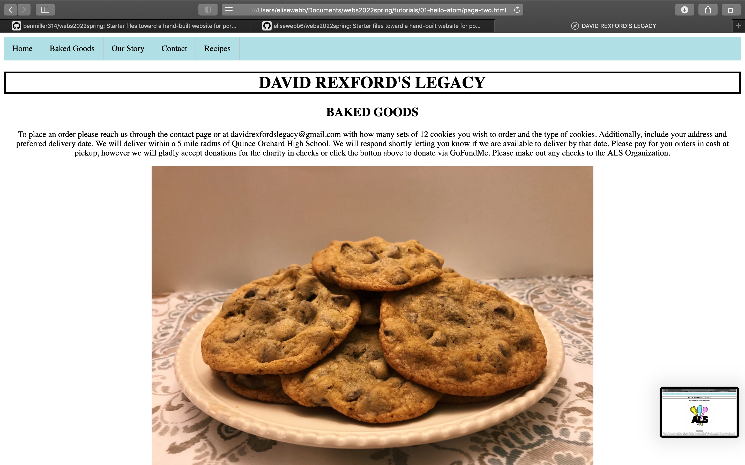
2 years ago For my website I decided to recreate a website I had designed a few years ago. However instead of using Weebly to build it I would now be using html and css. I have never coded before so this was all very new to me. I started off with creating a navigation bar which linked five different pages together. On the home page I added headings, an image that I drew, and a button that led to a link for a GoFundMe page. I included the header (the name of the website "David Rexford's Legacy") on every page and added a bold border to it so it would stand out on the pages. For my baked goods page I added images of every item we would sell and a description below. For my our story page I included a description of the reasoning behind my website along with an image below it. I also added two buttons which linked to a news article about David and his story and another GoFundMe site. I also attempted to code a contact us page however I did not get as far with that as I would like. If I had more time I would have liked to expand upon this more. The layout is there I just have not coded the submission process. Lastly, I included a recipes page which was is series recipes that David introduced me to. For each website page I created its own css stylesheet because I found it easier for me to organize my ideas this way. When using one sheet I really struggled with organization since it is still very new to me and I felt very inexperienced. If I had more time I would like to add more colors and play around/experiment with the design of the website. Specifically my recipes page I feel like I could organize better. Overall I feel as if I met the baseline criteria and would like to expand upon this website in the next unit and try to obtain more of the aspirational goals.

These photos display my progress designing some of the pages that I created for my website. During my process some of the feedback I received was on how I had my files were ordered. I had them in a hello atom folder instead of docs. I renamed all my files and fixed how they were organized in order to make it more accessible to people along with successfully display locally in a web browser. I also received feedback on the layout of my recipes page which I plan to try to redesign in the next unit. I would like to create colored boxes/backgrounds surrounding each individual recipe. It is also suggested that I switch up the font as well which I plan to play around with some.

 KatelynKunzmann
commented
2 years ago
KatelynKunzmann
commented
2 years ago https://katelynkunzmann.github.io/my-portfolio/
Most of the work was done on the mobile version, which can be viewed from the same link above, but on a mobile phone
Project portfolio with just mobile site code: https://github.com/KatelynKunzmann/webs2022spring/
At first, my idea was completely mobile focused with some 3d aspirational content that I quickly realized I wouldn't be able to achieve in the given amount of time. Therefore, I restructured my goals to be just making a clean, straight-forward simple mobile-friendly site while also finishing my portfolio I had already started prior to this class. I never got the time to finish it to my satisfaction and this project made that happen, which I am extremely happy about! It finally gave me the motivation to apply to internships. Anyway, as a result, I ended up fixing my current portfolio website and making a completely different mobile-friendly site as my skills in three.js working and looking great on mobile are non-existent.
The changes I made to my desktop portfolio website were:
The desktop portfolio then looked like this afterwards:

Then I proceeded onto making the static, simple mobile website. This website included almost all of the same content except images and wild css animations. My thinking was if a recruiter were to view my portfolio, they would most likely do it through a laptop. The mobile website is simply a courtesy in case someone is looking at it on the fly because they forgot some type of information. Therefore, the content is straight to the point, but still (hopefully) slightly professional feeling.
The peer feedback I received on my draft mostly revolved around lack of content, which I expected since I hadn't incorporated everything yet.

I then proceeded to add all of the projects that I created repos for and added more to education.

:heavy_check_mark: Use arrangement, size, color, visual rhythm, and/or contrast to focus viewers' attention :heavy_check_mark: Include at least 2-3 navigable html locations (multiple pages, or multiple scrolling locations on the same page) :heavy_check_mark: Have a clear mode of navigation among the pages (no dead ends) :heavy_check_mark: Include a sitewide css stylesheet (i.e. an organized visual theme) :heavy_check_mark: Include at least one legally useable image, with alt text
:heavy_check_mark: Optimize image filetypes, resolutions, and file sizes for faster loading
I really enjoyed this project as it felt personally fulfilling. I was already stressed about not being able to finish my portfolio before the semester started and am really happy I got to finish it in this class.
 ellsimm
commented
2 years ago
ellsimm
commented
2 years ago This was definitely the most challenging unit for me! I started off with an idea to create a site about the different types of chihuahuas (keeping in theme with my previous two unit projects). However, I was having a rough few weeks and found myself crying quite a bit around the Pitt campus, and then it hit me: A site ranking what I thought were the best places to cry at Pitt. I was originally only going to make this site a personal comedic outlet. However, I felt there was a mental health side of this list that begged for a slightly more complex site. I first thought to include resources. Finding these were slightly difficult and I didn’t want it to be a trite page with only things like meditation apps that people already know about. I landed on linking the National Alliance on Mental Illness website, as I know a few friends of mine who have found that club on campus very helpful, and they seem very passionate about it. I would also like to include apps that have helped me but wouldn’t necessarily be obvious. One of those is an app that reminds you to take your medication, something that have come in super handy for me! The next part of the site “The Science” came from a class I am taking called “Wellness and Resilience.” One of the lectures pointed out that a study showed that tears prompted by negative emotions actually contained toxins, so crying is not just a waterfall reaction, but your bodies way of literally purging things that can harm you. I thought this gave my site a little more logos, and after seeing some of these articles, I feel a little less bad about the amount of crying I do! Another decision I made was not to rank the places to cry on campus, but rather give a pros and cons for each, in a way allowing myself to vent about my experiences and laugh them off in the end. This part, like many others on the site is unfinished. A goal I have for this part of the site is to include a suggestions submission aspect so the site could be more interactive. Unfortunately, I was unable to have my site posted for submission to peer evaluation in time for the peer feedback class, so I will not be including any feedback as of yet. However, I hope to get some feedback and amend that issue in the consolidation unit. (If not from a classmate then maybe from a friend).
Everything in this unit was brand new to me, so it would be impossible for me to fit in everything I learned into screenshots below. I included some screenshots of moments that stuck out to me as “ok good one now you know how to do that.”

This is random but when Ben showed me how to Toggle Soft Wrap, it really changed the game for me, so I thought I would include that here as a little thank you.

It took me a very long time to do this, which is ok, but that is the reason it stuck out to me. I wanted to include a footer on every page that noted that the page was in no way affiliated with the university when it was published for public viewing.

Above is a time that I realized I needed to

Changed to In its current state, I believe my site only meets some of the baseline criteria. It includes navigation and pages, a style sheet, can display in a local browser, has a clear mode of navigation, and I committed with meaningful comments as I went. However, it does not utilize style well at all and also does not include an image. I would really like to continue to work on this in the final unit and create something that hits far more aspirational criteria, as well as fulfill all baseline.
 amo104
commented
2 years ago
amo104
commented
2 years ago Repository: https://github.com/alocampo/webs2022spring
My website, "Me, Perpetually" is a collection of drawings, pictures, and writings throughout the past few years of my life in order to document how I've grown as a person. Prior to this unit, I had incredibly minimal experience with HTML and CSS; the most I had ever done was use a few lines of CSS to change some colors on a Twine project. I'm fairly familiar with coding as a whole, but I found that the most challenging part of this project was trying to establish what the goals or problems in the website's design were in the first place. The technical implementation came somewhat easily after that, but figuring out what I actually wanted to implement felt quite foreign to me.
In terms of the baseline, I believe that I satisfy all the criteria. The website has 8 separate pages which never reach a dead end as there is a navigation bar at the top of the page. It has several images that all have alt text, and are all credited in my assets.md page. Important to note are the alt texts for the Question of the Day pages, in which I only state that it is a QotD page and what date it is from. I found that, since the entirety of the image was transcribed directly adjacent to the image, it would be long and unnecessary to completely describe that using alt text. The website has a site-wide CSS stylesheet which helps arrange the content into aesthetically appealing and functional structures. The main colors of the page are purple and orange, which are nearly complementary colors. But where the actual complementary colors of blue and orange may cause too loud of contrast, this more-muted palette is easy to look at and still draws readers' attention through the pops of color. Nothing in the stylesheet is completely black or white either, both being replaced by dark purple and a light beige respectively. The goal of the color scheme is to be quite relaxing and neutral to focus more on the content while still being interesting enough to keep the audience engaged. Everything on the page also follows a clear top-to-bottom, left-to-right order where the most important information is the first thing on the page and everything else follows chronologically. Lastly, I use commit messages that describe the work being done in that save and the website is published to the Github Pages link at the top of the reflection.
This website also satisfies some of the aspirational criteria as well. First, all of the content on the website (aside from the quote on the about page and the lorem ipsum on the portrait pages) is made by me. All of the drawings and photos of me have been rescaled from the original (large) files into the sizes they actually appear on the website to improve the loading time. Further, the website utilizes several flexboxes in order to be resizeable depending on the window:


Admittedly, there are some problems with the sizing on small screens, particularly about the font size changing in some places. If I were to revise this project fixing that formatting would be one of my main priorities, but for now, what's important is that there's code in there facilitates some level of responsive design. This is done using @media which causes the widths of the containers to be flexible when the width of a screen is below the maximum width of the containers.
The fonts in this website are deliberately chosen. The headers are all in Cooper Black and all the prose is in Times New Roman. First off, these are two of my favorite fonts so I wanted to use them in this website all about me. But more importantly, I think it sets a nice tone between the playful nature of this concept—where all I'm doing is curiously looking at my younger self—and the more sophisticated, over-arching goal of being thoughtful and analytical about who that younger self is. I think this dichotomy would be more clear if I was able to fully write out the contents on the portraits pages, but for now, I think the fonts still portray a message inherent to this project: the subject matter is lighthearted and fun, but still carries valuable and considerate insights.

To touch on the peer comments, I do agree with Marty that the landing page is a little plain. However, I think there is not a lot that I could add to that page that would be meaningful; I could slap another portrait or a logo onto the empty space below, but I feel like that wouldn't serve much purpose other than to fill space. But, this comment made me think: the landing page could be more notable if it was in general a bit more different than the rest of the website. At the time, the navigation bar used the same type of buttons as on the main page:

This was mainly as a placeholder, but I realized later that minimizing the footprint of the regular navigation bar added a little more weight to the buttons on the home page. So I simplified the navigation bar and I think it makes the home page feel more purposeful. This decision was also made based on Ellie's comment, in which I didn't really want the top buttons to have a lot of weight (since the focus should be on the actual content), and the dark purple buttons were drawing that attention.

Overall, I believe that my website satisfies all the baseline criteria and a fair amount of the aspirational criteria. In the future, I might like to re-address the responsive design on the website and work to fill in the lorem ipsum blocks of text. For now, though, I think this unit was valuable to me in becoming more thoughtful in how design and structure work in contexts where the main output isn't a graphic, and exploring new ways to be expressive.
 kfm24
commented
2 years ago
kfm24
commented
2 years ago This was one of the more challenging sections of the course. I spent a lot of time in office hours and many hours rereading the various chapters trying to make sure I had the write code. It took me more hands on, trail by error and practice to learn the new language we learned in class. I learned the most from going to office hours after class and having more of a one-on-one learning experience. I was able to practice how to inspect my website and make edits to fix how it works. It was also one of my goals to make the images have similar margins. I did feel overwhelmed by this section at first and realized that going to get extra help was a great resource to take advantage of while I have it!
Currently, I am very happy with my website. I am pleased with how much I learned throughout this section as well as how my website looks and can be useful as I apply to careers. The first final draft I missed one of the baseline criteria involving creating alt text for the smiley graphic. Later on in the project I added graphics I had made and needed to add alt text to them as well.
Here is the added alt text for the graphics I have created and added to my website:

Otherwise it looks like I hit all the baselines. Regarding my goals, I just wanted to be able to understand what was going on and able to fix something on my website by myself. Later on in this section I was able to create content containers, classes, and more. I was able to change the colors of buttons, and successfully create a nav box that brought viewers to the proper section of the page with one click(my favorite feature of my website):
Header/Nav bar with updated colors:

Here is a screenshot of the "href"s to be able to make my nav bar able to navigate to different locations on my website:

Some feedback I received on my website is that I should adjust the color palette so I changed the buttons and hover colors to be more pastel to be easier on the eye and maybe come off as more professional. However, I liked the placement of my Resume and LinkedIn buttons so I decided to leave them where they were.

I got advice to add a picture of myself and more information about myself and experience which I plan to do for the final reviews. Also just took graduation pictures so maybe I will add one of them to the website. Here is the piece of feedback that I was responding to:

Overall, I probably learned the most this section than any other section of the course. It was the most challenging and the most rewarding once I was able to understand the content. I also got more feedback from Ben for this assignment that I have been using to clean up the website for my revisions. Currently I am inspecting and viewing my website on Chrome since Safari makes my graphics a little distorted.
 Mapatterson379
commented
2 years ago
Mapatterson379
commented
2 years ago I really loved working on this project, however, I did struggle bringing my vision to life. I started out really enjoying being able to learn something new like HTML and CSS, but it was harder than the other projects to combine everything I was learning into a product. Overall, I think I did a good job building a website from scratch with what I learned in such a short period of time.
As for the baseline criteria, I believe I met all the baseline except having a sitewide css stylesheet. I had a hard time getting my visual theme to remain intact once I merged my stylesheets. However, I did have several pages aside from the “HOME” page. I also included alt text for all my images. What was also important to me was having meaningful commit messages as I made a lot of adjustments to my website and this helped me keep track of where I left off. If I had more time, I would definitely try to figure out why my visual theme did not translate to when I put all of my CSS on a stylesheet. For the aspirational criteria, I was able to use grids to organize my photos and I opted for the website to be dark mode because I felt it looked neater and made it easier on the eyes. It was bit of a challenge at first getting the grid to work because the images would organize themselves straight across instead of in four columns and three rows.
If I had more time I would fix the stylesheet to be used sitewide, add more media such as interviews of some of the models and back stage clips. I would also like to add more history content to the website to talk about the process of making the carnival costumes.
While I was not able to get a lot of written peer feedback, I did reevaluate a lot of pieces from my original vision. I decided to focus on visual content, rather than written content as I felt the show was about the in-person experience and that could only really be captured through seeing it.


This is the landing page, which also took a while to look like this as I had experiment with the HTML and CSS. The image I used here was taken during our promotional shoot and I felt did a good job capturing the vibe of the fashion show.


This is a space where you'll be able to post your final-for-now thoughts on your website portfolios. We've talked in class about what that should include, but the main goals are to give a sense of what you've learned from doing this project, the work you put into it, and whether it accomplishes what you wanted it to.
At a minimum, please include:
NB: After using the formatting buttons and drag/drop tools to add images here in the Issue queue, you can optionally copy the source code and paste it into a new reflections.md file in your repository: it should then have the same formatting there as here!