Open benmiller314 opened 2 years ago
Project | Repo |
---|---|
Project 1 Audacity: | https://github.com/paullewis2013/soundscape2022spring |
Project 2 GIMP: | https://github.com/paullewis2013/visual-argument-2022spring |
Project 3 Website: | https://github.com/paullewis2013/Portfolio/tree/engcmpCDM_overhaul |
Consolidation Project Chrome Extension: | https://github.com/paullewis2013/NewTabChrome |
Over the course of the semester I had the opportunity to learn a lot of new skills and solidify many of my existing ones in digital media. As we moved from unit to unit we tended towards some of my stronger skills so the projects got progressively more comfortable for me. In the first project using audacity, I had very little previous experience and this would be the one I struggled with the most. My background as a CS major and working as a software developer during my internship meant I already had experience using git and github so this part at least felt natural. Audacity does not particularly lend itself to version control though so this had little effect overall. The biggest obstacle in this project was recording the sounds I wanted from myself, my roommates, and our cats. It was one thing to write a script for how I wanted my audio narrative to go, but another thing entirely to try to make that work with the sounds I had available to me. In the end, I believe this was the project I was least proud of.
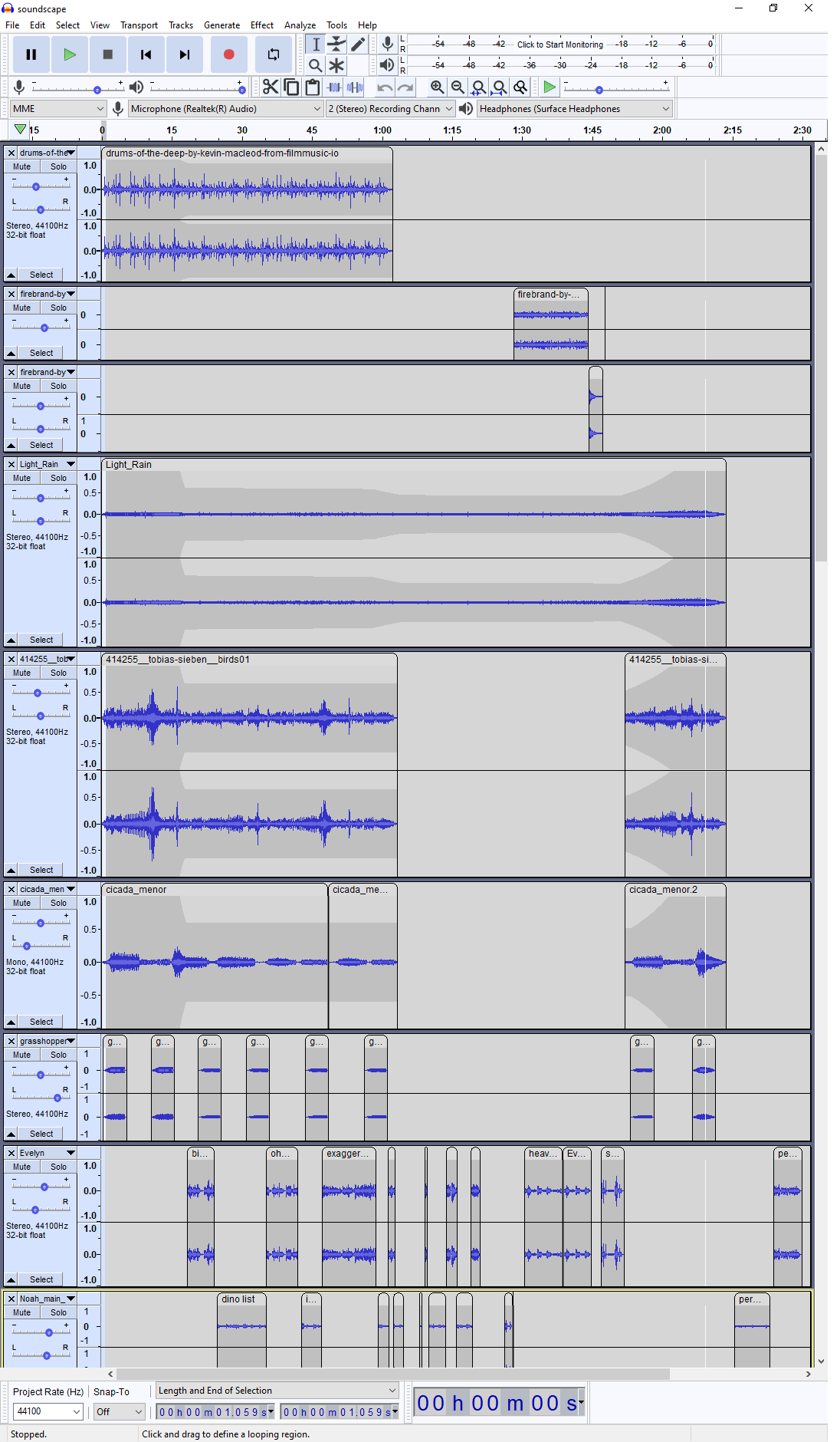
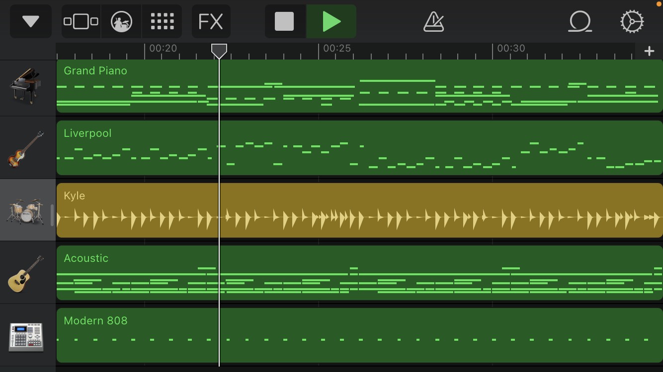
My final Audacity project layout looked like this:
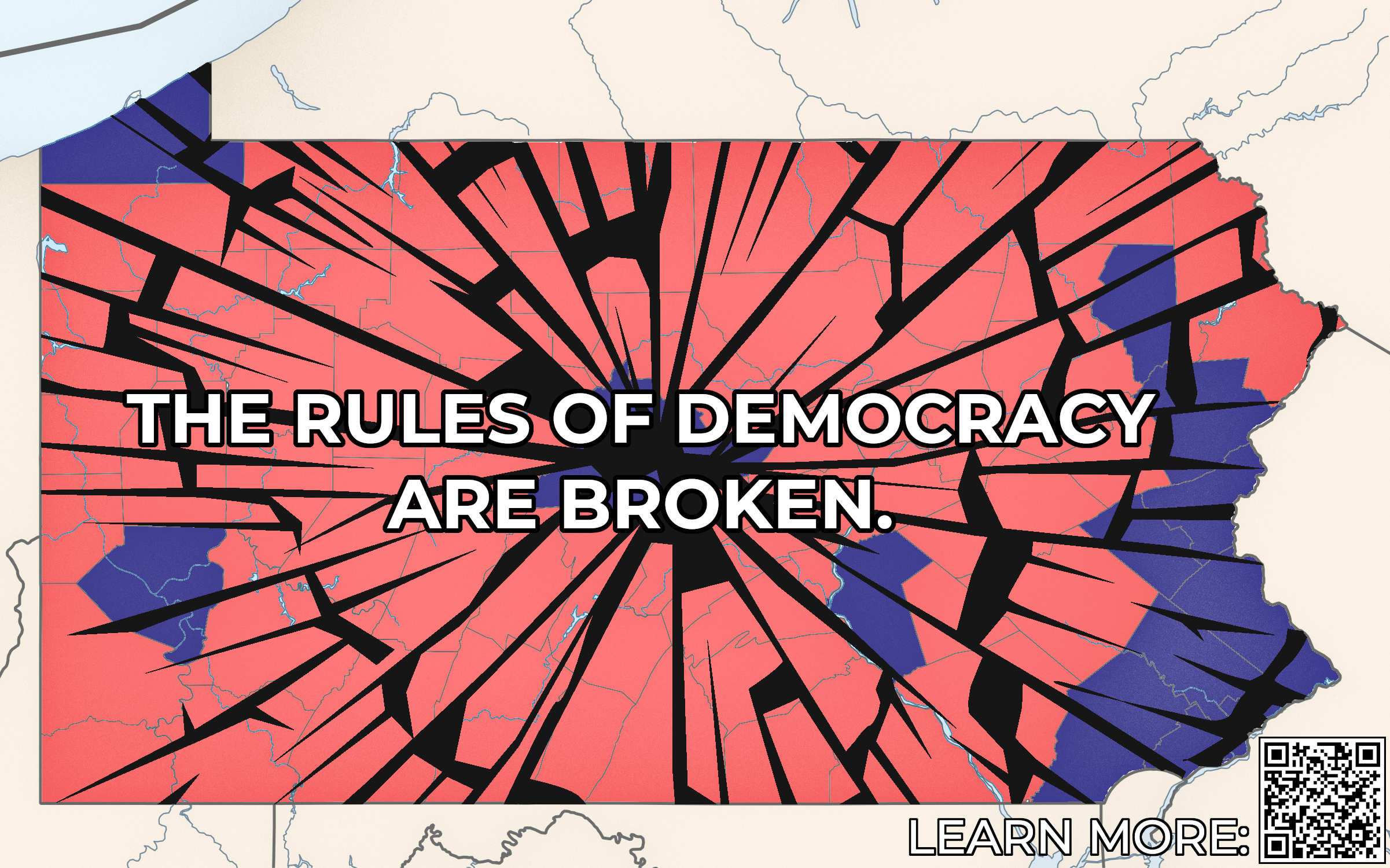
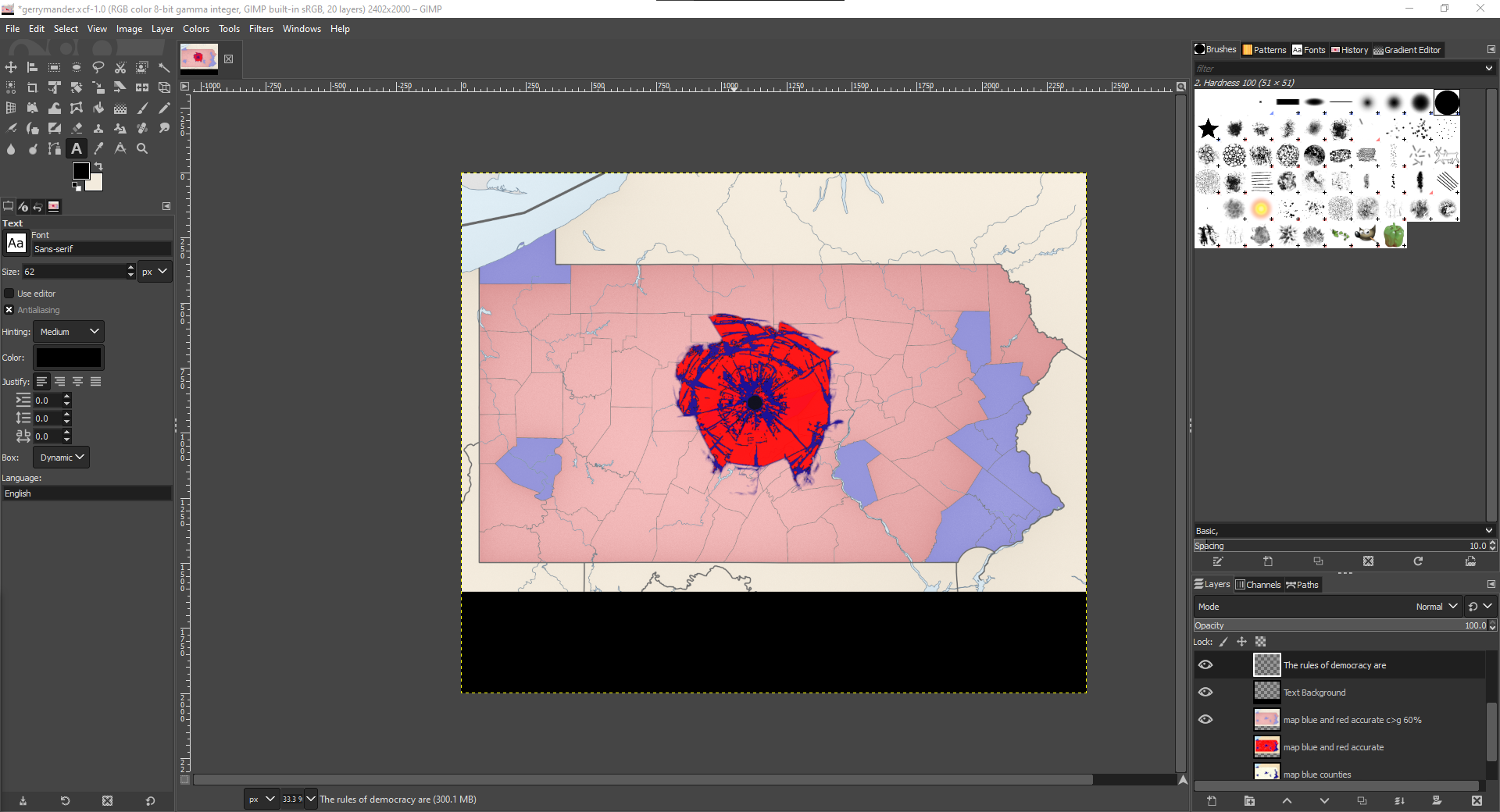
The next project was moving into an area where I felt much stronger working. I had learned how to use photoshop in high school and have worked with GIMP before but only as parts of larger projects. Many of the tools in photoshop have analogs in GIMP and the biggest learning curve was learning the new workflow as I already understood more or less what I intended to do. I worked with things like layer masks and color manipulation to create the image I had in my head when I started. With a bit of time leftover I couldn't help myself and decided to get to the github pages work earlier than I needed to. In the bottom corner of my image I included a qr code — these are much easier to generate than I realized – which linked to the domain of a github pages site I then created. This site included further reading about the topic of urban planning and the harms related to car dependence which was a nice way to weave in some of the benefits of working with digital mediums by including a reference to more material. It was also a nice way to warm up for some more serious web development work to come.
My final GIMP project looked like this:
The third project was my favorite and also easily the one I am most proud of. I have been working with github pages since I was in high school and I already had an existing portfolio site I was excited to overhaul. I created a new branch for my changes and got to work refactoring the entire site. One of the main things I wanted to include was a new section I called 'development stack'. This was a list of languages and technologies I'm familiar with that I can incorporate into future projects or work that I do. Over the course of the semester I actually learned several more things which I later included on this list. I included programming languages, data science languages, design languages, javascript libraries, and miscellaneous software that I like to use. Once I completed my list I went out and found icons for each of the items and properly attributed them in my readme, another piece of my repository that I hadn't gotten around to making before this overhaul. One interesting thing about this work was how much of what I did exists completely behind the scenes. While you might notice the nice new CSS flex layouts and svg animations that I added, the improvements to code and repository structure are less obvious. The html and css code are both much cleaner and my git commit messages are much clearer than they used to be too. I even included a gitignore file to get rid of some miscellaneous junk that exists in macOS directories that's been cluttering my repo for years. I think the biggest overall difference to the portfolio is the inclusion of per project landing pages. These were an interesting challenge to create and as I realized that I would be adding more projects in the future I decided to write a node.js script that would generate the html for me. This script is called compile.js and every time that I run it, it will populate a subdirectory with a webpage for each individual project all generated from individual json files. I'm very happy with the improvements I made to my portfolio and the new look of the site. Even after all that, there are still lots of things I'd like to add which I've listed in a markdown checklist inside the repo's readme file.
My website is live at https://paullewis2013.github.io/Portfolio/
Here is a side by side comparison of the code in the two branches to show how the structure has changed:
The final consolidation project offered a chance to try something new so I decided to use my skills with GIMP and web dev technologies to create a chrome extension. The extension I wanted to create would overhaul the default new tab page with a simple clock overlaid on top of an image I pull from a set I curated from Unsplash under the Unsplash license. Building a chrome extension is remarkably similar to creating a website. The main difference is a mainfest.json file which lists the specifications for the chrome extension and which areas of the chrome API the extension will have access to. Unlike a typical website, I used the chrome API to access local storage where I stored information like whether or not the user wanted the clock to be visible or which photos to include. The next interesting aspect of this project was that I had an opportunity to publish my finished product on the chrome web store rather than just keep it running locally in development mode. I created an account and registered it as a developer for the chrome web store and then packaged up my code and submitted it for review. Unfortunately, the extension was initially rejected as I incorrectly filled out the manifest file and relied on several deprecated API methods. During the process, I did get to learn a lot about what goes into the review and publishing of code for online platforms like the chrome web store and issues like security and user permissions. Fortunately, the mistake I made when packaging was very easy to fix and I have since resubmitted my extension for review. Although it is not live at the moment, I expect that it will be available soon.
Here is a screenshot of what the chrome extension looks like when run locally:
In the end, I learned a lot about digital media and found exciting ways to tie the different units together to create new things I've never had a chance to try before. I'm especially proud of the final two projects. The skills I refined during this class will be something I continue to use for a long time.
Project | Link |
---|---|
Audacity Project | https://github.com/mknuth5/soundscape2022spring |
Visual Project | https://github.com/mknuth5/visual-argument-2022spring |
Website Project | https://github.com/mknuth5/webs2022spring |
I definitely learned a lot in different aspects of composing digital media, but I think one of the most useful things I learned about during this semester was getting more familiar with GitHub. I'm almost positive this will not be the last time I'll see GitHub or a repository and, to be honest, I never really bothered learning the details of Git before this class. Usually, I would just complete the entire project, and then commit a final version saying "here it is" or "done" in the commit message. I had no idea what a branch was or how to fork something, at all. I feel like most people learned the most in other areas, like GIMP, Audacity, and Web Design, but I actually had previous experience in all of these technologies (or the equivalent technology GIMP <-> Photoshop for instance) so the most knowledge I gained from this class was in Git.
For me, I think one of the hardest parts of each project was coming up with an idea of what to make. All of my other classes don't really allow for creative composing like this one. Most of my classes are something like: "here's a problem, now fix it," which is actually something I enjoy more (not to say I didn't enjoy this). I enjoy being creative in solving a problem that's given, rather than composing something in a creative/free manner.
As a CS major who's taken web design courses before, I also learned a lot about modern web design using flexbox and grid. I'm still not totally comfortable with it starting from scratch, but it was good to get familiarized with it. This class was also helpful in the sense that I know I would never go into website design for a career. At least for me, I find it to be incredibly frustrating. It could be because I'm just not good at it, though.
One of the things I found to be the most difficult for me but doesn't seem hard at all was to take screenshots as I progressed. This kind of goes back to when I mentioned I don't commit until the end of the project. When I start on the project, I get really focused on building what I want that I forget to take pictures of my progress or commit my progress. In fact, for the visual project, I don't think I took any progress screenshots when I was working on the visual. I think I had to remove layers from the project and rebuild what it looked like as I was working on it...
One last thing, I would've enjoyed doing the audacity project last because my project involved a lot of outdoor sounds that I could have recorded in person. Since that project was completed in February, I couldn't go out and record the sounds I would have liked to have added. I probably could have done that in the last two weeks for my final portfolio, but the weather was also bad and I hadn't thought of that until now...
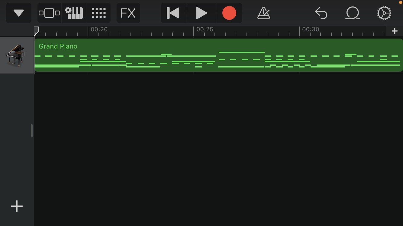
Here is my audacity layers screenshot.
I had never worked in Audacity on a large-scale project, but I found that it was very intuitive to learn and provided a lot of interesting features. One of my favorites, that I probably overused a little bit, was the sound movement feature. This was where I could make it sound like someone was walking to the left of the listener. I thought that was really interesting and the kitchen soundscape still sticks in my mind when I think about that feature.
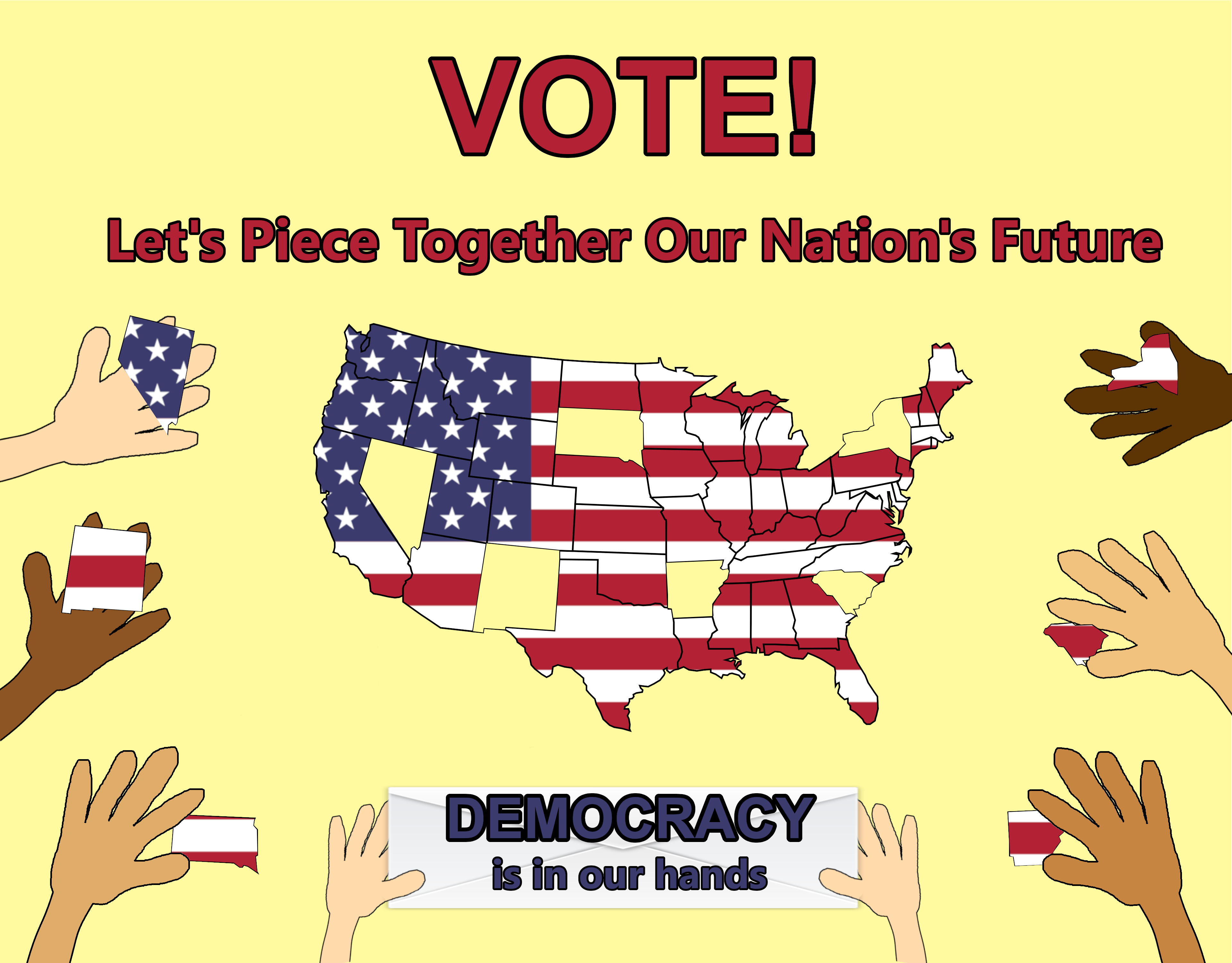
Here was the final version of my visual project.
I chose to use photoshop for this project because I have previous experience in photoshop and feel somewhat comfortable using it. There is a lot of advanced stuff people can do in this program, but most of the tools I used were pretty basic for this project.
Here's the link to my website: https://mknuth5.github.io/webs2022spring/
It's a little to long for everything to be included in a single screenshot so I just included the link. I used bootstrap for this website, which feels a little "cheaty" but it definitely made it look a lot nicer than when I was not using it at first. One feature that I especially liked about my final website was the animation on the elements when the site is first loaded. I think that gives it a better feel than just loading everything at once. I don't exactly know how the animation function works, pe say, but it definitely looks cool!
This is what my website looked like before I learned we could use bootstrap...like I said before, I'm not the best at web design.
For the last two weeks of the class, I wanted to add more content to my site. I did a lot of researching and tinkering trying to add a PDF viewer of a paper I wrote for one of the classes. This proved more difficult than I anticipated, so what I did was use an iframe to a google doc that was published to the web.
You can see this above or here: https://mknuth5.github.io/webs2022spring/HIST1653.html
Projects | Repo |
---|---|
Audio Narrative - "Last Night at Slashfest" | https://github.com/kaitlynmchugh/soundscape2022spring |
Visual Argument - "Atoms, Molecules, and Materials Flyer" | https://github.com/kaitlynmchugh/visual-argument-2022spring |
Website - Personal Portfolio | https://github.com/kaitlynmchugh/webs2022spring |
Consolidation Unit - Pepper Portfolio | https://github.com/kaitlynmchugh/pepper-portfolio |
Throughout the course of this class, I’ve learned a lot about myself as a digital artist, including my strengths and weaknesses. One thing that I really enjoyed about this course was the variety, which allowed me to feel very solid in some skills, but be challenged in other areas. I think my main strength over this course was quickly adapting skills and implementing them throughout my projects. Although the programs we used in this class were completely new to me, I feel like I was able to learn the basics and apply them in my projects pretty quickly.
In my audio narrative, I was initially nervous about keeping track of so many sounds in one file, or even overloading the listener. However, once I became familiar with the effects in Audacity that could be used to make these sounds seem like they do belong together to create a cohesive narrative, I added a lot more sounds, taking some advice from peer reviewers. My preview started off with very few sounds and effects:
Meanwhile, my final draft, shown below, included much more sounds, all of which could not fit on the screen, with various effects applied. Final Audio Narrative:
This skill has definitely allowed me to reach the baseline criteria for each of my projects. However, I think one of my weaknesses and challenges throughout this course has been my slight aversion to changing my project and trying new things. I think since I am so unfamiliar with these programs I often struggle to trust my skills in making small changes to my project that may seem insignificant, but can make the project so much better. This challenge was particularly relevant for the visual argument and for the website, which had much steeper learning curves. I found myself struggling with changes to the visual argument in GIMP, like how moving certain layers affected other layers. For this reason, I feel that I didn’t really value the importance of naming layers and every piece of a digital project to help keep track of it until I started working on the visual argument. I found that it was a lot easier to keep track of things in Audacity for me, compared to GIMP. This is definitely one piece of advice that I will take away from this course, which will definitely help me to stay organized when working on any digital project. When I received my peer review for the first draft of my project (shown below), I knew I wanted to add some sort of effect to make the text pop more.
I decided to experiment with some effects that I was unfamiliar with until I found one that worked. I ended up using the drop shadow effect, shown in my final draft below. I think that experimenting with these effects definitely paid off because the text is much more readable now. Because these programs are so new to me, I definitely need to get comfortable with learning new effects as they can really benefit my work in the future. Final Visual Argument:
I had similar experiences when working on my website. I felt that changing small things in my code changed the presentation of my website in unexpected ways, so I felt that I couldn't try new things like implementing flexbox. However, once I learned more about how to use flexbox properly, I was able to use it on both of my websites to greatly improve their appearance. Before: Website Preview
After: Final web project - personal portfolio:
Final consolidation project website - Pepper Portfolio:
I think the main way to get around this challenge would be to become more familiar with the programs I’m using through experience. Also, thanks to github and version control, I don’t need to worry about any unwanted changes to my website, because I can always go back to a different version. I think through more practice with these tools I will definitely get used to being more experimental in my projects.
Based on these experiences, my main advice that has been helpful in this course would be to not worry about getting it right the first time. At the beginning of the course, I feel like I was worried about my previews and first drafts, but by the end I was more experimental and happy to get feedback and even hear different ideas that could be implemented in the project during those stages. Furthermore, it is a learning experience, especially if you're using these programs for the first time, so it’s definitely good to experiment and try new things.
I think the most surprising part of the course for me was how helpful GitHub was throughout each project. At first, I was very confused by GitHub and why exactly we were using it. However, I was surprised by how easy it was to learn the features and apply to the projects. I don’t think I could have stayed organized for these four projects without it. If I do continue to work with these programs in the future, I will probably end up using GitHub to do so, which is definitely not something I imagined I’d be saying by the end of the course.
I think I will definitely continue to develop my digital media skills in the future. Specifically, I’m hoping to continue to update my website and use it as a sort of online resume while also keeping track of any hobbies/projects I’m working on. I really enjoyed the web unit in this class, so I’m hoping I’ll have use for those skills elsewhere in the future, too. I’m also planning on working on some Audacity projects with a writer from Fordham, who is starting a digital horror magazine. I really had fun with creating an audio narrative, so I’m excited to continue that soon in the future.
Jumping into this course, I felt like I had only technical skills not any creative skills. I am a computer science student so programming is easier for me then manipulating digital media to make a final creative product. By the end of the term I felt confident enough to claim I have the skills to compose various types of digital media.
https://github.com/KatelynKunzmann/soundscape2022spring The soundscapes we listened to gave me a taste of what digital media can achieve, transformation and time travel. I decided to capture one of my most favorite places, Phipps Conservatory. The botanical gardens always transform me into a different life, if you will. I knew this would be difficult to do since plants don't really make sounds, so I added another dimension to it by editing it to have a psychedelic feel. I called it A Trip with Phipps. I started out with a 20 minute long recording of my walk through Phipps. I continued to shorten by saving all of the significant parts such as doors opening/closing, dialogue, footsteps, and narration. After shortening it, I edited many different sounds to sound trippy and threw them in places I felt needed a build-up or transition.
Afterwards I added some ambient sound I found through a website from the resources given and edited this to be included in a part of the soundscape I felt needed more background trippyness. This soundscape project definitely made me way more comfortable with editing sound. Audacity has a simple format, which I greatly appreciated as being new to all of this. The most challenging part was finding the right effect or combination of effects to achieve the atmosphere I am trying to make my listener feel and experience.
https://github.com/KatelynKunzmann/visual-argument-2022spring I feel like I had learned the most during this lesson. The Graphic Design Principles by Julie Thompson were eye-opening. I had never analyzed graphic design before and the principles we read about were not only very useful, but aptly summarized. After reading all the principles, I had a vision in mind and what principles to incorporate in my visual argument project. I took a subject I was passionate about and wanted other people to become passionate about, the right to sound and secure money (as without it, the Venezuela economic crisis will always be a possibility everywhere), which cryptocurrency provides. From the Graphic Design Principles, I felt most moved to have something simple, but powerful. I used proximity and density from the principle of Dominance and Hierarchy as well as a sort of flow/rhythm from Rhythm and Movement. The below draft image is what I came up with. Commit: https://github.com/KatelynKunzmann/visual-argument-2022spring/commit/7f49a677c533373064917f94409b6d1be3063505
I was very satisfied with this, but felt it needed just a little more of something. Thanks to the comments on the commit. I decided to add a splash of color and through my own brainstorming, I also added a balloon to exaggerate the inflation effect since that is the main focus/reason for the whole argument. Commit: https://github.com/KatelynKunzmann/visual-argument-2022spring/commit/b60a6018a317c6fc31be888655f5069b4bc46e68
Overall, I felt like I became a great deal more comfortable with GIMP. I started off not knowing anything about layers, I imported incorrectly many times and also barely understood all the selection tools. The GIMP essential training as well as the Graphic Design Principles by Julie Thompson provided me with a quick and easy resource to learn and develop my visual argument. By the end of it, I knew exactly how to center everything based on any orientation I want, select anything, fill anything with color, and mess around with layers easily. I definitely see myself utilizing these skills in the software engineering industry or UI/design part of software.
https://github.com/KatelynKunzmann/webs2022spring https://github.com/KatelynKunzmann/my-portfolio https://github.com/KatelynKunzmann/my-portfolio-mobile
Only optimized for desktop/laptop - https://katelynkunzmann.github.io/my-portfolio/ Only optimized for mobile phone - https://katelynkunzmann.github.io/my-portfolio-mobile
This unit was my most comfortable unit since I had made a few websites already. I certainly didn't consider myself an expert, but I knew I had the skills already to accomplish a website portfolio. This unit gave me a chance to enhance upon my already-started website portfolio. I hadn't attempted a mobile-friendly version yet so I made this my primary goal along with a secondary goal of enhancing the existing portfolio website. The mobile version proved to be difficult as I don't have the knowledge to know the best css displays or how to arrange everything to be flexible and pleasing to the eye. I relied on online sources to make fancy project boxes on my desktop portfolio as well as fancy buttons and navigation menu for my mobile portfolio. Integrating all of this was time-consuming, but well worth it. I continued to add more content and this is when the difficulties arose with things moving and even disappearing that I still don't have explanations for. Eventually, I got the display I was aiming for.
I definitely feel like I could improve my website making skills and definitely will continue to in the future. I am in a field full of website experts who also provide a plethora of knowledge and lessons. Through this project I improved upon the organization of my html and css tags the most. I also felt personally fulfilled after the completion of this project, completing my portfolio was always at the back of my head.
https://github.com/KatelynKunzmann/typing-test
I instantly knew I wanted to do another website for the final project in order to continue building on my HTML/CSS and JavaScript skills. I have been wanting to teach my niece of 5 years old how to code, but I realized she doesn't even know how to type on a keyboard. Therefore, I wanted to do a simple typing test for kids. I feel like I used some graphic design principles for it because I love making things simple, but effective. Using large blocks of color is perfect for children. This project built upon my current coding skills, which is something I will always be doing, and gave me another chance to showcase a project in my GitHub repositories.
Looking back, I felt appropriately challenged, humbled, and accomplished. Each project threw something new at me that I could easily learn through the resources given by Ben. These resources were the most useful to me throughout all units. I feel most successful at gaining new skills with new tools that I can take with me and use anytime anywhere, thanks to the tools being open source. I felt the most challenged at the visual argument part as never editing any images except through paint. There was an overwhelming amount of tools to get used to, but the GIMP essentials training provided a quick summary of the tools and how to use them, making the challenge conquerable. I plan on continuing with all of these skills at some point in my future since I will be in the software industry. User experience and interface design is always something I have been interested in and might delve into that area in the future.
When I think back to the first days of class, I remember feeling that I knew nothing about digital media. I enrolled in this class because it counts towards the Digital Narrative and Interactive Design major. If you told me last year that I’d be majoring in Digital Narrative and Interactive Design, I’d first say, “what the hell is that?” Then, upon learning what the major entails and that it’s in the School of Information Science, I’d think that you’re lying.
For most of my life, I’ve considered myself incompetent when it comes to all things computers. However, I figured that in our digital age, I should have at least a basic grasp on the mechanics of the digital world. When I discovered that I needed to fulfill a quantitative information gen-ed requirement and saw that Intro to Computer Programming was available, I decided to suck it up and take it. I was so surprised at how much I ended up loving that class. Halfway through last semester when I took the class, I decided to major in DNID in addition to English Nonfiction Writing. When I tell people what my two majors are, they’re often confused about how they could work together, treating writing and coding like fire and water.
Composing Digital Media, the class as well as the action itself, is one of the many ways the two disciplines work together. Beyond that, the ability to compose digital media, and more importantly the ability to learn how to compose digital media, feels essential in the current times. We exist in a culture that is largely digital, and will only become more-so in the years to come. The distinction between the “real world” and the cyber world is becoming increasingly blurred. This idea seems to scare a lot of people, perhaps rightly so, but the only way to shape the inevitably digital future into something positive is to embrace all it has to offer- in other words, its affordances.
When I think of the affordances of digital media, I’m reminded of the Tyler Su piece “Playing Lev Manovich” that we read during the first weeks of class. When thinking about the 5 principles of New Media Su lays out, I’m faced with the questions: “What can digital media achieve that other media cannot, and why is this important?” These questions formed the basis of much of my thinking as I navigated each unit.
Audio Unit When the audio unit was first introduced, it seemed like a good starting point because it was what I felt most comfortable in. I had some experience with sound editing through creating and producing music in GarageBand. I also took Filmmaking 1 last semester, which lended me some experience as well (one of our projects was actually to compose an audio narrative!). However, it turned out to be the most challenging unit for me. Working with the audio itself wasn’t too bad, but figuring out GitHub, organizing, importing, and exporting files, and navigating copywriting/licensing issues was a nightmare. When I looked back at my old repo, which you can find here https://github.com/ellagrant/soundscape2022spring, it was clear that I did not have a solid grasp on how GitHub operates.
That being said, I’m proud of what I was able to create for my final draft. I feel that I took advantage of what Audacity offers through my use of left/right paneling, the reverse, reverb, amplification, and echo effects, tempo and pitch changes, fade-ins and fade-outs, and layering. Many of these were new to me. I also recorded a decent amount myself, including the city sounds in the background, the walking sounds in the beginning and running sounds at the end, and the narration between the main character and her friend (for the man I used a text-to-voice editor). I even went as far as to take separate recordings of me walking and running in regular shoes and me walking and running in heels since the friend mentions that she was wearing heels. This felt a bit silly since you can hardly hear a difference, but even such a slight detail adds to the overall effect.
For my final portfolio, I ended up keeping my soundscape itself the same. I did, however, make changes to my repository. I forgot to even include a CREDITS.md to my repository, a testament to how unorganized I was at the time, so I added that. I also didn’t attribute my sources to their creators when I list them at the end of my soundscape, so I made sure to do that in CREDITS.md. The final change I made was adding a README.md to my repository introducing my soundscape to a new audience, since I also never did this during the sound unit. For each of these changes, I made sure to explain what I did through commit messages.
Visual Unit Learning how to organize and manage my work was the biggest improvement I saw from the audio unit to the visual unit. I learned what it actually meant to push and pull my files as opposed to just clicking different things until it worked, which was how I went about the audio unit. With a better grasp of the mechanics of GitHub and file management, I was able to have fun with the project.
GIMP was a bit tricky at first, but after watching a decent number of tutorials and, most importantly, playing around with it myself, I found it to be intuitive and user-friendly. As a visual, (previously) non-digital artist, I set out composing my visual argument by transposing what I could create on paper into a digital medium. I ended up hand-drawing several versions of my argument, then recreating them to the best of my ability on GIMP. Through this approach, I found that it was much more effective to strive for remediation, not recreation. What I mean by remediation is taking something that already exists and applying it to a digital medium given both the medium’s limitations and affordances. As I explain in my README.md, which you can locate in my repository https://github.com/ellagrant/visual-argument-2022spring, my visual argument is a critique of how notions of equality operate under corporatism and capitalism. My argument is that people from marginalized groups- in this case, women- assuming positions of power that were previously reserved for white, straight men, is not true equality when the positions themselves are unethical. This was very difficult to communicate through visuals. The most valuable part of the process was receiving feedback from others. Below, I’ve included a version of my visual argument from very early in the draft stage.
When I later pushed my draft, the feedback I received from my peers helped me develop my final version. Everyone who reviewed my work suggested that I change the font to one that is scarier, which I did. This small change had a huge impact on the clarity of my messages. I was also inspired by the feedback I received to remove some of the images I originally included to make my piece less cluttered. This way, I was able to focus more on what I did include and how I could use the affordances of GIMP to communicate a clear message. I’m very pleased with how my final version turned out.
For both the audio and the visual units, I think my strengths lay in my creativity. I had ambitious goals about what I wanted to create and what messages I wanted to communicate. For the sound unit, I intentionally wanted to make my narrative confusing and disorienting, which is difficult to achieve without overdoing it, especially for someone relatively inexperienced with sound-editing software. For the visual unit, I tried to convey a complex, nuanced argument (which you can read about here) through visuals.
For both units, my ambitious goals led me to take risks. I think this paid off a lot in the visual unit. For the sound unit, I do feel I could have created something cleaner and smoother had I taken a more simple route, but I’d always rather create what I want, even if not every choice works out how I want it to.
The only changes I’ve made since pushing my final draft have been adding a README.md to explain my visual argument and updating my commit messages to reflect my changes. Otherwise, I was satisfied with how my visual argument turned out.
Web Unit The web unit was by far my favorite unit. It was very challenging, but instead of being discouraged, I found myself excited by the challenges. HTML and CSS were completely new to me. The tutorials were quite helpful, but when it comes to coding, and digital media in general, a tutorial can only teach you so much. That fact is one of the major takeaways from this class.
When the web unit was introduced, I knew immediately that I wanted to create a website for Cherry Bomb, a literary arts magazine at Pitt that I’m a part of and helped create last fall. However, compared to my visual argument, it was very difficult to transfer the image I had in my head to a web screen. This unit taught me to be patient, look to others for help/inspiration, and trust the process. There were a lot of things I wanted to achieve with my website that I thought I wouldn’t be able to figure out, like embedding videos, that I ended up being able to achieve through lots of trial and error. Coding, I’ve come to find, isn’t so much something you learn but rather something you practice.
I devoted a lot of time to creating my website. At many points throughout the process, I could have pushed it in its current state as a final version, but kept coming up with things I wanted to try out. With digital media, and with web design specifically, there are always ways to expand. There isn’t really such a thing as a “final” version. That being said, here is what I call my final-for-now version:
Repo: https://github.com/ellagrant/webs2022spring.
Since pushing my final draft to GitHub, I’ve made slight adjustments to my website as well as my repository. I fixed a spelling error that Ben pointed out to me in the nav bar (I previously spelled calendar as “calendar”), and added README.md to my repository like I did for the other units.
Going forward, I plan to continue adding to my website and, hopefully, transforming it or at least using it as inspiration for Cherry Bomb’s official website. The other club members really liked what I made and we’ve been discussing working on an official website over the summer. In addition to showing my fellow club members, I’ve also shown my website to family and friends. I especially loved seeing my parent’s reactions as they were beyond impressed that I could make something like this.
Consolidation/Integration Unit For my final project, I just wanted to do something fun after a stressful semester. Since the visual unit, I wanted to try my hand at animation (I think I even wrote this in the Issue Forum). I proposed my idea on the shared Google Doc and Jin Jin said that she was interested in collaborating since she had experience with 2D animation. We decided to work together.
We split up the project so that Jin Jin would do the animation and I would do the audio. This was my first and only collaborative project for this class. Collaboration was most helpful when it came to generating ideas about what our animation should be. It allowed us to give and receive constant feedback during all parts of the process. Collaboration also allowed us to decrease the quantity of work we had to do individually.
However, working in a group complicated the execution of our project. This is something I have found to be unique with digital media because of file sharing and editing. I remember for my final project for Filmmaking how frustrating it was to work as a group when only one person could access the file on Adobe. With all of the incredible capabilities of modern technology, you’d think by now they would have found a way to make these software easily collaborative.
Composing the different components of the project separately made it difficult to combine them. When editing the audio, I had only a rough idea of the timing based on our conversations in class. It would have been easier for one of us to finish our part of the project and have the other person base their part on that, but because of our limited time this wasn’t feasible. When we layered the audio and the visuals, a lot of it didn’t line up. This meant fixing it in Audacity, pushing a new version, and replacing the previous track with the new one.
What we couldn’t achieve collaboratively through composing and editing our project itself, we tried to make up for in other ways. I created the repository, assets, credits, and our README. This way, we could more equally split up the work.
Repo: https://github.com/ellagrant/finalprojectaudio
I’m really proud of how our final animation turned out, and want to give a lot of credit to Jin Jin for doing the animations. Our final animation, appropriately titled “The Sound of Color,” depicts different scenes when the sound changes. The main audio track we used was the song “Sound & Color” by Alabama Shakes, and added sounds to represent different things happening in the animation (footsteps, camera clicks, pencil on paper, etc.). Each change signaled a different color and an emotion associated with that color (red, for example, represented anger, blue sadness), which we represented visually. The animation ends with a rainbow section that starts when the beat drops in the song. Our animation is fun, exciting, and very literally explores the relationship between audio and visuals.
Overall, this class has changed the way I think of digital media, media in general, art, and the creative process. Going forward, I’m certain that I will apply what I’ve learned in this class to several areas of my life. Given my major, I imagine that I will continue to compose digital media in the future. Outside of class, I also plan to work on projects similar to what we’ve done in class, simply because it’s lots of fun! Beyond the creation of digital media itself, the problem-solving skills I’ve developed over the course of this semester will be valuable for anything I do. I’m really grateful for what I’ve learned this semester and proud of what I’ve been able to achieve.
Project | Link |
---|---|
Soundscape | https://github.com/19jinjinwu/soundscape2022spring |
Visual Argument | https://github.com/19jinjinwu/visual-argument-2022spring |
Website | https://github.com/19jinjinwu/webs2022spring |
Animation | https://github.com/19jinjinwu/finalprojectaudio |
In this class, I have created an audio narrative of a real-life, near-death adventure out in the Pacific. It is mostly an internal monologue of a young man sailing through rough waters on a rainy night while coming across some unknown figures. For my second project, I created a visual argument about food waste, I am criticizing how Americans throw away a large amount of food when there are many households who can not provide enough to feed their families. My composition showcases a perfectly edible pizza being pulled out from a landfill, and also offers solutions to combat this issue (compost, mindful eating, donate). The third project involved creating a website, which I made for a fake cat café. The home page features moving images, interactive buttons, and reservation/contact forms, and the cats page features the adoptable cats. Lastly, my final project is a collaborative animation for the song “Sound of Color” by Alabama Shakes. I participated in the visual frame-by-frame animation, which tells the story of a woman going through various human emotions in her life. The animation features sound effects and dynamic transitions to immerse viewers through the open-ended journey.
Throughout the projects that I have completed in this class, one of the most important ideas that I have picked up is using Creative Commons resources and manipulating them to create a new piece. Beforehand, I would often credit my sources incorrectly (URLs), or create a composition completely from scratch to avoid the issue of copyright. Not only is using free-license assets time-efficient, but they are also high-quality and look/sound more cohesive in the compositions. In application, the free-license sources were highly essential in my audio unit. I had never been out at sea nor was I sailing anytime soon, so I found the sound clips/effects for my narrative off of Freesound. I searched through the sounds clips with the narrator of the story to capture his experience accurately and even had to manipulate some of the clips with Paul stretch, pitch, reverb, distortion, and tempo. It would have been difficult to emulate the sound of waves crashing (outside and inside) in a location that is far away from rapidly moving water.
In terms of advice, I think clarity is one of the most helpful tips that I have been given. Compositions don’t need to look elaborate in order to have meaning or make an impact. Hand-in-hand with this is the importance of space; too much clutter can distract the viewer, and confuse them with the message of the piece. Likewise, I think a lot of modern visual media is geared towards simplicity and a clean appearance. Clarity and space were evident in my visual argument, where I wanted the viewers to understand the detrimental effects of food waste. I tried to draw attention to the enlarged pizza by using negative horizontal space so that it was the main visual element. The background was also free of any distractions after editing out a light pole and had a near solid color so that the text would stand out. Another example of simplicity is my website; the background colors complement each other and repeat throughout the pages. For the sections where the background is an image, I placed a semi-transparent, black overlay to allow for more clarity. In addition, most of the text and boxes had a drop shadow so that it stands out from the background.
On a broader note, I think taking advice from peers is important when creating digital compositions. When comparing the pieces that I have done outside of the classroom setting, I often look back on them later thinking that they could be a lot better. Feedback was not only essential to getting input on my work from another perspective but also useful in congregating new ideas from my peers’ work. In terms of feedback, I received helpful advice for all the units but especially for the audio narrative, with which I had much less experience than in the visual and website unit. One of my peers had inspired me to use the envelope feature, which I had never really tinkered with before, despite having experience with Audacity. The importance of feedback is especially evident in the last project because while I am fairly satisfied with my animation, I definitely feel like there’s something missing.
Looking back at the unit goals and overall course outcomes, I think I was definitely the most successful in the visual and website unit. I had plenty of experience using Photoshop to edit images, so I think it was fairly easy to meet the baseline and aspirational criteria. The only tools that were really new to me were the content-aware tool, which I used to edit out the light pole, and the adjustment layers. As for the website unit, I came in with the knowledge of CSS and HTML from a class the previous semester. It was fairly easy to categorize and write the code with the right syntax, and I already knew how to use more advanced layouts like flexbox and forms.
While I was successful in creating an interactive website, I also found it equally challenging as I definitely spent more time on my website than my audio narrative and visual argument combined. I’ve never used JavaScript, grid layout, color overlays on images, modal popups, absolute and fixed positions, and GIFs. I figured out how to add all of these features through code examples and looking at the HTML/CSS on similar website designs. At the same time, I feel like the final project was equally as challenging, but in a different way. I had no experience with Adobe Animate or creating animations, and we did not have tutorials/guidance as we did for the other units. Since we had a lot less time for the animation compared to the website unit, I didn’t watch the tutorials and mostly blindly experimented with the tools. For example, I used an asset warp tool to animate the woman walking so I wouldn’t have to draw it frame-by-frame, but it ended up making the lines blurry. Since I was comfortable drawing line art, I expected that frame animating would be a lot easier than using a vector animation program, however, I definitely bit off more than I can chew; the animation has over 160 frames, not counting the overlapping frames on the 10 different layers. Furthermore, I also had no experience with After Effects or creating motion graphics, so I just searched for tutorials where it was necessary. While I did not initially plan on working with After Effects, I wanted the animation to feel smooth and dynamic between scenes. It would have been a lot more manageable if I stopped after frame animating instead of working in another new program (After Effects), but at the same time, I don’t think I would be completely satisfied with it. Another solution would have been to split up some of the animation frames with my partner, but I was worried that the art style would be too different.
I think all the projects were manageable in terms of baseline criteria, and I definitely enjoyed creating multiple forms of digital media using various applications. If I were to do something differently, however, I think I would have definitely liked to have more time for the last project, and have a feedback session like the other units. While the website may seem like the biggest challenge amongst the units, since we have the option of revising it for our final project, we could combine the tutorials into a shorter number of days. I completed each tutorial in roughly fifteen minutes, while I spent 3 hours or more each session coding my actual website. I also might be biased, but I feel like we had more than enough time in audio and (especially) visual units because there was a designated application that was fairly easy to learn, while there was an infinite number of problems (and solutions) in website design. Shortening the first two units by a day would provide more time for the final project as well.
Moving forward, I definitely will be using all the skills I learned in this project in some way. I plan to pursue a career in graphic or visual design, which involves photo manipulation/editing, an understanding of UI (web design), and possibly motion graphics or video editing. I was also really satisfied with some sequences in my animation (like where the girl is running), so I hope to create more animations in the future as a hobby.
Project
Repository
Audacity
https://github.com/jennakupferschmid/soundscape2022spring
GIMP
https://github.com/jennakupferschmid/visual-argument-2022spring
Website (HTML/CSS)
https://github.com/jennakupferschmid/webs2022spring
Final Project
https://github.com/jennakupferschmid/visualargument2
When I first started this course I had very little experience with any technological programming. Not only did I have no experience with HTML, but audio or visual programming as well. I remember the first class we had was super overwhelming for me, as I felt I would never be able to keep up with the goals of the course due to my inexperience. Throughout each unit, I got more comfortable learning new skills and my adaptability towards technology drastically improved. Before starting the first unit, I already faced some problems while using Github. Learning how to save my work to a folder within my documents and then pushing files through Github desktop was unknown territory to me. The largest roadblock I originally had was ingraining each step of this process into my memory. I learned that it was important to code each repository on Github in order to create a folder within my documents. After doing so, I quickly was able to place my projects within these folders and push them on Github desktop into my repository. Occasionally, I ran into issues with Github desktop during the visual unit. Since some of my files were too large I had to adjust the .gitattributes file within my repository in order to adjust for the file size.
Audacity My Final Audacity Layers:
The first unit, which tackled an audio narrative, was less daunting to me even though I had no experience. I felt I could figure out how to navigate audio effects since the sound I intended to create was so simple. Although I eventually compiled an audio narrative, I ran into issues with my sound. Balancing how loud each track was became an issue, with the maximum sound constantly being hit on the playback. I never ended up fixing this issue because I forgot to playback the sound using headphones, which I have learned is very important. Without headphones, my sound appeared at the perfect volume so I made the decision to not adjust the tracks. In the future, I plan to check the volume with headphones of each of my tracks individually before compiling them in order to avoid this issue. Other aspects of my audio narrative were challenges as well including learning about dead space. Before completing my audio, I planned on the sound strictly following the main conversation between the two friends in the library. Once I compiled this, I learned that even ten seconds worth of dead space within the audio felt uncomfortable to hear. Therefore, I added in background scenes, such as a drink being spilled, in order to capture the listener’s attention without drawing away from my main scene itself.
GIMP My Final Image:
The second unit, which tackled the visual argument, was originally very daunting to me. Although I have been wanting to develop photoshop skills for a long time now, knowing where and how to start prohibited me from exploring any programs in the past. Because of this, I was excited to approach this unit but also nervous. The hardest aspect of this unit for me was figuring out how to provide gradients to an image and how to cut a selection of an image out of a larger picture. The gradients posed an issue towards my success because learning how to play with the layered brightness of the image took many trials. At first, I made one half of the image almost white and the other almost black. Finding the perfect color gradient for the image took a lot of playing around with the GIMP tools which was unfamiliar territory for me. Furthermore, learning how to cut up certain sections of a larger image proved a challenge as well. Although figuring out the tool to accomplish this only took one or two trials, ensuring the image was smooth after it was cut proved difficult. Eventually, I used the eraser tool in order to remove any unwanted background image and the smooth tool in order to smooth any edges. Overall, this unit taught me to be more comfortable exploring new programs and that as long as you save your changes you can always go back to the original draft you created.
Website Website Link (my final draft of this project): https://jennakupferschmid.github.io/webs2022spring/ Some Progress Pictures:
The third unit, which tackled website design using HTML, proved to be the largest learning curve for me. I had no prior experience using HTML or CSS and therefore felt that this unit may be impossible for me to complete. At first, the tutorials provided to us helped me understand the basics of HTML and CSS but failed to help me actually apply these concepts to my own work being that I am more of a hands-on learner. Unlike the two previous units, it is harder for me to pinpoint specific tools or areas of my work which I overcame challenges because this whole unit was difficult for me. The largest learning curve personally was figuring out how to link images, websites, or my own work into my website using HTML. Once I determined the best strategy to accomplish this, forming the overall website was easier. Additionally, before this unit, creating new folders and files within Atom was still unknown territory to me. Exploring this and grouping all my images together within one folder allowed me to grow more comfortable with exploring Atom itself. By the end of the unit, I felt I could learn how to build upon the HTML and CSS skills I had developed and continue to add to my website as my academic career progresses.
Final Project First Image:
Final Image:
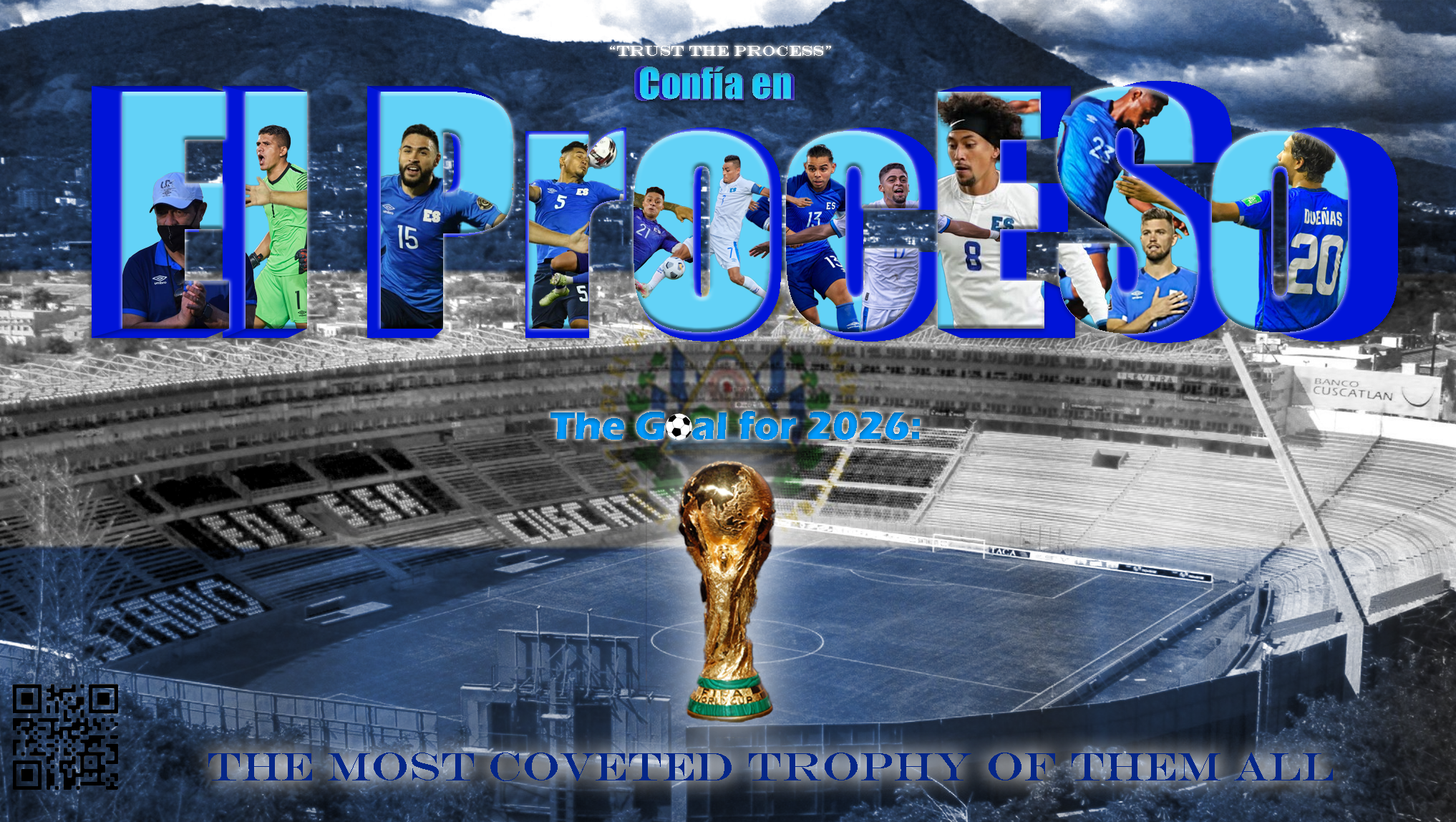
Lastly, for the final project I decided to expand on my previously acquired GIMP skills in order to create a more professional image. This project specifically allowed me to recognize the development of my skills over the course of the semester. My original idea was to cut out images of players with a faded image of PNC park in the background with text reading “let’s go bucs!”. The lines of the original image, although already better than the first GIMP image I created, were still not sharp enough. In order to remedy this, I started playing around with the GIMP features and eventually used the edge-detect feature. This sharpened the image and distorted the colors. I decided that I liked the appearance of this newly developed image better and decided to enhance the saturation of the overall image in order to accomplish the final image itself. Lastly, I cut out the image of the mascot and scaled the images of all the players and text in order to finalize the image overall. Allowing myself to inspect different features on GIMP until I made a desired product proved the newfound confidence I developed within this course when using technology.
Final Thoughts
Throughout the course, I was surprised how easy it was to develop skills that previously seemed impossible for me to achieve. For example, HTML and CSS were two programs that I not only had no prior experience with, but did not think I was capable of. Within that unit, I noticed it was important to take new skills one step at a time in order to stop myself from becoming too overwhelmed. I also was surprised to see how comfortable I became with trusting myself to learn a new skill. Before this course, I felt I needed an experienced teacher to guide me through new skills and would consistently say that I was just blatantly bad at using technology. Near the end of the course I realized some simple Googling and playing around with the different features of a new program allowed me to gain the experience I needed to use the programs themselves. I no longer feel that I am bad at using technology, rather that I am simply in the process of learning how to develop new technological skills. Moving forward I plan to continue building upon the skills I have required within this course. Because I want to pursue social media marketing as a future career, it is important to me that I am proficient in video and image editing. Although we did not specifically work on video editing within this course, the adaptability I acquired from this course itself makes me confident I will be able to navigate those programs and teach myself their features. I also plan to continue creating new projects on GIMP in order to continue furthering my experience with the different features within the program. Overall, this course has been a very transformative and informative experience for me and I will take the skills I learned throughout the course into my daily life and future career.
Projects | Repo |
---|---|
Audio Narrative | https://github.com/glittaua/soundscape2022spring |
Visual Argument | https://github.com/glittaua/visual-argument-2022spring |
Website Project | https://github.com/glittaua/webs2022spring |
Consolidation Project | https://github.com/glittaua/cdmfinalproject |
I did not know what to expect when coming into this class. However, I was very excited because every class that I had prior to this one did not allow me to use my creativity. The entire class was unknown territory for me. I had no experience with any of the software we used. Audacity, GIMP, Atom, and even Github were all new to me. I think the easiest software to use was Audacity and the hardest was GIMP. Throughout the class I found myself spending time researching how to actually accomplish things instead of brute-forcing them. I found myself invested in the process of creating. As pieces of the puzzles came together I sometimes got carried away in adding or editing and had to dial it back. Looking at the class as a whole I can say without a doubt this has been one of my most fun classes. It was very fulfilling to see my work come together in a coherent and complete fashion. I felt a great sense of accomplishment when something I wanted to do worked especially in coding. Building something from scratch is always a challenge but the challenge was doubled in this class by having to learn the software along with it. One of the main ideas or themes that I will definitely take with me into future digital composition is flow. Having a good flow in a composition is key to holding the attention of the viewer or audience. When composing digital media there should be a story; people love a good story. Discussing and talking with my classmates, especially my tablemates, was extremely beneficial. They gave a fresh perspective on what I could improve or what I could change in my composition and often it looked better. Looking at my classmates’ compositions also helped me improve mine. Their compositions gave me new ideas and inspirations to try for myself. Along with their compositions, the feedback from people in class was very useful for each project.
For my audio project, I created a sci-fi battle scene. The sequence of events came to me organically as I adding in audio. I knew what I wanted to do from the start and it sort of evolved over time. Using my roommate’s voices and my own I brought Tharpe, Kingsley and the other characters to life. One important feature of the narrative was the sequence of traveling and being truly immersed in the battlefield. I also wanted the sound to be overwhelming, after all a battlefield is chaotic and loud, hence a lot of places had much clipping due to the amount of layered audio. A big piece of the narrative was timing. The music soundtrack SPEARHEAD by Kohta Yamamoto was dramatic with a good buildup. I wanted to time the climax of the entire narrative with that big tempo change around 1:45 in the soundtrack. Much of the timing of the narrative was built around this moment of fast-paced shooting and battle when the characters are dropped onto the planet’s surface. The track also has a sense of urgency to it with a fast synth underneath the heavy drum line. I also thought of sound distance when making this. Features such as the artillery shots while in the plane and the AA gun sounds are good examples. Using panning I made the AA gun explosions alternate to give more immersion to the listener. The artillery gun sounds I made louder and louder to signal getting closer to their objective. Finally, I was really proud of changing how the voices sounded from normal to walkie talkie. This was essential for my audio as it is obviously military based. To do this I had to use effects I had not previously used like equalization or high pass filter. In the end I used distortion and high pass filter to create the walkie effect as distortion added a nice static effect. For the extended tracks from Halo and 86, I used these tracks because they provided the perfect feel and background for what I was going for. The Halo ambience track is actually multiple map sounds mixed together for a fuller soundtrack and feeling and 86’s musical score could be used for things other than a battlefield. Overall, I had a lot of fun creating a story for this project and audacity was really to use.
Visual Argument Draft Final Visual Argument
For my visual argument I wanted it to embody the concept of hard work and accomplishment. I am a firm believer that anyone can do anything they put their heart and mind to. Enter, Cooper Kupp, a 0-star recruit who just had one of the greatest wide receiver seasons in the history of the NFL. Usually posters are read from top to bottom but mine is read from bottom to top and I think I do a good job of drawing viewer’s eyes down using a harsh red color that is very different from the rest of the poster. The strong glow around the red Cooper Kupp also helps draw attention to him. Useful tools included clone and heal to swap the number on Kupp’s jersey to better suit my message. A large amount of negative space behind the NFL Kupp’s was rectified by layering images denoting his accomplishments behind them. For this project, the feedback was especially helpful. I was able to edit the image to the point where even people who had not watched a single minute of football could understand the argument being put forward. One subtle message in the overall image is a strong, connected line from the stars all the way down to the red Cooper Kupp. It shows a strong emphasis on the fact that Kupp was a 0-star recruit and became a Super Bowl MVP, one of the most coveted and rarest achievements in football (after all there have only been 56 super bowls).
Finally, for my website project, I created an idea/concept I had for a long time before I even knew about this project. The often-asked question of “Where do you want to eat?” leads to nowhere usually, just twenty minutes of suggestions. With this website, the decision is made easier. I created a website that consolidated all the best places to eat in Pittsburgh and there were a lot of them. I used a black background to bring more attention to the food photos in terms of making them pop more and more vibrant. I also wanted each page to feel unique and therefore had multiple different style sheets to make this a reality.
Consolidation Project For my final consolidation project, I wanted to do something I had wanted to try out for a while and that was photoshopping myself with celebrities. I thought it would be a really fun concept and it turned out better than I thought. GIMP in particular I truly wanted to get better at using. I love editing the photos and this final project helped me with that. Being able to use editing tools like dodging and burning and healing helped me with experience. Also figuring out how to match photos so they looked alike was very challenging. Choosing this as a consolidation project was absolutely worth it and I will definitely continue to use GIMP in the future.
Reflection In terms of the unit goals and overall course outcomes, there was a lot to take in. Baseline was always fairly easy to meet and I did like the challenge of getting to that aspirational criteria. One of the main challenges I had when constructing my compositions was flow. Particularly with the audio project, timing was everything. When I work, I usually do not do outlines or plan a path out. I go where the wind takes me with projects and I do my best work in that setting. A lot of the times as well, the final product was very similar to what I had envisioned and I spent a little too much time trying to perfect it when I hit a wall. One of my biggest strengths this semester was the ability to actually work in a flow type of manner. I found that when I did this, new and experimental ideas seemed to come organically and I implemented them into my project with ease. If I did not like it, I at least learned something new and if I did like the result then everything worked out great! A good example would be the with the website we created. I knew I really wanted a navigation bar but could not figure out how to use one. Through some research and editing I made one and it worked perfectly. With the visual argument, I did not think of putting the quotes on the bottom until the very end. One of my classmate’s comments talked about the flow from bottom to top was good but they were a little confused on what the bottom photo meant. So, I decided to put quotes about the player to make the argument a little clearer. The area I think I improved the most in is hard to narrow down. I believe this class helped me improve in all areas of composition. A specific area I improved on in giving feedback. Having to review multiple people’s projects was much more beneficial than reviewing only one person’s which is the usual. Each project was different and because of these differences my criticisms had to adapt per project. One of the main things that surprised me was how easy the software we used were to learn. Audacity’s basic tools including panning, volume, etc. were very easy to understand and I do wish that we learned more complex tools in all the software. For instance, GIMP had a dodge and burn tool that people may not know about which lightens or darkens parts of an image. I personally know about this because I used to edit photos a lot but it is useful to know. For the coding project I wish we were taught how to do a tiny bit of JavaScript to make our websites look better. The assigned readings and assignments of “Interneting is Easy” were amazing and so helpful. But I think learning at least one more complex thing would have been nice. I think these projects were a good starting point if I ever have a digital media career. I will definitely continue to enhance my skills into the future.
Project | Link |
---|---|
Audio Narrative | https://github.com/isabellebautista/soundscape2022spring |
Visual Argument | https://github.com/isabellebautista/visual-argument-2022spring |
Website Project | https://github.com/isabellebautista/webs2022spring |
Final Project (Image) | https://github.com/isabellebautista/cdmfinalproject |
Thinking about where I was on the first day of class, I can remember your survey that you asked us to fill out. Each question asked us if we were comfortable with this program, then this one, then this one. I can confidently say each one I put "uncomfortable", and to be quite honest, that was a little scary for me. Usually, that type of class would have ended in me dropping out of it. However, I decided to test myself. I knew one or two people somewhat in the class which I know could help with the nerves.
After learning about the assignments, I can say I was very excited. I had never used any of the programming we were introduced to, for visual, website, or audio. But the first step was understanding Github. I remember sending emails to Ben asking him to basically spell it out for me. That was something I had never done before really, asking my professor for more information on things I didn't understand. But Ben is definitely the most patient and encouraging professor for this.
Audacity Project Final Project:
With the first project, I had little to no experience with audio editing. I used Garageband when I was around 12 for fun, but that was 10 years ago so I don't count it. I struggled a lot with an idea. I didn't want to do something too hard or something too easy. I remember brainstorming for a while, whenever I had free time, ultimately ending on the idea of doing a first date. Now looking back, I can see it as being simple, but at the time, I thought it was definitely enough for me to accomplish. I knew I could accomplish a storyline for this within the time constraint. I ran into a few issues with my track, from the volume of one sound like the male voice talking to the direction of the water pouring. These were all easily fixed with some feedback from others after they listened to the track. Then, I struggled with the timing of the conversation, but with help, was able to mix the two voices since they were not together, and compile them into one sound instead of one. I think at the end of the project, it sounded pretty believable and I am proud of what I created having no experience (and a lack of ideas) before the start.
Visual Project Final Project:
When this project was introduced, I was particularly excited, just because it relates the most to my marketing and branding interest. I had never used Photoshop or even heard of GIMP and usually if I were to do anything like this, I would use Picsart on my phone. I thought of the idea of sustainability, which is another interest of mine. Since we were asked to complete a rhetorical image, I wanted to persuade people to think about where their clothes come from. Since we talked about the different elements of images, I wanted to focus on the flow of the image. At first I was going to do some kind of outfit in the middle with the phrase, "What do your clothes cost?", but I changed it to this sort of process of what goes into the ending result; the clothes. I wanted a background image that would emphasize this, which led my choice. After that, I thought I could represent the different elements, like pollution, unhappy workers, little pay. Part of the reason I didn't change the 'little pay' icon was because I didn't know how to better represent it and did not really find what I wanted. In terms of the phrase at the bottom, I wanted to emphasize an important point that was made in the icons, which was the little pay. These all flowed into the stack of clothes at the right of the image. I wanted them to have some amount of color to stick out from the rest of the image. Overall, I think I accomplished the baseline criteria, with a little aspirational criteria. I think this unit of the most of them, taught me how to take feedback, and look at it as so instead of taking it as criticism.
Website Project Final Project: https://isabellebautista.github.io/webs2022spring/ When this project was introduced, I think I was the most intimidated of all the projects. I was fascinated by the examples you showed us and how those students were able to accomplish them. I knew I wanted to do a consignment or retail shop not just because it is one of my interests, but also because I thought I could complete it in an organized layout that was achievable. I thought that the 'interneting is hard' tutorials were extremely helpful. As I had no prior experience with HTML or CSS, I think this unit proved to be the one where I learned the most. With help from the tutorials and Ben, I was able to develop this grid layout to display my images in a way I see on a lot of retail websites. In addition to this, I really enjoyed getting feedback from other students in the class, including adding the social media at the bottom, changing the font and adding an interactive contact page. I thought these were definitely all necessary. If I had more time and these products were actually available for sale, I would make individual pages for each of the items listed. I would also ensure the contact information could be sent to an email when the form is filled out. Overall, I think the baseline criteria was definitely met and that I am satisfied with what I have created.
Final Project Final Project Visual: For this last project, I was unsure of what I wanted to do, but I knew I wanted to revisit the GIMP software to try and create something else. After brainstorming, I figured I could make a flyer for one of my favorite small businesses here on campus, JJ Poke. Anyone who knows me, knows I love this place. I knew the basics from the previous image I made, however instead of doing a kind of flowy path for the phrases, I wanted one in a circle, playing on the phrase, "Poké makes the world go round". I was able to use what I know from the path and text tools in the past and elevate it a little more by filling in the letters this time. I also used the same noun project website for the little icons. As well, in my baseline criteria, I definitely wanted a QR code this time. I saw a good amount of people do it in the first GIMP assignment and figured it would be appropriate for this one. Lastly, I wanted to follow the main color scheme for the restaurant itself, as it includes lots of bright colors like blues, oranges and yellows in their own marketing. Overall, I was able to use the last little time we had to complete this poster that I am satisfied with.
Final Reflection Throughout this course, I think I really surprised myself. I came into this class knowing nothing about the main software we worked with, Audacity, GIMP, HTML and CSS. With other people in the class knowing how to work some of these, it was hard not to compare. I thought the baseline and aspirational criteria were both attainable, helping each of us to push ourselves to see what we could do. Through using Audacity I learned how to compile two clips into one and how to bring a situation to life without actually being in it. In the Visual unit, I learned how to layer images and put them together, creating a rhetorical image. In the website unit, I learned how to make and edit a website from nothing. What was extremely helpful throughout all of this, was the feedback from others. Sometimes, it is hard to take a step away from your own work and figure out what's missing. Having an extra set of eyes to look and assess is really necessary. This is essentially the area I most improved on. I have a really hard time taking feedback and not seeing it as criticism, but I think this class and environment made it really easy to change that viewpoint. Since we did that for each unit, I got more and more comfortable with the suggestions that people were giving me. In terms of my skills, I essentially improved on every single composition of digital media. I mean, I didn't know how to do any of this before and now I feel as though I could walk my friend through it if they asked me a question. For the future, since I am interested in branding and marketing, I plan on including the skills I have learned in this class in projects and assignments to come. I know that the Visual Unit and the Website Unit will be especially helpful for possible job opportunities and positions. As far as improving on my acceptance of feedback, that will be transferable in everyday life. I hope to now be more comfortable with this and remind myself that suggestions are not criticism, rather just something else to consider that I might not have before. If I had one piece of advice to give to any student about to take this class, I would tell them not to quit. The projects and assignments may seem hard and challenging, but everyone here is going through it and helping you along the way.
I did not know what to expect when coming to this class because I thought this class would be focusing solely on composing digital media using HTML and CSS. However, after completing the course I have gained skills using various types of digital media tools that I can use in the future.
For this project, I did a “Night at the Orchestra” where the listeners go on a night out with a woman who is going to the orchestra. However, near the end, the listeners are surprised that the conductor passed out on stage. So, the only “orchestra” the narrator and listener hears is the ambulance sirens as they come to rescue the conductor.
This was the hardest project for me. I had never used Audacity before, and I do not consider myself a creative person, so I did not have any ideas on what I wanted to convey in the narrative. This is where I found the examples of previous projects extremely helpful. Not only for this unit, but for the others as well. I also struggled because I was not overly enthusiastic about the topic I was doing my project on. And I did not realize until it was almost over that I would need quality equipment to get the sound that I wanted.
Even though I struggled in certain aspects, considering this was the first time I used Audacity, I am proud of the finished project. I used effects such as the fading in and out effect to let the listener know when the narrator was entering a new space. I also did research and found the Filter Curve EQ effect which created an effect on my voice that made it sound like I was using a walk-talkie. In the narrative, it made it seem like there was a ticket collector. Also, I implemented feedback from my peers which was to add more dialogue. I did this by including a conversation on the phone to let the listener know what was going on in the beginning. I achieved this by going to Hillman and renting out professional podcast equipment.
My biggest struggle was that I could not convey what was going on, especially when the conductor passed out. It was also hard trying to find a sound that sounded like a human falling. I realized later that if I had the opportunity, I would record myself falling to create a more realistic sound. However, I did find a sound of a bag falling which sounded similar. I also would have added more dialogue because based off the comments my peers made, they were somewhat unsure of what happened and why an ambulance came.
For the final portfolio I ended up keeping the audio narrative the same due to lack of time, but as I mentioned above there are some aspects I would have changed.
For my visual argument, I wanted to bring to light how fast-food industry uses factory farming and tries to hide it. Therefore, I named my visual argument "Quality is in our Food" which is like one of a Fast-Food slogan. It is supposed to be ironic because how can they care about the quality of their food when they do not even care about the quality of the living conditions that they get their food from. I also wanted to bring light to the cruelty of factory farming and the conditions that the animals live in.
In this unit, I started getting comfortable with GitHub Desktop and being creative. In the beginning, I struggled with GIMP because I could not figure out how to move the layers around with moving the whole image. However, I was able to figure it out by just working on my project. Once I figured that out, it was a simple project. Unlike the last unit, I was able to convey my message better.
This is also where I learned the most about composition. Julia Thompson’s articles on graphic design helped me in this unit and I can see myself using that knowledge in future. Her lesson in dominance and hierarchy is what I used the most. She wrote that the biggest element in your design is the first thing the viewer sees. I wanted the viewer to see the text at the top that said top quality chicken first so as they look down at the rest of the image, they will see I am being sarcastic. Her article on negative space impacted my argument as well because I had blurred the background of the chickens in cages using the Gaussian blur which created negative space. The hands with the chicken nuggets are regular to show how these companies are distracting the viewer and “blurring” the reality of where their food comes from. This was the project that surprised me the most because I was not interested in anything else but the website unit. However, I really enjoyed making this project.
For my final portfolio, I revised this project. This was a project I was enthusiastic about and there was not much to change based off Ben’s feedback. He had said that there might be too much blur on the background. So, I redid the blur, but I used the lens blur instead so I could adjust the blurriness. I also made the hands with the chicken nuggets smaller so the viewer would be able to see the dead chicken clearer. He also mentioned the text blocked out the claustrophobic nature of the cages. So, I got rid of the chicken text of the image because it seemed redundant and so the viewer can see the chickens in the cages clearer.
For this project, I decided to make a website about astrology. My website is a one that allows people who are interested in astrology and horoscopes to learn and enjoy an array of information. In total, I had sixteen pages, so I was able to practice my HTML skills. Thompson’s article on dominance and hierarchy helped me here too because based on what I wanted the user to see first, depended on the header tag I used. Also, after learning about repetition in her rhythm and movement article I decided to include it on my homepage with the horoscope buttons. My peer’s feedback also helped me because before the buttons were in a straight line and reached the edge of the page. They suggested that I split it into two rows, so the buttons do not reach the edge. I took their advice by adding a grid layout and adding margins to the page.
This was the unit I was looking forward to the most. I had taken a Website Development and Design class before, but because of the pandemic, it was cut short. Before I did not understand HTML elements (i.e., divs and padding) very well, but after this unit I finally learned. I want to continue developing these skills by taking more classes and finding projects to do online for practice. The only thing I would change about this unit is I wish we would have learned about JavaScript. It would have been interesting to learn how to add an interactive element on the website.
For my final portfolio, I ended up keeping my website the same, once again due to lack of time. However, I think the only thing I would change is I would have liked to add a new page where people are able to calculate the compatibility between two signs.
For my consolidation project, I decided to make a website for my mom’s hair salon. It includes a home page, services page, products page, a consultation page. Existing and potential clients will use it to find out information about the shop and be able to talk to the stylists when it is convenient for them. There is also the logo of the salon in the navigation bar of each page, so it focuses the users' attention and creates a strong first impression. I wanted to solidify my HTML, CSS, and GIMP skills with this project by creating a new website and a logo.
I focused more on CSS for this website since I wanted it to make it look professional. I wanted it to look simple and sleek, so I just used black and white for the overall theme. I accomplished all my baseline goals and for my aspirational goals I added a dark mode to the website by using JavaScript. In my original proposal, I said that I wanted to do a calendar page, but I decided against it. This is because it was too much to do in the timeframe and if I let people schedule their own appointments, they could potentially change someone else’s. So, instead I decided to do a consultation page where they can schedule a consultation and the salon would call them at the time they scheduled. This would reduce the amount of phone calls to the shop which would be beneficial. I once again used a grid layout for the index and products pages. I used JavaScript for the consultation page and for the dark and light mode.
For me, this was the best project I have done. It looks professional and like an actual website. I am proud of this project, and it contains a lot of the skills and knowledge I gained this semester. I want to continue working on this because I did not get to add a mobile phone layout due to lack of time. Also, because I have been trying to make a website for my mom since I took the Website Development and Design class. Unfortunately, I do not have any pictures of the website I made for that class, but this one is an extreme improvement.
Over the course of the semester, I truly grasped what it means to compose digital media. After taking the class, I would not change the structure in any way. The way the units are structured allowed me to use my skills in the previous unit for the next. I used the GIMP skills from the visual unit in my website and final projects. Those skills allowed me to create a logo for my website, resize images, and convert wepb images into jpg and png images. However, the biggest skill that I learned was the ability to receive feedback. Before I did not take feedback well because I took it personally. However, after seeing my peers provide quality advice really helped me see the importance of it. Specifically after applying the peer feedback to my website and audacity projects, I feel that they improved significantly. Not only did I learn technical skills in this course, but personal skills as well. Overall, this was a great class and I thoroughly enjoyed it.
Audio - https://github.com/elisewebb6/soundscape2022spring Visual - https://github.com/elisewebb6/visual-argument-2022spring Website - https://github.com/elisewebb6/webs2022spring
Reflection
Taking this class with very minimal digital media experience was pretty intimidating and overwhelming at first. However throughout the course I not only developed new knowledge and skills but confidence as well. I found that with each project I was able to more effectively use my resources and feedback along with hit more of the aspirational goals as well. Looking back I found one of the more challenging tasks actually to be learning how Github worked. It took me a few weeks and some researching to finally get the hang of it. Eventually I understood the point of the commits and was able to make them not only more meaningful but more often. Github by the end was very helpful to have while working on my projects as I could go back and reflect on my progress at any point. It also kept all my projects and work very organized.
Another huge takeaway I got from this class was the importance of patience and perseverance. There were a lot of times where I was really frustrated and struggling with using these digital media tools. I found some of them, especially GIMP, to not be very beginner friendly. However at the end of each project I was able to compose a piece of work that I was very proud of. One of the more challenging parts of being a beginner was coming up with project ideas not knowing what I would be capable of doing. However each time I ended up being surprised by the work I was able to accomplish. Overall this class was very beneficial for my growth and left me with many great skills. One thing I found particularly helpful were peer review days. It was neat to see what everyone came up with under the same set of guidelines and tools. Giving and receiving feedback also sparked my own creativity and allowed me to make positive changes to my own work.
For my audio project I found Audacity probably to be the easiest to figure out and I felt that I was able to learn how to use its features pretty quickly. The hardest part of this project was trying to find sounds to use. If I had more time I would have liked to have tried to have record more of the sounds myself. Another thing I thought was going to be difficult in this unit was making sure I hit the 3 minute baseline criteria. However after I found all my sounds and started putting them together I found myself reaching the 4 and 5 minute mark very quickly. With this project I specifically focused on layering the sounds and blending them together in order to get a very continuous audio track. My project was based on the growth of a child which is a very continuous thing so I did not want awkward pauses in-between sounds and for it to come across as chunky. During this unit I often forgot to take screenshots during my progress and slacked on making commits as I would get pretty focused on my work and forget. However over the next few units I noticed that I did get better at this and would do it way more often.
Visual
Looking back my visual argument project probably took me the longest to complete. I have gotten into photography over the past few years so from the start I knew I wanted to find a way to incorporate it into this unit. I started with just a few pictures and tried to find a way/tool that would nicely blend them so they looked like part of the eye. After playing with the transparency and the invert feature I was able to get this specific look as seen above. What took so long about this project was figuring out how to originally use GIMP's features and aligning the pictures so the colors blended nicely. I had to try many different techniques until I finally found a way I liked. I honestly did not enjoy this unit as much as I thought I would, probably because it did not come as naturally to me as the other units. However, I do feel that I learned a lot and I was able to see the complexity behind photoshop and how much skill is really required.
Website
My favorite unit overall was probably working on my website. I found the "Coding is Hard" page to be really helpful and allowed me to really grasp this unit. However it was pretty time consuming to work on so I was not able to accomplish everything I wanted to by the end of the semester. I decided to continue working on it for my consolidation project to try and make it more appealing and organized. Originally my home page had no grid and the font did not really suite the website and its overall purpose. After rearranging the structure and playing around with the font I was able to give the home page a much more modern and refreshed look.
I drastically changed the recipes page as well. I added pictures and also added a grid to this page to make it more appealing and organized for users.
I originally wanted to get the contact page actually set up but realized it would require me to download more software and was a lot more complicated than I thought especially with the time constraints. Maybe this is something I will one day teach myself in the future as I would like to continue practicing website building. I believe it is a great skill to have and would be very helpful to know how to do.
Below are links to all my repos:
Repo | Link |
---|---|
Audio Narrative | https://github.com/andres-trujillo7/soundscape2022spring |
Visual Argument | https://github.com/andres-trujillo7/visual-argument-2022spring |
Website | https://github.com/andres-trujillo7/webs2022spring |
As someone who wants to expand my skillset and expose myself to new challenges, when looking for classes to satisfy requirements for my CS major, I wanted to take something that I thought would truly benefit me. I've always wanted to learn web design and when I saw that there was a class that included learning HTML/CSS as a part of it, and knew right away I had to enroll in this class. Little did I know however that I would enjoy the other components of this course (audio/video projects) just as much as learning web design.
Let me take a brief intermission before I continue discussing the different forms of media we worked with in this course. I would say the MOST beneficial part of this course was the "studio" format, namely the feedback portion. Going into this semester, peer reviewing wasn't exactly my forté. For example, if a peer had a solid base for a paper, I'd struggle to give them feedback, so I'd just simply say what I would do if I were them, or try to knitpick some grammer mistakes. However, in this course we were given a guideline for peer reviewing. With this guideline, I made sure I hit every point and then as we started working on subsequent projects, I didn't even need to refer back to the guidelines as I would soon start hitting every point without even realizing. It came naturally to me, and I couldn't have done it without those guidelines. This course made me realize how truly important peer reviewing is. Seeing through the lens of another person is so incredibly important because you can see something that you would never have seen without consulting another. The peer reviewing in this course gave me new ideas, allowed me to fix things that were needed repairing, and become better at effectively communicating with others.
For all three of the main projects in this course, I had a clear-cut idea of what I wanted to do for each. For the audio and visual projects, I fortunately never hit any roadblocks. However, I cannot say the same for the web design project. I hit many roadblocks whether they be not knowing how I wanted to design a certain page or not knowing how to implement something. If something were too ambitious, then I'd modify the goal to make it attainable. However, for everything that should have been within reach for me, then I'd make the effort to go the extra mile to make it a reality regardless of if I was struggling with it or not. If I knew something was within reach but reached a deadend, I would make a new path out of the deadend by asking for help. To provide a specific example, I'm going to discuss a frustrating-to-implement part of my website portfolio. On my "coding projects" page I wanted to include a giant animated button with the github logo, but when I tried to do that, it ruined the formatting of the entire page. I spent hours on trying to "fix" it by watching coumtless YouTube videos and visiting many websites but got nowhere. So, I wanted to give Office Hours a try. This ended up paying off completely. I talked to Ben about what I wanted to do and he helped me make that a reality. This taught me that if you are every truly lost and have an available resource that can guide you, reach out and ask for help!
Coming into this class, I had very little experience with audacity. My only experience was putting songs I had downloaded on my laptop into audacity and trying out the different types of effects to see that exactly they did. I will say that doing that helped me in my audio narrative, as for the most part, I knew what effect I had to use to do what I wanted.
For my audio narrative, I wanted to make a story involving something that I enjoyed doing and knew had sounds that provided me with a sense of seratonin. This thing I that enjoyed doing was walking. Of course, my narrative couldn't simply be me walking so after being assigned this project, I lied in bed the same night and thought of some sort of story I could incorporate walking into. Thus, "The Winter Walk" was born.
I was very happy to know that I was approved to use Photoshop instead of GIMP for this project because I have some experience working with Photoshop because I took a computer aided graphics course in high school and I prefer the interface for Photoshop.
Within the past year, I have had two opportunuties to choose my own topic in which I have to make an argument and support it. One was an essay I had to write for one of my Spanish classes and another was this visual argument project. I chose the same argument for both. This argument was that I believe the El Salvador national soccer team will qualify for the 2026 world cup because of "el proceso" of coach Hugo Pérez. Because I am so passionate about this subject, I would say this was by far my favorite project and least difficult of the three because I had the most experience with working with Photoshop and I was having fun every step of the way.
Despite this being the most difficult and stressful project, this was the project I was looking forward to most. It was the most difficult for a plethora of reasons with number one being that I had absolutely no experience in working with HTML/CSS coming into this class which makes sense. While we did have the resources to make a basic website possible, I was a little to ambitious in the beginning. I wanted to do to many things that were not possible given the amount of time and practice I had. I spoke about this in the first part of my reflection (paragraph 3), but I'm going to provide screenshots on the changes I made to the Github "button" on my "Coding Projects" page after consulting with Ben.
Before:
After:
For my final project, I decided to add some fixes and additional features to my originally handed-in website. The first thing I added was a "Back to Top" button in the footer of my website. I realized my website needed this when I wanted to jump around my website quicker. I like for things to work efficiently and quickly so I figured this would save some time compared to having to scroll to the top every time I want to accesss the nav bar. I also added in my resume, and added to the "About Me" section on the home page. Of course, I dealt with the issue of having very limited time to work on this, and like I said I had many ambitions for this project when we were first assigned it, so I definitely plan on working on this over the summer. I intend to learn more about HTML/CSS and some JavaScript to make all the ambitions I had in the beginning a reality.
My favorite part of this course was that this was the first time I had every taken a class where we were actually rewarded for taking risks regardless of the outcome. Usually, if there was a negative outcome, we'd be penalized in our grade. That was not the case here. I think that being rewarded for taking risks provides an incentive for being more creative and not thinking twice about if an interesting idea we have is even worth considering. With that being said, Thank you, Ben.
I will start with a bit of a confession: I did not think I would ever take a course from the ENGCMP department. I am a CS major and did not like my high school English classes very much. The only real reason this course was even on my radar was because it filled my technical writing requirement for the SCI degree, and I felt like it was a toss-up between this course and Dr. Quigley's Technical Writing course. I broke the tie based on the recommendation of a couple friends who took this course last year, and because it genuinely looked more interesting. I am truly glad I chose the way I did - although I was worried that this course would be less "practical" than the Technical Writing course, I think that I have gained a lot this semester. Let's discuss, shall we?
The soundscape project was one that I had a lot of fun with. I was able to integrate my prior interest in D&D into a brand new medium that I had effectively never touched, all while creating my own assets via recording my friends' dialogue and going out into Schenley Park to pick up nature sounds. Plus, a little bit of foley allowed me to put some finishing touches on the sound.
In my opinion, this was probably my most creative project of the three. I had actually had the idea for what I wanted to create before the project was officially introduced (I think I did some reading ahead), and throughout the production, I had a very clear picture (well, not a picture...) of what I wanted it to sound like. I was able to use that artistic vision to guide me through the entire project. This sort of clear creative roadpath is something that I find very rare so I was excited to just be able to follow my instincts and do what drove me. Noticing when that opportunity arises is an important skill that I hope I've developed a little bit.
As mentioned before, I had extremely minimal experience with Audacity before this project. That ended up not being a roadblock at all, as I quickly took to the software and had fun playing with it, experimenting, and trying new effects. In fact, throughout this class, I often found myself working with things largely unfamiliar to me, and it never was a big deal. This experience has been somewhat illuminating for me, as I usually want to get a baseline of how something works before using it. I think that's still true to an extent, but that that baseline I need is probably a lot lower than I usually set it - I think I really only need the basics before I start playing with something, not every facet that would take years to master. In a way, it was freeing to be forced to use things I wasn't so familiar with, and to confront my perfectionist ideas that I need to learn everything before using it (an idea that nullifies the importance of learning through experience).
This project I struggled a bit more with - not technically, per se, but rather, creatively. In constrast to the soundscape, I really had no idea what I wanted this to be, and found the brainstorming session to be very helpful. My leading contender for this project was actually a satire piece about NFTs. (The general idea was a parody of the Microsoft Solitaire win screen with the cards bouncing around, except each card was a Bored Ape NFT - commenting on how NFTs aren't so unique after all.) However, I took it in a fully different direction because my other idea, while I had a clear vision for it, felt difficult to create. In retrospect, maybe I should have gone with my original idea, embodying the idea of 'following my instincts' I discussed. Or, maybe the grass is just greener on the other side. Hard to tell.
Either way, I think it was also good experience to go into a project with a more malleable vision and allowing it to shift a bit over time and through revision. Revision was quite important for my visual argument - both our formal in-class revision process, and my personal revisions and changes of heart. Part of the benefit of not having a set in stone vision is that when things don't work out so well, it's easier to pivot. In this instance, I had originally had my heart set on this red and blue "glass bullet hole" style pattern, as the preview below shows.
However, what you don't see in that preview is the multiple hours of my trying to edit, crop, and blend that image into the background, largely unsuccessfully (in my opinion). Perhaps if I were a GIMP/Photoshop expert, I'd know how to make it work. However, I am not that - instead, I am a student who was (in all likelihood) quickly running up against a deadline. So, I was able to pivot to the "glass fracture" style that worked out a lot better.
Indeed, I think this pivot helped me get more useful feedback during our in class workshops. If I hadn't made the decision to pivot early, I still likely would have pivoted later, and then my feedback would have been less relevant since it would have related to the discarded idea. (Then again, maybe the feedback would have helped me develop and implement my original idea to my satisfaction. Another case where there isn't a right answer. This ain't mathematics!) In contrast, with the website project (excuse the break in chronology), I made the decision to just focus on HTML before CSS, which meant that my feedback was less precise (largely, it was "write CSS"). This is not something I blame my reviewers for, but rather a mistake on my part for not giving them the opportunity to give me great feedback and not utilizing an important tool to its fullest.
As a final thought on our in-class revisions, I really appreciate the emphasis you've put on respectful feedback and constructive criticism. That being said, sometimes I feel like I might have benefited from somewhat harsher/more thorough feedback. Recognizing that that's not something everyone wants, perhaps an option for future semesters could be to make an opt-in mode for more rigorous feedback.
Finally we come to the website. Writing a personal website has been something I wanted to do for a while now and never really got around to. It's also the most obviously applicable to my career in CS. And honestly, it was a lot of fun (except when I'm stuck for hours debugging why my flexbox doesn't work, and its because I wrote display: flexbox
and not display: flex
...). This is the project that took up the most of my time and will continue to take up my time, as I hope for it to be a living document. It's also the only project this semester where there isn't a clear end goal in sight - I am sure that I will keep revising, learning, and expanding, as I go from a pure static site to cobbled-together fragments of Javascript to, hopefully, even more sophisticated designs. However, I am still proud of how it is right now - sometimes, simplicity is key.
I chose to work on the website for my consolidation project as well, getting it to a more professional looking project with a bit more visual interest. Overall, it was more of an extension of the website unit than a synthesis of the course as a whole, but I do want to share one instance where there was crossover.
On my resume, there is this cool image slider that I've used to help illustrate one of the key takeaways from my pram2mesa research project I did in Summer 2020. However, what you likely don't know is that the two graphs being compared were actually created using slightly different settings and so they didn't line up so neatly:
I actually had to edit one in GIMP using some pretty precise measurements to line it up with the other exactly and to look consistent. This is something I likely would not have been able to do before the visual argument project, and I thought it was a nice example of past projects paying forward the skills I learned from them. While I don't have an example of my Audacity skills coming in handy for another project, I suspect there will be a time in my future where I'll be glad I know how to edit audio.
(The edited version)
I will actually be doing a UI/UX/frontend CS internship this summer, which means that taking this course now has worked out well timing-wise. I'm excited to see exactly what I can transfer from here to my work, and where I can continue to level up further. I'm sure that I will learn things at my internship that I can use on my website, and hopefully, some things I've learned here will be useful there. This front-end side of things is not where I envisioned my career path going, and it may still change again. But I'm grateful to you for leading this course and giving me an opportunity to take unusual branches, take risks, and try new things. As cliche as it is, this is really the beginning, and no matter where my future ends up, the principles of learning to engage others, no matter the medium, will carry. So, thank you for engaging me and my classmates this semester; for allowing us to work at our own pace; for giving us room to grow, no matter where we started; and for being gracious and kind throughout. It's been a blast - may we meet again!
<!DOCTYPE html>
Project | Link |
---|---|
Audio Narrative | https://github.com/kfm24/soundscape2022spring |
Visual Argument | https://github.com/kfm24a/visual-argument-2022spring |
Website Project | https://github.com/kfm24/webs2022spring |
The ideas that have been most helpful came from my professor, peers, and friends. It is easy to assume what you created makes sense after working on it for so long; however, it is important to get an outside perspective to see if your creation translates well to others. I learned this lesson the most during the visual component of this course. I found myself getting discouraged when my peers and friends did not understand the visual argument I was trying to convey. After getting numerous feedback saying similar things about being confused I decided to use constructive criticism to better portray my argument about the prison system reform. I ended up being much more satisfied with my final visual and people were better able to identify the message I had initially intended to argue. From this unit I learned that asking for another opinion can be very helpful and I think that will translate into future situations especially regarding creative design. It will not be as impactful if the creator is the only one who understands the creation. Due to the resource of having at least three pieces of feedback I decided to revisie my three main projects for my final portfolio. Advice from my friends, peers, and professor were all taken into consideration as I went through my audio, visual and webpage portions of the class to better meet baseline and aspirational criteria.
Earlier Visual Draft:
Final Visual:
I felt the most successful within my visual argument and the web design sections of the class. I am proud of the work I put into both projects and I really enjoyed the visual elements of these projects. I think I grew from the visual section of this project since I had to restart several times. In the end I fine tweaked some things like changing the glow to the book to a glow coming from the book. Another change I made was to add a link to credit the images and creators of the images and icons I used for the piece. Missing the baseline criteria was eye opening and showed me that it is important to give credit where is it due and make sure that you check off all boxes before submitting an assignment. Throughout this course I probably had the most questions I have ever had in a class since high school. It was awesome learning all of these new things however it happened very quickly with lots of new information. An additional transferable tool I am taking away is asking more questions. In other classes it has been easier to keep my head down and ask friends to help me understand a certain topic. However, since this class was more dense and fast paced I found that asking peers and my professor(in the future my supervisor) more questions. Going to office hours helped me with this course and even when I do not want to have more one-on-one help it can be very useful!
During the audio section of this course I was pushed out of my comfort zone to try new things and since it was our first project it seemed overwhelming to use Audacity. For my revision of this project I decided to have the girls of the audio walk out of the bar and talk to their friend (who needed to get away from a boy) from two different sides. I played with the right and left sound levels to make the audience feel as though they were the main character listening to her two friends through her right and left ears. Here are screenshots of my final audio.
Part of why I felt most successful about my website is because of how difficult it was at first. The html coding was a new language to me and the hardest aspect of it was thinking that I was in the minority of the class as I did not know one thing about coding. After attending office hours and many times through the coding tutorials I was able to fix an issue within my coding on my own. It was awesome to feel like I could still learn new, challenging tasks and be able to see my work progress. For example, I realized that an image I had uploaded on my site was not appearing but instead only the alt text was showing up on the page. I realized that I did not put the image in the “image” folder of Git and it fixed my issue. It was not easy to learn these new tools that we have worked with however, it made me feel like I was still learning new things even in my last semester of college. This is my website as of now and recently I added more info about me and my experience as well as description for my creations (why I made them, when I made them). I am excited to add more in the future!
https://kfm24.github.io/webs2022spring/
Here is a screenshot of my most recent website:
During this course I was surprised at how difficult it was for me to adjust to new concepts and features. For some reason I had a strangely hard time staying organized and keeping with the assignments since everything was not solely on canvas like my other courses. I appreciated how the class website was set up but I needed time to adjust to using it. With that said, I felt that the class was more manageable once I grew accustomed to the class link and daily recaps. For the next sections of this class I would suggest allowing people to work together for other projects. I feel as though people were shy to work with others for the final projects since we were not aware of how each other worked. I also think that sharing our creations is a great way to learn from each other and spark questions/conversations. After every section I found myself wondering what everyone else’s creations looked like so possibly more sharing of the awesomeness for your next students.
Currently, I am applying for jobs and I would ideally like to do something with a creative element. I am not sure how that may happen however in the meantime I plan to continue helping others with their event flyers, resumes etc. and now I have the ability to help with audios, and (some) website coding if needed. Podcasts have always interested me and after graduation I might need something to take up my free time so starting my own podcast with audacity about my mental health journey could be a productive way to combine my experience and learned skills. I can simply interview people and ask them to send me voice memos and use the new tool to edit and compose different episodes. Another tool I will keep will be Atom and html coding. I ended up being quite proud of my website and plan on learning more about coding to play around with my website and one day send it to future employers. I hope to add sections with my aspirations, interests, and my personal mission statement.
Rita's fundraiser flier I helped with recently:
Project | Link |
---|---|
Soundscape Narrative | https://github.com/alocampo/soundscape2022spring |
Visual Argument | https://github.com/alocampo/visual-argument-2022spring |
Website Portfolio | https://github.com/alocampo/webs2022spring |
Consolidation | https://github.com/alocampo/delaceys-cottage |
Prior to this class, I've had a lot of experience dabbling into creating digital media, but I've never had any experience trying to formalize my process or conceptualize my works through any structure. While these units taught me several technical skills in actually making media, I think my most valuable takeaways regard the pre-production phase. Learning to explore what about an idea actually interests me and establishing baselines for how a project will be executed have been incredibly helpful in all my work in this class.
When I first decided to create a heist narrative, I felt both excited about creating such a fun environment but also daunted by the prospect of needing to actually design that environment. Primarily, the fact that audio projects are multidimensional (you can layer sounds on top of each other, and the sounds progress through time) felt difficult to navigate on top of writing a story. I ended up looking back on the free writes at the beginning of the unit to help me break down what sounds I should expect in this kind of environment. Through that, my main concerns could transition from "What could happen?" and instead direct into "What events could tie these core sounds together?" Ultimately I feel like that made the end result much more cohesive.
By peer review, I had a mostly-complete project. Almost everything was in the order I wanted it to be and I feel like the narrative was cohesive.
Of all the units, I think peer review helped me the most here. In other units, I already had ideas about what more needed to be done to finish the projects, however, in this unit I felt so close to completion that I couldn't really tell what I felt was missing. This is another big takeaway from this class; almost everything I do creatively is an independent passion project, but my work can be monumentally improved if I just let someone see it before I declare it finished.
Overall, I think that my genuine excitement about the concept of this piece really let me power through my struggles in executing it. After getting over the first bit of overwhelm about outlining this project I was surprised at how naturally I adapted to Audacity. I think this piece has a lot of personality and I'm proud of the story I was able to tell. I felt a little challenged by trying to balance explicitly telling the story and letting the sounds speak for themselves. I think the final product comes to a nice balance between those two.
I felt very confident going into this unit. Although I mostly do illustration, visual design is definitely in my wheelhouse. Knowing that I had a preexisting grasp on the processes in this unit, I made it my goal to really push myself by honing in on the technical skills.
But first, I want to touch on the readings/course material related to this unit. I do digital art, yes, but because I focus so much on reference drawing and learning through practice, a lot of the fundamentals of design are things I execute but don't really know. Much of the information on arrangement, hierarchy, contrast, and so on are things that felt a little obvious to me but I truly would not have thought of any of that while drafting my piece if it weren't for the readings. Julie Thompson's articles breaking down the aspects of design are effective in relaying the information while still leaving the principles general enough to be applied everywhere. Again, setting the groundwork before undergoing a project has been incredibly helpful in my compositions.
Alongside getting used to GIMP instead of my usual software, my main struggle in this unit what the level of tedium I caused by being so particular in what I wanted. I think the resulting image is worth it, but this is one of those projects where if a deadline didn't exist I would never stop tweaking it. I don't regret the subject matter I chose—how silly this piece is truly sparks so much joy—but while trying to push my technical skills I think I got a little caught up in the idea that more difficult equals better for a moment. Genuinely, I think GIMP crashing and losing my progress helped me here.
Nearing the end of the unit, I knew what I still had left to do because I had already done most of it before. Knowing that it would not be possible to get my project exactly back to where it was before let me loosen up a little and accept there are infinite ways that this can end up as a "good piece."
I think the end product fulfills what I wanted it to fulfill. I satisfied my desire to get in the weeds of applying GIMP and the outcome itself hits the tone I was going for.
This unit was the hardest by far. Not only was it challenging to conceptualize what designs would work mostly from scratch, but the tools we used to get to a finished website were also difficult to learn. Out the gate I want to acknowledge the CSS Diner; for this whole unit I basically had that tab open and constantly flipped through it while debugging my stylesheet.
I think what was most frustrating about this unit for me was that I am familiar with coding as a whole—I'm working toward a CS minor, I've had internships in R&D, I'd say I'm pretty locked-down on the mindset of writing code—but for the life of me I could not unscramble how to transfer from the underlying structures into the technicals of designing the website. What I mean is, I feel like I was constantly readapting what the HTML was because I'd realize that the way I was organizing my elements wasn't conducive to how I wanted them designed by the CSS. Unlike my normal coding process, problem-solving felt so nonlinear. I spent most of my time in this project fighting with my code rather than making design decisions.
Pretty earlier into the project, I knew my goalposts had to shift. Although that's a little disappointing, I think that's a bit of an achievement for me nonetheless; I really don't like when I'm not immediately good at things or when I have to admit a project isn't panning out. So even if that's not directly about digital composition it's still an improvement in my mindset and identity as a creator. I still like my final product. I think that shifting my focus on digesting the code instead of brute-forcing myself through creating more intricate web layouts was the best choice I could have made in terms of using this class to improve my media-making.
It's not perfect, but I'm proud of the extent to which my responsive design works. I think I ended this unit with a decent understanding of how HTML & CSS work. I'm taking a course on programming for web applications next semester, so I hope that this experience gives me a bit of a taste of the challenges I anticipate for the future. Ultimately, I feel dedicated to improving in this field and want to circle back to this project someday. At the very least, clear out the lorem ipsum!
I had a lot of ideas coming into this last unit and a lot of expectations for what could be done. Evidently, I landed on creating another soundscape based on Frankenstein. Although I would have liked to do more visual design alongside it, I think I made the right decision in prioritizing the audio because it's more exploratory and engaging than if I just flexed my digital art skills again.
Versus my first project in this class, I wanted to explore more blended transitions through scenes and try to use literal sounds to build more of an emotional experience. In my first soundscape, my transitions were clean-cut using sound effects and each sound served to build either the actions or the environment. Here, although the sounds are still motivated by the plot, I wanted to try layering the action-sounds in a way that causes the audience to react rather than just observe. Honestly, I think some of it just comes off as noisy rather than intense or overwhelming in a meaningful way, but I nonetheless enjoyed trying something new in a familiar field.
If I had more time, I would want to circle back to the sound effects on the monster's voice. It's goofy, and I think it's kind of fun that way, but I wonder on a technical level how I could cross over from unbelievable into uncanny. I can't provide much concrete revision on this piece since I mostly uploaded it all at once, but in general, most of the revision work on this project concerns itself with balancing volume and considering when suspenseful pacing just becomes dead time.
Overall, I think my experiences in this class have been pivotal in instilling digital media skills within me rather than just interfacing with these media through a hobbyist lens. I certainly came out of this class with improved (or completely new) technical skills. But, more importantly, I think this class has taught me how to unravel composition; by definition, this work is made of multiple parts, and taking the time to unpack everything that leads into creation has been so helpful in maturing my work. Above all, though, is this class has kind of forced me to accept that this is the kind of work that I truly love. And although I can't quite say how digital media will manifest as my life moves forward, I appreciate the opportunities I have to explore this field while I'm in college. I'll be taking Projects in Digital Composition next semester, so I'm excited to see how else I can expand my craft. Thank you!!
Final reflection
Soundscape project: https://github.com/Mapatterson379/soundscape2022spring Visual argument: https://github.com/Mapatterson379/visual-argument-2022spring Website: https://github.com/Mapatterson379/webs2022spring
Over the course of the semester I was able to learn a lot of different things I had not been previously exposed to in digital media. This was my first time working with audacity, GIMP, CSS and HTML. It was even hard at first learning how to navigate GitHub. However, I eventually got the hang of it. With no background in computer science or using these softwares I understand a lot more about the expression of ideas through digital media and how limitless it can be.
My first project in audacity was about self-care and the idea came to me as I was exploring living by myself for the first time and having to take care of my own space and be responsible for more adult things. I had a lot of fun working in audacity and I felt like it was very intuitive after a certain point. If I had more time I would definitely like to add onto the complexity of the sound and incorporate poetry, humming, and dialogue between some of my friends and I.
This is a picture of my layout:
My second project was a little harder than the first because I have never really worked with anything like GIMP before. While I did have a brief experience with Photoshop it was a while ago. My vision for this project was to take the #SayHerName movement and give it more meaning. Initially the movement was about knowing the names of the women but their faces are not as well-known nor are their stories. I felt that these were important aspects to emphasize because being able to understand someone’s story and maybe even relate to it allows it to resonate deeper. If I had more time I would have liked to mold the photos of the women in the collage into a fist. However I want to maintain The space each of the women’s photos have because I think it’s more impactful to be able to see their actual faces.
This is a picture of my visual argument
For the website project I wanted to encapsulate all the hard work and creative vision that me and my peers put into producing a fashion show. The show is an annual fashion show that happens at Pitt and is hosted by PCA, also known as the Pan-Caribbean Alliance. This year we had a womenswear, menswear, streetwear and Carnival scene. The show was put together by all students including the photography, the DJ and MC, and the clothes. Being able to put this all into the website was really exciting even though it was really challenging at the same time. I had never worked with HML or CSS before this and had always wanted to. I struggled the most with CSS as some of the code didn’t always seem to translate into the idea that I had in mind. Despite this, over time I think I got the hang of it even though I do have a lot to improve on. If I had more time I would have loved to work more on it and really bring it to life.
Pictures of my website:
Overall, in this class I was able to tap into my creative side-- something that I haven’t always been able to do as a pre-medical student. With some of the new skills that I picked up learning the different softwares and analyzing my projects I hope to be able to create some more pieces in my free time. As I prepare to graduate in a few days I am really grateful I was able to take this class where I was challenged and excelled in new ways.
REPOSITORIES Audio Narrative, "Just Like My Cat," https://github.com/ellsimm/soundscape2022spring Visual Argument, "Adopt Don't Shop" (https://github.com/ellsimm/visual-argument-2022spring) Website Design, "Crying @ Pitt," (https://github.com/ellsimm/webs2022spring) Consolidation Unit (continuation of "Crying at Pitt"), (https://github.com/ellsimm/webs2022spring)
REFLECTION When I entered this course, I was genuinely fearful. I had little-to-no experience with most of the software and programs we planned on using throughout the semester. I knew audacity was an audio editor, had never heard of GIMP, and thought an “atom” was just the basic building block of matter. I had actually attempted to use GitHub in the past, but got so flustered I gave up. Lastly, I had only ever heard the term HTML, but had never known what it was. To top it off, I will be entering into a job in tech when I graduate, so these are all things I feel like everyone I work with knows about… and at this point I was too afraid to ask. The first idea that comes to mind when I think about what I will be taking away from this class is that: I can do it. I often find myself held back from learning new programs and software because I simply don’t think it’s possible for me to learn, that it is simply too complicated. One of my favorite parts of this class was that it made it clear for all students that it was entirely possible to learn what once seemed to be complex concepts. The strategic lesson plans combined with the curated tutorials made me less fearful of learning and trying things like web design HTML and CSS. It reminded me that there exist so many different methods and tutorials on the internet that can guide you through almost anything, as long as you set your mind to it. This leads me to another broad lesson I learned in this class: to be comfortable with being uncomfortable. There were times when putting class lessons into practice that I was physically uncomfortable. The first time this happened was during the audio narrative unit. I have always been very uneasy both listening to my voice on recording and sharing works in progress with my peers. When working in google slides, I would go as far as to create a separate document to work out my ideas and graphics placements so that no one would see my slides in progress. The combination of recording myself and having to let my group of peers provide feedback quite literally had me shaking during class. However, after that first round of feedback, not only did my work get better by implementing peer suggestions, but I also got much more comfortable sharing my unfinished work in class (and in other classes as well). Working in programs I had never used before made me more comfortable with being uncomfortable, especially with technology. That is a skill that will be invaluable as I step into my career post-grad. When I look back at course goals, I think I was most successful in simply improving my skill set and showing growth in comfortability and versatility in the programs we used. For example, I remember leaving the audio unit with several skills including: how to fade, adjust pitch, source audio, layer audio, and build emotion in a story in audacity. I guess it is easy to improve when you come in at skill level zero, but I’m proud nevertheless. I feel I was least successful in the visual argument unit. I don’t think I pushed myself enough to make something moving. I attempted to create an image that revealed a story, but struggled to come up with and implement original art. I don’t think the bars of the cage in my “Adopt Don’t Shop” piece came off exactly how I had intended when observed by my peers, and I felt stuck in my idea and wasn’t able to think of another creative way to incorporate the facts to create a revealed story in the piece. I think something that holds me back is my pure lack of artistic ability. While I believe I have strength in ideation and somewhat in creativity, I sometimes find it difficult to translate that to digital design. I think taking an art class or even committing to some online tutorials could help me become a better artist in order to translate the ideas in my head onto paper, or more specifically onto screens. I was surprised by the amount I was able to learn in such a short period of time. The number of tangible, practical skills I am stepping away from this course with is far greater that many of my other courses. I can say now that I at least have some experience with GitHub, Atom, HTML, CSS, GIMP, and Audacity, which are all skills I can mention to potential employers. I am confident enough to say to employers that I have worked with these platforms and also feel confident building my skills outside of this class with the resources that were shown to us. That leads me to another thing that surprised me about this class which was the accessibility of the resources and tutorials. With my extremely limited knowledge on the topics, I was afraid I was not going to be able to keep up with the tutorials as they might have required some basic knowledge. However, I was able to work my way through all of the resources without having to know anything other than how to click my mouse. Moving forward, I intend to focus on what I believe this class further exposed as my weak points when it comes to digital media. I really want to get better at design and creating original and professional-looking digital content. I hope to take a course or at least commit myself to a series of tutorials on digital design in order to better these skills. I also really want to keep working on my website to the point at which I feel comfortable sharing it with the world. It was a goal of mine to publish the site, but I fear that the content was a bit too sensitive to release to the internet without having it reviewed by a few more people, including at least one mental health professional.
FINAL PROJECTS
"Just Like My Cat"
I had a great time working on this piece. My main goal was to evoke the emotion I felt as I grew up with several adopted dogs, while also getting to hear about my parents' childhood pets. This audio narrative mimics a conversation and experience I want to have with my children one day.
"Adopt Don't Shop"
Keeping with the theme of adoption, I wanted to give a visual to a phrase I had always been taught, Adopt Don't Shop. These words have very intense meaning to me, and evoke very powerful emotions of anger, sadness, and passion. I realize my goal was to compose an image of how the phrase made me feel and be able to inspire others to possibly think differently or even feel the same way. These are extremely lofty goals. I wish I had been able to make the image more emotional. After thinking about it a bit more, the use of real images rather than cartoons could have been a more powerful way to present this message, but I am still happy that in peer feedback the idea I was portraying seemed to come across accurately.
"Crying @ Pitt"
This site started as a joke with myself, What if I ranked all of the places I've cried at school? I soon realized that this site was about more that just crying, it was a commentary on mental health in college and much more. It then became a place for me not only to work through my experience with depression throughout college, but also to create a space filled with resources. The point of the site became to let anyone who was looking at it know that they are not alone, although it may feel like it at times. I would have loved to publish it and be able to send it to my friends but after much thought, I decided I wanted to wait until I was maybe able to have it reviewed by a mental health professional and several other peers, to ensure that it would not do more harm than good. I attempted to include trigger warnings as I could think of, but couldn't be sure I was thorough enough in my explanations. I learned a lot making this site and am super happy I got to do it.
"Just Like My Cat" Part 2 (a meaningful revision moment) https://github.com/ellsimm/soundscape2022spring/blob/master/Just%20Like%20My%20Cat.mp3
This was a meaningful moment in a few ways. First, I wish I could put into words how nervous I was to share this draft with my peers. I felt that it was not sufficient or good in anyway, as well as having a fear of others hearing my voice on recording. However, my peers provided constructive feedback and it helped me get much closer to getting over my fear of sharing works in progress. This moment of having to share this draft with my group set me up for better being able to share work and get feedback not only in this class but also in several others. This moment, while extremely stressful, made me a better peer editor and feedback receiver.
Going into this class, I wasn’t sure what to expect from composing “Digital media”, as it seemed very vague to me. I’ve always been a mathematical-minded thinker, and I was not confident that I was capable of making creative media, as I’ve never been good at writing or even art. I also had no experience creating audio files, image files, or even a website that didn’t look like basic HTML code. Although I had these prior worries coming in, I’m glad that I took this class, and even though my projects are far from perfect, I’m glad that I was able to pick up skills that will be useful to me in the future as well as exercise the underdeveloped creative mind that I had. And even though I’m not artistically gifted, I’m still pleased with the media I’ve created. An important lesson that I learned from this class was the importance of the brainstorming phase of a project. Oftentimes, I would have trouble coming up with an idea for a project or end up switching ideas, ending up with less time later. What I learned is that the brainstorming phase may be the most important; it’s important to set aside quite a bit of time to tinker around and try things out to realize what I want to do and what is actually practical. It’s important to have a good plan set out, because once you have one, all that’s left to do is go through the motions. Another important lesson that I learned from this class was the importance of choosing the right project. I’m most proud of my Audio Narrative project and Soundtrack of Pitt project, and those were the projects I was most excited to work on.
Audio Narrative: https://github.com/jsw64/soundscape2022spring
My soundscape project was titled “A Fisher’s Tale”, an audio narrative of a man going down to a river to catch some fish. What drew me to this idea was that I liked the sounds of the outdoors, so I wanted to pick an outdoor setting and convey that through the tracks. In traditional narrative fashion, this audio narrative features a sequence of events that the man goes through to catch a fish, such as dropping his phone in the river, swatting away a fly, reeling in junk, and an oncoming thunderstorm, before finally catching his coveted fish. This project was one of the most fun and rewarding in my opinion; Audacity was easy to learn, the features were convenient and worked well, and there was no shortage of tutorial videos on the internet if I ever got stuck. Not to mention that I also had a solid idea that I was excited to work on.
Peer review was especially helpful in this case, because after listening to your own tracks over and over again, it was nice to have fresh ears give you advice. I did much revision after the peer feedback and experimented more with Audacity’s tools, including smoothing transitions with the envelope tool, adjusting amplitude of certain tracks, using the fade-in tool, increasing bass to deepen the river audio, adding reverb, adding echo, and more.
Visual narrative: https://github.com/jsw64/visual-argument-2022spring
This unit was the most challenging for me. I understood the visual concepts well, such as negative space, hierarchy, and contrast, but it was difficult choosing what I wanted to represent and how I was going to do it, especially since I had no prior experience working with image software. I finally settled on the idea of creating a poster that would encourage people to vote, because after all, it seems like our civic duty as Americans. Once I had my vision, I really struggled to develop my first piece, which was the American flag overlaid on top of the United States cutout. This idea was inconvenient to execute in GIMP and I ended up spending a lot of time on just this one part. I wish I had spent more time brainstorming and tinkering around with GIMP before committing to this idea, but by then it was too late. I didn’t have a well-developed work to show for peer-review, and as a result, I did not get impactful feedback that would have helped me more in developing the final project. All in all, I was still satisfied with what I was able to accomplish despite my initial setback. Some revision skills that I’m most proud of are drawing the hands myself, using layers to make the thumbs hold the envelope, and of course overlaying the flag over the outline of the United States.
Website: https://github.com/jsw64/webs2022spring
Out of all the projects we’ve done, the website project was the most satisfying to build and develop. It certainly wasn’t easy, but unlike the visual project, I found that it was less frustrating to deal with the roadblocks. I’ve always liked coding and seeing how things work, so this project was right up my alley. Even though I had little HTML experience and practically no CSS experience, it was easy to learn new things and implement them because the Interneting is Hard guide was really helpful and there were numerous tutorials on YouTube as well. The biggest regret I have with this project however was choosing to build an online store site. The main reason why I picked this was to give myself an experience of what it might be like to be a web developer for a company, as I was considering that as a career path. While the site looks fine, I wish I had chosen to build a website on something I was more passionate about, since then I would have been more motivated to work on it and thus produce a better product. Also, it became tiring to pick out so many products to implement in the code and cite them all, causing me to just phone it in and display the same products over and over again. I also regret that I was not able to add functionality to the site due to encountering many bugs with trying to implement the Add to Cart feature so I decided to just scrap it. The revisions that I’m most proud of are adding the drop-down menu when mousing over the tabs on the header, the automatic sliding image deck on the home page, and the hover effect on the grid of products for sale.
Final project: https://github.com/jsw64/CDMfinalproject
For my final project, I decided to go the audio route, and decided to produce an album of soundtracks. I’ve always had a lingering interest in producing music, and I figured that this would be a perfect opportunity to explore that. Now out of all the projects I had done so far, this was the most intimidating for me. For all the other projects I’ve done, Ben and my fellow classmates were there with me to help guide the way. But for this one, I was venturing off road. I thought that maybe it would be too ambitious. We only had two weeks, and I didn’t know anything about making music or using any music software beforehand. Nevertheless, I gave it a go. Now in my case, I wanted to produce songs that were similar to video game soundtracks that would play in certain areas and times, and I based the album off of this idea. I had picked some locations on campus that would inspire these tracks, such as William Pitt Union, Schenley Park, Sennott Square, etc. The first hurdle was choosing a music software. I initially chose Alto Live, but after watching tutorials on it and trying it out myself, I realized that it would be too difficult to learn and execute given the time. So then I settled on Garageband iOS, and I found it to be more beginner-friendly, and it also came with a large library of instruments and effects to choose from. Next, I had to figure out how to create a song. Some basic song attributes that need to be decided are the tempo of the song, the key, and the time signature. I stayed around 110 BPM for most of the tracks, adjusting when I thought fit the theme of the song (South Oakland - Saturday Night is the fastest at 118, while WPU - Night is the slowest at 96). For the key signature, I used C major for almost all of the tracks (Forbes Avenue - D Major), as it is widely regarded as the most useful and beginner-friendly scale. As for time signature, I kept things simple at 4/4. The next most important thing was choosing the chords that would be played. I mostly used C major chord progressions for all of the tracks, mixing in F, G, and D chords to complement them. Luckily, Garageband makes it really easy to play chord progressions. For selecting the instruments, there were a ton of instruments to choose from and effects to play with, and I just picked what I thought would match the theme of the location. For example, I chose the Electric Piano and a variety of synths to represent Sennott Square - a building that I’ve always associated with serious academia as well as vast, empty hallways. Another example was that I chose a vibrant, energetic keyboard and plucks for South Oakland to represent the excitement and parties on a Saturday night. A full breakdown of the instruments I used for each track is on my repository page.
For the album cover, I pixelated an image of the Cathedral (credit to https://pinetools.com/pixelate-effect-image), inspired by the video game soundtrack idea.
When considering the finished album, I am happy to say that I accomplished all baseline goals, while also fulfilling some of the aspirational goals too such as producing 5+ tracks, producing tracks that are pleasing to listen to (at least in my opinion), mixing to make tracks sound crisp, and posting it on soundcloud.
By the end of our final exam slot, please reply to this thread with a single post containing the following:
PS: In addition to the portfolio, or as preparation for it, please do take the end-of-term version of the Tech Comfort Survey – among other things, it will give you a space to officially let me know whether and how I can use your work as an example for students in future semesters.