 janezd
commented
10 months ago
janezd
commented
10 months ago TL;DR: Why show you more colors than you can actually distinguish in a plot?
This issue has a lot of history and discussions
We decided to use colors that are distinguishable; one of criteria was that they must be "nameable" (e.g. have names in English). The "lighter shade of cyan" is probably indistinguishable from the darker shade. Colors like in https://artshacker.com/wp-content/uploads/2014/12/Kellys-22-colour-chart.jpg are useless because I can't distinguish between reddish orange and red. In particular not if they are scattered around the plot.
Here is a nicer palette: https://sashamaps.net/docs/resources/20-colors/. Still, we can't use white, I would also remove two greens, two of pink-purple-magenta-lavender, one brown and This leaves us with 14 colors. (Just 4 more than 10!)
So far, one could still say that this is, well, not our problem. Let Orange show as many colors as necessary and let the user deal with it.
But the problem is: what if you need just two or three? Or, perhaps, five? The palette must be "progressive" in the sense that a palette used for n groups must contain all the colors that would be used for n-1 groups. Imagine that the user picks two subgroups, like two clusters in a dendrogram. They get assigned some colors in a subsequent plot. If he then picks another subgroup, the plot must still show the same two colors plus another one. And so forth.
Colors in a 20-color (or 14-color) palette are chosen so that they are as distinct as possible. The blue in this palette is quite ugly - but this is done to distinguish it from navy. So if we take this palette, we'll have to live with ugly red and blue in most plots just to accommodate 20 (14) colors in the rare cases one would need them.
All this led us to set a reasonable number of distinguishable colors that look nice and work well when progressively increasing the number of groups. As a consequence, we merge other, less frequent groups into "Other".
The issue is still open for discussion, but my worry is that we already walked this path (not just of discussion but of actually implementation in Orange) a few times and I would prefer not to go another circle. :)
 wvdvegte
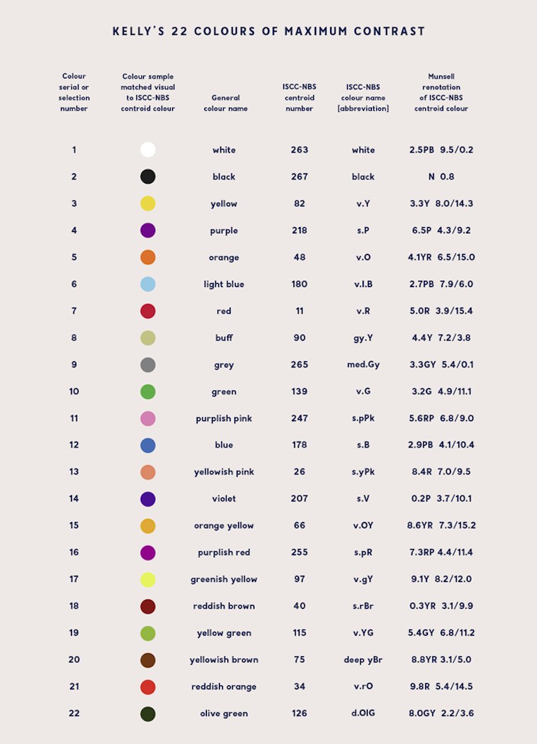
What's your use case? I would like to be able to visualize more than 10 categories of a categorical variable by color in Scatter Plot .
What's your proposed solution? In Annotated Corpus Map (Text add-on), it is possible to color more than 10 clusters if "Color points by cluster" is checked, so it shouldn't be too difficult to support more categories.
Are there any alternative solutions? Not that I know of.