Closed Louis-Backstrom closed 6 years ago
Yeah, I think having a logo or mascot is a great idea! I also think the book cover also needs updating too, at the moment it's an image from a parody book cover generator (https://dev.to/rly).
Yeah, setting up tracking is a great idea too. I use Google Analytics for a few website and it does what I need. I've got a meeting with @dbl3raf next week, so we maybe could try setting something up then with Rich's google account?
I'm happy to give the book cover a bit of a spiff up - I was trying to do that today but couldn't find where it was stored/generated. I know Rich had some ideas on getting someone to make a nice drawing/artwork for the main cover?
Setting something like that up sounds good - I'm nominally free from now as well so could get to a meeting too.
Here's two logo ideas I've made up - they're both based off images drawn from wikipedia (licensed for reuse with modification, so I think we're clear) - I know @dbl3raf thought Spotted Quail-thrush might be a good mascot too, and I have to say the logo isn't half bad. I can try a few others too?
Neat - when you and Rich decide on a cover image - you can replace the assets/misc/book-cover.png
file to update the book cover. Note that you will probably want to make sure the size of the image corresponds to the size of an A4 page to avoid stretching.
I've changed the book cover - let me know what you think. The current image is very much provisional but it's a decent start. @jeffreyhanson how difficult is changing the website logo?
Not very difficult according to bookdown docs (https://bookdown.org/yihui/bookdown/html.html). Once you and @dbl3raf decide on a logo, could you please upload the file (in ico format) to the file path assets/misc/favicon.ico
? I can then update the settings to tell the atlas to use that image for the tab image (note that it must be in ico format)
I just had a look at the cover and I think it looks great! Something about it is causing the build to fail though, so I need to work out what is causing that. Also, if you haven't already, I would recommend double checking names to include on the author/edited by bit on the cover with @dbl3raf first? If I recall correctly, we wanted to make sure that we were giving credit to the many people that have and (hopefully) will contribute to the atlas. For instance, in the author field of the index.Rmd
file we don't list any specific names.
I've just assigned @dbl3raf in case the email alerts for this conversation got lost in his inbox :)
I just had a look at the cover and I think it looks great! Something about it is causing the build to fail though, so I need to work out what is causing that. Also, if you haven't already, I would recommend double checking names to include on the author/edited by bit on the cover with @dbl3raf first? If I recall correctly, we wanted to make sure that we were giving credit to the many people that have and (hopefully) will contribute to the atlas. For instance, in the author field of the
index.Rmd
file we don't list any specific names.
Yeah, I wasn't entirely sure what to do with the author section - currently it's "Edited by Richard Fuller and Jeffrey Hanson" - I thought that was a decent compromise between showing that it's a community built effort and acknowledging the two of you as the sort of guiding force in the project? Happy to change it.
good to see all this activity - I can't keep up! In the middle of exam marking - I'll look at the atlas tonight. One broad point, I'm keen to use the time and goodwill of @jeffreyhanson wisely. It might be that his energy is best focused on building a survey sheet creation system, as I'm worried that it will be horribly time consuming to rebuild them manually after each eBird update.
Ah, what do you think about "Prepared by the birdwatching community of Brisbane" - that's what the author line for the website says?
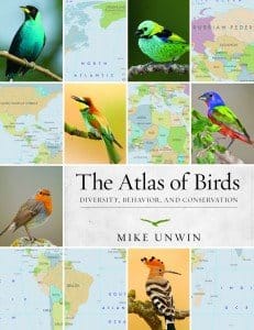
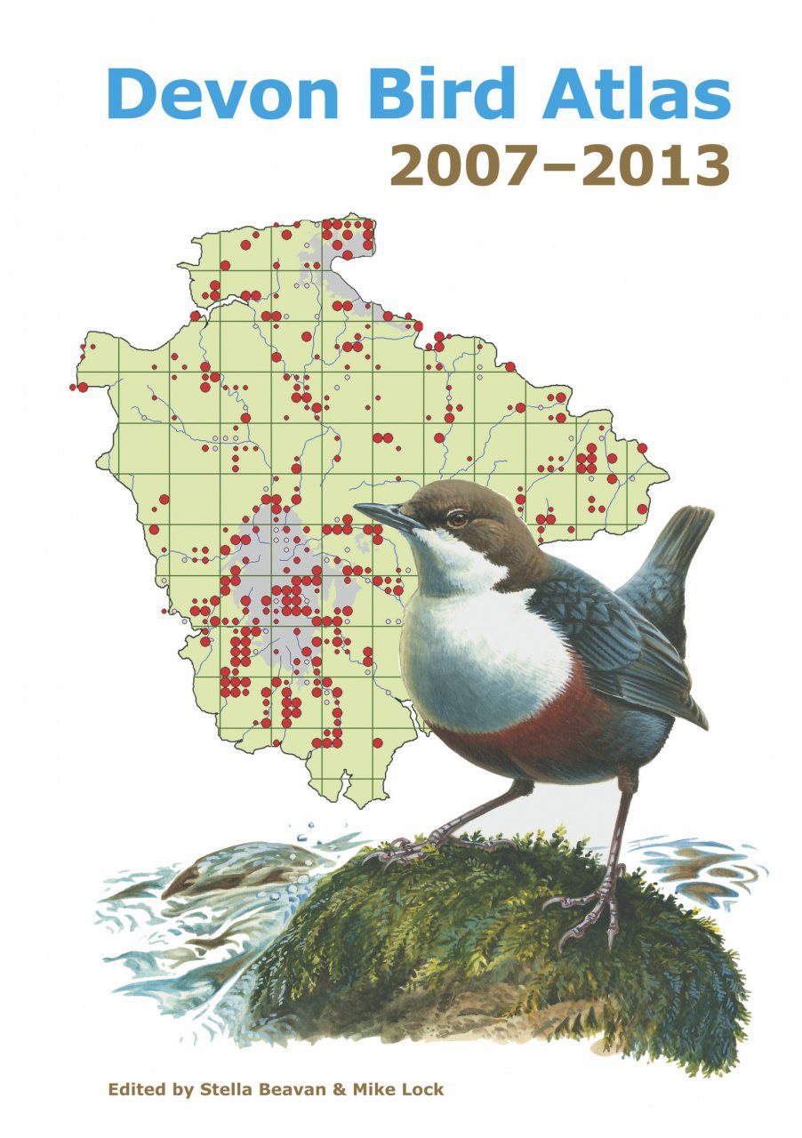
Also, I just had a quick look at other atlas covers just to see if there's a "standard", and it looks like most just show a pretty picture, or a pretty picture + atlas grid, or pretty pictures of multiple birds + study area outline. For example:
Also, @dbl3raf has an impressive collection of bird atlases, so might have more insight into what makes an atlas cover informative and attractive?
Here are some icons I've made up - I think the black/white fairywren one probably works best, keeping in mind the best icons are simple - it's going to be a tiny dot on the screen so much more detail just confuses things. We can keep the "mascot" as something else for the book cover - just the silhouette of a fairywren is distinctive and a nice shape to put in a circle icon. @dbl3raf?
As for the design cover - I can certainly change the author line to your suggestion. Those covers all look great (and way outside my skillset to make I think!) - I'll see if I can emulate them somewhat...
Yeah, I agree keeping the icon simple is best, maybe black/white or 2-3 colors at most? From a marketing perspective, the cover is probably one of the most important aspects of the book. I'm not a graphics person or a consumer of bird atlases though, so I don't know what's good and what isn't - so it might be worth ignoring me for the moment so you don't waste your time on my vague and directionless suggestions :)
Here's the new book cover - something a bit wacky happened when I converted from pdf to png so there's an outline around the LGA and some grey stuff around the bird, but I think as a mock up it looks alright?
I'll go and add the BW Fairywren to the assets as favicon.ico
as well
That's absolutely amazing @Louis-Backstrom - this serves us brilliantly as a cover page. Maybe "Created" instead of "Prepared"?
and I agree with the B&W fairywren as the tab icon - wonderful stuff.
Alright, the book cover has been changed to say "created" rather than "prepared" and I more or less fixed the weirdness with the outlines etc. so I think it's at a good stage. Icon is in the assets folder, it just needs @jeffreyhanson to change over whatever website setting it is so it displays. Analytics can be worked out at the next meeting or whenever, but for now i think this issue can be closed :)
Just updated index.Rmd
to use the favicon - so the website should use it after the rebuild finishes.
Currently the logo for the website (what you see at the top of the tab next to the page name) is just blank - is there an easy way of changing this / do we have something that we wanted to change it too? I know @dbl3raf were discussing what bird we wanted on the title page too - perhaps we could adopt a "mascot" bird? I could make up a little 64x64 pixel image of a bush stone-curlew that could work perhaps? For my little hobby photography site I've got a pied cormorant and I think it looks alright - same should work with another species.
The other thing that might be beneficial in the long run is setting up a system of tracking visits to the site etc. - something like Google Analytics - which might help gauge how much activity there is after launch (and therefore might be helpful in securing further funding etc. - once you can prove it's actually being used). I've played around a bit with Google's option, but I'm fairly sure there are other options out there too. @jeffreyhanson do you know if this is possible?