bisq-network / bisq-website

@bisq-network website at https://bisq.network
36 stars 77 forks source link

[Proposal] Translate Bisq software images in the homepage #207

Closed huey735 closed 5 years ago

huey735 commented 5 years ago

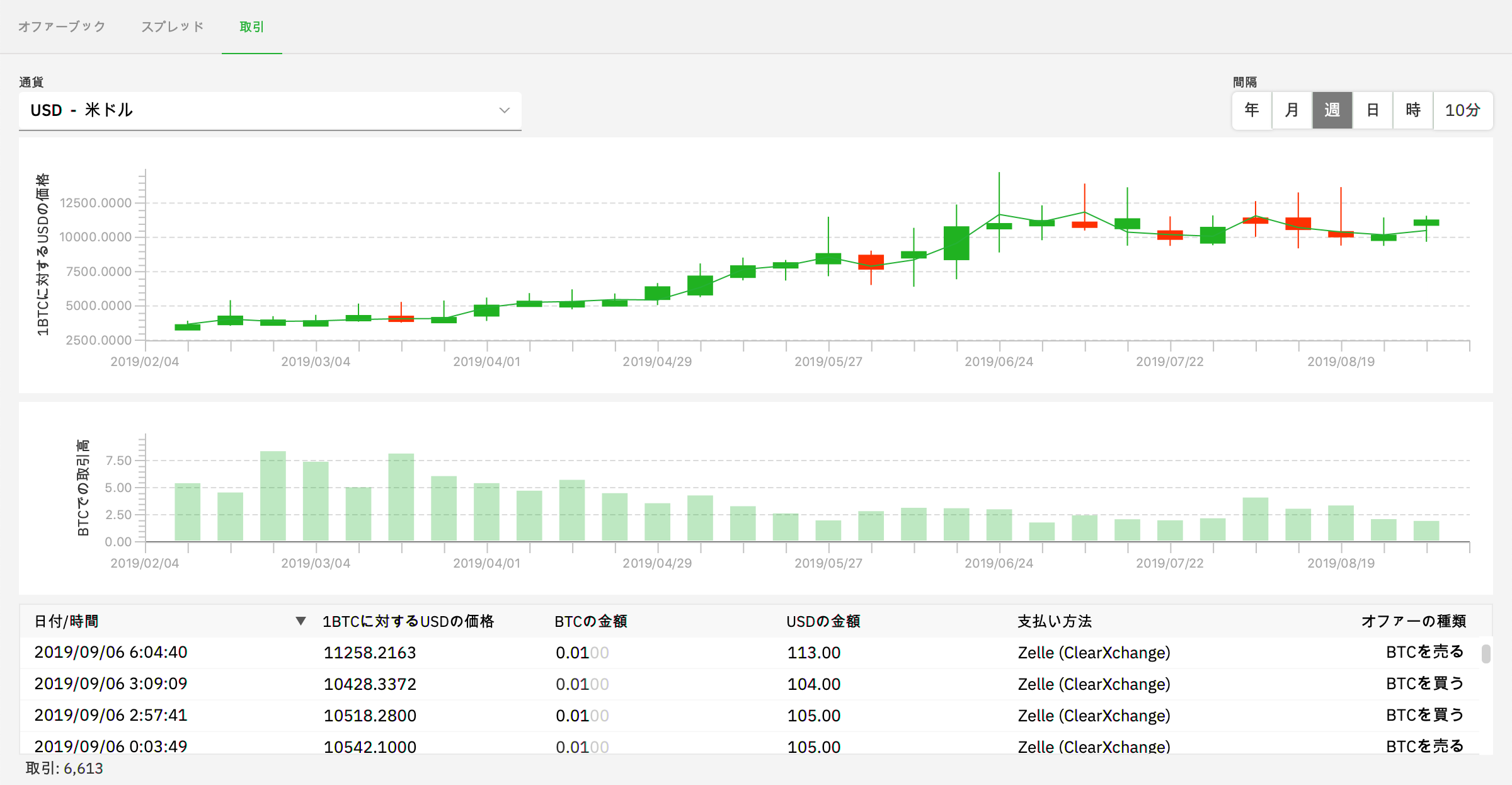
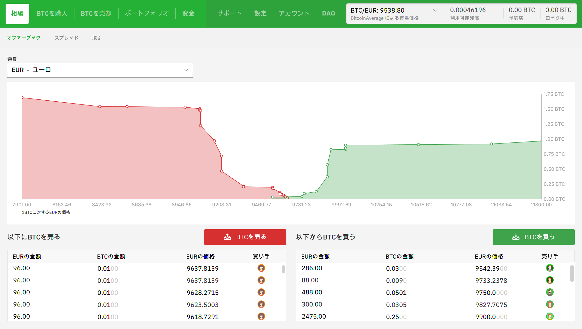
To add to the translation of the website, we can also translate the images of the software in the homepage. I'm thinking of using screenshots of the USD market as a standard for every language. What do you think? @m52go @mpolavieja Bellow is the comparison of the current images in the website and their current form in the software in English

Trades

bisq_screen1 bisq_screen1_new

Offer book

bisq_screen0 bisq_screen0_new

m52go commented 5 years ago

@huey735 should be ok, but I wonder if the new images are too complex. It looks like the old images are mockups of the UI, instead of screenshots of the actual UI, so they seem to hide some of the real UI's perceived complexity (e.g., small numbers, lots of rows, etc).

huey735 commented 5 years ago

Yes, @m52go the original images are easier on the eyes but I don't think the new are too 'busy'. And I can't render the images in the same resolution as the originals. I hope it's ok orginal - 2400 x 1378 new - 1566 x 899

m52go commented 5 years ago

Wow, I could only get 1200 × 747 and I'm on a pretty big 4k monitor. Weird. Anyway yeah maybe try it and see how it looks? It might not be a big deal after all.

m52go commented 5 years ago

@huey735 would you like to take care of this? #230 makes it straightforward...just replace the placeholders referenced there with localized screenshots.

huey735 commented 5 years ago

@m52go I got 1566 x 899 screenshots if full view which is kind of ugly as it adds to many rows and I feel like unbalances the picture. At Bisq's default size I get 1200 × 747, 1200 × 680 when I remove the top and bottom info bars.

These are what mine look compare @wiz's who's rendering them close to the current resolution. I've chosen to render them all for the USD market to keep consistency.

bisq-japanese-market bisq-japanese-market

bisq-japanese-trades bisq-japanese-market

wiz commented 5 years ago

Oh, I didn't know you had an issue for this, yeah I actually increased the size of the top main navigation strings in the Bisq app for Japanese locale in preparation for taking the screenshot on bisq.network/ja since I wanted to polish it up a bit. Let me know if you need help taking sexy localized screenshots for the homepage.

huey735 commented 5 years ago

@wiz I'd pretty much appreciate your sexy screenshots. Can we agree on a standard? For simplicity and cohesion I was thinking of taking screenshots for the USD market for all markets. And we'd exclude the top and bottom info bars from the screenshot. You've excluded the navbar from your bisq_screen1.png. I'd prefer it back.

wiz commented 5 years ago

@huey735 The goal here is not mere translation, but complete localization. Let me explain:

Localization is an art, of much more than just translating content, it is the process of completely adapting and optimizing UI/UX for the intended target audience of users. It's usually done by an expert of that locality who knows what users will expect and how they will behave. For example, for users in Japan, of course they will want the Japanese language, but more importantly, I know they will want to trade on the JPY market, and they will want to use a Japan Bank Transfer payment method.

So please understand it is counter-intuitive to the localization process to always show the USD market in screenshots, even to people who are probably not interested in USD. The correct choice for Japan users is to show them screenshots of the JPY market, but since the JPY market is not mature yet, for now I decided to use Japanese screenshots of the app displaying the most liquid fiat market EUR. What screenshots are best to display to a particular locale is a decision that the contributor doing those localizations should make.

This is also why I didn't just blindly take screenshots of each app in each language and throw them on the website in my original PR; this is the job for the individual localization experts because there are many important decisions to make along the way. So to clarify, I'm not offering to take screenshots, I could have done that already - I'm offering to help you take nice screenshots of what exactly you think should be displayed to your users, as in technical support if you need it, since you had commented that the screenshots you had taken were low quality.

So hit me up on slack if you need help taking sexy screenshots :wink:

wiz commented 5 years ago

@huey735 hey buddy, did you still want to do this? 😅

gilsanjuan commented 5 years ago

Hey guys I can help with this task @wiz

m52go commented 5 years ago

@gilsanjuan sure, why not. Can re-assign this to you if you'd like to knock it out.

gilsanjuan commented 5 years ago

Hey guys, I made render on Sketch, I mixed current home image with current Bisq UI, tell me what do you thing?

SVG file here -> https://drive.google.com/file/d/1vxlSizSE1uQEAq50Nx7jisQtGAvuSbA9/view?usp=sharing

Bisq UI EN

m52go commented 5 years ago

Completed with #278.