 pedromvpg
commented
4 years ago
pedromvpg
commented
4 years ago We should also try to make the whole element clickable, not just the type/text.
Closed pedromvpg closed 4 years ago
pedromvpg
commented
4 years ago We should also try to make the whole element clickable, not just the type/text.
 erciccione
commented
4 years ago
erciccione
commented
4 years ago In general is not a good practice to include flags in language selectors
This was already pointed out in #243, but as you can see from that PR, the Bisq team prefer to use flags (for reasons i disagree with).
 m52go
commented
4 years ago
m52go
commented
4 years ago As explained in this comment, the motivation was to have some way to communicate region-specific content.
Upon thinking about this over again, maybe we can accomplish this by simply adding the region-specific content for the translations it most likely applies to. For example, payment methods specific to Mexico and Spain could both be specified in the Spanish-language translation of the relevant FAQ. It wouldn't be ideal for Venezuelan users to see this information, but I guess it beats forcing Venezuelan users (or even Spanish speakers in the USA, or anywhere) to click a button with a flag of Spain just to see the site in Spanish.
pedromvpg
commented
4 years ago I think we're asking too much from the users to have region specific content when toggling for translation. It assumes too much of geography just going by language. Would then be much better to have a "Regions" section in that menu, or something much more tied to geography.
A lot of people speak different languages from the official one in their jurisdiction.
I would strongly urge to go with the option below thats much more familiar and maybe add a geo specific UI element like a "Where are you based" dropdown, or even a world map that links to specific pages or FAQ sections. Something that unequivocally tells the user they are going to get geo specific information.
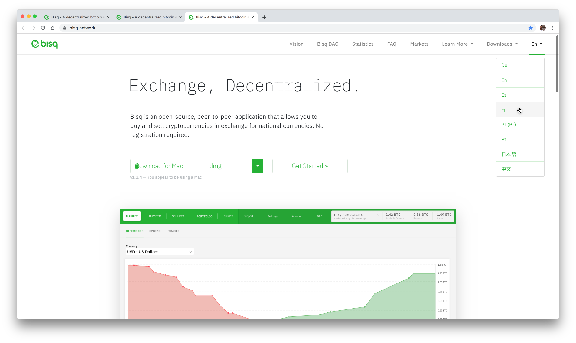
In general is not a good practice to include flags in language selectors, there are a lot more countries that use the Spanish or French language besides France or Spain. Also it looks really colorful and off-brand.
I recommend removing them. It will also save some space in an already over populated navigation.
Short form is very much understood worldwide.